Photo Mask Challenge with PrelestnayaP
![]()
Omigosh, the 2022 Challenges are fabulous! There are some new ones that I’m still familiarizing myself with, but I wanted to highlight the new-for-2022 Photomask Challenge brought to us by the incredibly talented PrelestnayaP Design (Irina). I’m always intrigued by how each of us interprets a Challenge based on a single, specific element and how we arrive at such unique results. For this Challenge, Irina has provided this photo mask that must be part of the layout.

I visited the Challenge Gallery and randomly (well, not exactly) selected a dozen layouts to share with you. I’ll offer my critique and why it caught my eye. Each layout will be linked to the Gallery so you can take a closer look if you like, and maybe leave a little praise for the scrapper too. Just click on the scrapper’s name!
The first layout is from etycz. She’s blended the plaid paper with a snowflake paper quite seamlessly by placing the mask the full width of the page. I suspect there’s another mask at play here too, under the Challenge mask. Then she concealed the edges of the mask with clusters. Beautiful!

PixyGirl has used the mask to create a paint swatch, and then used it again for her photo. See how the photo follows the contours of the larger painted mask?

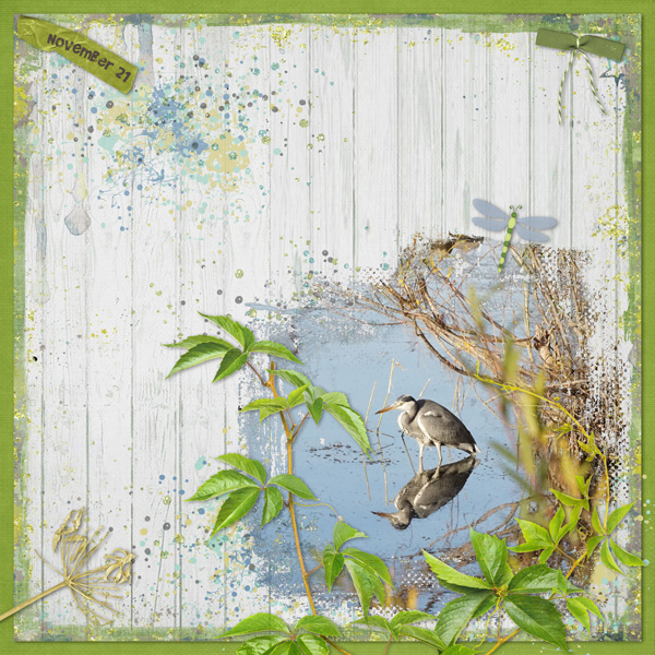
The way chris01 has used the mask is to focus the eye on the heron in her photo, an effect she amplified by framing it with foliage. It looks like it could just fly away!

I love this layout by HalinaMiga. She’s used the mask to make the skier look like he’s surrounded by blowing snow. The stone cottage, fir tree and leafless bush with birds in it create such a charming image.

What drew me to Pippin‘s layout is the overall vintage look she’s obtained by using the mask to blend her sepia-toned photo into a dark brown background. It’s hard to tell where the photo ends and the cup-and-saucer-pitcher cluster starts.

Jill‘s layout is another example of flawless blending. The grungy paper she chose for her background is an inspired choice. Her clusters enhance the overall look of the layout and the whole effect is amazing.

Here, gmae has created an echo of sorts with the build-up of colour variation. It reflects the principle behind the cairns in her photo, careful stacking to achieve a stable foundation. And what a whimsical touch, tucking the photographer behind her cluster.

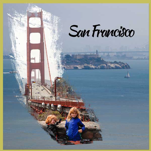
Wait! What?!! How clever of fontaine to cut the mask and rearrange the pieces to create a mask map of California! (Please tell me I’m not the only one who sees it…) Her layout is super-simple, but eye-catching nonetheless.

Katherine Woodin documents all the little moments of each day through photos and layouts. Here, she’s used the mask to frame that beautiful snow-covered mountain. The kit she chose pulls colours from her photo so accurately!

I’m positive Karen Diamond has used multiple brushes and masks for her layout. I zoomed in on it and there are so many layers of paint and snippets of paper, then a stack of paper pieces, the Challenge mask and her photo. That cluster is exquisite – balancing out the photo stack without taking centre-stage.

For her layout, Lisa Campbell has used the mask to create a paint swatch that ties the the whole layout together. Her clusters are perfectly positioned to put the focus on her photo.

And finally, NHSoxGirl has evoked a sense of dreaminess and imagination with both the photo she’s masked and the elements she’s surrounded it with that wouldn’t be there if she’d simply framed her photo.

Examining all these layouts has given me some inspiration for my own Challenge layout. Off the dig through my supplies!
PDF Version : https://bit.ly/3GIbxx8
![]()