Archives for November 2021

Tutorial Tuesday (Photoshop Elements)

Can I Make Something Crystal Clear? (As Glass)

Omigosh. November is over at midnight! For me, December will be even busier than November – and Canada doesn’t have Thanksgiving in November! – has been, and I wouldn’t have thought that possible. But here we are…

Last week I signed off with a promise to show you something really cool, and I hope you’ll be suitably impressed. It all started with a message from Carol (gnana96): “Hi Jan, I have another tutorial suggestion for you. Several years ago I started scrapping family recipes for my kids and adult grandchildren. The first year they got an album and several recipes and every year I give them 7 to 10 more to add to their collection.
This year one of the templates I used was from The Cherry On Top What’s Cookin, template 1. The template has a mixer and a bowl which I thought would be so cute for my 7 minute frosting. The bowl on the template is white and I thought it would be cute to make it a glass bowl so I applied one of Karen Schulz (Snickerdoodle) glass styles to the bowl and my sister Ellen and I both decided that it just didn’t look right so I ended up attaching a patterned paper to the bowl. (The layout was for the bingo challenge and I posted it as # 13)
I’m not sure if I chose the wrong glass style or if my idea itself was flawed. I know Ellen has tried to apply glass styles to something besides a bowl and she didn’t think it worked either so I am hoping you can help us out.
How do we decide which style to apply and what needs to be done to make it look right. How do we make a glass bowl look like a glass bowl and not like a glossy part of the wall.
Thanks
Carol

Well, didn’t I have to right away start playing with those glass styles (after I ran to the store and bought them – how did I not have them in my stash??). Today’s tutorial will look at making a solid opaque object transparent and three-dimensional, and next week I’ll show you how to create a realistic look against some “wallpaper”. [<whispers> I had some issues with Elements and had to reset all my preferences, then it was still giving me a hard time. That’s why the text is a little wonky on the screenshots.] Let’s go!

I started out with this bowl from WimpychompersBaking Traditions (retired). She has a mixer in the kit too, with a metal bowl; I opted to use this one but the technique will absolutely work on pretty much anything. The only alteration I made to the bowl was to make it taller.

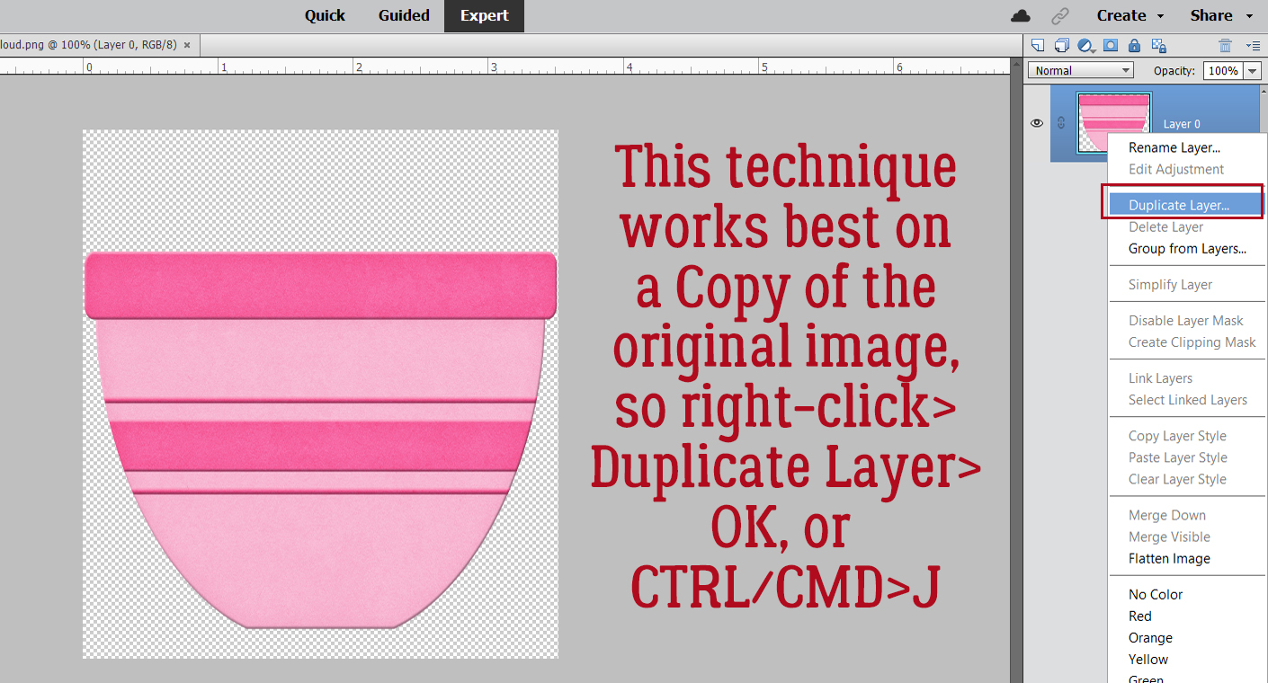
For this technique to work it goes best on a Copy of the object, so right-click>Duplicate Layer>OK or CTRL/CMD>J gets that done.

I have several clear glass bowls and the upper edges of them are all thicker than the rest of the bowl, so I decided to make my digital glass bowl the same. I’m going to give that top band a bit more heft later. For right now, I activated the Rectangle Marquee Tool.

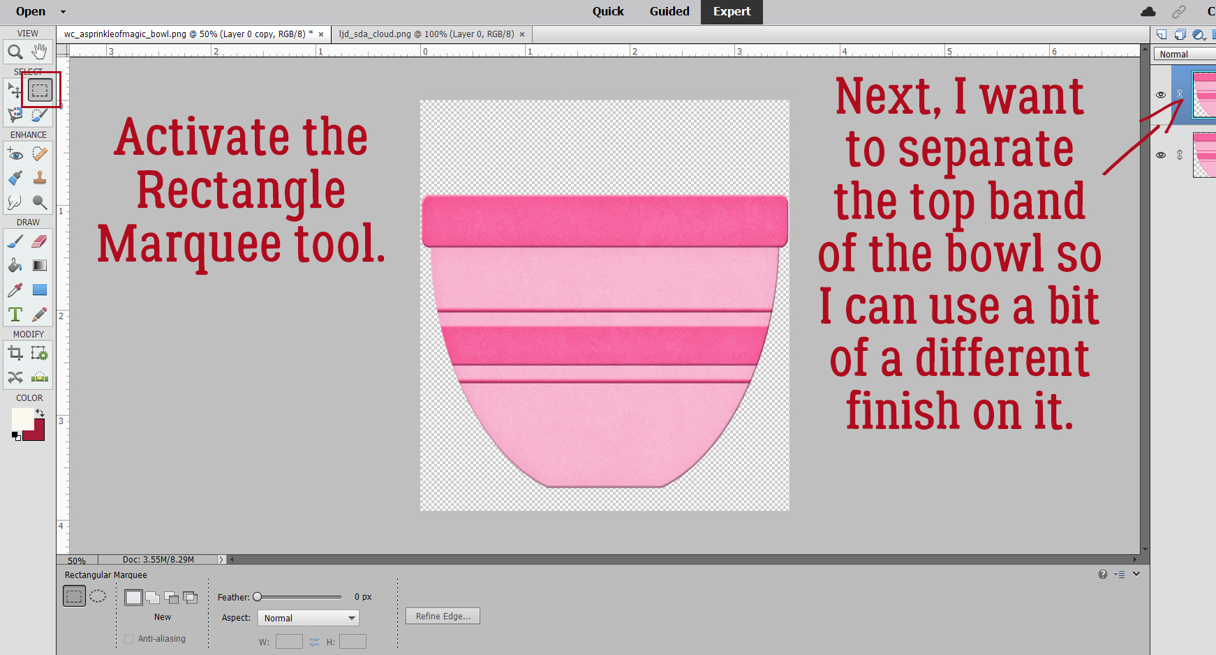
Working with the Copy layer, Select the top band using the Rectangle Marquee Tool as shown.

Now we want to make a Copy of JUST THE BAND. To do that you can click Edit>Copy or CTRL/CMD>C.

The band needs a layer of its own, so add a blank layer above the two bowl layers by clicking on the sheet of paper icon.

Now Paste the Copy of the band onto that new layer: Edit>Paste or CTRL/CMD>V.

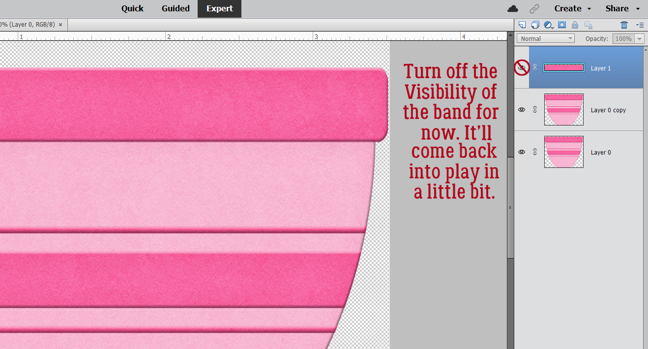
For right now, let’s turn the Visibility for the band off. It won’t go anywhere.

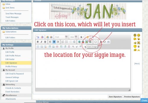
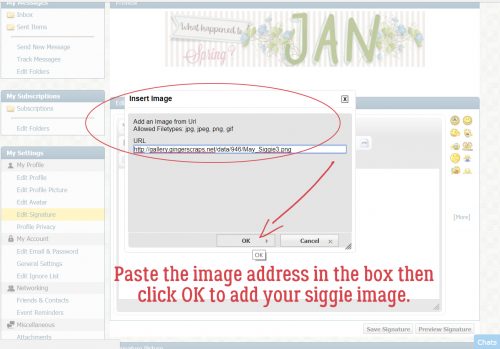
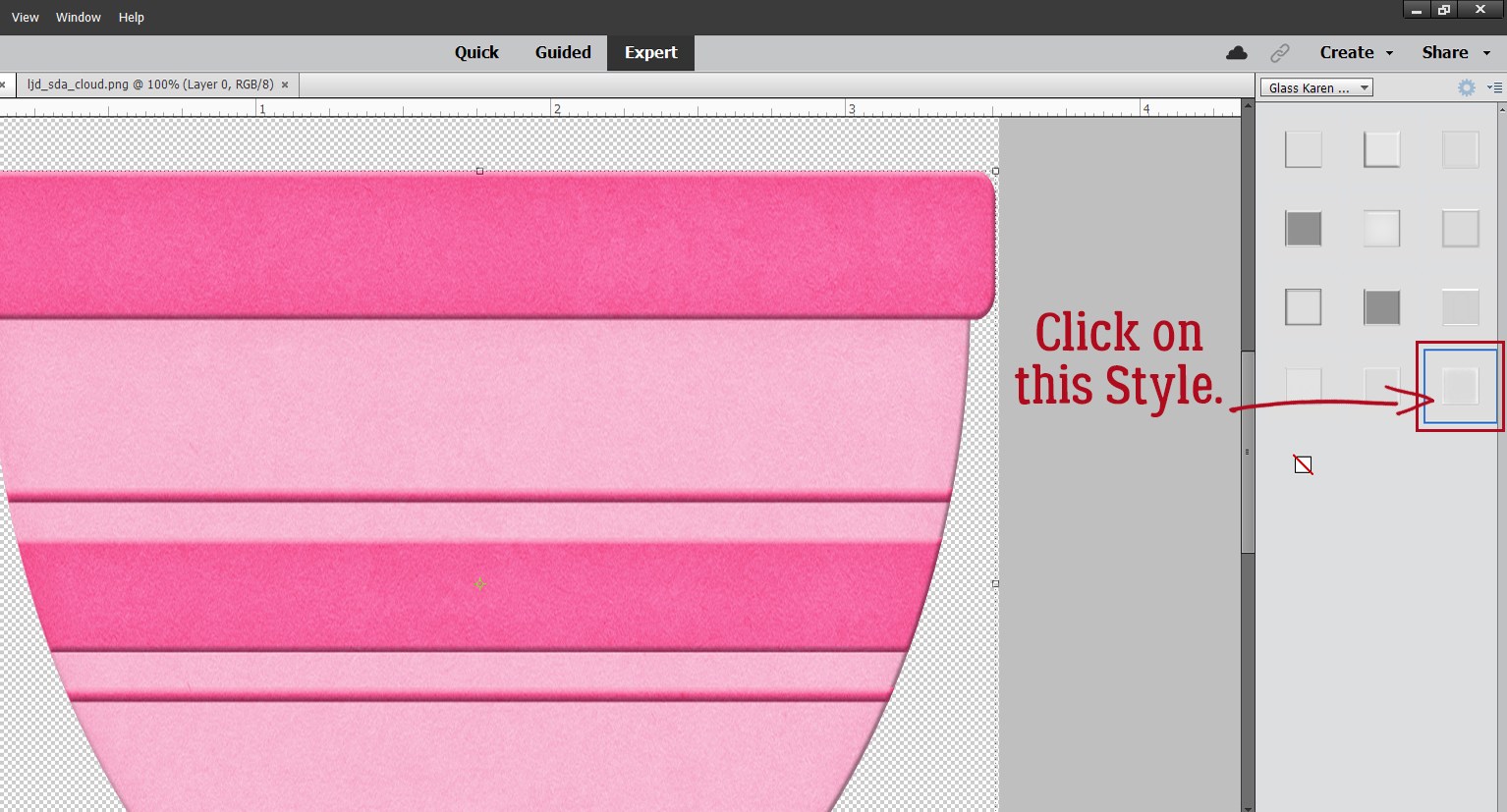
I was steam-rollering through the technique when it occurred to me that I probably haven’t covered how to load Styles. How remiss of me!! If you’re not a pro at loading Styles, follow along. First, make sure you know where the .ASL file containing the Styles lives on your computer. Click on the Styles button at the bottom right of the Layers Panel. It looks like a deck of cards. When the Styles menu opens, click on the icon that looks like a stack of paper, at the top right of the Layers Panel, up there underneath the Share button. That opens the settings menu for the Styles tool. Click on Load Styles. Then when the pop-up opens, find your .ASL file in your folders and double-click on it. There! The Styles will show up in the dropdown menu now. I rename all my .ASL files for easier recognition, so on my list the glass Styles come up as Glass Karen Schulz. (I’ve linked to the store so you can find them quickly!)

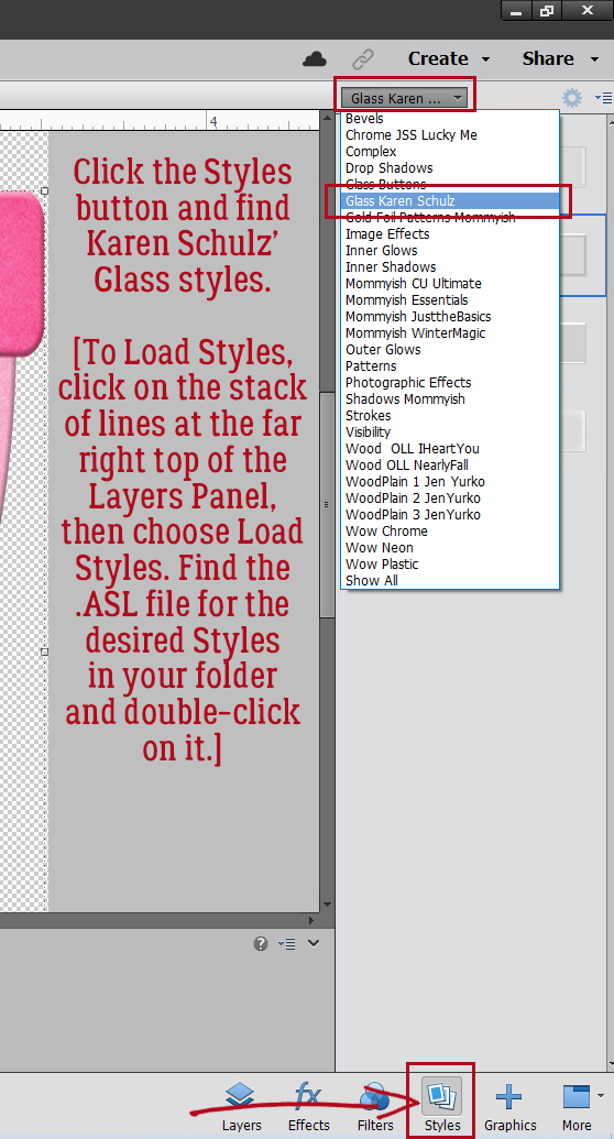
Karen hasn’t used a descriptive name for the Styles, just numbers. The one you want to use is the one I’ve outlined.

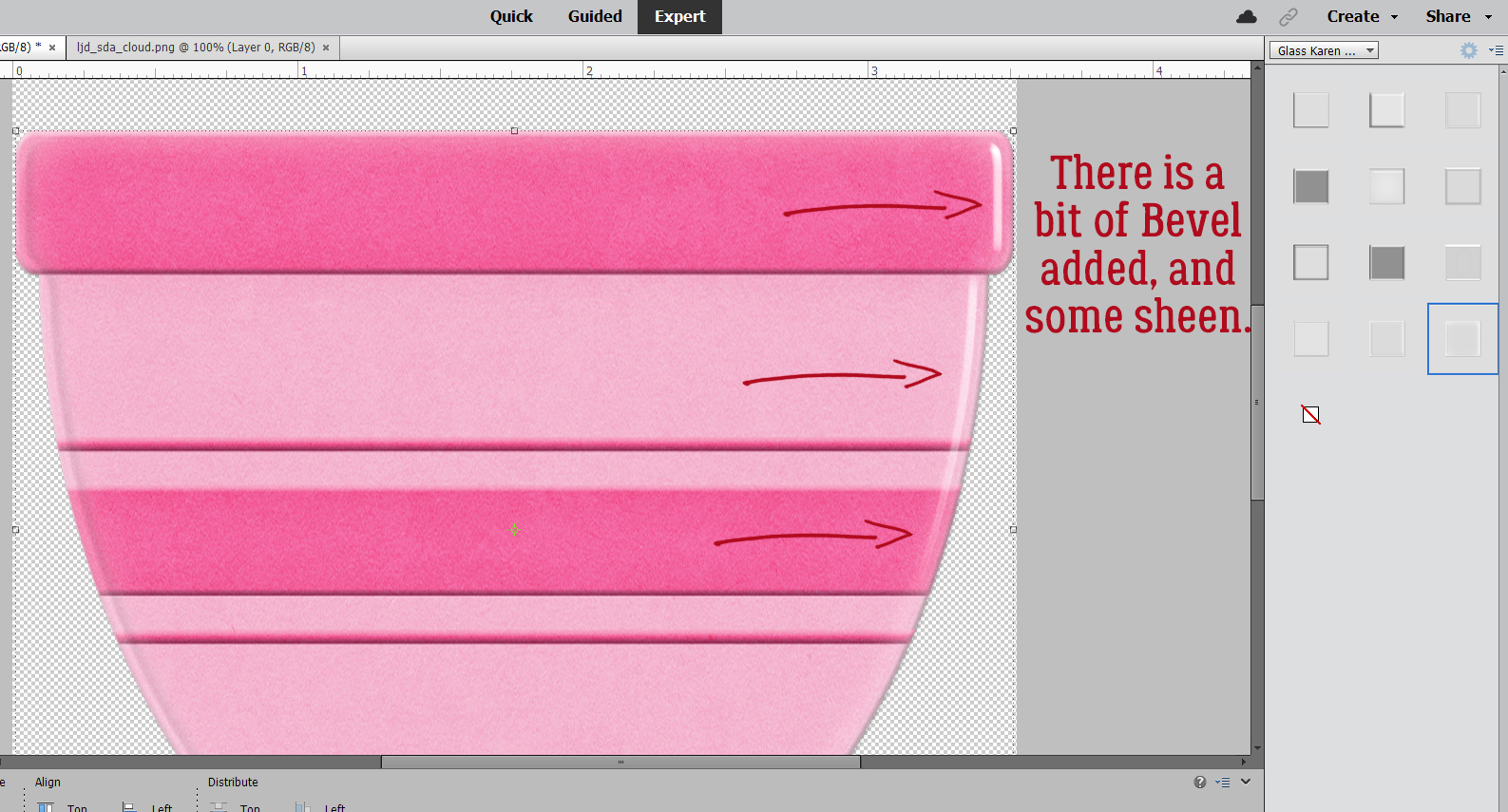
In this screenshot, both bowl layers are Visible. Can you see the rounded Bevel and the shine?

Here I’ve turned the original bowl and top band layers’ Visibility off. All that’s left is the shiny clear glass! But it doesn’t look much like a bowl. So let’s play with the settings! Double-click on the fx icon for the bowl’s Copy layer where the Style has been applied. You’ll see this pop-up menu with the default settings for this Style.

It took me some fiddling to get this right. Don’t be afraid to experiment! I increased the Opacity for the Inner Glow to 75% and the Bevel all the way to 250 pixels. Now it looks round!

Next, let’s apply a different Style to the band layer.

Now, we’ll tweak the fx as before, with these settings.

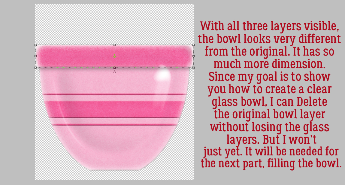
With the Visibility for all layers turned on, this is how the bowl would look as a glossy ceramic. The original bowl layer isn’t needed any more for the technique, but I’m not going to Delete it yet.

Let’s put some cookie dough in the bowl! I turned the bowl Copy layer and band off for this part, leaving just the original bowl visible. This cloud from Lindsay Jane‘s Sunny Days Ahead (retired) looks a bit like dough if you squint. But how can I make it fit into the bowl?

Make sure the cloud is completely covering the bottom of the bowl. Select the edges of the bowl by CTRL/CMD>clicking on the bowl’s layer thumbnail (the little picture in the Layers Panel) with the cloud layer active.

Now it’s time to Invert the Selection by clicking Select>Inverse or CTRL/CMD>SHIFT>I.

To remove the bits of the cloud hanging over the edges of the bowl, Edit>Cut or CTRL/CMD>X and it’ll disappear.

I nudged the “dough” up a bit to create the illusion of glass walls. You’ll see what I’m talking about in a minute. But before we get there, I want to make my “dough” look like it was made with butter and not shortening, so I’ll need to make a Copy of the “dough” layer. Right-click>Duplicate Layer>OK or CTRL/CMD>J.

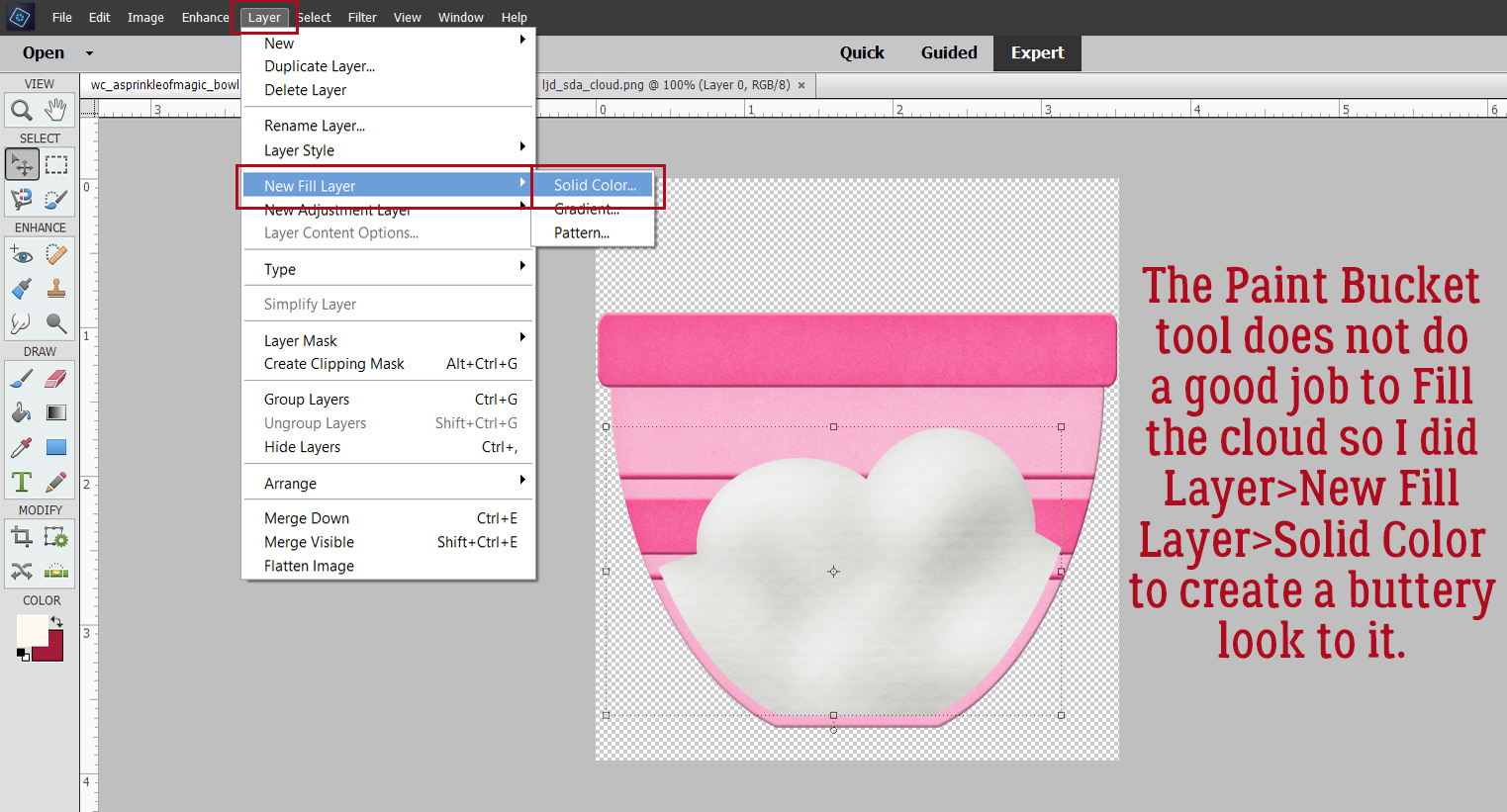
I really tried to change the colour on this “dough” using the quick-and-easy Paint Bucket, but it looked HORRIBLE. So instead, let’s add a Layer>New Fill Layer>Solid Color.

Check that box Use Previous Layer to Create Clipping Mask.

Then pick a colour that looks like “dough”. Or whatever colour you like!

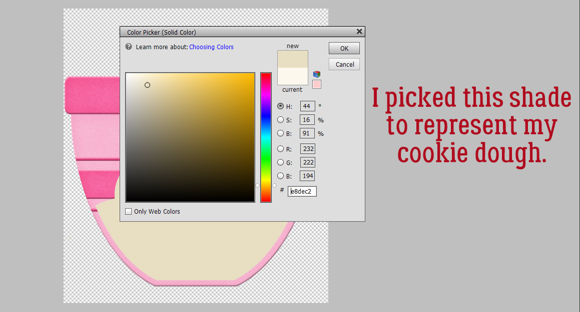
Next, Merge the Fill Layer with the Copy cloud layer.

To preserve the lumpiness of the “dough” change the Blend Mode to Linear Burn.

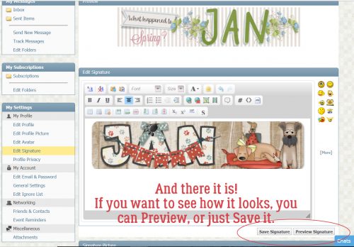
Et voilà! Cookie dough in a glass mixing bowl!!

Carol, I hope this is what you were expecting. Happy birthday!

PDF VERSION : https://bit.ly/3FXy1cw

November 26, 2021: Fresh Baked and Black Friday

Happy Black Friday!!! Just like those great sales in your favorite stores (physical and online) we are having a great sale at GingerScraps as well!

Many of the designers have put together Black Friday/Cyber Monday DEALS!

Remember, any $10 spent in the store gets you this cute kit for free!

Our designers have really gone all in with new kits, grab bags, and much more.

You still have time to get those challenges done. Any 10 completed challenges get you this great kit!

Tutorial Tuesday (Individual Style)

November Challenge Spotlight: Template Challenge

Is the timing for our Challenge Spotlight perfect this month, or what? This week nobody has to try following Jan’s twisted and tangled directions! Because who’s got time for that right now? This month I’m shining a light on one of my faves, the Template Challenge. I LOVE templates… and for those who think they stifle creativity… well that’s simply not true. Templates enhance creativity! I look at them as a foundation, not something to follow slavishly; the template designer takes some of the guesswork out of layout creation, but leaves the scrapper in the driver’s seat. Sure, if you love a template exactly as you see it, you can faithfully duplicate the designer’s vision to create a beautiful layout. But if you’re like me, you see a template as more of a springboard; I often flip or rotate my templates, resize or reposition photo spots, add, subtract or substitute elements and make my layout uniquely mine. Let’s look at some examples of what can be done with a single template and how amazing the results are.

Before I forget, I’d like to welcome Dagi back to the family. Dagi has been designing templates for many years; her nom-de-plume was originally Dagi’s TEMPtations, then more recently Dagilicious. She’s taken a couple of sabbaticals from designing when life has required, and now she’s back again with lots of fresh looks. She has provided the November challenge template (did I forget to mention they’re FREE every month?) and it’s fantastic! Here’s a peek, in case you haven’t seen it.

Her Creative Team member Karen took the template and created this layout with it. As you can see, Karen kept her layout true to the template, and it’s gorgeous.

Now on to the Gallery! [PS… Each Challenge has its own Gallery. You can find the Template Challenge Gallery here. Each layout is also linked: click on the scrapper’s username!] First up is a cute layout by Yvonne55. She stayed pretty faithful to the template, but has blended some papers, added a stitched border, substituted some string for wordstrips, stitched down the journal card and added that little clothespin to anchor her single wordstrip.

I’m going to guess that Cinna doesn’t like bows… she’s substituted wings for one and some brass elements for the other. She tossed in some sequins, some scribbles and extra paint, but the bones of the template are easily identified.

KatherineWoodin is a storyteller. Her layouts are daily diary entries and she does a beautiful job of enhancing those stories with her choices. Here, she’s rotated the template 90° to the left. The large photo spot became her notepaper and the journal card is replaced with a photo. She added some scattered flowers and butterflies too. And check out that cool font for her title!

I admire people who can capture good photos of birds. granny5pics subbed a tag for the journal card, some fine curly ribbon for one of the bows and some wooden bird cutouts for wordstrips. She added some twigs behind the paper/photo stack.

Look at this little cutey! Got2Scrap has added a photo in the upper right, a grungy brush behind all the paper and photos, eliminated the wordstrips and perched a cowboy hat on the photo stack. The template is recognizable, but not in a cookie-cutter way.

This layout from Glee is a significant departure, but the bones are still there. She eliminated the paint splatters, going with a patterned paper instead. Her focal photo is long and skinny, and she’s filled the space with doodles. Then she tied the ribbon cluster to the photo/paper stack with a hot air balloon. She’s used word art rather than wordstrips. Very cool!

When I look at Jill‘s layout, the template influence isn’t really obvious, but the more I look at it the better I can see it. She’s made the photo spot smaller and framed it in black rather than white. She moved one of the large clusters to the opposite corner and tucked it underneath. She deleted the journal card, filling it instead with paper. Her stitched border and the addition of a pair of buttons to it is a deft touch. And what can I say about the rubber ducky?

There are SO MANY creative tweaks to the template in cinderella‘s layout. She’s turned the photo spot into a cut-out and has that amazing extracted photo popping up from inside it. The elements in her clusters are positioned with the template’s placement as a guide, but she has a very different look with the die-cuts. Tucking some strong into the background and scattering some beads rounds out a interesting and eye-catching layout.

At the most basic, makeyesup‘s layout has the look of the template, but not. I know that’s not really sensible, but she’s made a lot of choices that really sets her layout apart. Her dark background and muted colours are visually pleasing. Rather than use a journal card, she’s created a dialog box to describe her photo. The primitive bird atop the paper immediately made me think of “plain” folks, like the ones who settled Salem more than three centuries ago.

Derby Wharf

Now, where have I seen that background paper before? Oh yes… in the first layout I showed you. And the template’s form is quite apparent. But the layouts couldn’t be more different! greenfiend127 replaced the journal card with a circular tag and it works beautifully. She replicated the stitched border on each of her papers and her photo, giving the layout such an organic look. Exchanging the zigzag paper strip borders for a narrower papercut border is another way she’s made the template her own.

I hope you’ll find some inspiration in these layouts and begin to see templates with a new perspective. If you see the Challenge layout I’m going to post later, see if you can identify the changes I’ve made. What are some ways you can bring your unique style to a template? Give it a whirl!

Next week I hope to have something really different to show you. If my experimentation works the way I think it will… Meanwhile, Happy Thanksgiving to all of you in the USA. While y’all are watching football, I’ll be binge-watching Yellowstone. See you soon!

PDF Version : https://bit.ly/3IbAXo7

Fresh Baked: November 19, 2021

Welcome to another Friday. This week has just flown by. It’s hard to believe next weekend is Thanksgiving in the US. Do you have big plans for the holiday meal?

Remember, any $10 spent in the store gets you this cute kit for free!

Our designers are really starting to kick into winter and holiday mode and it’s showing in our previews for this week.

Don’t forget to work on those challenges. Any 10 completed challenges gets you this kit as a reward.

Tutorial Tuesday (Potpourri)

Holiday Memories Start with Photos – a Review

It seems like we’ve all been through so much the last couple of years. Last Thanksgiving in the United States, with the COVID-19 pandemic raging, a lot of families opted to cancel their usual big gatherings to protect each other from the virus. Others went ahead with their traditions, then wished they hadn’t. Then there were the lucky ones with the best of both worlds. Quite a few things have changed for this year, access to a safe, effective vaccine being a big one. So maybe this year, traditions can be upheld without as much angst, although modifications might still be needed. Our layouts have gradually shifted to more hopeful thoughts, and the pandemic has been interwoven as a part of life as we know it. This run-up to Christmas and then the New Year may take a bit more planning than before, and planning how we’re going to memorialize our celebrations should be a priority too. We’ve played with a lot of techniques for editing our photos to make them worthy of scrapping, but why not skip a step (or ten)? Let’s review some tips for taking better photos. I know we’ve already talked about that before, but a few reminders probably won’t go amiss. Whether your photos are caught with a point-and-shoot, a high-end DSLR or a cell phone, there are some things you can do to get great photos.

  • Right now, right this minute, make sure your camera battery is fully charged. If they’re replaceable batteries, put fresh ones in your camera NOW!
  • Make sure you have an empty memory card (fully formatted, of course!) in your camera and a couple of spares so you won’t run out of space. If you’re using your phone, you should move some photos from your internal storage to your computer so you’ll have room for the new ones.
  • Think about how your typical holiday events usually evolve. There will be some traditions that are carried out no matter whose house you’re having the celebrations at, so plan ahead to capture those moments. Make a list, if you need to.
  • If you haven’t done it lately, review the manual that came with your camera. Review the settings and modes you’re most likely to use for your shots and remind yourself what each is doing while you’re shooting. I use the metadata from my most successful bokeh and full moon shots to set my camera up ahead of time so I don’t miss the shot.
  • Practice a few creative techniques that you can memorize so that when you’re ready to take photos of the candles on your dinner table or that gloriously brown turkey, you won’t have to fumble.
  • Refamiliarize yourself with your tripod, if you use one. I have two – an aluminum ball-head one that allows infinite adjustments but takes a lot of room and needs to be set up ahead of time and a Platypod Max, which looks like a little travel iron but is actually a very clever and sturdy tripod that can be set up in minutes on any surface. Why use a tripod? It lets you take longer exposures while keeping the images tack-sharp and it lets you be in the photo! Use the built-in timer and get in FRONT of the lens for a change.
  • Keep an eye on the lighting. Natural light from a big window is fantastic, as long as it’s not backlighting your subject. This is especially important for those group shots we all love. You want everyone’s face to be evenly lit, without harsh shadows everywhere. So maybe turn on some lamps so your flash won’t be so startling. Shoot a couple of test shots so you can see what needs to be tweaked.
  • Get in close to your subject! This “rule is even more valuable when that subject is a child. Get down on their level whenever possible so you capture their best smiles. Shooting from above should be reserved for those special-effect shots, not photos of kids having fun. For the most natural photos of people though, you can use a telephoto lens and shoot them from some distance. (As long as the light is right!) Some of the most memorable photos are those taken when the subject is unaware they’re being snapped. They’re relaxed, and acting naturally; smiles are genuine and emotion is often quite palpable.
  • Don’t insist on smiles. You know what I mean… those cheesy grins aren’t going to be your favourite images. Rather than having everybody say “cheese” for your group shots, have them say “family” or “money” or “gotcha”. You could go with a made-up phrase, such as “moldy mozzarella”. Another trick is to tell everyone you’re going to shoot on “3”, then count, “1… 2… (shoot) WHOOPS 3!” then shoot a second shot right after that. You’ll get some natural smiles that way.
  • When taking photos of food, again, get in close and vary the angles. Show the flaky texture of that piecrust, the glisten of the done-to-perfection skin on your turkey, the creaminess of your mashed potatoes, the detail of the frosting on your cupcakes. (That reminds me, I need to get some baking done!)
  • Do you take photos of your Christmas decor? If you’re getting harsh shadows and lots of glare, you can drastically reduce the odds of that occurring by using a big sheet of white cardboard as a reflector. (Dollar store foam core board is perfect for this.) It’ll bounce and soften the light in your space to produce much more even lighting and much more interesting images. Hold it at an angle to the source of your light (windows, lamps, even your flash) so the light is reflected at an angle too. If you’re using a flash and find it too harsh, you can wrap a tissue around it or in front of it and diffuse the light that way. Here’s where test shots are really time-savers.
  • Composition is key for any photo. Remember the rule of thirds, but don’t be a slave to it. Decide what your focal point will be and compose your photo to make it so – use leading lines where possible and don’t forget white space. Crop your photos in the viewfinder – so much less work later! And don’t forget the background. Is there anything growing out of someone’s head? Take a step to one side or the other and recompose.
  • Take LOTS of photos. Take several of each subject from different angles and distances so you have a choice of which one is best. More is definitely better!
  • This just popped into my head… Instead of an Ugly Christmas Sweater event, maybe this year you could do Ugly Christmas Masks. We’re still masking indoors in public here, with a government mandate. It’s such a small thing, but with such great potential for safer interactions.
  • We should take a moment to talk about safety. If you’re taking photos of weather phenomena (like the “atmospheric river” that just devastated the Pacific Northwest), landscapes or nature, do it safely!! People have died trying to take that one spectacular photo. I don’t want it to be you!
  • Last but not least, have FUN!

Next week I’ll be compiling a Challenge Spotlight post. Maybe one of your layouts will find its way onto the GingerScraps Blog.

PDF Version : https://bit.ly/3FXyoDW


$1.00 Bake Sale now OPEN at GingerScraps!

 Hello scrappers, It is time for the $1.00 Bake Sale!! Have fund shopping these amazing deals!

$1.00 Bake Sale!

Fresh Baked: November 12, 2021

Hey there everyone! I hope you have had a great week!!

Remember, any $10 spent in the store gets you this {Be-YOU-tiful} kit for free.

We have a great mix of topics from the designers this week!

Have you picked up the November Monthly Mix? Look at that  adorable pumpkin in the preview!

How are your challenges going? Only 10 completed gets you this great kit for free. Did you know there are over 25 different challenges to choose from?

Tutorial Tuesday (Photoshop Elements)

Pleated Paper? Maybe…

The other day I got a private message from Ginger, whose working title is Dandelion Dust Designs. “I’ve had some customers and CT members fall in love with this LO in the GS Gallery and would love a tutorial on how to do that amazing layered/shadow work on the left side of the page, if and when you have time as a future tutorial! Thank you!!” The layout she’s talking about is this one, wvsandy‘s Use It All challenge layout, and it’s FABULOUS! (I’ve linked it there so you can visit the Gallery and leave her some love.)

What follows is part of a literal scraplift of wvsandy‘s layout. As I was putting it together, I learned a few things about how layers work that I hadn’t known before, and so the screenshots are a bit muddled. I’ve tried to work around that to give you the most concise instructions and fewest extra steps that I can. Please tell me if you try this and come up with a better method! First off, I started with a blank 12×12 canvas on my workspace. (Obviously, you can make it whatever size you want. I just like 12×12!)

For best results this technique wants a light-coloured neutral background – otherwise the shadows that make it so awesome will be diminished. I’m using Jumpstart DesignsGood Friends Gather Here for my layout. (Sheri gave me a shout-out in her newsletter! Did you see it?)

Essentially, I’m creating a template for the paper strips/pleats in these next few steps. Looking at the inspiration layout, the paper strips along the left of the page don’t reach to the centre and there are 12 of them. So using the Custom Shape Tool, with the Rectangle shape selected, I set a Fixed Size of 5 inches wide, 1 inch tall for my “cookie cutter”. The foreground colour isn’t important for this but should be something that contrasts with the background. This Tool creates a “Smart Object” which can’t be altered in its original form and must be Simplified. In later versions of Elements, there’s a Simplify button right there in the Tool Options panel. If your version doesn’t have that, right-click on the layer and choose Simplify Layer from the dropdown menu.

Next step is to make a bunch of Copies of that paper strip template. The quickest and easiest way to do that is to click CTRL/CMD>J as many times as you need copies. Or you can right-click, Duplicate Layer>Ok for each copy.

All the Copies will be stacked up on top of the original paper strip and will need to be moved up or down the stack to create the column of strips.

Because I screenshot as I work my way through the techniques I show you, if I discover I’ve taken the LONG way to get where I’m going, the images won’t sync well with the text. And of course, I figured out after I’d gotten more than halfway through that I wasn’t taking the most sensible route to my destination. (GPS anyone?) Please read the text on the images and the text for each step to see where I’ve messed up. (It’ll be in red here…) I’m going to show you how to quickly and easily Align the edges of all those strips and Distribute them the length of the page. For the shadowing to work best, the strip layer at the BOTTOM of the layer stack goes to the TOP corner of the page. So move that layer into place. 

Now, rather than what the image shows, you’ll move the strip at the TOP of the stack to the BOTTOM corner of the page. The rest of the strips will need to be moved up and down the stack later, but for now they can stay piled on top of each other.

To Align all the left edges of the strips with the left edge of the page, first we have to Select all the pertinent layers. Click on either the top or the bottom layer then hold down the SHIFT key and click on the one at the other end of the pile.

With the Move Tool active, look for the Tool Options at the lower left of the workspace. Click on the Align Left button and Elements will move all the strips so their left edges are aligned. With all the layers still Selected, click on Distribute Center as shown. Elements will move each strip so they’re evenly spaced down the page. If there’s a slight gap in the column, it could be that 3600 pixels isn’t exactly 12 inches. Just close the gap.

Then you can start Clipping papers to your strip templates. I’ll do three strips from each of four papers for mine, but you do you! Drag a paper on top of the first paper strip layer then right-click and choose Create Clipping Mask or use the keyboard shortcut CTRL/CMD>G for Elements versions 13 and lower, CTRL/CMD>ALT>G for versions more recent. You’ll need to move the various layers up or down the Layers Panel to have them in the correct order.  You can drag them up or down or use the CTRL/CMD>[ key to move down, CTRL/CMD>] to move up.

You can shift each paper layer around while it’s just Clipped to the strip template so that the results are pleasing to your eye.

Before going any further, make one more Copy of the original paper strip template. It’s going to be the basis for the custom shadow layers we’ll be creating next.

Some template designers use black for shadows, some designers like a warmer, softer brown colour. Click on the foreground colour and make your choice.

The quickest way to change the colour of the shadow layer strip is to CTRL/CMD>click inside the Layer Thumbnail and use the Paint Bucket. Just click anywhere on the canvas. Or you can click Layer>New Fill Layer>Solid Color>Use Previous Layer as Clipping Mask.

Before going on, to minimize confusion I suggest Merging each paper to its strip template. Select both layers by CTRL/CMD>clicking on each layer (not the thumbnail though!) then right-click and choose Merge Layers, or simply click CTRL/CMD>E.

Now Move that shadow layer so that it’s underneath the layer at the top corner of the page.

To turn a black rectangle into a realistic shadow, it needs to peek out from under the paper and give the impression there’s space between the paper and whatever is underneath it. You can nudge the shadow layer down and to the right using your arrow keys, but to get a truly interesting shadow, let’s go a bit further. Image>Transform>Distort.

Grab the “handle” at the lower right corner of the shadow layer and click>drag it a bit to the right and down. Don’t go too far! If you did that in the default Move Tool Options, and that Constrain Proportions box is ticked, the shape of the strip won’t be changed, it’ll just be bigger…

To further refine the shadow, let’s play with the Smudge Tool! The icon is a gloved finger. This tool is really versatile, but it’s easy to overdo it and sometimes the preview of it lags a bit behind its action. So a gentle touch is essential. I like to use a large diameter brush for creating a bit of a curve along an edge, then a much smaller one to pull a corner or tip out and over. Think of it like moving a pile of flour on the counter. If you use a glass and push it, you’ll get a curve. If you use a knife to pull it, you’ll get a tail. That’s how this tool works.

So now we have a very sharp, harsh shadow. Ew. Let’s hit it with a Filter! Filter>Blur>Gaussian Blur.

The slider adjusts the degree of blur applied to the image.

Achieving realistic shadows also requires a change to the Blend Mode. Why? Well, you want to be able to see what’s underneath the shadow, but you still want it to have good saturation. Leaving it “Normal” means it’s opaque and completely conceals what’s below. Linear Burn and Color Burn both give the layer transparency so pick the one you like.

But it’s still harsh. So I’m going to lower the Opacity of the layer to 45%.

See how the edge of the paper layer below the shadow is visible? That’s the goal!

Now that we’ve made a nice shadow layer, let’s make a bunch of Copies! Same process as for the paper strip template layers. One for each paper strip. CTRL/CMD>J times x.

And just like all those paper strip templates, the shadow layers are piled up. Move them as you did the paper strips so that there’s a shadow layer under each paper strip and nudge it into place.

Again, let’s minimize confusion. If you turn the visibility of all the shadow layers but the one you’re working with off, it’ll make it easier to see what’s happening with it.

Here’s another option for moving layers around in the stack.

Here’s the almost-there arrangement of paper and shadow. It looks good!

Once each layer is shadowed, you might want to further tweak the shadows so it doesn’t look too perfect. Nudge some of them down a tiny bit more. Pull out your Smudger again. But make your changes subtle!

My finished scraplift will be my Inspiration challenge layout. I used some word art from Jumpstart’s Gracious Heart Graced Life (the not-so-secret add-on part!) and used a Gradient Fill layer to make it work better with my photo and papers. I love it!

See you all next week!!

PDF Version : https://bit.ly/32PvjYw


Fresh Baked: November 5, 2021

Happy Friday. We had our first real frost/freeze of the season overnight. I think our summer is gone for this year.

Remember, any $10 spent in the store gets you this awesome kit for free.

Let’s see what our designers have special for us this week.

Have you gotten a jump on your challenges? I love the colors in this reward kit. Only 10 completed challenges gets you this kit as a reward.

Tutorial Tuesday (Review)

Navigating the Wide World of GingerScraps Digital Scrapbooking

Greetings GingerScrappers! I know you were all waiting patiently for a new tutorial today, but I’m sorry to report the tutorial technique I was creating for you didn’t work! I’ve been playing with it for 2 solid days, can’t figure out what I’m doing wrong and have run out of ideas for getting the thing to run properly. I hate when that happens! Rather than leaving y’all hanging. I thought I’d revisit a previous tutorial about navigating the world of digital scrapbooking websites for our ever-growing family of new members. It’s from May 2018, so it may be a bit dated…

Pickymom is a new member of the GingerScraps family (well, she WAS, in May 2018! She’s a pro now!). She posted a request for help with navigating the various features in the Forum in the Help!! thread and when I read it, I was immediately thrown back nearly a decade to my first feeble attempts at establishing my own online digiscrapping presence. I remembered how it seemed like I was never going to understand how to do things in online forums, despite having been a moderator of an online community for several years already. So, with her permission, I decided it might be a good use of this space to help the new members of our family get their feet wet and start reaping the benefits of our amazing site.

You’ll want to have at least two browser tabs open to GingerScraps so you can move between them as we work through the lesson.

My Profile has a series of options for telling others who you are, and it’s pretty straight-forward so I’m going to skip that part. First I’d like to show you the quickest, easiest and least taxing method of adding a photo to your profile. Since I already have a profile photo, the steps show how to change the photo, but they’re exactly the same for getting one out there for the first time, there just won’t be an image there for you to change. Make sure you’re on the Forum page and click on the Settings button.

On the left side of the Settings page is the menu that allows you to customize to your heart’s content.

Under the My Profile heading, click on the Edit Profile Picture button.

I’m going to pretend that the photos you’re seeing are recent. (They’re REALLY not. 🙁 ) As I said, I already had a profile photo so I changed it to allow you to see how easy it is. You can use photos from a website by using the first box, labeled Option 1. So if you have a photo you like posted to Flickr, (or FacebookInstagram etc) for example, you could copy the URL (Uniform Resource Locator) where the photo is and paste it into that first box. To do that you would open a browser tab to the place where your photo is, highlight the text in the address box at the top of your browser screen then right-click and select Copy (CTRL/CMD>C); then go back to the tab with your Settings menu open, put the cursor in the first box (If you have a photo online…), right-click and select Paste (CTRL/CMD>V). Alternatively, if you have a photo on your computer that you’d like to use, then you’d use Option 2. Click on Choose File next to that second box (If you’re uploading a photo…), then find the photo on your computer.

I’m giving you a peek into my cluttered mind and messy desktop here. Yep, I have LOTS of browser tabs open, all the time, and I have a long list of links on my Toolbar. I’ve found the folder with my photo in it, then chose the photo I want to use. As the screenshot says, SIZE MATTERS. For profile photos, which are the ones people will see when they look at your PROFILE, not your Forum posts, your photo must be no larger than 300 x 300 pixels or 976.6 kilobytes, whichever is smaller. You can hover your cursor over the image in your folder to see the dimensions of your photo so you won’t make the mistake of choosing a photo that will be rejected.

After you’ve clicked on the thumbnail image of your photo, click on Open.

Once you’ve opened your photo you can see how it’ll appear on your profile. I decided I didn’t like this one after all. But if I had liked it, I would have clicked on Save Changes and carried on.

I just followed that first step again to choose a different photo, Opened it and Saved the Changes.

Yes, that’s what I like!

Now we can work on the photo people see in the Forum when you post questions, comments or layouts. This photo is called an Avatar. It doesn’t have to be a photo of you, it can be anything you want it to be. I’m rather partial to Bitmojis myself.

In the same Settings menu, click on Edit Avatar. Here again, you can use an online image, say from FacebookInstagram or Pinterest. The steps to do this are exactly the same as for the Profile Picture… with one significant difference.

As you can see in the screenshot, I have photos of me, flowers from my garden and memes I found online and saved for later. The photo I chose to use for my Avatar for this lesson is one that was taken at a wedding in Jamaica 3 years ago. I checked to make sure it would work as an avatar by hovering my cursor over it.

Here’s where that significant difference comes in. The MAXIMUM size for avatars is 150 x 150 pixels, or 1.91 megabytes, whichever is smaller. Since I’d already checked that out, I knew this photo would be fine and I clicked Save Changes.

Let’s do a Signature now. A while back I wrote a tut about creating original signatures for the Forum; you can find it here. I always save my signature files as .pngs so if I have rounded corners, elements extending out from the main part of the siggie or I want a transparent background, it’ll look the way I want it to when I use it. I also save them slightly smaller than the maximum size allowed because I want it to be a footnote, not the focus! For this feature, you will need to post your signature image to the Gallery, where you’ll get the image location data to put it into your profile. Have that Gallery tab open to your siggie. The screenshot below shows the existing signature and the Editor.

I like my signature to be centered at the bottom of my posts, so I click on the icon shown below. To remove my old siggie from March’s Signature Challenge, I clicked on the image that is now blue in the screenshot. Then I hit the Delete button on my keyboard and it went away.

Then I went to my Gallery tab and right-clicked on my May Signature Challenge signature itself. This option box opened up, where I chose Copy Image Address.

Moving back to the Settings menu browser tab, I clicked on the Insert Image link as I’m showing you below.

Then I pasted the data I copied from my Gallery image into the box and clicked OK.

In the screenshot, you can see both the old siggie and the new one. You have the choice of Previewing it or just Saving it.

Here’s a Forum post with both my new Avatar and my new Signature on it.

These methods work identically when you want to post a layout to a Challenge thread in the Forum. I highly recommend having two GingerScraps tabs open in your browser and simply moving back and forth between them, Working Smart, Not Hard. Go to your layout in the Galleryright-click the image, Copy Image Address then navigate back to the Challenge thread. Select that Insert Image iconpaste the Image Address into the box and click OK. It doesn’t matter if you’re on the first page of a thread or the last, you can compose your post at the bottom of the screen and the site will automatically move it to the end of the thread.

These Tutorial Tuesday Blog posts are all tagged with Tutorial Tuesday. If you don’t want to bookmark them (or aren’t sure how) for future reference, you can always just type Tutorial Tuesday into the search bar up in the right corner of the main Blog screen and the site will find them all for you, in reverse order. If you know a key word that appeared somewhere in the post, you can also use that to find the post again. As with everything else in life, the more you do a task, the easier it becomes and the less thought you have to put into it. But… update for late 2021… Ginger has been converting each new tutorial into PDF files that can be downloaded and saved to your computer for posterity! Those of us who’ve been here for a long time sometimes forget how lost we felt in the beginning; as Pickymom said in her initial post, technology is still a challenge for people who grew up without it. But the best part of the GingerScraps community is that help is always a couple of clicks away!

PDF Version : https://bit.ly/3k7B9dn