Two Mini-Tuts! Parallelograms and Hanging Chads
![]()
Reader beware: This tutorial will be strong on bad puns and corny jokes… ICYMI in the header.
After last week’s tutorial covering the February Inspiration Challenge and shapes, Karen left a comment asking where she could get the template mdusell used for her Bodega Sunsets layout because she really liked the parallelogram. I took a look at the credits for the layout where the template was listed, then went through (all 38 pages) the designer’s store to see if I could find it. [She used a Connie Prince template, if you’re curious.] Alas, the template set has been retired. So the next best thing I could think of is to show her, and all of you too, how to create a parallelogram photo spot complete with white border, like the one from Connie‘s template, that can be saved and used ad infinitum. Then to finish off this week’s post, I’m responding to granny5pics [Kathi] who sent me this message: “I thought I saw some place how to trim/crop a layout so any overhanging picture areas get cropped off and the layout fits in the given size. I thought I had done so successfully myself recently, but I can’t get my current layout to cooperate!” Let’s get started.
Karen‘s parallelogram starts life as a rectangle that is led astray. I’ve activated the Rectangle Custom Shape Tool as you can see below. I’ll start with a square. Then we’ll see how it looks and make any adjustments it may demand. You can see that there are two rectangular options in this toolkit; don’t pick the rounded one!
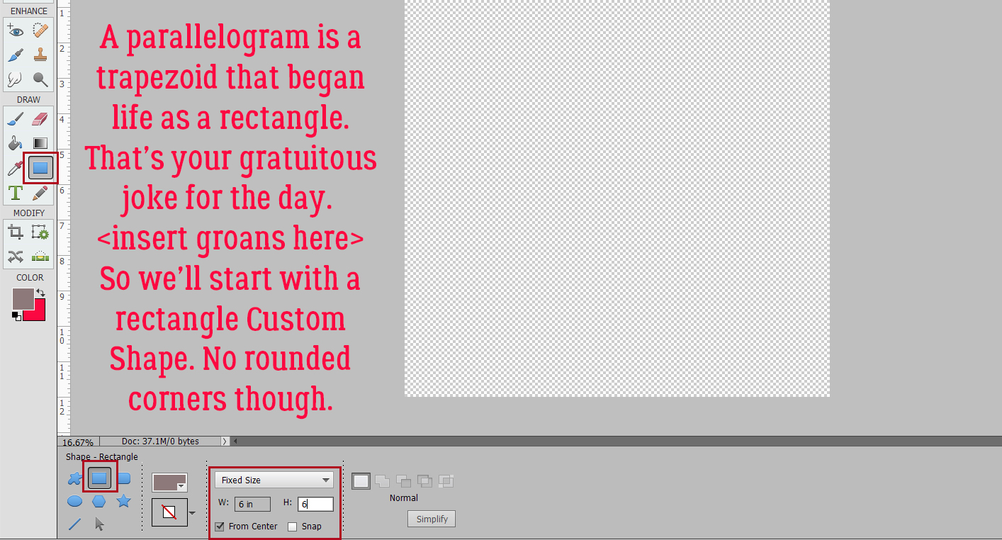
Here’s my one-step square. I just clicked at the centre of my workspace and it appeared. Remember, all Custom Shapes start out as Smart Objects and can’t be manipulated as is.
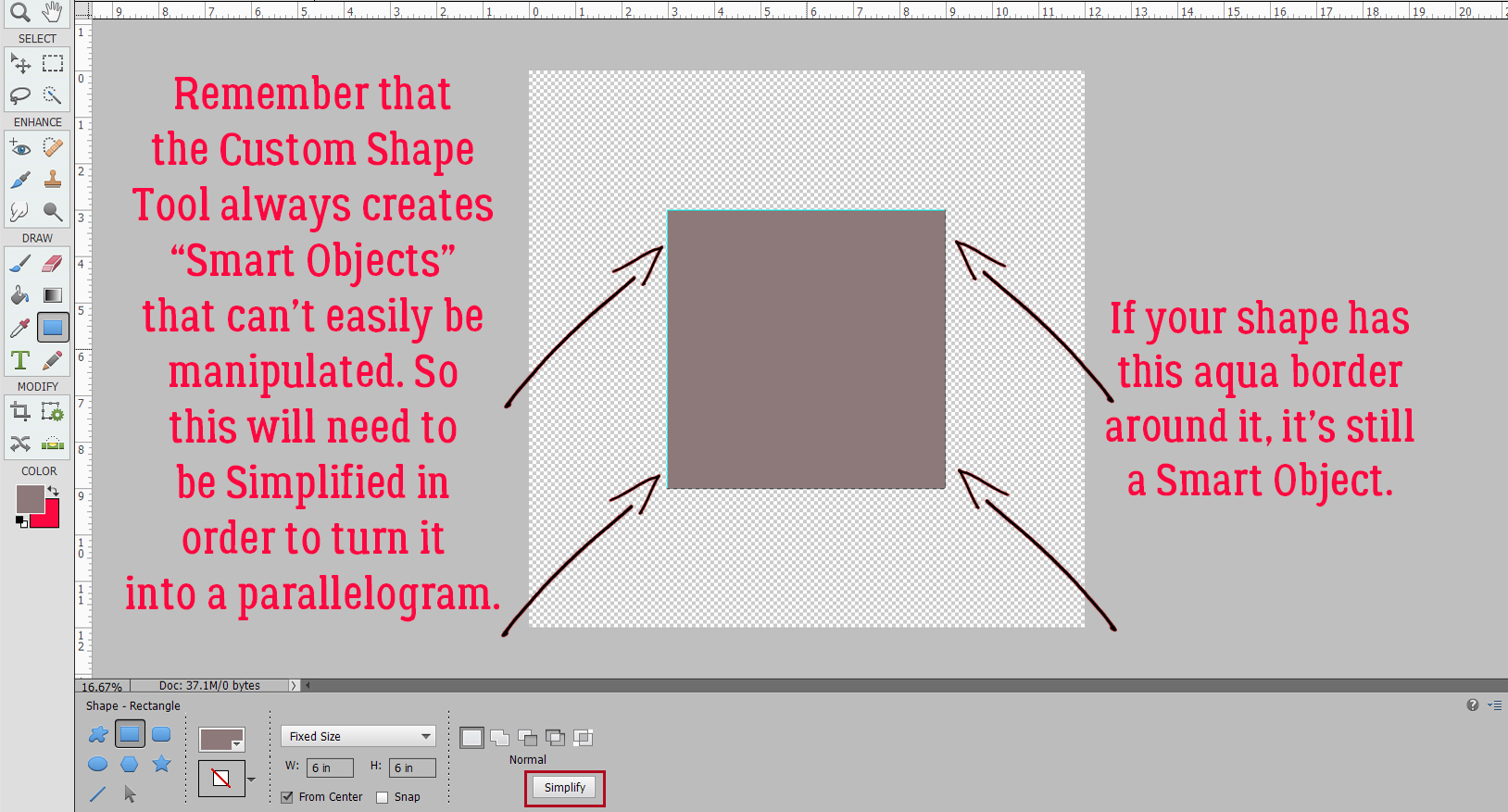
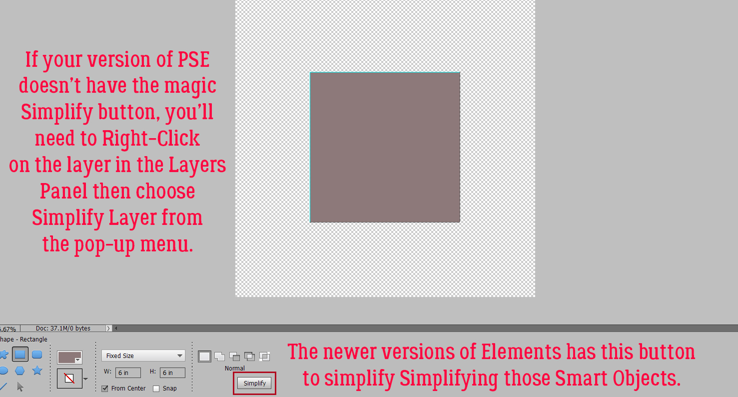
Newer versions of Photoshop Elements have a Simplify button right there in the Tool Options. If you don’t see one, you’ll need to Right-Click on the layer in the Layers Panel and choose Simplify from the pop-up menu.
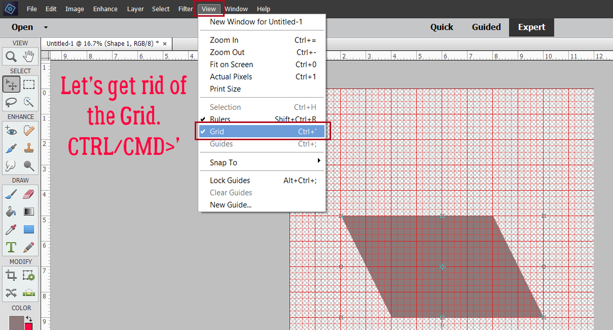
Here’s a Work Smart Not Hard tip. Use your tools! I’m going to turn on the Grid to help me with my shape-shifting. If you don’t regularly use the Grid, I hope I can change your mind about it. But it’s only useful if it’s set up to be useful. Although I live in Canada and the metric system has been our method of measurement since 1979, I still think in inches so my Preferences for the Grid are set so I have a Gridline (heavier) every inch and 4 Division (lighter) lines per inch… i/e I have reference lines every 1/4 inch. Now, to turn the Grid on, View>Grid, or CTRL/CMD>’ will get you there.
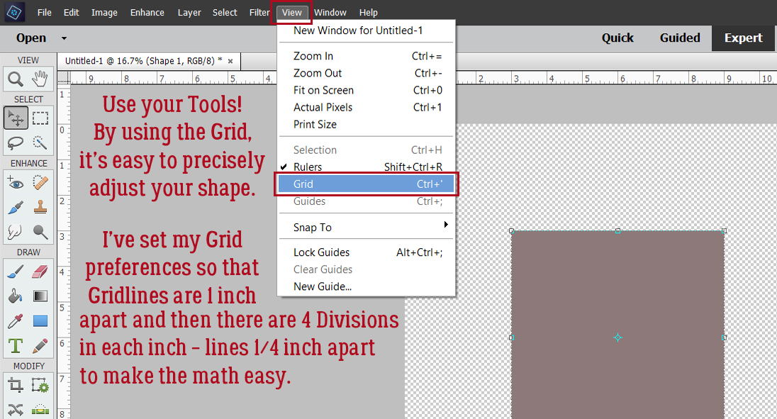
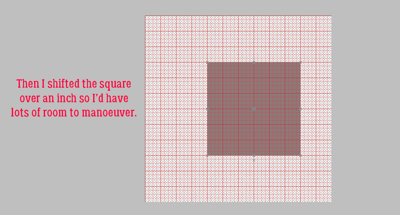
Once I had that Grid for reference, I moved the square over to the right an inch to give me lots of room to manoeuver.
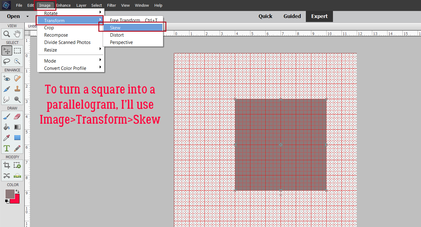
Going from square (which is a parallelogram already, but…) to a more diamond-shaped parallelogram requires the use of the Image>Transform>Skew command.
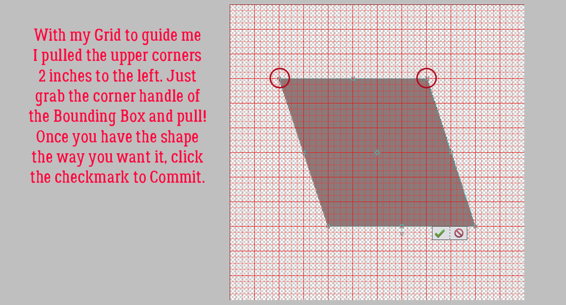
Grab one of the upper corner handles and pull it out to the side. I went left. You do you! Then grab the other upper handle and move it the same amount.
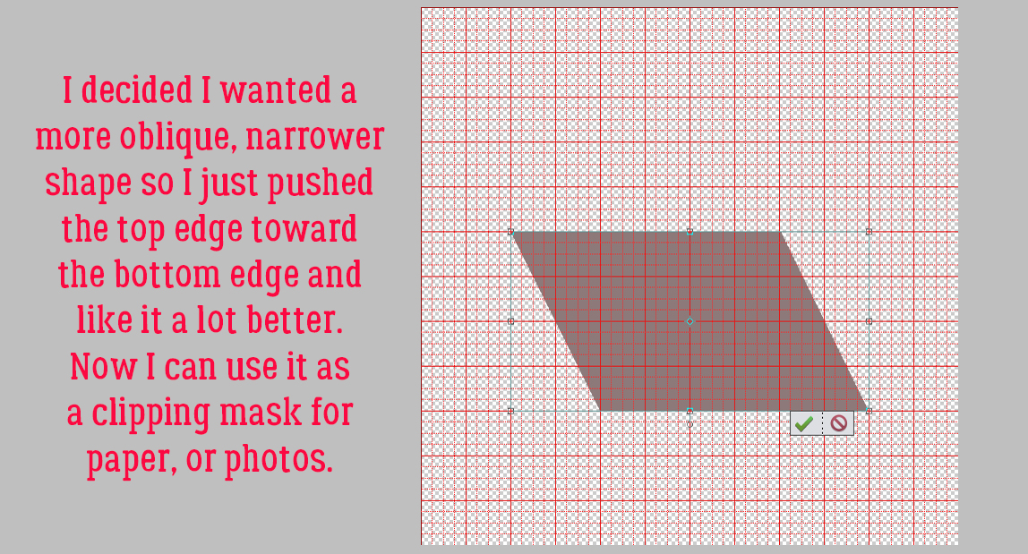
My finished shape didn’t look enough like the one from the template, so I pushed the top edge down a couple inches and like it much better.
The grid isn’t necessary any more so it can go away.
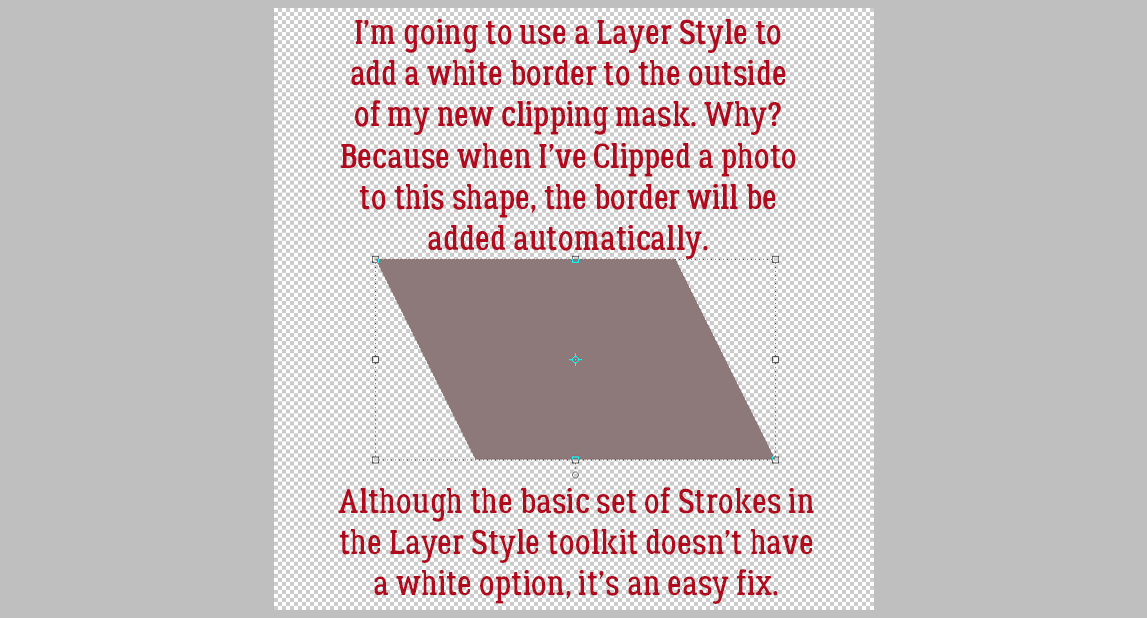
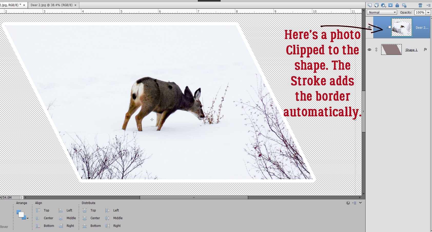
On mdusell‘s layout the parallelogram shape had a white border. The easiest way to do that and have a save-able, reusable clipping mask is to use a Layer Style. There are some basic Strokes in the Layer Style palette, and although there isn’t a white option, that’s a simple fix. Why not just add a Stroke through the Edit menu, you wonder. Well, it’ll be part of the shape, not sitting on top of the shape; it won’t be visible when something is clipped to the shape, and that defeats the purpose.
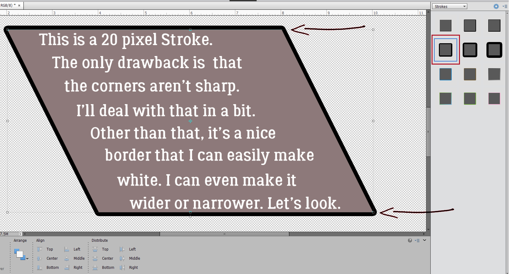
So I’ve added a Stroke Style. It’s 20 pixels according to the menu, but shows as 26 pixels later. Regardless, it’s all completely adjustable! And that’s a good thing, because I don’t like the rounded corners much.
By double-clicking on the fx icon on the layer, I can fix all the things I don’t like about the stroke. I can make the stroke wider or narrower, I can change the colour and I can move the Position from Outside to Inside and get those sharp corners.
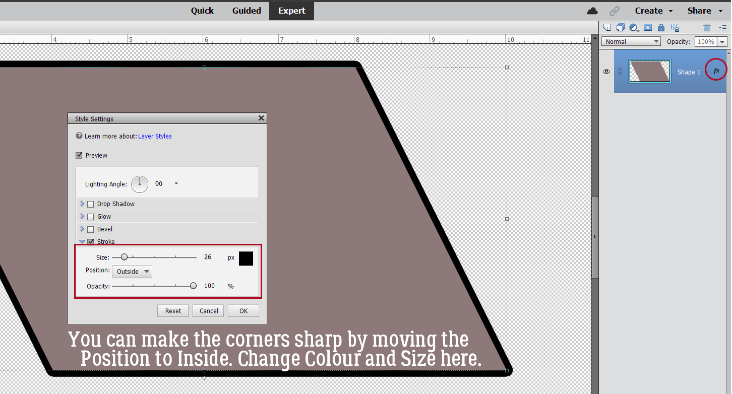
Here’s the easiest way to turn black to white. Just click on the colour swatch then type ffffff into the # box! If you think you’ll want to reuse this photo clipping mask again Save As a PNG and call it something you’ll remember.

Meet my new neighbour.
Now, for Kathi‘s question… I figured the easiest way to help her with her problem is to show her.
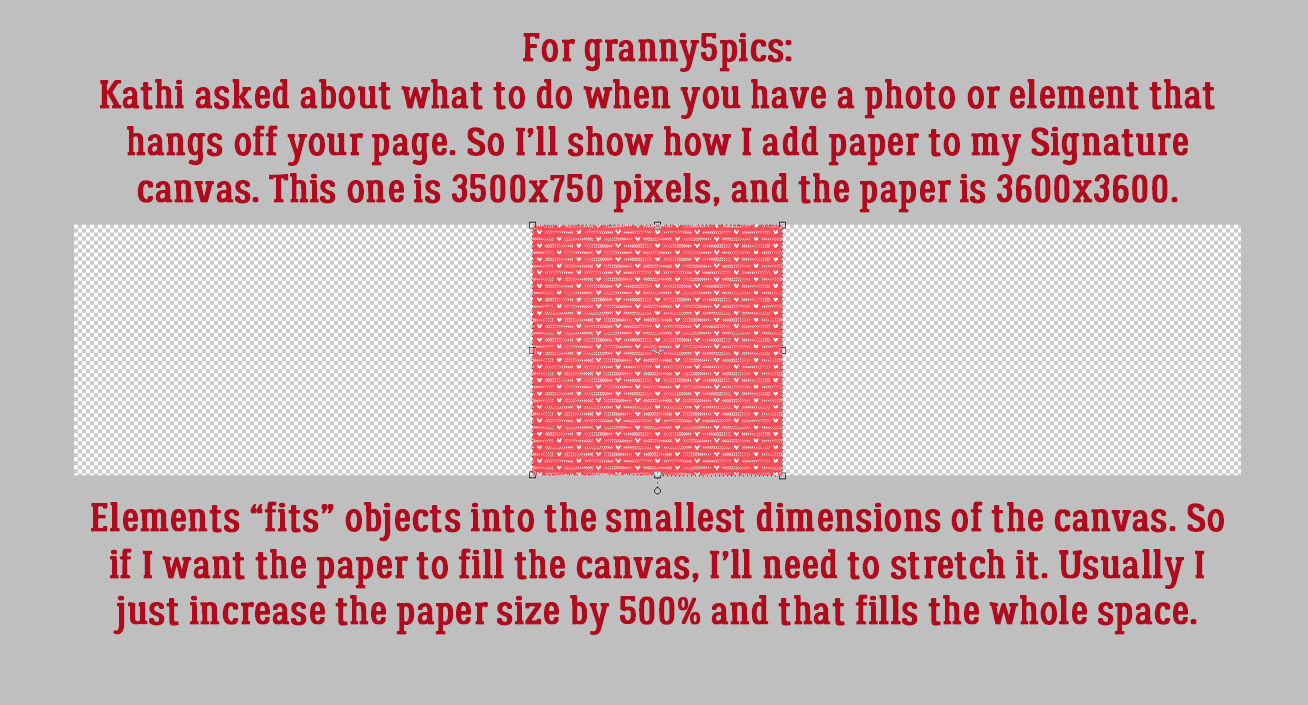
I have a lot of paper outside the boundaries of my signature canvas.
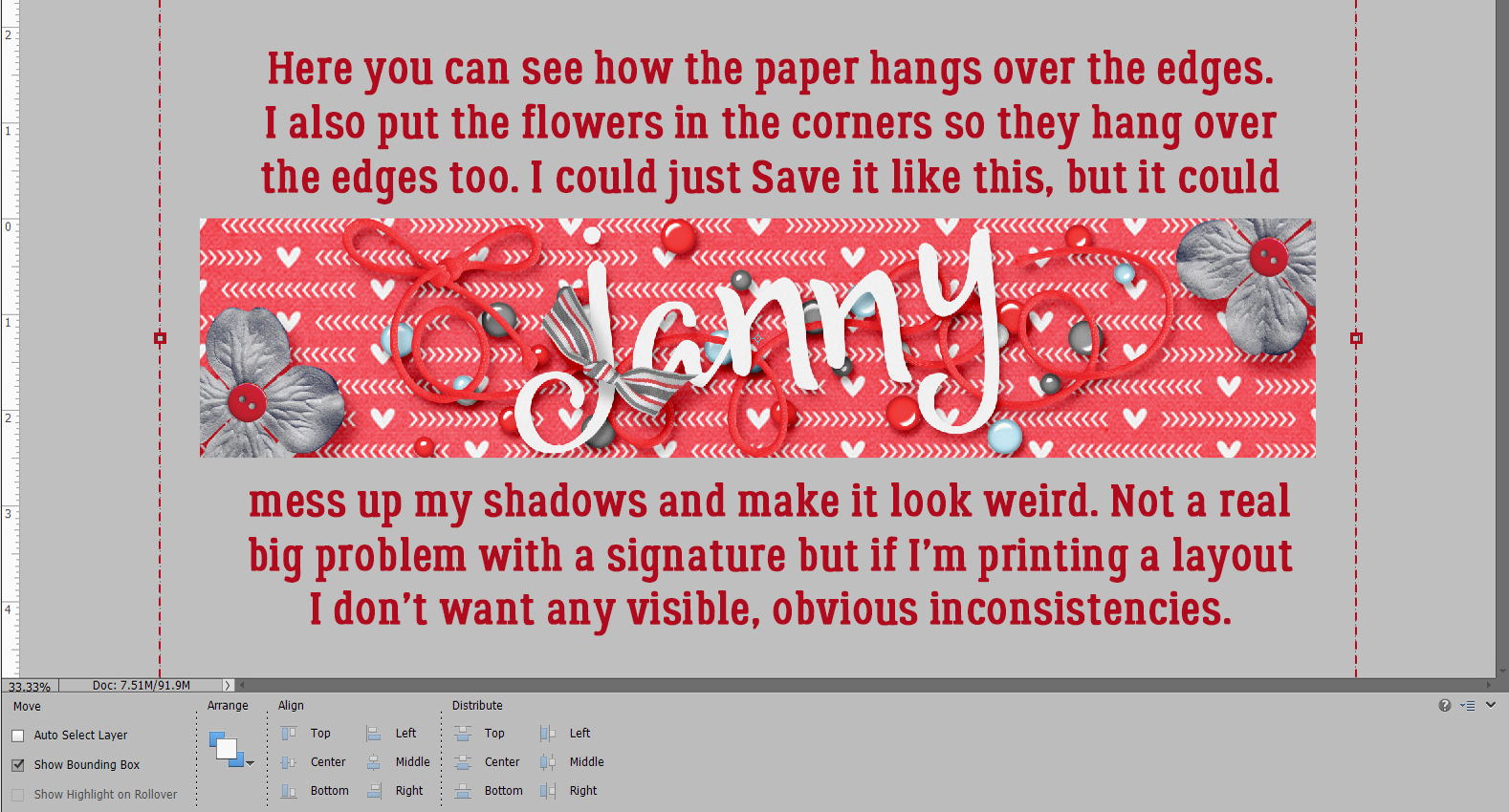
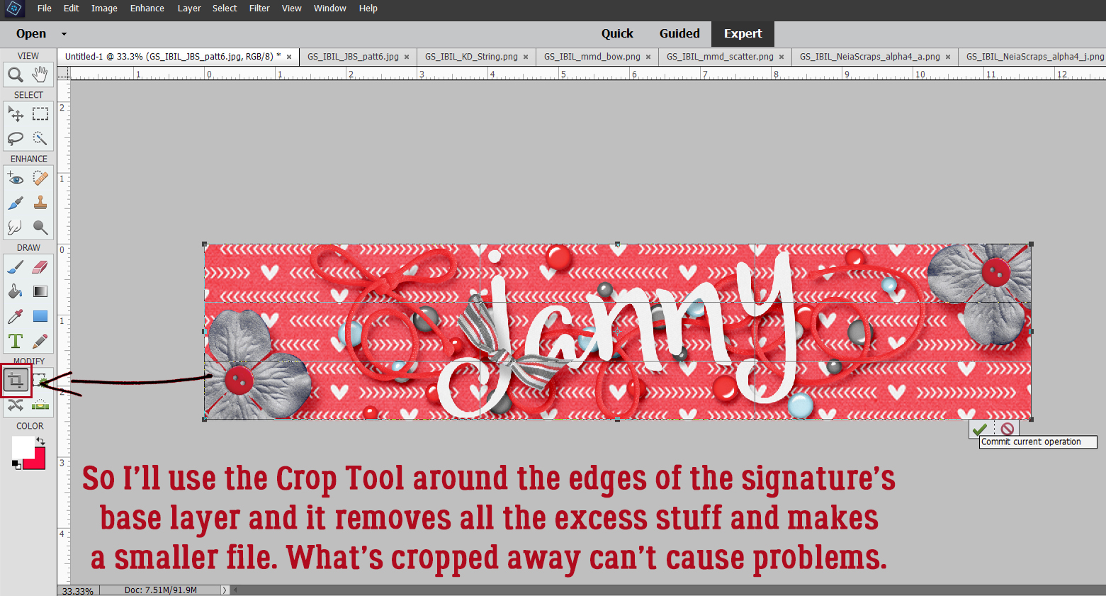
Enter the Crop tool. You can use this to remove the overhang at any point while you’re creating. Here, I’ve waited until the whole thing is done and Cropped all the overhanging stuff away at one time. I hope this is what Kathi needs for her issue…
I’ve been helping my daughter with a top-secret project that I hope we can share with the world soon. It’s eaten up quite a bit of time over the last week, so I’m behind………………… and next Tuesday it’ll be March. Gah.
PDF Version : https://bit.ly/3vvZXm3
![]()
Thanks Jan! That was so simple! I had been going to Image (on the top bar) > Crop. It gave me choices of sizes, I’d set the size, maybe have to reset the grid around my layout, then hit the crop icon. Just tried it again and it worked twice on 2 trial layouts, then took about 3 times to work on the 3rd. I have PSE 21, but my computer is old and slow, and my tech called it “ancient”! I’m thinking it’s the computer, not PSE 21 and not me! Loved your sense of humor in this tut!
Thank you.
I crop every layout that I make. This is the technique I learned years ago: on the top bar go to Select > All, then Image > Crop. Very fast and easy.
Thanks for posting these tutorials every week, I’m always trying to learn more about PSE.
Kathi tried that method but was struggling with it. There’s almost always at least 2 ways to do most things in Elements, I find.