Archives for March 2022

Tutorial Tuesday (Photoshop Elements)

A Simple Photo Border with Label

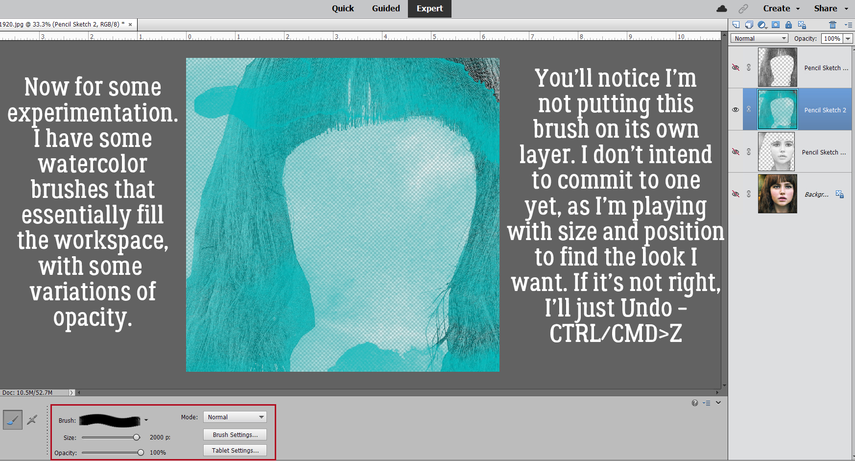
Whew. The last few tutorials have been challenging, haven’t they? Today I think we need a nice, easy, basic technique that even the least experienced scrapper can succeed in doing. (Or, you could say I lacked inspiration this week, and you wouldn’t be wrong.)

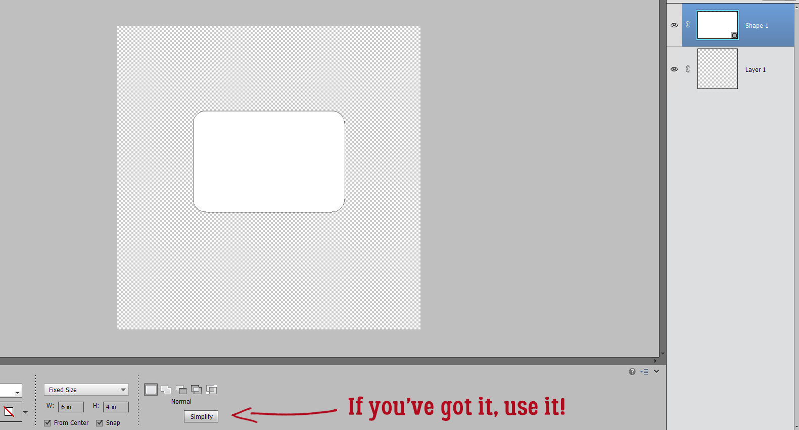
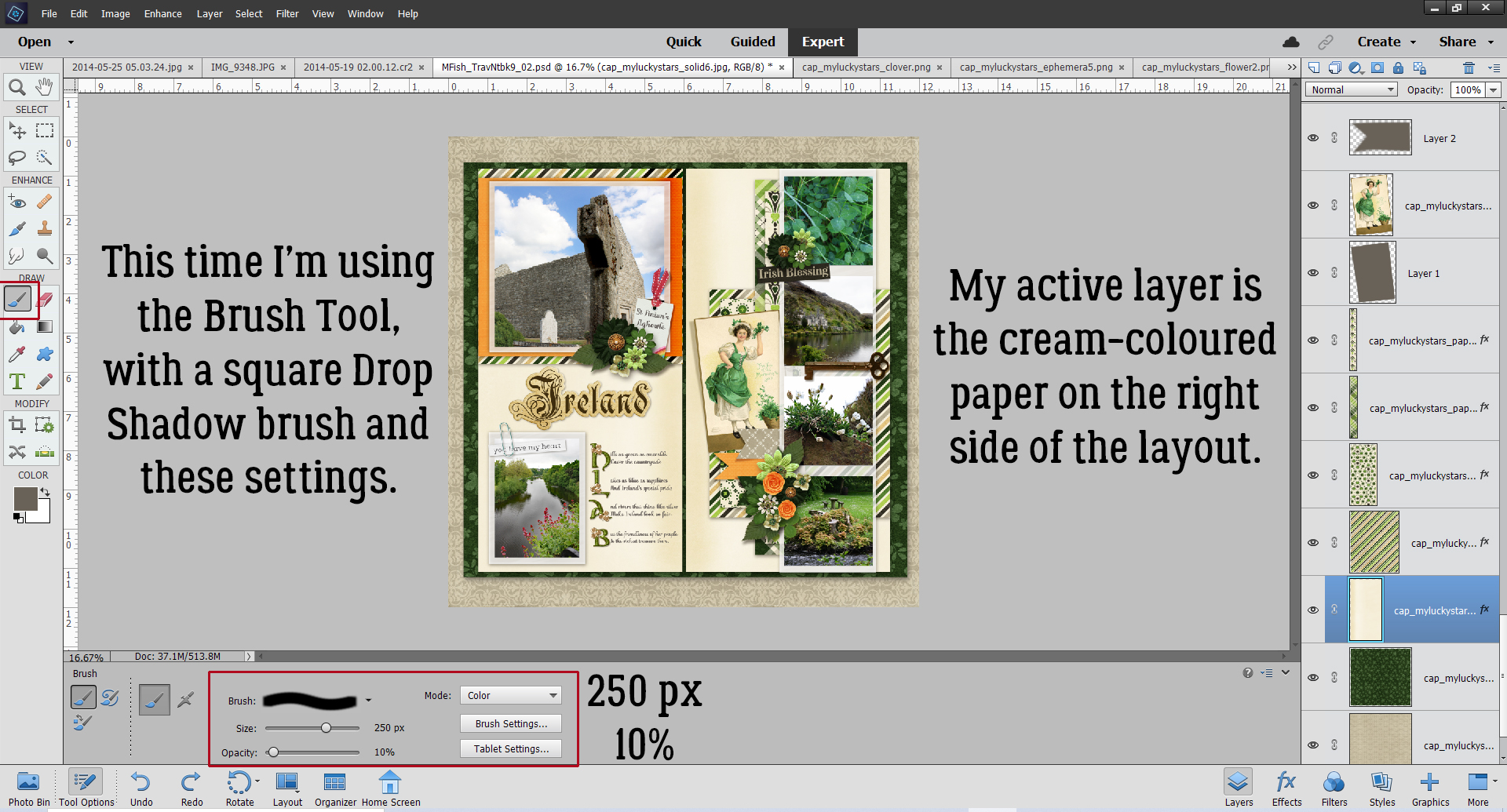
The first step, as always, is to open a new. blank canvas on the workspace. As you can see, I’m predictably going 12 x 12, with lots of room to work. If you’d rather use a smaller canvas, it’s still going to work perfectly fine. I’ve chosen the Rounded Rectangle Custom Shape tool, with a 150 pixel Radius for the rounded corners. I’ve also set a Fixed Size of 6 inches wide, 4 inches high – standard landscape print dimensions. I’ve ticked the From Center and Snap boxes as well. Some tools have a lot of options that make for fewer steps, so why not make use of them?

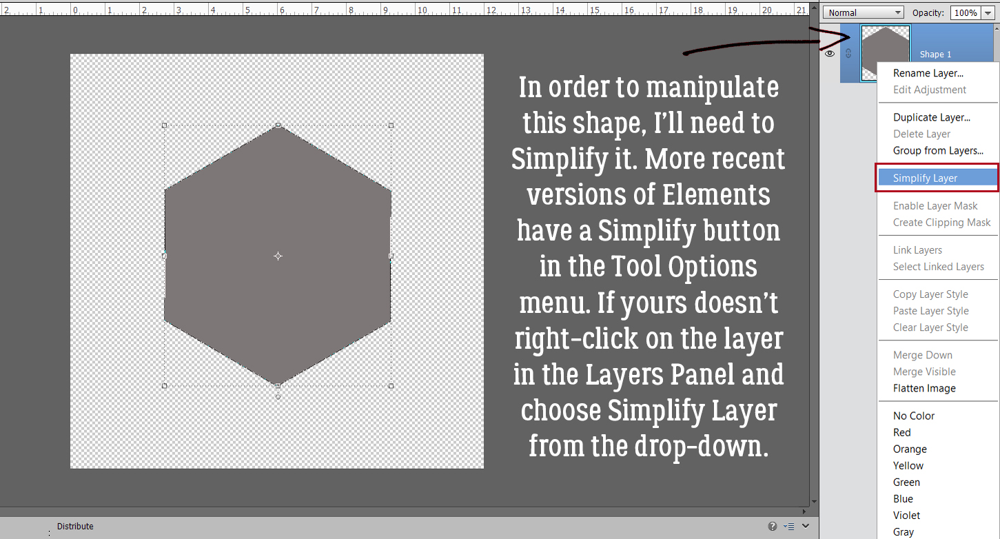
With a single click in the middle of my canvas, I’ve created a 4 x 6 rounded rectangle shape. Custom Shapes are always Smart Objects when they’re first created. That means the only alteration they’ll permit is to resize.

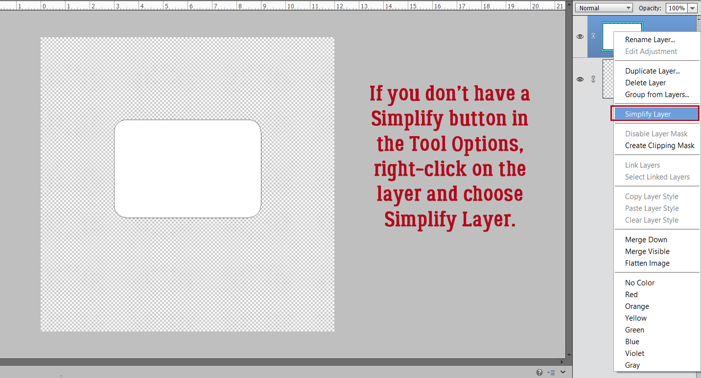
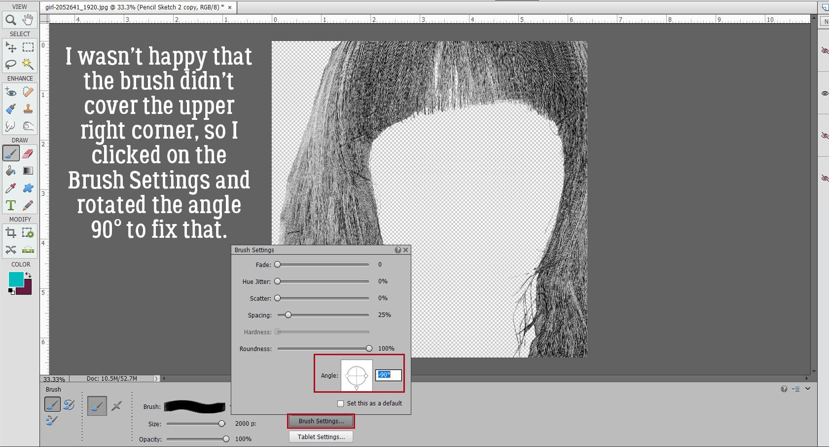
If you want to do anything else to a Custom Shape, the Smart Object needs to be rendered dumb, or Simplified. If you’ve got a newer version of Elements, you’ll have a Simplify button right there in the Tool Options.

If you’re working with an older version you’ll have to do it the old-school way. Right-click on the layer in the Layers panel and choose Simplify Layer from the drop-down menu.

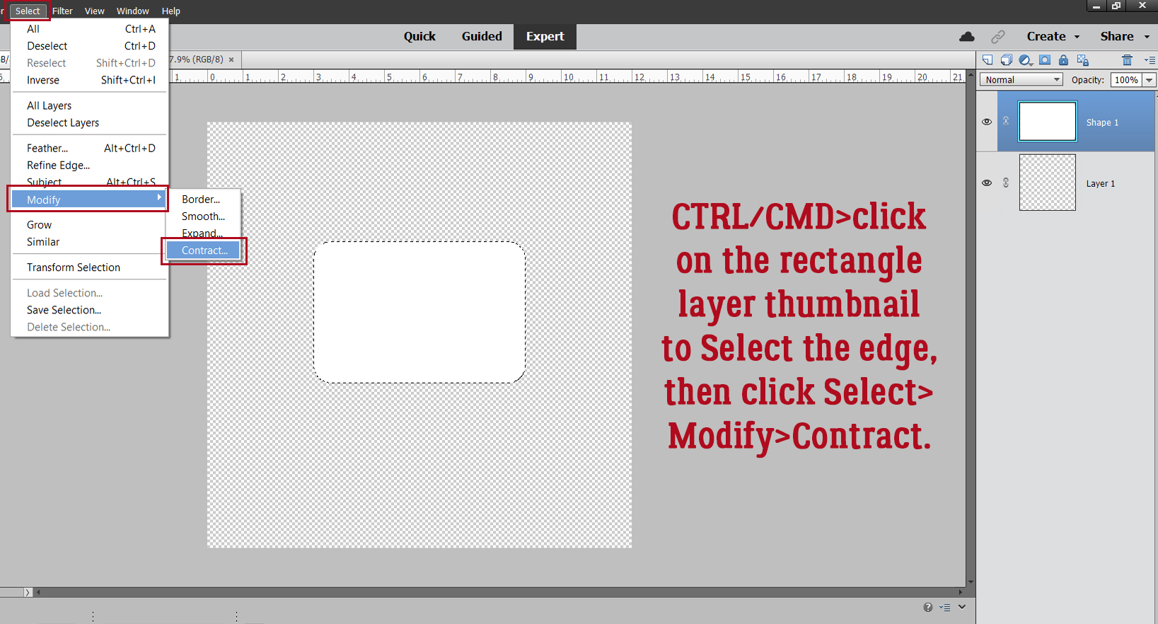
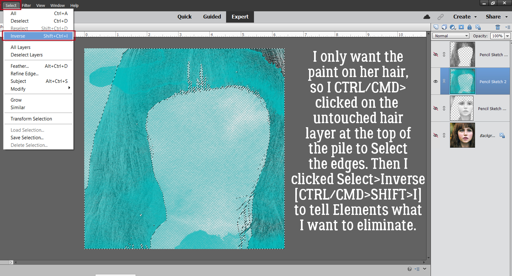
To create a border/frame that follows the contours of your rounded rectangle CTRL/CMD>click on the shape’s layer thumbnail in the Layers panel. That will Select the edge of the rectangle. Then click Select>Modify>Contract… to shift the marching ants inside the rectangle.

You might want to experiment a bit with this step. I tried a few possibilities for how far over I wanted the edge to move. I want a gap between the Selection and the edge of the rectangle deep enough to add some text in a large enough font that it’s easily read. I settled on 65 pixels.

The marching ants can be hard to see on these screenshots. Trust me when I say they round the corners cleanly.

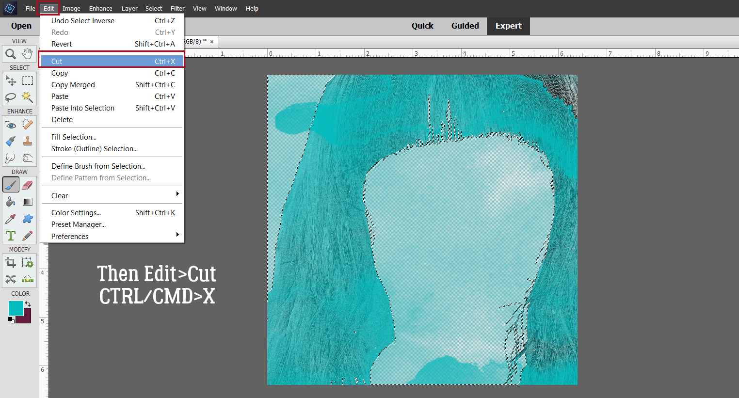
Now to create the border. It needs to go on its own layer, so add a blank layer to the top of the stack in the Layers panel by clicking on the sheet-of-paper icon at the upper left corner of the panel. Then click Edit>Stroke (Outline) Selection…

Again, this step might take some trial-and-error. I opted to go with a 25 pixel Stroke applied on Center of the Selection.

Here’s a close-up of my 25 pixel Stroke inside my 65 pixel gap. To eliminate the marching ants that outline the Selection, click Select>Deselect, or CTRL/CMD>D.

Now to add the label. I chose a clean, sans-serif (no ‘extra’ extending features) font, but you can choose any font you like. I wanted simple but eye-catching so I went with Caneletter Sans for my label.

It was a bit insipid, so I highlighted the text and clicked the B for faux bold and made it a bit more meaty.

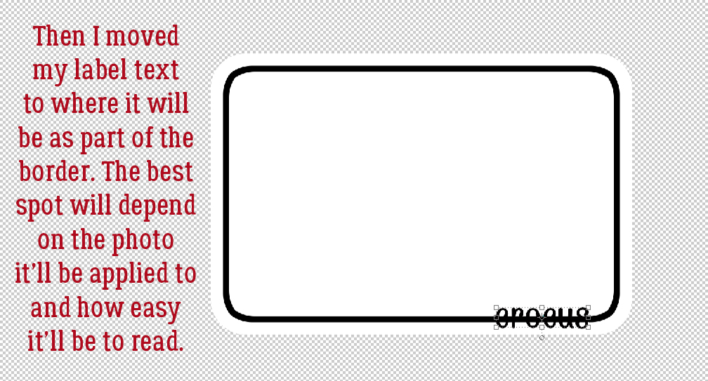
Then I moved the text to a spot on the border/frame. Where your label goes will depend on the photo you’re using. You’ll want it to go somewhere that won’t obscure any focal point, and where it won’t get lost in the photo itself.

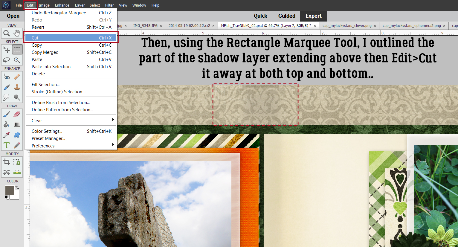
I’m going to cut an opening in the border to sandwich the label, so I used the Rectangle Marquee tool to drag out a box around the text as shown. The active layer is the one with the border on it.

Edit>Cut or CTRL/CMD>X will take that chunk out of the border.

Because the label is on a separate layer, if it doesn’t look centered in the opening, it’s easy enough to nudge it so it does look right.

Once I was happy with the border and label, I activated both layers by click>SHIFT>clicking on them, then right-clicked and chose Merge Layers. Shortcut: CTRL/CMD>E.

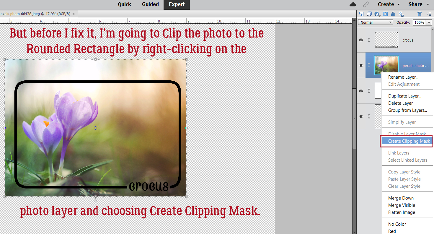
Now to fine-tune. I dragged my photo onto the workspace, positioning it between the rounded rectangle shape and the border/label layers.

But first, I’m going to Clip the photo to the shape, by right-clicking and choosing Create Clipping Mask. Shortcut: for versions 15 and up, CTRL>ALT>G. For earlier versions, CTRL/CMD>G.

Elements indents the layer once it has been Clipped to the layer below it, as shown.

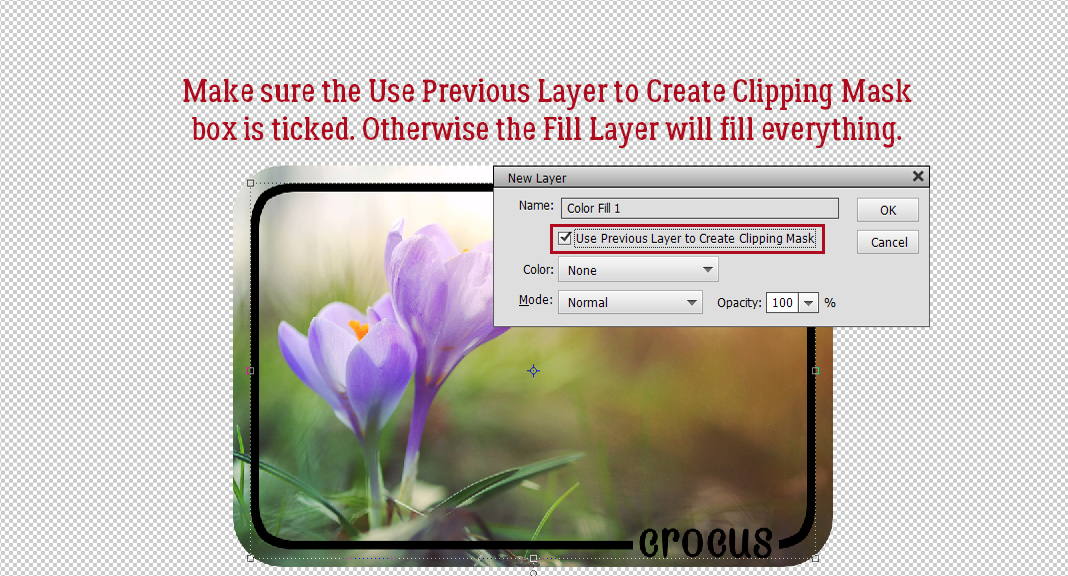
The black border/label gets lost a bit against the photo. So I’m going to change the color to something more visible. The cleanest way to do that is to add a Solid Color Fill Layer. Click Layer>New Fill Layer>Solid Color…

Make sure the box is ticked to Use Previous Layer to Create Clipping Mask to save yourself some steps.

For the most flexibility I Merge the two layers together.

Elements will use the foreground color in the Color Picker, but you can always choose to pull a color from your photo. Activate the Eye Dropper tool and click it on any color you like. You can see the changes happening in real time, and that guarantees you’ll find the look you like best.

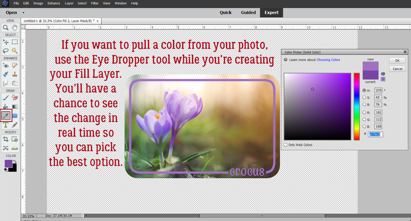
What color would you go with?

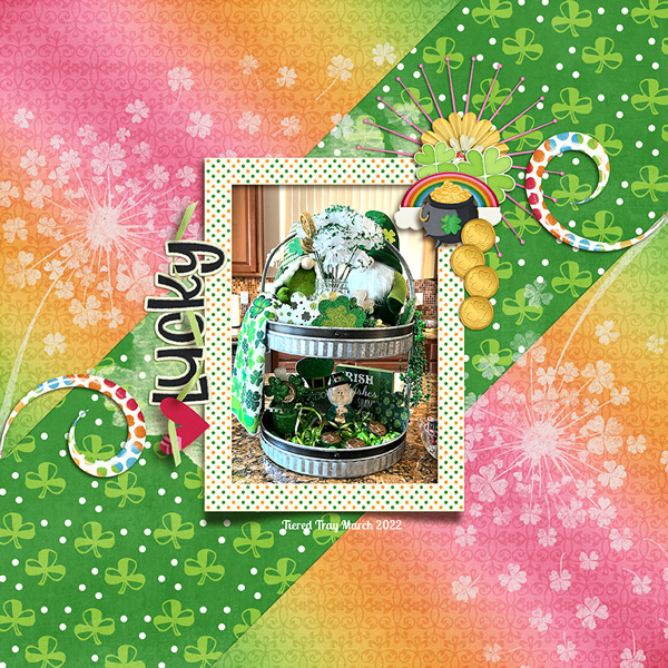
I can’t believe I managed to create 20 new layouts this month. I’m greedy… I want both the Challenge Reward kit AND the Shine Your Light mega-collab. (That might mean our next tutorial is about moving kits and layouts onto an external hard drive and changing some workflow but it’ll be worth it…) March is almost gone, it’s 61°F outside and the orchards are greening up. Makes me feel like I can do anything!

PDF Version: https://bit.ly/3qOm97N

March 25, 2022: Fresh Baked and Scrap-a-Thon Continues!

It’s almost the end of the month and the GingerScraps Scrap-A-Thon is almost over, but it’s not too late to join! There are so many amazing prizes and rewards, you won’t want to miss it!

Forum link to Scrap-A-Thon : https://forums.gingerscraps.net/forumdisplay.php?2205-Scrap-A-Thon-2022

Please make sure you give yourself plenty of time to upload all your wonderful challenge layouts. See the forum post about gallery upload limits.

Don’t forget. Spend $10 in the store and get this great kit for free!

There are some really great new kits in the store this week.

Are you getting your challenges uploaded. Check out the link above for Gallery upload limits. You get this great kit as a reward for ten completed challenges.

Tutorial Tuesday (Photoshop Elements)

Creating Art with a Photo

I’ve been procrastinating over this tutorial for awhile… because A) I wasn’t sure I could articulate how I do this and B) other, quicker techniques kept presenting themselves. 😉 But I bit the bullet. Today’s the day! I want to show you how to turn a photo into a watercolor work of art, and it started when Karen asked how the scrapper got the paint effect on this layout, shown below. (Sorry, I’m not sure where the original is posted or who the scrapper is to give them credit… if it’s yours, you did a fantastic job!) Anyway, I want to make one thing clear before we start: this is a labour-intensive technique, and much will depend on your choice of photo how much work will be involved. But your skills will get a good workout!

I chose this photo from Pixabay as my canvas. It already has a bit of an arty look to it, but when I’m done with it, it’ll be very different. It was already a square so that helped, although you can do this technique on any photo.


First, I’m going to use a Guided Edit. This one was introduced with Elements 2019. If you’re working with an earlier version, you can follow this tutorial, or this tutorial for the sketchy part. I’ve also used the Guided Edit we’ll be working with for a previous tutorial back in July 2019, so if it looks familiar that’s why. The outcome today will be very different from that other though.


Choose Pencil Sketch from the options in this menu, the one in the upper left corner there. Then drag your cursor over the parts of your photo you want to be sketchy. The cursor can be sized to fit the area you’re including, and you’ll have the ability to “unsketch” parts if you go too far.


I decided I wanted the WHOLE photo to be sketchy, so I made my cursor brush huge and rolled it over everything. But let’s say you only want part of your photo sketched. In my experience, it’s easier to ADD an area to my selection then SUBTRACT with a smaller brush where the details are. You’ll see what I mean a bit later. In this step, it’s also possible to decrease the Opacity of the effect so more of the original shows through. But not today!


Once I had my sketch the way I wanted it, I went to the lower right corner of the workspace and clicked Next. (Be careful you don’t click Cancel, because that’ll undo everything you’ve done and take you back to the starting gate.) Then I chose Continue Editing In Expert.

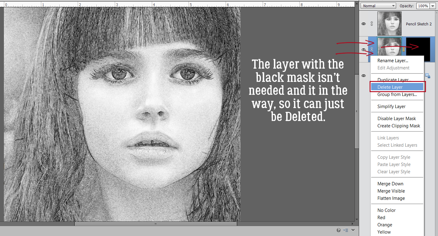
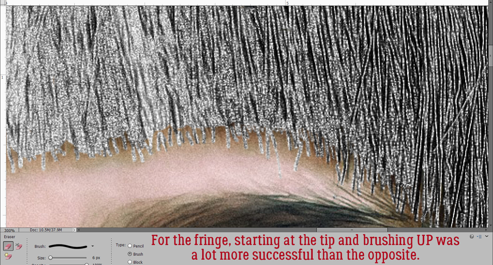
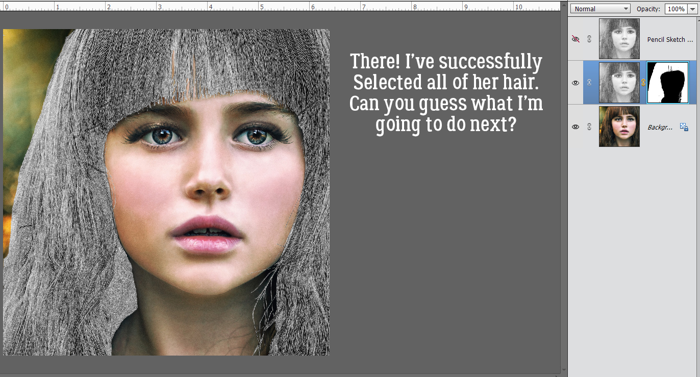
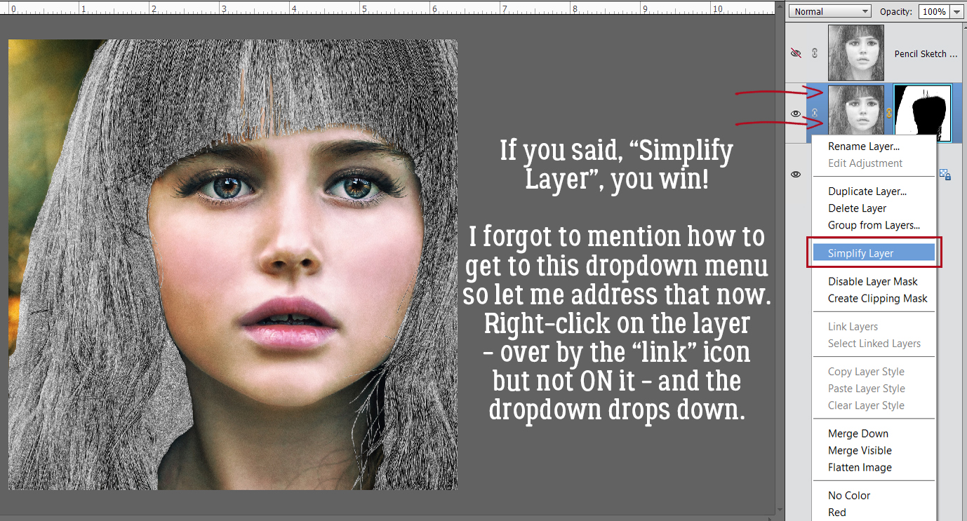
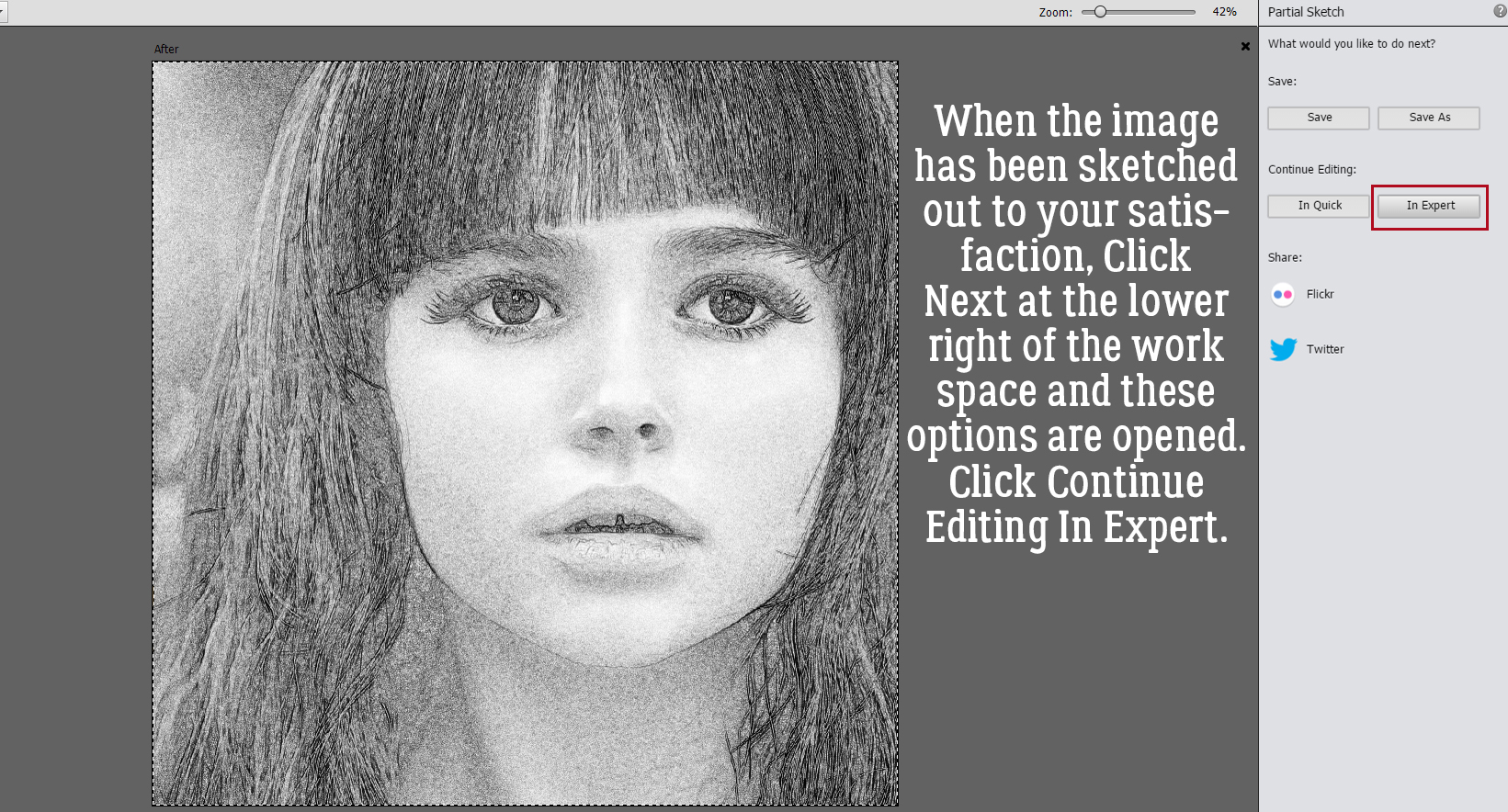
Now it’s possible to see what Elements was doing in the background while we were busy and oblivious. Now I have 3 layers: the original, a sketch layer with a black Layer Mask and a sketch layer with a white Layer Mask. It’s possible to do the following steps using these two masked layers, but it’s a bit more challenging than my approach, so we’re not going to do that. The layer that I want to work with is the one with the white Layer Mask, but I need to Simplify it. Right-click on that layer – over on the left of the layer near but not ON the link icon – then choose Simplify Layer.


Then I Deleted the layer with the black Layer Mask.


You can turn visibility for the colour layer off if you like, or leave it be.


Next, I made a Copy Layer of the sketch. You can right-click on the layer then choose Duplicate Layer>OK. Or use the keyboard shortcut CTRL/CMD>J.


I put the Copy Layer in my back pocket for later and made the first sketch layer my active layer and added a Layer Mask to it… I know what you’re thinking – but I’m really not making work for myself. I tried it with the previously masked layers and it didn’t do what I needed it to do.

For those not familiar with Layer Masks, they allow removal of part of a layer in a “non-destructive” way, meaning that if I erase part of the image that I didn’t really want gone, I can just paint it back in. See the colour picker? The Eraser Tool is active with a white foreground and a black background. When white is the foreground colour, whatever the Eraser rolls over with be revealed – in this case it’s the transparent background. When black is the foreground colour, it conceals – the transparent background in this case. Toggling back and forth between removing and replacing parts of the image plays a big role in getting this technique nailed. I started by Erasing her face and neck as well as the green in the upper left corner. As I mentioned, I find it easier and quicker to Erase (white) past fine details like wispy hairs, and then paint them back (black).

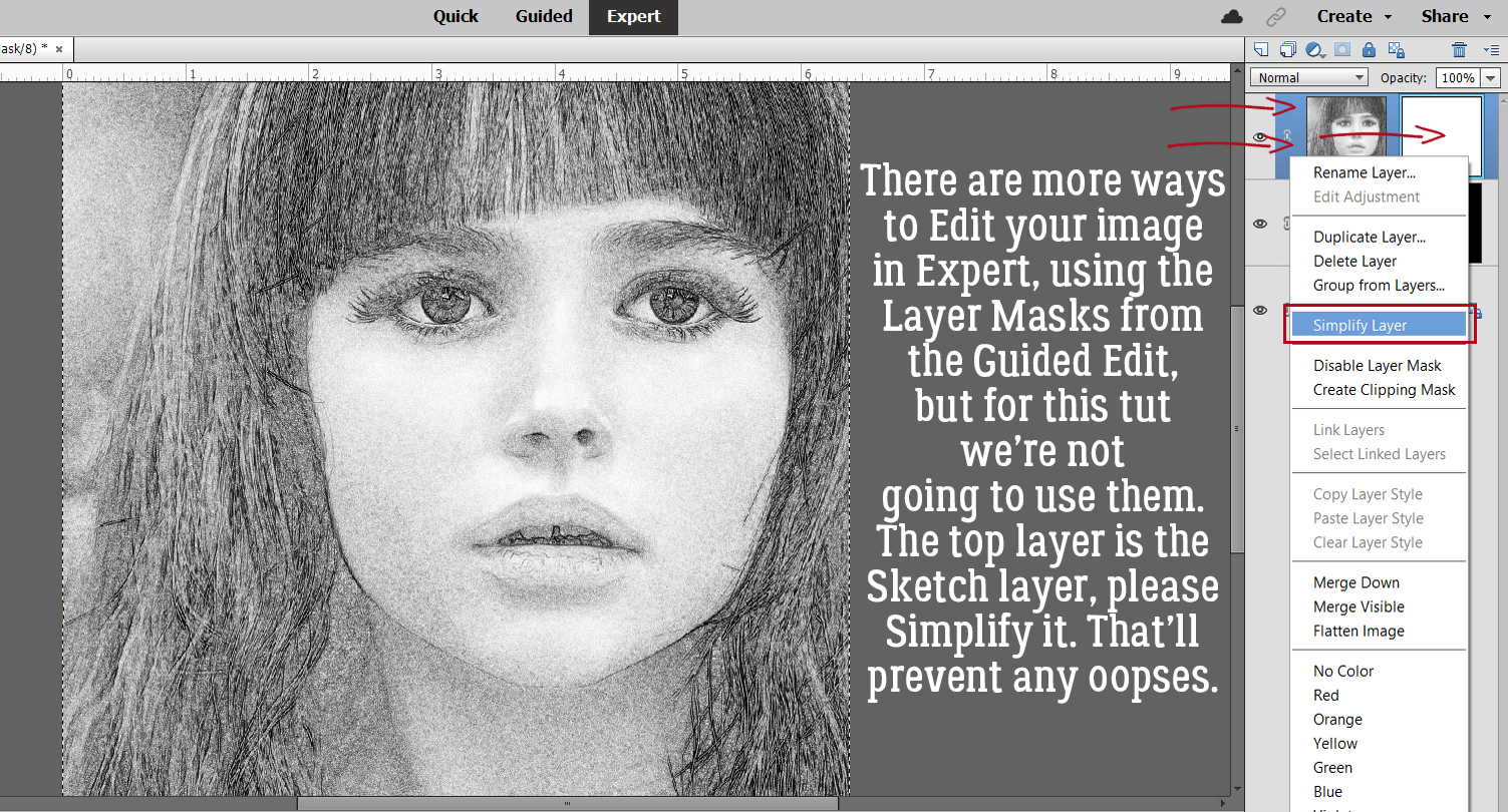
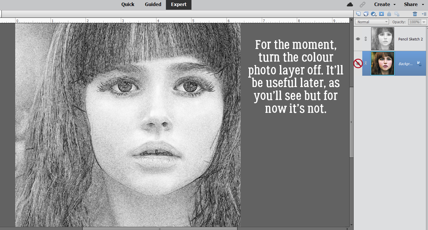
I also discovered that toggling the colour layer on and off makes it easier to see edges of things better.


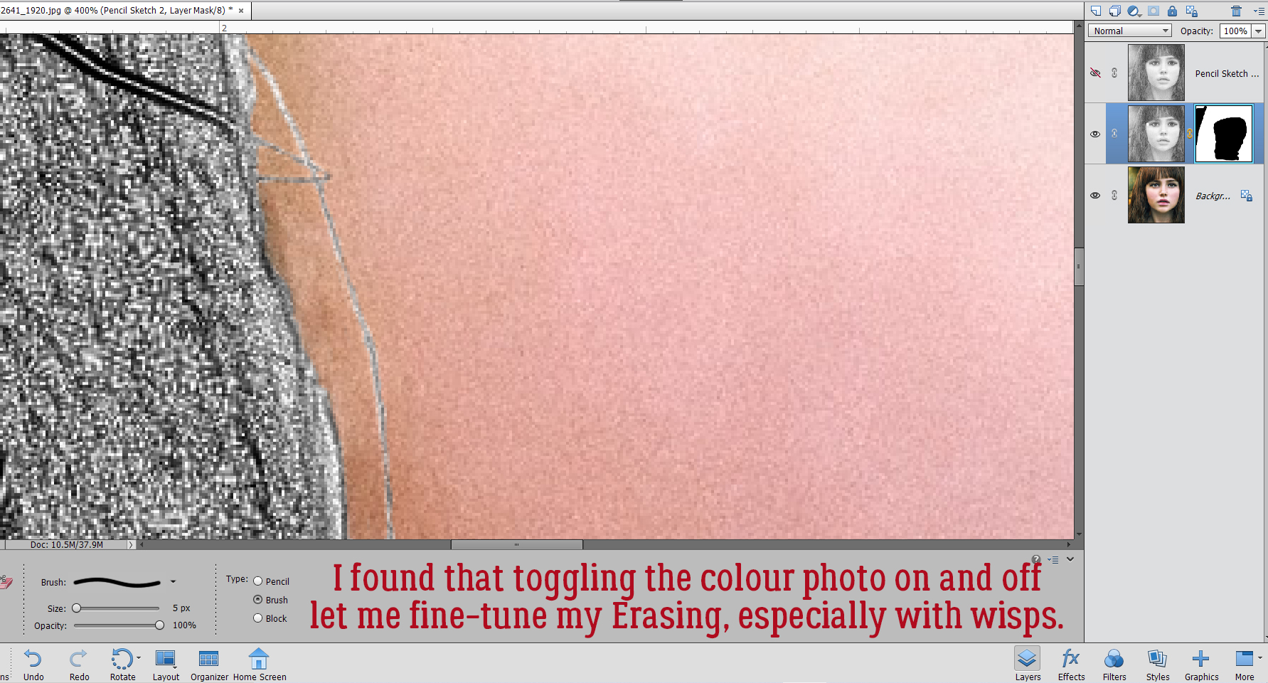
Aaaaaand toggling the sketch layer on and off helped me see where and what needed more help.


Her fringe didn’t seem too important when I first got going, but to be really successful, I figured I needed to make it as sharply detailed as possible. I work on a laptop with a trackpad, and lemme tell ya… it’s a SKILL!! I found I got better results when I started at the tip of a strand of hair and dragged the cursor back toward the fringe than when I tried to go from fringe to tip. Try it both ways and see which works best for you. This is where most of the time expenditure happens. If you’ve chosen a less detailed image to work with, it’ll go a lot quicker.


So, I’m happy with how I’ve isolated her hair. What do you think the next step will be?


Did you guess right? If you’ve read a lot of my meandering tutorials, you probably did!


And you probably knew this step was coming too. Make a Copy Layer of the hair. ALWAYS have a copy of something you’ve done a lot of work on, just in case you need it!! Now I have a Copy of the whole sketch and a Copy of just her hair.


It’s really hard to see the marching ants in this screenshot, but they are there. I activated the whole sketch layer then CTRL/CMD>clicked on one of the hair layers to Select the edges of the hair on the whole sketch.


I want everything BUT the hair so I clicked Select>Inverse. (In reality, I used the keyboard shortcut CTRL/CMD>SHIFT>I…)


Then I clicked Edit>Cut (CTRL/CMD>X).

At this point I have four layers, one colour, one just her face and the green in the corner and two hair layers.


Now I took some time to experiment with my watercolor brush collection. The ones that worked best are the ones that are a square swatch, like the ones you can grab here for free. I resized the brush so it filled the whole photo so I could see where the colour was most opaque and how it looked overall. Because I was just looking at options. I didn’t create a new blank layer for the brush, although in retrospect I should have.


Did you know you can make lots of adjustments to your brushes? Click on Brush Settings and you’ll see this. I wasn’t happy that the brush I chose didn’t cover all of her hair, so I rotated the brush 90° to the right and fixed it.


The next two screenshots are still part of my experimentation, but the process you’ll follow after you’re settled on your brush and have it on its own layer is the same as I’m showing.


After the hair is Selected and Inverted, I’ll Cut it away to see what effect I have.


Alrighty! I’m ready to commit. I have a brush and a colour I like, it’s positioned well and I can go ahead with the brush on its own layer. I put the new, blank layer in between the hair layers by clicking on the sheet of paper icon at the upper left of the Layers Panel.


I really wanted the ability to manipulate her face separate from her hair, as you can see here. That’s why I went to all the work of Layer Masking her hair. I’ll change the Blend Mode on the FACE layer to Luminosity.


I’m almost happy now. But I’ll look at it for a bit to make sure.


So I played with some Blend Modes and decided all I needed to do was decrease the Opacity of the painted hair layer to 80%. It looks pretty good, even if I say so myself. The untouched hair layer adds some necessary detail back to the hair, and the effect can be enhanced with Blend Modes if desired.


Here’s what it looks like on a layout. I used a mask-and-frame combo in PSD form so that I could move the frame around. I’m really pleased.

Again, I apologize for the formatting mess I’ve made here. I haven’t figured out how to make spacing adjustments in WordPress when I’ve had to move an image around. Or when I’ve made a booboo after I’ve added the images. It’s a problem!


Sherri, I haven’t forgotten about your paper-punch-tear but haven’t figured it out yet. It’s a work in progress…

PDF Version : https://bit.ly/3wy8xkz


March 18, 2022: Fresh Baked and Scrap-a-Thon Continues!

Happy Friday. Even though our wishlist contest is over, the GingerScraps Scrap-A-Thon is in full swing and it’s not too late to join! There are so many amazing prizes and rewards, you won’t want to miss it!

Forum link to Scrap-A-Thon : https://forums.gingerscraps.net/forumdisplay.php?2205-Scrap-A-Thon-2022

Don’t forget. Spend $10 in the store and get this great kit for free!

We’re starting to see a lot of Spring in our designer previews.

How are your challenges going? Are you trying to do them all this month as part of the Scarp-a-Thon? The kit below is your reward for completing ten challenges.

Tutorial Tuesday: Individual Style

Making Magic with Brushes

Yes, it’s the third Tuesday of March already. It’s a sad day here, as our daughter said goodbye to her furbaby Lucy this morning. We knew this day was coming, and tried to prepare, but it’s not that simple, is it? I’ll be working on a tribute layout later as my therapy, and seeing all the amazing ways our GingerScrappers have created magic with this month’s Challenge Brush has given me some inspiration.

When I chose these layouts to show you, I was looking for uniqueness, and I had a lot to choose from. Each layout will be linked to the Gallery; the GingerScraps user names are your links so if you’re inclined, you can pop over and give them some praise. But first, let’s talk about the Challenge. This year, the host for our Brush Challenge is Alexis Design Studio. She’s brilliant with creating brushes, so we’re all very lucky she’s giving them away! The Challenge is to use the brush she provided (free) on a layout, and there are some very creative ways to use brushes. Let’s have a look.

This layout by wendeeds is filled with shamrocks. I had to look hard to see the brush – it’s behind the journaling! I thought she’d used patterned paper.

Here, pippin has turned the brush into confetti and it’s showering the couple with luck.

I love how Rhewko has blended the brush into her background and added a touch of gold leaf to it. It’s both subtle and obvious.

Here, jcfdelaware has overlaid the brush with her photo mask, blending them. The little boy blowing on the dandelions is blowing the brush’s shamrocks into the universe.

Look at the tone-on-tone beauty of this layout from ysgbo! The brushes are randomly positioned, with the layout divided diagonally. The upper right are embossed and the lower left are debossed. Brilliant!

Dannisa has the brush repeating and gradually shrinking, with the shamrock pouf overlapping and creating a cloud of parachutes.

My eyes went right to this layout in the album. The way Grace has turned one of her photos into a pencil sketch is lovely, and who isn’t drawn to sunflowers right now? But it’s the way the brush seems to mingle with the paper scatter that is the real genius here.

The way barbaraj has duplicated the brush is clever; it looks like she die-cut them from paper and carefully positioned each tiny piece.

Macsandy makes the brush an integral part of her background, and has pulled the green from other aspects of her background to create a seamless image. Using a black-and-white photo was a great idea.

For her layout, Effie4037 used the brush in a very subtle way. I like that she chose to echo the mint green from her border paper rather than the more traditional green of her title strip. The brush ties her photos together and grounds them to the background beautifully.

The way willow‘s brush explodes into the layout makes it so hard to know where the brush ends and her photo begins. Great choice to invert the colour where the brush extends into the central gray paper strip too!

To me, the brushwork on garrynkim‘s layout looks like a stencil applied with a very gentle hand.

At first, I thought Jill had put her layout into the wrong album. So I took a closer look. The brush is there… russet and blended into the old wood background and providing a landing pad for that gorgeous cluster.

At first glance, you might think this layout from PixyGirl has popcorn on it. But it’s the brush, in white and with a pearl glued to many of the shamrocks.

Tsubasa went to a lot of trouble to blend the brush into her photo. Look carefully at how she’s lightened the main part of the photo, framed that focal seedhead and then augmented the blowing seeds with the brush. Amazing!

By blending the brush into this dreamy, soft watercolour paper, wvwendy has really added oomph to her layout.

I saved this version from linweb for last. She used it very cleverly to create a St Patrick’s Day card and I LOVE it!!

I hope you’ve gotten some flashes of inspiration from this stroll through the Gallery. I know I did!

PDF Version: https://bit.ly/3KKY6Oz

$1.00 Bake Sale & $2.00 Tuesday Now OPEN at GingerScraps!

Who is ready for some AMAZING deals? We have the $1.00 Bake Sale AND $2.00 Tuesday happening NOW!

Bake Sale


Celebrate St. Patrick’s Day and the Luck of the Irish with us here at GingerScraps as we host our annual WIN YOUR WISH LIST CONTEST!!

Visit the forum for all the details : https://forums.gingerscraps.net/showthread.php?62537-Are-You-Feeling-Lucky-WIN-YOUR-WISH-LIST-CONTEST!!!-2022

The GingerScraps Scrap-A-Thon is in full swing and it’s not too late to join! There are so many amazing prizes and rewards, you won’t want to miss it!

Forum link to Scrap-A-Thon : https://forums.gingerscraps.net/forumdisplay.php?2205-Scrap-A-Thon-2022

Don’t forget. Spend $10 in the store and get this great kit for free!

March 11, 2022: Fresh Baked and Scrap-a-Thon Continues!

Celebrate St. Patrick’s Day and the Luck of the Irish with us here at GingerScraps as we host our annual WIN YOUR WISH LIST CONTEST!!

Visit the forum for all the details : https://forums.gingerscraps.net/showthread.php?62537-Are-You-Feeling-Lucky-WIN-YOUR-WISH-LIST-CONTEST!!!-2022

The GingerScraps Scrap-A-Thon is in full swing and it’s not too late to join! There are so many amazing prizes and rewards, you won’t want to miss it!

Forum link to Scrap-A-Thon : https://forums.gingerscraps.net/forumdisplay.php?2205-Scrap-A-Thon-2022

Don’t forget. Spend $10 in the store and get this great kit for free!

There are so many great new kits in the store this week!

KEY LIME DIGI DESIGN

TAMI MILLER DESIGNS

How are your challenges going? Are you trying to do them all this month? The kit below is your reward for completing ten challenges.

Tutorial Tuesday (Photoshop Elements)

Realistic Book Looks

If you’ve been waiting for today’s tutorial all day and were wondering if it would ever appear, I have an excuse… a MILLION interruptions! But fortunately it’s a short snapper this week, so I’m hoping it doesn’t break too late. Let’s get after it!

Jill sent me a request to help her figure something out. She’d done some layouts using Miss Fish’s Travellers’ Notebook V.9 templates and some spiral wire binding, and that was okay. But she also wanted to leave out the spiral binding and have more of a bound-book-laying-open-on-a-table look. She’d tried to achieve it but wasn’t satisfied with her efforts. So today, I’m tackling it for her.

I whipped up a travel-related layout using the same template she’d shown me as her example. As you can see, it looks like… a layout. Not much like a coffee table book.

It’s actually an easy thing to make a flat layout look more like a book. It involves the Burn Tool (the one that looks like the “OK” hand gesture). I chose one of the round Drop Shadow brushes that are included with the software. These are my settings, which I’m providing as a guide. You may like more or less! I also turned on the Grid (View>Grid or CTRL/CMD>’) to give me more control over what I’m going to do. Things to keep in mind: Burn the layers that are going to follow the contour of the curved part of the page. Anything that might lift away, like the tag and the journal card, won’t be part of this process. Choose the proper layer(s). I’ll be starting on the left side of the layout, so will have to Burn the background cream-coloured paper, the orange paper layer, the striped paper layer and the photo layer. When I do the right side of the layout, I’ll only need to Burn the background cream-coloured paper.

Making a straight line in Elements is super-duper easy when you know how. Using the Grid as a guide, I positioned my Brush as shown, 1/4 inch off the paper on its right side and so that the widest part of the Brush was over the bottom. I Clicked to start the Burn, then held down the SHIFT key and Clicked again at the top of the visible part of the cream paper. See how the paper is darker there now, but not gray? I repeated this process for each of the paper layers on the left side, then did the same to the background paper on the right.

It looks better already! But I’m going to make it even more real-looking.

This time I’m going to add an actual shadow, using a big square Drop Shadow Brush and my shadow colour. These are the settings I used. I’m going to start on the right side this time, and you’ll see why in a sec. I’ve got the cream-coloured background paper layer active.


I ALWAYS put my brushes on their own layer. Then I can adjust them in so many different ways. If I actually put the brush on a paper layer, it’s part of the paper layer and thus not tweakable at all. So I added a new blank layer above the cream paper layer.

I used the same steps to add the shadow. BUT. Using the Brush Tool in this way doubles up the effect where the first Click is done. That’ll look bad. So I did my first Click OFF the paper I’m shadowing. I centered the brush but in hindsight, I could have just aligned the left side of the brush with the center of the book and skipped some steps. Oh well. Click>SHIFT>Click top and bottom, off the paper.

Next, I used the Rectangle Marquee Tool to outline the overly dark bit at the top of the layout, then Edit>Cut (CTRL/CMD>X) that bit away.

To further blend and soften the shadow, I added a Blur>Gaussian Blur.

It looked just about perfect with a 4.5 pixel Blur.


Rather than Shadow all the various layers on the left side, I instead made a Copy Layer of the shadow and moved it up the Layers Panel so it was above the photo layer. Then I nudged it over so it was balanced with the right side. Of course, it overlaps the right side. Darn! Rectangle Marquee Tool CTRL/CMD>X to the rescue.

There! It looks a lot more 3D now, and I really like it! I hope Jill does too.

Well ladies, spring is in the air here and it’s time for supper! (And I’m only 10 minutes late.) See you next week, when we’ll check out a Challenge.

PFD Version : https://bit.ly/3MG9bSE

March 4, 2022: Fresh Baked and Scrap-a-Thon

Happy Friday my scrapping friends!

We are so excited for the new SCRAP-A-THON

Click on the graphic or the link above to take you right to the fun!

Don’t forget. Spend $10 in the store and get this great kit for free!

Let’s see what our designers have this week. I’m seeing some St. Patrick’s Day green popping in!

KEY LIME DIGI DESIGNS

TAMI MILLER DESIGNS

Have you gotten started on your challenges for the Scrap-a-Thon? This is one of the great kits you will get for completing challenges.

Tutorial Tuesday (Photoshop Elements)

Taking Those Shapes to the Next Level

I don’t know about you, but I’ve been doom-scrolling Twitter, with MSNBC on in the background, continually since the Russians invaded Ukraine. As if things weren’t already awful enough… Two of my mom’s sisters and one of her cousins married three Ukrainian-Canadian young men back in the 50s. My dad’s mom was Polish. This invasion feels personal to me and it’s hard to shift gears. But I’ve succeeded – I have a tutorial for you that builds on last week’s Custom Shapes clipping masks. This time I’m going to show you some ways of turning those shapes into 3-D frames – it’s simple and so much fun! Rather than reinvent the wheel and go into obsessive detail with every step, I’m going to assume you’ve got some Elements chops and sort of start in the middle.

Each of these Shape frames will start out the same way, with choosing the Custom Shape and dragging it out on the canvas. As usual, I’m working on a 12×12 canvas so I have lots of room. I started with a hexagon.

I’ll always remind you that Custom Shapes begin life as Smart Objects and don’t have a lot of flexibility. So before you can manipulate them, you’ll need to Simplify them… dumb them down, so to speak. If your version of Elements has the Simplify button in the Tool Options panel, just click it. If you DON’T have that button, you’ll need to right-click on the layer then choose Simplify Layer from the dropdown menu.

To create the frame’s opening, first we need a Copy layer. Either right-click on the layer and choose Duplicate Layer>OK or use the keyboard shortcut CTRL/CMD>J to quickly make that Copy. (I LOVE Copy layers and recommend you come to love them too. When you play with a Copy, you’ll still have the original if you make a booboo.) (Second editorial comment: CTRL refers to Windows-based systems, CMD to Macs.)

Obviously, a Copy is identical to the original and that’s not going to work to make a hole. So the Copy layer will need to be Resized. The easiest way to do that in this context is to click on one of the handles on the Bounding Box, which opens up the Move tool‘s Tool Options menu. Then, with the Constrain Proportions box ticked and the centre of the layer as the reference point, type a numeric value into one of the boxes as shown. I went with 85%, which will give a nicely solid frame.

In this screenshot you can see the outline of the smaller hexagon. Now it can be used to remove the middle of the frame.

Ensure your large hexagon layer is active and then click Edit>Cut, or use the keyboard shortcut CTRL/CMD>X
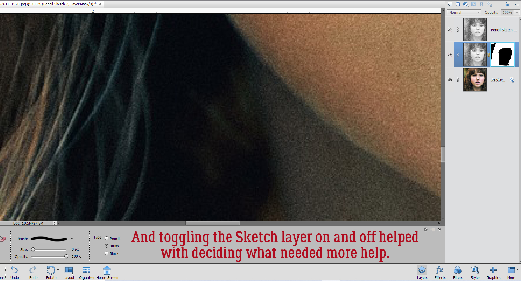
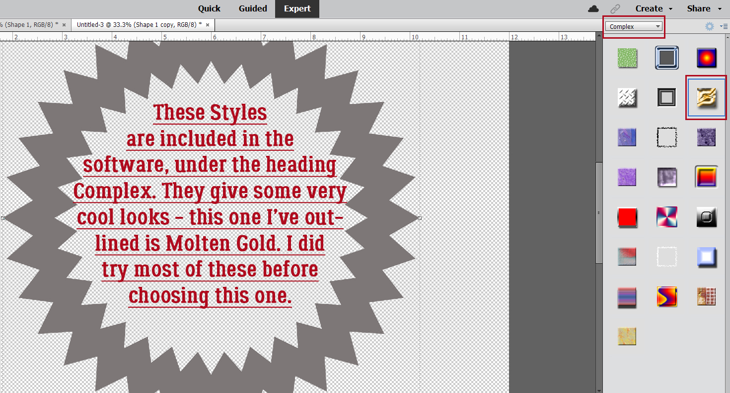
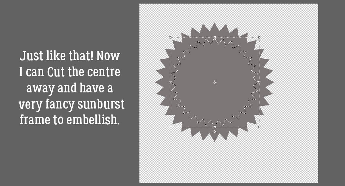
We’ll come back to the hexagon in a minute. What if you chose a more complicated shape, like this seal? You can use all the controls in the Tool Options, like using Defined Size, and if you tick the From Center box, Elements will put the shape right in the centre of the canvas. Here, I’ve shown the Simplify button (the one you may not have). Experiment with your software; the more you play with it, the better you’ll understand what it can do and what it can’t. (And these tutorials will make more sense…) You’ll find a system and a rhythm that works for you.


So. What if you didn’t tick the From Center box and now your two shapes aren’t positioned precisely like you want them to be? Elements has a fix for that! Activate both layers by clicking>Shift>clicking on them in the Layers Panel. You’ll see the Move tool Tool Options menu over on the left. Where it says Align, click on the Center button – Elements will move both layers so their centres are aligned. Then right away click the Middle button, and Elements moves both layers so the middles are aligned. Easy peasy!

CTRL/CMD>X and now I’ve got a nice starburst frame.

Okay, back to the hexagon! When I was thinking about this technique, my mind’s eye saw a shiny green frame with glittery gold edges. Making that a reality will take a couple of additional steps. I’ll need to create the border first, because once I alter the frame itself it’ll be harder. The border needs to be completely separate from the frame so I can jazz them up in different ways. That means it goes on its own layer. (Of course!!) So I added a new blank layer to the Layers Panel by clicking on the sheet-of-paper icon in the strip across the top of the Panel.

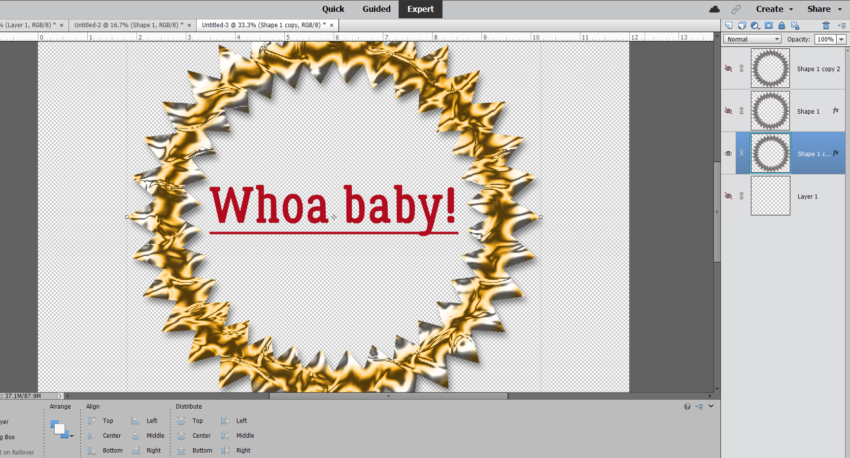
Quick-and-easy border making uses the Stroke Edit. CTRL/CMD>click on the Layer Thumbnail to “Select” the edges of the hexagon, inside and out. Make sure you’re on the blank layer, then Edit>Stroke (Outline) Selection.


I want the glittery border to be visible but not overpowering so I went with 35 pixels for my width. The colour can be anything – the glitter will hide it anyway. I chose the Outside setting; it’s not going to round the hexagon’s corners enough to worry about.

This is something I sometimes forget when I’m doing something on the fly. If there are marching ants – something has been Selected – none of the things I try to do that don’t involve the Selected area will actually happen. They need to go away. Select>Deselect or CTRL/CMD>D will do that.

I’m going to use some Styles now. Have you bought some Styles.ASL files – but don’t know how to get them into Elements so you can use them? Some of the GingerBread Ladies collaborations include Styles (usually glitter, but not always; Craft Fair is a good example) so you could have some and not even know! I’m going to show you quickly how to access them.


I’ve renamed all my Styles files and Copied them into the Elements Program Files for easy retrieval but you don’t have to worry about that, you can grab them from anywhere. If you don’t know where they are, run a Search using .asl as your search term, then let your computer do the work.

I chose a green acrylic gel Style from Just So Scrappy‘s Lucky Me… seemed appropriate for March, however cheesy. The Style added colour, a bevel and highlights all in one move! If the one you choose doesn’t look like you want it to, CTRL/CMD>Z it and try again.

I like this darker gold glitter Style from the same collection. (I’ve gotta say, Katie [Just So Scrappy and Ooh La La Scraps] makes perfect Styles of all descriptions. Check them out! I’ve linked to her shop for you.)

I didn’t do a step-by-step for the star in this image, since it’s done exactly the same way as the others. Stars offer a masculine option so I’m going to give this frame a leather look. Snake skin, to be exact. I made some Copy layers so I’d have back-up and this time I’m going to use a Filter. From the Filters menu I chose Artistic>Textures. I’ll be using Mosaic Tile.

Here are the default settings for Mosaic Tile. I think the “scales” are a bit to insignificant for a manly frame though.

You can see what’s happening with your Filters as you make your adjustments, so it’s not too hard to find the right combo.

I think it needs a touch of colour and a bit of sheen too, so I’ll use a Chrome Style on a Copy layer – flexibility!

When I was a kid, I had one pair of leather shoes. My mom said they weren’t brown, they were “ox-blood”. This reminds me of them. So I’ll use this dark red one.

The Chrome Style will be opaque, so the mosaic tile texture won’t be visible unless I decrease the Opacity of the Chrome layer. 50% looks good.

I wanted to make a few more tweaks so I double-clicked on the fx icon on the Chrome layer and played with this menu.

Were you wondering what I had planned for the sunburst? I made some Copy layers and added a Wood Style to one of them. I’d like a gold edge on it, but not on the inside. So I Resized the bottom original layer by going to 105%. See the gray border there now? It’s just enough.

So far, I’ve only shown you Styles that are purchased. But Elements has some basic Styles included that most of us never even look at. I like this Molten Gold one, I think? It’s in the Complex folder along with a bunch of very intriguing others.

So this is what it looks like before I bend it to my will. It’s pretty in-your-face!

I toned it down a bit.

What do you think? I love it!!

I popped a photo into the hexagon frame. But first I added a bit of a shadow to the green section then Merged the glitter border with the acrylic gel centre so it’s all one piece.  (Looks like I forgot to turn the underline off! Oh well. Not a disaster. I apologize for the formatting issues; when I was editing the screenshots I forgot to crop some of them until after I’d already inserted them into the post. Fixing that made the gaps. Sorry!)

I’ve got some great ideas for tutorials in my pocket and will need the distraction this month. Слава Україні!
PDF Version : https://bit.ly/3tn2goD