Quick Trick: Transparent Titles
![]()
PDF Version : https://bit.ly/3oHPCP7
If it’s Quick Trick Tuesday, this must be Belgium. I mean, this must be the last Tuesday in July. (Lame joke for the Boomer set… it’s a riff on the title of a 1969 movie with Suzanne Pleshette. Sorry, I couldn’t help myself.) RESET RESET RESET! Today’s Quick Trick is truly quick, max only 5 simple steps. Check it out! My layout is built on a Seatrout Scraps template with GingerBread Ladies‘ Sunny Days collab.
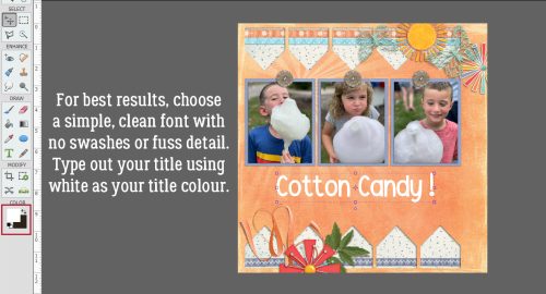
This technique comes with two rules. For best results, choose a font that’s relatively simple but substantial, with smooth, unfussy lines. I used this month’s Challenge font, Garlic Shrimp, in my sample. Other good choices would be Impact, Comic Sans (if you must), Alef, Arial, Lucida, basically most of the system fonts pre-installed on your computer, or any purchased/free sans serif font. 9A lot of the Kimberly Geswein fonts would be perfect!) But having said that, don’t be afraid to try fonts you like – it won’t be that big a time suck. The second rule it that you must type your title in white.
Next, click on Styles at the bottom of the Layers Panel and choose Bevels from the drop-down menu.

Choose one of the Bevel Styles. You’ll see how it looks instantly so it you don’t love it, CTRL/CMD>Z it and try another. I like Simple Emboss for this. The default size for Bevels is 21 pixels, but don’t stress about that.

Now, change the Blend Mode for the text layer to Multiply. The Blend Mode picker is at the top left of the Layers Panel, as shown.

And it really is THAT easy! but…

Last, completely optionally, if you think you want to adjust the Bevel, double-click on the fx icon on the text layer as shown below. When the control panel opens make sure the lighting angle is the same as for the rest of the layout. It’ll really look weird if it isn’t. And then use the slider to make the Bevel bigger or smaller. I made mine a bit smaller. And that’s it!

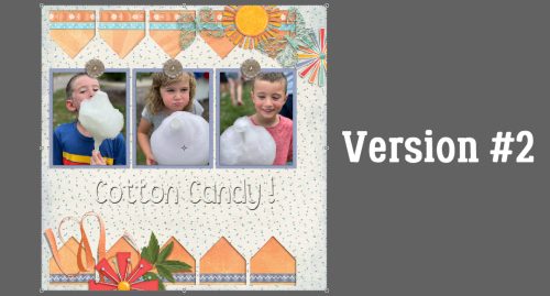
Wondering about that “Version #1”?

Just for fun, I rearranged my papers to see how I’d like it.
And again…

Which version did I decide was the one I liked most? (There was a Version #4, but it was so awful I rejected it immediately.) You’ll have to check the Gallery tomorrow!
PDF Version : https://bit.ly/3oHPCP7
Love the quick trick! Love that embossed look! I never would have realized that using the “multiply” blend mode would give that effect. Thanks, Jan!
I love all these tips.
I got the joke (I’m a Boomer!) and love the title tut! Thanks. Need to try those modes more often on many things!
I’m glad someone got my lame joke. (I LOVED that movie!!)
I’m always learning new things to do with Blend Modes. I often play with them while building a title, just to see if I can make it better. Sometimes it works, others it doesn’t. Nothing’s lost through experimentation, right?
Hi Jan, I would really appreciate a pdf, of this tutorial, if at all possible. I prefer to do my digital scrapbooking offline, as I am so easily distracted, and find the pdfs an invaluable resource.
PDF conversion is Ginger’s role. I’ll remind her.
Thank you for the reminder! It is up now 🙂
Thank You so Much Jan & Ginger for the pdf