Archives for August 2022

Tutorial Tuesday (Photoshop Elements)

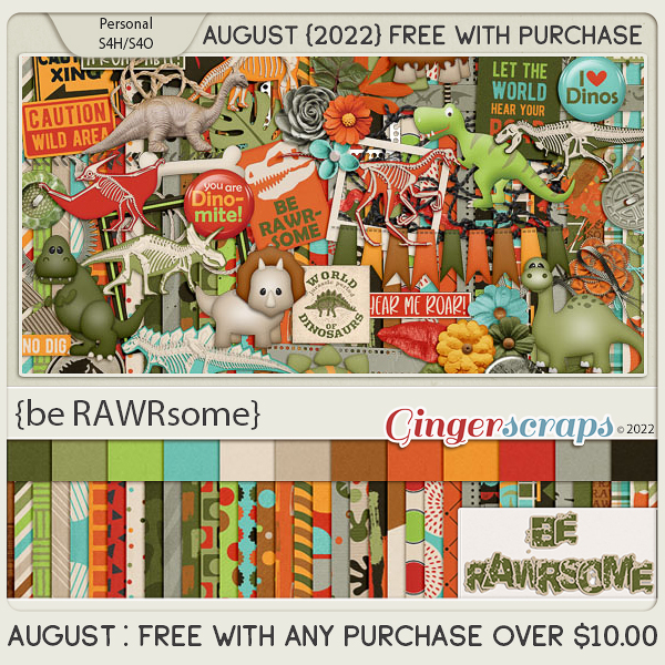
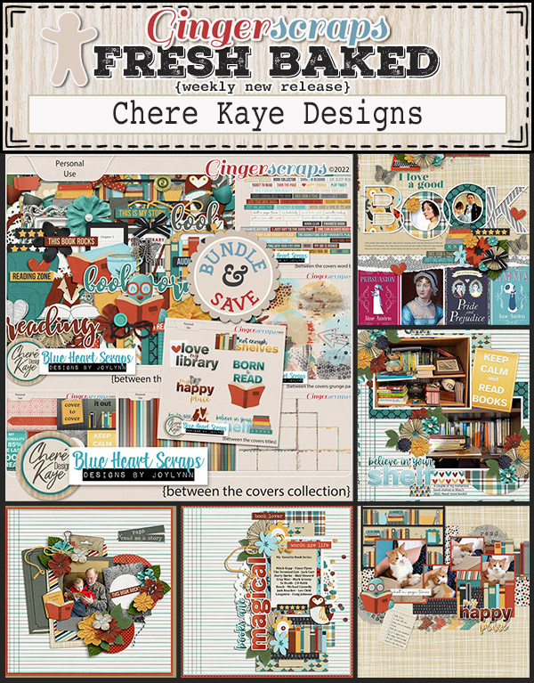
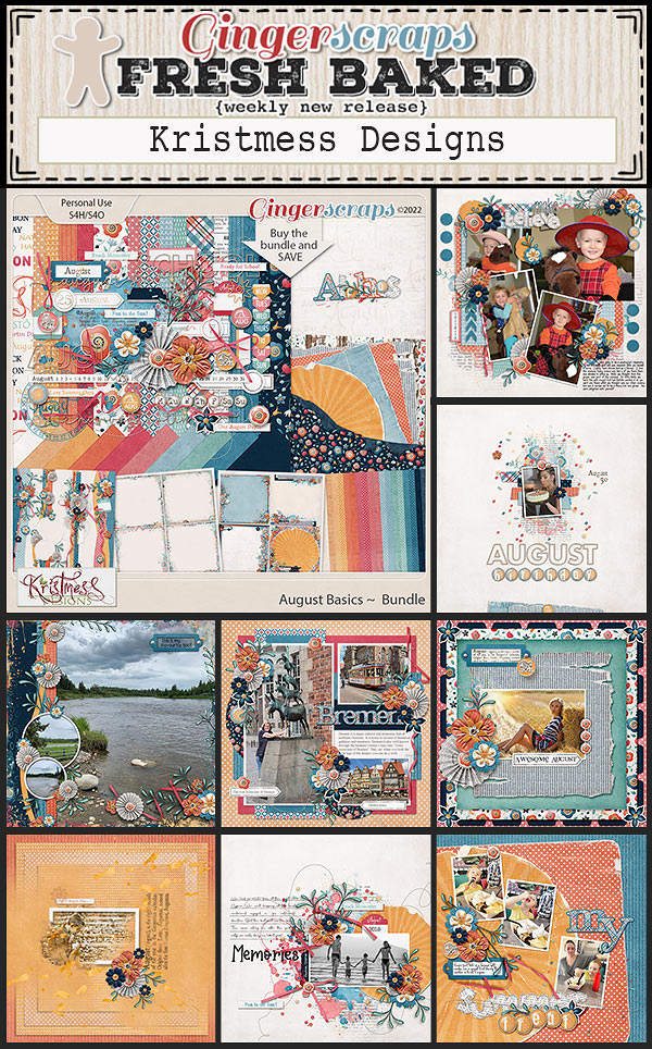
Turning a Font into a Sticker: Reprise


PDF Version: https://bit.ly/3BgqBlm

Did you know that my very first Tutorial Tuesday Blog post appeared on August 30, 2016? Six years!! So I thought it might be fun to re-run that first post (with maybe some tiny updates) just to see how far we’ve come. Ready?

Aug 30 2016

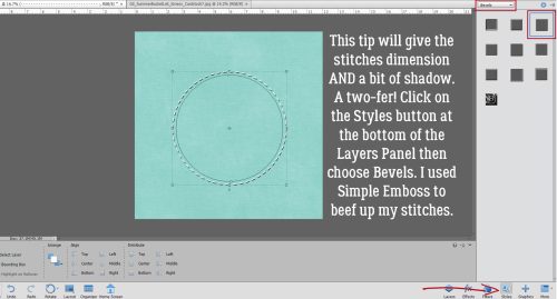
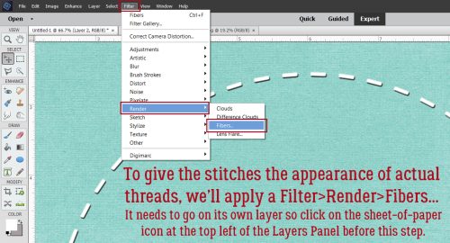
GingerScrapper Heather requested some help with creating eye-catching titles, so this little lesson will focus on turning a font into an outstanding sticker. Over the next few weeks we’ll go into more detail on how to really jazz up your layouts, so stay tuned!

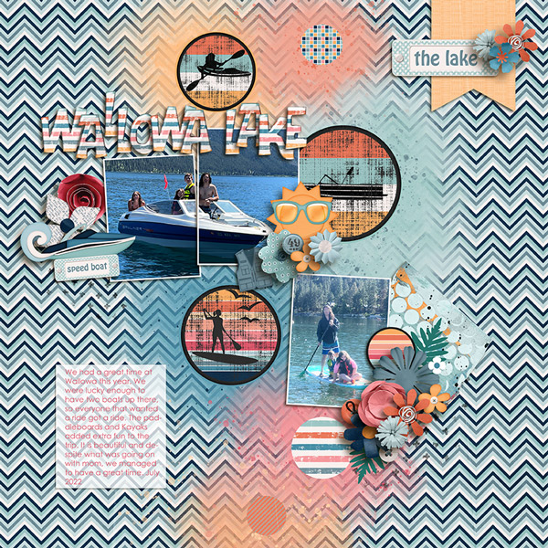
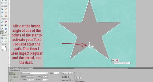
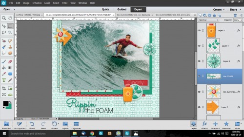
The very first step is to figure out what to call your layout. You want to choose something that works with the topic, but you don’t want it to be “Joey’s 8th Birthday”… where’s the excitement in that? Instead you could go with “Today He’s 8!” For the layout I created to help with this lesson, I looked up some surfing terms, looking for a hook. I came up with “Rippin’ the Foam”.

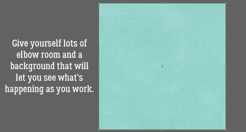
I like to build my titles on their own work space – there are fewer distractions and I can see clearly what I’m doing – so I always open a new file <CTRL/CMD+N>. (I use keyboard shortcuts, they really speed things up, but if you’re not comfortable with them, go ahead and do things as you usually do.) The size of the work space can be whatever you want, because you’ll be able to resize your title when you’re ready to use it.

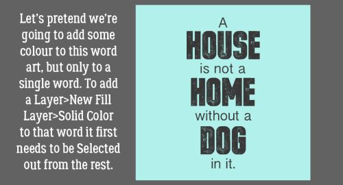
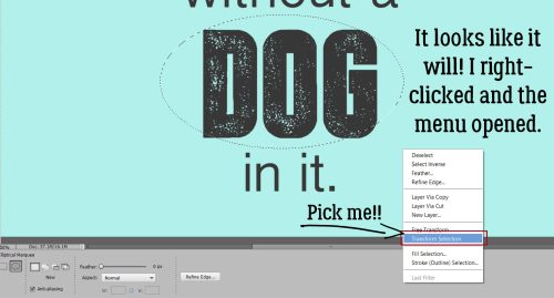
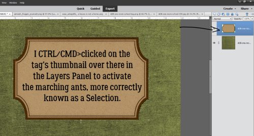
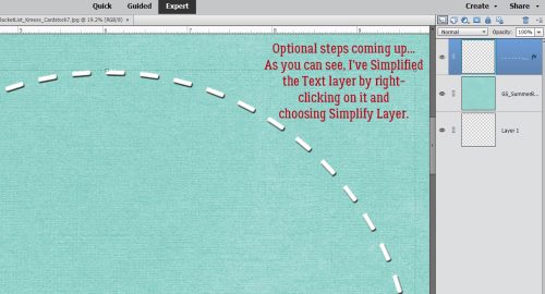
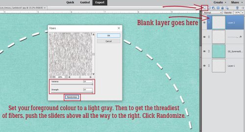
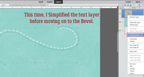
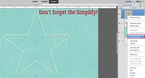
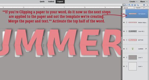
As you can see, I’ve already chosen the colour for my title. I decided to work with the two fonts selected by Jennifer of Leaving a Legacy Designs for the August challenge, since I hadn’t done it yet. Using Sacramento I typed out “Rippin’” but found it to be a little anemic for a title. To beef it up a bit, I simplified the text <right-click on the layer and select Simplify Layer from the drop-down menu> then I selected the text by <CTRL/CMD+click> on the thumbnail (the little image in the Layers Panel). Once I got those little ants marching around my text, I went to the SELECT tab menu and chose Modify>Expand and put the number 3 in the box.

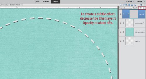
That pushed the line of ants out by 3 pixels, which was just enough. (Sometimes you have to play around to get it right, so don’t forget that CTRL/CMD+Z is your best friend.) Next I used the Fill Tool (the paint bucket) to fill in the space created in the last step. You’ll notice that there’s a very thin line inside the filled space so just keep moving the paint bucket around and clicking until all the space is filled in. Now I had a nice, fat word but it was a little umm… meh. So my next step was to change the foreground colour in my colour picker to a medium-dark gray.

In the EDIT tab menu, I chose Stroke (Outline) Selection

… set the value to 1 and chose Center.

2016-08-29 (9)

That puts a very thin gray line around the edge of the text. To continue on achieving the sticker look, I changed the colour of my foreground to white (ffffff) and I again selected the EDIT tab menu, only this time I put 6 as the value and selected Outside for the location.

And this is the result.

Now we’re cookin’! I changed the font to the other featured font for August, RNS Camelia and added the rest of my title in black. It needed a little nudging to get it where I wanted it – that’s part of the process. deciding what looks good. I chose not to include that part in the sticker because I wanted it to look like I’d written it on the layout.  At this point, I had two layers on my work space. With the Rippin’ layer selected, I added a Drop Shadow Layer Style and tweaked it so it was close to the sticker, sort of sharp and fairly dark. <Double-click on the fx icon on the layer in the layers palette, then use the sliders to adjust the size – sharpness of the edge, distance -width of the shadow and opacity – darkness of the shadow until it looks good to your eye.>

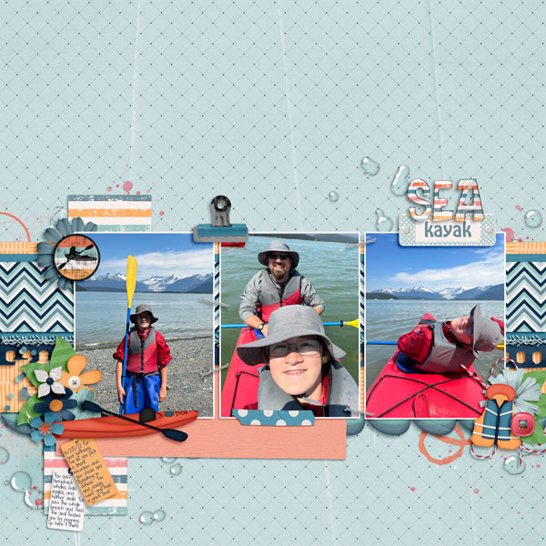
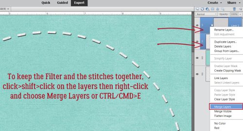
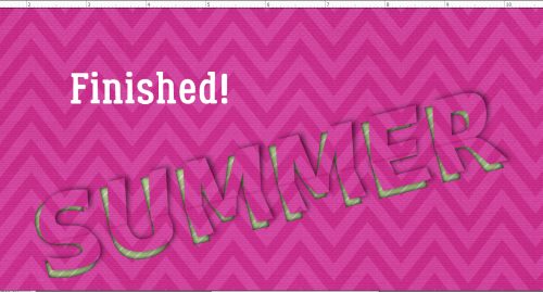
Once that was done, I merged the two layers together so I could move the title in one piece onto my layout. Now, knowing that I didn’t want my title to “float”, I selected the background paper layer of my layout to drop the title onto. It needed to be adjusted for size and placed where it looked best then ta-da! it was done! As you can see in the very first photo above, if I’d just used the font by itself, my title would have been lost against the patterned paper in the background. With a few simple steps, I made it so much better!

There you have one very basic method of adding interest to your titles. The tutorials to follow will build on this lesson and add a lot of cool techniques to your skill set. I hope you’ll continue to suggest topics for future lessons so you can grow your skills to match your imagination. (This part made me LOL. 273 tutorials and counting!!)

PDF Version: https://bit.ly/3BgqBlm

August 26 2022: Fresh Baked

Hello everyone!! We’ve made it through another week. I hope your week was fantastic and you have a great weekend!

Remember, if you spend $10 in the store, you get this great kit for free.

Let’s see what is new in the store this week.

Are you getting those challenges logged? Just a few more days to get them in. Any 10 completed challenges gets you this reward kit!

Tutorial Tuesday (Photoshop Elements)

Quick Trick: Transform a Selection

PDF Version: https://bit.ly/3BgqBlm

August 2022 is one of those rare months with five Tuesdays. That means there’s still one more Tutorial Tuesday before we move into September. (I can hear the shrieking… yes, this year is flying by!) It still feels very much like summer here, with temps in the 80s or 90s and thunderstorms – which aren’t typical here even in high summer. Last night’s storm was intense! Hopefully there weren’t a bunch of new wildfires created. But enough chit-chat. Let’s look at today’s Quick Trick.

One of the most common reasons I have for Selecting something is for recolouring word art. I do it a lot and the method I like most, which gives the best results, is to add a Solid Color Fill Layer.

I can’t be the only one who has this issue – sometimes my mouse/trackpad just stops responding (or let’s be honest, my finger slips) while I’m using the Marquee Tool to Select something, causing the area I’ve Selected to be not what I wanted. And until I learned this trick it meant I’d Select>Deselect (CTRL/CMD>D) or Undo (CTRL/CMD>Z) and start over.

Then one day I learned it’s possible to make the bad Selection box into a good Selection box! (This has streamlined editing my screenshots dramatically.) Rather than abandon the too-small/too-big/just-not-right box, right-click somewhere on the canvas. This magical menu will appear. Click on Transform Selection.

Now the marching ants are a Bounding Box. When you Commit current operation, it morphs back into marching ants. Crazy! Now you can Cut/Paste, apply a Stroke, rotate or whatever you had planned to do when you chose the Marquee Tool.

But will it work with an Elliptical Selection?

Seems like that’s a YES!

Here we see one of the limitations of Elliptical Selections when you’re playing with word art. If I make the ellipse big enough to get everything I want inside it, I also get stuff in there I don’t want. Because I can’t help myself, I tried Image>Transform>Skew. If it wasn’t going to be an option, those choices would have been grayed out. They weren’t! But the question still remained. Would the Skew only apply to the marching ants Selection?

Answer? Affirmative! But… the dots from the two “i”s in the line below are also being bitten.

I was so pleased, but shocked, to see that the Selection was still a Bounding Box and I could still tweak the contours of the ellipse. I tested the result by Cutting DOG out of the image to see if the whole word was inside and the dots on the two “i”s weren’t. It was perfect, but I didn’t think you’d need to see a screenshot of that.

Feeling quite accomplished now, I took it all one step further. Could this trick work with the old CTRL/CMD>click-inside-the-thumbnail-to-Select thing?

So I gave it a whirl.

Well, darn. Right-clicking only brought up options that would apply to the LAYER the tag is on, not the Selection. Is there another way? I clicked the Select tab and there it was! Transform Selection is right there!

The Selection turned into a Bounding Box and I could Resize it without a problem. Pro tip: If you want the original shape to remain centered in the Selection, don’t grab a Bounding Box handle and pull. Instead, change the size in the Tool Options dialog box.

You may never decide to use this trick, but I’ll tell you, I’m using it a LOT now that I know how it works. See you next week!

PDF Version: https://bit.ly/3BgqBlm

August 19, 2022: Fresh Baked and RETIRING PRODUCTS!

Happy Friday!!! We have a big sale starting today. It’s our Retiring Products Sale

Make sure you check out of the store before 11: 59 pm Eastern on August 25th. 

Remember, if you spend $10 in the store, you get this great kit for free.

Let’s see what is new in the store this week.

Just a little over halfway through the month. Are you getting those challenges done and posted? Any 10 completed challenges will get you this great collab.

Tutorial Tuesday (Individual Style)

Challenge Spotlight: PINTEREST CHALLENGE

The Pinterest Challenge is a new-to-you-in-’22 challenge, brought to us by Lisa Minor. I’ll confess, when I first read the premise for this challenge I wasn’t sure how it would work, although I LOVE Pinterest and have to actively discipline myself or I’d never get anything done. I digress. The August 2022 Pinterest Challenge Gallery shows us how well the challenge works – really well. It works really well. Let’s have a look. In no particular order… the scrappers’ names are linked to their layouts in the Gallery, in case you’re inclined to leave them a comment.

The basic premise is that Lisa provides a pin (or several) she’s saved to one of her Pinterest boards as inspiration, with a brief description of what she’d like to see contained in the layouts participants create. For August 2022, she provided this image, followed by: “This pin says to me “beach, seaside, vacation time, travel, elegant, relax and make memories”. So what does it say to you? Scrap it!” 

First out of the box is this layout by garrynkim. Can you see which aspects of the pin were chosen? Of course you can… the mood, the water and the colour palette are right there.

This layout from bkasko also features water, and the theme of rest and relaxation. I really like how her photos all have the waterfall in them, and how she’s masked her large group photo.

Oh look! B2N2Scraps has water photos too! I sense a trend. She’s also incorporated the colour palette from Lisa‘s photo. I just love the water droplets in the background here.

More water! These underwater photos are amazing!! The tropical sea elements robinoes66 has clustered around her photos mesh really well with the topic of the photos and she’s also pulled colour from Lisa‘s image. Strong work!

I’m starting to think water is an integral part of vacation… if I only had these layouts to define the word, that would be the most obvious aspect, amirite? I’ve gotta say kristal, that’s one HUGE pond! The colours from Lisa‘s image are there too.

Water sets the scene for basketladyaudrey too. She was inspired by the making memories part of Lisa‘s impressions. That woodgrain paper reminds me of a dock, and she’s pulled colour from her photos into her choice of papers and elements.

Even mary-lynne has included water in her layout, but more as a backdrop to their leisurely breakfast. Her colour choices echo her photo beautifully and she’s masked her large photo perfectly.

pjm117 took her inspiration from both the watery view and to a lesser extent, the colour palette. I love the quotes she’s used for her word strips… as I wiggle my bare toes.

Ah! A layout that was inspired by the food in the image… both are focused on breakfast. route66 kept it simple, with the breakfast photos taking the spotlight.

KarenDiamond really understood the assignment! Beach, vacation, relax, memories… they’re all in there – without literal water – and the kit she used screams summer and heat.

The summery colour palette of grannyNKy‘s layout, and  yes… water, meet the criteria for the challenge too. They look like they really had a great time on the lake.

Last, but not least, this layout from DianeInOz went all the way down the vacation-making-memories path. The incorporation of a lot of photos tells a story of a busy, fun-filled day and the few elements she used to embellish them kept the overall impact from being overwhelming. Truly a case of less-is-more!

What would your layout look like if you took up this challenge? I’m not a beach person, but I do enjoy breakfast overlooking a scenic view.

August 12, 2022: Fresh Baked

Welcome to Friday. Has school started in your area? I know a lot of places started this week. Where I am, we don’t start until end of August. Both of my kids have been out of school for several years so I don’t keep up with it all. 

Remember, if you spend $10 in the store, you get this great kit for free.

Let’s see what is new in the store this week.

How are those challenges going? We have a lot to choose from and you only need to complete 10 to get this great reward.

Tutorial Tuesday (Photoshop Elements)

Going Creative with the Stitch Technique

PDF Version : https://bit.ly/3zUIB2y

Today I’m going to build on the stitch tutorial from a few weeks ago. I have three more ways to add stitching to your layouts that go beyond vanilla. I’ve played around quite a bit to be sure the instructions are accurate, and you’ll be surprised how easy these new options are. Let’s start out by making sure we have room to work. I opened up a new 12×12 workspace and dropped a paper on it so the stitches – I’ll use white – will be easy to see.

Again we’ll use the Text Tool because it has so many options. I’m using Elements 2021; if your version is much older you may not have all of these Tool Options. The option we’re starting with is Text on Shape and we’ll be using the Ellipse to create a circle. My screenshot font is Lumberjack Regular and I’ve used it for two of my samples today. If you have a font with a dash symbol that has a rounded look to it, it’ll work beautifully. Set the font size to at least 40 points.

Drag out a circle on your paper. You can make it as big as you want. It can always be resized later to fit your layout. This outline will tell Elements where to put the dashes and how to position them.

Move your mouse until you see the Text Tool cursor. It’ll become visible when you intersect with the edge of the circle and it looks like a swoosh with an I-beam crossing it. Click to set it in play then using the dash and the space bar, type out a long string of stitches. They will move and bend to the shape you’ve created; the dash sits above the baseline, but that won’t really matter.

Here you can see what I mean. You can stop when you’ve only gone part way around if you like, or keep going to enclose the circle.

Your spaces may or may not uniformly proceed around your circle when you reach the finish line. If this is a concern for you there are a couple of options – start over, adjusting the size of the circle or the font until it’s perfect, or you can accept it and just cover it with a flower or a brad on your layout. If you resize the stitched circle to a smaller version, it’ll be less noticeable.

Now to give the stitches some dimension. By using a Bevel Style, you won’t have to add a shadow later! Click the Styles button at the bottom right of the Layers Panel, choose Bevels from the dropdown menu and then choose Simple Emboss.

These are the default settings for Simple Emboss. You may find them to be too strong. Styles can be adjusted by double-clicking on the fx icon on the layer.

You can see how just shifting the Size slider to the left makes each stitch a bit flatter.

You could stop at this step and have some very nice stitches. But if you’re interested in a bit more realism, that’s pretty easy. First Simplify the text layer by right-clicking on the layer then choosing Simplify Layer.

To make the stitches look a bit more like they’re made of thread and not paint, we can apply a Filter. It needs to go on its own layer though, so click on the sheet-of-paper icon at the top left of the Layers Panel. Then click Filter>Render>Fibers…

Make sure your foreground colour on the Color Picker is set to a light gray – the filter will be whatever colour you have in the foreground, and red isn’t pleasing! The Filter Options look like this. For the most thready look possible, push those sliders all the way to the right and click Randomize.

This is what is supposed to happen! Don’t worry. It’ll be fine!! Right-click on that Filter Layer and choose Create Clipping Mask from the menu.

Then all that’s left is to adjust the Opacity so that you have the thread effect but not so strongly that it’s distracting.

To be sure the stitches and the thready filter stay together, click>SHIFT>click on the layers then right-click and choose Merge Layers. Or use the keyboard shortcut CTRL/CMD>E.

If you look closely now that I’ve shrunk my circle, you might be able to see the slightly bigger gap between my first and last stitches. Maybe.

Okay, now let’s try something a bit more out there. This time, I chose Text on Path from the Text Tool Options. See the Draw icon? It turns the cursor into a pen, a fountain pen… and you’re only limited by your wrist’s flexibility and the size of your mousepad!

I clicked on my paper to tell the cursor to get to work, then drew a simple swirl. It looks pretty smooth, so I don’t need to Modify it. But if I did, the Modify icon will give me the necessary tools.

To get the stitches to conform to the swirl and extend from one end of the line to the other, I discovered I needed to click my cursor as close to the center of the line as possible.

This time I went ahead and Simplified before adding the Bevel.

You may not have ever explored the More button down there at the bottom of the Layers Panel. I just happen to know there’s a Simple Emboss under the Favorites tab.

This time I changed the Lighting Angle as well as the Size. Always make sure your Lighting Angle matches your shadows; there might be a visible incongruence that will bother you otherwise.

On to the thready Filter… but only if you want to!

This time I left the Filter a little darker.

The last sample looks like it’s the most complicated, but it’s not. Let’s use the Custom Shape Tool and drag out a nice 5 pointed star. Don’t forget to Simplify, because you won’t be able to manipulate it otherwise.

Next, I chose Text on Selection. I made sure it was set to Add – meaning wherever the cursor was dragged would be part of the Selection. It doesn’t have to be precise, just click inside the shape and drag the cursor to the edges. The marching ants will snap to the edges automatically.

Once you’ve got the edges Selected, Commit the Action.

Choose a logical starting point, like the inner angle of one of the points. Click to activate the Type Tool and start typing. I switched the font to Impact Regular and used the period instead of the dash. As I typed, the stitches moved along both sides of the star until they met at the top.

Don’t forget to Simplify the text layer!

I tried all the Bevel Styles to see which one worked best with the period-style stitches. It turned out to be Simple Scallop.

If you squint, these look almost like cross stitch!

PDF Version : https://bit.ly/3zUIB2y


I hope you’ll give one or more of these a try. If there’s something you’d like me to build a tutorial for, you can leave me a comment here on the Blog, or send me a Private Message through the Forum – user name is ObiJanKenobi. Next Tuesday I’ll be doing a Challenge Spotlight. Stay tuned!

August 5, 2022: Fresh Baked

Hello fellow scrappers and welcome to the first Friday in August. We’ve got some really cute kits to share with you this week.

Remember, if you spend $10 in the store, you get this great kit for free.

Let’s see a sampling of what is new in the store this week.

Have you gotten a start on your challenges for August? Complete any 10 challenges and get this collab as a reward.

Designer Spotlight: August 2022

Magical Scraps Galore

The year is just winging by, isn’t it? It was my great pleasure to chat with Marina, aka Magical Scraps Galore, over a cold drink recently. It’s her turn in the GingerScraps Designer Spotlight so let’s get to know her better.

J: Let’s start with the bread-and-butter stuff. How long have you been designing?

M: I’ve been designing for 11 years now!

J: That’s a long time in the digi-world. What made you decide to design?

M: I started creating my own digital papers and embellishments for scrapping our second trip to Disney World, since the digital offerings were very limited back then. It didn’t take long to realize that scrapbook design was my passion, and I started participating in the design challenges hosted by MouseScrappers. I opened my first shop in 2013 and I’ve been part of the wonderful GingerScraps family since 2014.

J: There’s nothing better than creating exactly what you want but can’t find. What tools do you use to create your designs?

M: I use Photoshop, Illustrator, Procreate and ArtRage.

J: Kudos to you for blending all those platforms! I have enough trouble with just one. Can you describe your design workplace?

M: I design in my studio at home, with my two cats sleeping by my computer or on my lap. Sometimes they like to sleep ON my computer and they mess with my designs, LOL! I have to be very careful!

J: Too funny! My dogs see me pick up my laptop and go somewhere else. What kinds of things motivate and inspire you as a designer? I mean, other than Disney… 😉

M: My main motivation and inspiration are my kids and my trips around the world.

J: Those two things seem to be the launch pads for many of the designers I’ve chatted with. What is your favorite kit currently in your GS store and why?

M: It’s hard to pick just one, that’s mean, it’s like choosing your favorite child, LOL … I have several kits that I love, especially my travel collection, but one of my favorite kits is Magical Memories, it’s all about my happy place and it’s a reminder of all the magical moments I spent there with my family.


J: That’s how I feel about Ireland. I’d move there if I could! If you were given a super power, what would you like it to be?

M: Teleportation, so I can travel anywhere in no time and with no jet lag!

J: Wouldn’t that be amazing?! I used to wish I could teleport home from work after my 12 hour night shifts. Have you ever met anyone who’s famous?

M: Yes, I met Tom Felton (Draco Malfoy in the Harry Potter films)

J: I’m not much of a HP fan, but I know who he is. That must have been a special moment. You clearly enjoy things that relate or appeal to children. What did you want to be when you were small?

M: I wanted to be a flight attendant or a rock star.

J: I can’t sing or play an instrument so I never dreamed of being a rock star, but I did want to be a flight attendant for awhile. They work pretty hard and put up with a lot. I think my sarcastic evil twin would take over and I’d be fired. If you had a warning label, what would yours say?

M: Warning: Crazy cat lady!! LOL! I’m a huge cat lover, and if my family would let me, I’d have 10 cats or more!

J: Ooh. That would be overwhelming to me. I have enough trouble keeping track of two dogs. Thank you so much for taking the time to visit with me; I’m just going to fill our readers in on all the awesome August goodies you’re a part of before I finish up.

Of course, Marina is hosting the Designer Spotlight Challenge this month. She’s also the Daily Download Diva for August, so make sure you look for the links here every day or two. (Links are active for 5 days, so you can condense your time:effort if you want to.) If you don’t have time or miss some pieces, the kit will be for sale next month in the Shop. AND… Marina is permanent host of the monthly Surprise Challenge! If all of that isn’t enough, she’s offering a lovely coupon that’s good for the whole month. Be sure to check all of this out. You won’t be disappointed, I promise.

Tutorial Tuesday (Photoshop Elements)

Creased Paper Cut-Out Word Art

PDF Version: https://bit.ly/3bowWBc

I had a request in my PMs from glee, who thought I could magick up an Elements version of the Photoshop technique shown on this fabulous layout by physioscrapper. (Hey Nancy!!) So with some trepidation, I embarked on turning a 7 1/2 minute YouTube video into a 46-screenshot tutorial. [I know, only I could do that!] There are quite a few steps, but many of them are repeated a few times so it’s really not that horrible. And, as with some other things that I’ve made up as I was going along, I took a couple of missteps that resulted in more work for myself that I only figured out AFTER I’d gotten there. So I’ll let you know when we get to those!

This is where I began. I used a big, bold sans serif font and only upper case letters. Font selection is super-important for this – it just wouldn’t work as well with an embellished font. You can use more than one word if you like. The inspiration layout only has a single word so I emulated that.

Next I made a Copy layer of the word. As you might recall, I like to use keyboard shortcuts, but there’s a learning curve with that. I’ll always show you an alternate method of doing something then give you the keyboard shortcut for that action where one exists. CTRL is a Windows key, CMD is for Mac. To create a Copy layer, right-click on the layer then choose Duplicate Layer… and OK. Shortcut: CTRL/CMD>J.

In order to take the next number of steps, this Copy layer must be Simplified. Right-click and choose Simplify.

To make keeping the two word layers straight in my mind, I changed the colour of the Copy layer to coral. Using the Paint Bucket would work, but I’d have to pour paint into each letter and the edges might not be sharp with that method. So instead I clicked Layer>New Fill Layer>Solid Color.

To put the Fill Layer right over the letters, tick that Use Previous Layer to Create Clipping Mask box.

If you’ve never used the Color Picker you may not know how to choose a colour you like. Start by clicking on the colour family you like over there in the rainbow strip. Then fine-tune your choice by clicking inside the big swatch. The Preview box between the swatch and the OK button will show you how the spot you’ve selected in the swatch compares to the previously selected colour.

To keep things manageable, click>SHIFT>click on the Fill layer and the text layer then right-click, choosing Merge Layers. Shortcut: CTRL/CMD>E.

Now, go back and activate the original text layer, the one we didn’t Simplify. It’ll be the cut-out part of the word art. There are some techniques in Photoshop that don’t have an Elements equivalent. This is one of those. We want a shadow under the cut-out, but using an Inner Shadow layer Style only applies it to two edges, while in Photoshop, it’s possible to have all four edges shadowed and adjustable. So here’s a work-around. It’s not quite perfect, but it’s good in a pinch! Click the Styles button at the bottom of the Layers Panel then choose Glass Buttons. From the Glass Buttons menu, choose Translucent Glass as shown.

It looks like garbage, but don’t worry! We’ll fix it!!

Double-click on that fx icon on the text layer to access the Styles adjustment menu. These are the default settings for the Style we chose.

Untick the Bevel setting. Then play with the Inner Glow sliders to find a look that you like. These are my choices: Lighting Angle 90° Size 20 Pixels Opacity 60%. It’s possible to change the colour of the Inner Glow here too, but for now we’ll leave it until we see how it all looks later.

Now go back and activate the coloured version of the word. To create the fold, we’ll need to divide the word into two halves. Using the Rectangle Marquee tool, drag out a box around the top half of the letters. Having a capital R there helped. But if your word doesn’t have an obvious halfway part to it, you can turn on the Grid and use it to line things up. View>Grid or CTRL/CMD>’ will turn it on and off.

Edit>Cut or CTRL/CMD>X will Cut the top half off and make it disappear. It’s not really gone, just hiding.

To bring it back into view, Edit>Paste or CTRL/CMD>V. Now you’ll have two separate layers, each with half the word on it.

You may need to use the arrow keys to nudge the two halves back into alignment.

Moving to the layer that has the bottom half of the word on it, activate the Move tool then push the bottom edge upward toward the centre of the word, just a bit.

Still on the bottom, click Image>Transform>Perspective.

Grab that centre “handle” and move it horizontally to the right. A dialogue box will appear telling you how much you’ve shifted it in degrees. Aim for about 11°.

Move back to the top half of the word and activate the Move tool again, only this time stretch it upward about the same amount you shrunk the bottom. You can toggle the layers’ visibility on and off if it helps you keep track of where you are.

Repeat the Image>Transform>Perspective step.

Moving to the right the same amount as for the bottom, about 11° will keep it symmetrical.

Here we go… it looks like the letters are creased away from the background. There are still some things we need to do to get a realistic look though.

A drop shadow Style isn’t gonna cut it for this so we’ll create a custom shadow. First, select the layers for both halves of the word by click>SHIFT>clicking on them, then right-click and choose Duplicate Layers>OK or CTRL/CMD>J.

This is an optional step: Rename the layers to help remember what they’re doing for you. Double-click on the name Elements gives the layer and change it. Here I’ve labeled the new copies as Top SHADOW and Bottom SHADOW.

Now we’ll add Layer>New Fill Layer>Solid Color to each of those shadow layers. Make sure you tick the Use Previous Layer to Create Clipping Mask box. For simplicity’s sake we’ll use black for the shadows.

I sometimes just type in a value in the Color Picker‘s # box. Pure black is 000000. White is ffffff… easy enough to remember. Some designers like to use an umber colour, like 2c1902.

With both halves of the shadow layers filled with black, we’re on the way to a nice custom shadow!

Move the two shadow layers so they’re underneath the folded letters. Click>SHIFT>click on the two layers and drag them down the Layers Panel, or use CTRL/CMD>[ to get them into their proper spots.

Yep, you guessed it… we’re going to pull them off kilter too, one at a time. In the screenshot I’m working with the top half of the shadow. Image>Transform>Perspective.

Don’t go too far! 4 to 4.5° is plenty. You just want it to peek out from under the letter above it.

When you’ve got both top and bottom shadows peeking out a little, it should look like this.

Next, Merge the two shadow layers together. Click>SHIFT>click, right-click>Merge Layers / CTRL/CMD>E.

Now to soften that shadow up a bit so it doesn’t look like it could cut glass… Filter>Blur>Gaussian Blur.

The Filter menu opens up. Move the Radius slider until you think the shadow looks realistic. I went to 13.9 Pixels.

But it’s still too harsh, so adjust the Opacity. 70% looks good.

Here’s one of those missteps I referred to at the beginning. **If you’re going to Clip papers to your letters do it now!** That way, the next couple of steps will be visible on your paper rather than the letters you’re using as a template. Merge the papers with the word halves so you don’t get mixed up. Then you can move on to this next step. Activate the layer with the TOP half of the word.

Add a new blank layer above the top half of the word by clicking on the sheet-of-paper icon at the upper left of the Layers Panel and make it your active layer. Then CTRL/CMD>click inside the Layer Thumbnail for the TOP half of the word to Select the edges.

OMG… we’re trying something NEW!! Layer>New Fill Layer>Gradient…

Make sure that Use Previous Layer to Create Clipping Mask box is ticked. We want the effect to apply to just the top half of the word. The marching ants will tell it where to stop.

Choose the black-to-transparent gradient option. Of course it looks horrible. Tick the Reverse box, then we’ll make it pretty.

Now the effect is at the top of the letters and by decreasing the Opacity to 15%, it just adds a hint of shadowing where the light couldn’t quite reach the paper.

This step is another optional one, but I think it’s actually essential. Using the Burn tool let’s add some deeper shadowing where the paper creases. (You want to take this step AFTER you’ve clipped your paper to your letters.) The Burn tool icon looks like an “OK” hand signal. Use a small diameter, 15-20 Pixels, and don’t go too heavy, maybe 10-15% on the Opacity. To create a straight crease, click your cursor where the two halves of the word intersect then hold down the SHIFT key and move over to the other end of the word. Click the cursor at that intersection point and voilà, you have a straight crease.

So you can see how it looks with some papers in place, here you go.

If you think your cut-out shadows aren’t quite dark enough, this is how to fix it. Go back to the original text layer, double-click on the fx icon and use the swatch to change the Inner Glow to black.

Because I wasn’t thinking and waited to Clip my papers until after I’d Burned the crease and added the Gradient, I went back and fixed that.

There… a reasonable facsimile of Nancy‘s word art!

PDF Version: https://bit.ly/3bowWBc

I’ll be back in a day or two with the August 2022 Designer Spotlight. See you then!