It’s the Snowy Season! (Fancifying a Font)
![]()
PDF Version : https://bit.ly/3jf6vBS
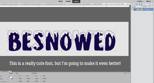
If you’ve thought about taking part in the Font Challenge this month, you probably live in North America and have lots of snowy photos you can work with. Snowy Season is a showy font with lots of visual interest. It’s an all-caps font with scaled lower-case characters, a full set of numerics and the most commonly-used punctuation, which makes it a great title option. I think it would make for difficult reading as a journaling font though. Today’s tutorial will show you how to make the snowy parts of the font look like actual snow! Read on…
Before we get into the meat of the tutorial I want to welcome all the new GingerScrappers who have joined us in the last while and give an overview of Tutorial Tuesday. The first two Tuesdays of the month will focus on techniques that elevate our 2 dimensional layouts into 3D masterpieces. The third Tuesday is Challenge Spotlight day, when I share YOUR layouts and discuss what makes them special and interesting. On the fourth Tuesday, I provide a Quick Trick that will speed up your workflow. When I create these tutorials I want them to be achievable by anyone, with any amount of experience with digital scrapping. To that end, I typically provide both written and visual instructions of every step in the process I’m demonstrating. If you already are proficient you have my blessing to skip over all the extra instruction. I try to use free or software default fonts and styles wherever possible so you’re not having to shop before you can play. Most tutorials are for Photoshop Elements, which is the most commonly used software and what I work with. There are usually multiple ways to accomplish a task. I like to Work Smart, Not Hard, so I’ll show you the easiest/fewest keystroke ways, and include keyboard shortcuts where they exist. I work in Windows but recognize that there are a lot of Mac people out there. So any keyboard shortcut will include the appropriate function keys for both PC and Mac. For example, the keyboard shortcut for Merge Layers is CTRL>E for PC users and CMD>E for Mac users. So when I include Merge Layers in a tutorial it will look like this: CTRL/CMD>E. The other function keys that are part of keyboard shortcuts are the ALT (PC) and OPT (Mac) keys. Make sense? Now for today’s tut!
Our winter began a full 6 weeks early than usual and brought us a LOT of snow. I like to think outside the box when it comes to titles for my layouts and sometimes will do a Google search for related words, phrases or synonyms. That’s how I came up with this one. Notice the transparency inside the snowy bits. If I just used the font as is, whatever is behind my title will show in the snowy areas. Not what I want!
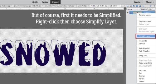
Before I can manipulate this title, the text needs to be Simplified. The actual text itself will no longer be editable so make sure it’s spelled properly and it says what you want it to say before you Simplify. One way to do this is to click Layer tab on the taskbar that sits at the top of your workspace then choose Simplify Layer. Or right-click on the text layer and choose Simplify Layer from the drop-down menu.
I made a Copy Layer of the title so I could work on a Copy and not the original. There are several ways of doing this. Click Layer>Duplicate Layer… on the taskbar. Or right-click on the layer then choose Duplicate Layer… from the drop-down menu. Both these will open another menu where you’re asked where the duplicate layer will go. In this instance, it’ll go into this project, so all you’d need to do is click OK on that pop-up. Or easiest for copying layers within the same project, CTRL/CMD>J will just do it all.

Here’s the pop-up I mentioned above.

Now I’ve made the original title layer invisible so I can see what I’m doing to the Copy Layer. Just click on the eyeball to close it.

I’m going to remove everything but the snowy areas from the title. I added a Layer Mask to it by clicking on the icon at the top of the Layers Panel that looks like a gray circle in a blue square. Why a Layer Mask? It lets you hide parts of a layer but not make them actually disappear. It gives you the most control you can have over what happens to your image. More later.

This is where Elements puts the Layer Mask. You want to be sure you’re working on the MASK and not the LAYER itself. When you look at the Layers Panel you’ll see a blue line box around the active part of the layer. Be careful to make sure you’re on the MASK.

Next, activate the Eraser Tool. You’ll have another reminder that you’re working on a MASK because the Color Picker will show black and white. It there are any other colours there, you’re NOT on the mask. If you remember “White REVEALS and Black CONCEALS” it’ll help with your task… but this mnemonic is referring to what’s BEHIND the object you’re masking. The magic of Layer Masks is that it lets you erase things, but if you accidentally remove a part you wanted to keep, it’s not really gone. For example, sometimes my track-pad sticks and my cursor goes haywire, erasing EVERYTHING it touches. To recover that stuff, I just toggle my colour from white to black and reveal it again by rolling my cursor over the oops. Toggling between foreground and background colours is easy, just click the X key.

Make sure your snowy areas are completely enclosed with a thin border of your font colour. It’ll save you a lot of grief later.

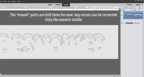
This is what you’ll be left with on the Copy Layer once you’ve concealed all the non-snow areas. Zoom in and go over all of it while you still have the ability to correct any little issues. Once you’ve moved on to the next step it’ll be too late…
Now, to be able to play with this layer, the Layer Mask has to be integrated into the layer by Simplifying it. Same steps as for the initial title.

As soon as your Layer Mask was integrated, your Color Picker will have returned to whatever colours you’d had there before. Set your foreground colour to white: you can either click your cursor on the upper left corner of the palette or you can type “ffffff” into the hex code # box.

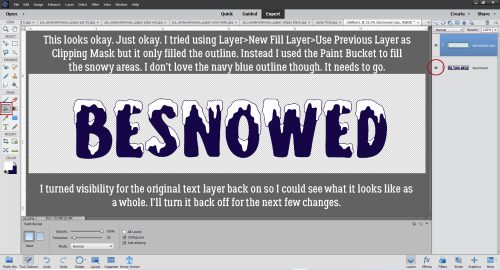
Now to fill the snowy areas with white. I tried my preferred method of New Fill Layer>Solid Color>Use Previous Layer as Clipping Mask but all it Filled was the outline. In retrospect, that might have worked just as well as what I ended up doing. Keep that in mind as we proceed. I used the Paint Bucket to click-and-fill the snowy areas. This method is imperfect, sometimes leaving areas unfilled around the edges. That can be overcome by Filling again. As you can see from the screenshot, there’s still a navy blue outline that detracts from the look I want. Here’s where it might have been better to use the Fill Layer process, THEN the Paint Bucket. Live and learn!! Instead, I worked unsmart…
I essentially did the same thing that using the Fill Layer>Paint Bucket method would have done but with WAY more steps. I covered up the blue outline with a Stroke. Edit>Stroke (Outline) Selection…

To expand on the EXTRA steps I took, I had to experiment to find the right size and location for the Stroke. I settled on 6 pixels and Inside to conform to the contours of each snowy shape.

Okay, that looks a lot better. Still a few areas where the Stroke didn’t quite cover the outline – another reason to advocate for using the Fill Layer>Paint Bucket route.

Now to add some dimension! I experimented to find the right combo for this step. Click the Styles button at the bottom of the Layers Panel then go up to the drop-down menu at the top of the Layers Panel and choose Bevels. These are stock Styles that came with the software.

I got the best results with the Simple Inner Bevel as shown. I know it makes the snow look like toothpaste, but Styles are adjustable! Double-click on the fx icon on the layer to open the adjustments menu then push the Size slider to the left until it stops looking like it’s sitting in your bathroom sink. To reduce the glaring shadows, decrease the Opacity of the beveled layer to 66% or so.

Now make another Copy Layer of the snow. We’ll add some glitter to it so it glistens like real snow. CTRL/CMD>J. (Learn the keyboard shortcuts! They’re amazing!!)

Ugh. Let’s get rid of the glop. Right-click on the layer then choose Clear Layer Style. That’ll remove the bevel from the Copy Layer.

You may already have some fine white glitter loaded into your Styles collection. I didn’t have the one I wanted so I went to my Styles folder by clicking on the stack of lines to the top left of the Styles Panel and chose Load Styles. This is where your software stores Styles; if you’ve purchased some to coordinate with your kits this is where Elements will look for them. I’ll put together a tutorial on managing Styles later. For right now I’ll just give you the bare bones.

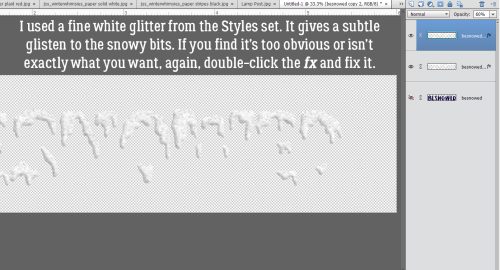
Here’s the result of applying fine white glitter, then decreasing the Opacity of that layer to 60% so the contours of the layer below are visible.
The finished title! I’m really happy with how it looks. Next time I’ll learn from my errors and skip a few steps!

See you next week. Which Challenge will be in the Spotlight?
![]()
Wow !!! I love how your font turned out !!
Thanks for the great tutorial ,
I can’t wait to try this .
That’s great! Thank you, I love the look. I’ve done the Font challenge, but am using the font in another. Anxious to play around with it soon.