A Little Crisp Around the Edges
![]()
PDF Version : https://bit.ly/3JeXrGz
Today’s tutorial is, once again, pulled from the GingerScraps Challenges. When I started thinking about how I’d meet the criteria for the Inspiration Challenge, which is to create a junk journal page, I started imagining how I could use the lyrics from one of my current favourite Lainey Wilson songs. They resonate with me on a lot of levels – although I don’t really think I’m a redneck. The chorus goes like this:
If I look a little drunk, it’s ’cause I drank some;
If my neck’s a little red, it’s ’cause I am one.
Heaven’s where I’m gonna go, the Bible says so on my shelf,
But if I smell like smoke, it’s only ’cause I’ve been through hell.
So then I was thinking about how to really sell it. And I came up with the idea of altering an element to look like it’s been singed. I ran with it! Let me show you how I “burnt” some paper. I used this stack from Aimee Harrison’s The Work in Between – which is part of a mega-collab kit created by Aimee, Cheré Kaye, Cindy Ritter and Connie Prince. (Click their names to see their kits.) The collab is an ideal choice for junk journal pages; there’s a goldmine of ephemera in there. As you can see in the screenshot, I’ve dropped a blank layer with a transparent background underneath it. You’ll see why in a bit.

First step is to “tear” the area of the paper that will have the scorch marks on it. I Zoomed in on the upper left corner of the papers and chose the Eraser Tool. Set with a hard, round brush from Elements’ Basic Brushes, about 30 pixels in diameter and full strength Opacity.

I just nibbled away at the corner of the paper, with some sharper and some rounder bits. It’s not going to be perfect.

Now you can see why I put that layer under the paper. As much as I’d like to think I got it all when I was removing the corner, with very little contrast between the paper and the background, it’s hard to be sure. And leaving the odd little bits there would show up later, and not in a good way. So I dumped some black into the bottom layer with the Paint Bucket.

That made it really easy to clean it up.

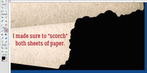
I decided the opposite corner would be another good place to scorch my paper. Fire will spread to the bottom sheet in this arrangement, so I “burnt” both.
It doesn’t look quite right to me.

Easy enough to fix!

Time to play with fire! If you think about how paper burns, it changes colour first, as heat spreads through the fibers in the paper, taking on a brown tinge. So I chose this as my first scorching colour. The hex key is #883102, if you’d like to just type it in.

After I turned the black background layer off, I chose the Brush Tool, set to a SOFT, round Basic Brush at 300 pixels and 35% Opacity. It’s a good place to start, and allows for adjustment later. The Basic Brush set is one of the Brush collections that is included in Elements when you install it. To see what Brushes you have, click on the thumbnail – the squiggle with the little triangle to its right – and the list will open up. To locate the one I’m using, click on Basic Brushes, then scroll down past all the hard-edged ones until you get to the soft ones. The thumbnail will look like it fades from the centre. That’s what you want.

Say it with me… ALWAYS PUT BRUSHES ON THEIR OWN LAYERS!!! If you were to just run a Brush over the edge of the paper ON the paper layer, there’s nothing you can do to adjust that Brush that won’t also affect the rest of the things on the layer. So **BRUSHES ALWAYS GO ON THEIR OWN LAYERS**. Now, I simply ran the Brush over the edge of the paper as shown. It’s fine that there’s a mess in the background. It’s temporary.

With the same Brush active, I dropped the Opacity to 17% and dragged the Brush over the edges again, this time not overlapping the background too much. This step deepens the scorch closer to the actual burnt area.

To further deepen the singe look, I changed my foreground colour to the darkest brown in the same family of orange-brown. The hex key is #010000.

This time I made no changes to the last Brush settings and brushed over the edges again – this time with MORE of the brush OFF the paper.

See how the colour blends and fades? That’s exactly what I was trying to achieve.

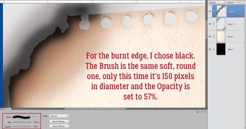
Smoke show time! I used the same process as before, the same Brush but with different settings: 150 pixel diameter and Opacity at 57%. **…** The black Brush goes on its own layer.
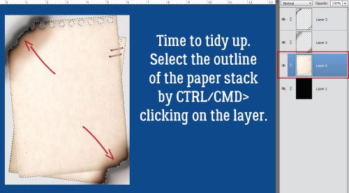
Now to clean up the background. Select the edges of the paper stack. You can click the Select tab and then Select All, or you can CTRL/CMD>click on the paper layer’s thumbnail. That’ll turn on the marching ants.
To make the areas NOT inside the paper the active bit, Select>Inverse or CTRL/CMD>ALT/OPT>I. Don’t forget this step!!

With both the brown and black Brush layers active, to remove the brushed area that spilled over the edge of the page, Edit>Cut or CTRL/CMD>X.

And like magic, all that spillover is gone.

So I adjusted the Brush layers. The brown one drops to 47%.

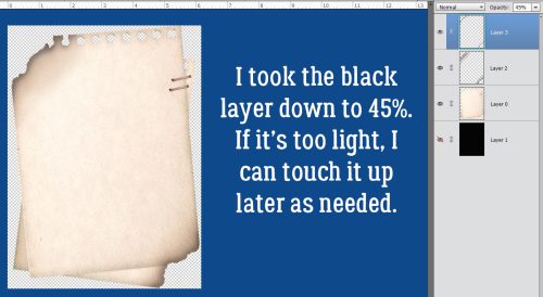
The black Brush layer dropped to 45%. It looks pretty darned good!
As my faithful readers know, I can never just *be done* so I went ahead and used a tiny, soft, round black Brush to add a little more dimension to the spot where the two sheets of paper overlap. It’s a subtle thing, and totally unnecessary, but I did it anyway. I changed the Blend Mode to Multiply so the paper underneath shows through better, and lightened it to 29%. Now I’m happy!


Lyrics credit: Derek George, Lainey Wilson, Lynn Hutton and Monty Criswell.
Now, I have a question for you… As you can see, I’ve changed the Elements background to blue. Is it easier to read the text on the blue, or do you prefer any of the various shades of gray that are options?
![]()
Jan, somewhat consciously I noticed the bright blue background right away. It is easy to read but quite bright. I had to look at a previous tut to determine your gray usage. To be honest, that works for me just as well. So, if you don’t have to change your default settings, use it and make it easier on yourself. If you were doing lots of editing with text in one setting over another, use what makes the least work for you. Let’s see what others say…
This is a very useful tutorial. Not sure it would occur to me to sweep several shades of color to make the blended effect. But once I read about it, it sure seemed logical. I would never thought about needing extra layers to catch “over-sweep” of the brushes. Your knowledge never ceases to amaze me. Thanks.
I love the blue background. It’s really ver clear to me. But what Lorri said, I don’t want you to have to put a lot of effort in it. The other tutorials I could read as well.
I do like the effect of the burned paper! Thank you for sharing. The blue background is a good contrast, but the dark gray you’ve been using is fine with my troubled eyes. I have glaucoma and some vision loss in my right eye.
I always enjoy your tutorials, such clear instruction! Thank you! I like the the blue, but then again, I like blue and I like color!
Fun tutorial. I need to find more time to play with all your tutorial wisdom! The blue background is pretty bright. I believe some shade of gray works fine for me. I agree with make it easy for you.