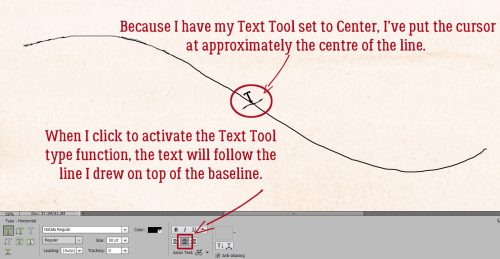
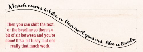
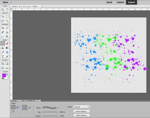
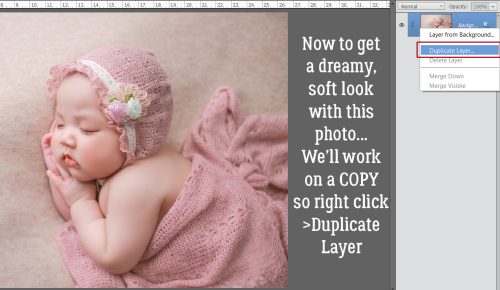
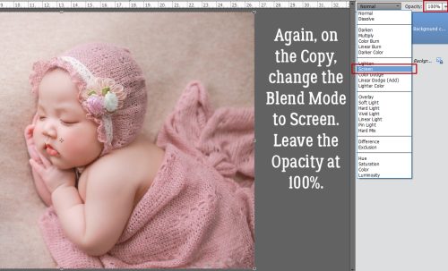
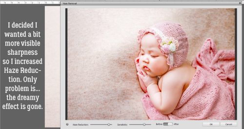
Challenge Spotlight: Word Art
![]()
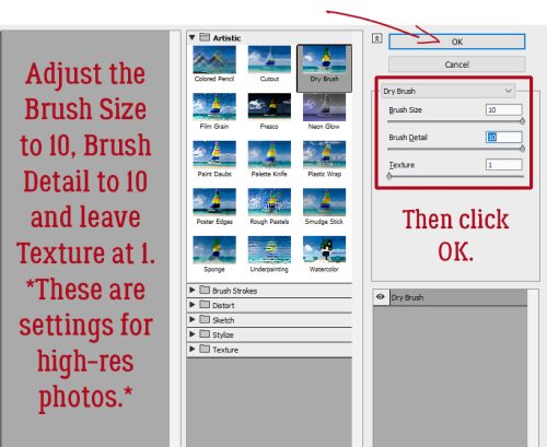
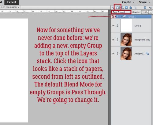
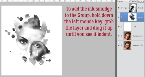
Whew! I wasn’t sure I’d get this tut out to you today. We started the day with an unplanned trip to the dentist – Adam lost a filling that had only been in there a short time and it was RIGHT IN FRONT!! He needs IV sedation for dental work and that adds a ton of time to everything. But in the end, he was awake enough to get him into the car before noon so here I am! I’ve chosen the Word Art Challenge this month; the Challenge is to use the provided word art as inspiration and have it on the page somewhere. The host for this Challenge is Cheré Kaye and this is the word art she created for us. There are so many ways this can be used!

March is a brutal month for choosing a Spotlight Challenge… Scrap-a-Thon being in full swing. The Gallery is overflowing!! So, in a bit of a departure, rather than showing you every layout that has been submitted for March I decided to go with every OTHER layout. Otherwise we’d be here all week. 😉 The layouts are in the order they were uploaded, the GingerScrapper‘s user name is the direct link the the layout in the Gallery so you can get a closer look and leave a comment or two (I hope you’ll also look at the others, they’re awesome!) and I’ll be making my own comments as we go.
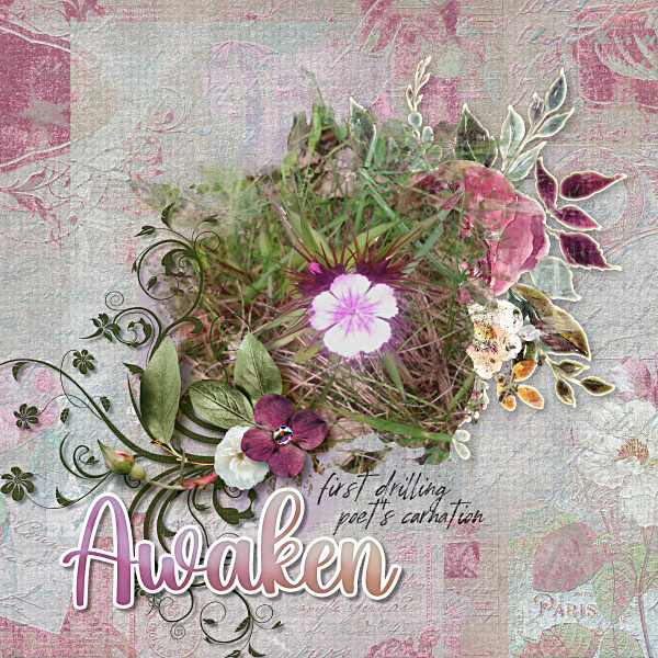
First up is Karen Diamond. She preserved the gradient colour of the word art, using it as her title, and took colour palette cues from it. It’s a little ironic that she chose the humble dandelion as her focus – they seem to “awaken” earlier than a lot of other plants.

This layout from jojores is a true original. The word art title looks a bit muted, but in the original gradient colours. I like the detail she’s added to the upper corners and how she included food-related elements to riff on the book covers in her photos.
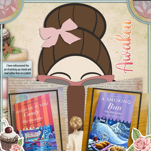
For her layout demma_b13 also used the word art as is, and drew her palette from it. I can almost hear birds singing when I look at her layout, and don’t know how the woman in the photo can sleep through it!

Look at all the white space tillykaye has given us. The simplicity of her layout lets her photo shine. As the others have, she pulled colours from the word art for her palette.

Dhariana has given us more white space with her layout. She’s scaled everything down to draw the eye to the butterfly in her photo. I like the washi tape holding the photo in place. Against the buttery-yellow background the colours in the word art seem a bit brighter.

It’s interesting how the background colour can change the way our eyes see something, as biche57 shows us here. The gradient colours of the word art look more purple. It’s a perfect accent.
Let’s look at photocrazy‘s entry. See?! By putting the word art against a bright yellow background, the colours in the word art pop yellow too! She’s the first one (of this baker’s dozen) to use the wings that Cheré included with the word. The blue provides beautiful contrast.

AHA! AlyciaIN recoloured the word art!! Such a rebel. 😉 In the same way nature changes all the brown to green, she’s given the word art a lovely, shimmery look.

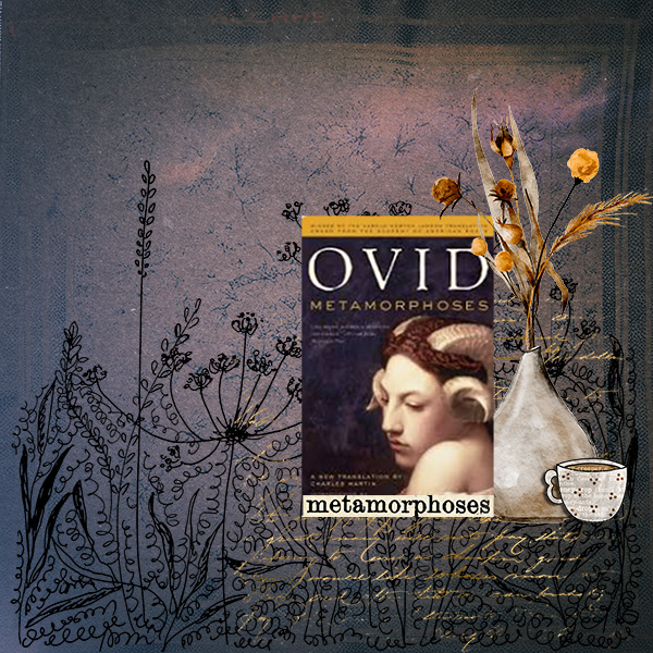
Jill went in a different direction with the “awaken” theme, and it works really well. Her shadows really give the brushes and paintbox realism and dimension. The word art colours appear in the paint splatters to tie it all together.

I like how greenfiend27 created contrast with the teal and blue elements to coordinate with her photo. Using a gradient paper in one of the shades in the word art is next-level thoughtful.

CathyS opted to recolour the word art to pick up the sandy, beachy look of her photos. Good choice!

Windswept has gone Easter-candy with her colour palette. The beautiful pink of her photo demands some drama. Clever girl, she used the same font to build her own addition to the word art, and she eliminated the white border around the words. Pretty!

Lucky 13 belongs to Zanthia. And her layout is stunning! She used the word art as created, pulled colour from it and reinforced the theme with her photos.

We’ve had four days of record-breaking warm days in a row here, and there are already two wildfires in the area. What will it take to awaken people to the climate crisis? I don’t know, but I’m really not looking forward to fire season. Please send rain!
![]()