Tutorial Tuesday (Photoshop Elements)

How Do I Build a Reusable Cluster?

Happy New Year, GingerScrappers! The holidays were quiet at our house, but exhausting anyway. In a few days it’ll be time to put all the decorations away and turn to figuring out what life will look like this year. Sort of depressing, isn’t it? Thankfully we have our digi-scrapping hobby to distract from all that!

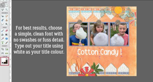
This week’s tutorial was inspired by a question from Rachel M. She wanted to know how to create a cluster that she could save and reuse on other layouts – for themed albums, I’m guessing – with the separate layers preserved. She’d experimented but just couldn’t make it work. So I took over the experimenting and came up with a way to do it. Why keep the layers separated though? So the clusters can be modified a little, of course! To keep them from looking too contrived, to maybe substitute some of the elements, to rotate and manipulate easily while keeping the overall look consistent. Now, I’m going to climb up on the soapbox for a second before we go on… I strongly suggest you create your own unique clusters if you plan to do this. If you’re using a template created by someone else, there’s really no need to save a cluster, right? Because the original creator has already saved it… O-o-okay. Onward and upward.

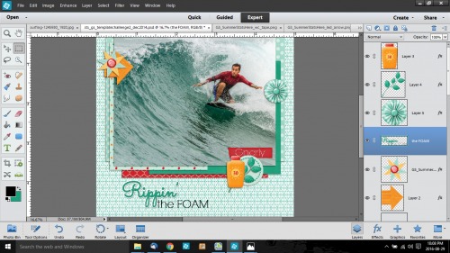
This image is of the cluster I created for Magical Scraps Galore‘s January Surprise Challenge. I used Aimee Harrison‘s Winter Freeze kit (no longer available) and a photo from Pixabay for my layout. The cluster is simple, but has several layers so I figured it would be a good one for demonstrating this technique. The layers are all together in the Layers Panel to make the next step easier. As you might have noticed, I’ve used Shadow Layer Styles rather than custom shadows. I know, how unlike me! But for the cluster to be really reusable, custom shadows would need to be added to individual layers once the layout is completed. The reason for this will become a bit more clear as we work through the tutorial.

I Selected all the element layers by clicking on the top layer of the cluster, holding down the SHIFT key and clicking on the bottom layer. It works the other way too, clicking on the bottom layer, SHIFT>clicking on the top. You do what works for you!

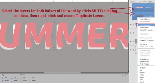
Next, I right-clicked on a random layer. (With them all Selected, what happens to one happens to all.) Then I chose Duplicate Layers from the drop-down menu.

PSE will need you to tell it where you want those Duplicated Layers to go. If you just want to add them to the canvas you’re already working on (named Untitled-1 here), all you need to do is click OK. But for this exercise, I chose New.

PSE will create a whole new canvas and to help keep track of it, I recommend giving it a name. I went the lazy route and just called it Cluster, but if this was a cluster I planned to use over and over again, I’d give it a more descriptive name, maybe with the layout name, the kit name, the theme or a combo of all of them.

The new canvas is the same dimensions as the original one, 12×12. All the individual layers are there, all the Shadow Styles are there. To make it a little less cumbersome, I Cropped it down to a more manageable size, with a little border of white space around it for future tweaking.

Now, the reusing part isn’t quite as straight-forward. If I just drag-and-drop the layered cluster from the Photo Bin onto my layout, it comes up as a single, Merged/Flattened layer. That might be okay, but what if I decide I want to Rotate it? The Shadow Styles aren’t going to adapt to the new position! And that might be okay, unless your eye sees the inconsistency and it drives your OCD crazy. Oops, projecting!

When I Open the cluster while it’s in the Photo Bin, all the layers and Styles are still there. How can I harness that so that I can have my cluster and tweak it too?

Answer? Do the tweaking right there on the layered cluster canvas! Here I’ve used the Rotate command to Flip the cluster Horizontally, then I Filled the word strip with white and oh yeah. I rearranged things a little.

This step can be done before you play with things, rather than after like I’ve done. But the tweakability is there either way. The goal is to be able to use the LAYERED cluster again, so it will need to be Saved As a layered cluster – a Photoshop document, so make sure it’ll preserve the Layers and Color Profile. You could alternatively Save As a TIFF to save some hard drive space. Go with whichever format you’re more comfortable with.

Here I’ve Saved the PSD to the folder for my Challenge layout. If it was going to be used again and again, I might put it into the kit folder so it would be right there to mix and mingle.

Now, how is it reusable once it’s been Saved? As I said, just drag-and-drop isn’t going to work.

I could decide how I want the cluster to be oriented on the layout, adjust all the shadows to sync with the rest of the layout and then drag-and-drop. But that’s a lot of work and might need a bunch of Undo and Redo [CTRL/CMD>X and CTRL/CMD>Y]. Surely there’s a better way… one that’ll keep the layers loose. Just build the layout behind it!

But to do that I’ll need to Image>Resize>Canvas [CTRL/CMD>ALT>C] so there’s room.

I used the default center as my Anchor point but it isn’t essential. What does matter is making the Canvas the size you want your finished layout to be. I work with a transparent background, so I want that preserved too.

Bingo! All the layers are there, I have room to add papers, photos and other elements, and the canvas is the correct size to become a layout!

I just popped a paper behind the cluster layers to show you how it works. I hope this is what Rachel had in mind when she asked her question…

Next Tuesday I’m going to use this same layout as my example. Can you guess what the topic will be?

PDF Version : https://bit.ly/3EVpJRJ


Designer Spotlight: January 2022

Studio Liv

Happy New Year! I hope the dust has settled at your house and you’re getting a little chill time in. I also hope we’ve gotten an upgrade on the last couple of years. We all need a break.

With the new year, GingerScraps has been freshening up and building on past successes. Our community is the our biggest strength and the Designer Lineup is spectacular!! Let’s get acquainted with one of our newest Designers, OliviaStudio Liv. Of course, I started our chat with the most ordinary question…

J: How long have you been designing?

O: I started designing scrapbook supplies in July 2021, and I’ve been designing at GingerScraps since September 2021.

J: Ooh, you’re a real newbie! Welcome, welcome!! What made you decide to design?

O: I studied graphic design in college, and I’d given some thought to opening a shop to sell stickers and stationery. Then I tried making scrapbook kits which led to me joining GingerScraps!

J: I bet you know lots of industry-insider things the average digi-scrapper would  never know. What tools do you use  to create your designs?

O: I design using Adobe Photoshop CC and Illustrator CC. I illustrate elements using Procreate on my iPad Pro.

J: Did I call it? Now we know what you’re designing with, please tell us about your design workplace.

O: Currently I work out of my bedroom. I have a gaming PC with two monitors (a recent addition that I highly recommend). On my desk I keep my planners, iPad, and pens and markers. On the wall, I have a cork board displaying my enamel pin collection, whiteboard, and framed art.

J: So you’re a bit of a hybrid, and you sound very organized. I used to have an enamel pin collection too! But I think it got lost in a move. Here’s a hard question for you. What is your favorite kit currently in your GS store and why?

O: I really love my Very Merry Kit! I am proud of the illustrations I made for this kit.

J: So cute!! Here’s a softball question now. If money was no object, what would your perfect vacation look like?

O: Any location, but something with no agenda! Just deciding what to do as the day arrives, if anything.

J: It’s so much more relaxing to just do what you feel like doing when you feel like doing it, isn’t it? I’d say that’s what a vacation should be. What would you do if you won the lottery?

O: Pay off my college loans, help my family out, buy a home, and donate to charities.

J: Being debt-free would be like a dream, wouldn’t it? If you could have a super power, what would you like it to be?

O: Teleportation! I want to see the world without all the driving and plane rides.

J: YES! I used to wish I could just blink and be home, instead of having to drive across the city in all kinds of weather after a hard ICU shift. Have you ever met anyone who’s famous?

O: I’ve done a couple meet and greets after concerts, including BarlowGirl, Superchic[k], and Andy Mineo.

J: I have to admit, none of those names ring any bells for me. Wait while I Google them… I see they’re Christian rockers. I’m more of a country music fan. But I’ve met Fred Penner. Hahahahaha!! What did you want to be when you were small?

O: When I was a kid I wanted to be a teacher. In high school I wanted to be a photographer. Then in college I decided graphic design was more my thing!

J: Well, let’s make sure you make a living!! Ladies, Olivia has a super-sweet Daily Download for us that you can pick up right here on the Blog. Here’s a sneak peek:

And because she’s generous to a fault, she’s also giving everybody 25% off everything in her store this month!! She’s hosting the Designer Spotlight Challenge, and because she’s new, here’s some help for your chance to play along.

Check out her designs – I linked her store up there at the top of the post – and get her Spotlight month off to a roaring start!


Tutorial Tuesday – on Hiatus!

Hey ladies! I’m is taking a break today – the last week has really kicked my butt – but I’ll be back with a brand-new tutorial for you next year. (Of course, that’s only next week so don’t worry! I promise it’ll be worth the wait.) Stay warm, stay safe, stay healthy. Happy New Year!

Tutorial Tuesday (Individual Style)

Challenge Spotlight: Miss Fish Memory Mix Up Challenge

Here’s the fourth installment of Challenge Spotlight. This month we’re going to dive into Miss Fish’s Memory Mix It Challenge. Every month, Juli (aka Miss Fish) presents us with a different Challenge focusing on preserving our memories. For December, she said, “This month’s challenge is a Recipe Challenge. No, not the kind where I give you different “ingredients” to put on your page. The kind where you scrap your favorite recipe. It can be one for the holidays, a family hand me down recipe or a new favorite. Your choice!” I thought it was the perfect topic for this month and also for this Blog post! I’m going to share a baker’s dozen (plus one – see what I did there? 🙂 ) of YOUR recipe layouts. Some of them sound pretty tasty! [Each layout is hyperlinked to its location in the Gallery in case you’d like a closer look or to leave some love.] Let’s have a look at how this Challenge shakes out!

First up, gmae shares her taco seasoning with us. It’s pretty similar to the one I make, and her “recipe card” is packed with taco-related embellishments.

I LOVE this one from jam-on-toast! The colour palette is so wintery, and that photo makes my mouth water. The tag tucked behind the recipe is telling the truth. And can we talk about the way she created her title – it looks like meringue!!

What caught my attention with curio‘s recipe is the rustic look it has. It’s a brilliant choice for a cobbler recipe, right? But that photo… yummmmmmmmmm!

How amazing is it that linweb has this recipe in her mother’s handwriting? (With one small addition. 😉 ) She has a lovely memory of the first time she made the pie and has embellished her layout with some pecans.

I think most of us have made sugar cookies as children or with children at least once. chigirl has photos to prove it for her family. The kit she chose for this layout is particularly appropriate, and let’s talk for a second about using a striped paper border to pick up on the striped sweater!

Everybody has their own favourite hot chocolate recipe (and some of us make it from a tin) but how many of us has a beautiful winter layout with ours printed on it? I’ll have to try hichchei‘s method one of these days.

CathyS has cleverly provided us with a bakery-worthy recipe for chocolate chip cookies. I love how she’s surrounded her photo with all those baking-related elements.

This one is a historical recipe dating back to 1914! The original pecan pie wasn’t the syrupy custard packed with nuts that we know today, and it had meringue. The way fontaine presents the recipe has a heritage look to it.

<record scratch> Time to move away from the sugar for a second. Daydreamer‘s recipe is a savoury one, set in eye-catching yellow.

Okay, back to sweet! Flighty-188 makes her own animal cookies using a 60+ year-old recipe from her mother-in-law. I love how she found a baking-themed kit to match the cookie colours.

Pups-r-Paps has a savoury recipe for some luscious lemon chicken; it sounds similar to a scampi recipe I’ve made and loved. She kept her layout simple so the photos could be the focus.

Family traditions are what connect us to both the past and the future. Reading alexandergirl68‘s journaling brings that message home pretty clearly! On special occasions when I was a child my mom used to make lime Jell-o salad with apples and celery in it. None of us liked it and it eventually faded into memory to be replaced by peanut brittle, of all things! I found a fool-proof microwave recipe and became the maker-of-peanut-brittle-for-all. I could make it in my sleep.

What could be more “holidays” than snickerdoodles? This is basketladyaudrey‘s version. I notice she doesn’t put nutmeg in them, so I might have to try them! [But I’d halve the recipe, since I should NOT eat 8 dozen cookies before they go stale…]

And lastly, Pixel Palette brings us a recipe for lemon cookies that sound am-AZING!

The Studio Recipe Card II template

I didn’t have lunch and now I’m STARVING!! What family favourite recipe do you know off by heart? Which of these will find their way into your collection?

PDF Version : https://bit.ly/3EVLYXL


Tutorial Tuesday (Photoshop Elements)

DIY Worn Wood

Last week I asked for some tutorial suggestions and you came through for me. There are some interesting topics coming up, ladies! This week, I went for a quick trick, since I’m super-busy with other things right now. (I bet I’m not the only one, either!!)

Before we get going, I want to thank Lee for the idea of creating custom worn wood papers. I played around and was shocked at how easy it can be. A few tips though… 1. Choose your woodgrain paper carefully. It should have some visible texture and its underlying colour family should work well with the paper you want to rough up. 2. Choose your second paper carefully too. It’ll look best when it’s got a highly-contrasting pattern or when it’s a solid. Some of my examples will show you why. 3. Practice using Undo! (CTRL/CMD>Z) If you pay attention to where the marching ants are you shouldn’t need it a lot, but there will be times when you just have to back up. Let’s get started!

This wood paper came from the GingerBread Ladies‘ collab Pizza Party. I recoloured it because the original is really yellow and it looked AWFUL with the buffalo check paper on it. But it has some good texture and the planks are well-defined. The buffalo check paper is from GingerBread LadiesCrafty Christmas.

So go ahead and drop the patterned paper on top of the wood paper. The following steps may not ALL be required, so take a good look at the result after each Cut stage to see if you’re satisfied with the outcome and stop when you are!

You want the patterned paper on top of the stack, but you don’t want to see it for this part. So turn Visibility off. Make sure the active layer is the wood paper layer. Then click on the Magic Wand Tool. Select the mode that looks like a sparkler. The default for this tool is New Selection, but if you’ve used the tool recently, it may be on the last setting you used, so make sure you’ve got New Selection on. Set the Tolerance slider to 75 and only tick the Anti-Aliasing box.

On the wood paper, click your Magic Wand on an area where there’s visible texture. The marching ants will appear.

Click on the Refine Edge button and when this menu appears, choose these settings: Edge Detection to Smart Radius, Shift Edge to 25% and Output to Selection.

Now turn the patterned paper layer back on and make it the active layer.

To rough up the red paper, Edit>Cut or CTRL/CMD>X will remove the red paper where the marching ants are.

I found that there was still too much red paper visible, so I went back to the first step, turned the red paper off and activated the wood paper layer again. With the Magic Wand Tool, I chose Subtract and set the Tolerance to 50. Then I clicked the Wand on one of the gaps between the planks.

This time, in the Refine Edge menu, I unticked the Smart Radius then adjusted the Contrast slider and the Shift Edge slider to 25%. Output to Selection.

Then I repeated the Edit>Cut (CTRL/CMD>X) step.

I still wasn’t happy. In this situation there’s no substitute for trial and error, so I went back to the Magic Wand Tool, Subtract, Tolerance 100. This time I see a lot of marching ants, so it might be the ticket.

But I still decided to Refine Edge with these settings: Contrast 5%, Shift Edge -20% and Output to Selection.

And then I Cut the selection away from the patterned paper again.

It isn’t all I’d been hoping for, although it is very rustic-looking.

Because I’m always trying to “get it right” I thought I’d see what happened if I played with the Eraser Tool to enhance the worn look. I tried a LOT of brushes before I found one that worked the way I wanted it to. I used a (PSE default) Dry Media Brush, the one inside the box (sorry for the cell phone photo but it was the only way I could capture the menu).

Then I randomly followed the contours of the exposed wooden areas to tidy it up a bit. I do think it looks a bit more worn.

But did I really need to do that Eraser step? I tried a few more papers to see if just the Magic Wand steps would be good enough. Interestingly, I got different results each time. For this example and the next I’ve used papers from GingerBread LadiesA Holiday in the Baking.

This sample gave me a headache. It just wouldn’t cooperate! I had to CTRL/CMD>Z so many times!!

In one of my OOPS moments, I forgot to switch between patterned paper and wood when I used the Magic Wand, and had this happy accident when I used the Wand on the patterned paper instead.

I changed up the wooden paper for this one from GingerBread LadiesSweater Weather. It has some roughed-up paint on it and oodles of texture.

It looks really insipid, but I think with a brighter paper it could be amazing!

Let’s see what happens when I use a plaid paper from Sweater Weather.

Or… If I Invert the selection? Magic Wand>[click on the rough part]>Select>Inverse (CTRL/CMD>SHIFT>I)>[activate patterned paper]>Edit>Cut (CTRL/CMD>X) and I’m in love!!

Who knew it could be so easy to get such interesting results?

Next Tuesday is the third Tuesday of December so I’ll be dissecting one of the monthly Challenges. It’ll be a little light reading just a few days before Christmas. Stay tuned!

[PS… remember, the coloured bold text contains embedded links that will take you right to the shop!]

PDF Version: https://bit.ly/33vL9rE

Tutorial Tuesday (Photoshop Elements)

Clearly Complete – Adding Some Background

Whew… we’re in the 2021 home stretch now! Twenty-three more days and it’ll be over. This last week has been a whirlwind for me! Last Tuesday my daughter and I spent 5 hours – the first 90 minutes in torrential rain! – in a car so we could spend 3 hours with my parents on the day before their 65th anniversary. On the first we set a temperature record, 63°F. Now we have 6 inches of snow! And later today I see the ophthalmologist to find out when he can remove my cataracts. [I thought the dramatic changes in my vision were related to having had COVID in the spring. Surprise!] It’s a good thing I already had a lot of the work done for this tutorial! Today I’m going to show how I added some “wallpaper” in the background behind my glass mixing bowl and made it look realistic-ish. We’ll pick up right where we ended last week.

It was a challenge to find the right paper for this part. I tried a few and didn’t like the results, so let me offer some tips on selecting. Pick a paper with some pattern, but not too small or large. Choose something with colour, but not too light or dark. Texture is good, but only to a point. I think I might try to fake some subway tiles later and see how that goes… The paper I liked best was from ADB DesignsAntiques Emporium. It kind of reminds me of my grandmother’s kitchen. The way I imagine it, not how it really was – she had no running water! As you can see, the paper is behind everything except the original bowl layer.

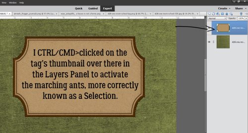
I was really glad I hadn’t Deleted the original bowl layer when I started figuring out how to make this work, because it DOESN’T work using the glass version of the bowl at all. With the paper layer active, I Selected the edges of the bowl by CTRL/CMD>clicking on the Layer Thumbnail (that little picture of the bowl in the Layers Panel).

Light changes as it passes through glass. This step adds that effect. Enhance>Adjust Lighting>Brightness/Contrast.

When the Tool Options menu opens, adjust the Brightness by INcreasing it to 15, and DEcrease the Contrast to -5.

Now, it could be my eyes, but when I was looking at real curved glass with a pattern behind it as I figured this out, the glass created a slight blur on the paper. So Filter>Blur>Gaussian Blur. But just a little bit, 1.7 pixels‘ worth. Keep the edges of the original bowl Selected until I tell you to Deselect it!

It looks okay, but there are still a few things it needs. I added a new blank Layer immediately above the paper. Click on the sheet-of-paper icon to the upper left of the Layers Panel.

Next, I Filled the outline of the bowl on that blank Layer with black using the Paint Bucket tool. Looks awful, but it’ll be great! Now you can Select>Deselect the original bowl outline (CTRL/CMD>D).

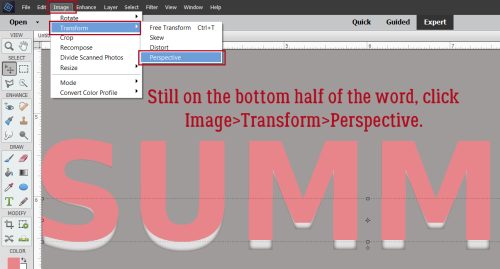
Don’t worry about that black, and don’t be intimidated by this step either. It’s going to work beautifully, I promise! The black is going to become a shadow, and bowls cast very complex shadows. To make it work, Image>Transform>Distort.

The best thing about Distort is that you can adjust the image in a single dimension, or multiple dimensions, depending on what your goal is. I know the light is coming from the top right part of the bowl because of where that big shiny spot is. For the shadow effect I arrived at through lots of trial-and-error, discarded screenshots and Undos, what worked best was just to pull the lower left “handle” straight out as shown. The image comes out from behind the bowl. I clicked the checkmark.

Then I Rotated the black image to the left, keeping the corners of the bowl and shadow layers aligned. And yes, it looks like it’s just a mess.

But not for long! Remember, the outline of the original bowl is still Selected. So now I’m going to Cut out the black that sits inside the outline. Edit>Cut or CTRL/CMD>X.

That wedge of black has to go too. I used the Rectangle Marquee tool to draw a box around it.


And again, Edit>Cut (CTRL/CMD>X).

Now to soften it up. Clear glass will never cast a harsh shadow. Ever. Filter>Blur>Gaussian Blur.

This shadow needs a LOT of softening, so I pushed the Blur all the way to 24.9 pixels. See how it spreads behind the glass a bit? Exactly what I wanted to see.

I know I’ve mentioned why I change the Blend Mode on my shadows to Linear Burn, but I think it bears repeating. The Normal Blend Mode remains opaque and doesn’t allow any of the colour under it to show through. Linear Burn will let both the colour and the texture be visible.

Last step for this shadow is to decrease the Opacity down to about 18%. It’s subtle, but quite nice!

All that’s left is to add a smidge of shadow behind the “dough”. Remember the steps for custom shadows?

1- Select the edges of the object by CTRL/CMD>Clicking on the object’s Layer Thumbnail.

2- Add a blank layer underneath the object. CTRL/CMD>Click the sheet-of-paper icon if you have the object’s layer active.

3- Fill the Selection from Step 1 on the new blank layer with your shadow colour using the Paint Bucket Tool.

4- Select>Deselect (CTRL/CMD>D) the object’s outline and nudge the filled layer so that the light source conforms to the rest of the layout.

5- Smudge the shadow layer to change the contours a bit, making the shadow look more natural. This is based on how the light would penetrate to the background. Thick, flat things will be more snugly connected to the background and the shadows here will be sharper and closer. Thin, curved things might be farther away from whatever is behind them and the shadow would be less distinct.

6- Filter>Blur>Gaussian Blur the shadow layer to the degree the object will block passage of the light.

7- Change the Blend Mode to Linear Burn.

8- Decrease the Opacity of the shadow layer until it looks “right” and you’re done!

I really enjoy trying to make two-dimensional images look real, and think it’s worth the effort. My next attempt might be a snow globe. If you choose to give this a try, don’t feel like you have to use exactly the same settings and what-have-you that I’ve used. Play a little so that when you’re finished, it looks good to YOU! Because you’re the only one who gets to have an opinion.

Anybody have a great idea for next week’s topic? Drop a comment below and I’ll see what I can do.

PDF Version: https://bit.ly/3pYuqon

Designer Spotlight: December 2021

Wimpychompers!

Well, here we are at the end of another year. December is probably the busiest month of the whole year for most of us, given there are so many festive occasions on the calendar. I hope you have a few minutes to get to know Christina, who’s nom-de-plume is Wimpychompers. [I wish I would have thought to ask her how she came to choose it! Missed opportunity.] Let’s just dive in!

J: This is probably the one question people are really curious about. What led to you deciding to become  designer?

C: I had started getting interested in digital signatures and started designing those and writing tutorials.  I finally made the switch to digital scrapbooking for my own personal use (it was easier to clean up with little ones).  I loved it and finally became a designer.

J: I think that’s the main reason most of us have been drawn to digital scrapping – the lack of mess! Can you tell us a little about where you do your creating?

C: My couch in the family room with a tv and a laptop desk.  It’s super comfy!

J: Right?! I work in an IKEA wing chair in my living room with the TV on too. I always feel like this question is like asking you which of your kids is your favourite… which of your current kits in the GingerScraps store is your favourite?

C: Just You and Me I think, it’s just sweet and all about love.

J: CUTE!!! Kids on mo-peds, how creative!! This might be a little harder to answer. If time travel was possible, would you go back in time, or into the future?

C: Back for sure, my kids are all teens and I would love to go back and hold them as little babies once again.

J: Omigosh, yes! That would be so wonderful. Mine are all well into adulthood, but I remember when they weren’t. If you could only eat one meal for the rest of your life, what would it be?

C: Swedish Meatballs, our family recipe is a favorite.

J: Hmm. I might have predicted that… being part Swedish myself. But then I don’t know anything about that branch of my family – my great-grandmother is a bit of an enigma, and if time travel was a thing, I’d go back and ask her to tell me all about them! Is there a super power you wish you had?

C: Flight, it would be cheaper to travel.

J: And so much easier! No airports, passports, security pat-downs, middle seats, delays, customs. Yes, please! Although I did meet someone famous on a flight, a country music songwriter who brought his guitar on as his carry-on. Can you play a musical instrument?

C: Yes, I can play the flute!

J: I love the sound of a flute and have an old school friend who plays. Did you want to be a musician when you were small, or something else?

C: I saw myself as a ballerina, a teacher or a children’s book author.

J: Oh, that makes sense! All the little people in your designs… you could have illustrated children’s books too. Now, aside from necessities, what is the one thing you couldn’t get through the day without?

C: My mascara, without it my eyelashes are blond and I look very tired!

J: I wish mascara was all I needed to conceal how tired I look. Last question: If you came with a warning label, what would it say?

C: Warning, tired of people’s crap!  (lol)

J: Have you been stalking my Twitter feed? We could be friends!! Christina, thanks for chatting with me; I know how crazy life is for everybody right now. I hope the rest of December is kind to you.

Tutorial Tuesday (Photoshop Elements)

Can I Make Something Crystal Clear? (As Glass)

Omigosh. November is over at midnight! For me, December will be even busier than November – and Canada doesn’t have Thanksgiving in November! – has been, and I wouldn’t have thought that possible. But here we are…

Last week I signed off with a promise to show you something really cool, and I hope you’ll be suitably impressed. It all started with a message from Carol (gnana96): “Hi Jan, I have another tutorial suggestion for you. Several years ago I started scrapping family recipes for my kids and adult grandchildren. The first year they got an album and several recipes and every year I give them 7 to 10 more to add to their collection.
This year one of the templates I used was from The Cherry On Top What’s Cookin, template 1. The template has a mixer and a bowl which I thought would be so cute for my 7 minute frosting. The bowl on the template is white and I thought it would be cute to make it a glass bowl so I applied one of Karen Schulz (Snickerdoodle) glass styles to the bowl and my sister Ellen and I both decided that it just didn’t look right so I ended up attaching a patterned paper to the bowl. (The layout was for the bingo challenge and I posted it as # 13)
I’m not sure if I chose the wrong glass style or if my idea itself was flawed. I know Ellen has tried to apply glass styles to something besides a bowl and she didn’t think it worked either so I am hoping you can help us out.
How do we decide which style to apply and what needs to be done to make it look right. How do we make a glass bowl look like a glass bowl and not like a glossy part of the wall.
Thanks
Carol

Well, didn’t I have to right away start playing with those glass styles (after I ran to the store and bought them – how did I not have them in my stash??). Today’s tutorial will look at making a solid opaque object transparent and three-dimensional, and next week I’ll show you how to create a realistic look against some “wallpaper”. [<whispers> I had some issues with Elements and had to reset all my preferences, then it was still giving me a hard time. That’s why the text is a little wonky on the screenshots.] Let’s go!

I started out with this bowl from WimpychompersBaking Traditions (retired). She has a mixer in the kit too, with a metal bowl; I opted to use this one but the technique will absolutely work on pretty much anything. The only alteration I made to the bowl was to make it taller.

For this technique to work it goes best on a Copy of the object, so right-click>Duplicate Layer>OK or CTRL/CMD>J gets that done.

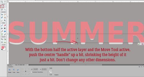
I have several clear glass bowls and the upper edges of them are all thicker than the rest of the bowl, so I decided to make my digital glass bowl the same. I’m going to give that top band a bit more heft later. For right now, I activated the Rectangle Marquee Tool.

Working with the Copy layer, Select the top band using the Rectangle Marquee Tool as shown.

Now we want to make a Copy of JUST THE BAND. To do that you can click Edit>Copy or CTRL/CMD>C.

The band needs a layer of its own, so add a blank layer above the two bowl layers by clicking on the sheet of paper icon.

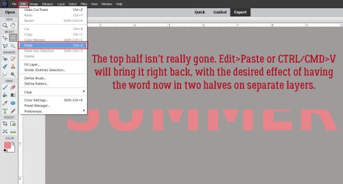
Now Paste the Copy of the band onto that new layer: Edit>Paste or CTRL/CMD>V.

For right now, let’s turn the Visibility for the band off. It won’t go anywhere.

I was steam-rollering through the technique when it occurred to me that I probably haven’t covered how to load Styles. How remiss of me!! If you’re not a pro at loading Styles, follow along. First, make sure you know where the .ASL file containing the Styles lives on your computer. Click on the Styles button at the bottom right of the Layers Panel. It looks like a deck of cards. When the Styles menu opens, click on the icon that looks like a stack of paper, at the top right of the Layers Panel, up there underneath the Share button. That opens the settings menu for the Styles tool. Click on Load Styles. Then when the pop-up opens, find your .ASL file in your folders and double-click on it. There! The Styles will show up in the dropdown menu now. I rename all my .ASL files for easier recognition, so on my list the glass Styles come up as Glass Karen Schulz. (I’ve linked to the store so you can find them quickly!)

Karen hasn’t used a descriptive name for the Styles, just numbers. The one you want to use is the one I’ve outlined.

In this screenshot, both bowl layers are Visible. Can you see the rounded Bevel and the shine?

Here I’ve turned the original bowl and top band layers’ Visibility off. All that’s left is the shiny clear glass! But it doesn’t look much like a bowl. So let’s play with the settings! Double-click on the fx icon for the bowl’s Copy layer where the Style has been applied. You’ll see this pop-up menu with the default settings for this Style.

It took me some fiddling to get this right. Don’t be afraid to experiment! I increased the Opacity for the Inner Glow to 75% and the Bevel all the way to 250 pixels. Now it looks round!

Next, let’s apply a different Style to the band layer.

Now, we’ll tweak the fx as before, with these settings.

With the Visibility for all layers turned on, this is how the bowl would look as a glossy ceramic. The original bowl layer isn’t needed any more for the technique, but I’m not going to Delete it yet.

Let’s put some cookie dough in the bowl! I turned the bowl Copy layer and band off for this part, leaving just the original bowl visible. This cloud from Lindsay Jane‘s Sunny Days Ahead (retired) looks a bit like dough if you squint. But how can I make it fit into the bowl?

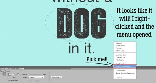
Make sure the cloud is completely covering the bottom of the bowl. Select the edges of the bowl by CTRL/CMD>clicking on the bowl’s layer thumbnail (the little picture in the Layers Panel) with the cloud layer active.

Now it’s time to Invert the Selection by clicking Select>Inverse or CTRL/CMD>SHIFT>I.

To remove the bits of the cloud hanging over the edges of the bowl, Edit>Cut or CTRL/CMD>X and it’ll disappear.

I nudged the “dough” up a bit to create the illusion of glass walls. You’ll see what I’m talking about in a minute. But before we get there, I want to make my “dough” look like it was made with butter and not shortening, so I’ll need to make a Copy of the “dough” layer. Right-click>Duplicate Layer>OK or CTRL/CMD>J.

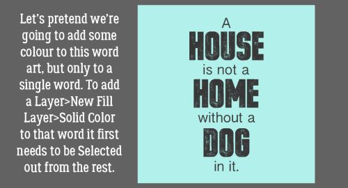
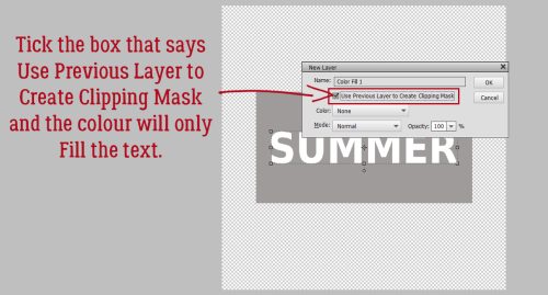
I really tried to change the colour on this “dough” using the quick-and-easy Paint Bucket, but it looked HORRIBLE. So instead, let’s add a Layer>New Fill Layer>Solid Color.

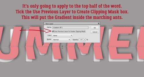
Check that box Use Previous Layer to Create Clipping Mask.

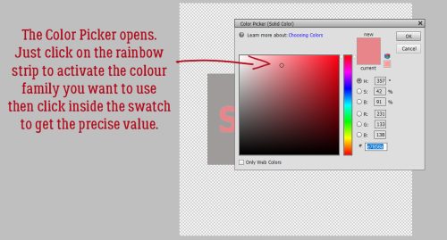
Then pick a colour that looks like “dough”. Or whatever colour you like!

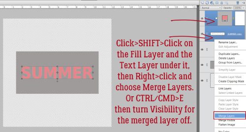
Next, Merge the Fill Layer with the Copy cloud layer.

To preserve the lumpiness of the “dough” change the Blend Mode to Linear Burn.

Et voilà! Cookie dough in a glass mixing bowl!!

Carol, I hope this is what you were expecting. Happy birthday!

PDF VERSION : https://bit.ly/3FXy1cw

Tutorial Tuesday (Individual Style)

November Challenge Spotlight: Template Challenge

Is the timing for our Challenge Spotlight perfect this month, or what? This week nobody has to try following Jan’s twisted and tangled directions! Because who’s got time for that right now? This month I’m shining a light on one of my faves, the Template Challenge. I LOVE templates… and for those who think they stifle creativity… well that’s simply not true. Templates enhance creativity! I look at them as a foundation, not something to follow slavishly; the template designer takes some of the guesswork out of layout creation, but leaves the scrapper in the driver’s seat. Sure, if you love a template exactly as you see it, you can faithfully duplicate the designer’s vision to create a beautiful layout. But if you’re like me, you see a template as more of a springboard; I often flip or rotate my templates, resize or reposition photo spots, add, subtract or substitute elements and make my layout uniquely mine. Let’s look at some examples of what can be done with a single template and how amazing the results are.

Before I forget, I’d like to welcome Dagi back to the family. Dagi has been designing templates for many years; her nom-de-plume was originally Dagi’s TEMPtations, then more recently Dagilicious. She’s taken a couple of sabbaticals from designing when life has required, and now she’s back again with lots of fresh looks. She has provided the November challenge template (did I forget to mention they’re FREE every month?) and it’s fantastic! Here’s a peek, in case you haven’t seen it.

Her Creative Team member Karen took the template and created this layout with it. As you can see, Karen kept her layout true to the template, and it’s gorgeous.

Now on to the Gallery! [PS… Each Challenge has its own Gallery. You can find the Template Challenge Gallery here. Each layout is also linked: click on the scrapper’s username!] First up is a cute layout by Yvonne55. She stayed pretty faithful to the template, but has blended some papers, added a stitched border, substituted some string for wordstrips, stitched down the journal card and added that little clothespin to anchor her single wordstrip.

I’m going to guess that Cinna doesn’t like bows… she’s substituted wings for one and some brass elements for the other. She tossed in some sequins, some scribbles and extra paint, but the bones of the template are easily identified.

KatherineWoodin is a storyteller. Her layouts are daily diary entries and she does a beautiful job of enhancing those stories with her choices. Here, she’s rotated the template 90° to the left. The large photo spot became her notepaper and the journal card is replaced with a photo. She added some scattered flowers and butterflies too. And check out that cool font for her title!

I admire people who can capture good photos of birds. granny5pics subbed a tag for the journal card, some fine curly ribbon for one of the bows and some wooden bird cutouts for wordstrips. She added some twigs behind the paper/photo stack.

Look at this little cutey! Got2Scrap has added a photo in the upper right, a grungy brush behind all the paper and photos, eliminated the wordstrips and perched a cowboy hat on the photo stack. The template is recognizable, but not in a cookie-cutter way.

This layout from Glee is a significant departure, but the bones are still there. She eliminated the paint splatters, going with a patterned paper instead. Her focal photo is long and skinny, and she’s filled the space with doodles. Then she tied the ribbon cluster to the photo/paper stack with a hot air balloon. She’s used word art rather than wordstrips. Very cool!

When I look at Jill‘s layout, the template influence isn’t really obvious, but the more I look at it the better I can see it. She’s made the photo spot smaller and framed it in black rather than white. She moved one of the large clusters to the opposite corner and tucked it underneath. She deleted the journal card, filling it instead with paper. Her stitched border and the addition of a pair of buttons to it is a deft touch. And what can I say about the rubber ducky?

There are SO MANY creative tweaks to the template in cinderella‘s layout. She’s turned the photo spot into a cut-out and has that amazing extracted photo popping up from inside it. The elements in her clusters are positioned with the template’s placement as a guide, but she has a very different look with the die-cuts. Tucking some strong into the background and scattering some beads rounds out a interesting and eye-catching layout.

At the most basic, makeyesup‘s layout has the look of the template, but not. I know that’s not really sensible, but she’s made a lot of choices that really sets her layout apart. Her dark background and muted colours are visually pleasing. Rather than use a journal card, she’s created a dialog box to describe her photo. The primitive bird atop the paper immediately made me think of “plain” folks, like the ones who settled Salem more than three centuries ago.

Derby Wharf

Now, where have I seen that background paper before? Oh yes… in the first layout I showed you. And the template’s form is quite apparent. But the layouts couldn’t be more different! greenfiend127 replaced the journal card with a circular tag and it works beautifully. She replicated the stitched border on each of her papers and her photo, giving the layout such an organic look. Exchanging the zigzag paper strip borders for a narrower papercut border is another way she’s made the template her own.

I hope you’ll find some inspiration in these layouts and begin to see templates with a new perspective. If you see the Challenge layout I’m going to post later, see if you can identify the changes I’ve made. What are some ways you can bring your unique style to a template? Give it a whirl!

Next week I hope to have something really different to show you. If my experimentation works the way I think it will… Meanwhile, Happy Thanksgiving to all of you in the USA. While y’all are watching football, I’ll be binge-watching Yellowstone. See you soon!

PDF Version : https://bit.ly/3IbAXo7

Tutorial Tuesday (Potpourri)

Holiday Memories Start with Photos – a Review

It seems like we’ve all been through so much the last couple of years. Last Thanksgiving in the United States, with the COVID-19 pandemic raging, a lot of families opted to cancel their usual big gatherings to protect each other from the virus. Others went ahead with their traditions, then wished they hadn’t. Then there were the lucky ones with the best of both worlds. Quite a few things have changed for this year, access to a safe, effective vaccine being a big one. So maybe this year, traditions can be upheld without as much angst, although modifications might still be needed. Our layouts have gradually shifted to more hopeful thoughts, and the pandemic has been interwoven as a part of life as we know it. This run-up to Christmas and then the New Year may take a bit more planning than before, and planning how we’re going to memorialize our celebrations should be a priority too. We’ve played with a lot of techniques for editing our photos to make them worthy of scrapping, but why not skip a step (or ten)? Let’s review some tips for taking better photos. I know we’ve already talked about that before, but a few reminders probably won’t go amiss. Whether your photos are caught with a point-and-shoot, a high-end DSLR or a cell phone, there are some things you can do to get great photos.

  • Right now, right this minute, make sure your camera battery is fully charged. If they’re replaceable batteries, put fresh ones in your camera NOW!
  • Make sure you have an empty memory card (fully formatted, of course!) in your camera and a couple of spares so you won’t run out of space. If you’re using your phone, you should move some photos from your internal storage to your computer so you’ll have room for the new ones.
  • Think about how your typical holiday events usually evolve. There will be some traditions that are carried out no matter whose house you’re having the celebrations at, so plan ahead to capture those moments. Make a list, if you need to.
  • If you haven’t done it lately, review the manual that came with your camera. Review the settings and modes you’re most likely to use for your shots and remind yourself what each is doing while you’re shooting. I use the metadata from my most successful bokeh and full moon shots to set my camera up ahead of time so I don’t miss the shot.
  • Practice a few creative techniques that you can memorize so that when you’re ready to take photos of the candles on your dinner table or that gloriously brown turkey, you won’t have to fumble.
  • Refamiliarize yourself with your tripod, if you use one. I have two – an aluminum ball-head one that allows infinite adjustments but takes a lot of room and needs to be set up ahead of time and a Platypod Max, which looks like a little travel iron but is actually a very clever and sturdy tripod that can be set up in minutes on any surface. Why use a tripod? It lets you take longer exposures while keeping the images tack-sharp and it lets you be in the photo! Use the built-in timer and get in FRONT of the lens for a change.
  • Keep an eye on the lighting. Natural light from a big window is fantastic, as long as it’s not backlighting your subject. This is especially important for those group shots we all love. You want everyone’s face to be evenly lit, without harsh shadows everywhere. So maybe turn on some lamps so your flash won’t be so startling. Shoot a couple of test shots so you can see what needs to be tweaked.
  • Get in close to your subject! This “rule is even more valuable when that subject is a child. Get down on their level whenever possible so you capture their best smiles. Shooting from above should be reserved for those special-effect shots, not photos of kids having fun. For the most natural photos of people though, you can use a telephoto lens and shoot them from some distance. (As long as the light is right!) Some of the most memorable photos are those taken when the subject is unaware they’re being snapped. They’re relaxed, and acting naturally; smiles are genuine and emotion is often quite palpable.
  • Don’t insist on smiles. You know what I mean… those cheesy grins aren’t going to be your favourite images. Rather than having everybody say “cheese” for your group shots, have them say “family” or “money” or “gotcha”. You could go with a made-up phrase, such as “moldy mozzarella”. Another trick is to tell everyone you’re going to shoot on “3”, then count, “1… 2… (shoot) WHOOPS 3!” then shoot a second shot right after that. You’ll get some natural smiles that way.
  • When taking photos of food, again, get in close and vary the angles. Show the flaky texture of that piecrust, the glisten of the done-to-perfection skin on your turkey, the creaminess of your mashed potatoes, the detail of the frosting on your cupcakes. (That reminds me, I need to get some baking done!)
  • Do you take photos of your Christmas decor? If you’re getting harsh shadows and lots of glare, you can drastically reduce the odds of that occurring by using a big sheet of white cardboard as a reflector. (Dollar store foam core board is perfect for this.) It’ll bounce and soften the light in your space to produce much more even lighting and much more interesting images. Hold it at an angle to the source of your light (windows, lamps, even your flash) so the light is reflected at an angle too. If you’re using a flash and find it too harsh, you can wrap a tissue around it or in front of it and diffuse the light that way. Here’s where test shots are really time-savers.
  • Composition is key for any photo. Remember the rule of thirds, but don’t be a slave to it. Decide what your focal point will be and compose your photo to make it so – use leading lines where possible and don’t forget white space. Crop your photos in the viewfinder – so much less work later! And don’t forget the background. Is there anything growing out of someone’s head? Take a step to one side or the other and recompose.
  • Take LOTS of photos. Take several of each subject from different angles and distances so you have a choice of which one is best. More is definitely better!
  • This just popped into my head… Instead of an Ugly Christmas Sweater event, maybe this year you could do Ugly Christmas Masks. We’re still masking indoors in public here, with a government mandate. It’s such a small thing, but with such great potential for safer interactions.
  • We should take a moment to talk about safety. If you’re taking photos of weather phenomena (like the “atmospheric river” that just devastated the Pacific Northwest), landscapes or nature, do it safely!! People have died trying to take that one spectacular photo. I don’t want it to be you!
  • Last but not least, have FUN!

Next week I’ll be compiling a Challenge Spotlight post. Maybe one of your layouts will find its way onto the GingerScraps Blog.

PDF Version : https://bit.ly/3FXyoDW