Realistic Book Looks
![]()
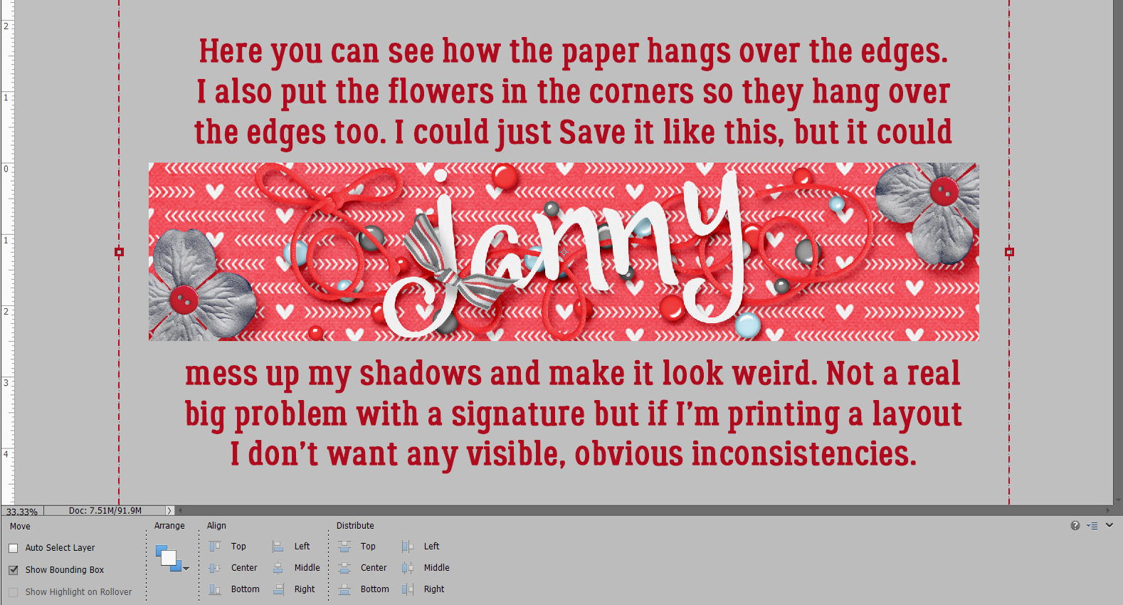
If you’ve been waiting for today’s tutorial all day and were wondering if it would ever appear, I have an excuse… a MILLION interruptions! But fortunately it’s a short snapper this week, so I’m hoping it doesn’t break too late. Let’s get after it!
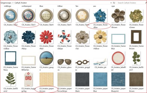
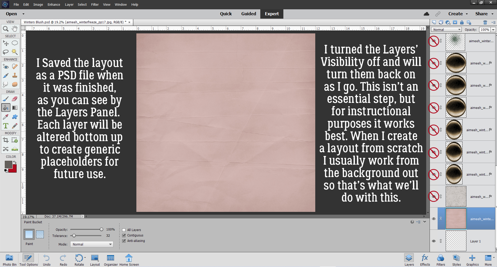
Jill sent me a request to help her figure something out. She’d done some layouts using Miss Fish’s Travellers’ Notebook V.9 templates and some spiral wire binding, and that was okay. But she also wanted to leave out the spiral binding and have more of a bound-book-laying-open-on-a-table look. She’d tried to achieve it but wasn’t satisfied with her efforts. So today, I’m tackling it for her.
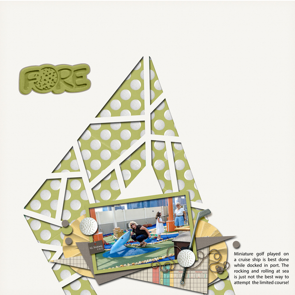
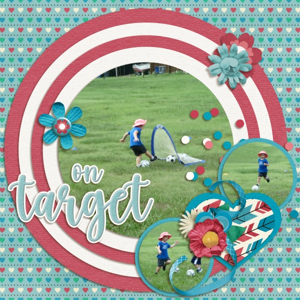
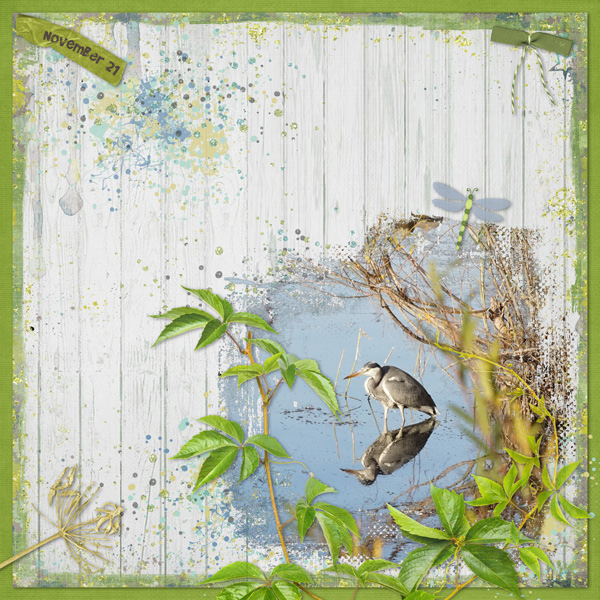
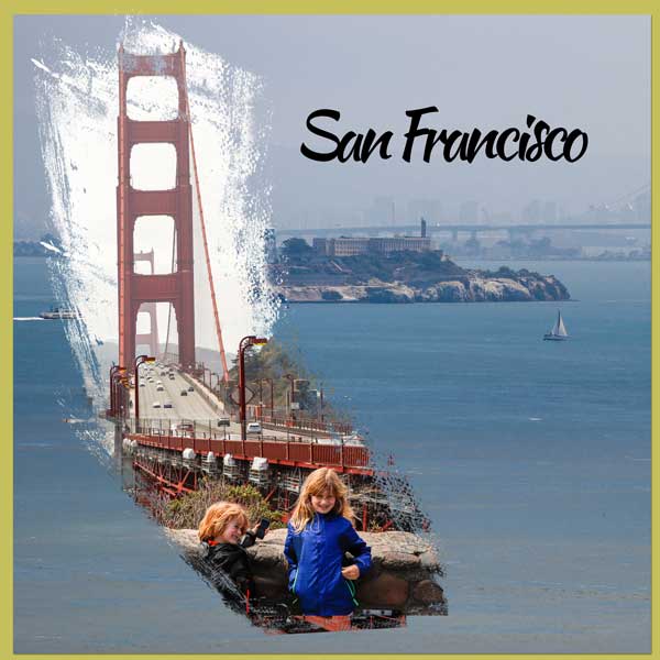
I whipped up a travel-related layout using the same template she’d shown me as her example. As you can see, it looks like… a layout. Not much like a coffee table book.

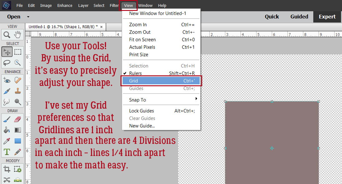
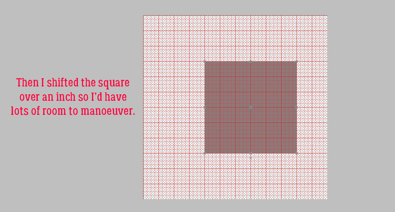
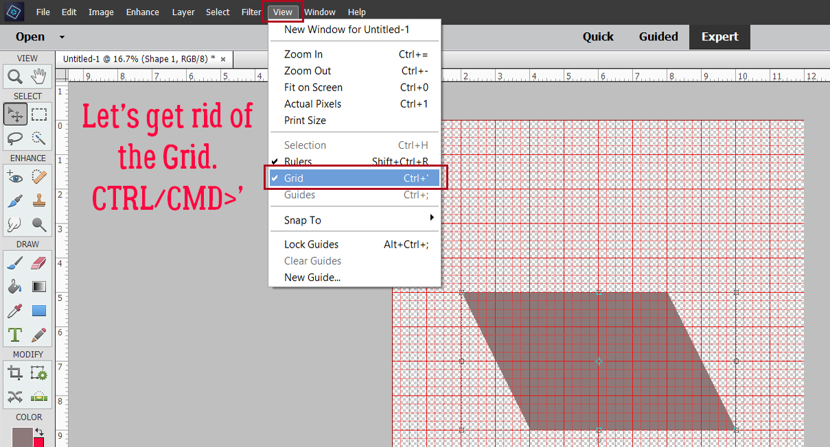
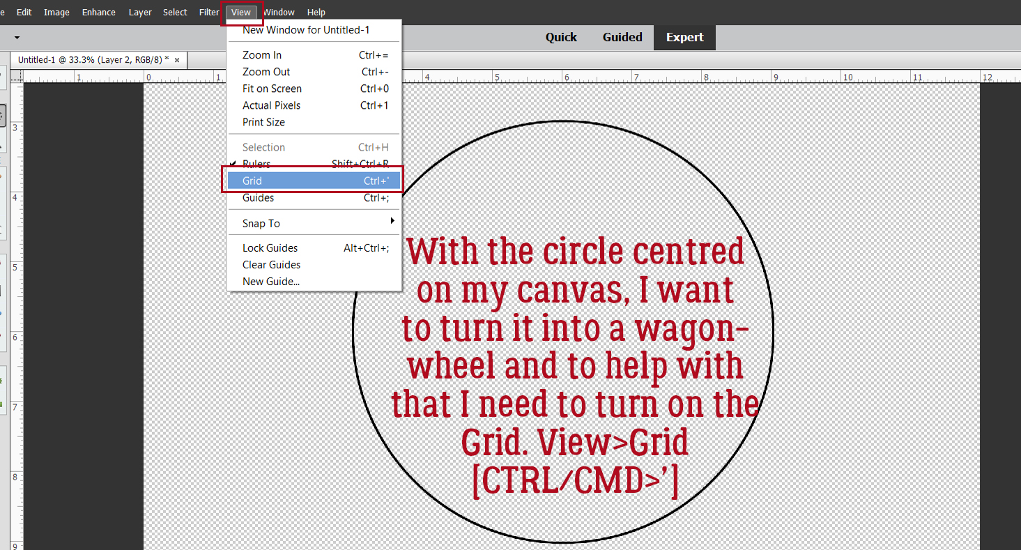
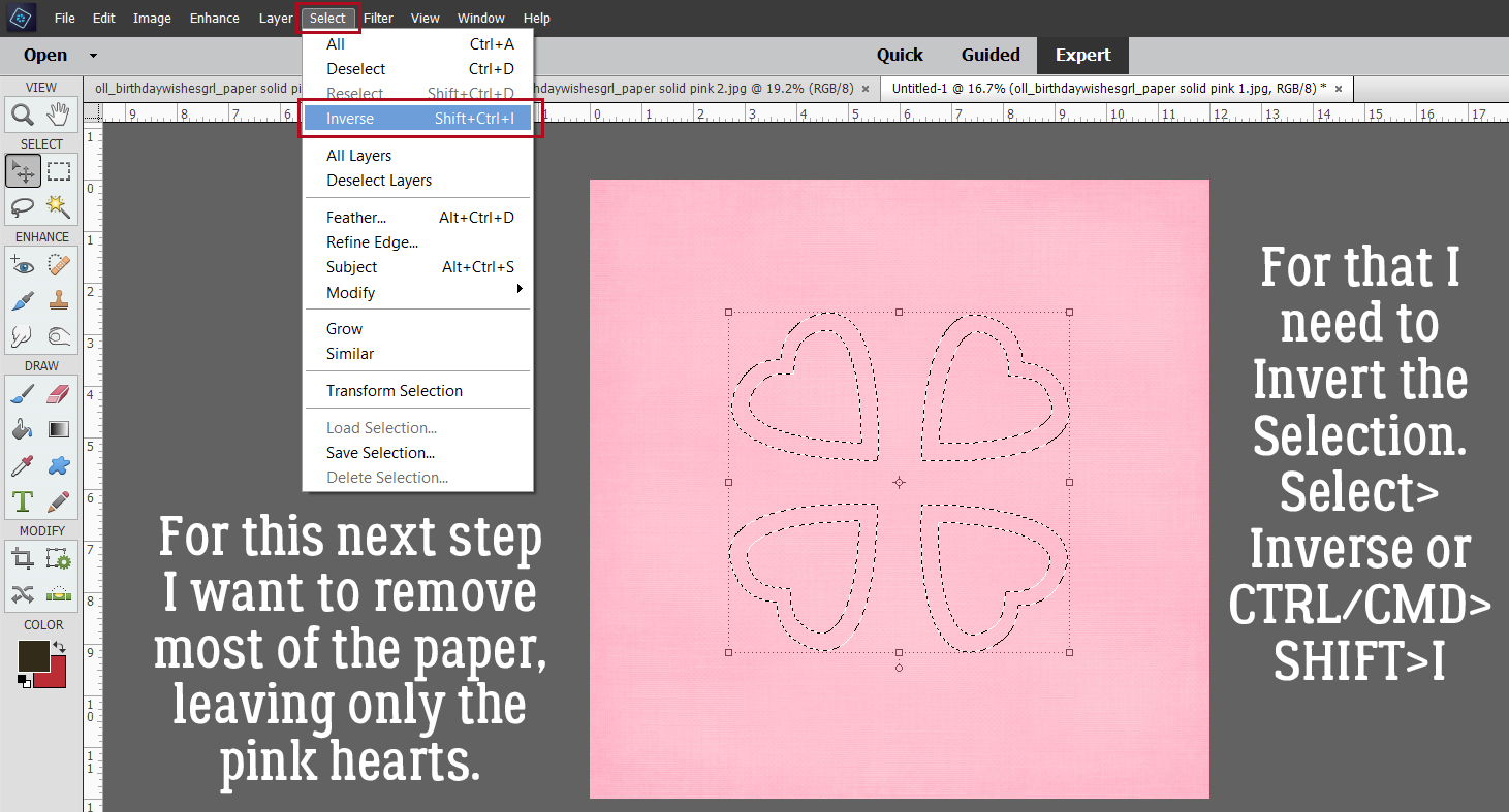
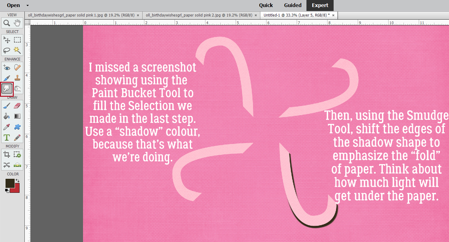
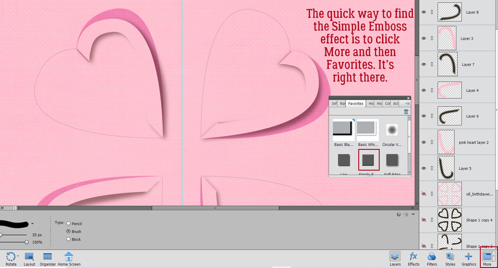
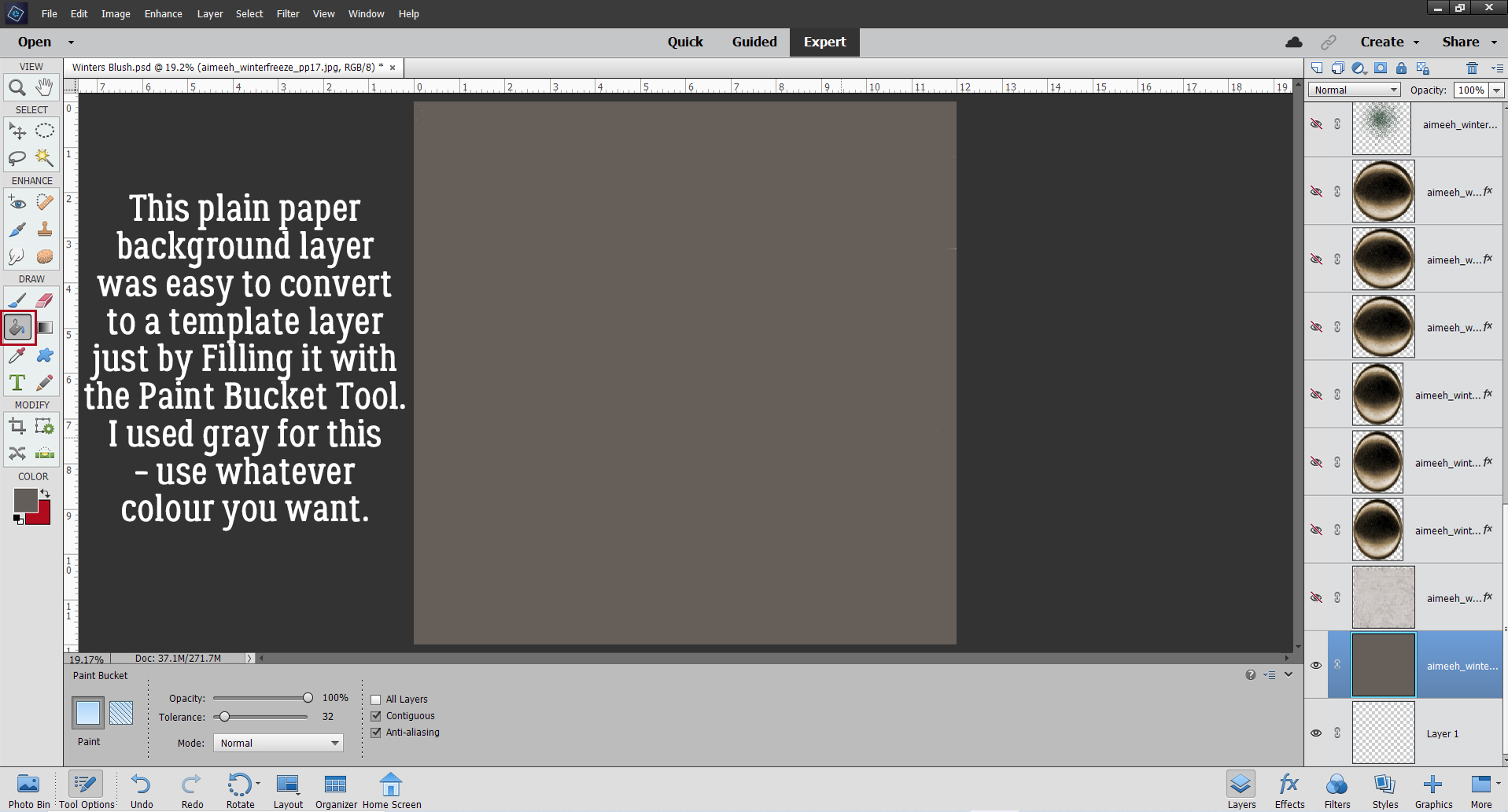
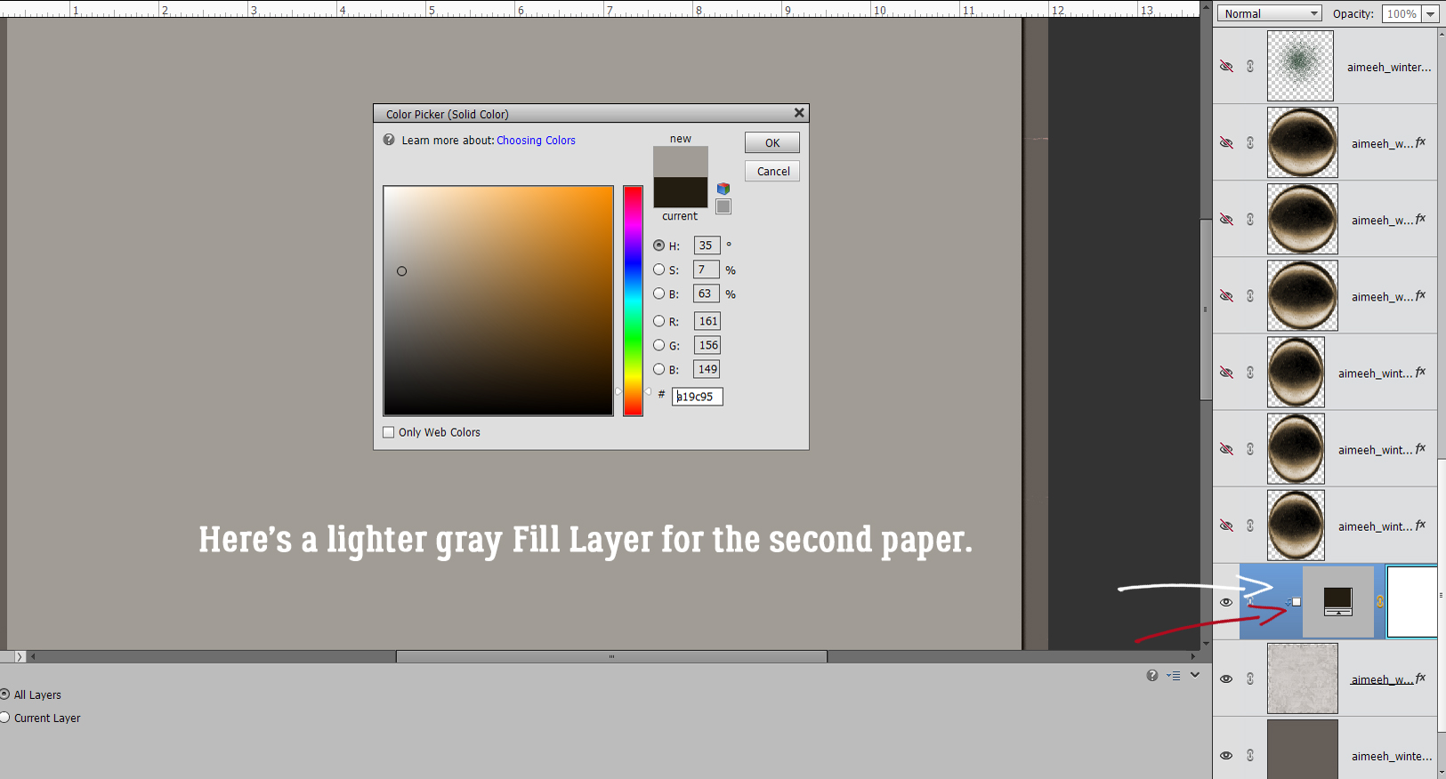
It’s actually an easy thing to make a flat layout look more like a book. It involves the Burn Tool (the one that looks like the “OK” hand gesture). I chose one of the round Drop Shadow brushes that are included with the software. These are my settings, which I’m providing as a guide. You may like more or less! I also turned on the Grid (View>Grid or CTRL/CMD>’) to give me more control over what I’m going to do. Things to keep in mind: Burn the layers that are going to follow the contour of the curved part of the page. Anything that might lift away, like the tag and the journal card, won’t be part of this process. Choose the proper layer(s). I’ll be starting on the left side of the layout, so will have to Burn the background cream-coloured paper, the orange paper layer, the striped paper layer and the photo layer. When I do the right side of the layout, I’ll only need to Burn the background cream-coloured paper.

Making a straight line in Elements is super-duper easy when you know how. Using the Grid as a guide, I positioned my Brush as shown, 1/4 inch off the paper on its right side and so that the widest part of the Brush was over the bottom. I Clicked to start the Burn, then held down the SHIFT key and Clicked again at the top of the visible part of the cream paper. See how the paper is darker there now, but not gray? I repeated this process for each of the paper layers on the left side, then did the same to the background paper on the right.

It looks better already! But I’m going to make it even more real-looking.

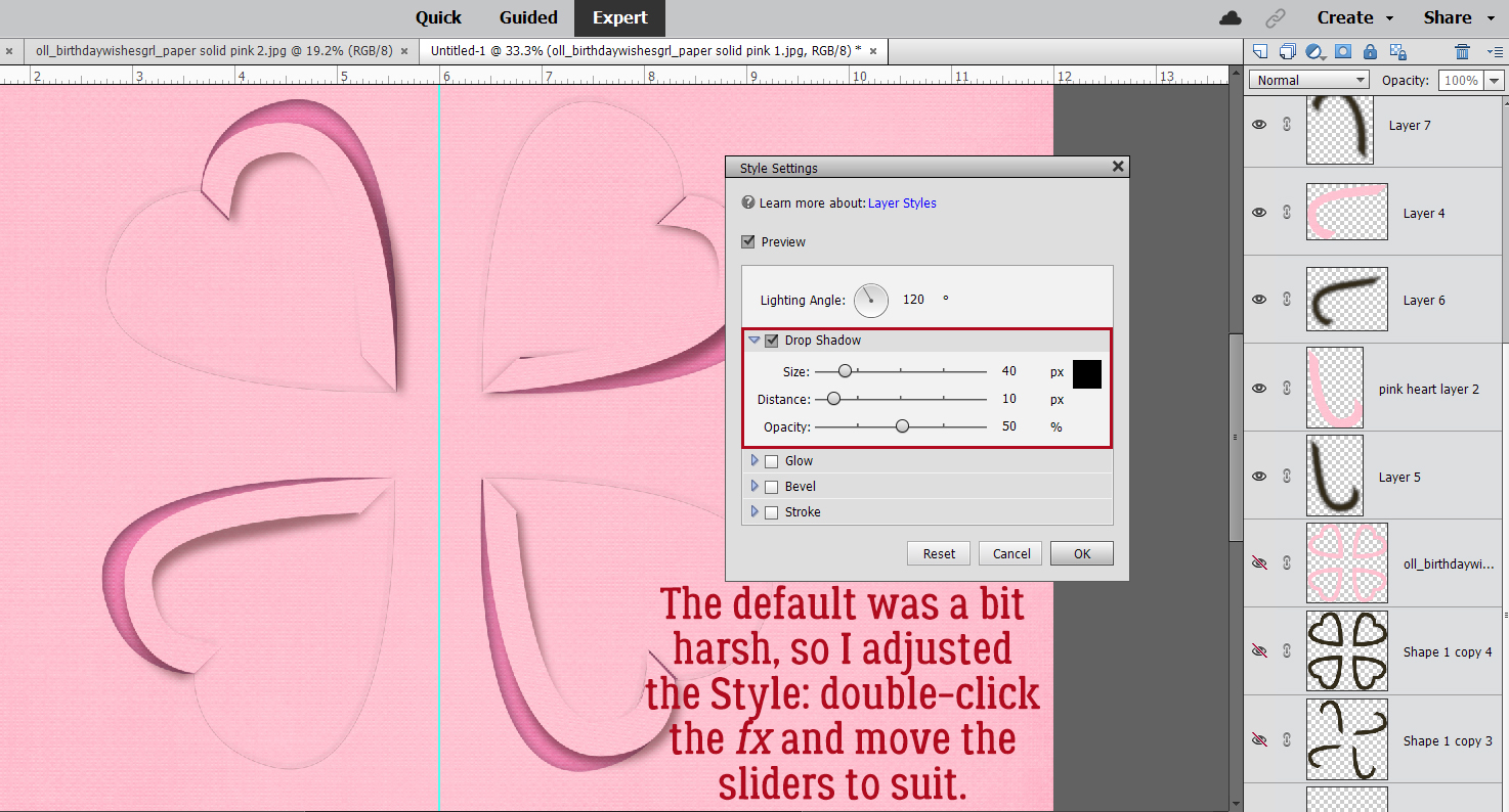
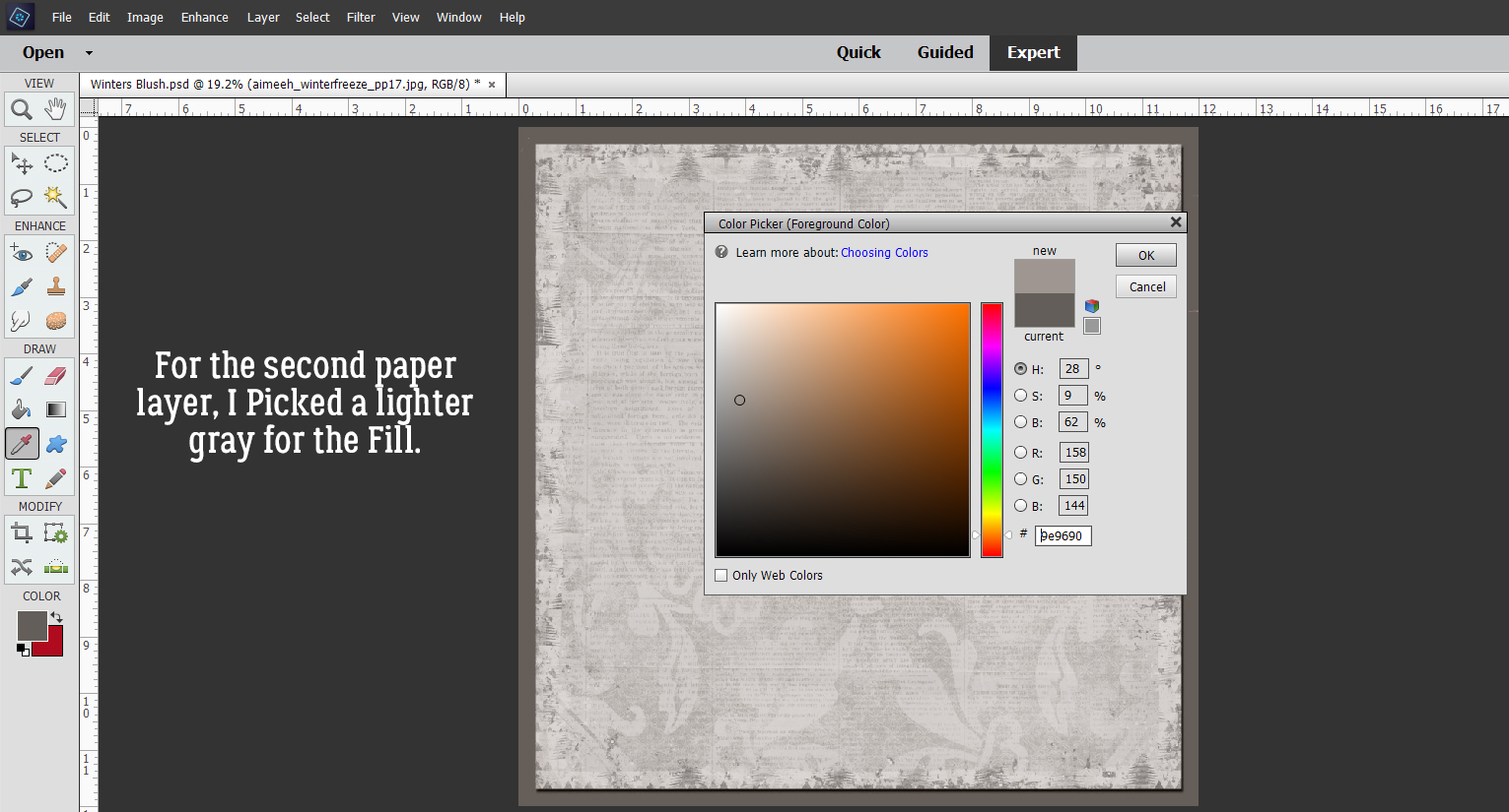
This time I’m going to add an actual shadow, using a big square Drop Shadow Brush and my shadow colour. These are the settings I used. I’m going to start on the right side this time, and you’ll see why in a sec. I’ve got the cream-coloured background paper layer active.
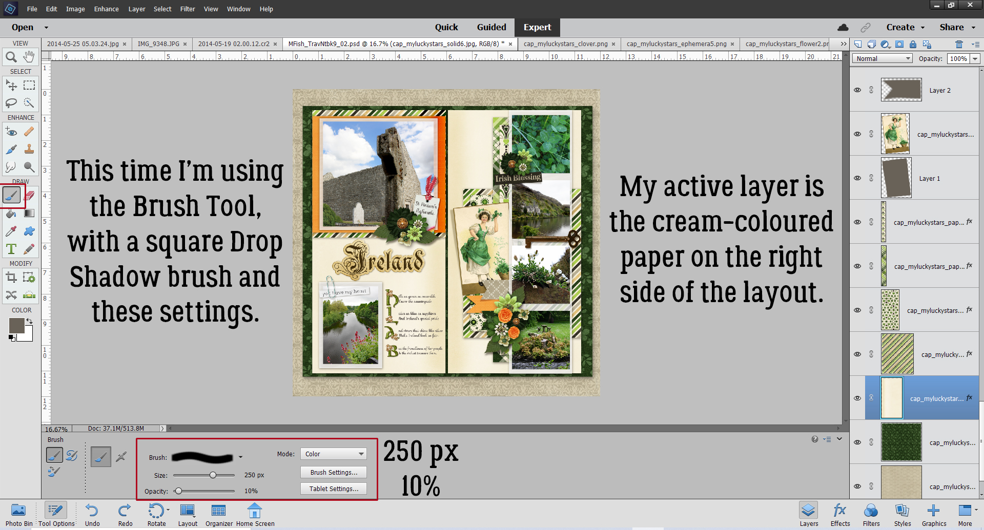
I ALWAYS put my brushes on their own layer. Then I can adjust them in so many different ways. If I actually put the brush on a paper layer, it’s part of the paper layer and thus not tweakable at all. So I added a new blank layer above the cream paper layer.

I used the same steps to add the shadow. BUT. Using the Brush Tool in this way doubles up the effect where the first Click is done. That’ll look bad. So I did my first Click OFF the paper I’m shadowing. I centered the brush but in hindsight, I could have just aligned the left side of the brush with the center of the book and skipped some steps. Oh well. Click>SHIFT>Click top and bottom, off the paper.

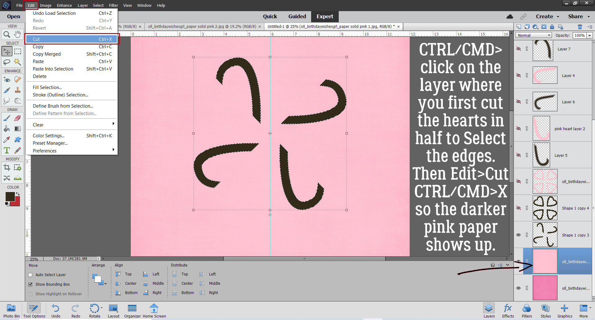
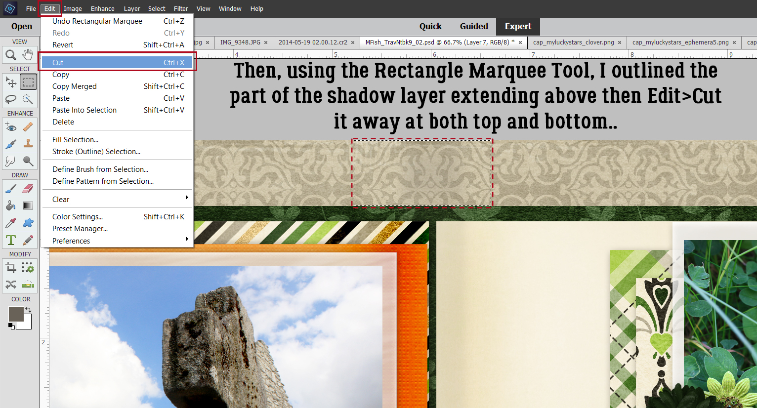
Next, I used the Rectangle Marquee Tool to outline the overly dark bit at the top of the layout, then Edit>Cut (CTRL/CMD>X) that bit away.
To further blend and soften the shadow, I added a Blur>Gaussian Blur.
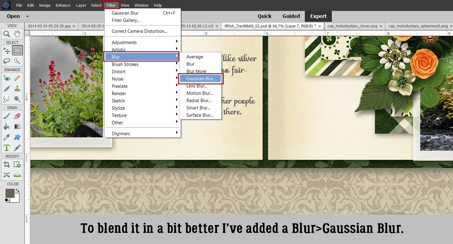
It looked just about perfect with a 4.5 pixel Blur.

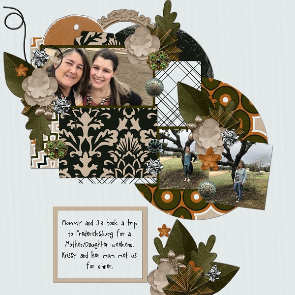
Rather than Shadow all the various layers on the left side, I instead made a Copy Layer of the shadow and moved it up the Layers Panel so it was above the photo layer. Then I nudged it over so it was balanced with the right side. Of course, it overlaps the right side. Darn! Rectangle Marquee Tool CTRL/CMD>X to the rescue.

There! It looks a lot more 3D now, and I really like it! I hope Jill does too.

Well ladies, spring is in the air here and it’s time for supper! (And I’m only 10 minutes late.) See you next week, when we’ll check out a Challenge.
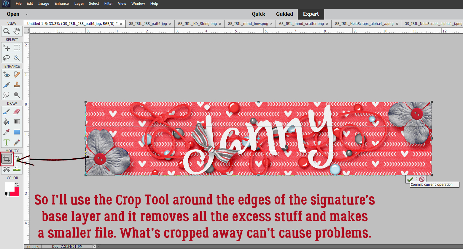
PFD Version : https://bit.ly/3MG9bSE
![]()

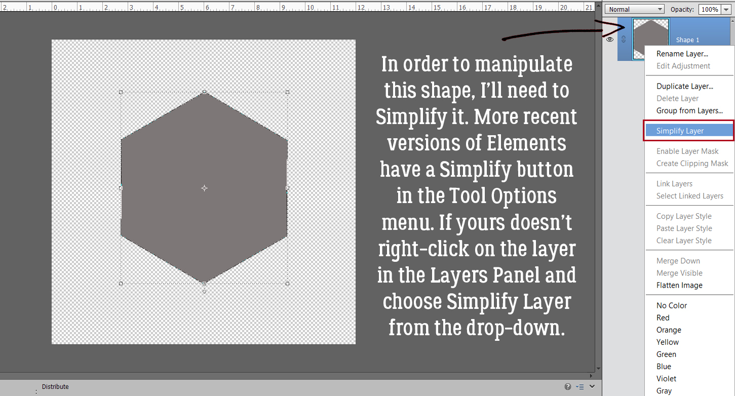


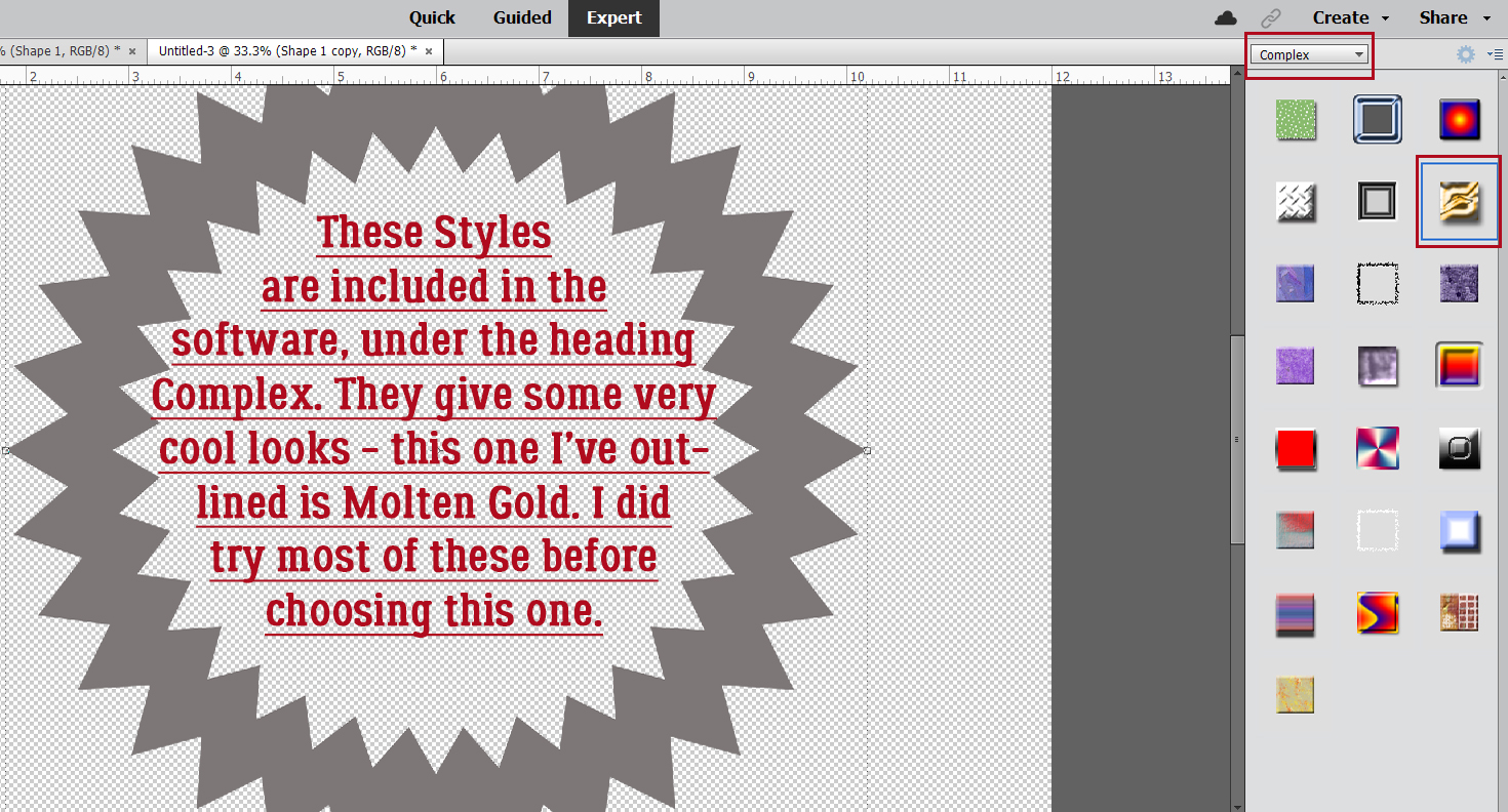
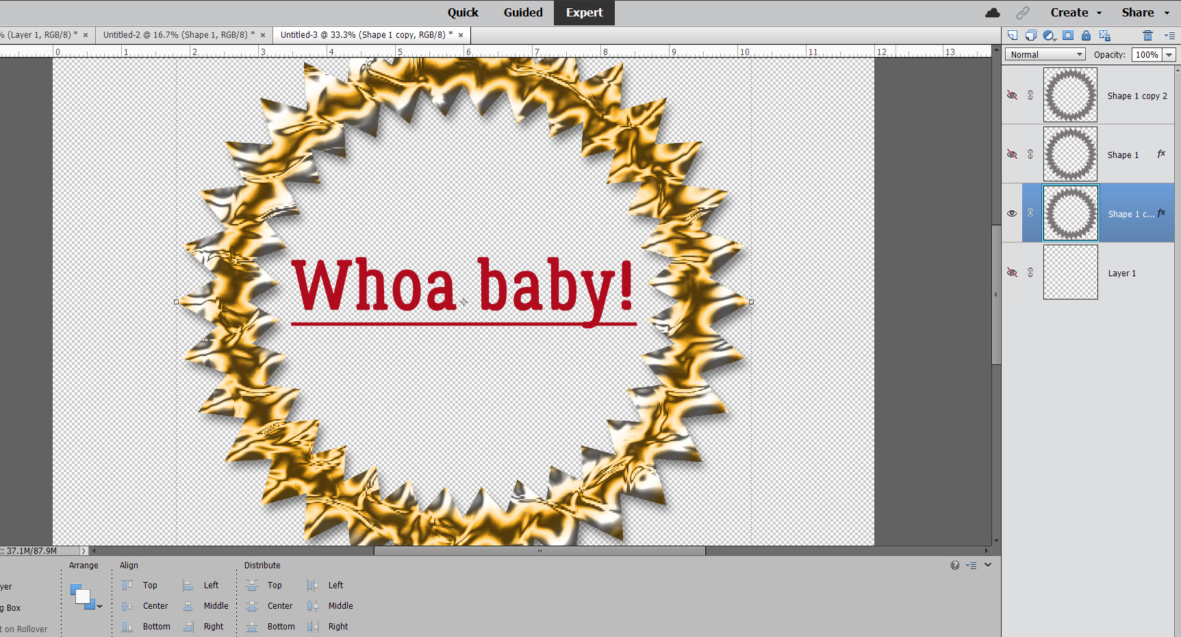
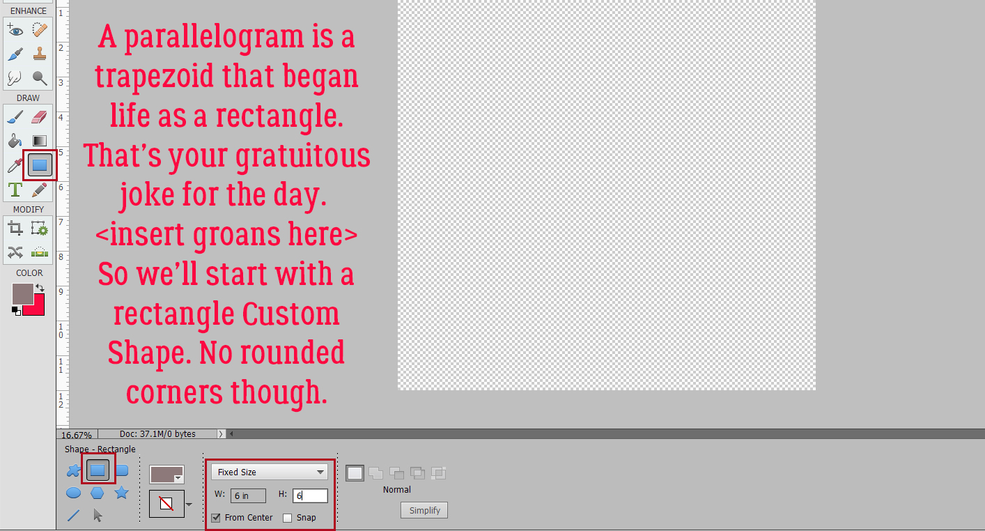
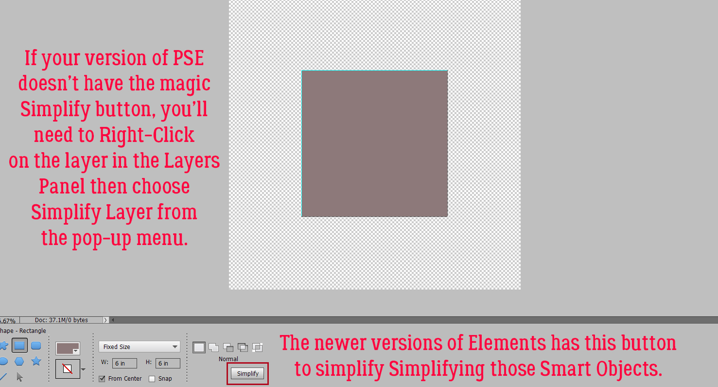
 We’ll come back to the hexagon in a minute. What if you chose a more complicated shape, like this seal? You can use all the controls in the Tool Options, like using Defined Size, and if you tick the From Center box, Elements will put the shape right in the centre of the canvas. Here, I’ve shown the Simplify button (the one you may not have). Experiment with your software; the more you play with it, the better you’ll understand what it can do and what it can’t. (And these tutorials will make more sense…) You’ll find a system and a rhythm that works for you.

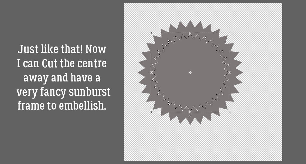
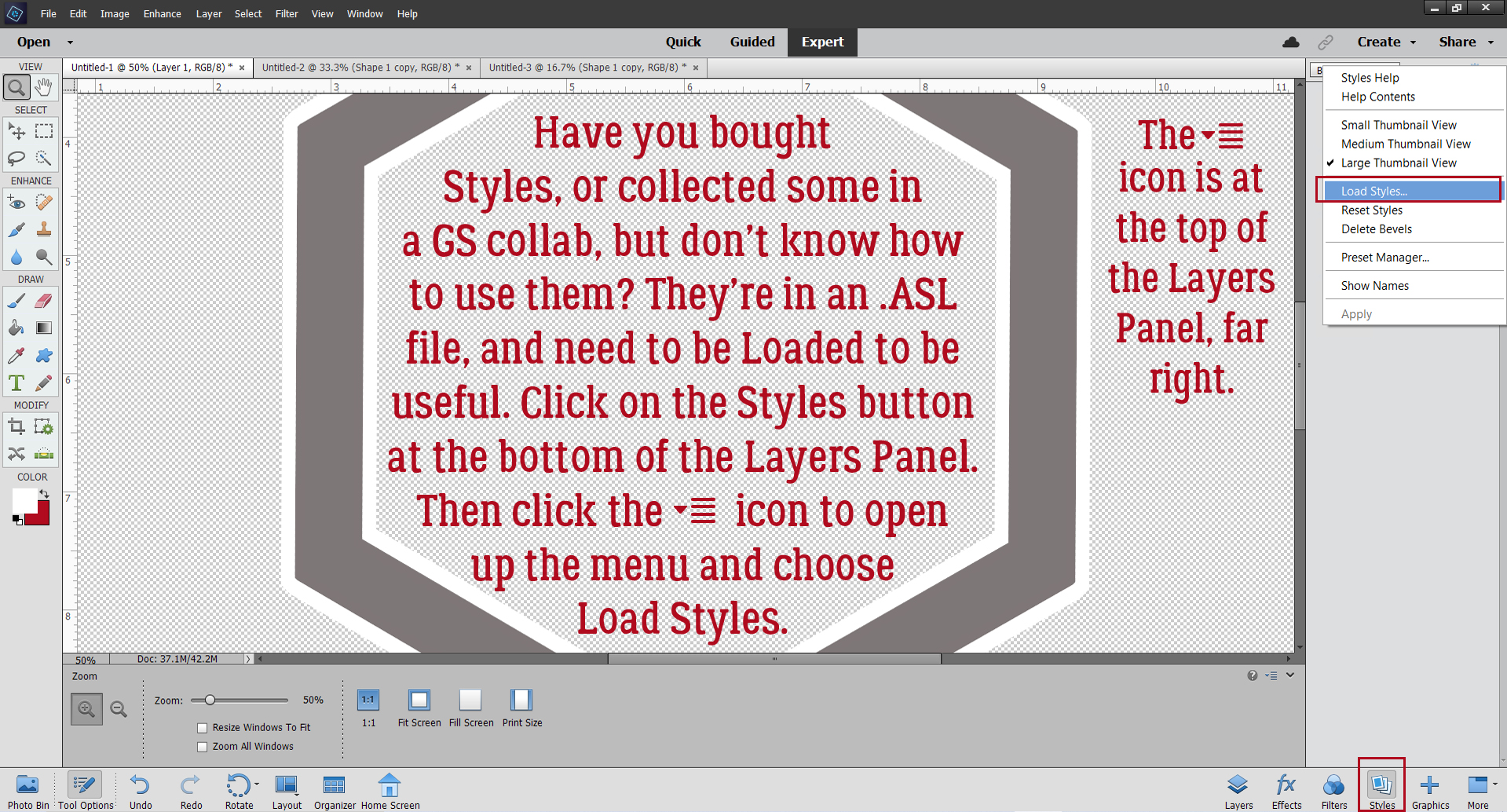
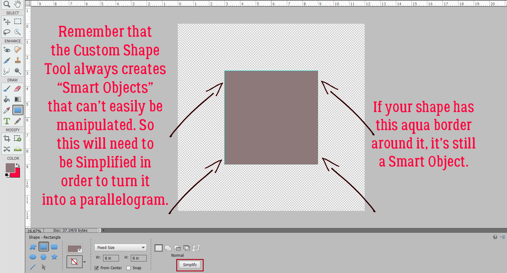
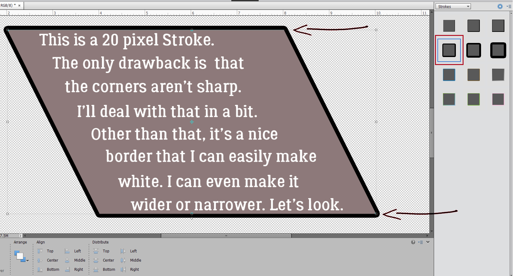
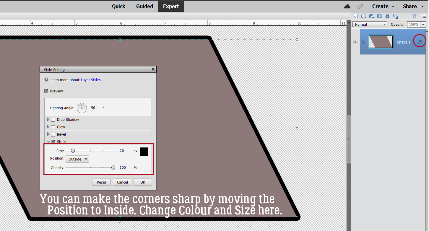
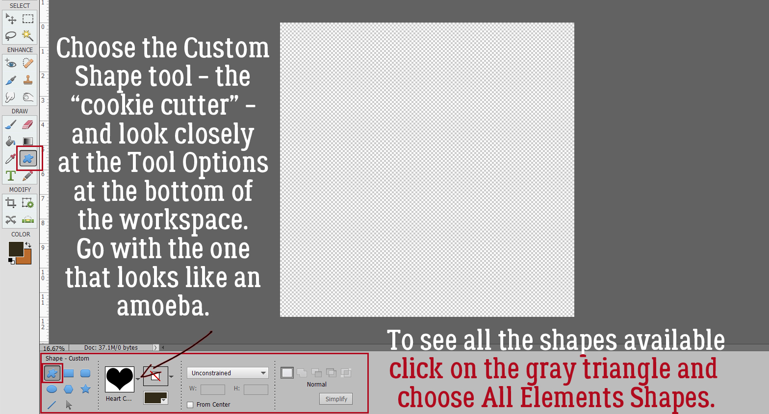
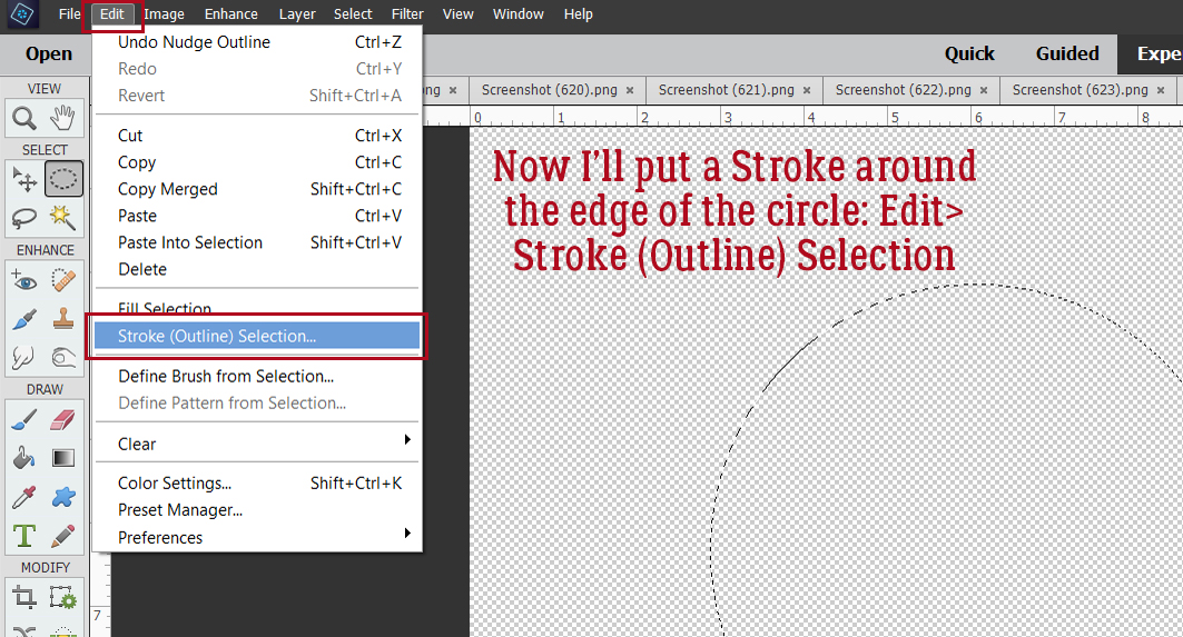
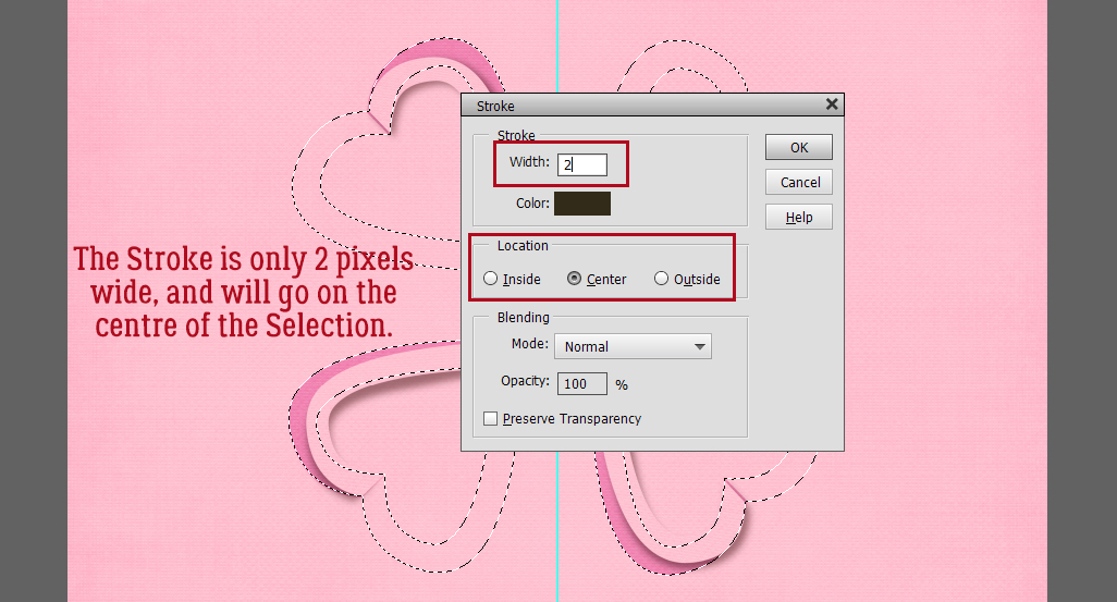
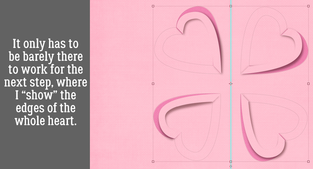
 Quick-and-easy border making uses the Stroke Edit. CTRL/CMD>click on the Layer Thumbnail to “Select” the edges of the hexagon, inside and out. Make sure you’re on the blank layer, then Edit>Stroke (Outline) Selection.