Like Snowflakes… No Two ALIKE
![]()
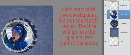
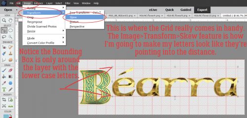
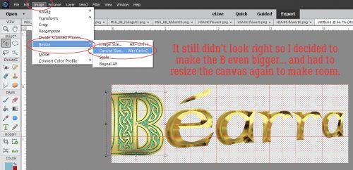
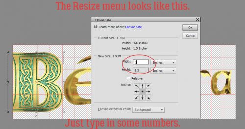
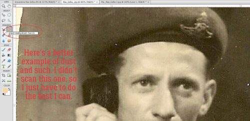
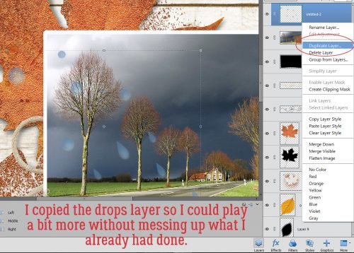
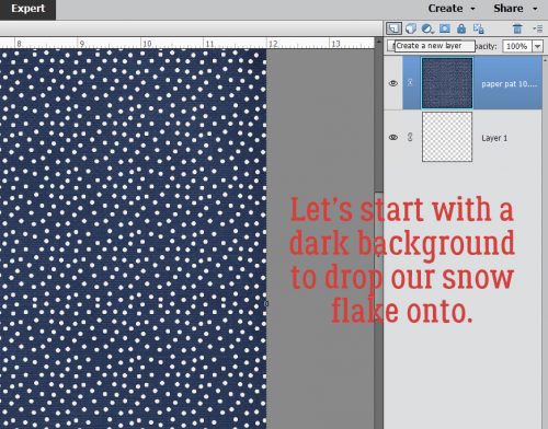
Hey GingerScrappers! Are you ready for another technique (or two)? This week’s tutorial shows two ways of using the Custom Shape tool and reviews customising shadows in Elements. The inspiration for it came from comments in the Gallery on two of my layouts, each with a paper snowflake. I used templates for both of them but that doesn’t mean I can’t show you how the effects were achieved. For the examples I used the January Buffet collection from Just So Scrappy called Bundle Up. I started with a 12×12 page on my workspace. For the first part of the tutorial the background paper is a darker blue one with white spots and the gray stripe for the snowflake.
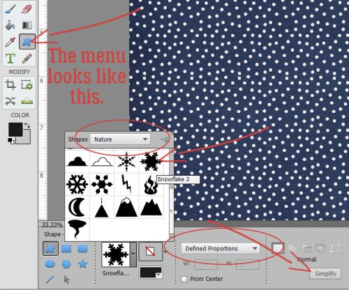
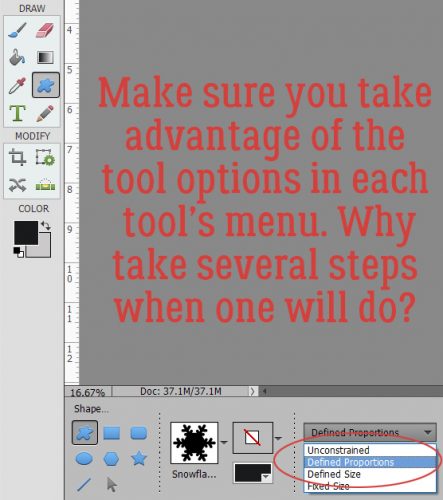
After I moved the blue spotted paper onto the page, I chose the Custom Shape tool, the one that looks like an amoeba. I also chose a light colour to create my shape so my tired old eyes could see it.

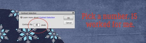
There are a number of options in the tool menu. I selected the Nature folder from the drop-down default shapes, chose a hefty snowflake from the folder and set it to Defined Proportions. This makes sure that my shape is as tall as it is wide. Symmetry is important in a snowflake!
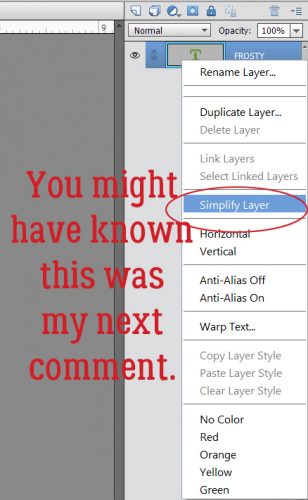
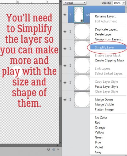
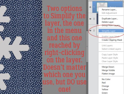
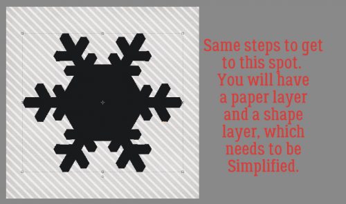
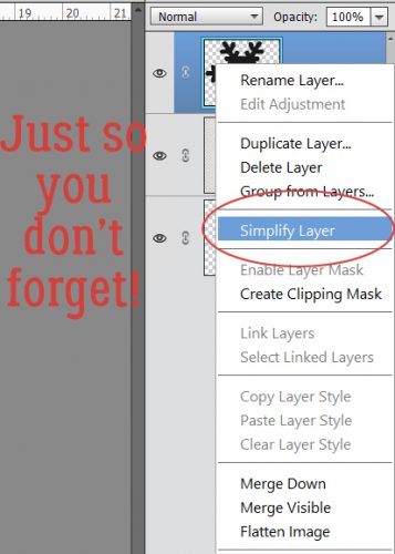
There are two ways to Simplify shape layers. Don’t forget this step. It’s what gives you the upper hand over the snowflake. You can do it right from the Shape tool menu or you can right-click on the layer and select Simplify Layer as shown.
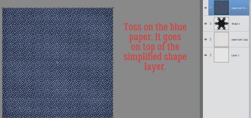
Then you’re going to clip a paper to the shape. The keyboard shortcut is CTRL/CMD>G for versions below 14 and CTRL/CMD>ALT>G in versions above 14.
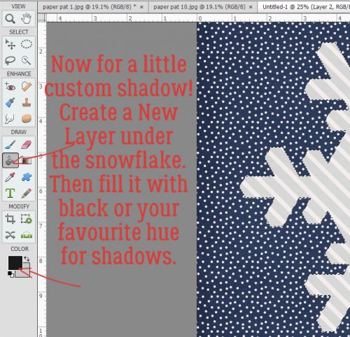
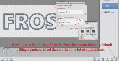
Now let’s give our paper snowflake a custom shadow. You might recall a previous tutorial on this subject, so this will be a review. The full set of steps is described in the second technique. (After I made all my screenshots I decided I should reverse the order of the two techniques and didn’t want to go back and redo it all… Sorry!)
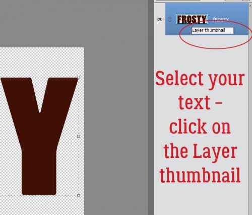
The steps are: New Layer below the cutout, Select the shape by CTRL/CMD>clicking on the shape layer thumbnail and filling the selected area with your shadow colour with the Paint Bucket tool. Then you want to move the shadow layer over and down in the direction your light source is coming from.
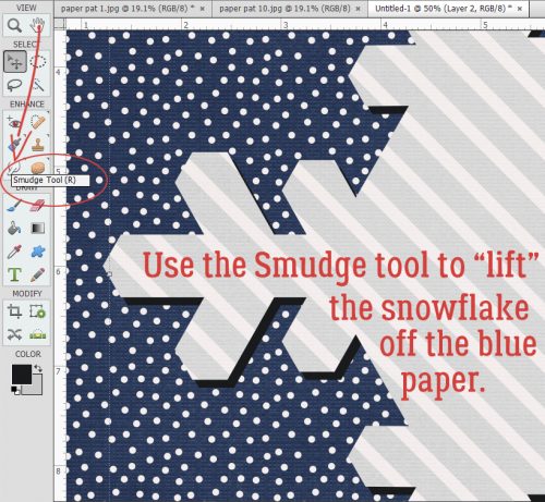
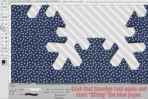
To really customise it and make your paper snowflake look 3-D, use the Smudge tool to gently move the shadows around. Think about how much light will get underneath the paper and nudge the shadow closer where the paper will lay flatter, farther away where it might lift.
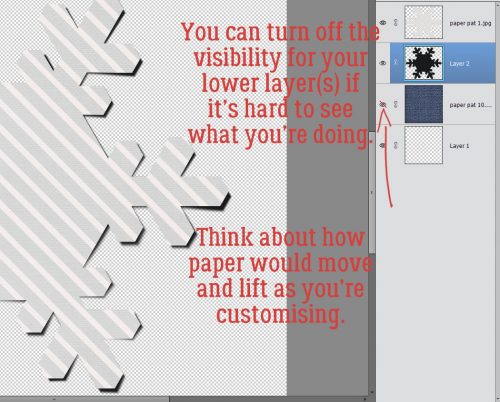
If you’re working on a darker background and it’s too hard to see what you’re doing, turn the background layer(s) visibility off.
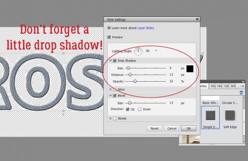
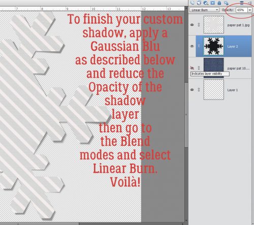
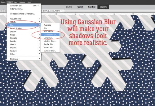
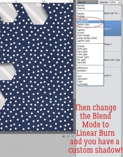
Aha! A typo!! That should say Gaussian BLUR! It’s found in the Filters menu. It softens the edges of your shadow to make it look more realistic. Change the Blend Mode to Linear Burn and decrease the Opacity until it looks like a nice shadowy bit.
There it is! A paper snowflake sitting pretty on your background paper.
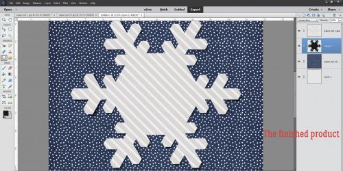
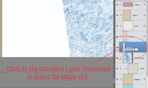
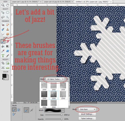
But let’s add some pizazz! For this step I used a wrinkled fabric brush I picked up free from Brusheezy. The brushes in this set have a maximum size of 2500×2500 pixels so I had to make my paper snowflake and its shadow small enough to completely cover it with the brush. To make sure the brush only covers the snowflake, I Selected the edges of it (CTRL/CMD>click on the layer thumbnail) then created a New Layer on TOP of the snowflake layer. I ALWAYS put my brushes on their own layer so I can play with them without affecting anything else.
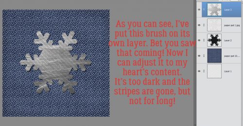
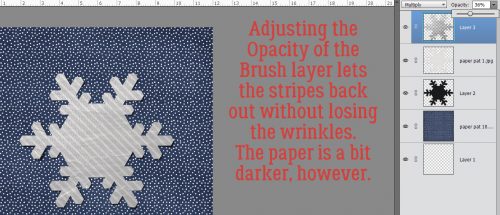
I used the same colour as my shadow. It looks a bit too dark and opaque, but I’m going to change that.
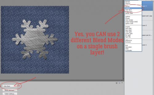
As you can see in the screenshot below, you CAN use two different Blend Modes on one brush. I used Color Burn when I put the brush on the layer and then Multiply afterward. The effect is subtle but pleasing.
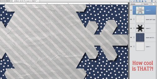
Then I pulled down the Opacity of the brush layer so the stripes show through again but the wrinkles are still there. The only flaw is that this technique does change the colour of the paper somewhat.
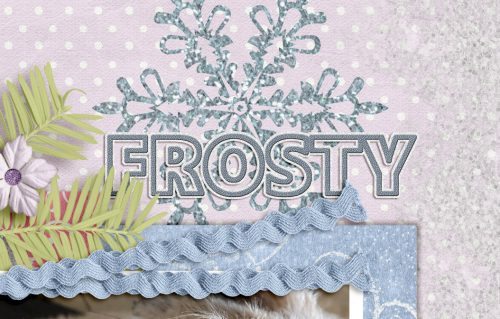
See? Now it’s so much more interesting to look at than a plain paper cutout!
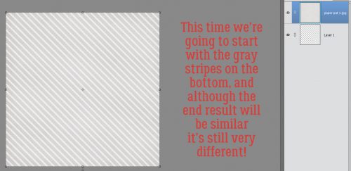
Now let’s flip this around. Start with the gray striped paper.
Follow the shape-creation steps as before. I used the same snowflake shape.
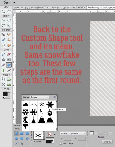
As mentioned above, do use the Tool options. They make life so much easier. Play around with them to see how they change things.
Look familiar? Only for a few more minutes!
Simplify the shape layer.
Now drop the blue spotted paper on top of the gray striped paper and the shape layers.
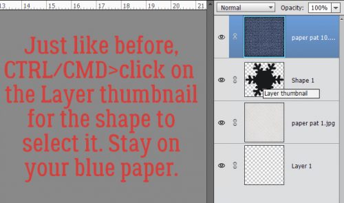
Select your shape. Make sure you’re on the BLUE paper layer.
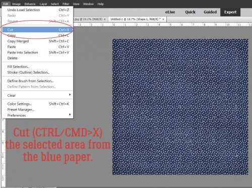
Cut the shape out of your paper. Instead of having a paper snowflake on top of your blue paper, you’ll have a snowflake-shaped hole in it.
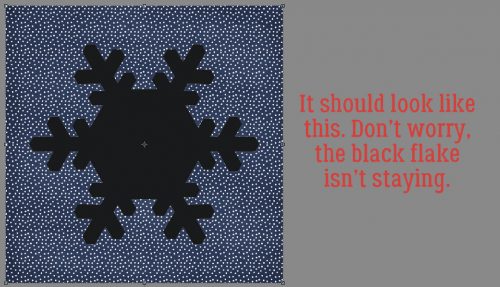
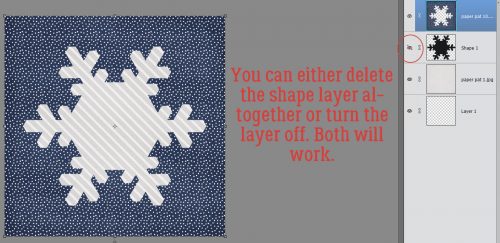
And it’ll be the colour of your shape until you delete that layer or turn it off.
Here we are again. It looks a lot like the first one right now.
Select the blue paper layer by CTRL/CMD>clicking on the layer thumbnail, just like before.
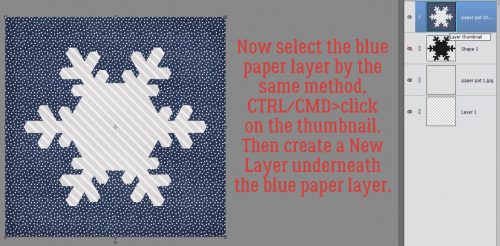
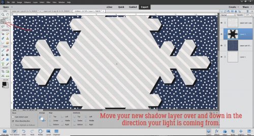
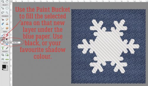
Create a new layer underneath the blue paper. Fill it with the Paint Bucket and your shadow colour.
Move it over and down in the direction your light is coming from.
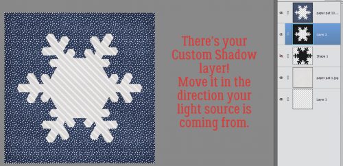
There it is! In this iteration it’s easy to see so you can start Smudging it to make your 3-D effect.
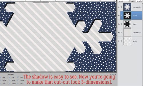
“Lift” the paper where it might curl a bit, anchor it down where it should rest close to the background. Once you’ve done this shadow technique a few times, it becomes very quick and easy. Trust me! I almost never use shadow styles any more.
Here are your detailed instructions for the Gaussian Blur filter.
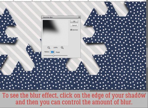
Clicking on the edge of the shadow somewhere gives you a preview in the adjustment box so you can see how much the edges soften. Don’t go crazy.
Pull down the Opacity…
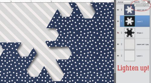
change the Blend Mode to Linear Burn and BOOM! You’re done!
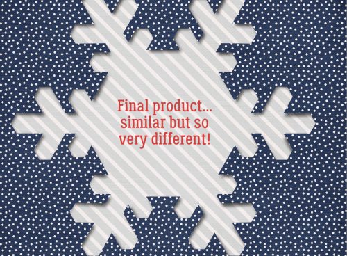
Almost exactly the same steps, but such different looks!!
Next week I think I’m going to show you some photo manipulation tricks that you can use for the Inspiration Challenge. Stay tuned!
![]()