Documenting Your Life {March 2025} Host: ADB Designs
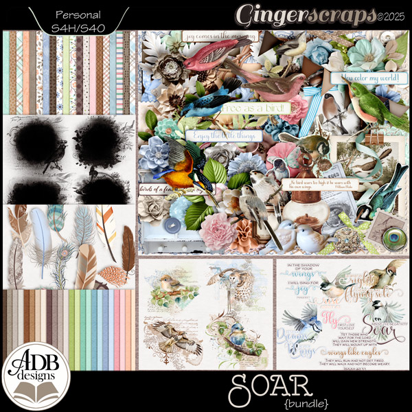
I am featuring my new March Buffet collection: SOAR . Individual pieces of the collection are on sale through March 9, 50% off; the bundle is 50% off for the entire month.
Page Creation Prompt(s):
- Create a page featuring a bird or birds as the main image.
- Create a page featuring journaling or photos about reaching for goals/dreams.
BONUS COUPONS: (These are not “stacking” coupons, you will earn only one.)
- All participants, regardless of GS designer used, will receive a $2 coupon to be used on orders of $7 or more in my store.
- All participants who use an ADB Designs kit/collection will receive a $4 coupon to be used on orders of $7 or more, in my store.
- All participants who use the ADB Designs featured kit/collection: Shimmering Evening, will be entered into a drawing for an opportunity to win a $10 coupon to my store.
- Freebies/gifts may be used in layouts, but those layouts are excluded from consideration for coupons.
I am always thrilled to see what you create!
ONCE THE FORUM & GALLERY ARE BACK ON LINE: Please be sure to post your layout in the challenge thread and in my “Documenting Your Life Challenge Gallery” AND please be sure to credit the designer and their product(s) as well.
I will announce the winner of the random drawing in this thread on the first day of the new month & then close the thread.
I will send PM (private message) via the forum to participants with coupon information on the first or second day of the new month. Be sure and look for it.
HUGS!
Diane
- All challenge layouts must consist of at least 80% GS products from current GS designers.


")


