Happy Friday friends. How did we get to the end of June already? Summer is in full swing in my area. I’m already wishing for fall temperatures.
Remember if you spend $10 in the store, you’ll get this great collab free.

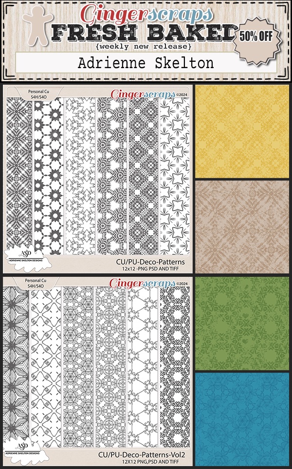
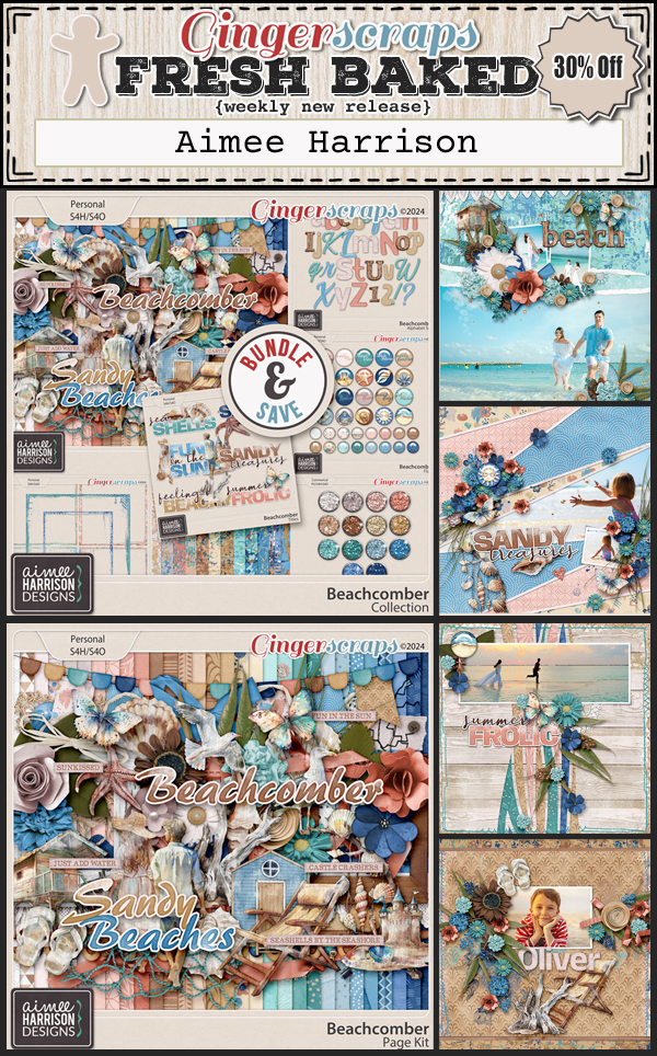
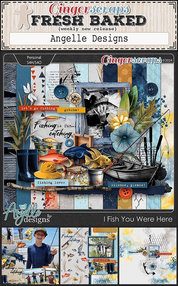
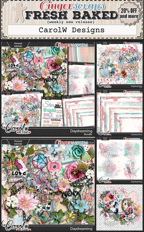
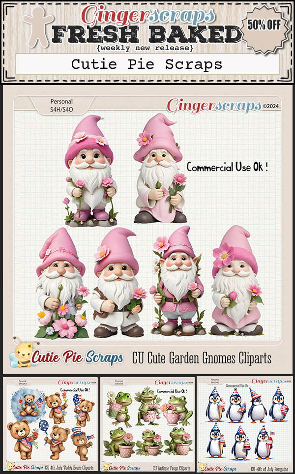
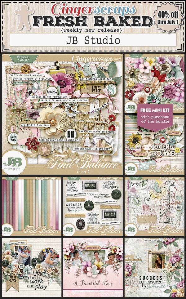
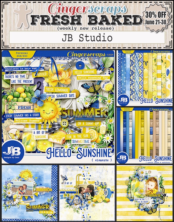
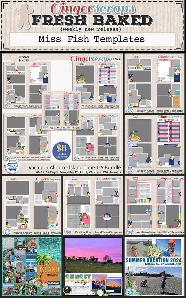
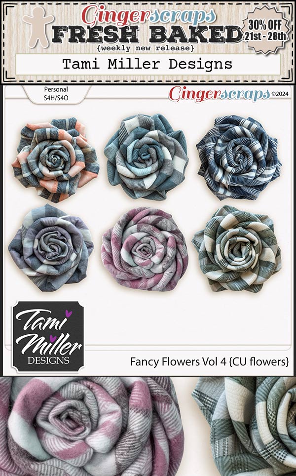
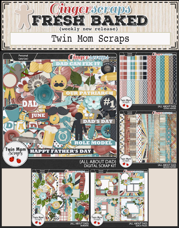
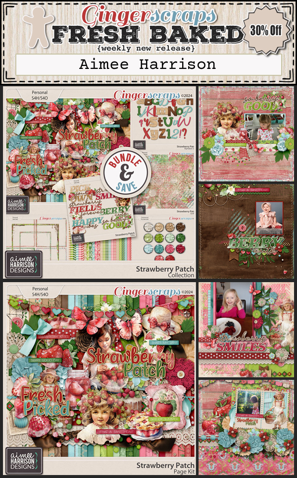
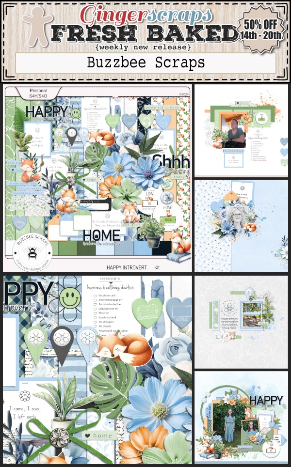
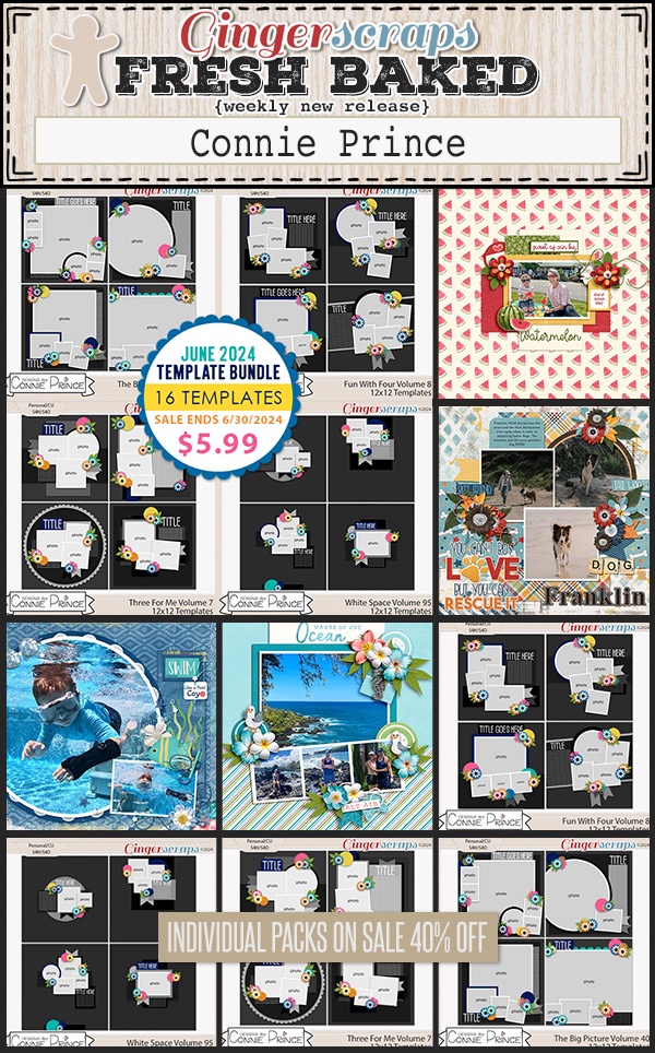
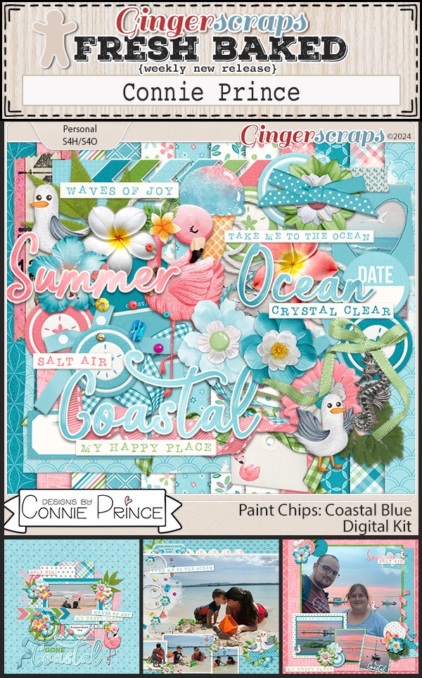
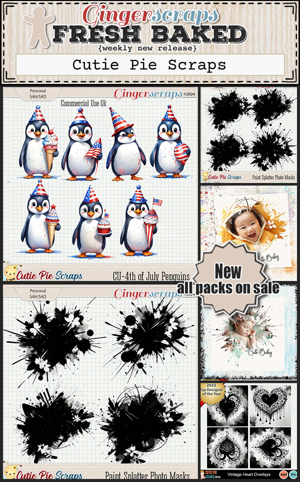
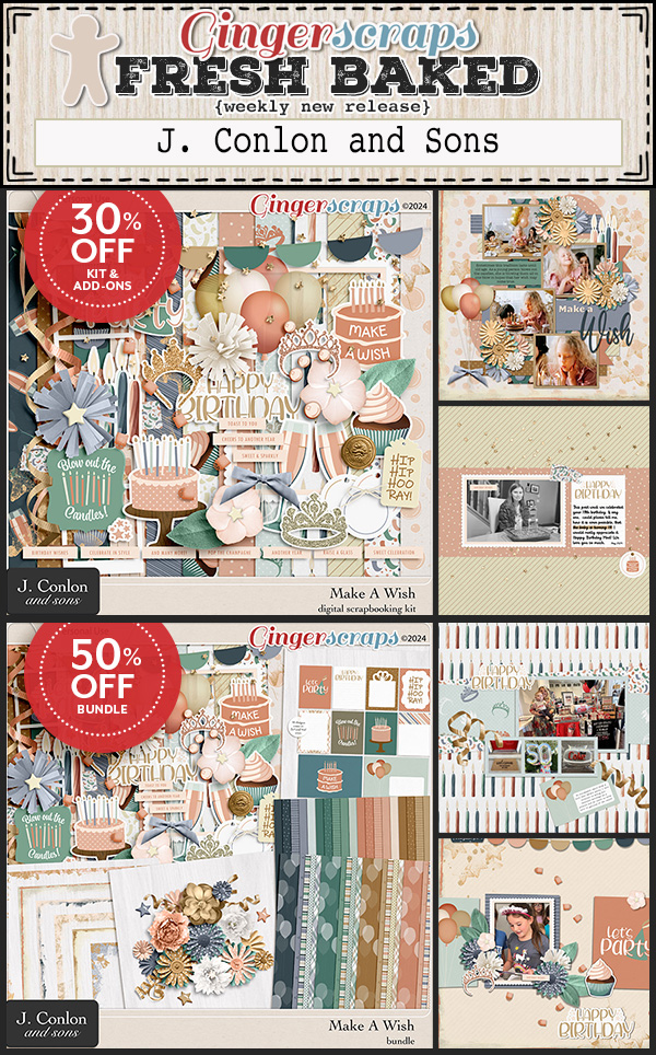
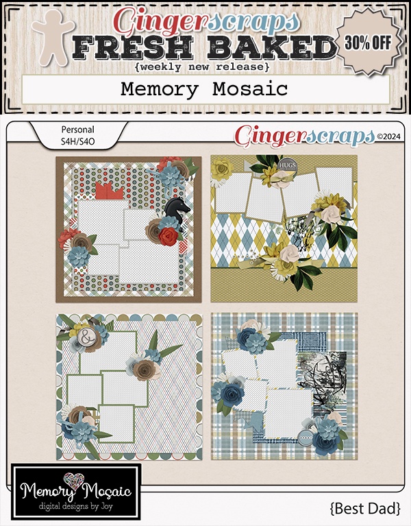
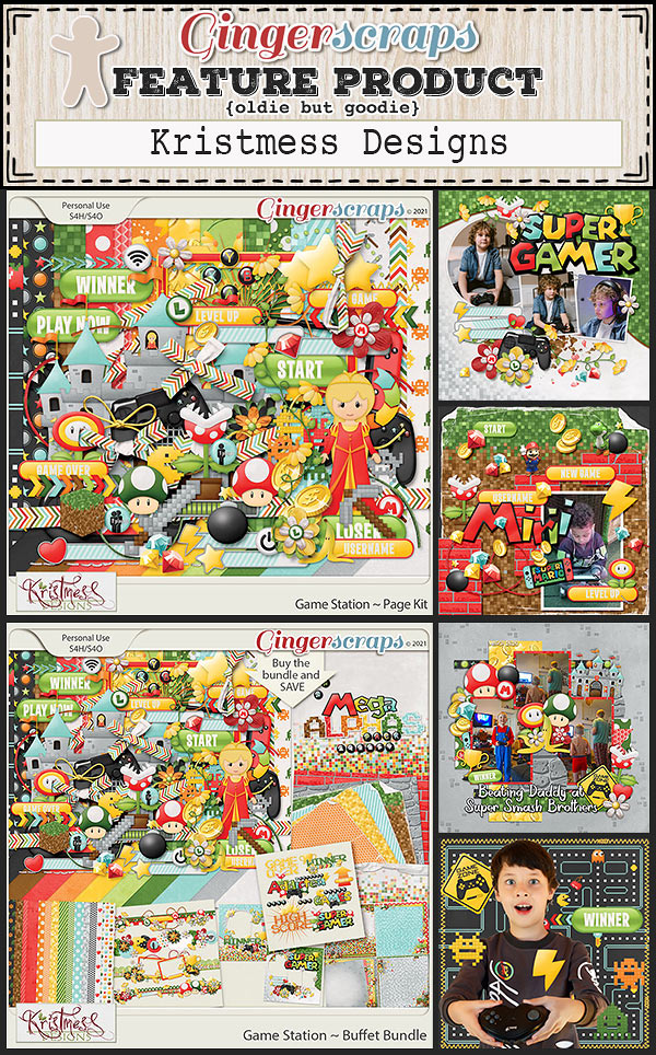
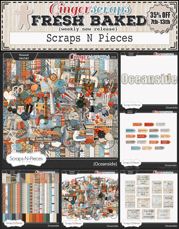
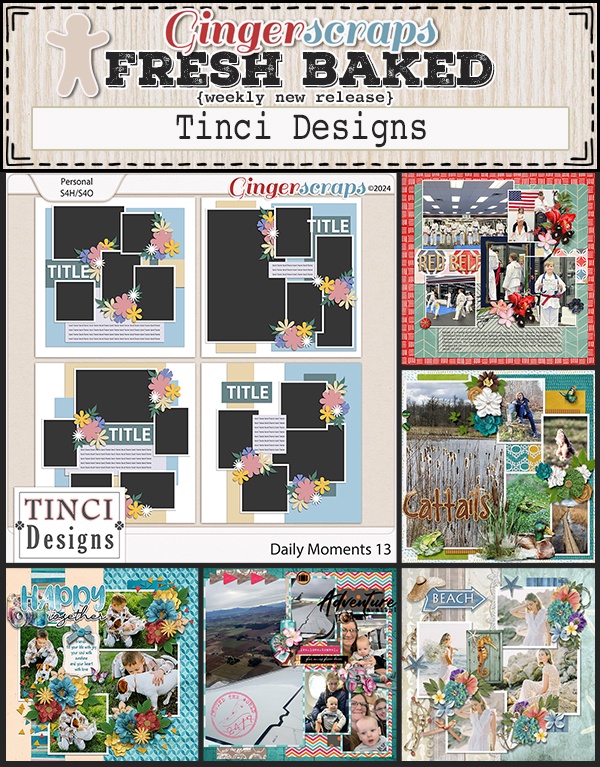
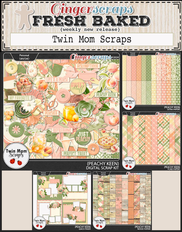
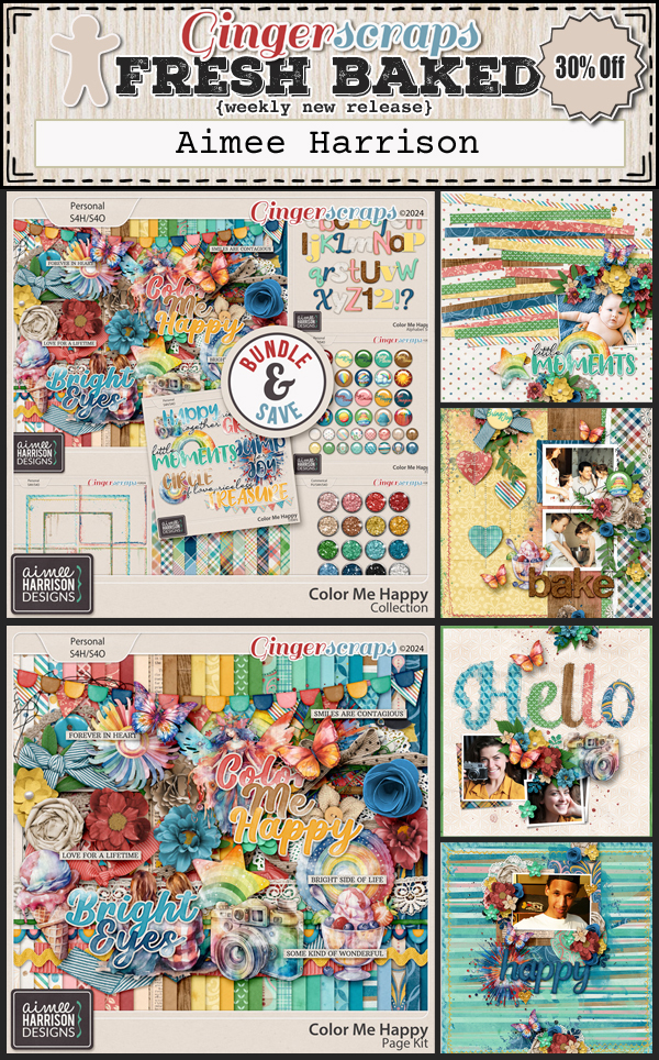
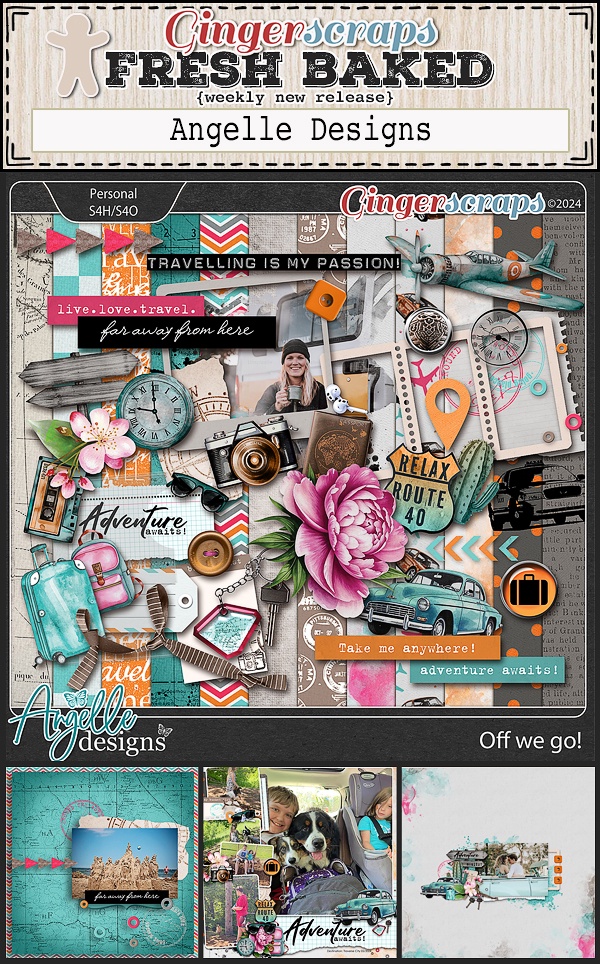
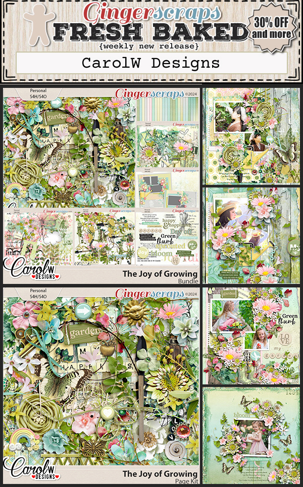
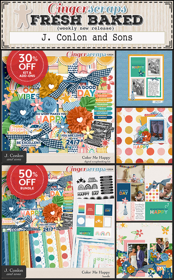
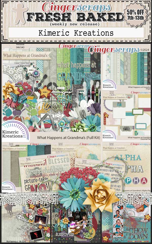
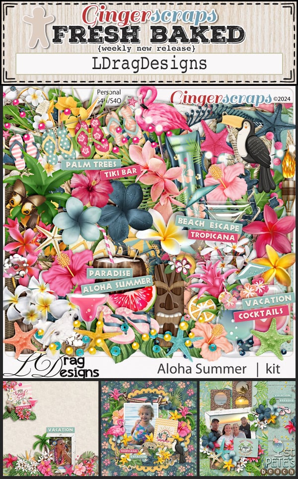
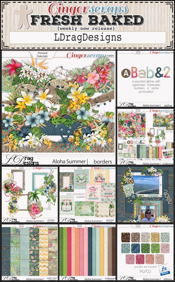
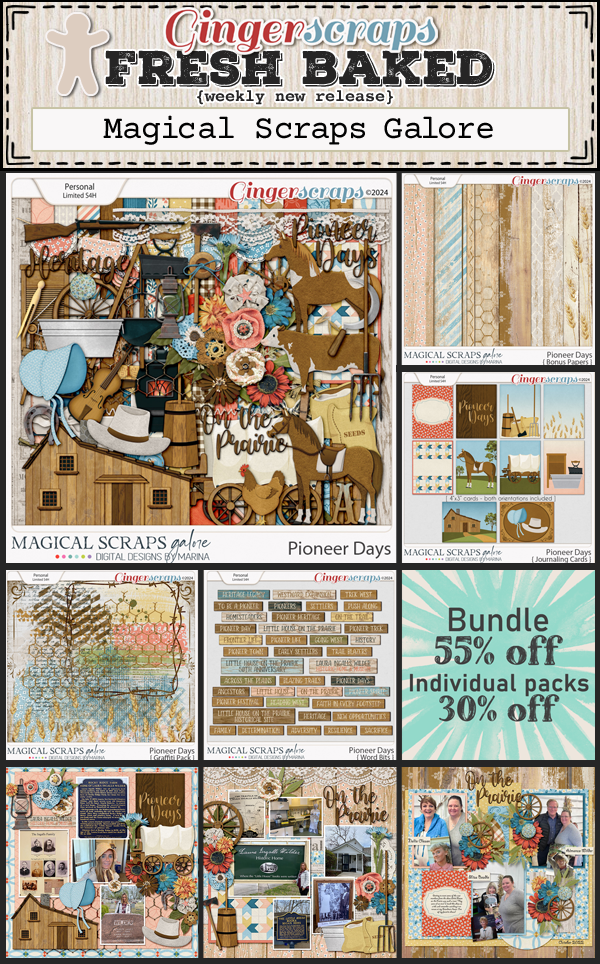
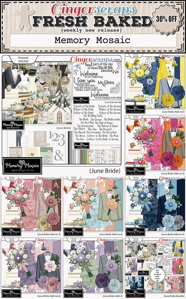
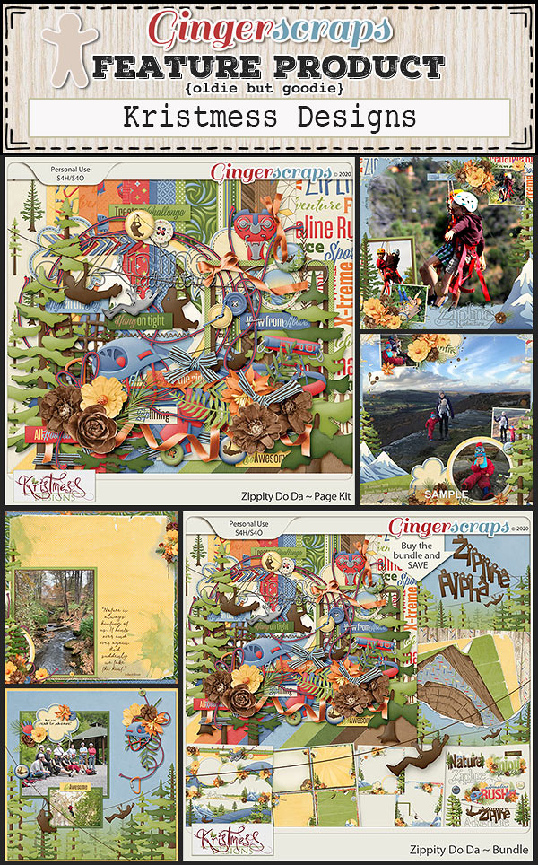
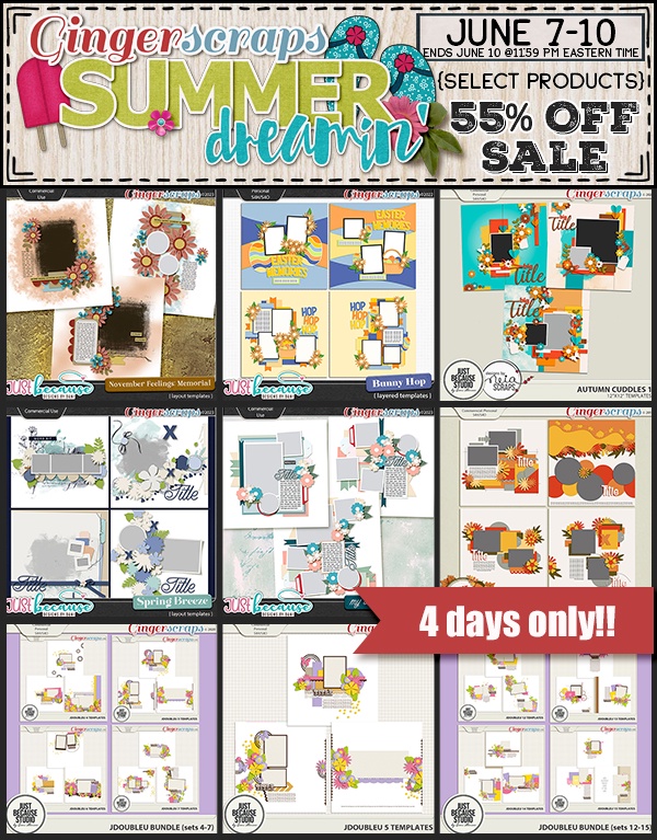
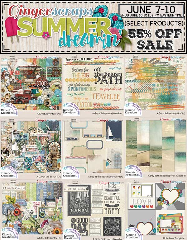
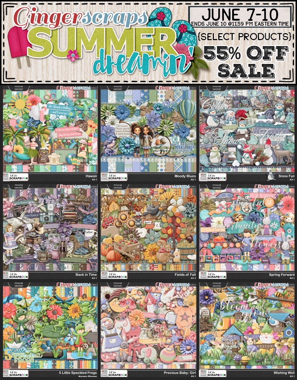
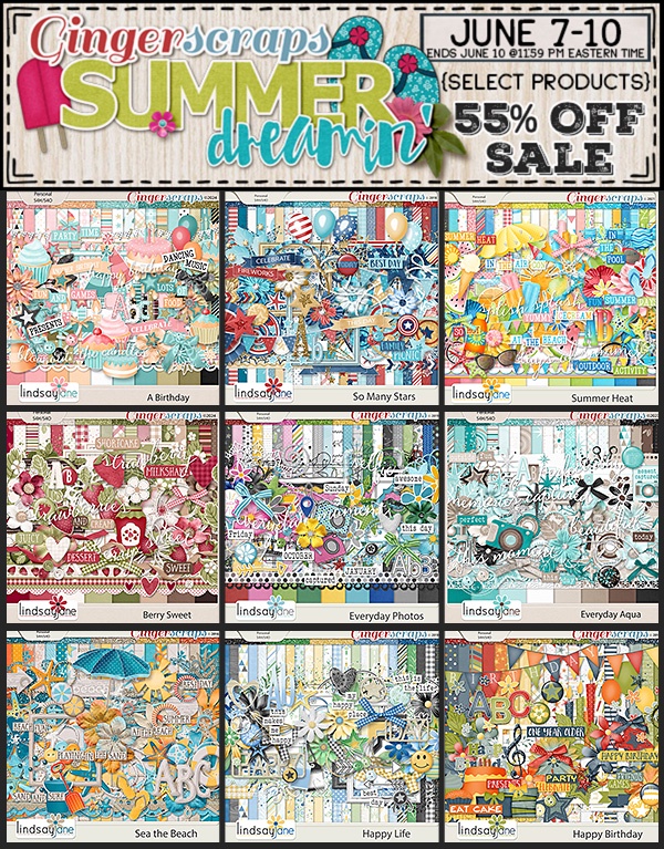
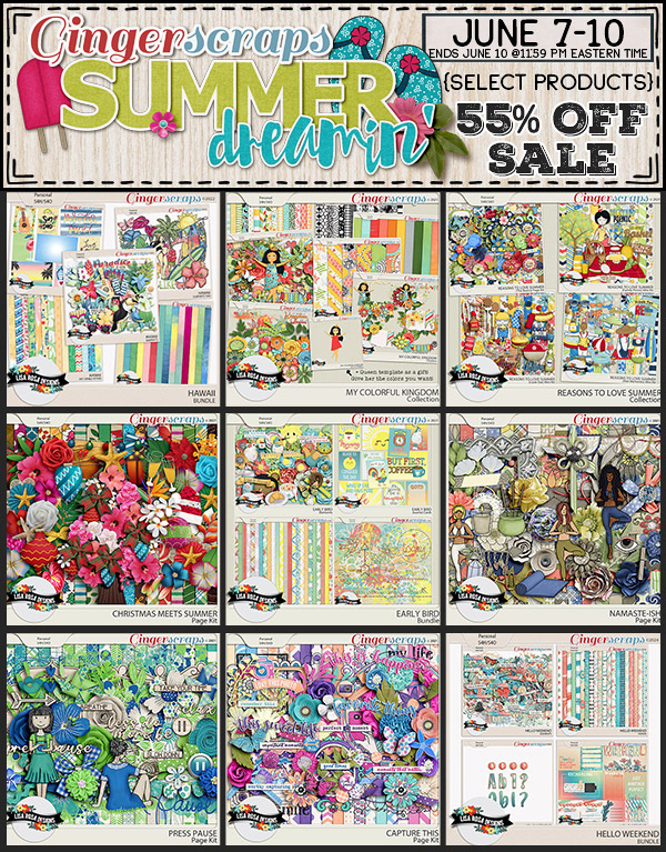
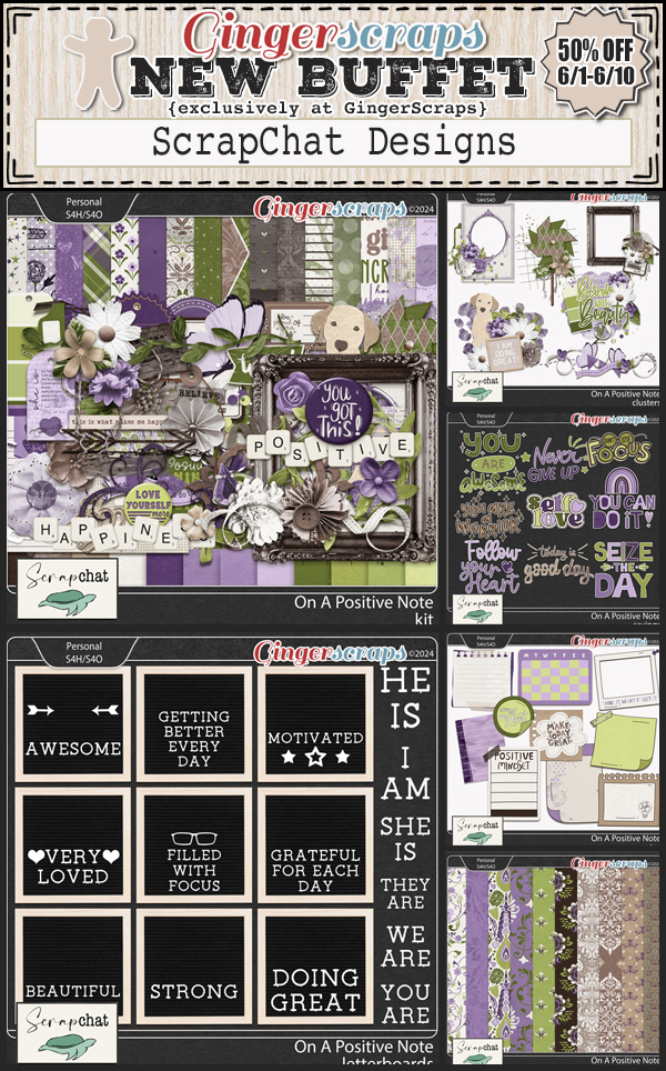
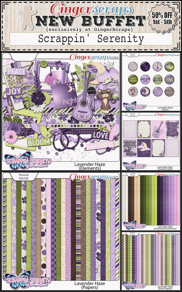
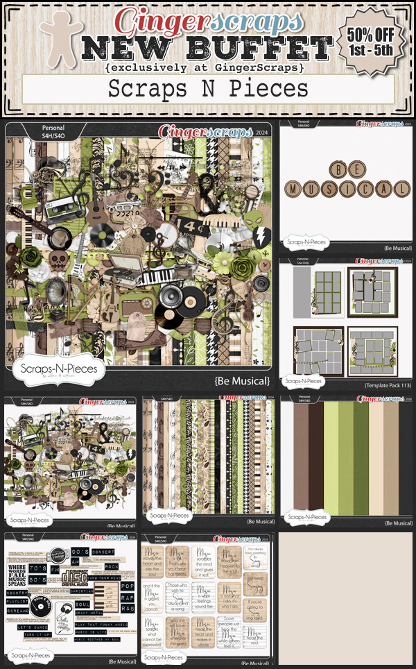
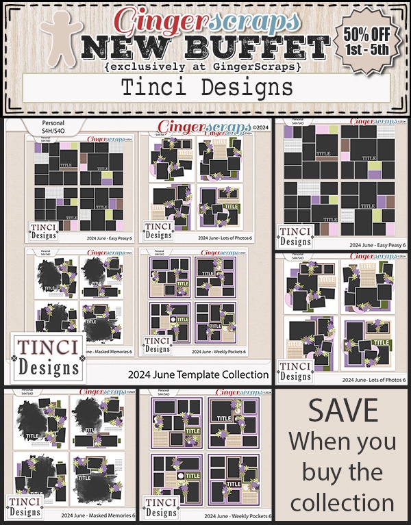
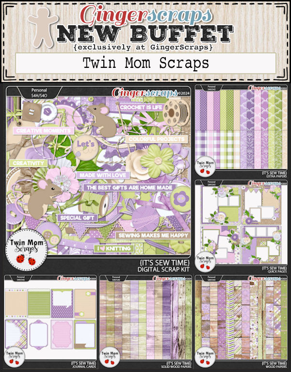
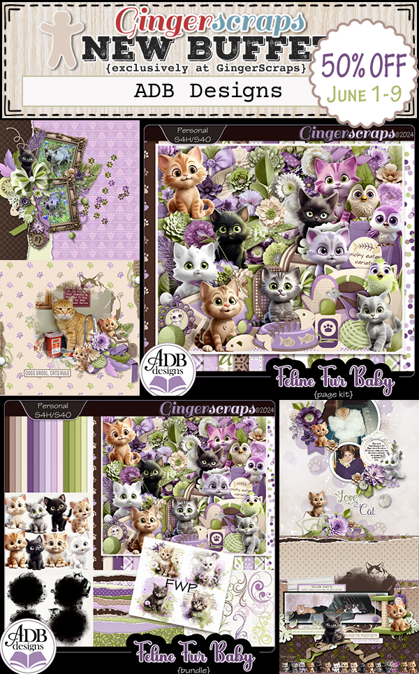
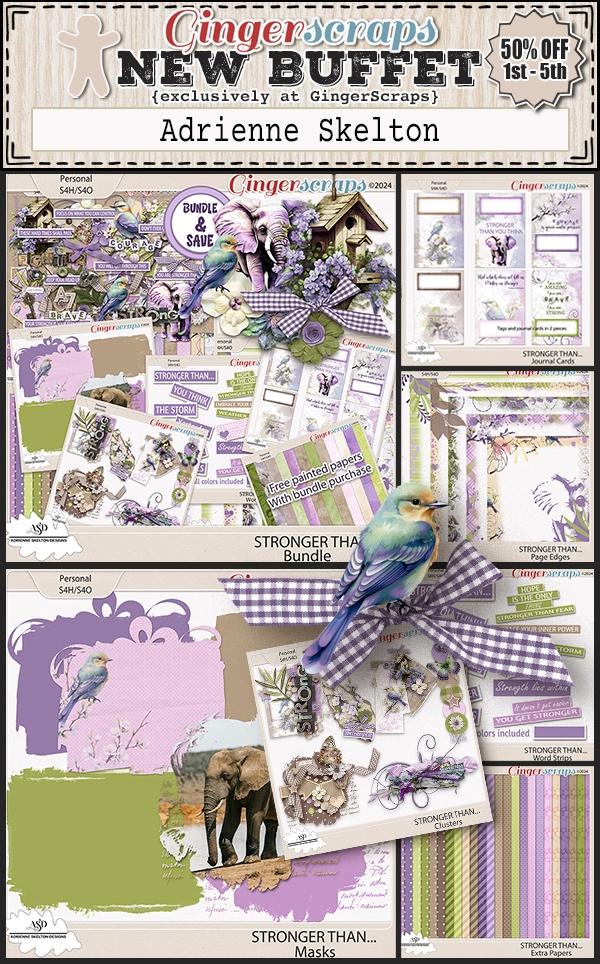
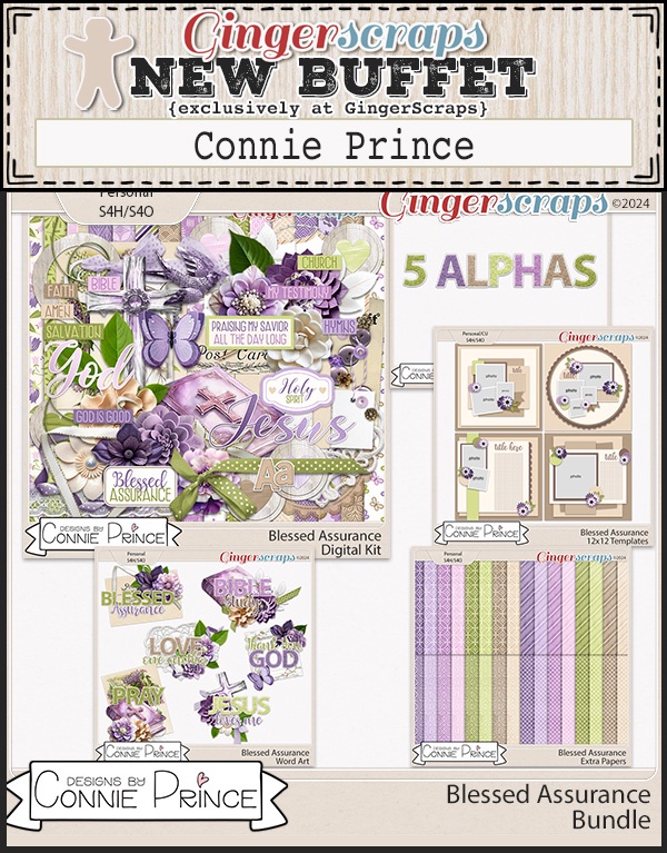
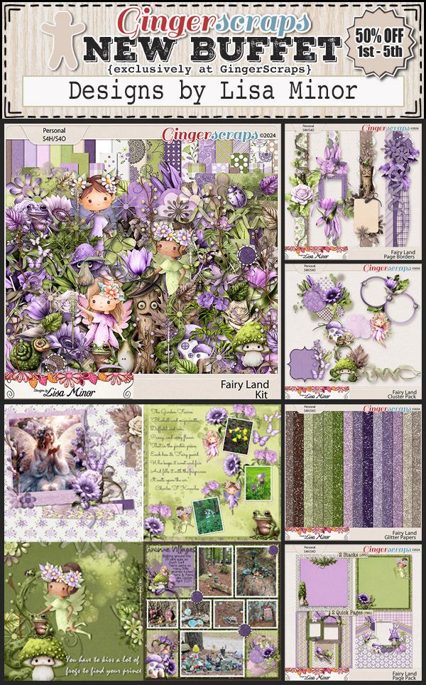
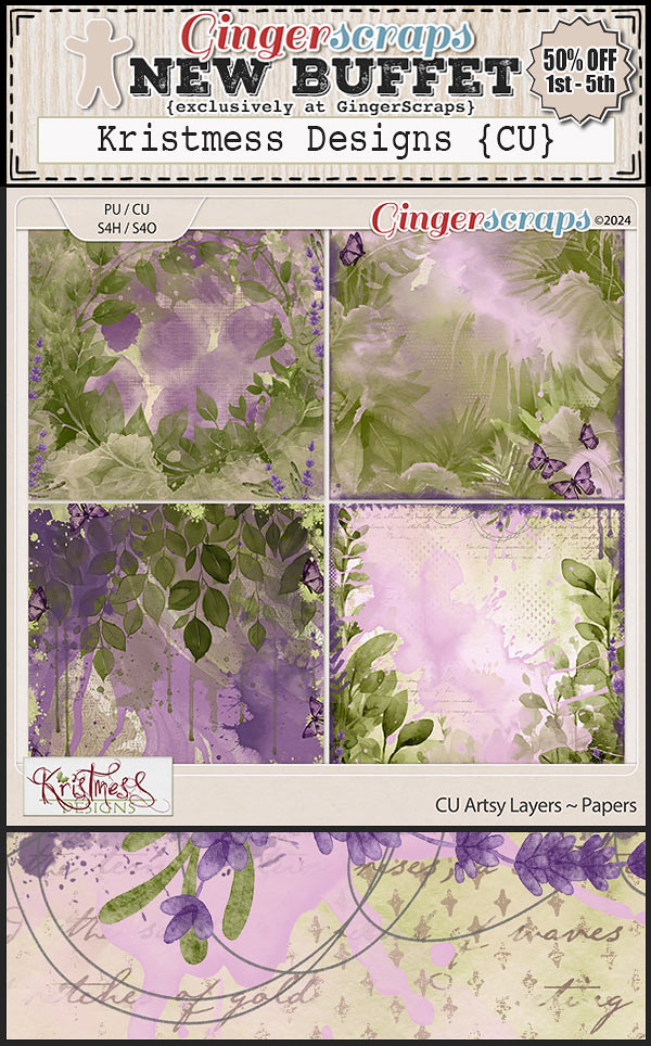
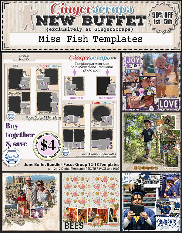
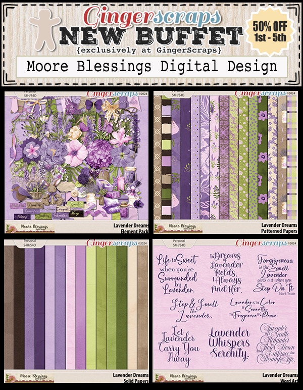
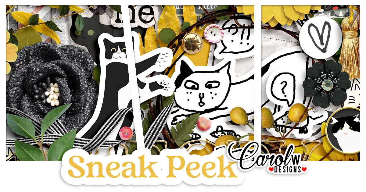
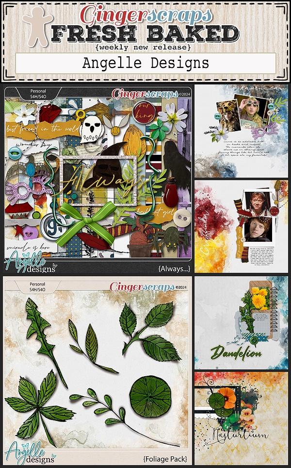
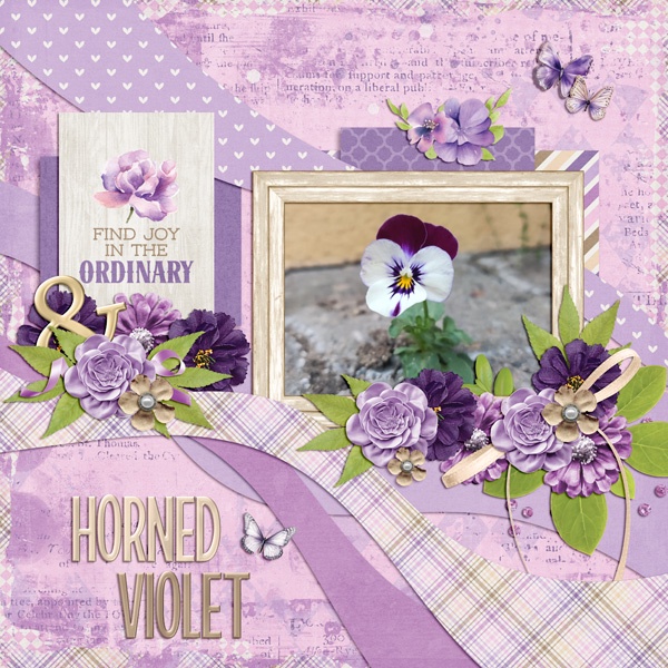
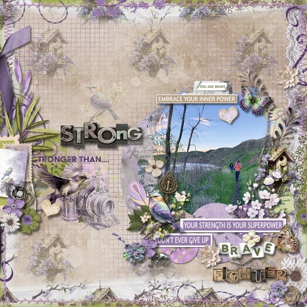
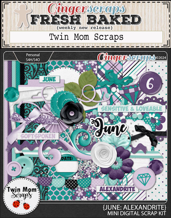
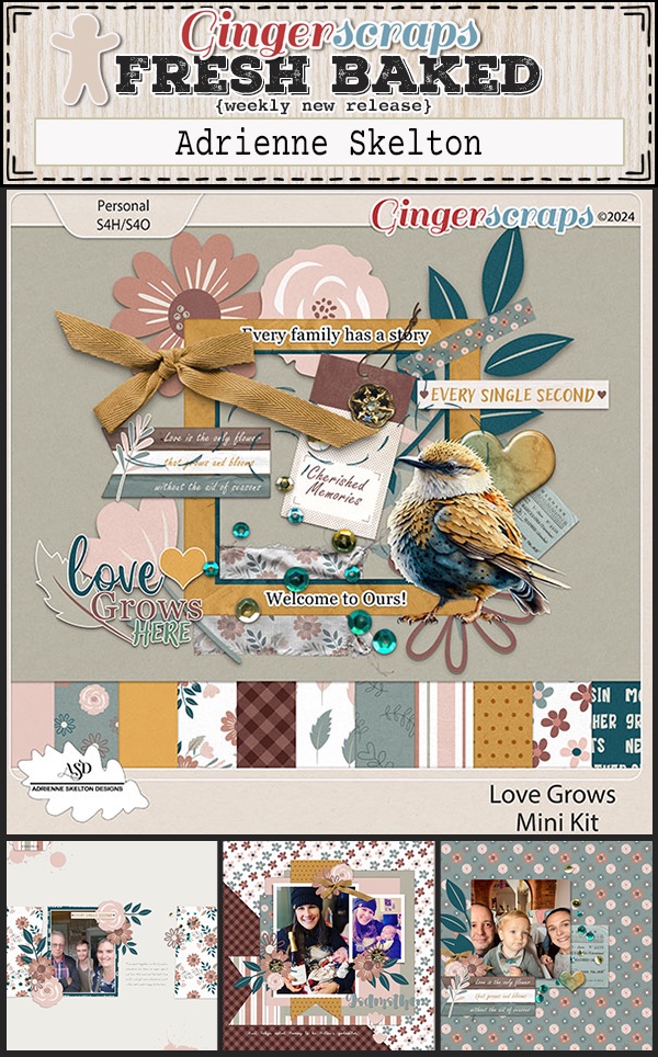
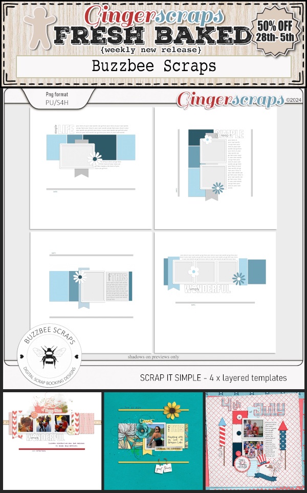
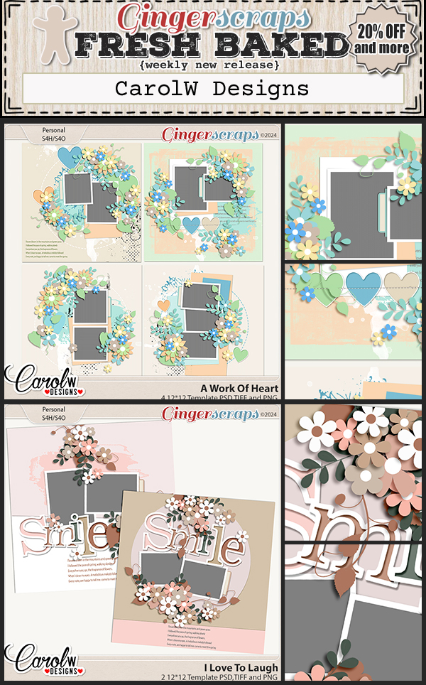
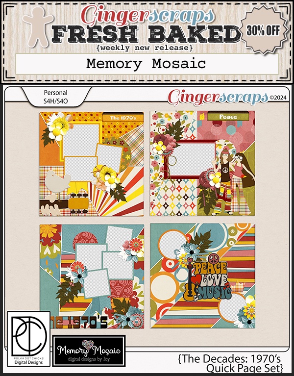
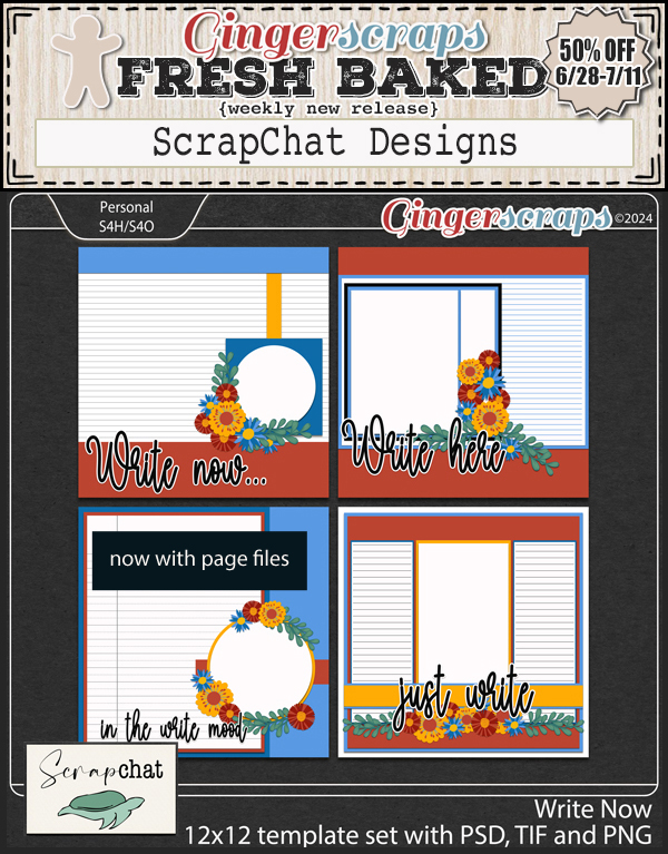
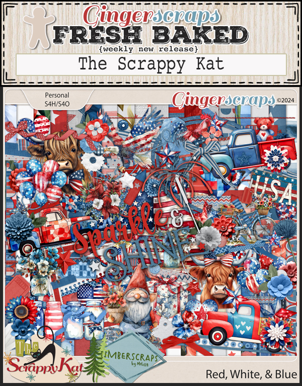
Let’s see what the designers have for us this week.


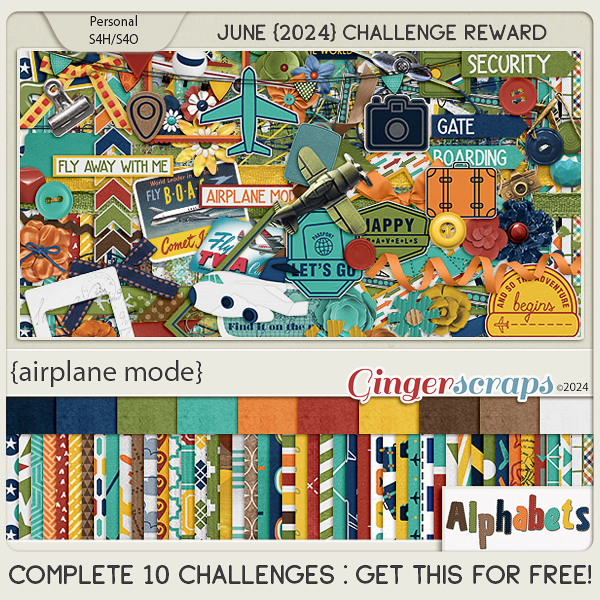
Only a few more days to get your challenges done and submitted. Complete any 10 challenges and get this kit as a reward.