Custom Christmas Cards – a Re-view
![]()
PDF Version : http://bit.ly/3XM3OHp
Well, I knew it would happen sooner or later. I overdid it last week and have been dragging my butt around for the last couple of days. My brain has been MIA… Not even 12 hours of sleep has helped; I still feel like I’m running through wet concrete. Instead of just posting a sorry-there’s-no-tut-this-week message, I’m going to update an older, but still timely, tutorial for you. Have you seen the price on commercial Christmas/Chanukah cards lately? Crazy. It’s just crazy. So why not make your own?
I’m going to show you how to make 2 personal Christmas cards from 1 sheet of cardstock. The resulting cards are 4 1/4 inches by 5 1/2 inches. You can get 50 envelopes that will hold these beauties at Michaels for $8 (Canadian, so about $5 in the US).
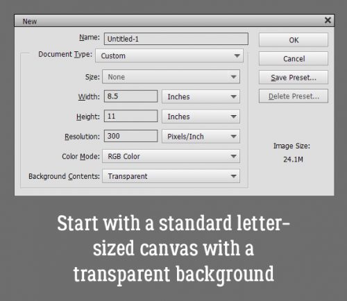
If I would have been thinking I could have skipped this step by putting the dimensions in reverse in the New Document screen. But I didn’t so I had to Rotate the canvas 90°.

Next I snapped a line across the centre of the page, and another from top to bottom. I used the Ruler and the Pencil Tool. To snap a straight line in a project, select the Pencil Tool and set the size of the line you want. I wanted these lines to be faint, so I went with 1 pixel. Line up the cursor with the halfway point along one side of your canvas. You can see a moving dashed line on the Ruler so you’ll know when you’re in the right place. Click once just barely inside the edge of your canvas. Then hold down the Shift key and move the cursor to the same spot on the opposite side and click again. It’s just that easy. Then do the same with the top-to-bottom centre point. These are guidelines for placement of elements and for cutting and scoring later.

Then I opened up the folder where I’d collected the objects I wanted to use. I have a photo taken several Christmases ago, a 3D snowflake from Lindsay Jane‘s Snowed Under kit and a mask from PrelestnayaP‘s December Wishes.

Working in the lower left corner of the canvas, I opened up the Shape Tool, chose the Rectangle, set a Fixed Size of 5.25 by 4 inches and chose a darkish green colour.
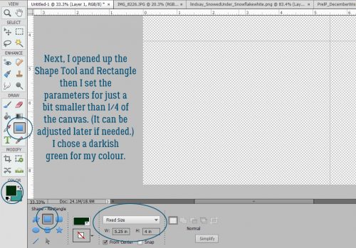
The resulting rectangle will fit inside the guidelines for one card. and by Simplifying the layer, I can make adjustments to it as needed because it’s now a Smart Object.

The next step is to add the mask. I resized it to fit inside the green rectangle completely.

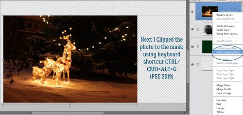
The photo went on top of the mask and was resized to approximately the size I’d need. I want the deer and some of the illuminated snow visible later.

Clipping the photo to the mask is simple. Right click>Create Clipping Mask or CTRL/CMD>ALT>G for more recent versions of PSE or just CTRL/CMD>G for versions pre-15.
Final position tweaks included a little shifting and a little more shrinking.

I chose a gold colour from my photo to use for the sentiment. Here’s where all those amazing fonts you have in your stash will come in handy. You can make this text as personal as you want, even making it family- or person-specific. But it still looked like it needed something. So I CTRL/CMD>clicked on the green rectangle layer’s thumbnail to select the outer edges of the rectangle. Then Select>Modify>Contract.

I pondered for a nanosecond how much I should shrink my selection and settled on 25 pixels.

And then I added a Stroke to the new selection. Edit>Stroke (Outline) Selection

I then used the same gold as for the text and added my Stroke. The position for this isn’t a make-or-break thing, so don’t obsess over it.

Yes, I think that’s what it needed.

The final step for this card is to add a trademark to the back. I went with the green for this.

Knowing that it’s on the BACK of the card and should be readable with the card right-side-up, I Rotated the text 180°. Alternatively, I could use that tip Pam K posted from a few weeks ago: Click the Image tab>Rotate>Flip Layer Vertical. Much easier!!

I’m going for 100% honesty here… I saw a card like this second one on Pinterest so I’m not taking credit for the idea. (Ignore the typo on the screenshot please!) I added a new blank layer to the stack and Loaded some watercolour Brushes. These are from a set of 20 free brushes from Brusheezy. I chose 3 shades of wintery blue for the brush area.
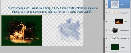
I layered the brushes, each on its own layer so I can make adjustments to just one – or all – if I need to.

For a bit of contrast I chose an aqua for the topmost brush layer.

I added in the snowflake and sized it appropriately. But it wasn’t quite enough by itself. So I added a Layer Style from Ooh La La Scraps‘ In the Frosty Air collection.

It still was missing something so I turned off the snowflake layer for a second and added a white paint splatter. That makes a big difference!

A few words and it’s pretty much what I was looking for.

A trademark on the back in the dark blue and it’s finished! [Just Copy the trademark layer and nudge it into place.]

I saved the file as a .png so the printer wouldn’t need to add a white background to everything. To turn this into cards, I’ll load up my printer with white cardstock and print several copies. Using my guillotine cutter I’ll cut the cards apart on the top-to-bottom guideline and score then fold along the side-to-side guideline. I choose to print my sentiments for the inside of the card on resume paper (it’s a bit fancier than regular printer paper) and trim to fit the inside of the folded card. Word art would be perfect for this! Here’s a handy tip for searching in the GingerScraps Shop. On the left side of the Shop home page there’s a Search box. Type the theme/word you’re looking for in the box, then click on Advanced Search. When the Search panel opens up, untick Product Title and SKU, then type Word Art in the Search in Category box as shown. Magically, you’ll have a handful or so of results – only word art that relates to your key words! It’s fabulous.

Another option is to use a sentiment stamp and ink in a colour to match the front of the card. All that’s left is to sign them, pop them into their envelopes and mail them! Best part? There’s still time to make a stack of them and get them in the mail!
PDF Version : http://bit.ly/3XM3OHp
![]()