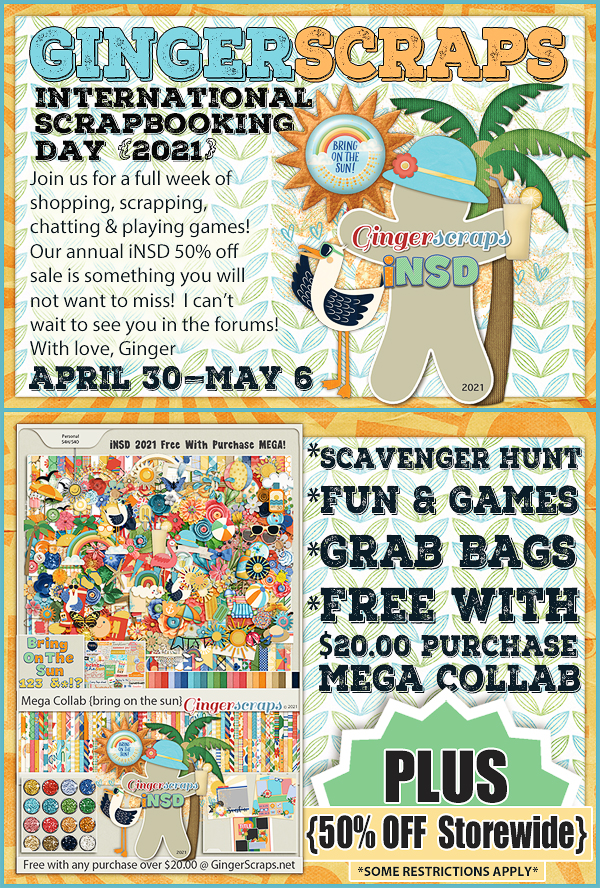
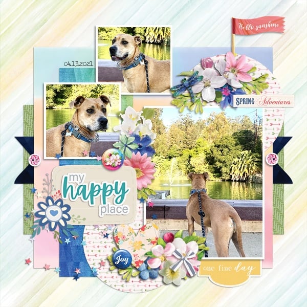
Happy Friday!! I hope you have had a great week.
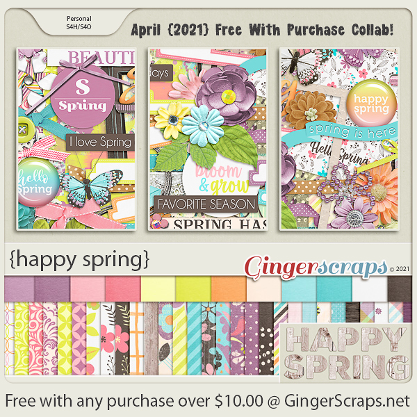
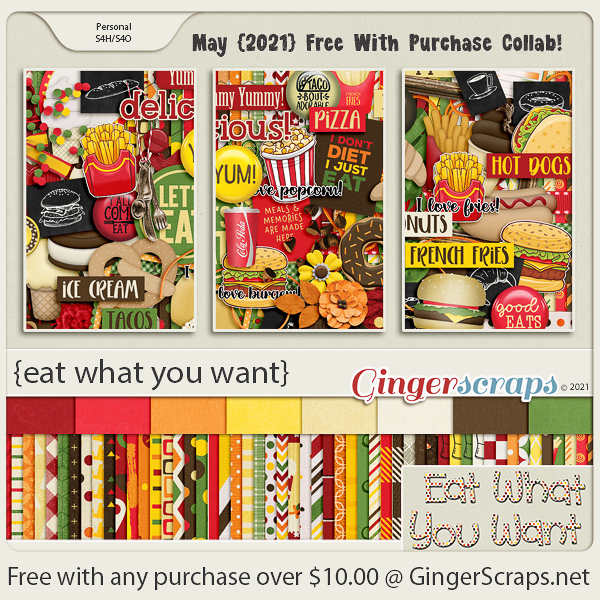
Remember, when you spend $10 you get this great kit for free.
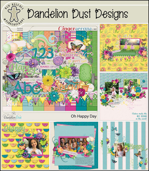
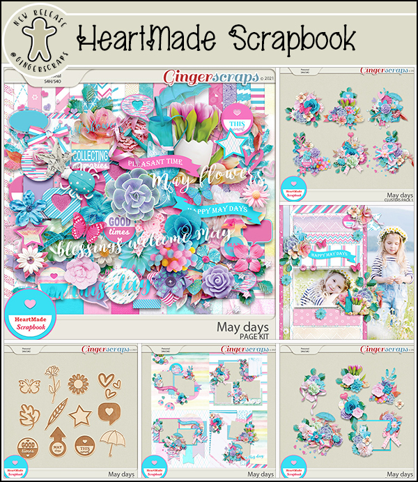
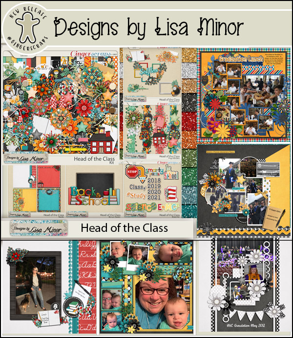
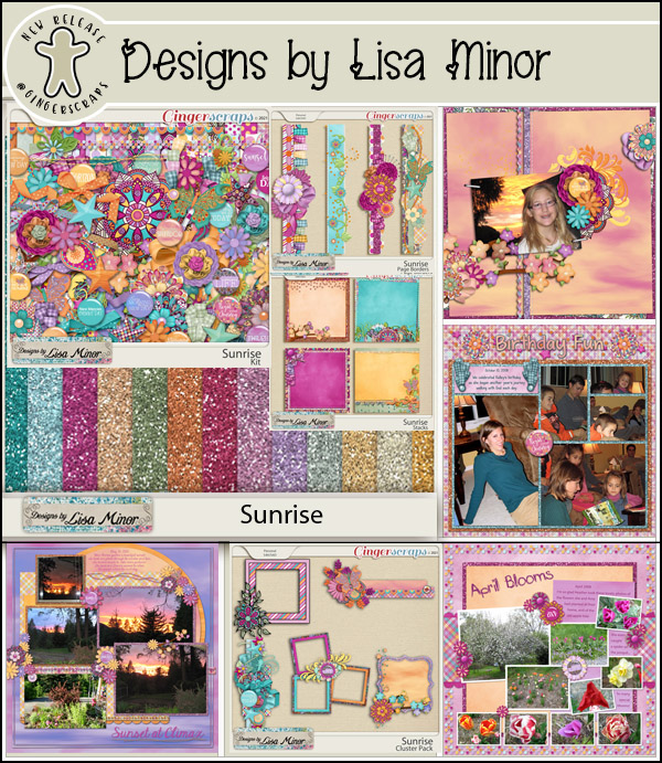
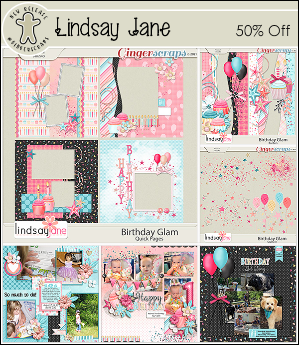
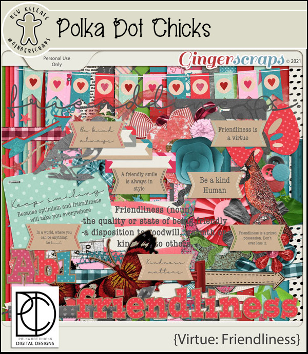
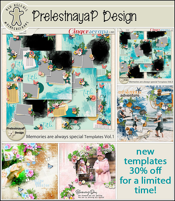
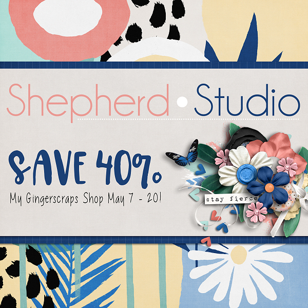
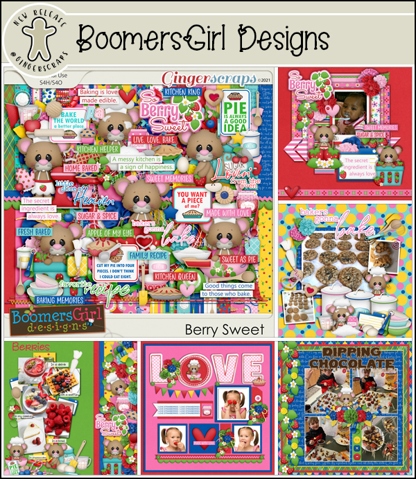
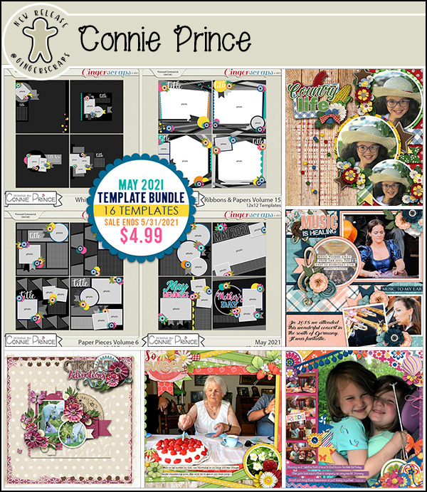
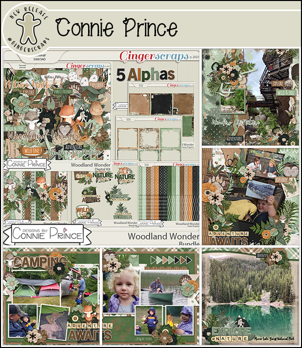
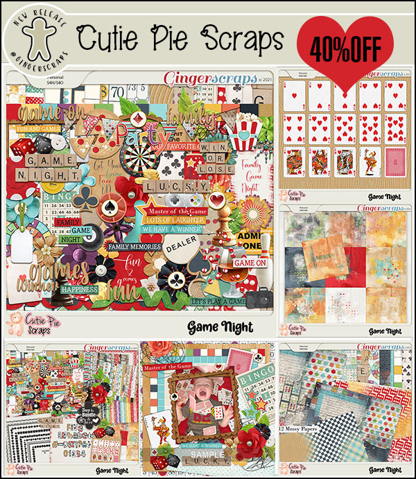
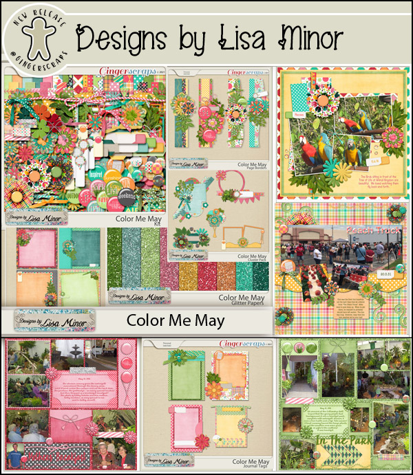
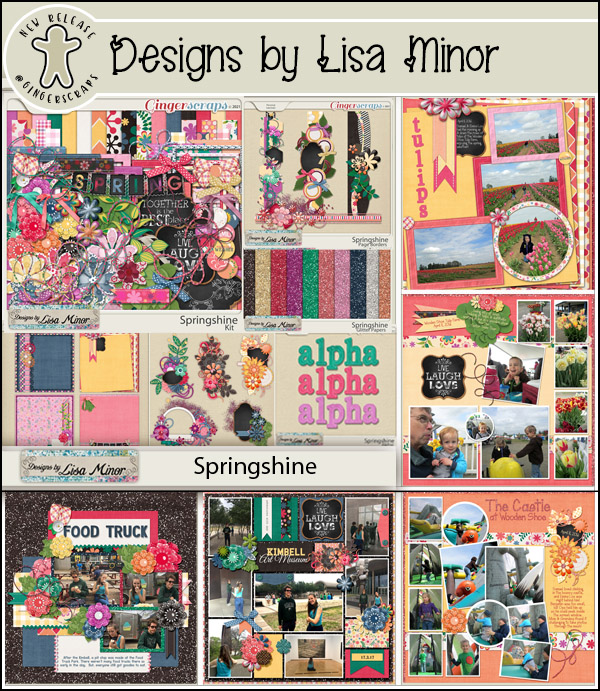
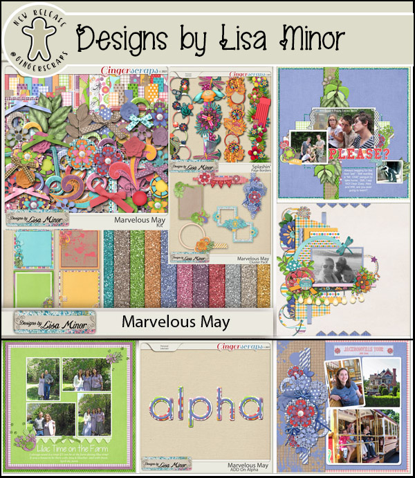
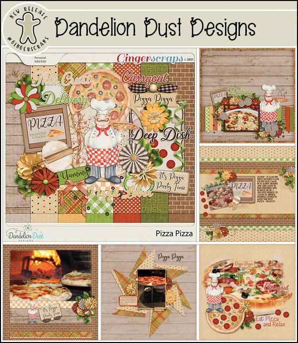
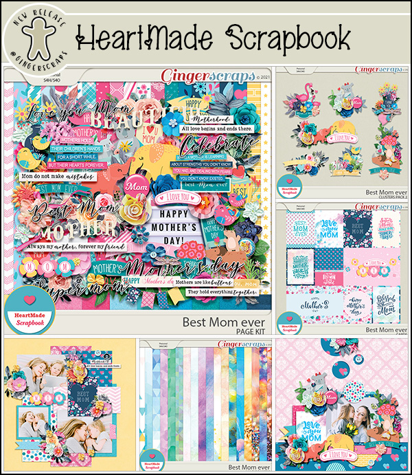
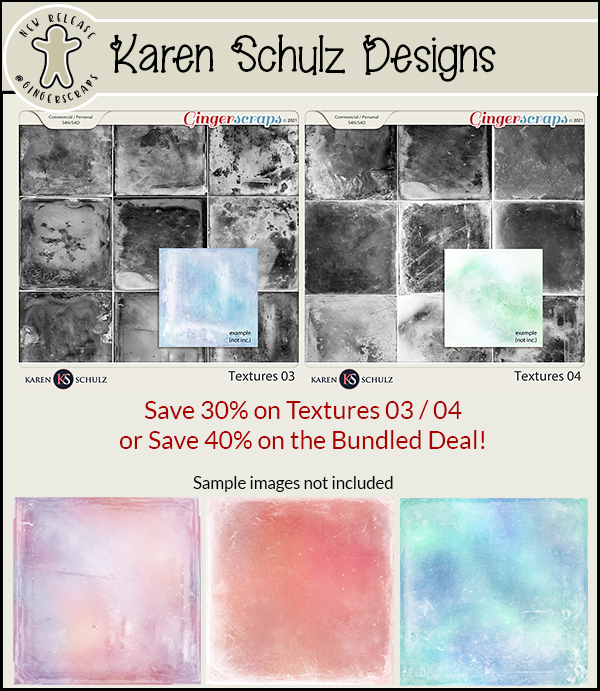
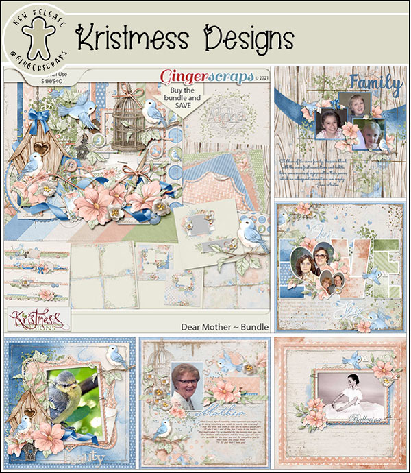
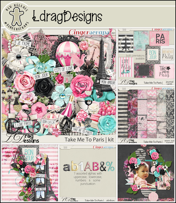
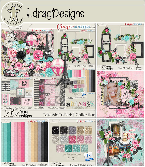
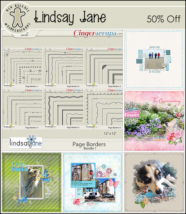
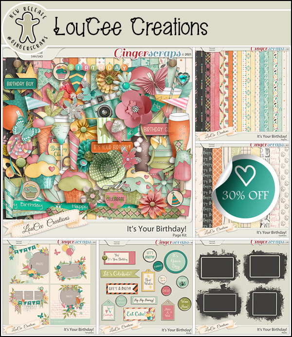
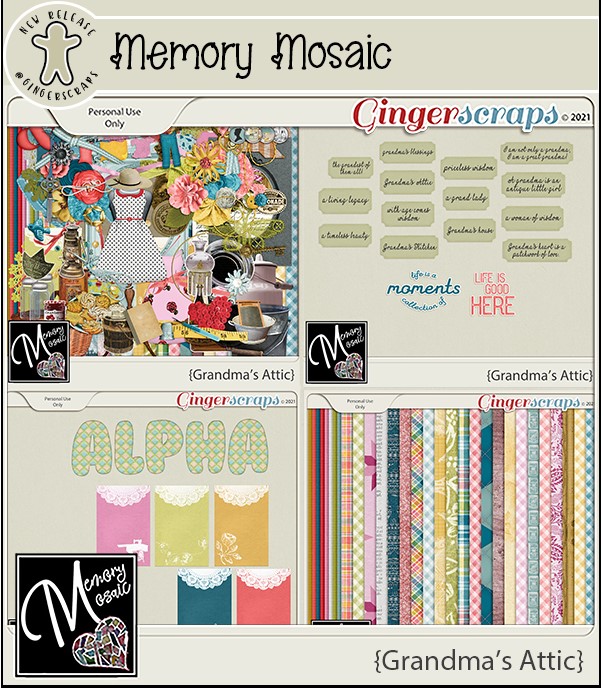
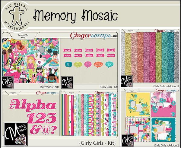
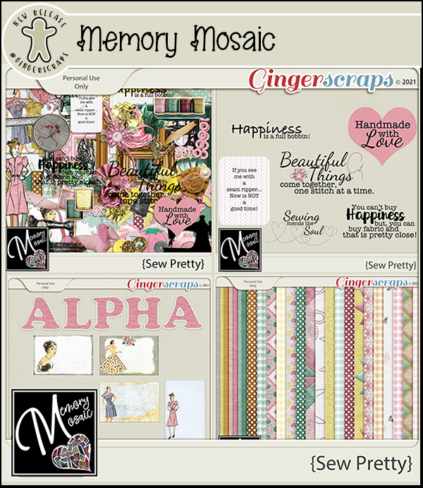
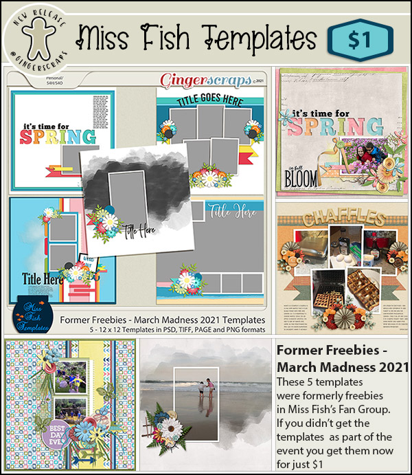
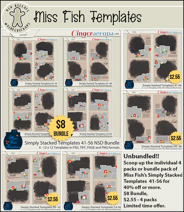
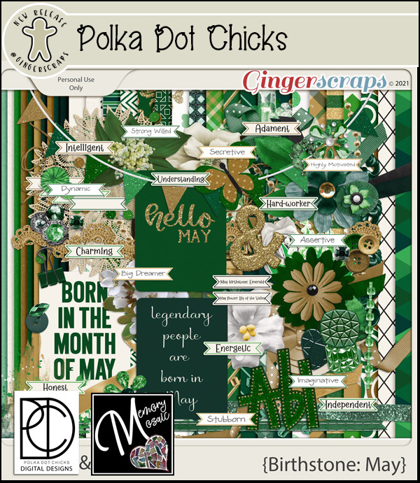
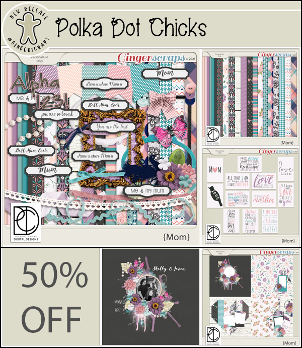
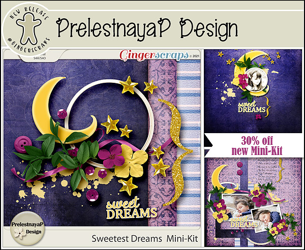
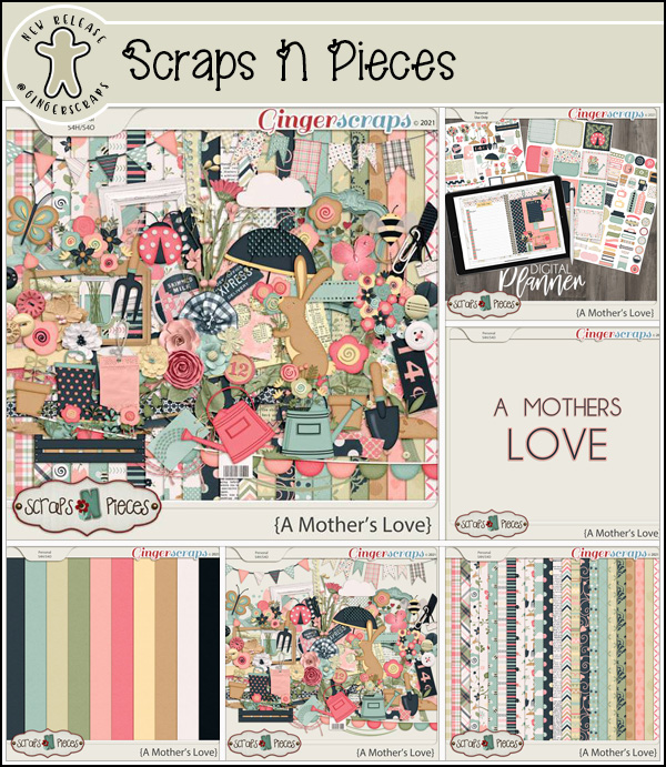
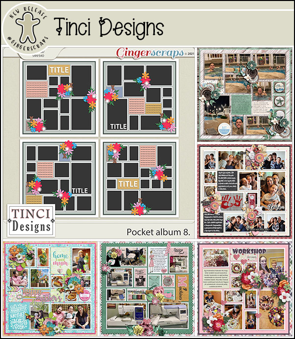
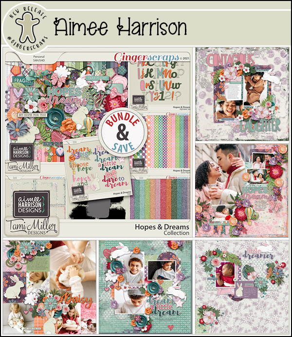
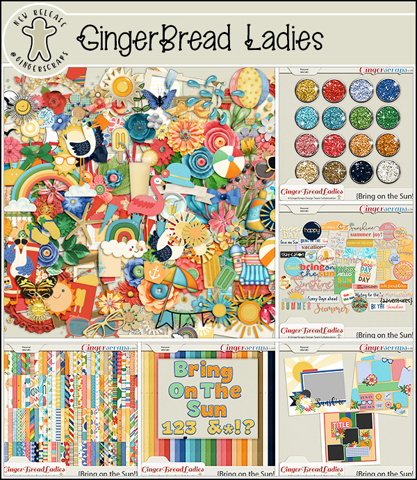
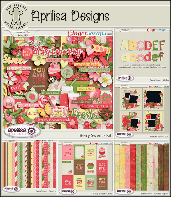
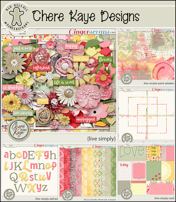
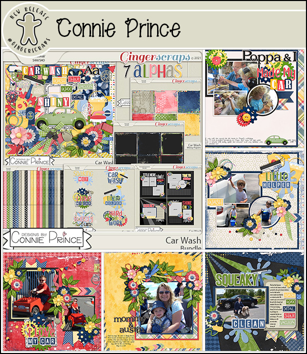
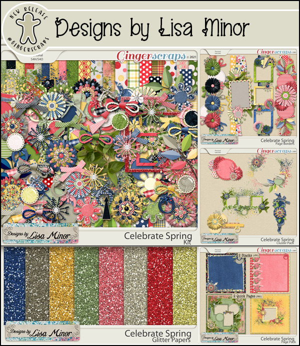
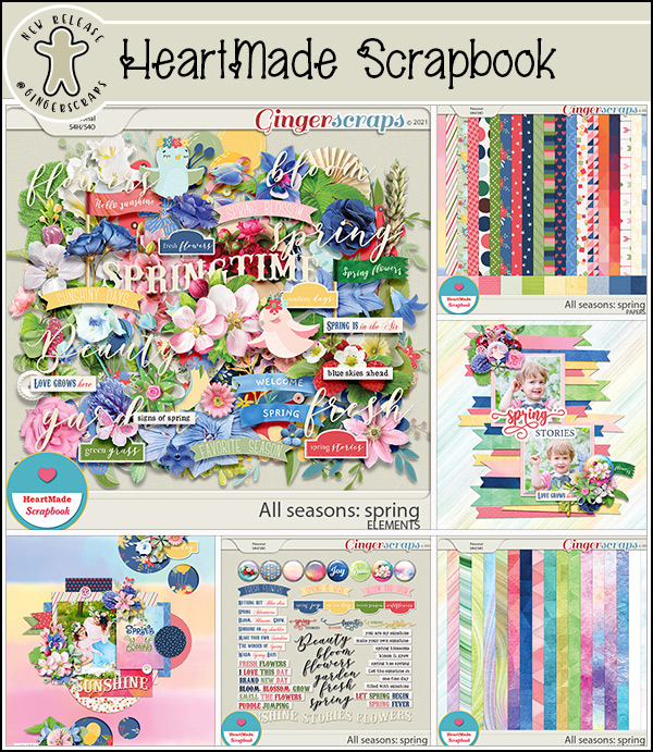
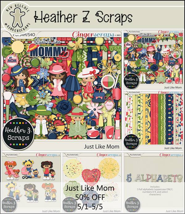
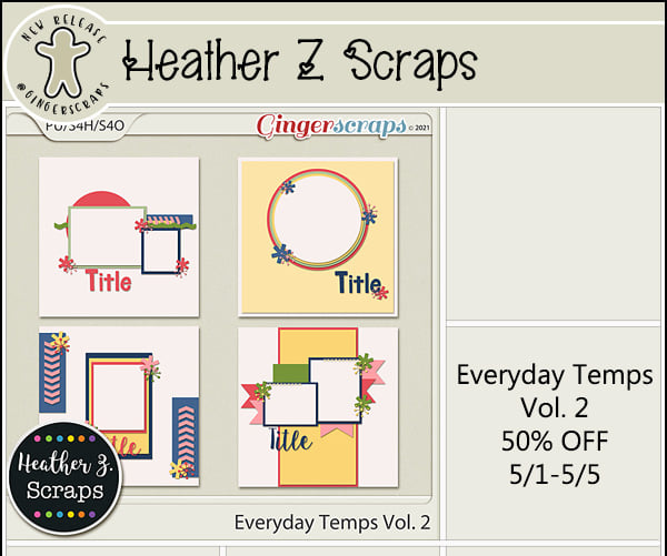
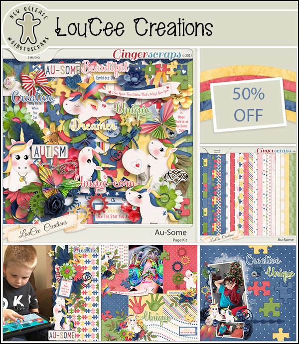
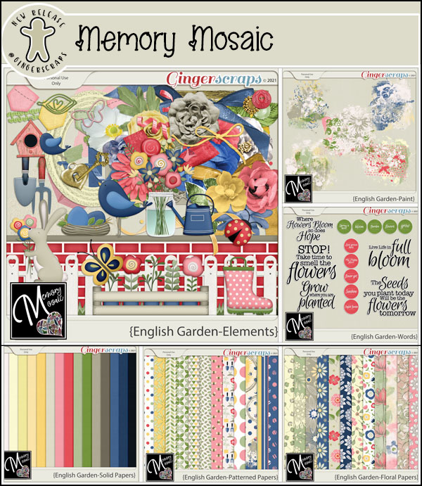
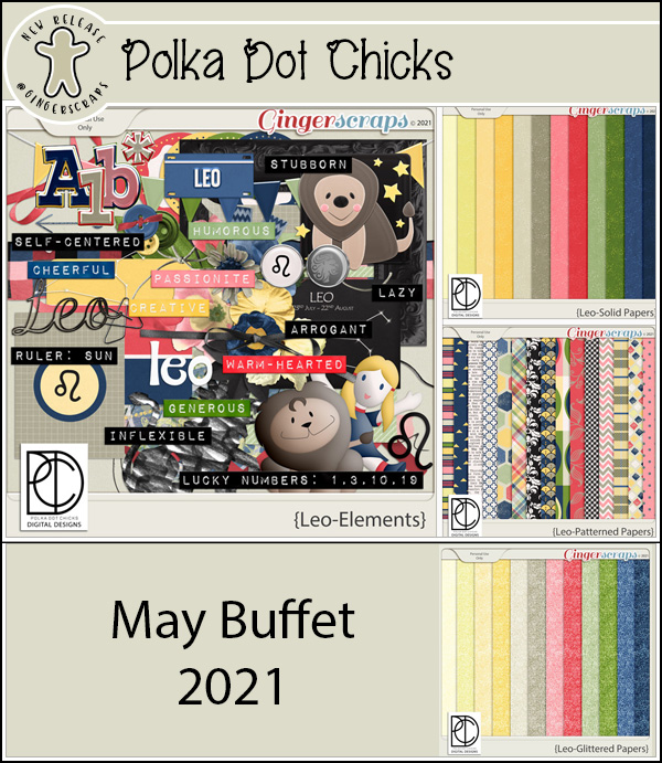
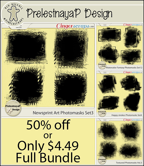
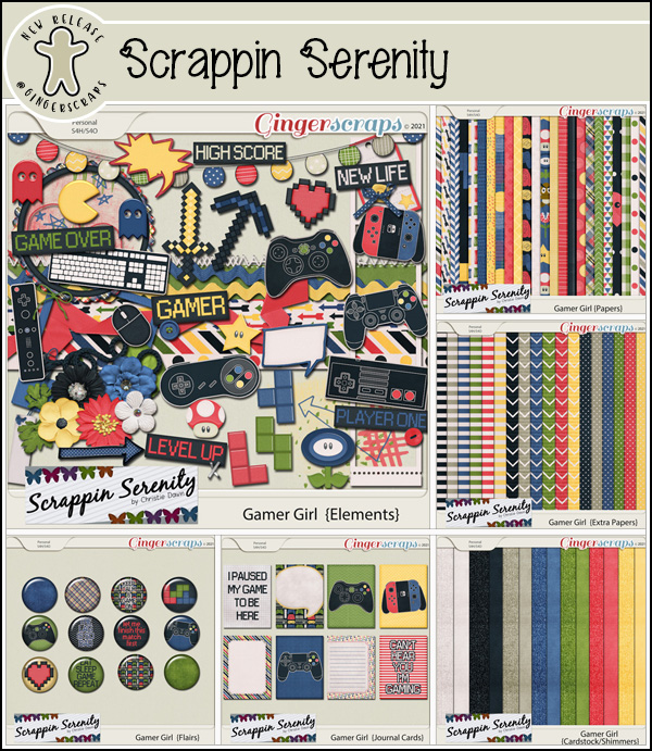
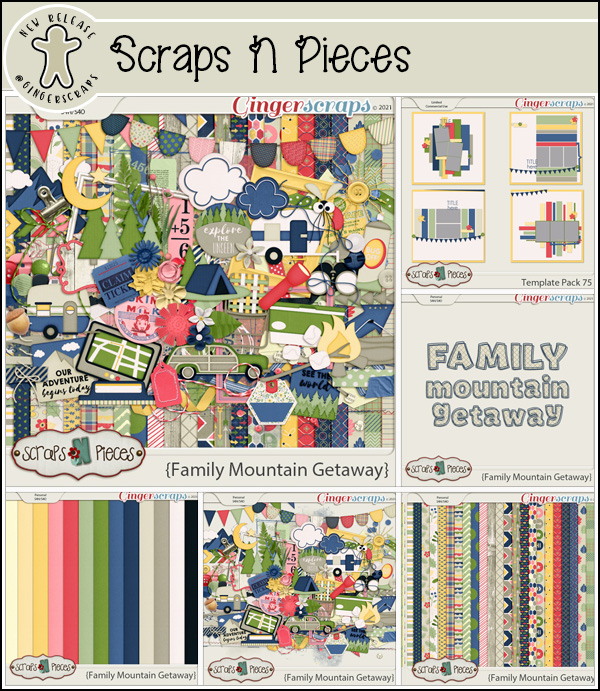
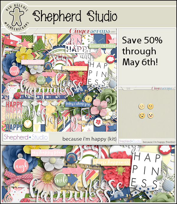
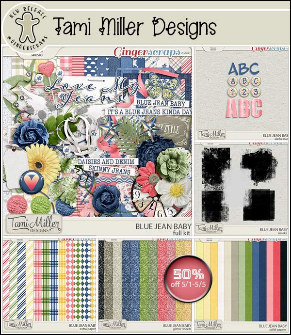
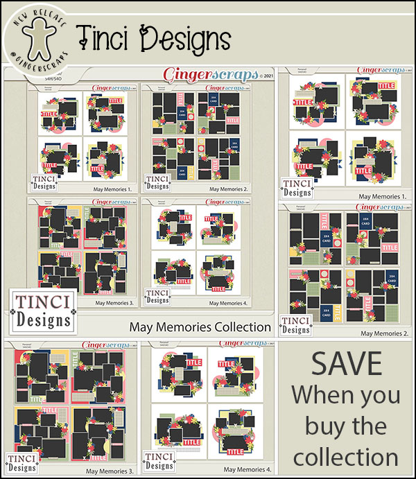
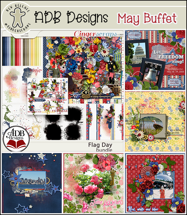
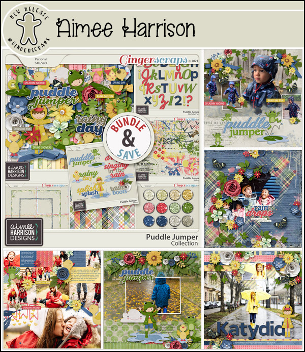
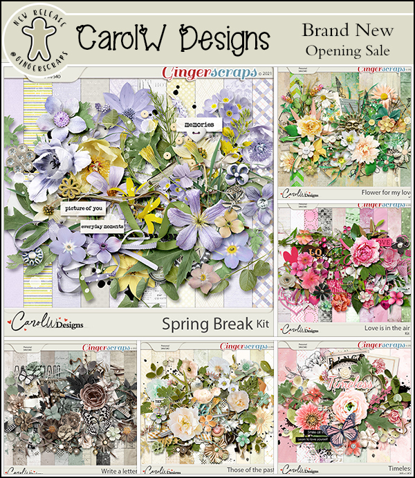
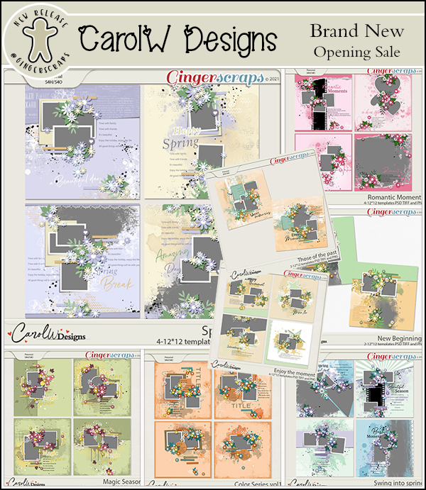
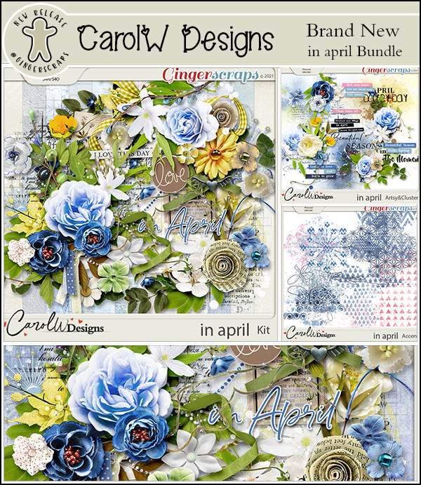
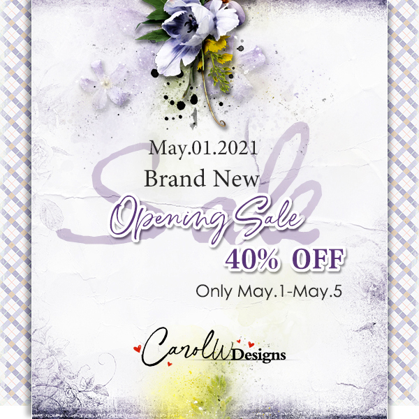
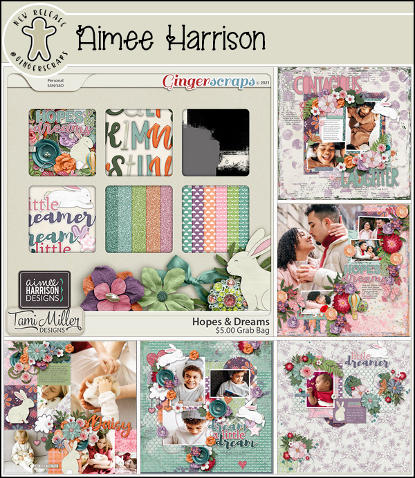
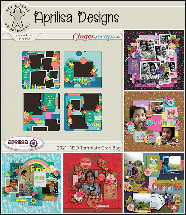
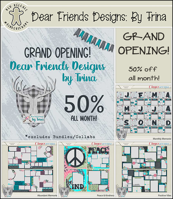
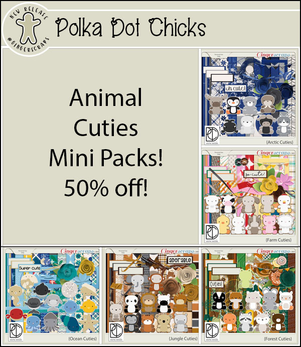
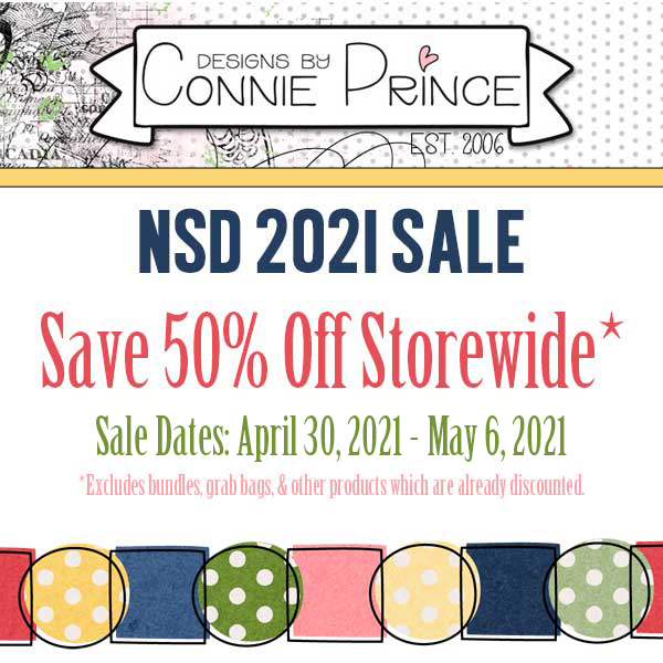
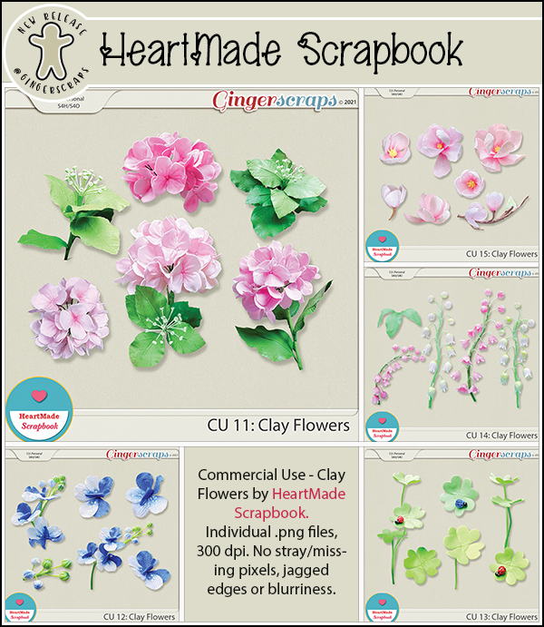
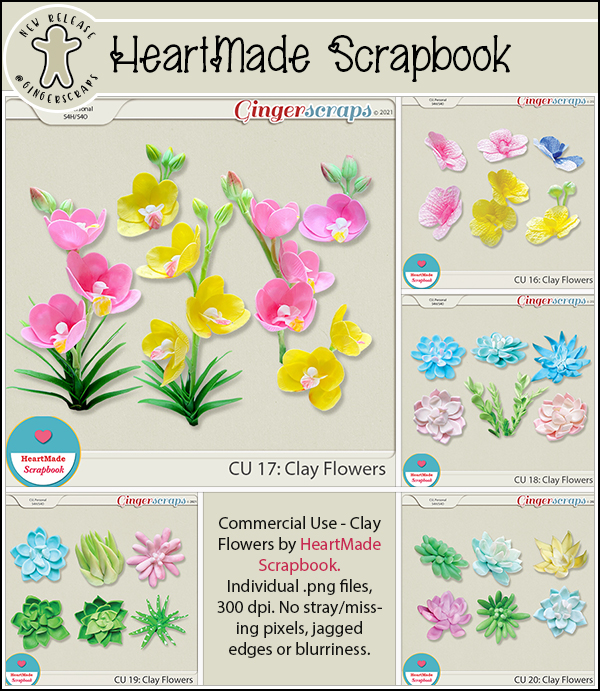
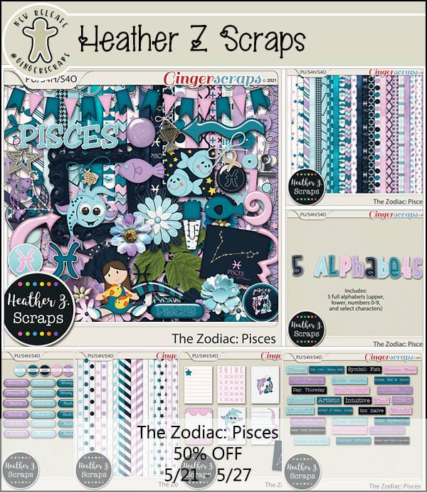
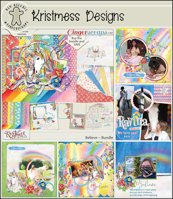
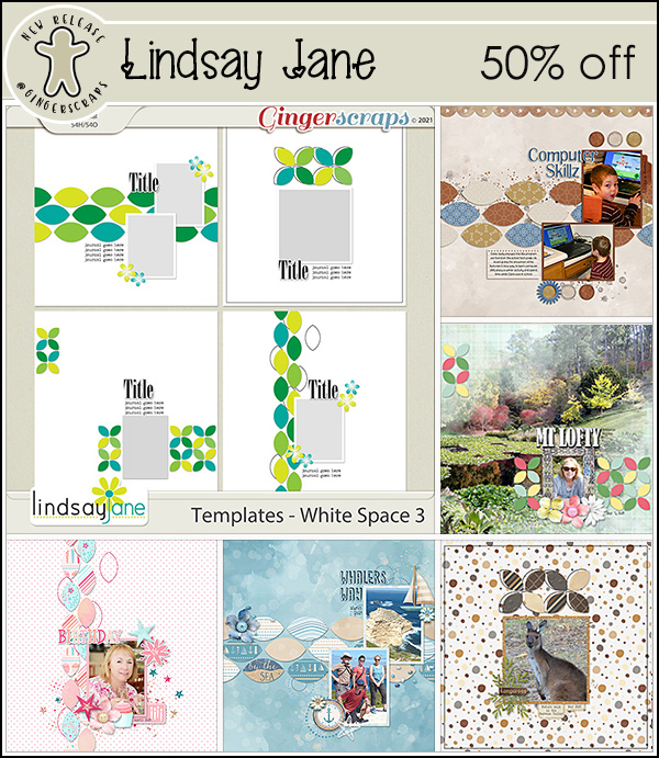
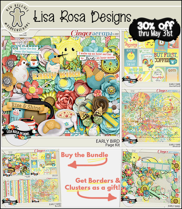
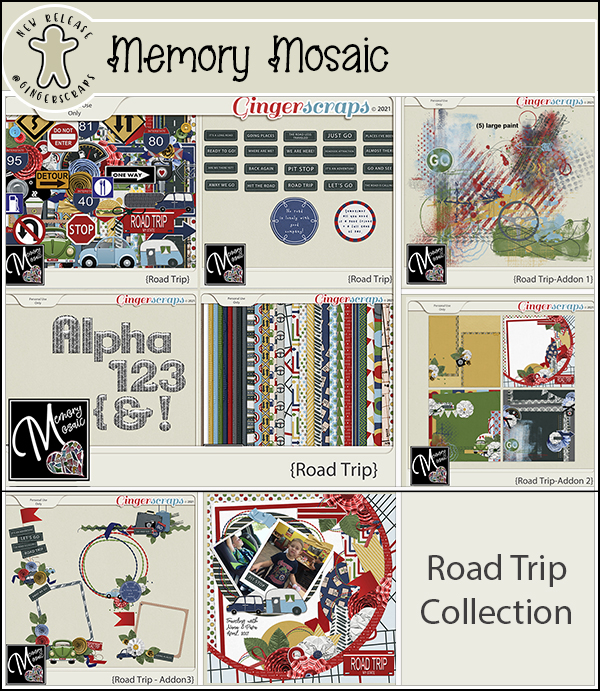
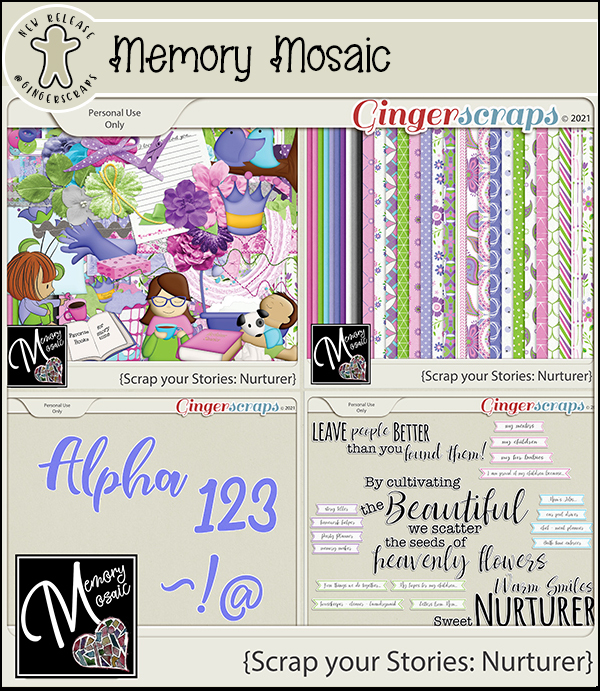
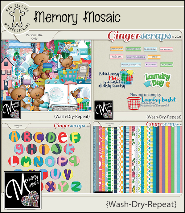
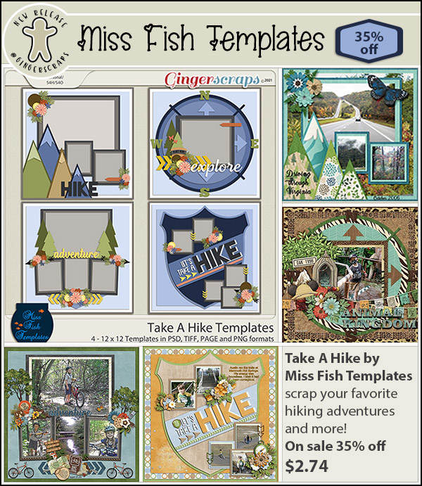
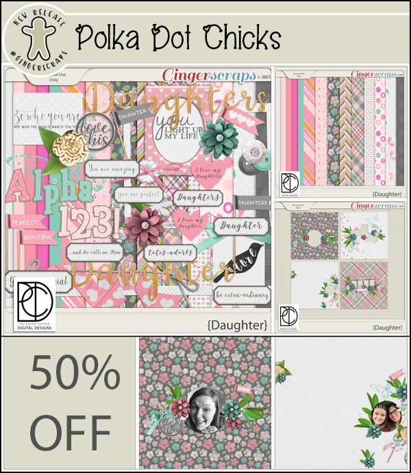
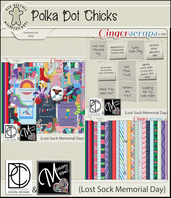
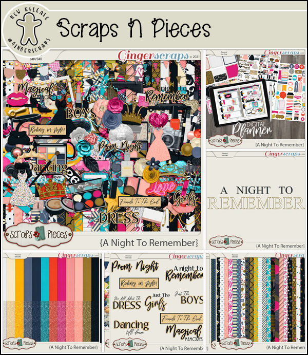
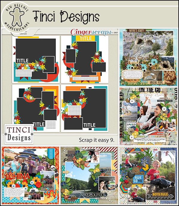
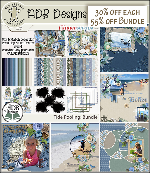
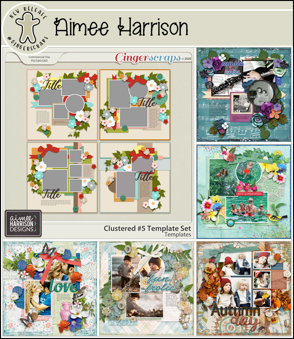
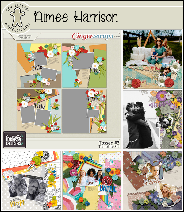
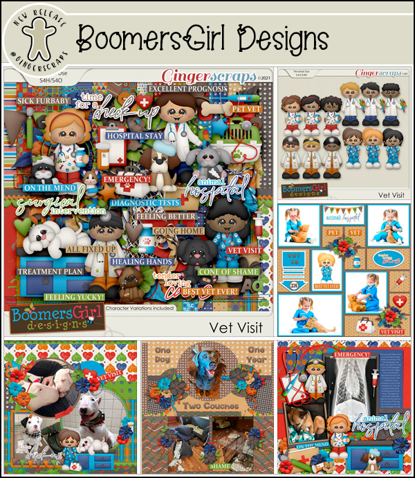
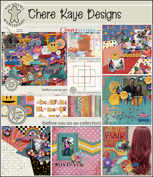
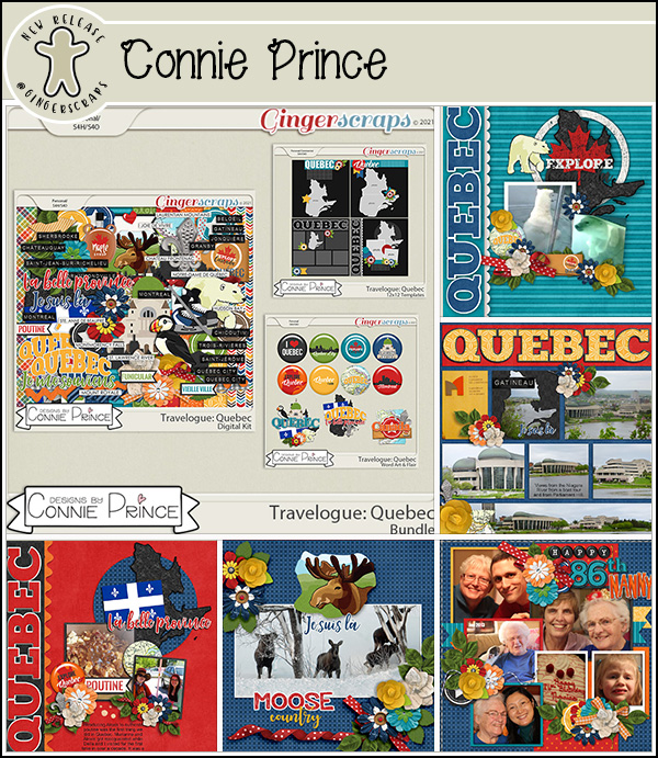
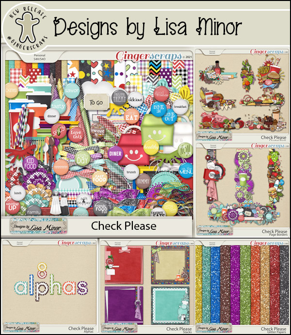
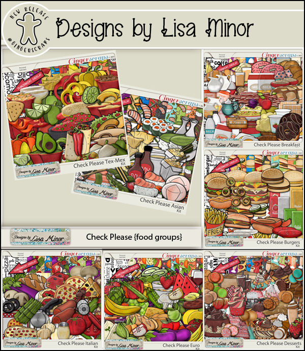
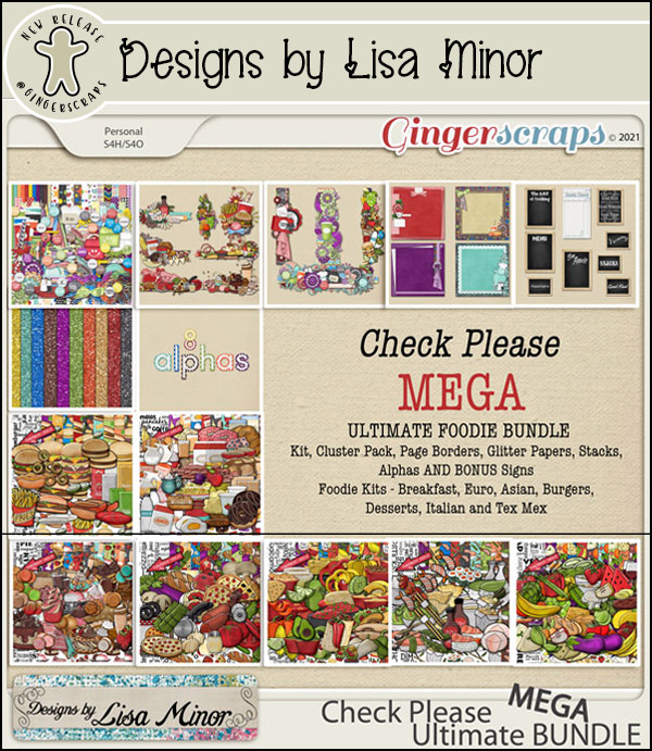
Let’s see what our designers have this week!

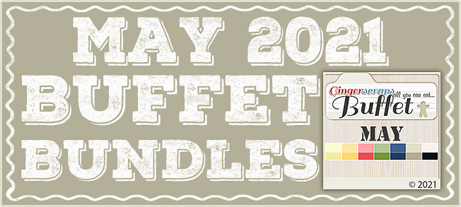
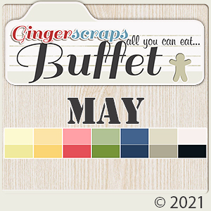
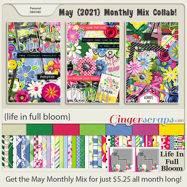
Have you grabbed the May Monthly Mix yet?
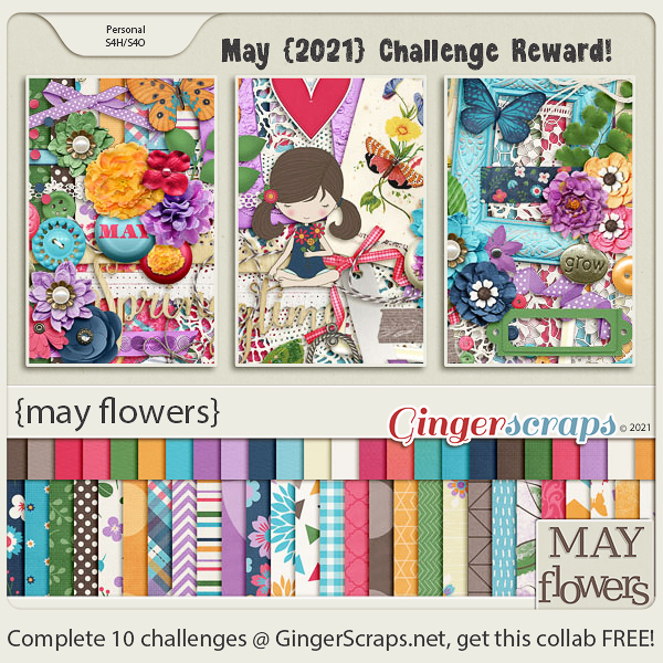
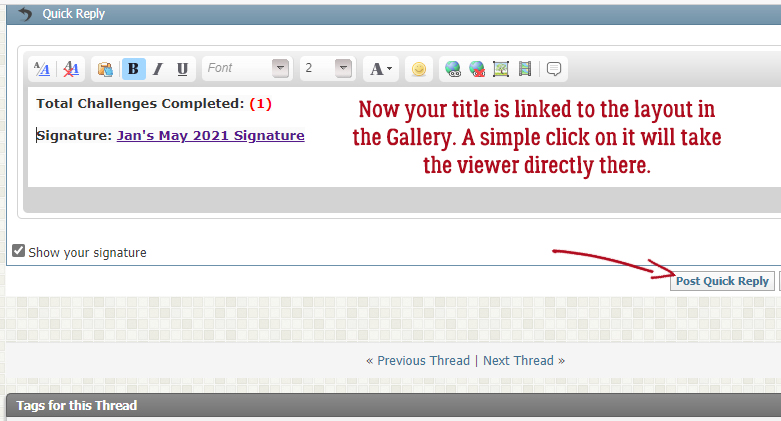
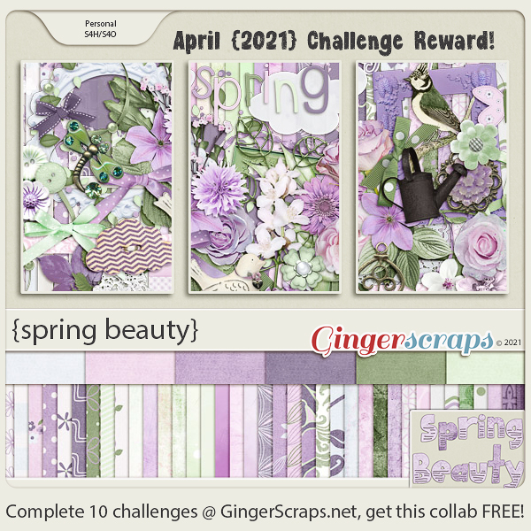
And how are those challenges going? Any 10 completed challenges gets you this collab as a reward.