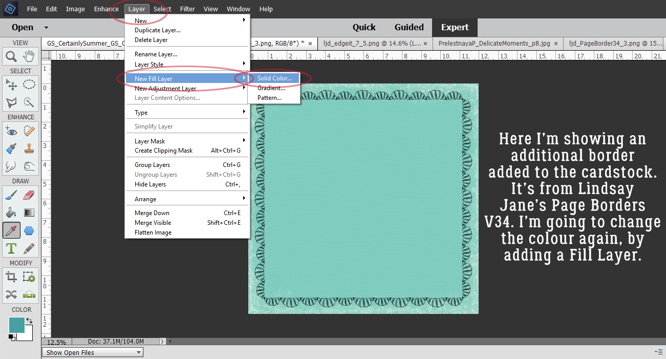
Stuffing that Envelope!
![]()
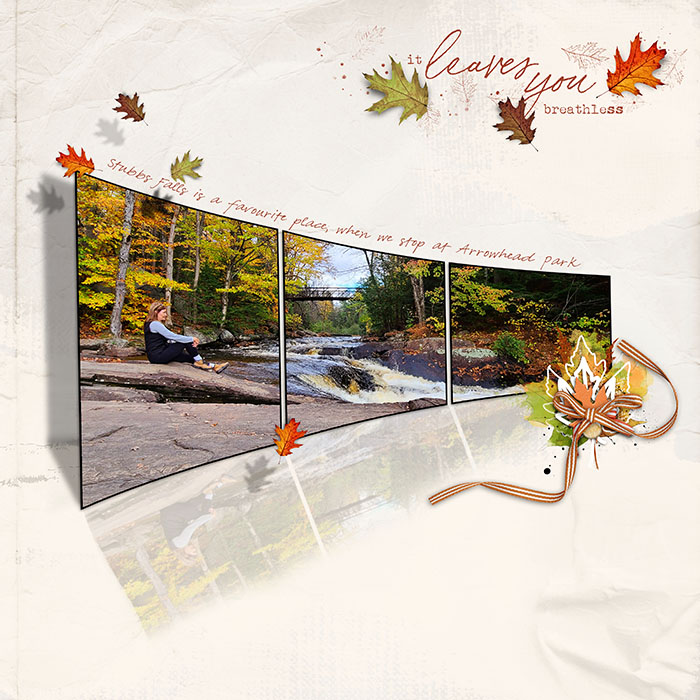
Did you ladies enjoy the tutorial on Reflections, Perspective and Shadows from a few weeks back? I hope you did. I know the ladies on the creative team for Ginger at Dandelion Dust Designs did, and becky_a wound up with a Layout of the Week with her version of the scraplift. After such success, the team has brought me another technique challenge after they found this beautiful layout by Blackkathy.
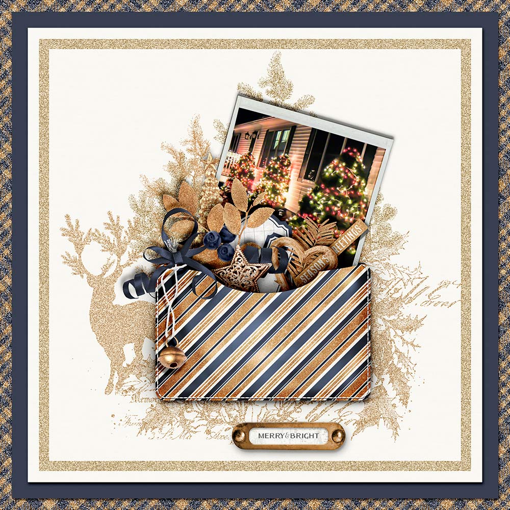
That envelope is to die for, isn’t it? It looks three dimensional and so real! So challenge accepted. Let’s hit it!
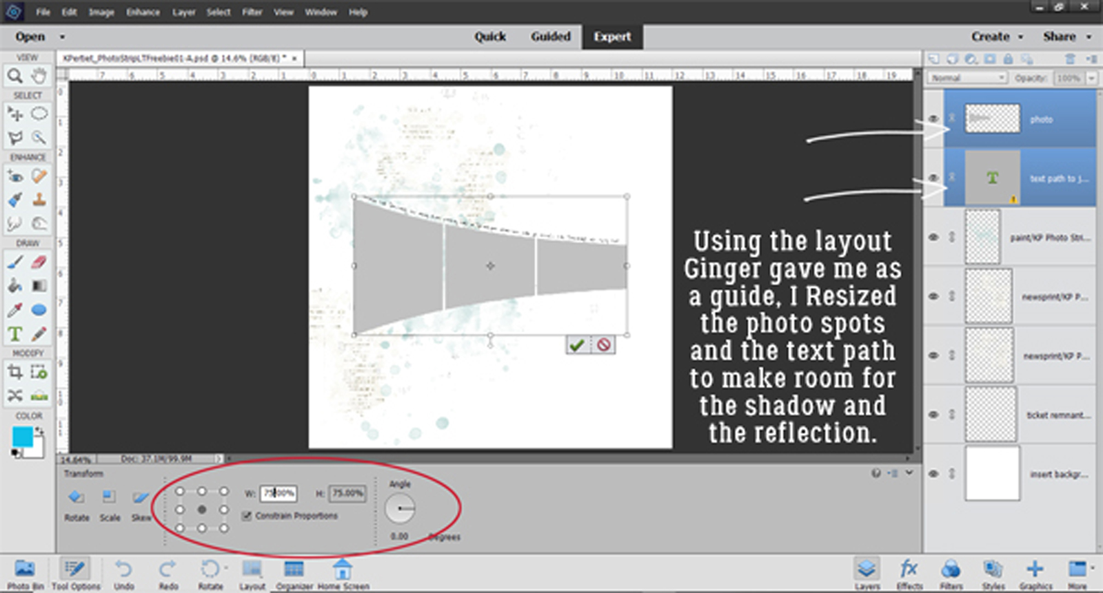
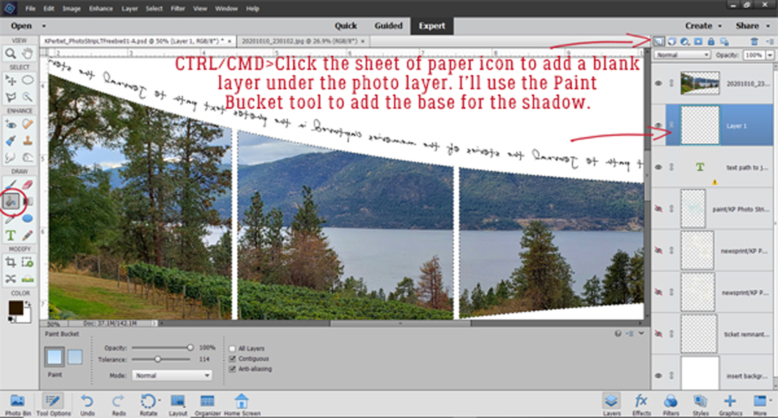
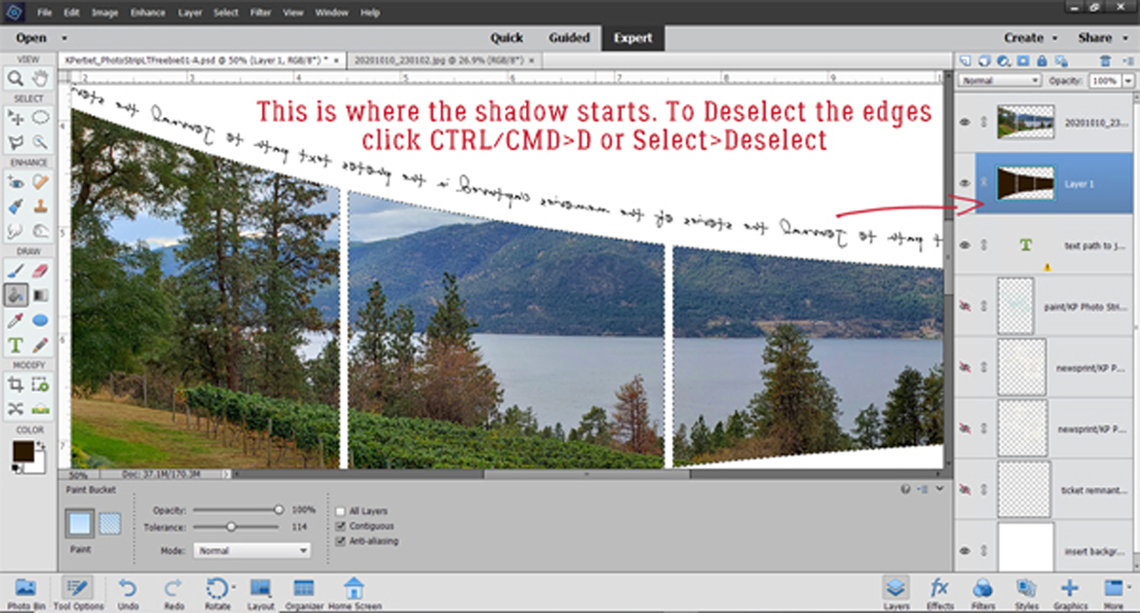
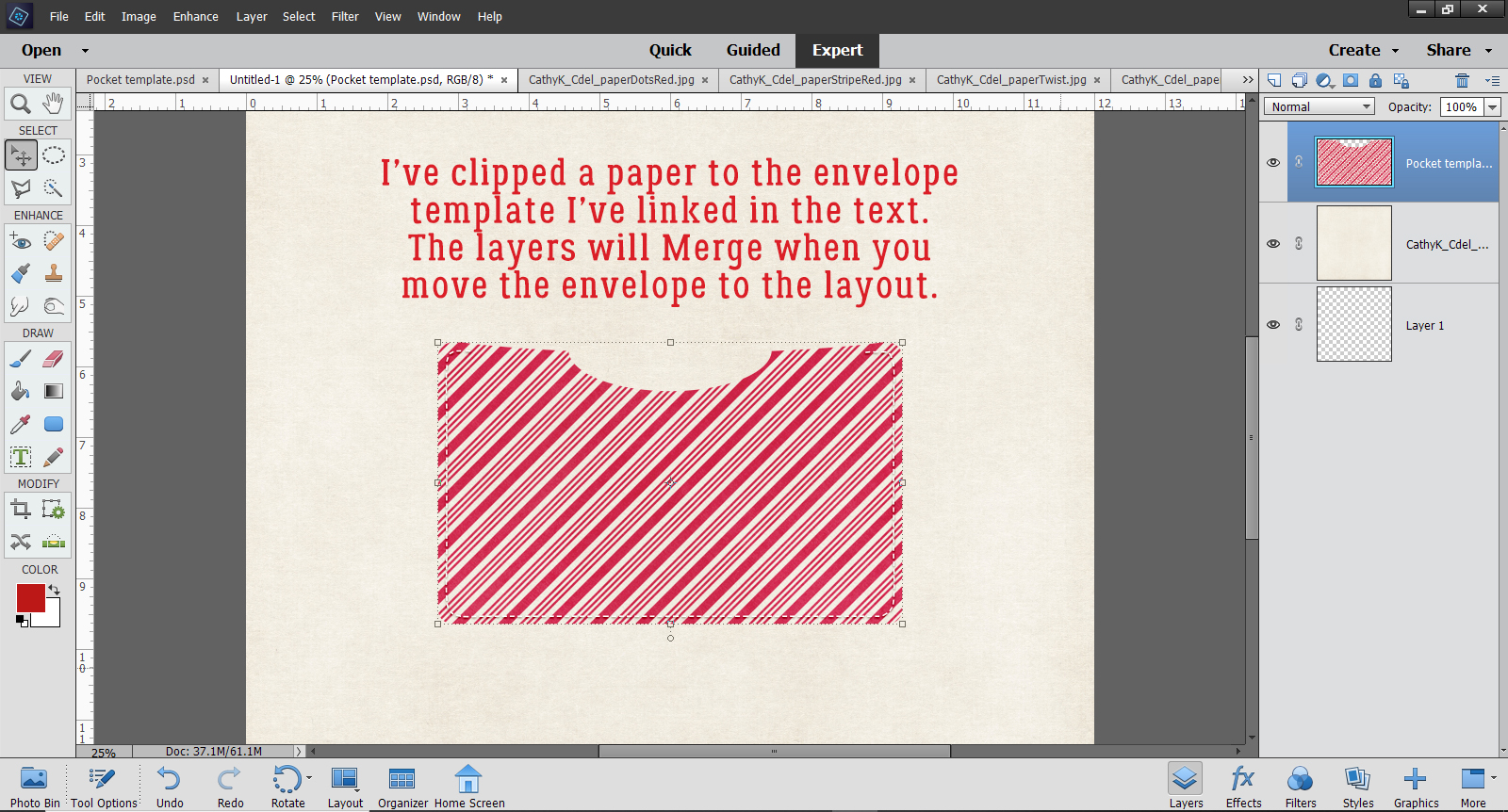
I looked and looked through my stash for an envelope or pocket I could transform and came up empty. So I created a template, which I’ve zipped up for you to download if you like. You can find it here. Then I clipped a paper from CathyK‘s Christmas Delight kit to it. (It’s rotated 90° to have the stripes running diagonally instead of the original vertical.) When you go to use the template, clip your paper to the base layer BEFORE you move your envelope onto you layout. That way you’ll have both the paper layer and the stitching together.
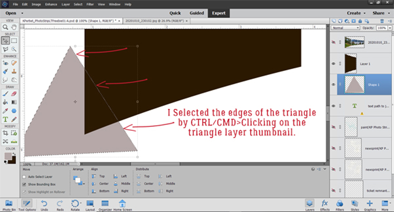
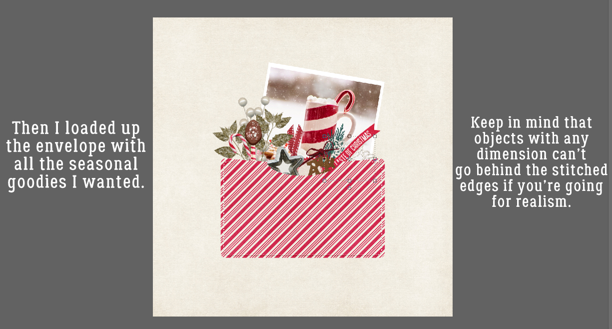
Then I loaded up the envelope with pretty seasonal goodies that will work with my photo. (It’s from Pixabay, the photographer is Terri Cnudde.) I used more of the elements in Christmas Delight as well as from a couple of CathyK‘s other kits. Remember when you’re putting objects “inside” pockets or envelopes that are stitched down that your objects have to sit within the stitched border. They shouldn’t rest UNDER the stitching, unless they’re flat or you plan to warp your pocket/envelope around them. In this screenshot you can sort of see the bounding box for the crocheted snowflake I’ve tucked in there. (More about THAT choice later…)
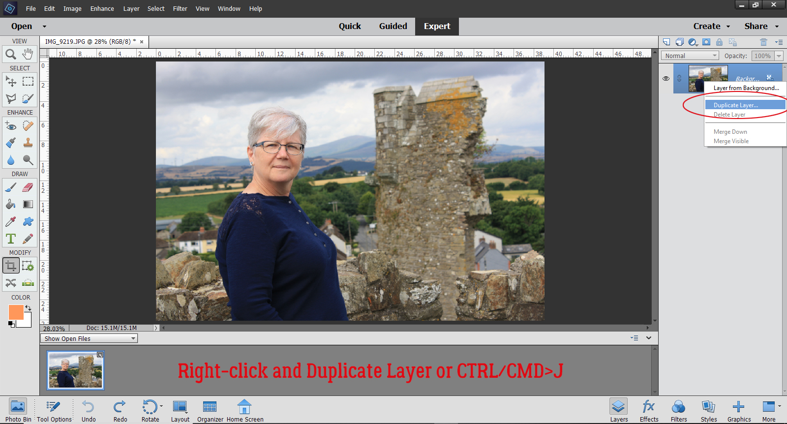
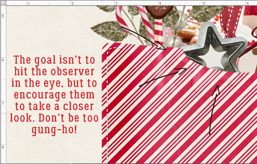
To achieve the dimensional look of a stuffed envelope we’re going to use the Dodge and Burn tools. I’ve shown several ways to use these tools before and if you’re already comfortable using them, you’ve probably figured out where I’m going. first up is the Burn tool. If you remember the basics, Burning darkens or burns the where you apply it, while Dodging lightens. I’m going to use a LARGE (367 pixels) soft brush with the Burn tool with the Range set to Shadows and the Exposure set to 55%.
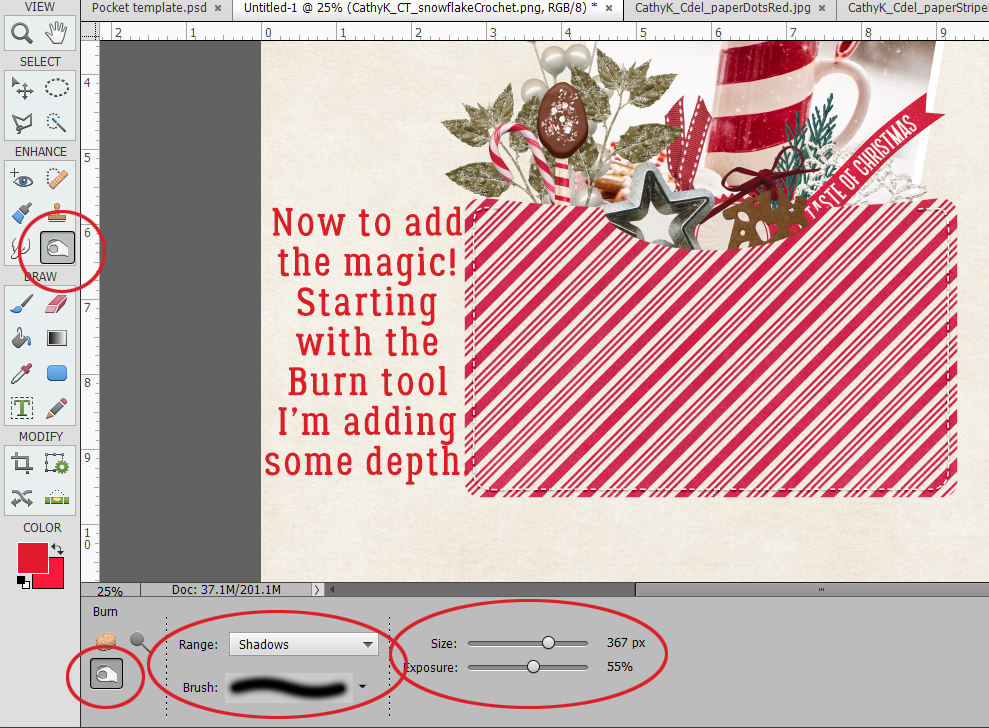
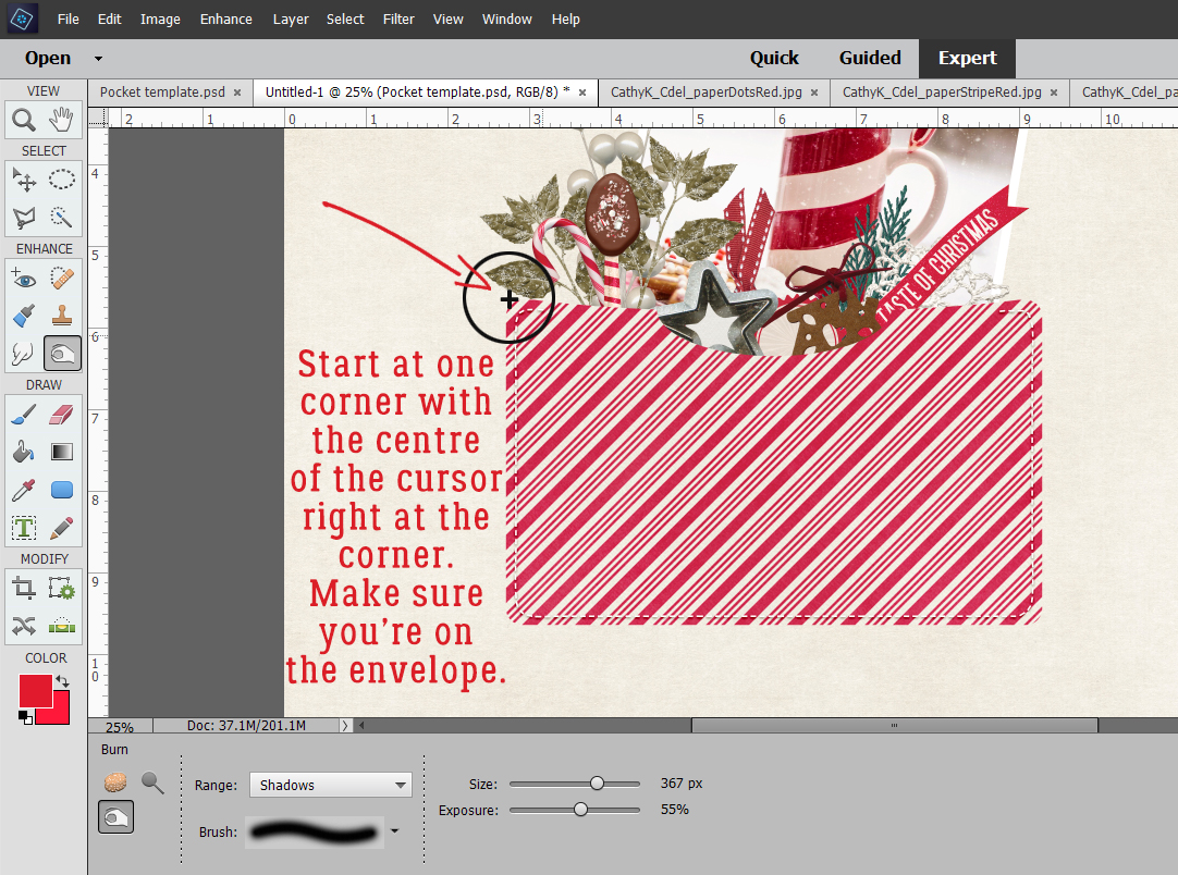
Make sure the active layer is the ENVELOPE and keep it the active layer all the way to the end! I’m right handed and work toward myself rather than away, but you’re welcome to start with either corner, depending on your own preference. I’ve placed the cursor as shown to centre the tool over the actual corner of the envelope. Click and drag the brush down, across and back up along the edge of the envelope to darken it where it would be more tightly attached to the background.
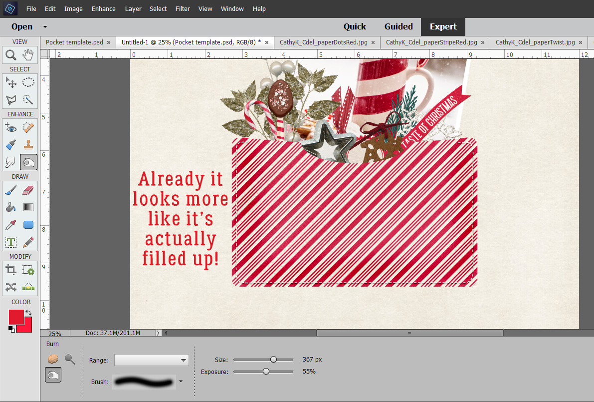
Now you can see the difference. It already looks more contoured. And you could stop here and it would be just fine!
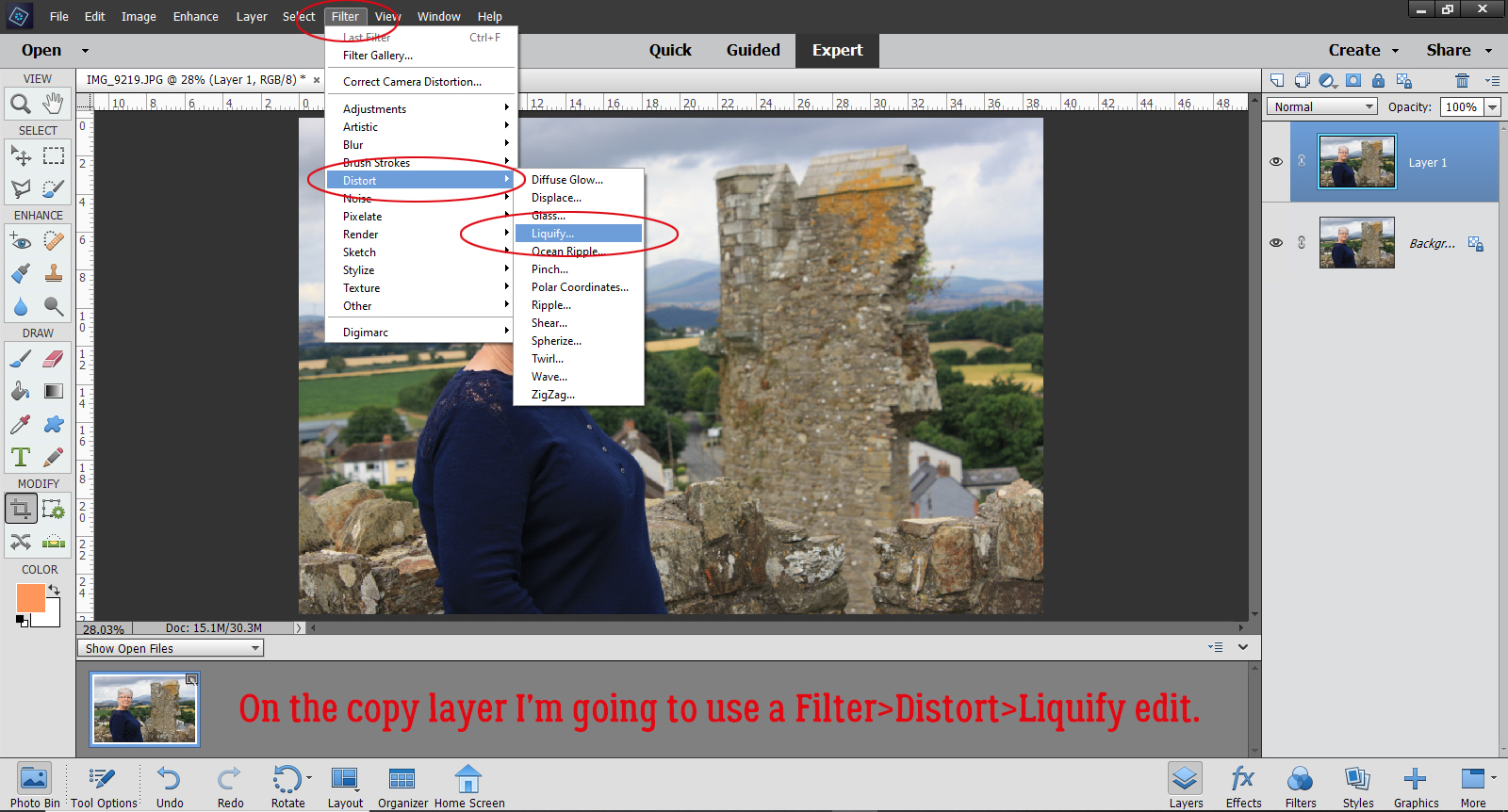
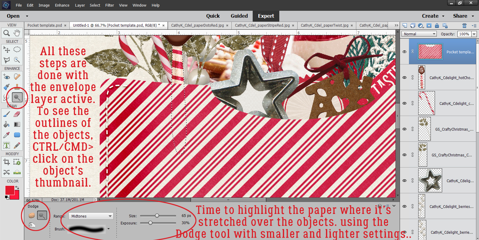
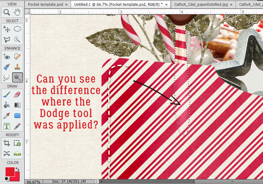
But that’s not my jam… so I’m going to highlight areas where the paper of the envelope would be stretched by the things inside it. I started with the chocolate dipped spoon. To know exactly where the handle is touching the paper on the inside of the envelope, I CTRL/CMD>clicked inside the layer thumbnail for the spoon – don’t click on the layer itself, just the thumbnail. You don’t want to change your active layer! The marching ants show me where the edges of the handle are and I can adjust the size of my brush to fit inside. This time I’m using the Dodge tool with the Range set to Midtones, the brush size is much smaller (65 pixels) and the Exposure is 30%. I click-dragged the brush down the centre of the handle.
And this is the effect it gave me.
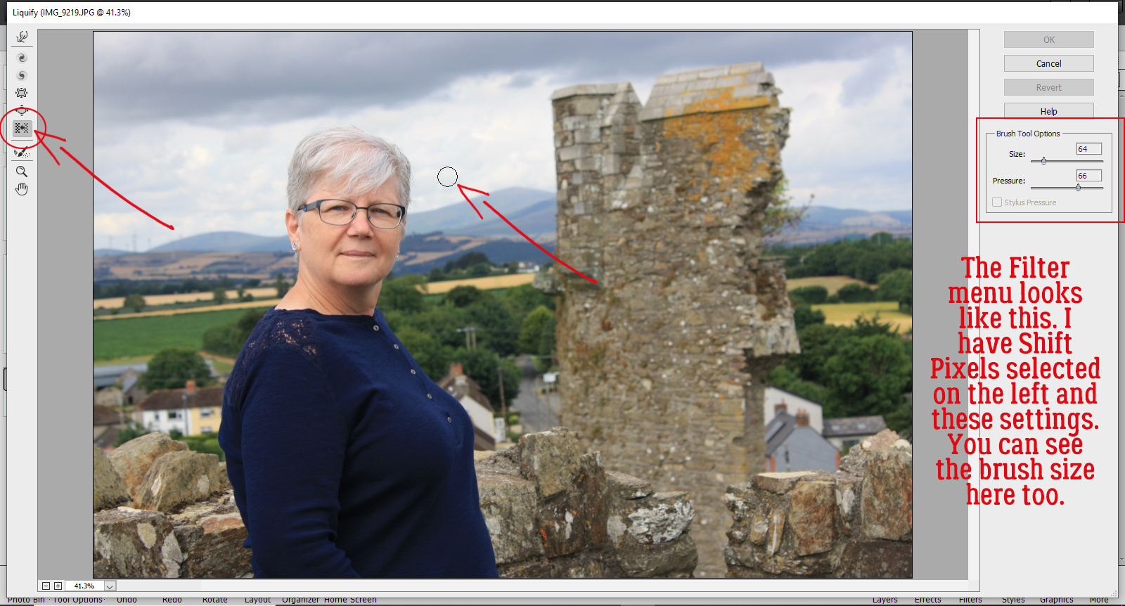
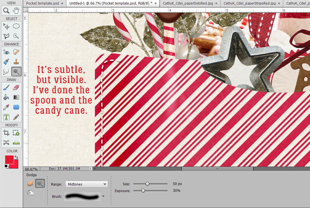
Then I moved on to the candy cane, which is sitting underneath the spoon. It *might* be pushing the spoon into the paper a little harder so the area where they intersect is a smidge lighter.
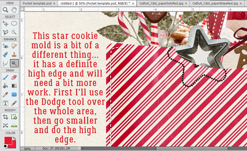
This springerle cookie mold is a bit more complex. It has a significant ridge in the centre of the outline and so I’m going to do the Dodging in two steps. First I’ll do the whole width of the metal, then with a smaller brush I’ll go over the high ridge again. I’m not going to be too picky here, just close enough.
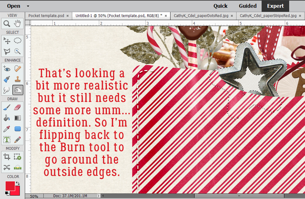
I think it still needs something. So I’m going back to the Burn tool with a smaller brush and I’ll go around the outside of the star to add a bit of shading.
It doesn’t have to be right there in your face, but perceptible if you know what you’re looking for.
This little gingerbread house cookie has holes in it. So I think it needs the same treatment.
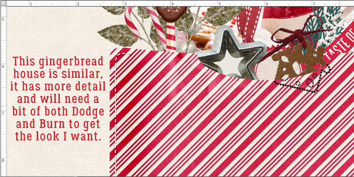
See what I mean? It’s subtle, but definite.
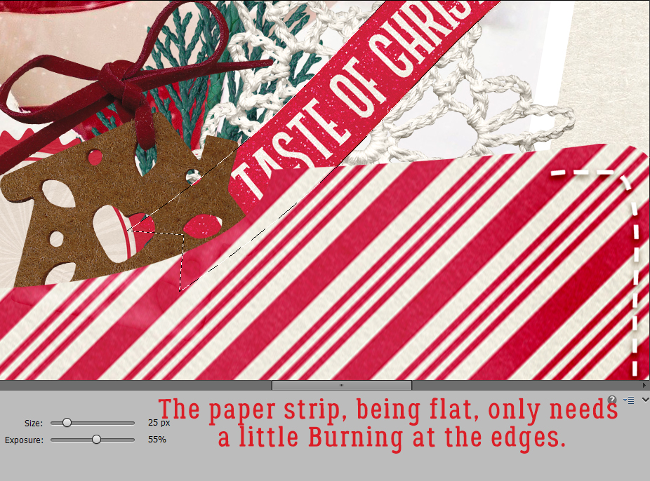
I kept working down the layers, adding contour as I went. This paper strip really only needed a tiny bit of shading/Burning along the edge, since it’s flat and probably a bit stiff.
Ah yes. The crocheted snowflake. What was I thinking? Dodge the high spots, burn the low spots. Zoom out. Look at it. Zoom in and add a bit more. Zoom back out. Repeat until I’m happy.
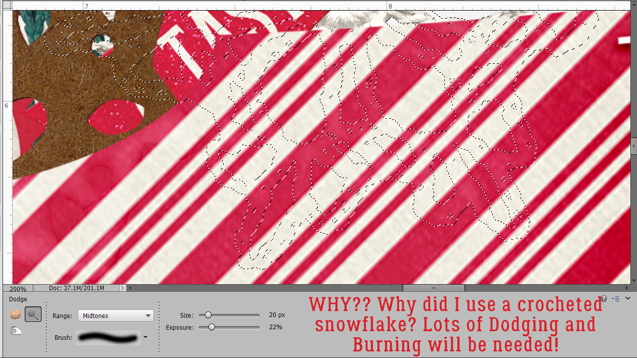
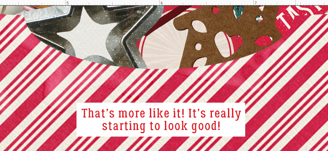
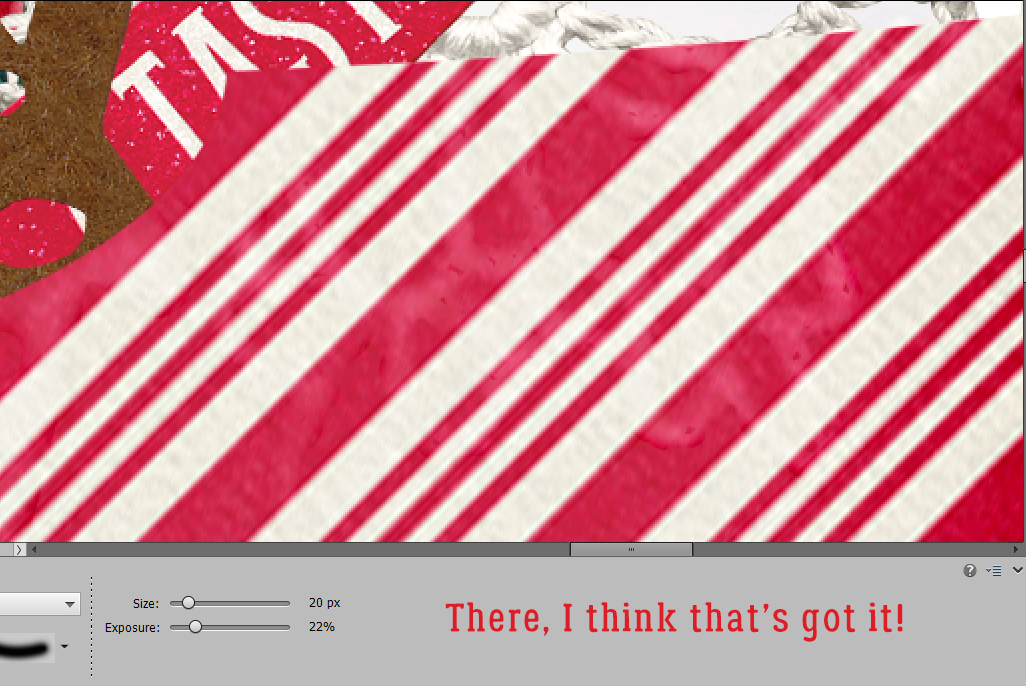
There, I think that’s good enough!
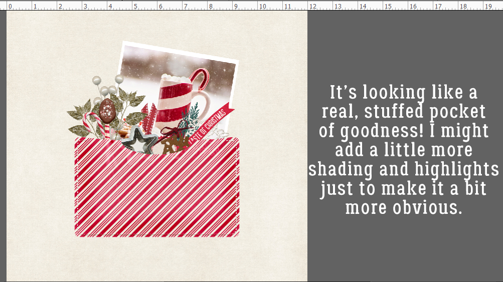
Here’s how it’s looking so far. I think I might add a bit more shading to the outside edges of the envelope, and in between the thicker objects.
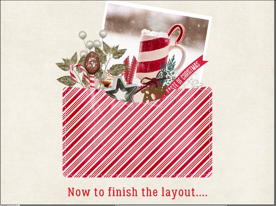
 I’m really pleased with how it looks. So now to finish the layout!
![]()
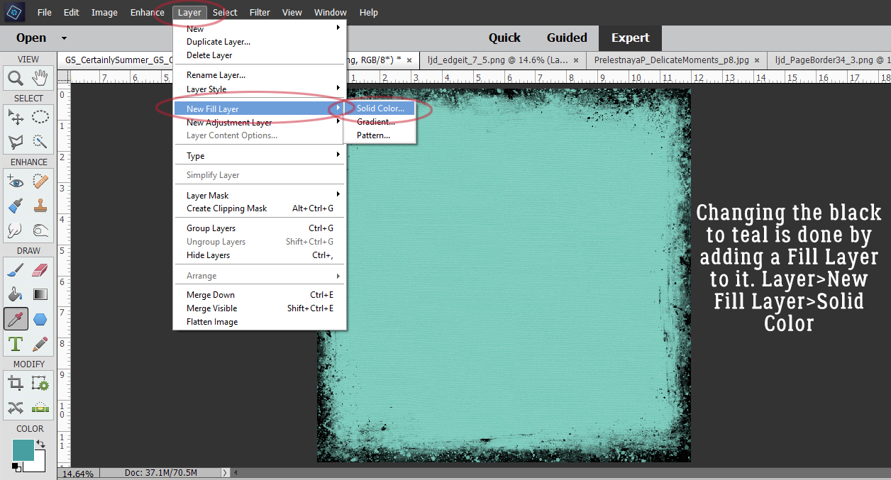
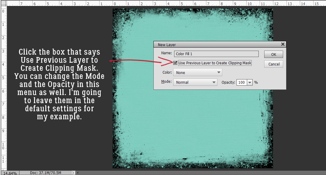
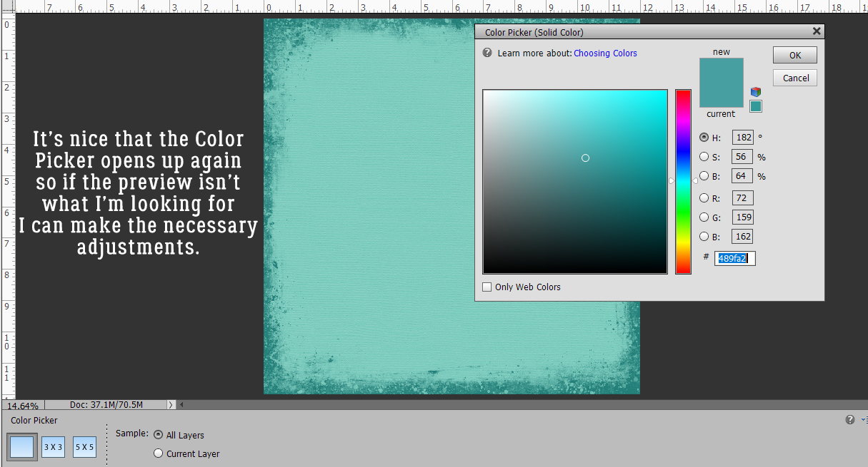
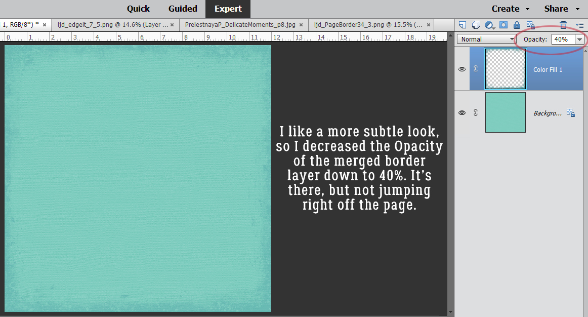
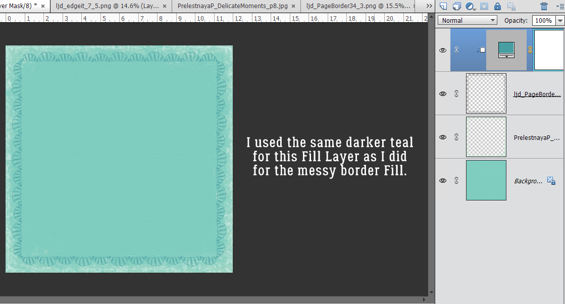 it with the same darker teal that I used before.