Challenge Spotlight: Scraplift
![]()
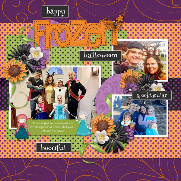
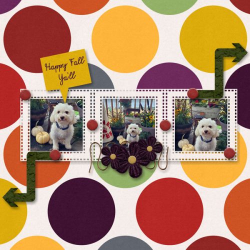
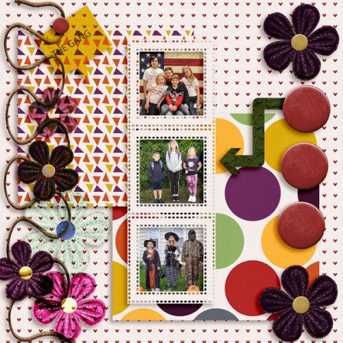
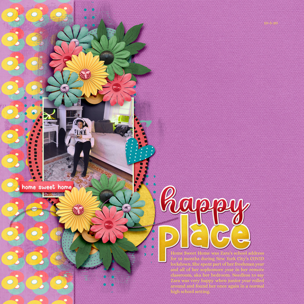
I’ll admit that I’m a purist when it comes to scraplifting another scrapper’s layout. I think that if I like a layout enough to want to lift it, I should try to stay as faithful to the original as I can while still making it my own. I also know that scrapping is an intensely personal craft and we all approach it from our own points of view; this is very true when it comes to scraplifting. There are so many options! Let’s take a look at this month’s layouts and analyze them a bit to see if we can figure out what the scrapper chose to emulate. But first, the Scraplift Challenge is hosted by Dagi; she chooses the layout inspiration and this month she chose this layout by Effie3047. Each of the Challenge layouts is linked to the Gallery so you can pop in and offer the scrapper some praise. Just click on the scrapper’s “handle”. This is the inspiration layout for reference.
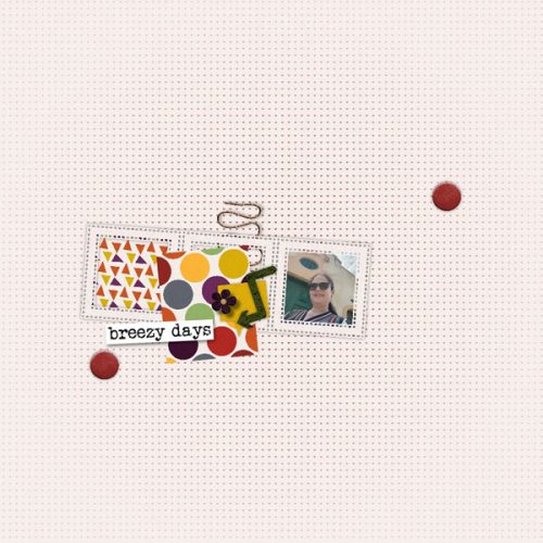
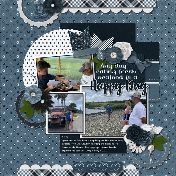
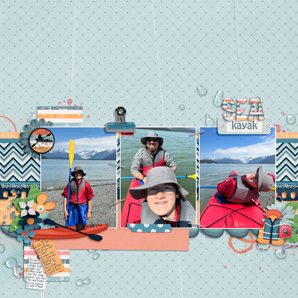
These layouts are in the order they were posted to the Gallery. First is this blue confection from dhariana. She chose to follow the blueprint of the layout fairly closely, with the photo, journal card and elements in the same arrangement. The doodle circles are her own touch.

kristal has also stayed close to the blueprint, but kept her layout crisp by increasing white space. She also has used a wooden background like the original has.

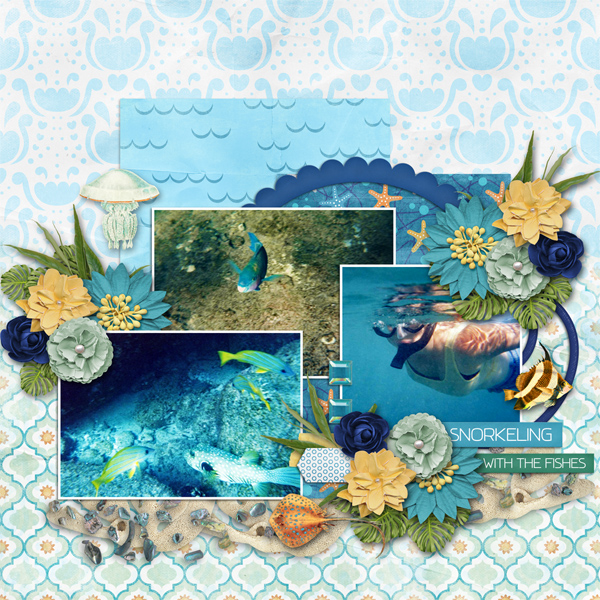
For her layout, lulutoo chose a much brighter palette, but stayed true to the basic layout and the wood background. I like that she went with a narrower paper strip behind her elements and tilted her photo a smidge… an original touch.
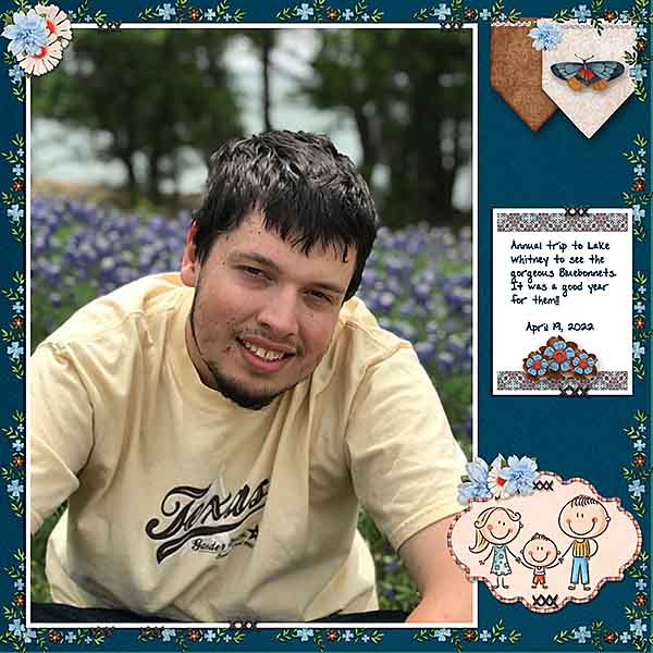
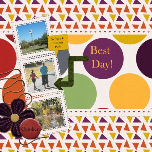
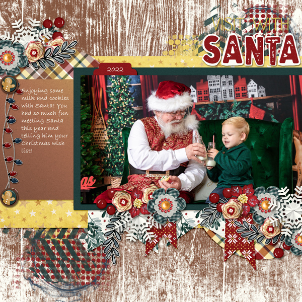
Tbear‘s layout is quite different, but you can see the basic shape of the Challenge layout. A single photo, a journal card, a Christmas theme with carefully-constructed clusters and a similar palette are what ties her layout to Effie‘s.

I can see the bones of the Challenge layout here in robinoes66‘ entry. She’s gone with a dark palette, positioned her photo in the same place but omitted the journal card. She used a good amount of paint and her primary colours are beautifully supported by her black background.

To me, ayla63‘s layout looks more like a scraplift of robinoes66‘s layout than it does Effie‘s! And that’s alright. Their visions are very similar. I like that she chose to turn her photo into a sketch, which makes her layout unique.

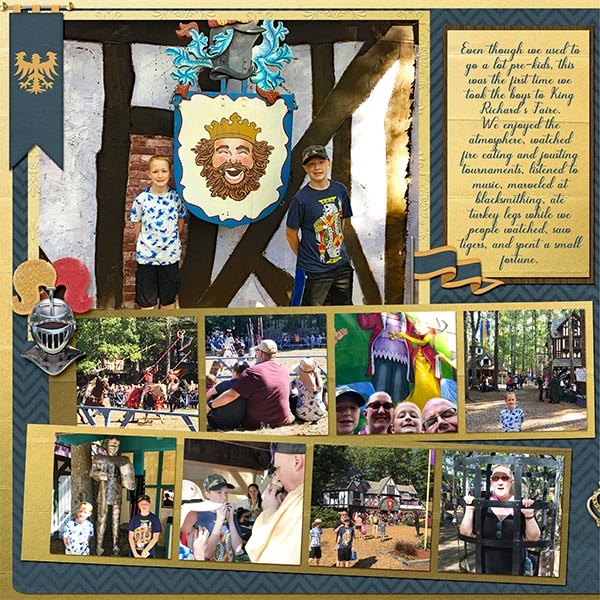
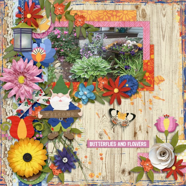
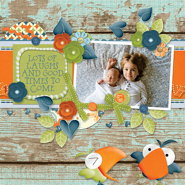
I love what Jill has done; she went with a portrait-oriented photo rather than a landscape and used gears instead of paper circles, while adding a couple of extra paper pennants. Her layout looks quite different than the original, but still has the important components.

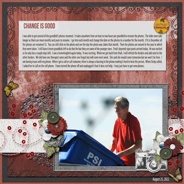
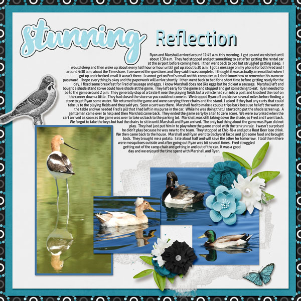
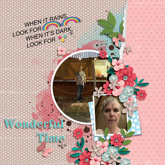
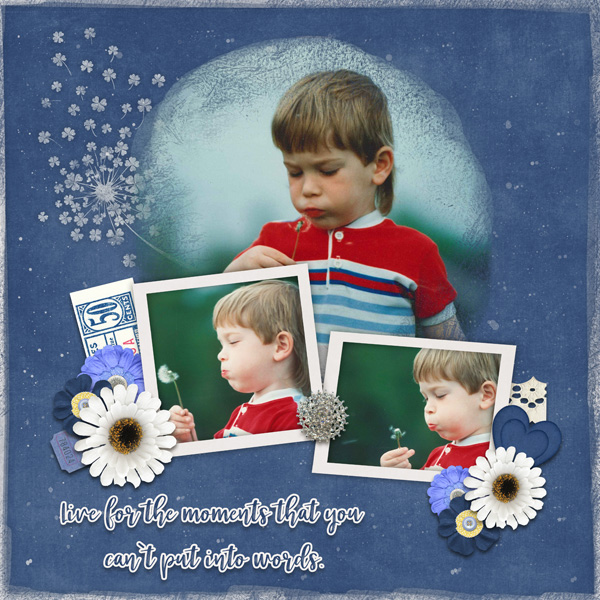
Pippin has stayed true to the original layout in most ways. Her blended background is beautiful, but can we talk about that photo? So cute!!

For her layout, pinklily went bigger with her photo and paper strip base, supersized her title, flipped the script horizontally and kept her clusters small.

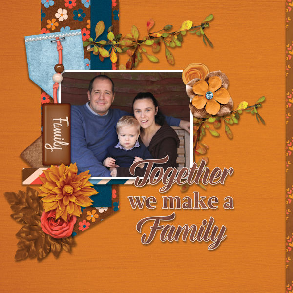
AJsRandom chose to increase the size of her photo but has kept most other aspects faithful to Effie‘s layout. The twined strings that anchor her journal card are a great substitute for the strings of lights Effie used.
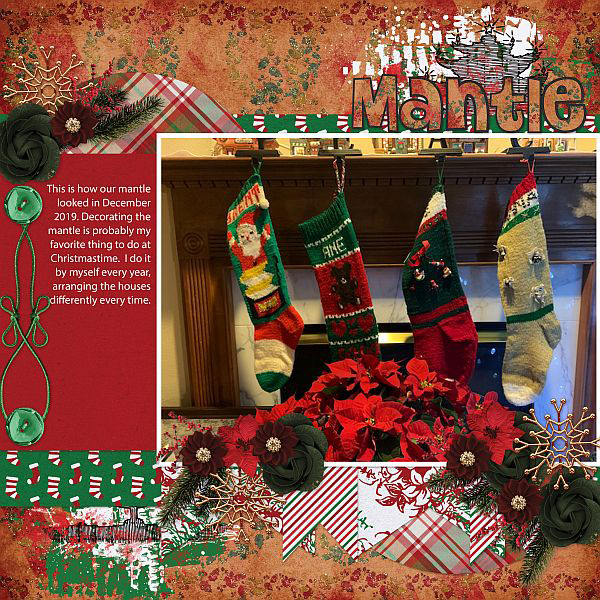
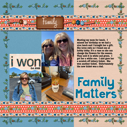
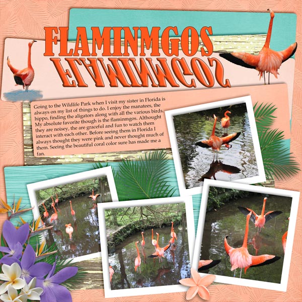
I like that breoni chose to place a row of circular photos across the lower third of her layout rather than clusters. That krafty background really makes her photos pop off the page.
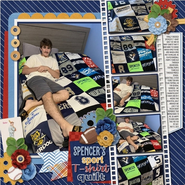
The choices Kristi Martin made of a large photo and minimal embellishments against a black canvas really gives her layout presence in the Gallery.

Our second Hanukkah layout by zanthia is another faithful lift. She made her title really do the heavy lifting here! The word-cloud journal card is a clever twist too.

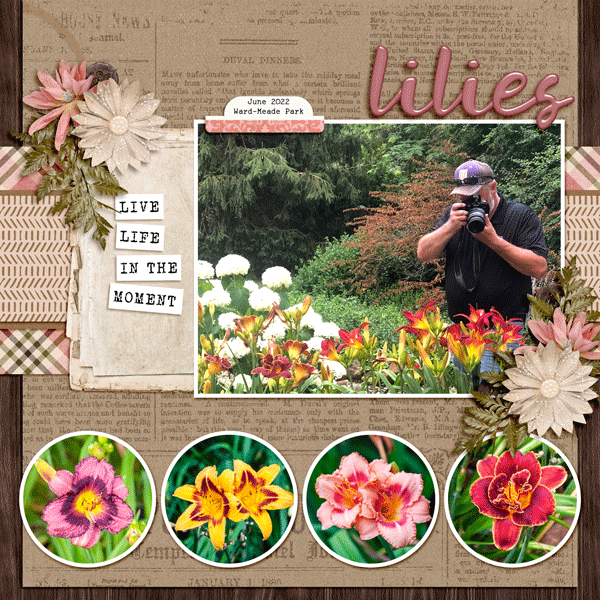
Treemoon took a really different approach by enlarging EVERYTHING. She kept the horizontal aspect and the basics of the design. Her palette compliments her photo so nicely and I love the clusters she’s anchored her banner with.
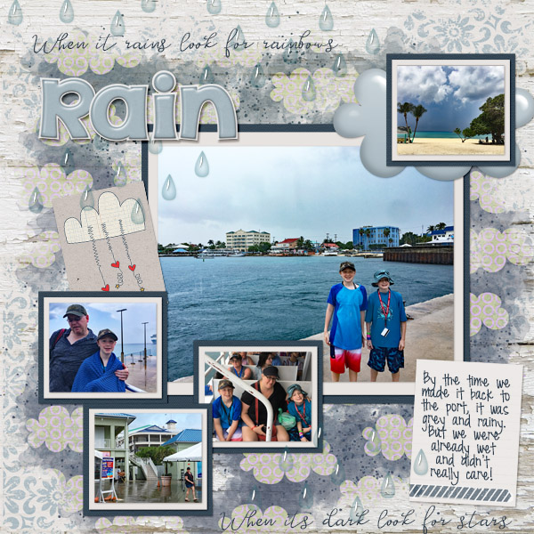
We’ve had some really miserable weather here in the BC Interior. We have a ridiculous amount of snow and it’s bitterly cold. I was planning a road trip to see my parents and bring them a box full of treats for the holidays but we were snowed in! I hope wherever you are and whatever you’re celebrating, you’re warm and safe!
![]()