Quick Trick: Toggling Between Tool and Color Picker
![]()
PDF Version : https://bit.ly/3V8fV2q
Today’s Quick Trick is one of those Work Smart Not Hard tips I only just discovered. Have you been using a Brush, Pencil or Text Tool in Elements and thought, “Gee, I’d really like to change colours for this fill in the blank” and then clicked through to the Color Picker, chose your new colour, clicked OK and then clicked back on your Tool? Would you like a shortcut for those 4 steps? I have one!
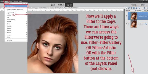
This Trick makes multi-coloured titles easier and much more fun to create, lets you throw a bunch of paint splatters in different colours onto your canvas, and whatever else you might use the Color Picker for. I’ve played with it so I can explain how to use it, but screenshots won’t be helpful, so don’t look for them. 😉
Once you’ve chosen your Brush or Font and applied your first colour, hold down the ALT/OPT key and click on the Color Picker. Release the ALT/OPT key, choose another colour and click OK. Bingo, you’re back to your Brush or Font and your new colour is ready to go! If you’re working with the Brush Tool, you can change the size, shape, Opacity and orientation after you’ve changed the colour by going into Brush Settings… If you’re working with the Type Tool, you’ll love this! After you’ve changed your colour, you can also change the Font, the Size, add an Underline, turn it Bold or Italic and not have to Simplify in between!!
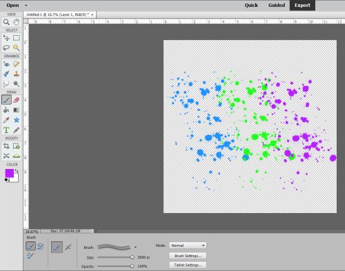
Okay, I lied. I have a screenshot for you. I decided to run a quick test and count the keystrokes I needed to obtain 3 different colours of paint splatter. 8. The answer was 8.
I’m going to use this Trick ALL THE TIME!!
![]()