Can you believe that we only have ten days left in the month? That’s crazy right? The designers are gearing up with some great designs for November, but that doesn’t mean that they’re slacking this week! Quite the opposite, in fact! They have some amazing new stuff out this week!
Remember when you spend $10 in the store, you get a great new collab!

https://store.gingerscraps.net/GingerBread-Ladies-Collab-Boys-To-Men.html
Before I start with the beautiful kits and products that the designers have created for you, I just have to share this awesome news with you, a new Welcome Wagon kit has been released! If you do not know about our Welcome Wagon area, you should go check it out right away! Once you register in the forum, you will have access to the Welcome Wagon area. The designers create wonderful goodies and give them to you for FREE! The Welcome Wagon has been up and running, for over a year, so our designers are changing their goodies! New goodies, Free goodies!
Today, you’re being given a new lovely gift by Neverland Scraps!

https://forums.gingerscraps.net/forumdisplay.php?499-The-GingerScraps-Welcome-Wagon
Let’s see what our designers are offering in the Bake Sale this month. All of these kits are available for $1 through Friday the 20th.

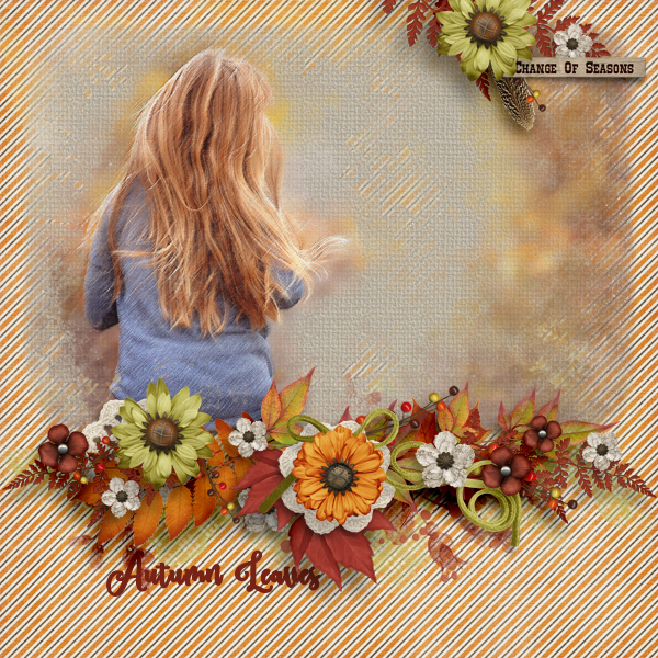
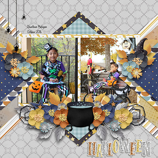
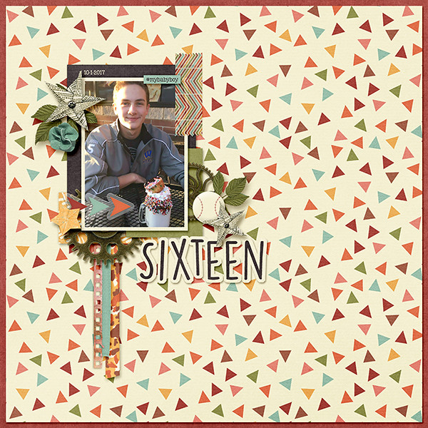
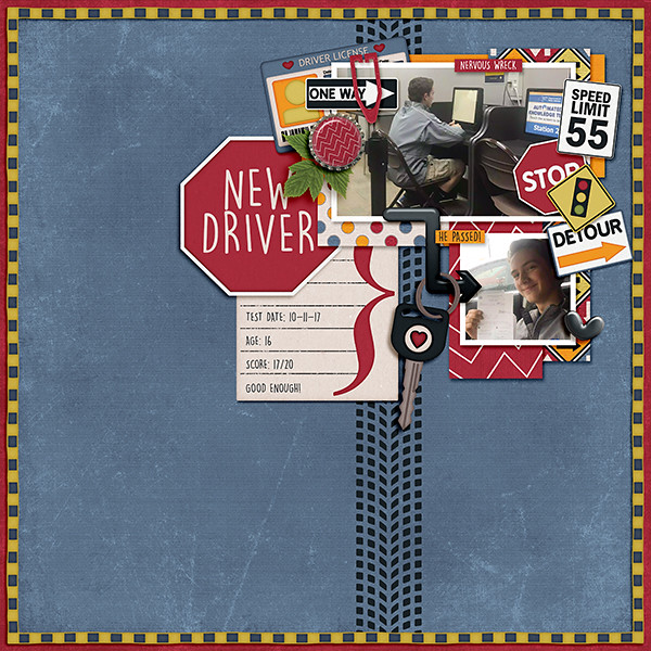
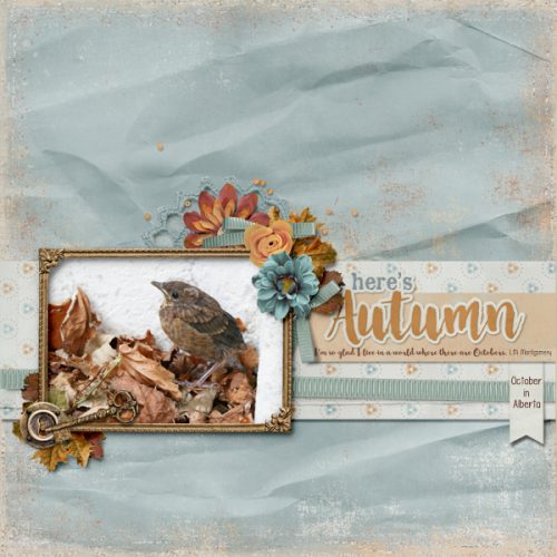
Looks like there are some gorgeous fall and Halloween kits in the offerings this month. Head over and load up. Make sure to share what you create with us in the Gallery and the GingerScraps Facebook Group!

https://store.gingerscraps.net/My-life-in-photobook-22..html

Collection: https://store.gingerscraps.net/Morning-Heather-Collection-by-Aimee-Harrison.html
Kit: https://store.gingerscraps.net/Morning-Heather-Page-Kit-by-Aimee-Harrison.html
Alphas: https://store.gingerscraps.net/Morning-Heather-Alpha-Sets-by-Aimee-Harrison.html
Borders: https://store.gingerscraps.net/Morning-Heather-Borders-by-Aimee-Harrison.html
Blooms: https://store.gingerscraps.net/Morning-Heather-Blooms-by-Aimee-Harrison.html
Plaids: https://store.gingerscraps.net/Morning-Heather-Plaid-Papers-by-Aimee-Harrison.html
Messy Edges: https://store.gingerscraps.net/Morning-Heather-Messy-Edges-by-Aimee-Harrison.html
Glitters: https://store.gingerscraps.net/Morning-Heather-Glitters-by-Aimee-Harrison.html

https://store.gingerscraps.net/The-Woman-at-the-Well-BGD.html

https://store.gingerscraps.net/The-Life-of-Moses-BGD.html

https://store.gingerscraps.net/autumn-birthday-by-Clever-Monkey-Graphics.html

Bundle: https://store.gingerscraps.net/Travelogue-West-Virginia-Bundle-Pack.html
Word Art and Flair Pack: https://store.gingerscraps.net/Travelogue-West-Virginia-Word-Art-and-Flair-Pack.html
Kit: https://store.gingerscraps.net/Travelogue-West-Virginia-Kit.html
Word Bits: https://store.gingerscraps.net/Travelogue-West-Virginia-Word-Bits.html
Templates: https://store.gingerscraps.net/Travelogue-West-Virginia-12×12-Temps-CU-Ok.html

https://store.gingerscraps.net/Gotcha-Covered-1.html

https://store.gingerscraps.net/For-Kicks-By-Dandelion-Dust-Designs.html

https://store.gingerscraps.net/Blessed-by-Dear-Friends-Designs.html

Bundle – https://store.gingerscraps.net/Hallow-Kitty-BUNDLE-by-Heather-Z-Scraps.html
Kit – https://store.gingerscraps.net/Hallow-Kitty-KIT-by-Heather-Z-Scraps.html
Borders – https://store.gingerscraps.net/Hallow-Kitty-BORDERS-by-Heather-Z-Scraps.html

https://store.gingerscraps.net/Kristmess/

https://store.gingerscraps.net/Kristmess/

https://store.gingerscraps.net/Kristmess/

https://store.gingerscraps.net/Laras-Digi-World/

https://store.gingerscraps.net/Passport-NYC-GrabBag.html

Bundle: https://store.gingerscraps.net/Cajun-Princess-Bundle.html
Kit: https://store.gingerscraps.net/Cajun-Princess-PageKit.html
Flairs: https://store.gingerscraps.net/Cajun-Princess-Flairs.html
Clusters: https://store.gingerscraps.net/Cajun-Princess-Clusters.html
Ombre Papers: https://store.gingerscraps.net/Cajun-Princess-OmbrePapers.html
Grunge: https://store.gingerscraps.net/Cajun-Princess-Grunge.html
Titles: https://store.gingerscraps.net/Cajun-Princess-Titles.html

https://store.gingerscraps.net/Page-Borders-23-by-Lindsay-Jane.html

https://store.gingerscraps.net/Page-Borders-24-by-Lindsay-Jane.html

https://store.gingerscraps.net/Fall-Singles-Templates-by-Miss-Fish-Templates.html

https://store.gingerscraps.net/Pumpkin-Love-Templates-by-Miss-Fish.html

https://store.gingerscraps.net/Neia-Scraps/

https://store.gingerscraps.net/Neverland-Scraps/

https://store.gingerscraps.net/autumns-in-the-air-bundle-collection-by-paty-greif.html

https://store.gingerscraps.net/Color-Me-autumn-bundle-collection-by-paty-greif.html

https://store.gingerscraps.net/Cozy-days-bundle-collection-by-paty-greif.html

https://store.gingerscraps.net/Harvest-Bundle.html

https://store.gingerscraps.net/Laras-Digi-World/
Remember, if you complete 10 challenges, just ten, you get a free kit as well!!

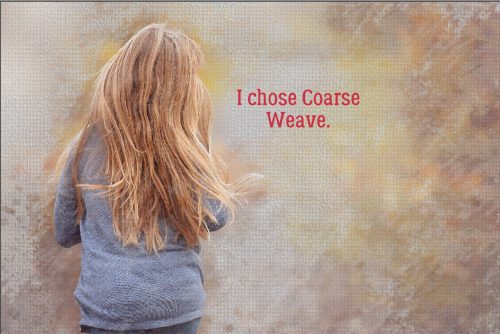
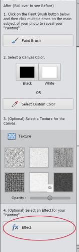
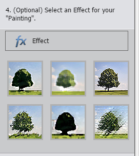
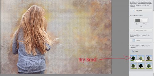
Fall is the perfect time to indulge! Join me in completing some challenges!


 \
\