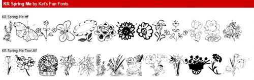
Spring has sprung. At least in my corner of the world. Warmer temperatures, budding trees, and pollen. For those of you that had to “spring forward”, I hope you have all adjusted.
We have some VERY exciting news today!! It is time for our 10th season of Scrapping Survivor!! Whoop Whoop! We have a few fun changes this year, you can read all about them in the forum. Are you ready to hear our theme this season … drum roll please … this years theme is *Sugar & Spice Bakery* and we have baked up some really fun challenges and an AMAZING Mega collab!

Here is a link to the official Scrapping Survivor Season 10 sub-forum you can sing up in the “sign ups” thread:
2020 Scrapping Survivor 10 *Sugar & Spice Bakery*
Remember when you spend $10 in the store, you get a great new collab! Read, Know, Learn, Go!

Here is the amazing MEGA Collab for this season of Survivor: It is HUGE and you are going to love it!

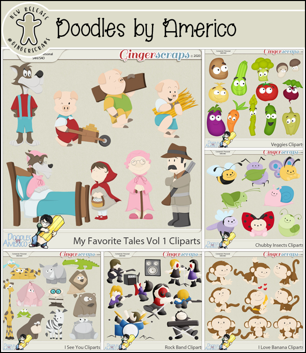
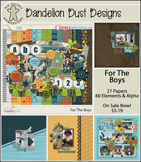
And now on to the best part of the week, our Fresh Baked goodies!


Remember if you complete 10 challenges, you get this amazing kit!

It’s time to Bring On Spring!