Happy almost Valentine’s Day!! Our designers have some great goodies to celebrate the holiday! Let’s take a peek!
From Aimee Harrison


From Tinci


From Luv Ewe


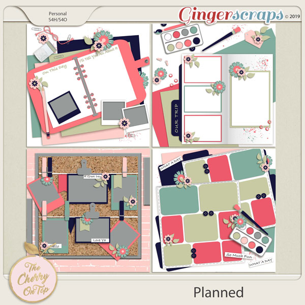
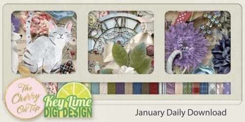
From A Cherry On Top


From Scrappin Serenity


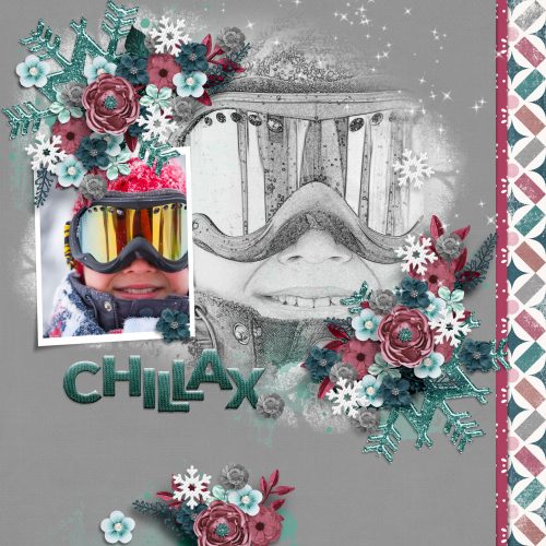
From JB Studio and Aimee Harrison


From LDrag


From Miss Fish


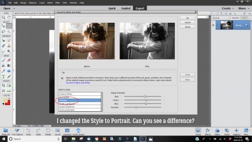
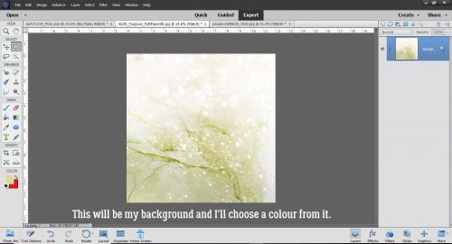
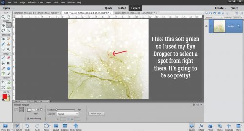
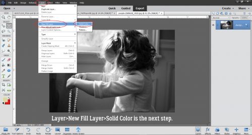
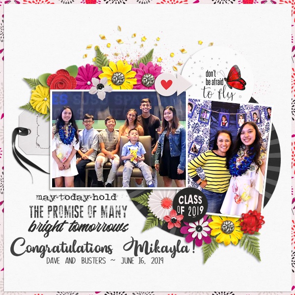
From Carol W


From Heather Z