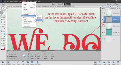
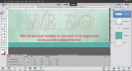
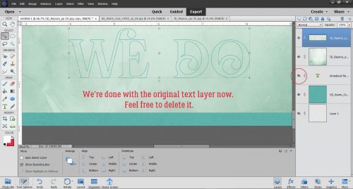
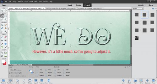
A-Tinting We Will Go
![]()
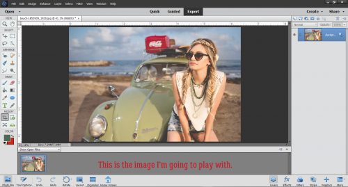
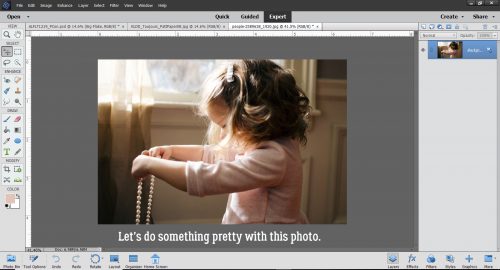
How did it get to be February already? The older I get the faster time flies. The last week has really kicked my butt, let me tell you. So I thought we’d try something very simple but incredibly beautiful today. I love this photo (from Pixabay) but I think it could be even prettier in black and white. With a little hint of tint…
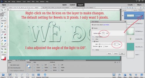
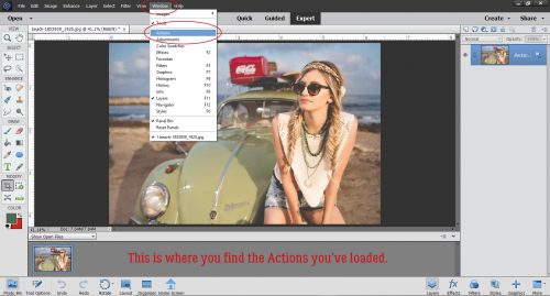
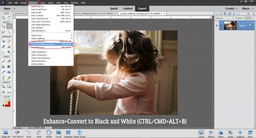
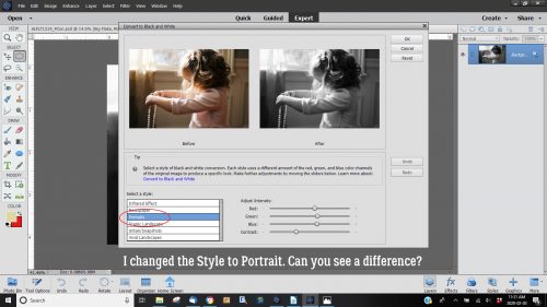
In Photoshop Elements there are several ways you can convert a colour photo to black and white. Probably the easiest is to click on Enhance>Convert to Black and White (CTRL/CMD>ALT>B) as shown. Or you could use Enhance>Adjust Color>Adjust Hue/Saturation then pull the Saturation slider all the way to the left. But… using the method shown gives you some added options that don’t involve fiddling.
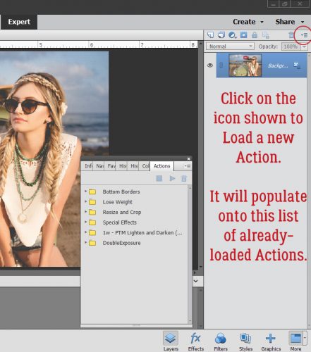
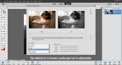
When you use the Enhance>Convert to Black and White tool, this menu opens. The default setting is for Scenic Landscape, but there are multiple style options you can choose from.
There’s a slight but visible difference when I change the style to Portrait. The image is a little sharper and the contrast is a little higher. For this technique, that’s perfect.
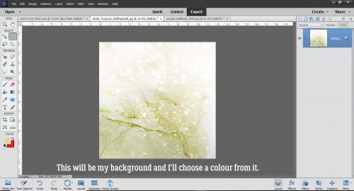
I plan to blend this photo into the paper shown below. It’s from January 2020’s Daily Download, Toujours from Key Lime Digi Designs and The Cherry on Top. I’m going to choose a colour from it to tint my photo.
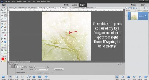
I decided that the soft green would be lovely, so I grabbed my Eye Dropper tool and clicked on the spot shown.
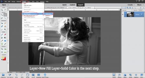
Next I clicked Layer>New Fill Layer>Solid Color. The green that I chose is the foreground colour so it will be the colour used.
I made sure the Use Previous Layer to Create Clipping Mask was selected.
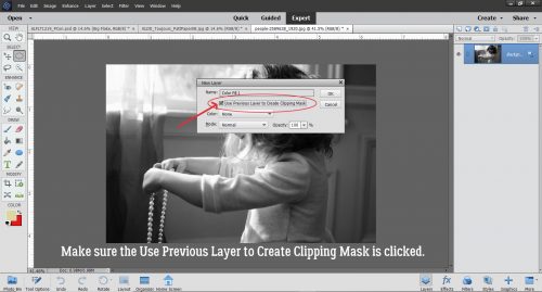
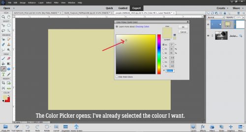
The Color Picker still opened so I had the chance to verify the green is what I want.
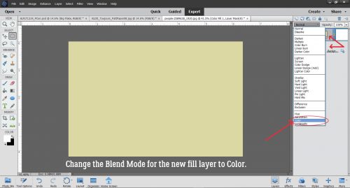
And there it is… the Fill Layer. Now what?? As you can see there are two separate layers there, with the colour layer on top. I changed the Blend Mode to Color.
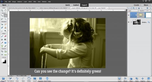
If you’re of a certain age, you might remember the days when the colour on those old tube TVs would go wonky and everything was really green. Look familiar?
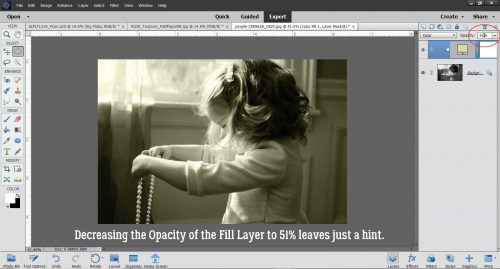
So I lowered the Opacity of the Fill Layer to 51%. Now there’s just a faint green glow.
I had already chosen a masked template that would work nicely with this photo. It was a freebie from Promethean Concepts in the A Love for Layout Templates Facebook group in December 2019.
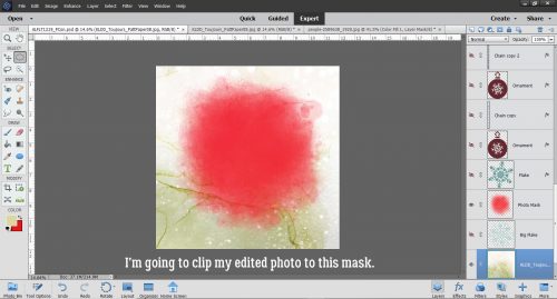
Here’s a tip for ensuring the part of your photo you most want included within a mask makes it onto your layout. Rather than dragging and dropping it ON TOP of the mask, clipping and fiddling with it, try dragging and dropping it UNDERNEATH the mask and moving it around.
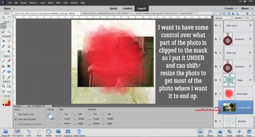
It isn’t exactly perfect, and I know I don’t want any harsh edges visible. I didn’t know this trick until just recently, but when using a mask like this it’s possible to use the Clone Stamp tool to extend a photo out to the edges of your mask.
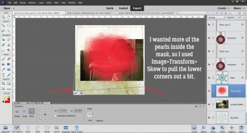
I wanted more of the pearls and her hair inside the mask, so before I started playing with the Clone Stamp, I clicked Image>Transform>Skew to adjust the shape of the mask just a bit by pulling the lower left corner down and to the left, the lower right corner just over more to the right.
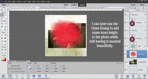
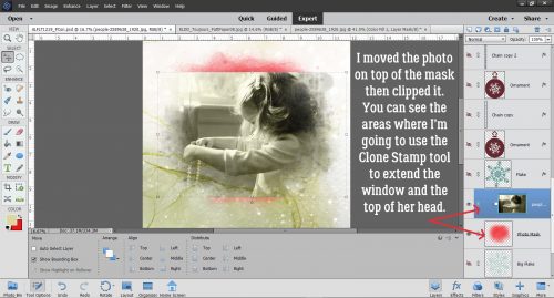
Then I moved the photo layer ON TOP of the mask and clipped it in place. I’m going to Clone the window, curtains and the top of her head to cover up all that pink that’s still visible from the mask. Once I’ve done that, I’ll use the Healing Brush tool to make the Cloned areas less obvious.
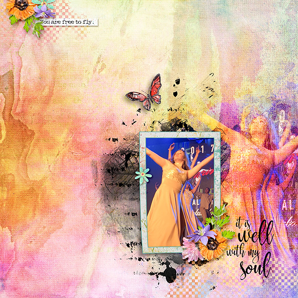
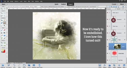
And there’s my finished blend. I’m pretty pleased with it, and with how little time it actually took to get the effect. I’d say 20 minutes, tops!
My finished layout looks like this:

Will you give this a try? Shout-out to Ulla-May for the inspiration.
![]()