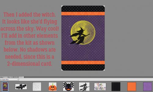
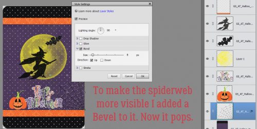
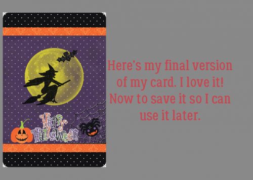
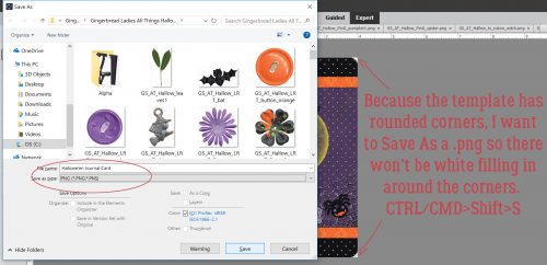
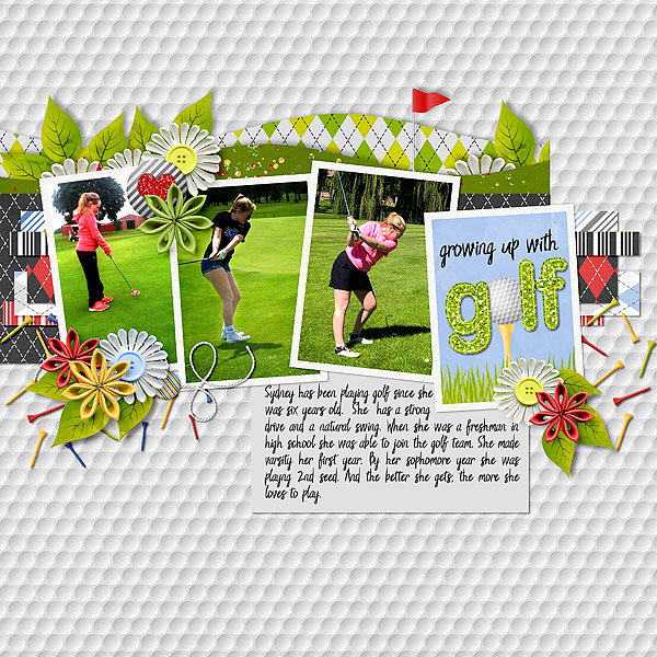
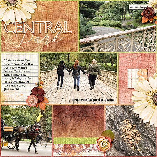
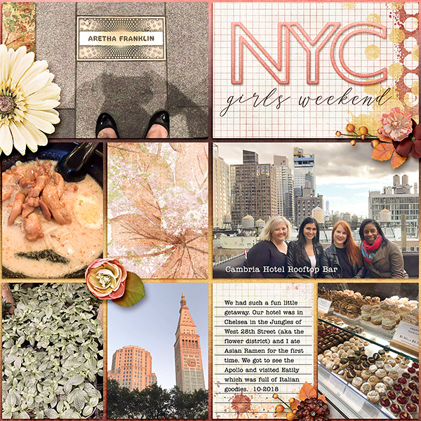
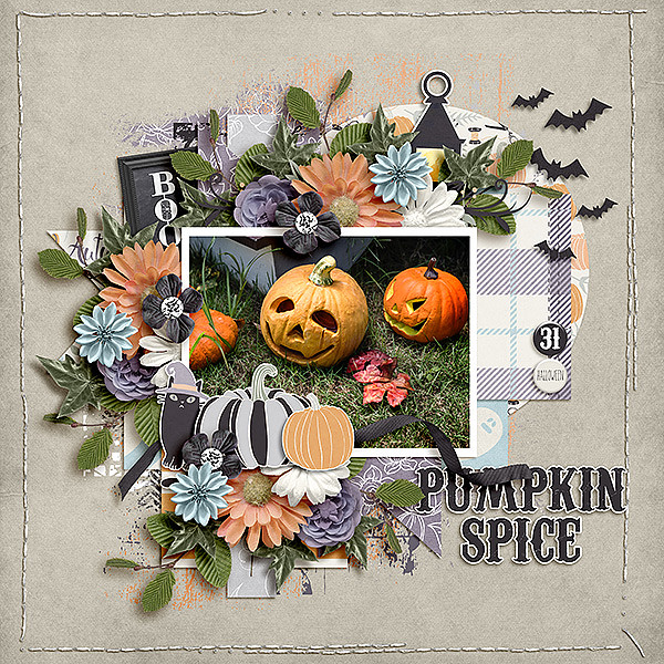
Tutorial Tuesday (Photoshop Elements)

Clusters… Have Them Your Way, the Easy Way!

I’m a big fan of templates. They’re an amazing time-saving tool for getting layouts done, while still allowing for individual style. But once in a while I go rogue and design a layout without using any time-saving devices. And sometimes I shock myself by creating a perfect cluster that looks fantastic… only to find that when I try to recreate it later, I can’t get it quite right. Of course there has to be a WSNH hack for that! And I’m going to show it to you. I’m using a cluster I created for Katie, Ooh La La Scraps‘ genius designer, with her Freezing collection.

If you save your layouts as a PSD file, this part will be super-easy. If not, you’ll be starting from scratch and might want to wait until you have that AHA! cluster creation at a later date.

Let’s assume you’ve got the layout in PSD form. Open up the file in PSE. Then select all the layers of that perfect cluster. To select multiple layers, hold down the CTRL/CMD key as you click on them. Once you have all the layers selected, right-click in the Layers panel and click on Duplicate Layers. (We’ve done this part before.) In the submenu that opens up, select New Document and click OK. A completely new work space will now be there for you to work on separate from your original layout.

Once you’ve got all those layers on your new work space. turn the visibility to all the layers off, except for the one on the very bottom. (Or you can work from the top down, your choice. I work from the background out.)

Now you’ll select a colour to make the place marker for that first layer. Whatever floats your boat… gray, pastel, dark, light, whatever makes sense to you. You’re going to make a New Fill Layer on top of that first layer to create your place marker.

If you’ve never used the Fill Layer function, you’ll be in for a treat. It makes a lot of things much easier! Click on Layer>New Fill Layer>Solid Color.

Make sure you click the box to the left of Use Previous Layer to Create Clipping Mask.

See what happened? All those little beads are blaaaah yellow, but they’re now a place marker for a scatter. You’ll notice that the shadow style is preserved, which is another time saver. But… that shadow style will disappear with the step after this one, unless you copy it. Right-click on the original layer and choose Copy Layer Style.

Then select both the original layer and the clipping mask layer to Merge them. Right-click on the layers, then choose Merge Layers, or CTRL/CMD>E. Once the layers are merged, right click on the new merged layer and Paste Layer Style to it. Voilà… the layer has a shadow again.

Continue on with all the layers in your cluster, using the same process. Change up either the colour or the intensity of each different layer so you can easily see the different components of your template later. When I was putting together the screenshots for this tutorial the whole thing took me about 11 minutes, bottom to top.

This is what my finished cluster template looks like.

When I had all the layers converted to place markers, I renamed each layer. You can right-click and select Rename Layer, or simply double-click on the label within the layer’s box in the Layers panel then just type in whatever works for you.

Now you want to save the fruits of your labour! File>Save As (Shift>CTRL/CMD>S), tell the software where you want to save it, then give your cluster a name.

Tell the software you’re saving the file as a PSD and you’ll have your very own, personally-designed cluster template to use again and again!

I think next week we’ll do another Guided Edit. See you then!

~~September Bake Sale!!~~

Checking in with you from the outer bands of (now) Tropical Storm Florence. We’re getting some wind here and have had a little rain, but we have a lot more rain coming. What a great day to stay in and shop in the Bake Sale. As always, each of these kits and template sets are just $1 each from today through the 20th. Let’s see what we can fill our cart with.

Time to head over to the GingerScraps store and go shopping!!!

Sneak Peeks September 13th 2018

Happy Thursday! I hope everyone on the East Coast is staying safe and dry! Hurricanes are no fun and I have been through too many to count living in Florida. If the weather has you staying indoors, why its the perfect time to get some pages done! Our designers have lots of new releases coming out tomorrow! Maybe you will find that kit you have been waiting for to finish a photobook! Let’s check a few layouts out!

From Wimpychompers

From LDrag Designs

From Tinci

From CathyK

From JoCee

From Miss Fish

From Aimee Harrison

From Luv Ewe

From Shepherd Studio


Check back tomorrow to see all the new releases fully revealed!

Tutorial Tuesday (Photoshop Elements)

Making a Stylish Sandwich

A few days ago I got a private message from Heidi1472 wanting to know more about using styles. I linked her up to some of the tutorials wherein I’ve used styles, but then I thought, “Maybe I should do a quick tut about putting multiple styles on a single layer, because maybe people don’t know that’s a thing.” So here it is!

First, does everybody know how to load styles into the Photoshop Elements? In Versions 12 and up, it’s super-easy. All you have to do is open the Styles menu on your workspace then click on the icon that looks like a stack of paper in the upper right corner. This sub-menu opens up. Click on Load Styles then find the folder holding the styles you want to use and it’ll do the rest.

I wanted to load the styles that Natasha of Ponytails Designs had created for the GingerScraps 10th Birthday MEGA collab Indian Summer.

So I found them in my stash and loaded them up. They’re BIG files, so they do take a few minutes. Don’t panic!

I had this great photo I found on Pixabay of some Amur maple leaves with some gorgeous bokeh in the background. So I decided to punch it up with a brush and a combo of styles.

I never did get to use the lovely brush Wendy of Neverland Scraps  created for us for the July 2018 Brush Challenge. It seemed perfect for this technique.

I created a new layer above my photo, shrunk the brush down a little to fit into the left-side area of bokeh and dropped it down. Then I added another layer, adjusted the angle of the brush and did it again. I ended up doing this process a total of 4 times. Putting each brush on its own layer lets me have a lot more creative control over what happens next.

Here’s what I mean about putting the brushes on their own layers.

Now it just looks like a bunch of fruit flies on a chunk of mango, but it’s not going to stay like that. See how most of the brush bits are inside the bokeh area?

Because I want the technique to highlight the bokeh and not the leaves, I went back and erased the bits of the brush that sit on top of the leaves, one layer at a time.

Then I made a copy of EVERY brush layer. You can do it the hard way, selecting the layer, right-clicking on it, selecting Duplicate Layer, waiting for the pop-up then clicking on OK, or you can WSNH and just hit CTRL/CMD>J.

In some spots, the brush still peeks out from behind the leaf, and that’s what I wanted. Then I hid all the COPY layers for later.

Now for the fun part! I clicked on the Styles button and found my GingerScraps Indian Summer glitter styles.

I started with my first brush layer and used the medium orange glitter style on the sparkles.

I let the colour and intensity of the bokeh guide my colour choices. The second brush set was over a lighter golden area so I went with the gold glitter.

The third (original) brush layer is in a darker area, so it got the darker orange glitter.

The brush at the top was over a darker area so it seemed the red glitter was right for it.

It looks really good, but where’s the layering part? I started unhiding the COPY layers one at a time and applied a glitter style to each of them too.

For the most part, I put a lighter colour of glitter on top of each original layer. I also decreased the Opacity of the COPY layers to 40%. That gives the brush layers a soft glow and a slightly different colour.

When I got to the red glitter layer, nothing looked right until I tried the GRAY glitter on the COPY layer.

You can see the red around the edges but it’s mostly covered up. But wait. I’m still going to decrease the layer’s Opacity to 40%.

Voilà! A sort of ruby look to it now.

Oh but wait, we’re not done yet! I selected all the layers and Merged them together. (CTRL/CMD>E)

If you’re a faithful reader of this tripe, then you know I still had another idea. So I made a copy of the merged brush layer.

I chose to use a soft yellow gloss style from Misty’s Miss Mis Designs‘s Hustle and Heart styles set (not shown). Then I again lowered the Opacity to 40%. It looked “okay”…

But when I moved that layer to underneath the glitter layer, it really gave a lovely glow to the brushes. I LOVE how it looks!!

Sadly, just as I was getting to the very tail end of my layout, my laptop crashed. So if you were hoping to see the final result, I’m afraid you’ll have to wait… I have to do it all over again, from the beginning…… and that’s gotta wait until after I play with y grandchildren for a few days. See ya next week!

Sneak Peeks September 6th, 2018

Happy Thursday! Get ready for Gingerscraps Birthday Celebration tomorrow! The festivities go on for a week! Our designers have loads of new goodies just for you! Let’s take a look!

From LDrag Designs

From Moore Blessings Digital Designs

From Tinci

From Shepherd Studio

From Craft-tastrophic

From JoCee

From Neverland Scraps

From Aimee Harrison

From Miss Fish and Shepherd Studio

From Ponytails

Check back tomorrow to see all the goodies releasing!

Sneak Peeks August 30th, 2018

Tomorrow is the end of August! Wow! 4 more months left in the year! Since tomorrow is the last day of August and Saturday starts a new Buffet, I get to show you sneak peeks for both! Lets get started!

From LDrag Designs

From Lindsay Jane

From Wimpychompers


From Miss Fish

From Aimee Harrison

And now here’s a peek of September’s Buffet!

Make sure you come back both Friday and Saturday to see all this week’s new products!

Tutorial Tuesday (Photoshop Elements)

Sketchy Simplified

Today’s tutorial doesn’t need a lot of explantation. It’s a little goodie I stumbled on when I was playing with this photo. I took it with my cell phone camera and was pleasantly shocked at how it came out, even when blown up in PSE. The sky is very flat, but that’s how the sky looked for much of my time in Ireland, so I’m not obsessing over it.

I’ve been playing with these Guided Edits just to see what they do, and the Orton Effect is amazing!

With this one, you can click the Edit button several times to create an additive change to your photo. But I only clicked it once.

The difference isn’t obvious, but it’ll be quite apparent once I change the settings.

See the change now? I barely moved the Blur slider to the right, I think the numeric amount was 4. But the whole image is softer and dreamier.

I played with all the sliders; the Noise one was the one I really wasn’t sure of. But in the end, I moved it to the right about 12 and the stone is starting to look sketchier.

By pushing the Brightness slider over about 1/3 of the way between the default and the max, I got this nice look.

As you can see, there are now 3 layers there when I clicked through to the Expert editor. Each layer can be further adjusted, Blend Modes changed to suit your mood and Opacity lowered. But I was happy with it so I just Merged them all.

But I tried a few more things on this image. I Duplicated the image layer so it would remain unchanged before I went on the add a Filter.

Filter>Stylize>Find Edges is the filter I used.

Don’t be alarmed! A simple tweak will make this work.

All I did was pull the Opacity of the top layer down to 32%.

And all that was left was to Merge the layers again. Then I saved the resulting image for use in a layout later. I plan to use it with a mask (or two) to blend it into the background a bit and that’ll add some life to the sky.

This should work with just about any photo with strong detail. Give it a whirl!

Sneak Peeks August 23, 2018

Happy Thursday! We’re almost at the end of August!!! Hopefully cooler temperatures are around the corner! Our designers outdid themselves once again with amazing new releases coming tomorrow!

From LDrag Designs

From Wimpychompers

From CathyK

From Heather Z

From JoCee

From Aimee Harrison

From Miss Fish

Come back tomorrow to see everything that has released!

Tutorial Tuesday (Photoshop Elements)

Expanding Your Repertoire

If you’re a Gallery regular, then you’ve probably seen this layout I created in May with Ooh La La ScrapsBuffet collection Mom and a template from Trixie ScrapsIf the Slipper Fits. I turned this layout into a Mother’s Day card for my mom and was so pleased with how it turned out. But I went beyond just printing it and calling it good… I went hybrid!

This is my own method, so if you’re doing something different and you’re happy with that, you don’t need to read on. Or if you’re not into making cards, I’ll see ya next week. But if you’re like me and started out as a paper scrapper, have a huge hoard of paper and embellishments you can’t bear to give away and like to make occasions more special with handmade cards (a win-win-win for me!) then let’s get to it. I start by Resizing my layout so that it’s slightly smaller than the card I’m planning to make. I have a stash of variously-sized cards and matching envelopes, and the 5 1/2″ square ones are perfect for this job.

See, I’ve resized to 5×5″ square and kept the resolution at 300 pixels per inch.

Next, while the PSD file for the now-shrunken layout is still open on the work space, I create a New File in the same size as the cardstock I plan to print my card parts on. If I was a thinking person, I could name this file something like “Card Parts”, but alas, I didn’t do that.

Once I’ve got that blank document with a transparent background ready, I start looking at the layout to see what parts I can print then glue to the original to make it more 3D. So any element that is sitting on top of the stack will work. Like this cluster of three little flowers…

So I selected three layers from the Layers Panel that have those elements on them. (They’re not the exact 3 I’m showing in the image, but they’re all the same so it doesn’t matter. Then I right-clicked and chose Duplicate Layers from the drop-down menu.

Then I copied them to the No-Name file in the Duplicate menu.

When I opened up that No-Name file, Elements had put the flowers in the exact same spots they occupy on the original. I moved them closer together so I could save some paper.

This butterfly is PERFECT as a 3D addition to my card, so over it goes.

Same exact steps as for the flower.

Voilà!

There’s still lots of white space there, which is a good thing, because I still have some things to add to this file.

Like some more of these flowers. I can just duplicate the two that are already on my No-Name card parts file.

The journal card and this dark brown mat will work too, so they’re coming over.

Last but not least, I flattened the original layout at its smaller size and added it to the card parts file. Once everything was on the page, I printed it out on my trusty Canon printer.

I used my guillotine paper cutter to separate out the larger pieces and then trimmed them right at their edges. Next I glued the mat and journal card to my layout copy right on top of their flat counterparts. Then I used my tiny sharp scissors to cut out the flowers and butterfly. To give some dimension to the flowers, I used the blunt end of a crochet hook to make a dimple in the middle where the centres are. That just curves the paper a bit. A dab of glue or a little piece of foam goes on the back at the centre of each flower then the flowers are applied to the same spots on the original. The blue flowers on the layout from Katie’s digital kit have pink pearl centres, but didn’t have any in my card-making stash, so I added some white pearls over top of them. You can see them if you look really closely at the image below… it’s a photo of the finished card. I creased the butterfly cut-out down the body and used a piece of foam to stick it on top of the layout. Again, if you look closely you can see the shadow it casts. And last, but not least, I add.d a 3D heart-shaped flair that just happened to match the pink from the kit pretty nicely.

And, without the arrows and circles… My mother loved her card.

I did a similar project with the layout I made with Katie’s June Buffet collection Dad for my Father’s Day card but didn’t get a photo of the finished project. You’ll just have to trust me…

Sneak Peeks August 16th, 2018

Happy Thursday!!! My oldest had his first day of kindergarten yesterday! I can’t believe the summer is gone and my son is in kindergarten! The back to school season is upon us! Our designers have some great kits releasing this week! Plus we have a NEW DESIGNER!

LDrag Designs is joining our team!!! Take a peek at some of her awesome products!

From Wimpychompers

From Luv Ewe


From Clever Monkey Graphics

From Tinci

From Lindsay Jane

From JoCee

From Miss Fish

From Aimee Harrison

Check out all the awesome products in the store tomorrow!