It’s THAT Time Again! Christmas and Winter Fonts
![]()
Fontaholics, UNITE!! I spent some time at Dafont.com looking for some new and awesome Christmas-y and wintery fonts we haven’t seen before. I won’t tell you how many I’ve downloaded though. 😉 But I can tell you that the free version of MainType isn’t adequate for my font collection. 😀 And speaking of MainType (it’s a font manager, for those who don’t know) if you’ve downloaded and installed a bunch of fancy fonts with swirls and flourishes, but when you use them all you get are the boring base characters, here’s a link to a tutorial on unlocking those special characters… I mention this because there may, or may not, be some fancy glyphs with one or two of the following fonts. There are eight “Christmas” fonts, five wintery fonts and four sets of seasonal dingbats coming at you momentarily. They are all FREE! (For personal use, of course.) As always, the name the designer has given the font is your link to it at dafont.com. Just give it a click.
When I saw Christmas Calling, I was immediately transported back to my childhood – doesn’t it just scream Frosty the Snowman to you?

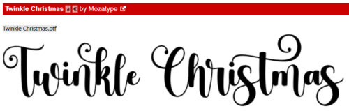
Twinkle Christmas is a pretty, twirly font that can be used for pretty much everything… titles, subtitles, captions and journaling.
I think Christmas Holiday is a more generic font, and would be ideal for layouts about cutting Christmas trees, sleigh rides, toboggan parties, ski trips and the like.

I could totally see this font with red, white and green Christmas Candy cane stripes, with an acrylic or gel Style applied on top to give it some curves.

Amore Christmas is a classic, elegant font perfectly suited to layouts about holiday pageants, choir performances, church service and even prgrams. It’s an all-caps font with both the curly and plain characters.

If you live in a cold part of the world, odds are you’ll have snow for Christmas. (I thought for sure we would, after we got about 8 inches last week, but it’s all gone, it’s 50°F and the forecast is for more of the same. 🙁 ) What I like about Christmas in Winters is that it’s very legible and would be a good title font for any winter layout.

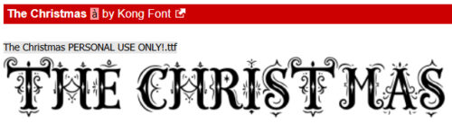
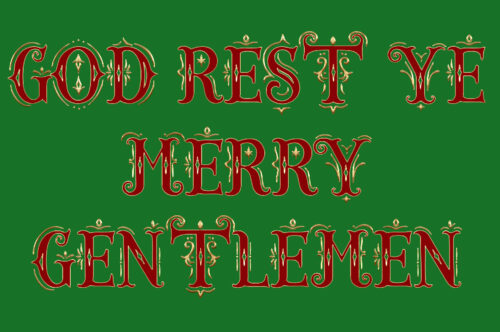
Look at this!! It’s so baroque and capital F fancy! When I look at The Christmas, I so want to have the main parts of the letters a deep, rich red (or maybe green), and the curlicues gold. I’m going to play with it for sure! It has both upper and lower case characters as well as some basic punctuation. No numerals though.
So… I played with this one. So fancy!
Christmas Comeback is a multipurpose font as well, with upper and lower case letters and basic punctuation but no numerals. I wouldn’t necessarily call it “Christmas-y”, but I might want to use it for card sentiments.

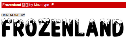
Now on to the winter fonts. Frozenland is a good, all-purpose winter font. It’s probably not quite right for journaling but has both cases, punctuation AND numerals. That drippy icy topping on the letters cries out for a pale blue, curvy Style.
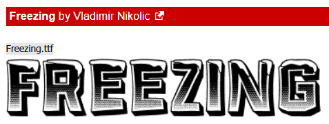
Freezing had me thinking about that ombré technique from earlier this year. It all-caps, but in two sizes, No punctuation, no numerals, so mainly a title font, I guess.
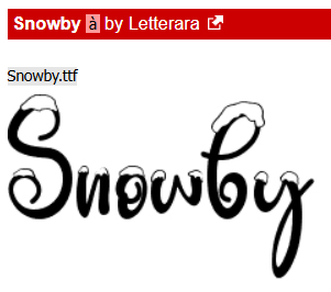
Snowby is just FUN!
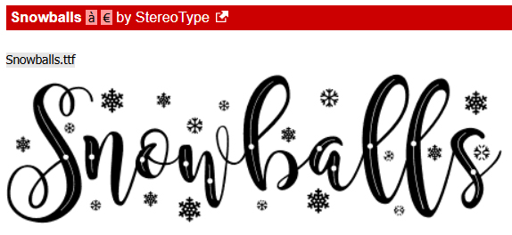
Snowballs is a demo font. The thumbnail shows letters that are included, along with numerals and punctuation. The full version has an assortment of additional characters; when you click on the name, you’ll see a link to where you can purchase, if you so choose.
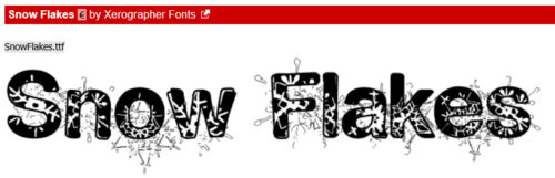
This one, Snow Flakes, is my most FAVOURITE! It speaks to me of snowball fights, building snowmen, winter carnivals, skating parties… whatever fun one may have in the snow.
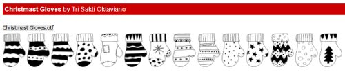
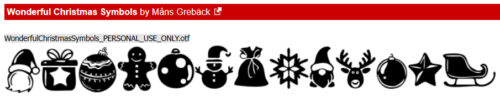
Now bring on the dingbats! Wonderful Christmas Symbols is filled with seasonal silhouettes. There are 159, all different! I could see using them for a border, on tags, with a beveled style to create brads… really, so many options.
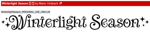
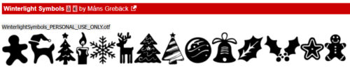
Winterlight Symbols is another 52-silhouette collection. They’re a little more stylized.
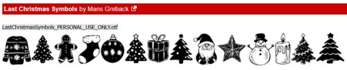
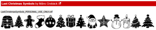
Last Christmas Symbols has a bit more of a detailed, traditional look. It has some religious symbols mingled with secular Christmas images, winter sporting events and nature.
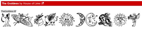
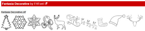
And finally, Fantasia Decorative is an outline collection with so much potential.
I’m going to go out on a limb here and guess that all of you have downloaded at least one of these… am I right?
![]()