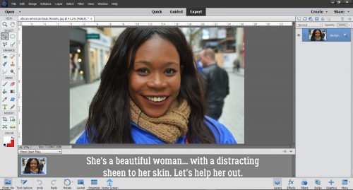
Peek-a-Boo, I See You (Solving Underexposed Faces)
![]()
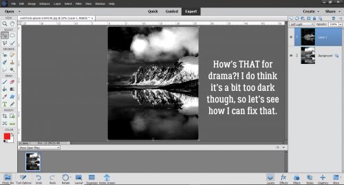
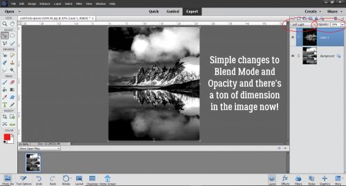
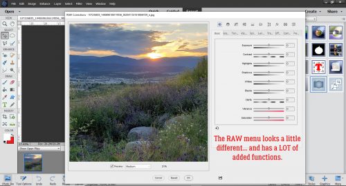
Well, it seems photo editing has become the hot topic for Tutorial Tuesday! After last week’s technique for diminishing shiny skin, Steph sent me a message: “I love this week’s blog post about correcting a shiny face. Do you remember if you have a tutorial about improving a photo that has a face in shadows? I tried searching but didn’t see one. Thanks, Steph“. I don’t think I have done one specific to faces, although we’ve talked about fixing underexposed photos in a couple of ways, by editing in Camera Raw or by copying the photo and changing the Blend Mode to Screen, then copying that new layer as many times as necessary to bring out those details. But there will be times when those methods aren’t going to work. Like when your subject is backlit…
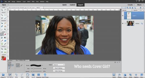
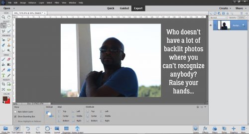
This gentleman is Mike. He works for JuJu Tours in Negril, Jamaica as a glass-bottom boat pilot. We took a New Year’s Eve boat tour with him in 2014 and I have quite a few photos where I know who I’m looking at but nobody else will. It seemed like a good choice for this tutorial.
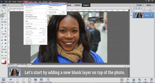
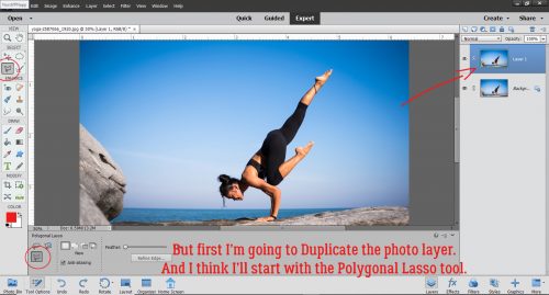
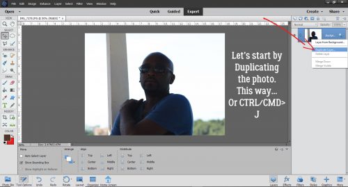
I like to do most of my experimentation on a copy layer so that my original is still there if I need to refer to it. So my first step is always to make a Copy layer. CTRL/CMD>J is the keyboard shortcut, but if you’re into working more than necessary, right-click on the background layer then choose Duplicate Layer and follow the prompts.
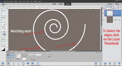
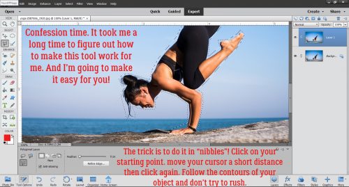
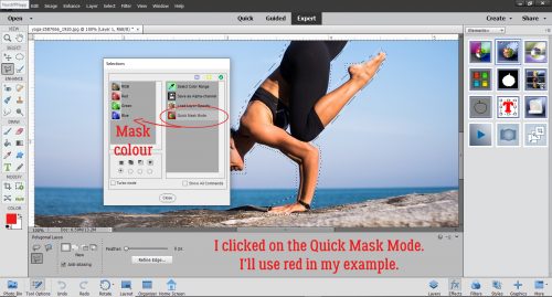
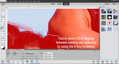
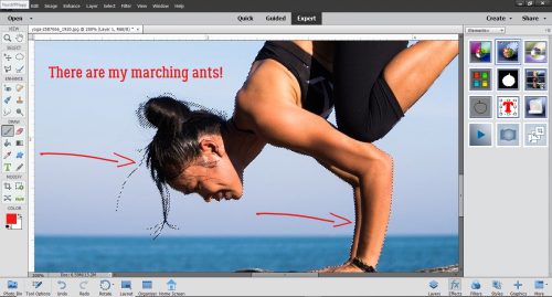
I want to separate Mike from the sky and now that I’ve figured out how amazing the Polygonal Lasso tool is, that’s what I used here. The trick to making this tool work beautifully for you is to make small movements with your mouse and click frequently to mark your spot.
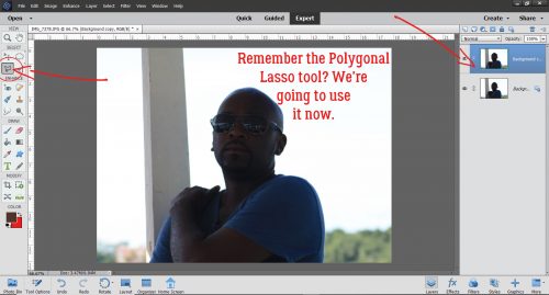
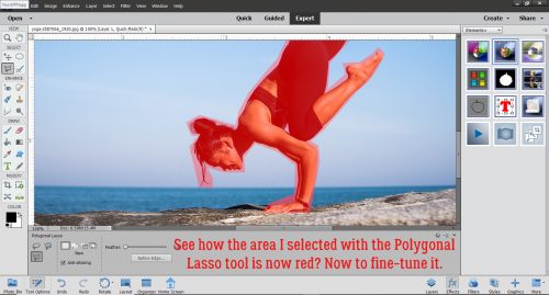
On the screenshot, I’ve used the word “slowly”. But it only took me about 3 minutes of small mouse movements and clicks to get a relatively clean selection. When I got back to my starting point the tool automatically turned on the marching ants showing me where my selection was.
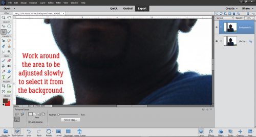
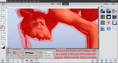
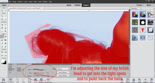
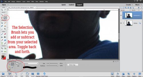
One drawback to the Polygonal Lasso tool is that you can’t Zoom in and out while you’re using it, so it’s hard to get a perfect selection. So once I have my basic shape lassoed, I use the Selection Brush tool – its icon looks just like a paintbrush with a few marching ants curving above the bristles. This tool lets me add or subtract areas of my selection. I usually use the biggest brush I can for the area I’m adjusting, and I toggle back and forth between adding and subtracting until I get all of my marching ants following the edge of my selection. The controls for this tool are at the bottom left of the workspace.
I Zoom in on areas like this one so I can see as clearly as possible where my ants have strayed.
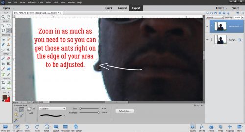
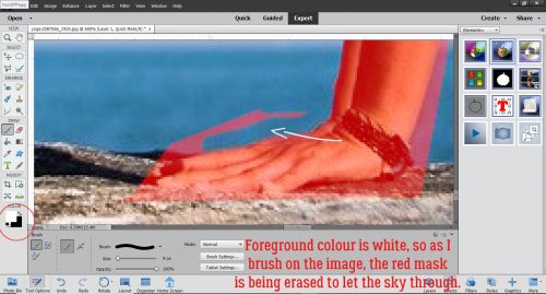
This photo was a great one for this example, because there aren’t a lot of these sticky spots. Don’t be put off by the time it takes to do this – it’s actually not that bad… maybe another 2 minutes.
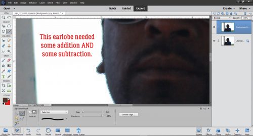
The spot where the sunglasses’ temple attaches needed some attention.
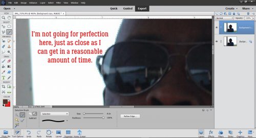
For general purposes, perfection is impossible and a waste of time. And in the end, it’s not usually necessary because unless the imperfection is a big one, it’s not going to be the centre of attention, so don’t sweat it!
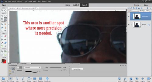
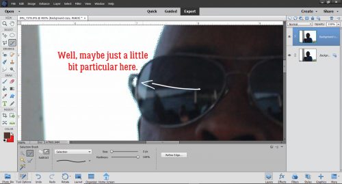
Depending on your background though, a spot like this might deserve some precision. The sky here is really blown out and I’m not going to change that, but if I had some sort of detail – leaves on a tree for example – that would be visible in that gap, I’d definitely want to add it into my selection.
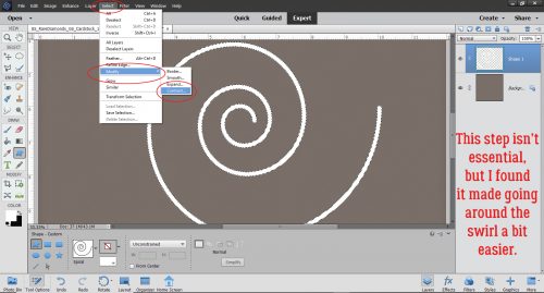
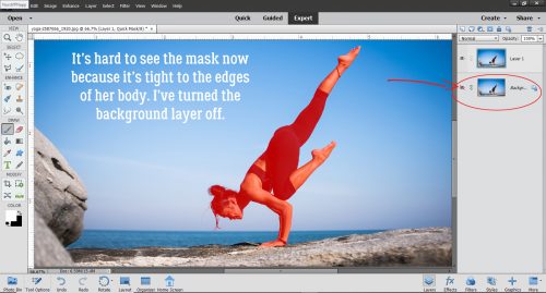
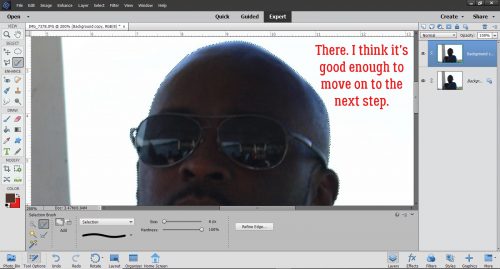
After I ‘d gone all the way around the selection and adjusted as needed, I Zoomed back out a bit to see how clean the edge looked. On to the next step!
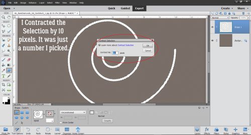
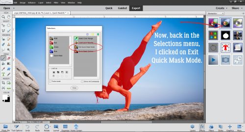
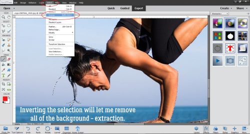
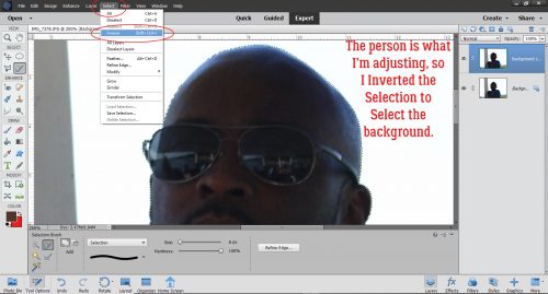
I wanted to separate Mike from the sky – or more accurately I wanted to remove the sky from around Mike. To make that happen, I Inverted the selection: Select>Inverse or CTRL/CMD>SHIFT>I.
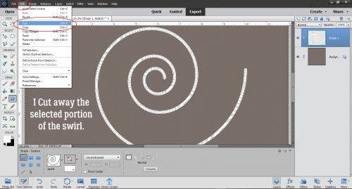
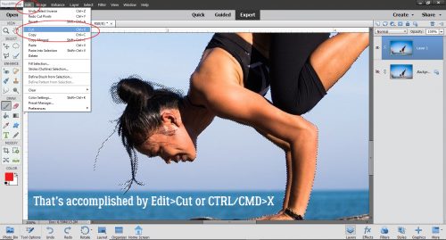
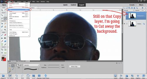
With the Copy layer still the active one, I Cut away the sky. Edit>Cut or CTRL/CMD>X
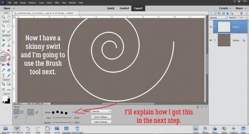
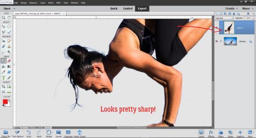
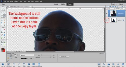
This screenshot is just to show you that the sky is now gone from that top layer, but it’s still present in the original layer (it’s just invisible right now).
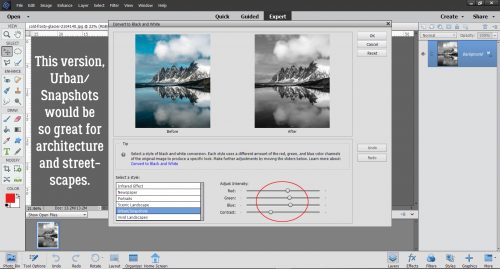
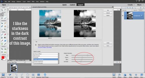
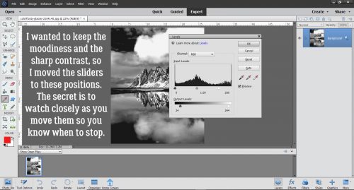
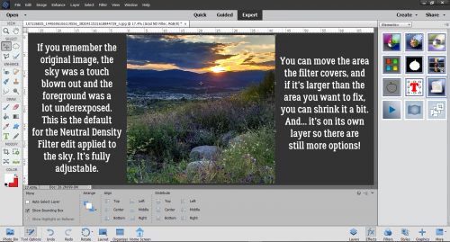
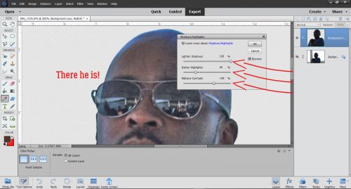
Now that Mike was all by himself on the top layer, I used Enhance>Adjust Lighting>Shadows/Highlights. The default setting for this adjustment is for the Shadows to be automatically decreased by 50% so don’t be shocked! Highlights are default-set at 0% and Contrast is set right in the centre.
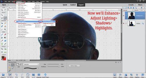
I pushed the Lighten Shadows slider all the way over to 100% to really lighten up his face. I Darkened Highlights by 26% and Midtone Contrast was boosted to +28%. All of a sudden it’s almost possible to identify what’s reflected in his lenses.
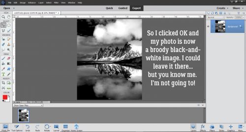
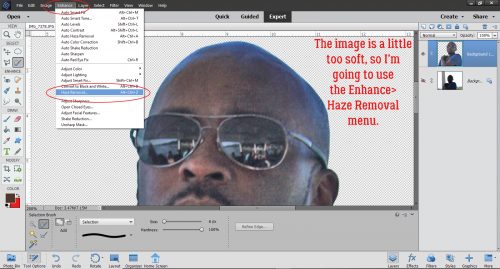
I’m happy I can see Mike‘s features now, but I think the image is a bit too soft. My favourite tool for fixing that is the Haze Removal menu.
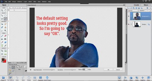
Haze Removal also darkens the image a wee touch, as you can see in the preview below. But it looks good with the default setting so I went ahead and clicked OK.
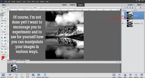
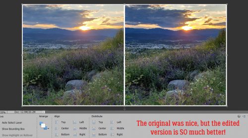
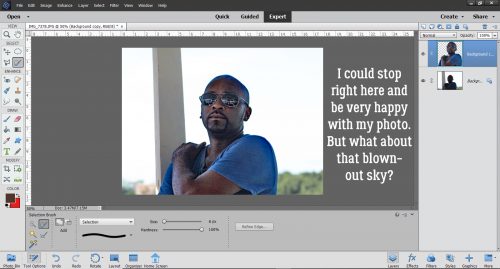
For all intents and purposes, I could quit right here and it would be perfectly fine. But I’m always going to take it a bit further so I can show you what else you can do with your photos. I think the background is a lot blown out and that’s fixable.
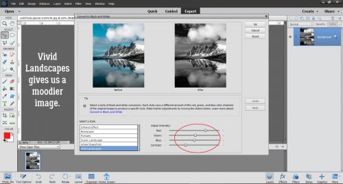
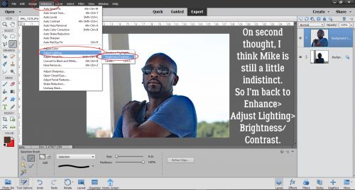
But before we move on to that, I decided Mike still looked a bit shadowy. So I decided to Enhance>Adjust Lighting>Brightness/Contrast just a smidge.
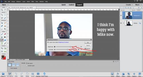
These sliders start out in the centre. I pushed the Brightness slider to 54 and the Contrast slider to 10. Now it’s good.
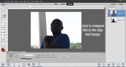
Just for fun, I turned off the top layer to remind myself where I started.
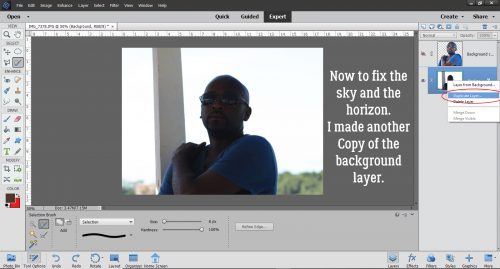
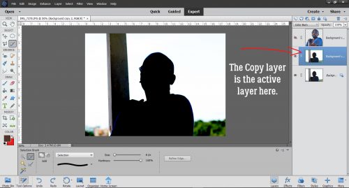
Okay, on to the sky. I made another Copy layer (right-click>Duplicate Layer or CTRL/CMD>J) of the background (bottom) layer.
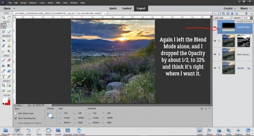
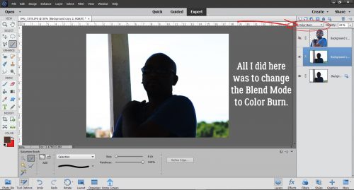
With the Copy layer active, all I did was change the Blend Mode to Color Burn. It looks a bit neonish now though.
Quick fix: Decrease the Opacity of the Color Burn layer to 61%.
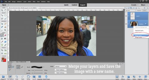
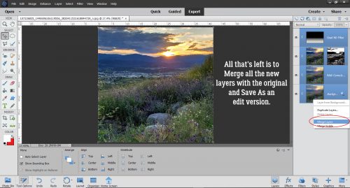
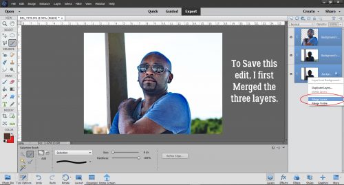
Then I brought Mike back and Merged all the layers so I could save my work.
I wasn’t totally happy with the finished image though. Mike still looked a bit fuzzy. So I Copied that image layer again so I could add a High Pass Filter.
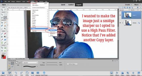
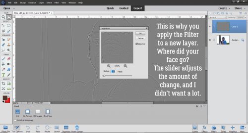
Here’s why you do the High Pass filter on its own layer. A rule of thumb for sharpening an image this way is that you should only see a hint of colour through the filter. Otherwise you risk having it look over-processed. (I have plans for a really interesting tutorial where you WANT to have an in-your-face look to your photo, but that’s all I’m telling you.)
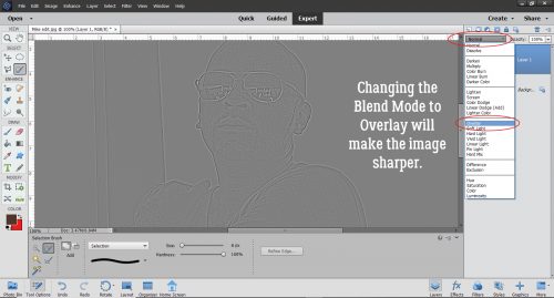
To see how the filter works, change the Blend Mode to Overlay.
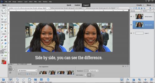
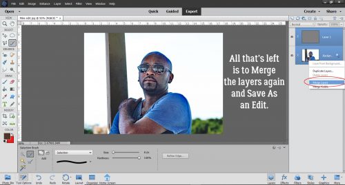
And now you see the photo I THOUGHT I took! I just had to Merge the layers again and save it for later.
Before I go, I want to remind you that you’re in control of your work. You can stop at any point along the way if you’re happy with what you’re seeing. These tutorials are intended to help you understand your software, make it work harder for you without making you work harder to get what you want, and to up your scrapbooking game… while having a little fun along the way.
![]()