When SIZE Really DOES Matter…
![]()
Please forgive the lateness of this week’s lesson. I sprained my wrist on Thursday and it’s slowing me down a lot! Oh, and I had company for a four-day weekend, so I’m running so far behind I might never catch up.
I was scrolling through the forum the other day while I waited for all my iNSD purchases to download and came across a GingerScrapper, ScrappyDel, asking how to improve the clarity of her images in the Gallery. She said she uses My Memories (I can’t claim to know anything about it, but I did do some digging…) and found that her Gallery posts looked really blurry. A very helpful GingerScrapper named Lynnie (FormbyGirl) offered her some suggestions, then she said,
“I know I could resize my image within the program (Elements/PS), but I am TERRIFIED I will overlay the original, so I never do that.”
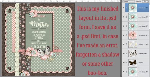
Then I can do whatever I want to the .psd file open on my work space. I resize each one twice, once to 2400×2400 (8 inches x 8 inches) for printing into a Shutterfly book later, and then to 600×600 for gallery posting. CTRL/CMD>Alt>I opens up the Image>Resize>Image Size menu.
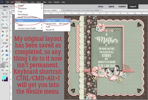
Below I’ve shown you the settings I use for resizing. All three of the boxes in the lower left part of the menu box are checked. And the drop-down selection is “Bicubic sharper (best for reduction)“.

Resizing doesn’t change the format, just the size of the image. So it will need to be saved as a .jpg file for printing and gallery posting.
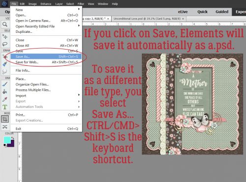
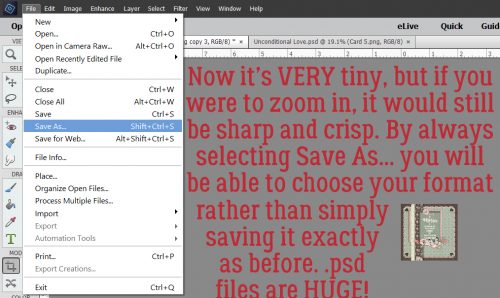
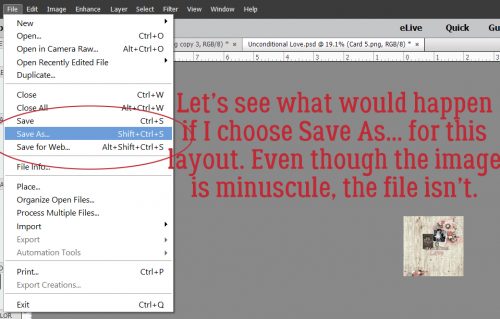
If you just click on Save (CTRL/CMD>S) Elements will save the current .psd file in the new size OVER your original. That might not be a problem, but I avoid it by using Save As… (CTRL/CMD>Shift>S).
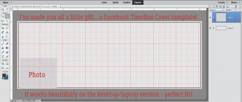
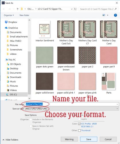
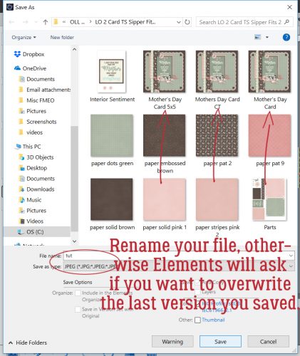
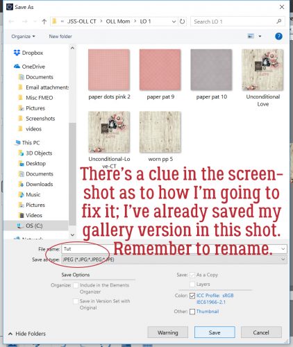
If I’m using a template, Elements will bring up the template’s name, which I then change to my layout’s title, and then I select .jpg from the Save as Type. If you forget to rename your layout, Elements will prompt you by telling you the file already exists and asks if you want to write over it.
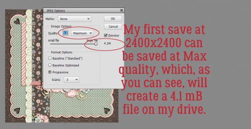
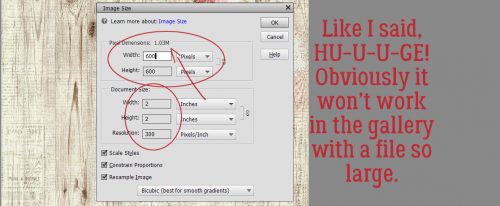
This part is important later. You can see in the menu box that the 2400×2400 .jpg file I’m saving is 4.1 mB of data.
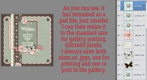
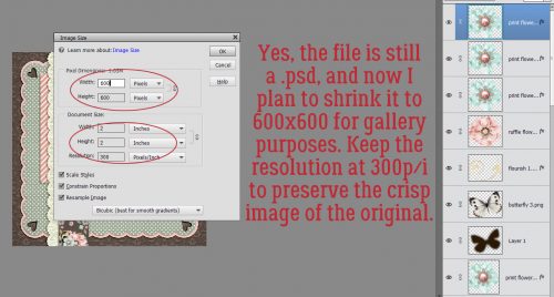
As you see, the file is STILL a .psd file. Now I’ll shrink it down to gallery size. Keep the resolution at 300 pixels/inch. This is the key to sharp images.
Elements shows you the teeny-tiny size the new file will be. Follow the same steps I’ve already shown you.
Remember: RENAME YOUR FILE!
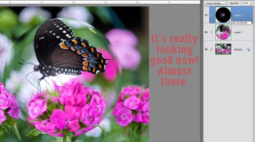
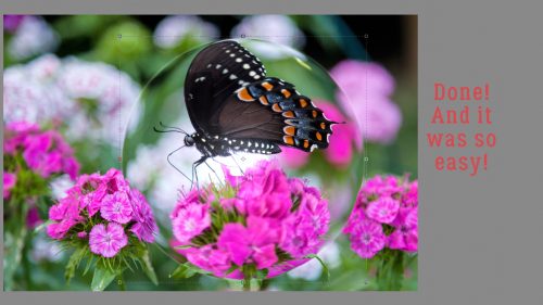
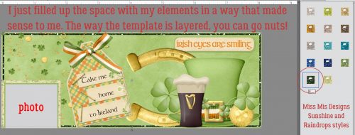
Both layouts in this tutorial were created with Ooh La La Scrap‘s May Buffet bundle Mom and this one also uses a template from Trixie Scraps‘ If the Slipper Fits. A lot of times, your finished project will be within the 450 kB size the GingerScraps Gallery allows. And that’s great! Just save it as is.
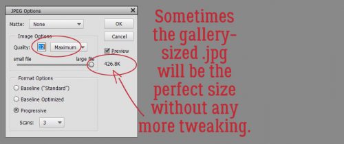
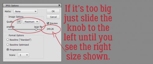
But if you’re planning to post your layouts to other galleries with much stricter file size limits, then you can reduce the quality a notch at a time until your file is small enough.
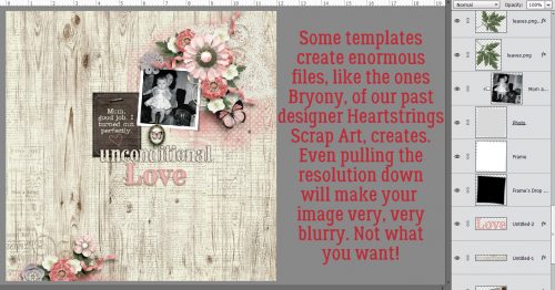
Then there are templates like those designed by Heartstrings Scrap Art that result gorgeous layouts, in humongous files.
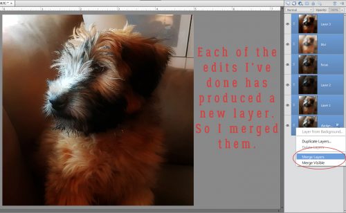
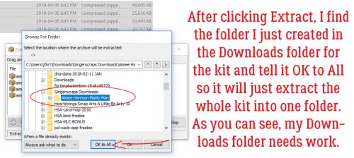
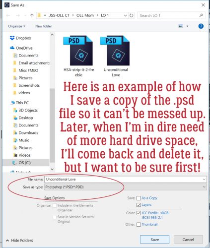
Shown below is the folder I created for the layout and it shows you how I save the layout .psd with the name of the layout so I don’t accidentally save over the original OR over the layout later.
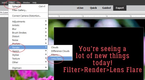
I wanted to show you how to handle these really big files so the next few screenshots will do just that.
I went ahead and tried to save it using my usual method.
If you’re really paying attention, you might figure out how I manage this issue.
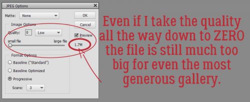
Look at the size of that file! 2.1 mB!! Even at 600×600…
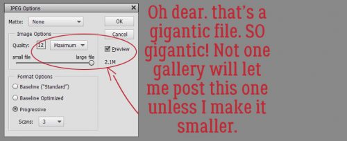
And then, if I drop the quality using the slider… well even that isn’t going to cut it.
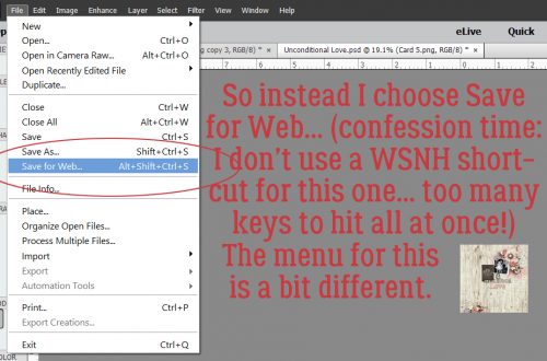
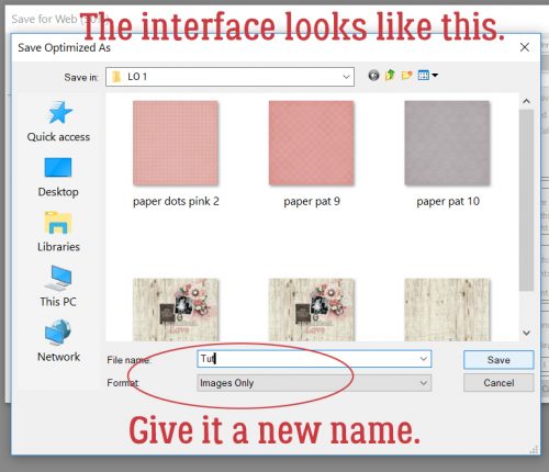
So for this particular designer’s templates, I use Save for Web…
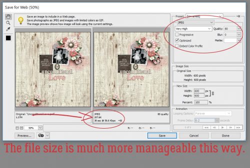
The interface looks like this. The default setting is a quality of 80% and the file size is a much more agreeable 207.6 kB.
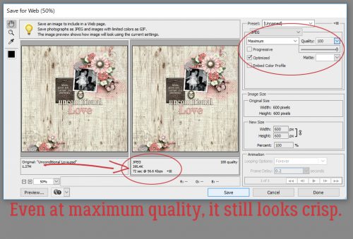
Even if I increase the quality to 100%, the file size is still acceptable at 395.4 kB.
Once I hit Save this screen opens up. It needs its own name if you’ve already saved a larger .jpg for printing.
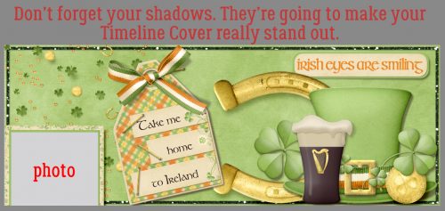
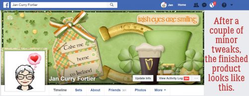
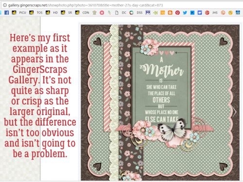
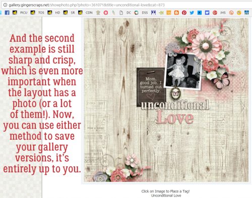
Here’s what the layouts look like in the Gallery.
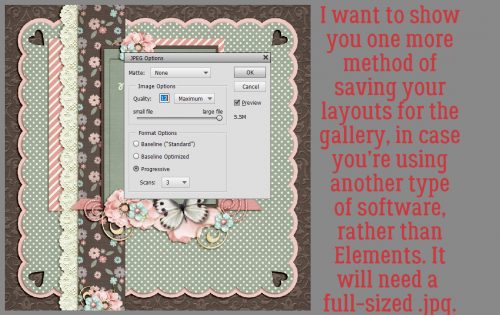
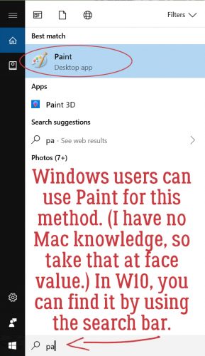
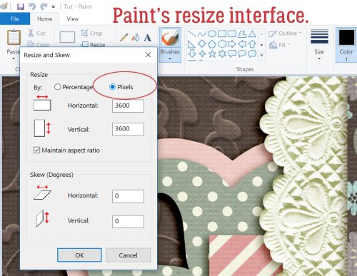
There’s one more method I want to show you, one that’s a little less labour-intensive than the one Lynnie uses and doesn’t alter the resolution of the image. This is a Windows-based method, and should work well with My Memories software. Save your image as a .jpg file at FULL SIZE, 3600×3600.
Then open up Paint on your desktop.
Then click on Open (CTRL>O).
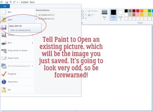
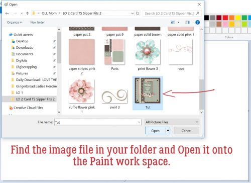
Find your full-sized copy in your folder and double-click on it.
And you’ll be shocked! It’s even more ginormous than ever.
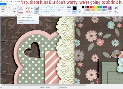
Click on Resize and Skew. Make sure the dimensions it’s going to use are the pixels.
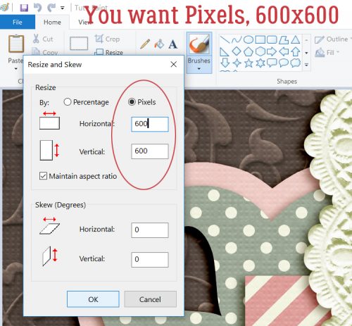
Then type in 600 in the first box. Windows will auto-fill the second one.
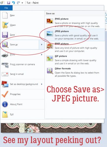
Tell it to Save as then select JPEG picture.
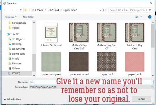
Again, make sure you change its name a little. Add a number or some other identifier.
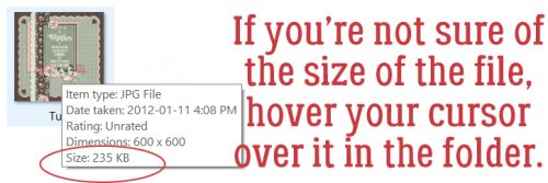
If you’re still not sure the image is small enough, you can hover your cursor over the image in the folder and this little box will pop up. Perfect!
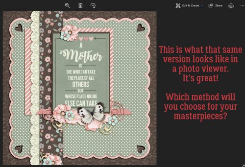
And as you can see, the image is just as sharp and clear!
You can use ANY of these methods to save your layouts. They all are pretty simple, and don’t take much effort. Which one will work for you?
![]()