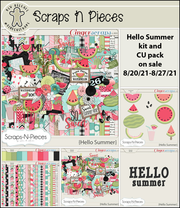
Happy Friday. Are you ready for a great store sale?
*Summer Retiring Products*
65% Off Select Category
{August 20-26}
*IMPORTANT NOTES*
This sale will end promptly at 11:59pm (Eastern Time) on the August 26, 2021.
Please download your purchase! These products will be deleted from our shop and servers approximately 45 days after the close of this sale. Once they are gone, they will be gone for good.

https://store.gingerscraps.net/2021-Summer-Retiring-Products-65-OFF-SALE
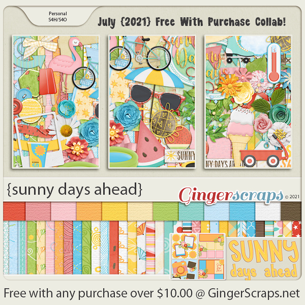
Remember, any $10 spent in the store gets you this great kit for free.

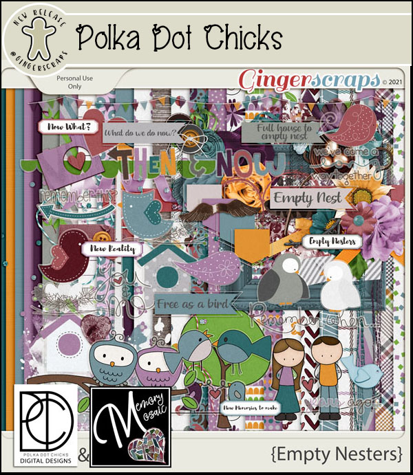
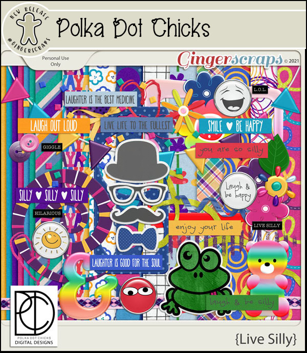
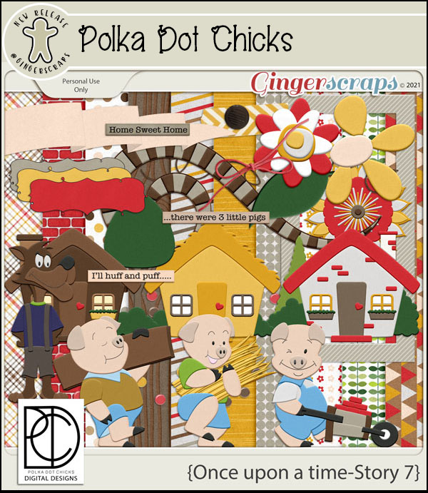
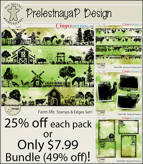
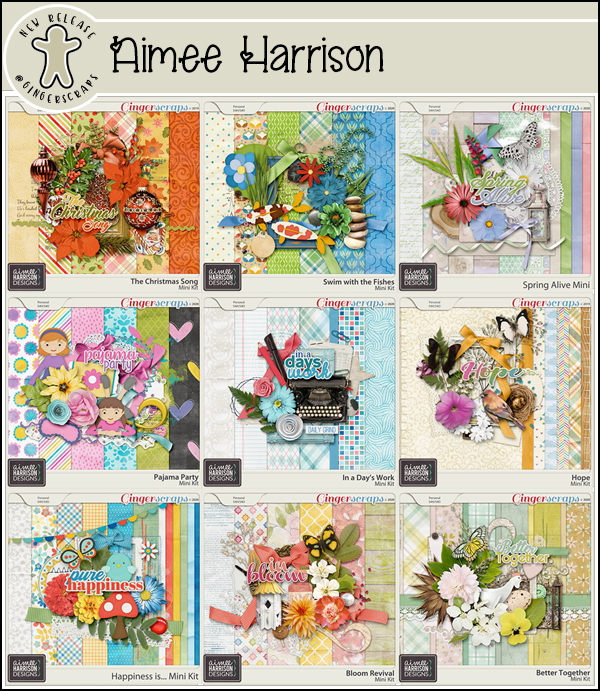
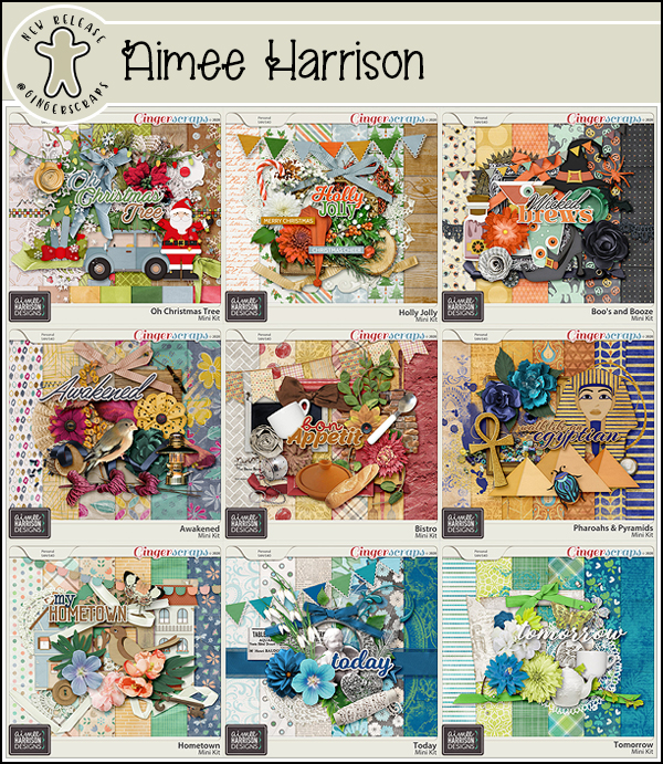
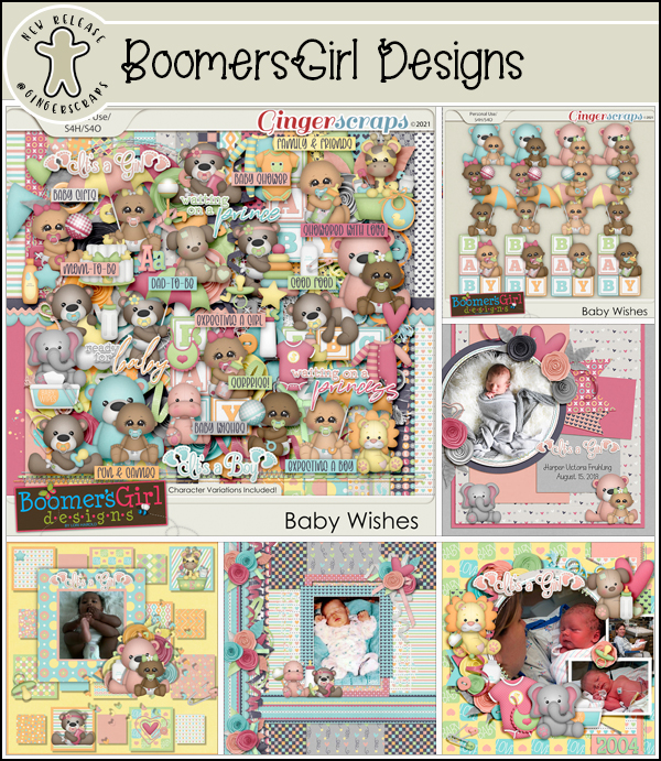
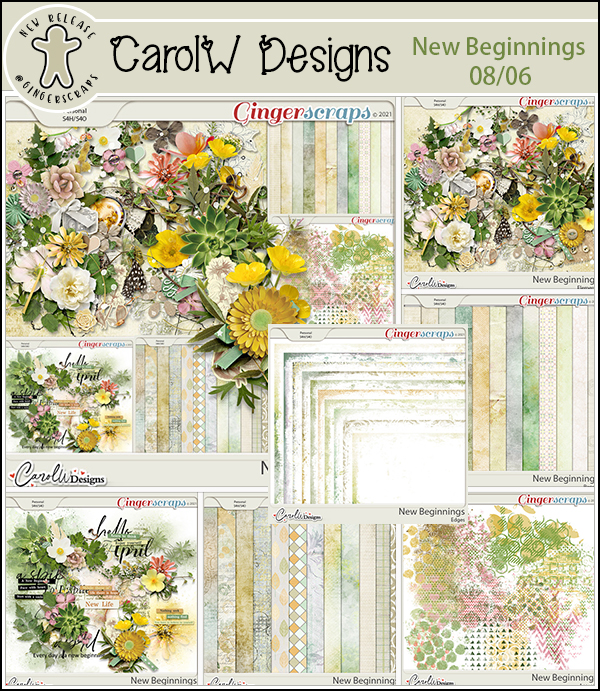
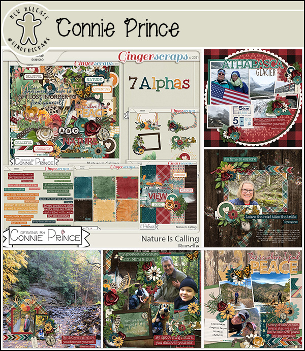
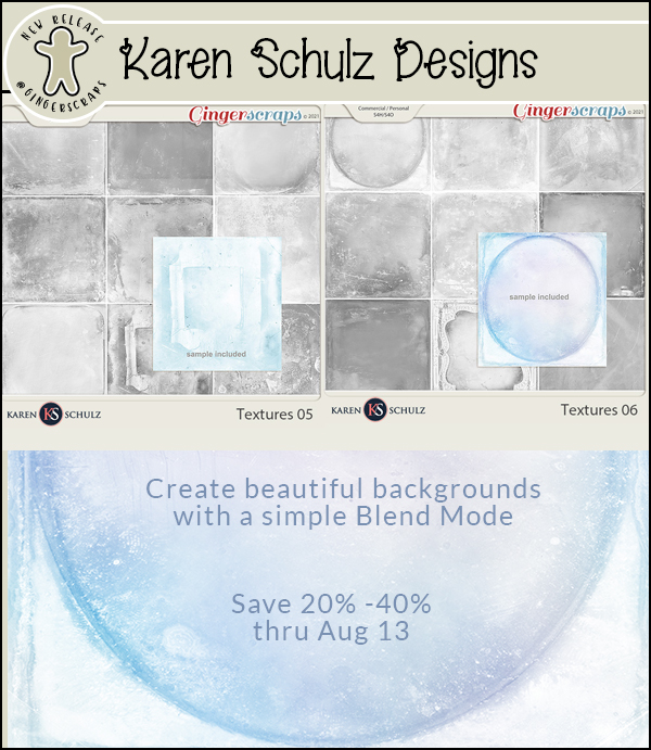
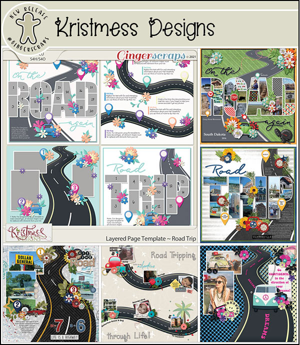
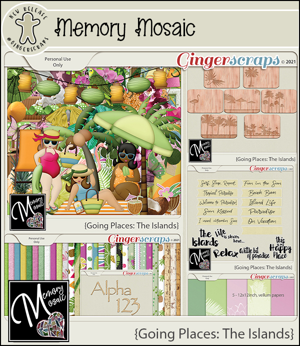
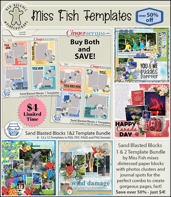
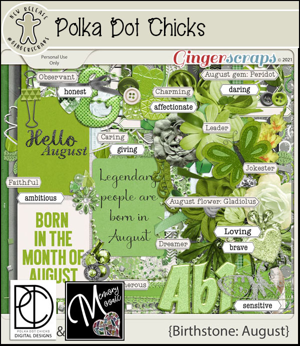
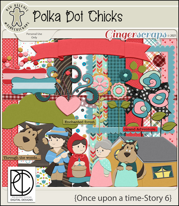
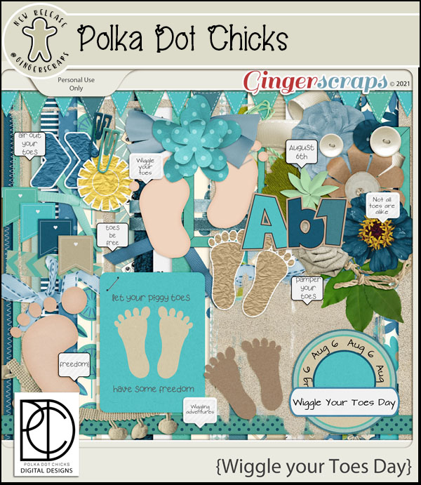
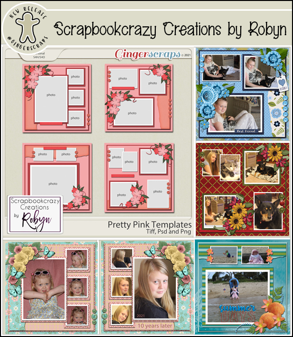
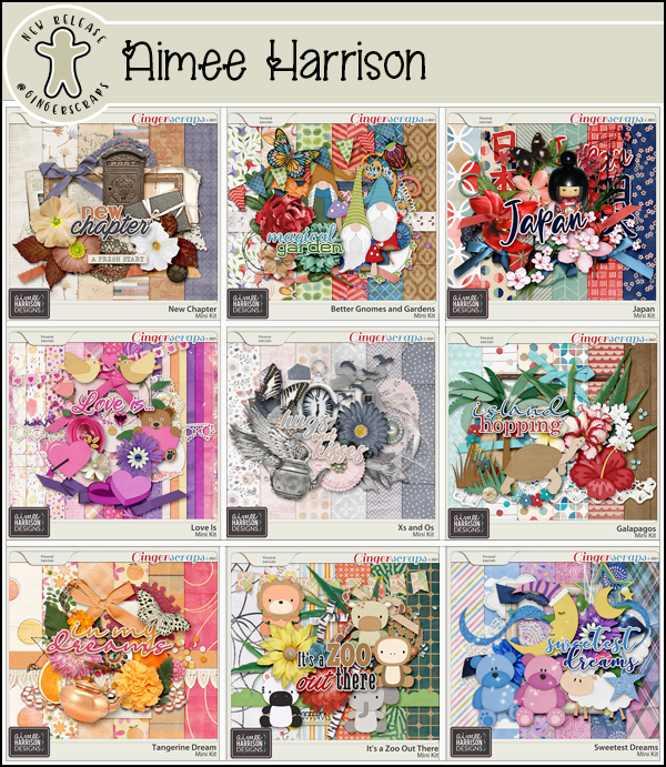
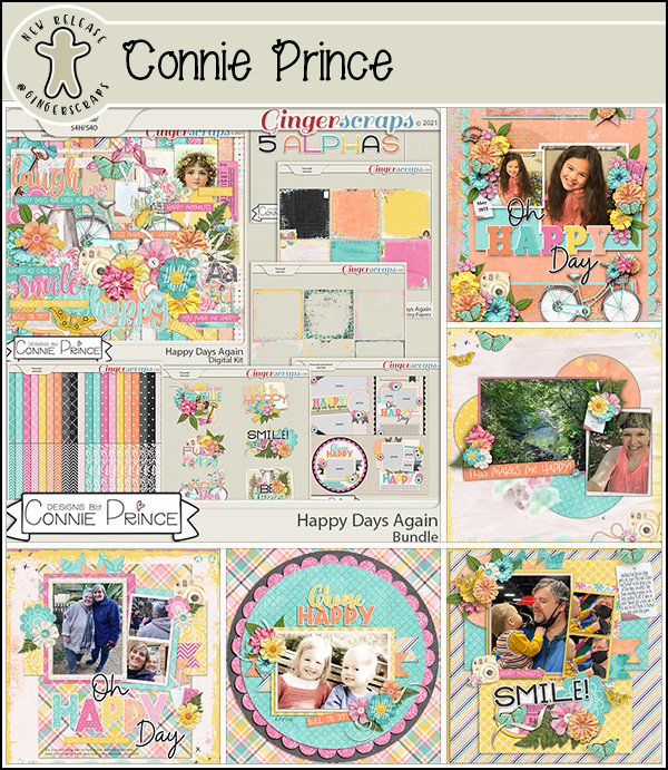
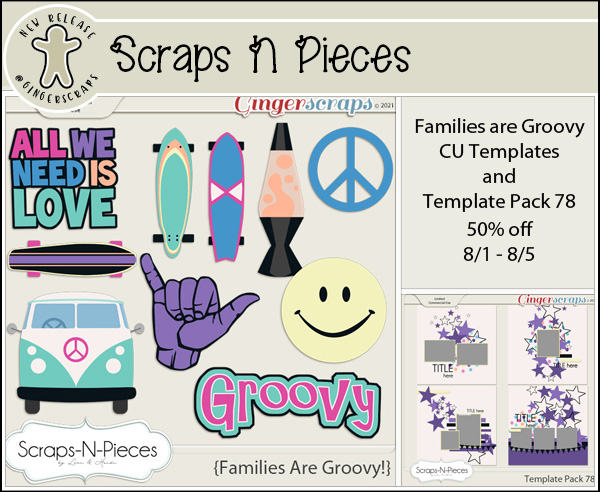
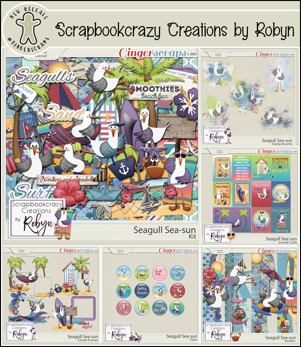
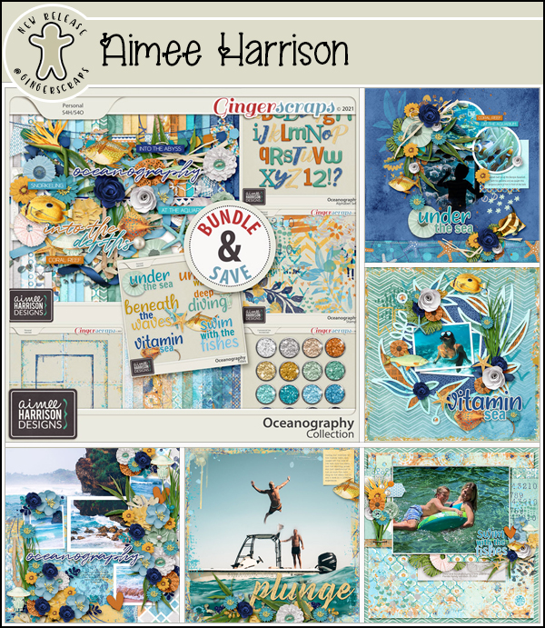
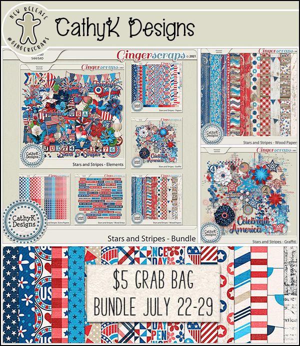
Now let’s see what our designers have going on this week.


Remember any 10 challenges completed will get you this kit as a reward.

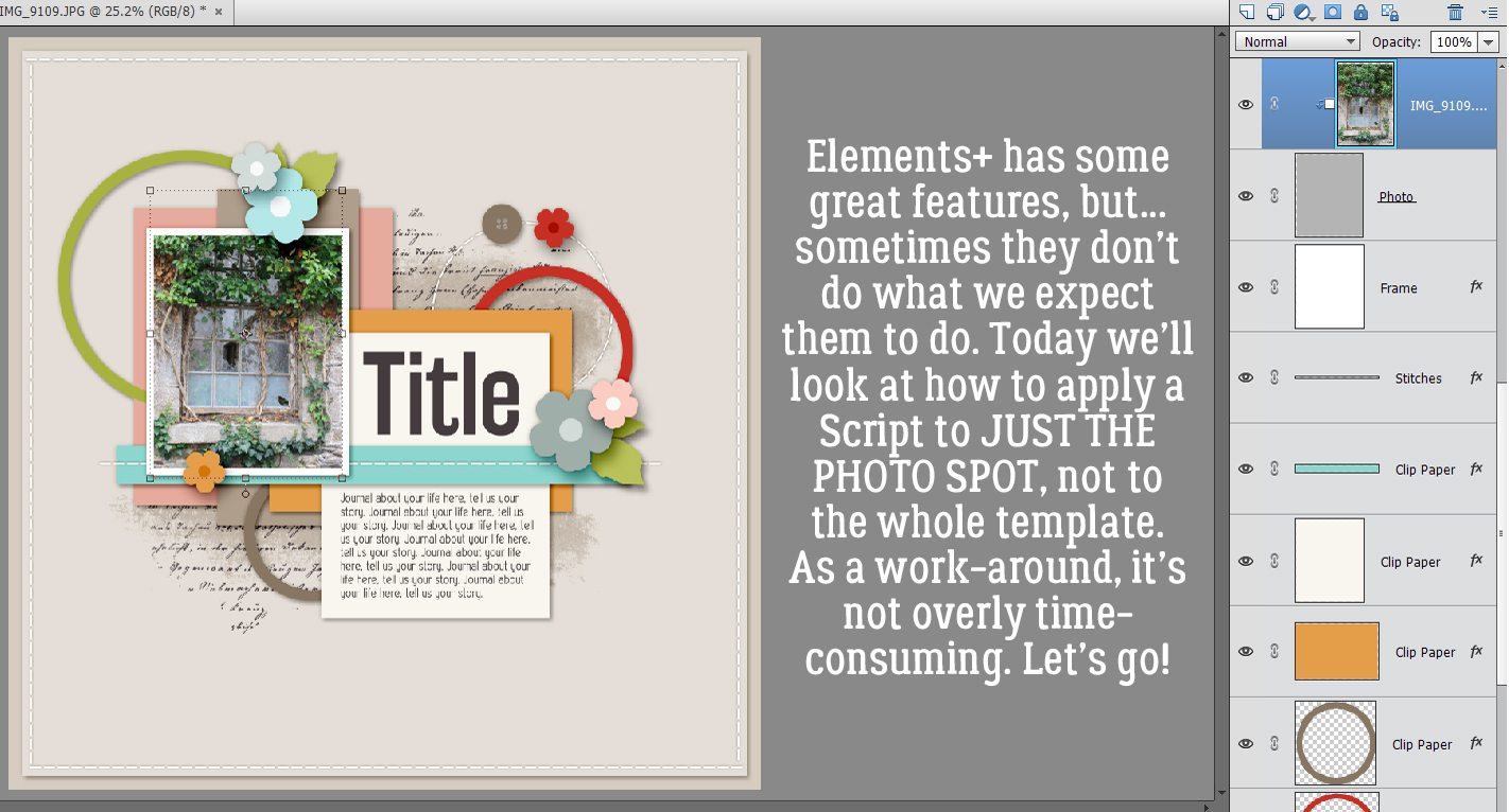

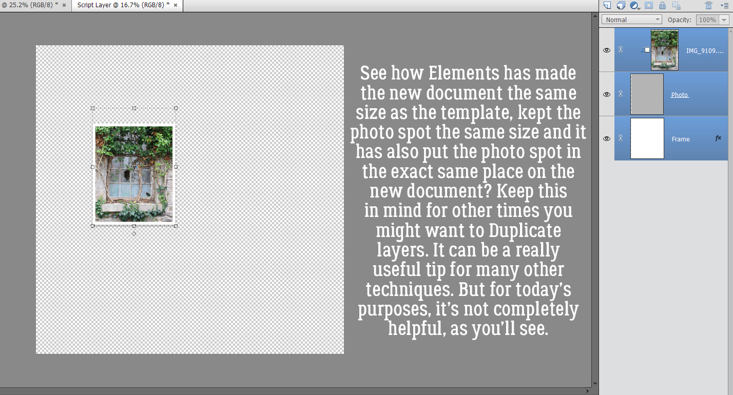
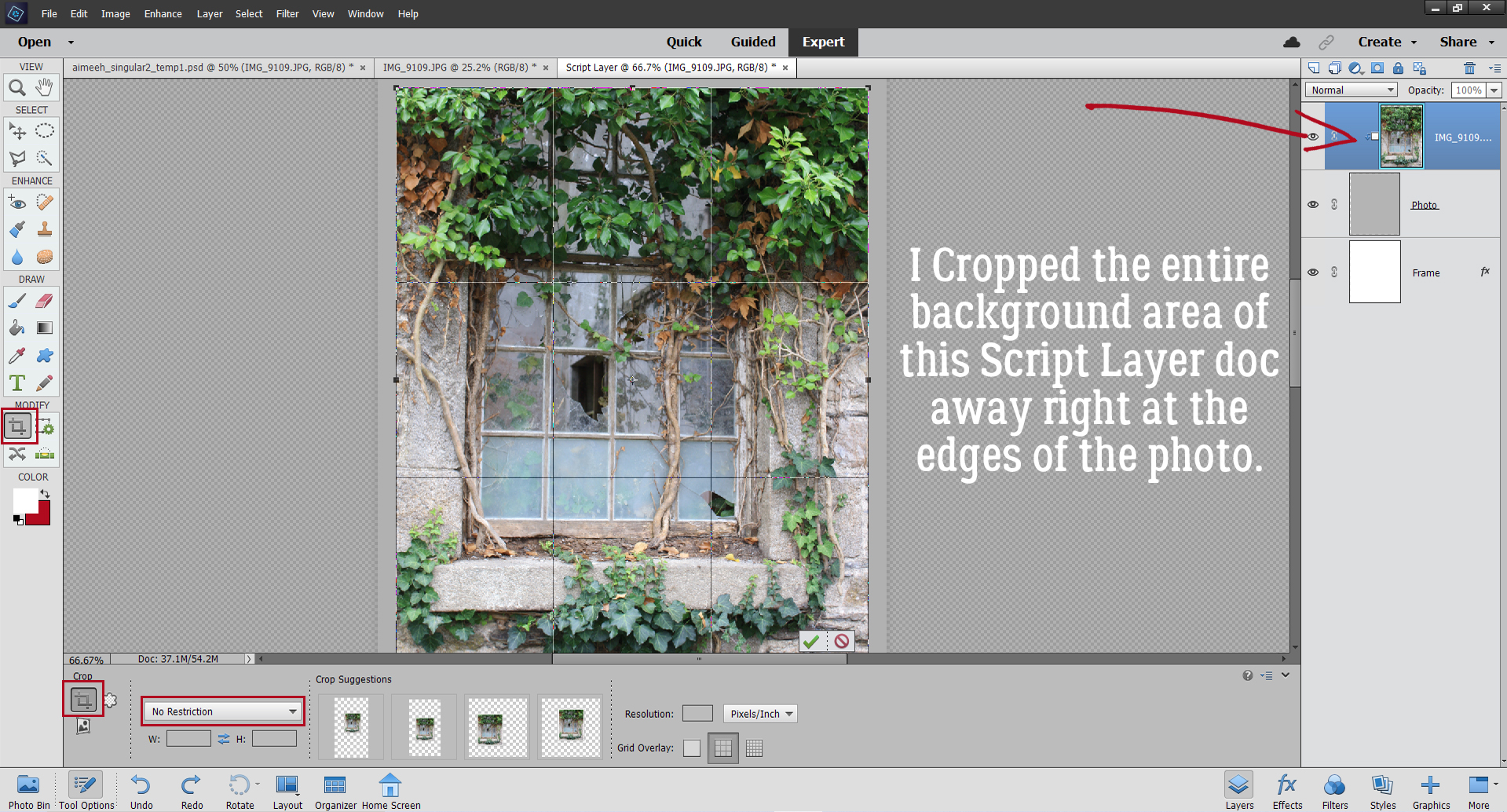
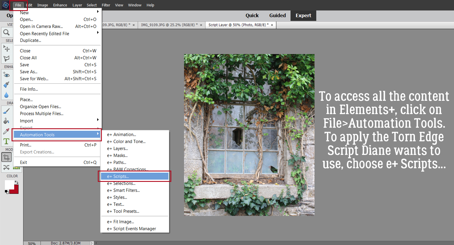

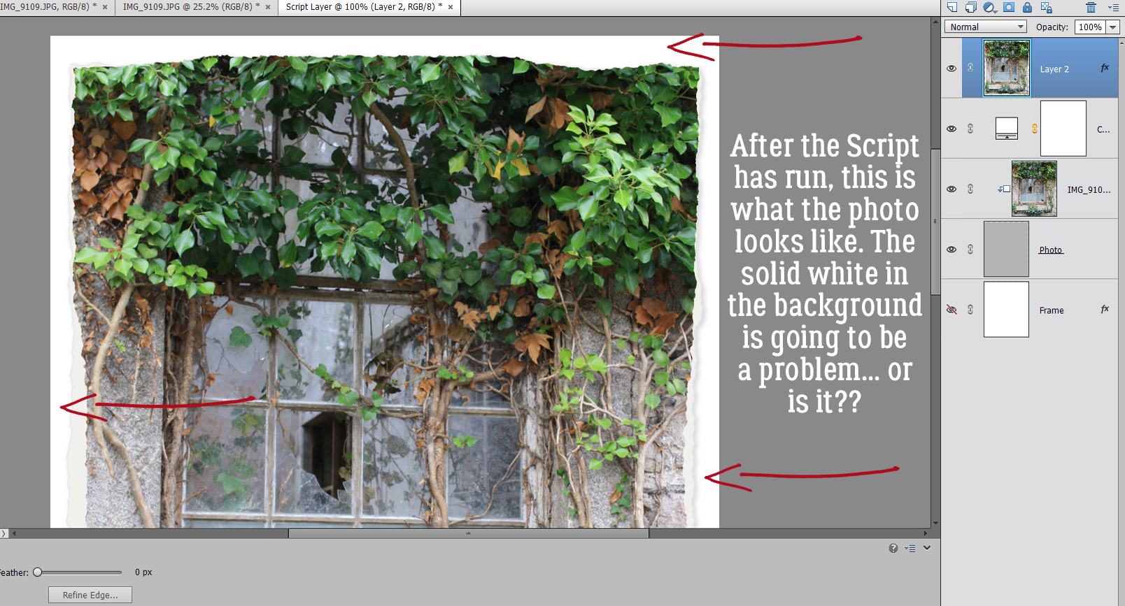
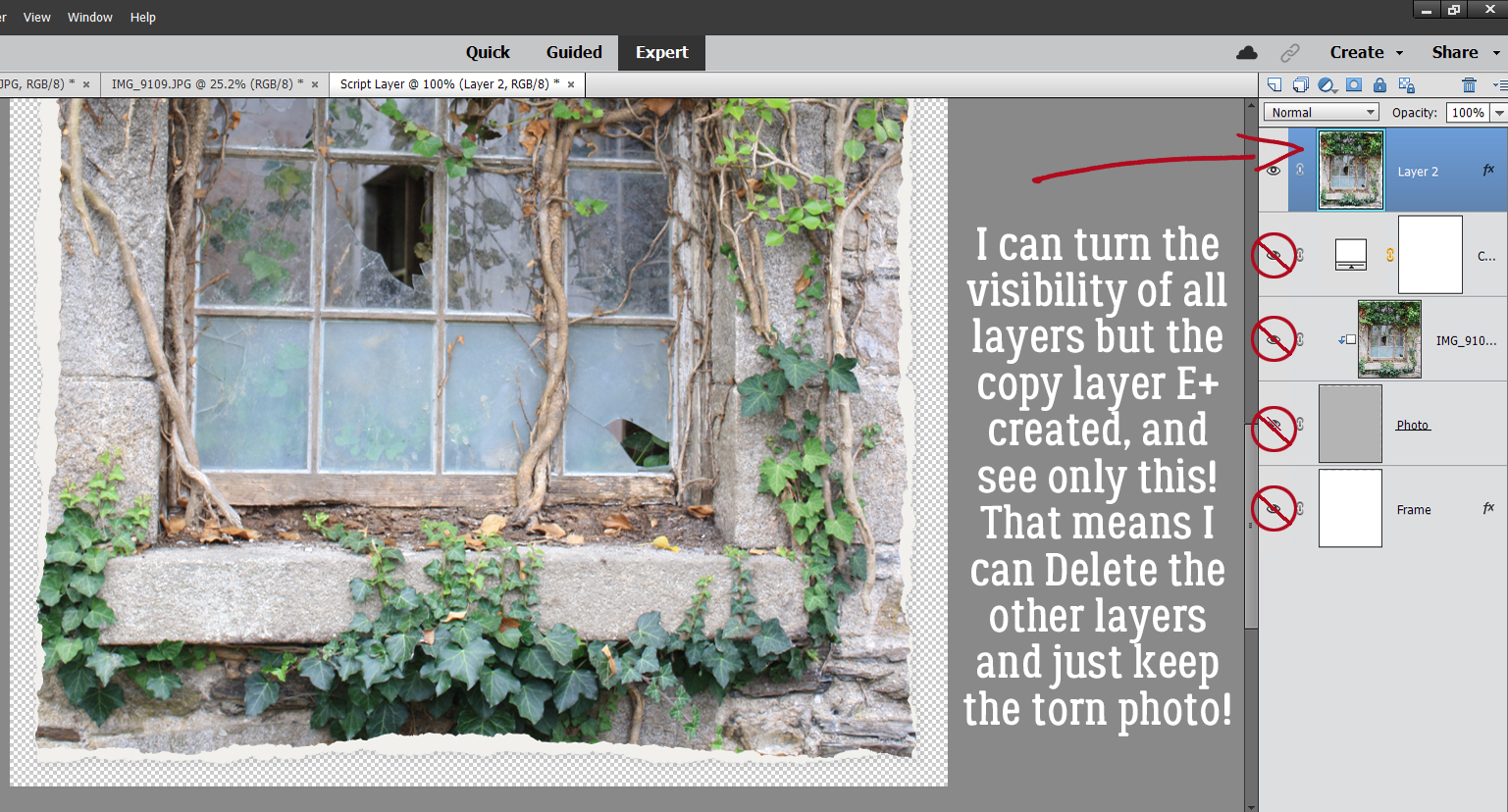
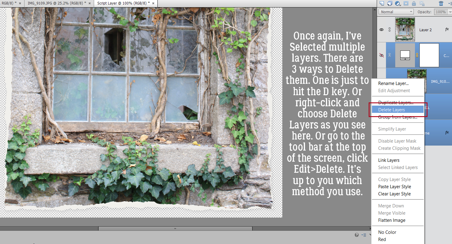


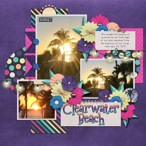
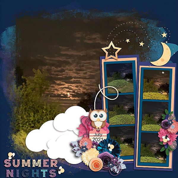


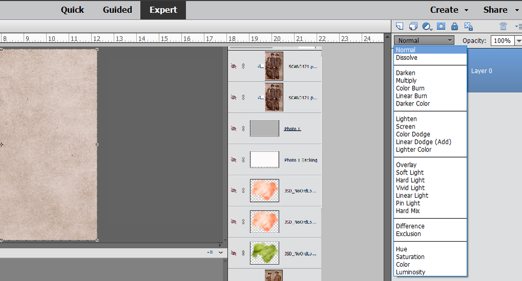
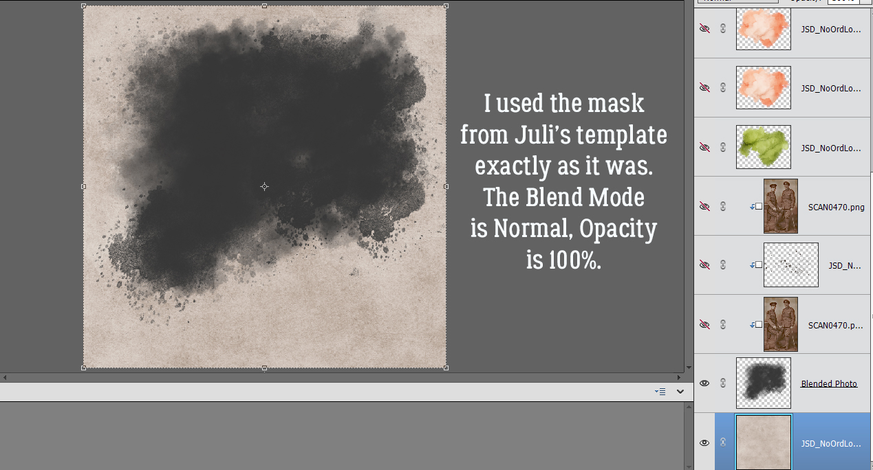
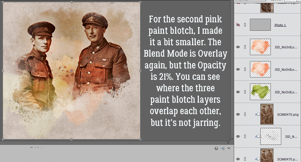
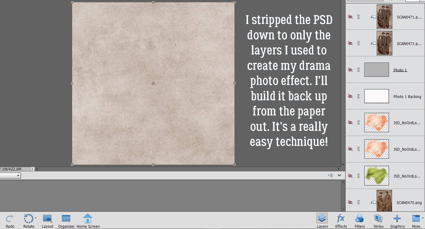 In the Gallery comments, Jill pondered whether I’d done any (labour-intensive) extractions or other witchery to obtain my results, but I didn’t. I used the mask exactly how