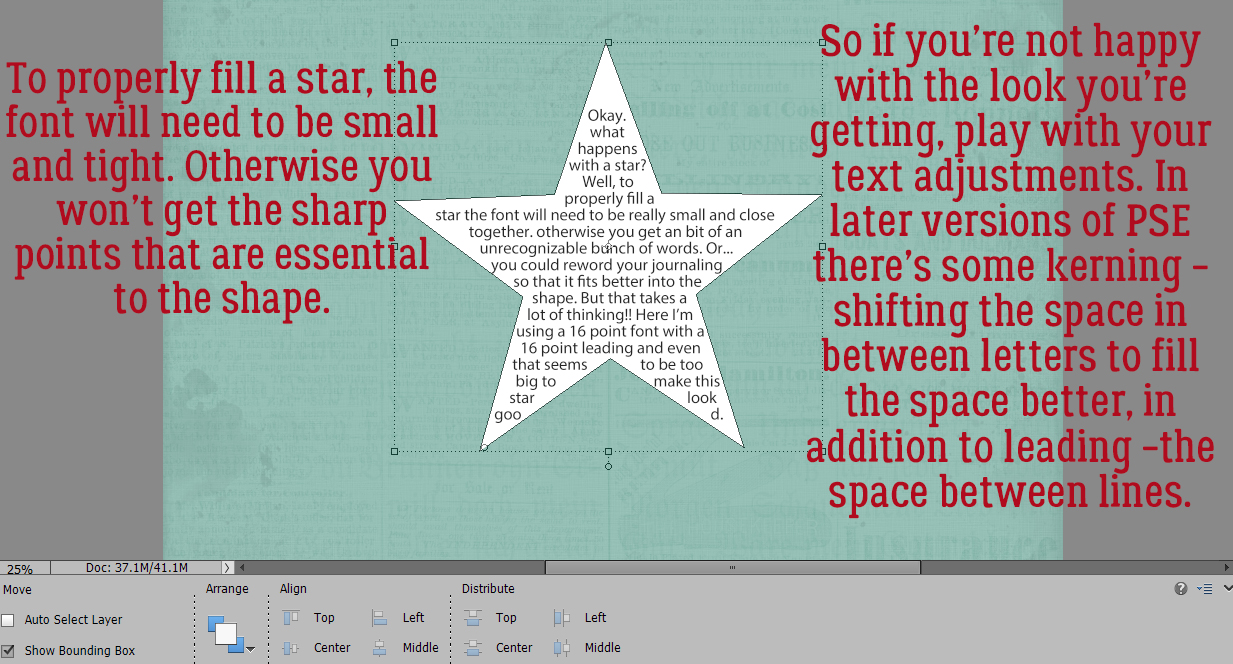
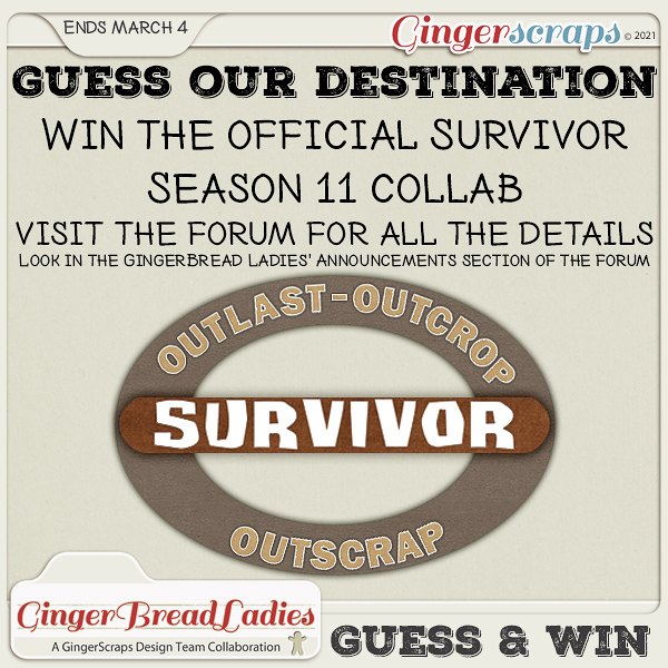
Happy Friday!! In addition to our regular amazing Friday New Releases, we have two super exciting announcements today! Scrapping Survivor: Season 11 is open for sign ups and we have our annual Win Your Wishlist contest happening now!
Head to the forum for all the details! WIN YOUR WISHLIST {2021}

And now, the moment you have all been waiting for!!
Are you ready for the big reveal? There were so many good guesses in the forum. Without further ado… Drum Roll Please … This years Scrapping Survivor theme is … Craft Fair!!!

You can find all the details about Scrapping Survivor in the GingerScraps Forum!
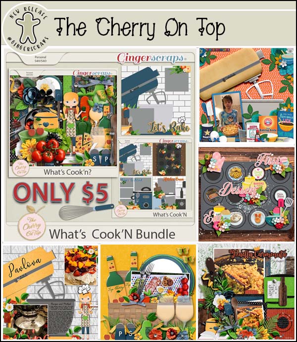
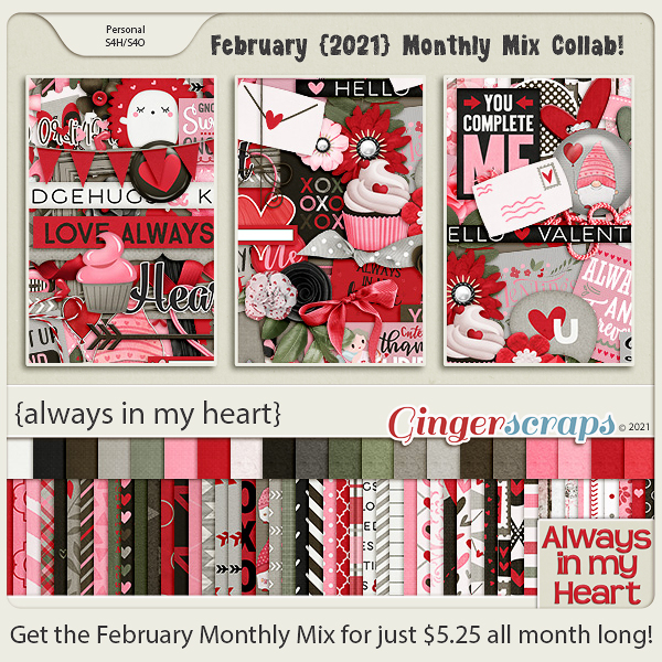
Don’t forget to stop by the shop and pick up the Craft Fair Mega! It is truly AWESOME!

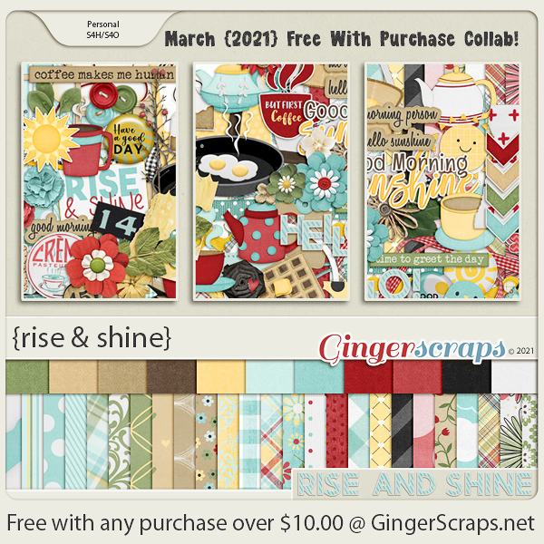
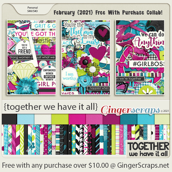
Remember when you spend $10 in the store, you get this great kit for free. Just looking at the preview makes me want to grab a cup of coffee.
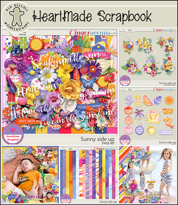
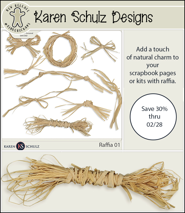
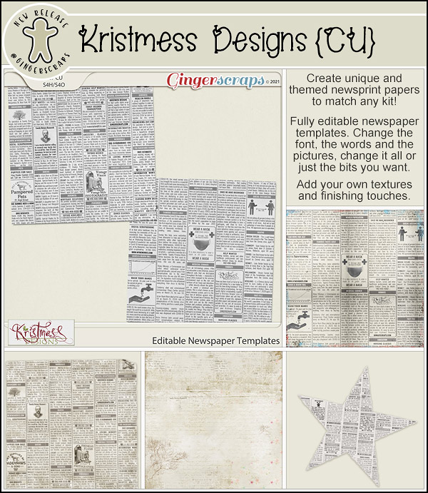
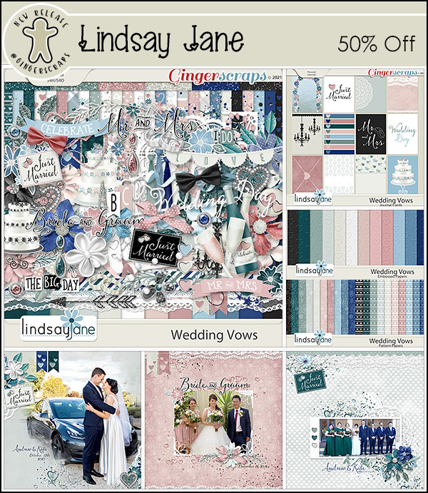
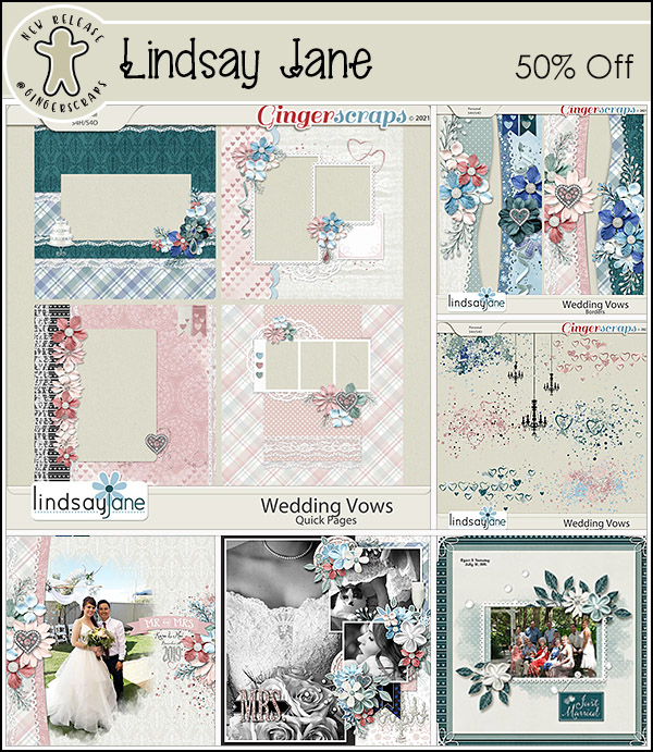
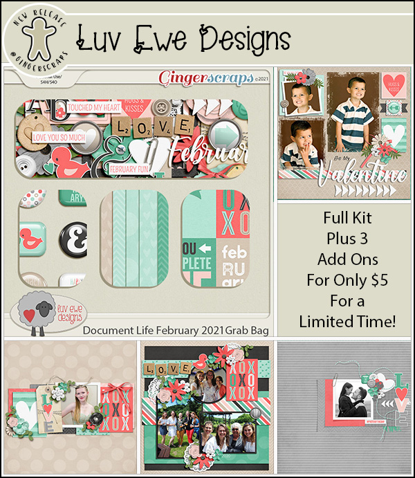
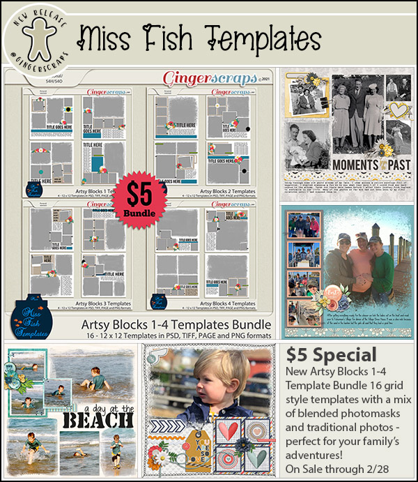
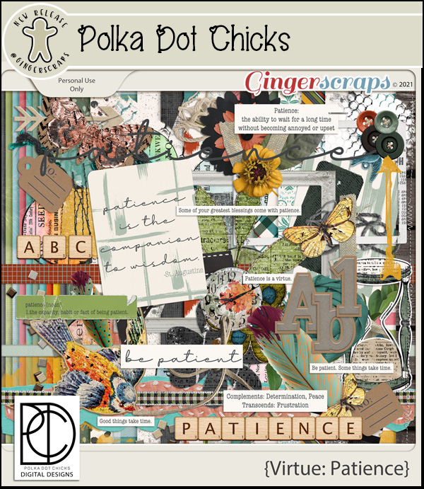
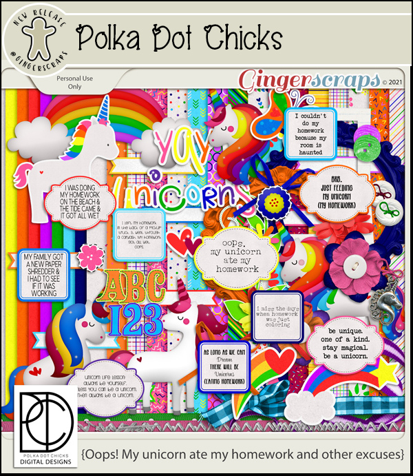
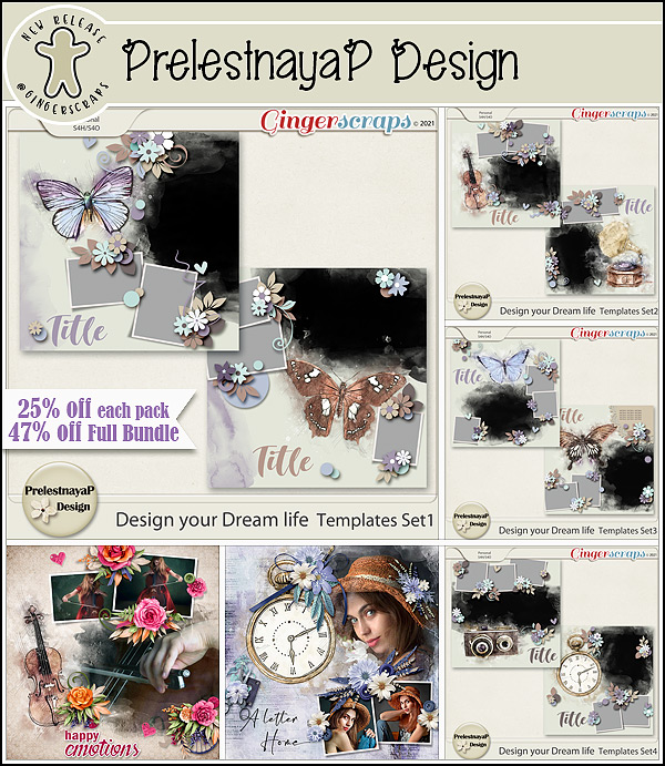
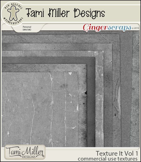
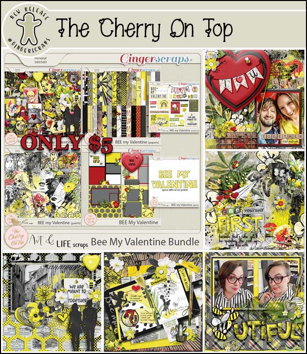
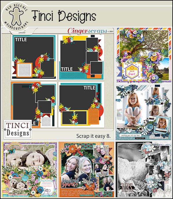
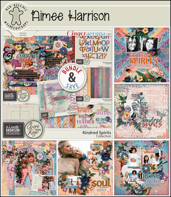
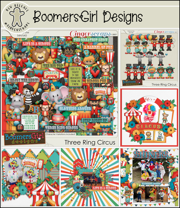
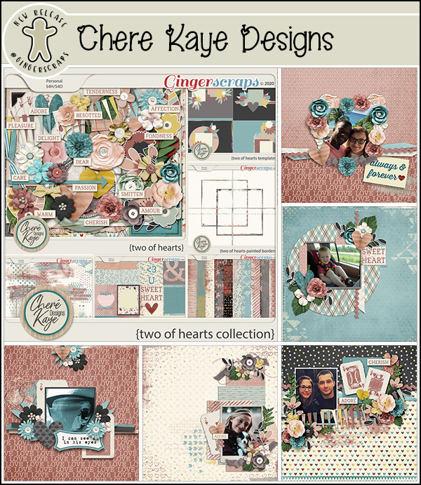
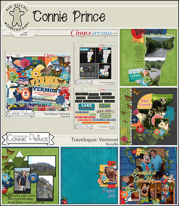
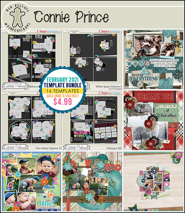
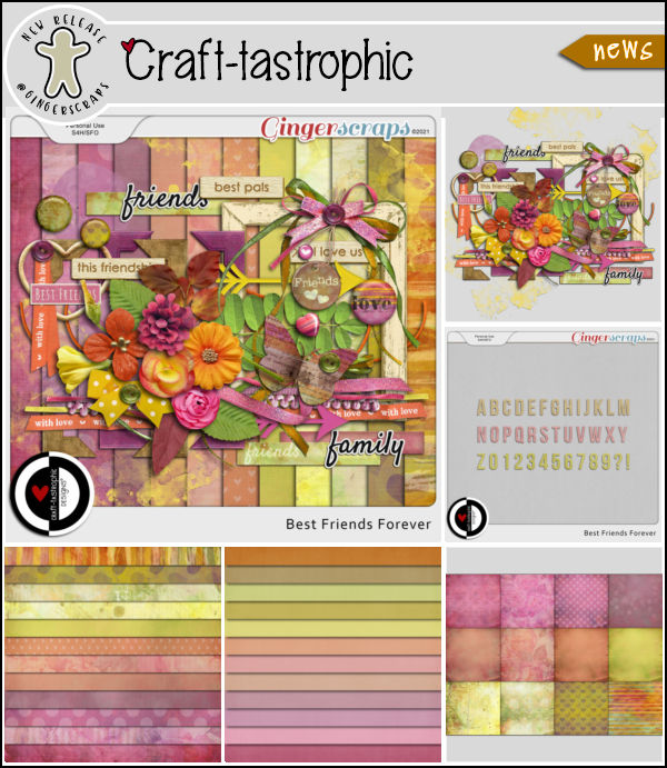
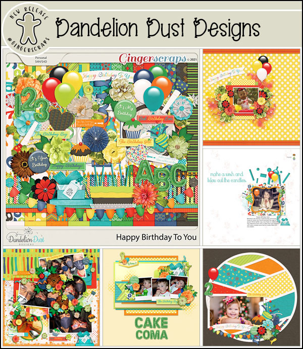
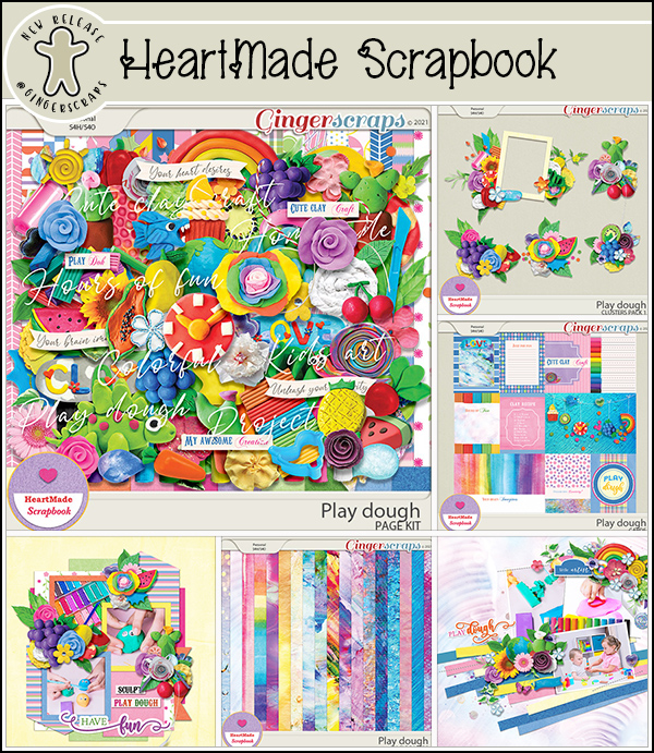
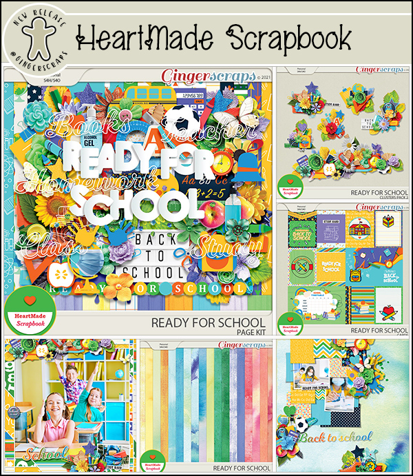
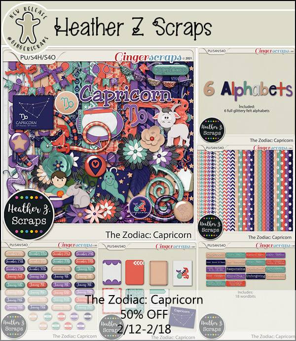
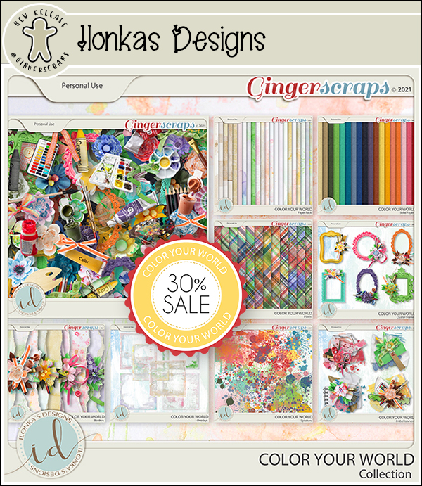
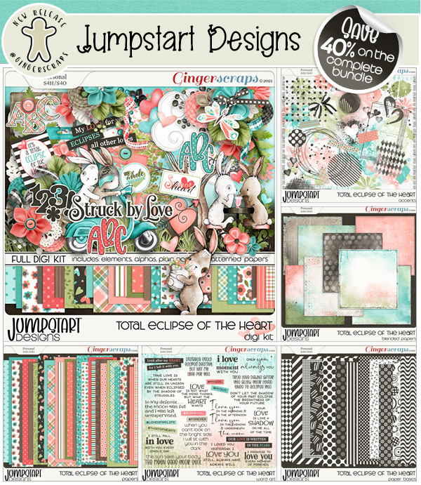
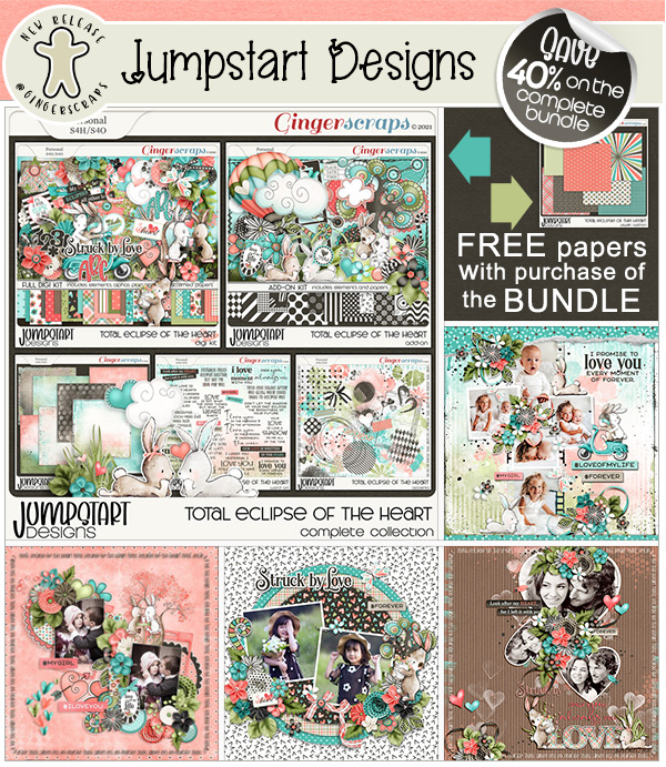
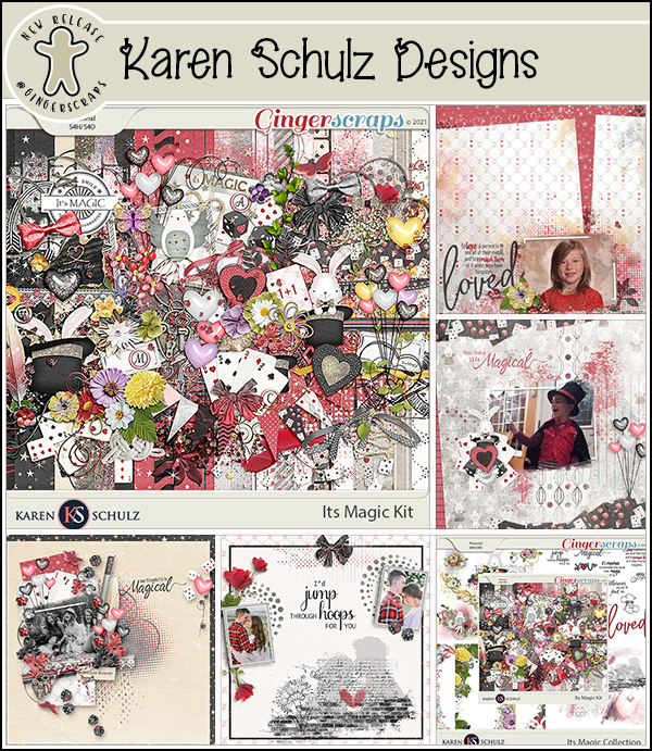
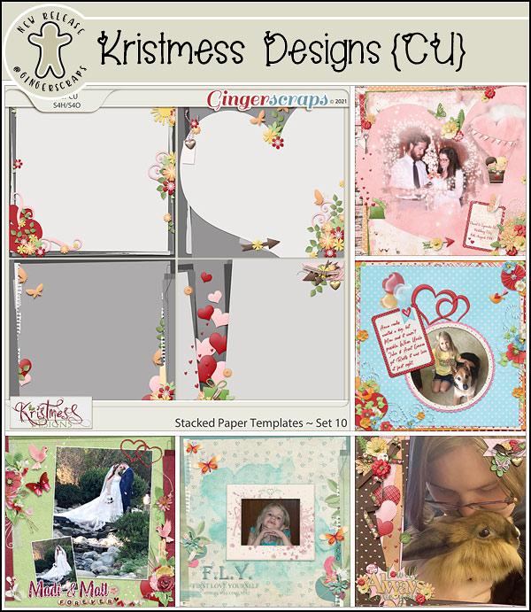
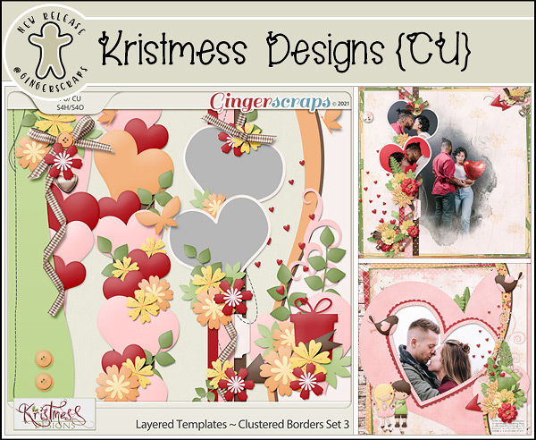
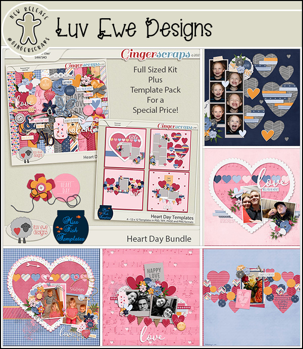
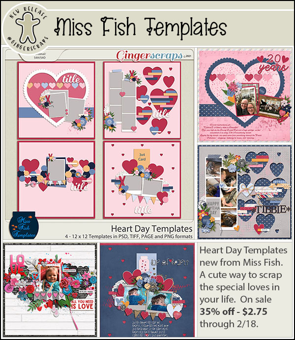
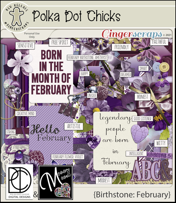
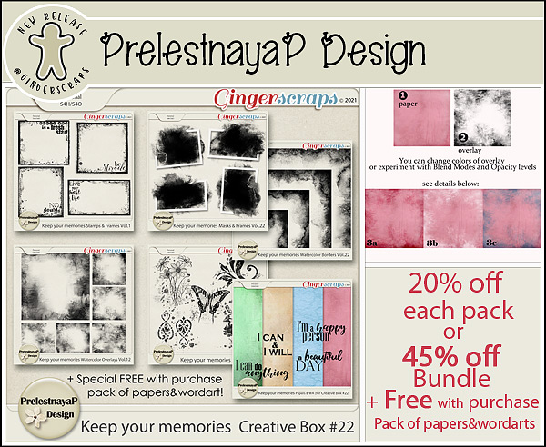
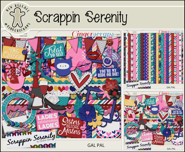
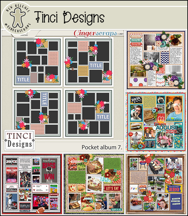
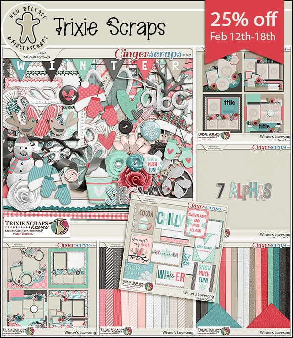
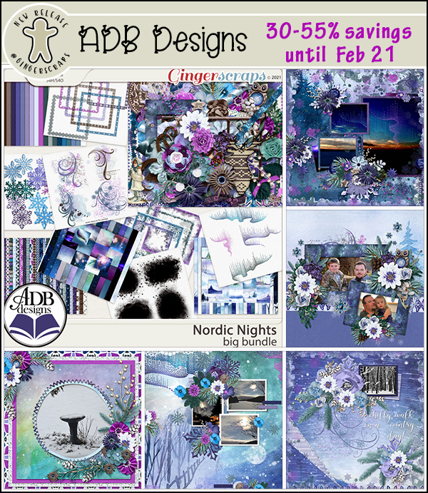
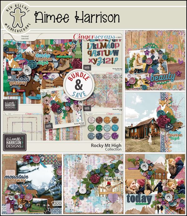
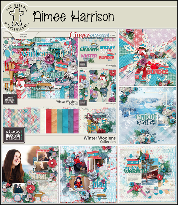
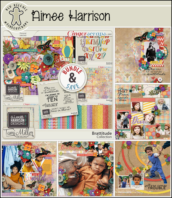
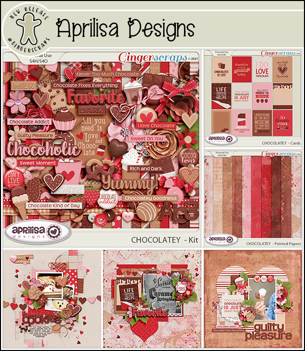
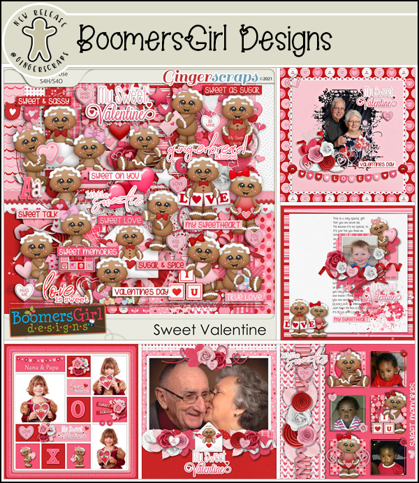
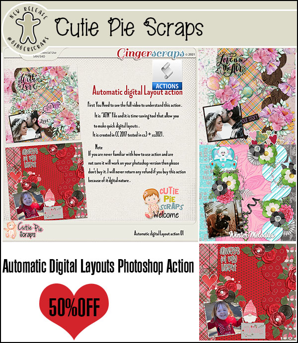
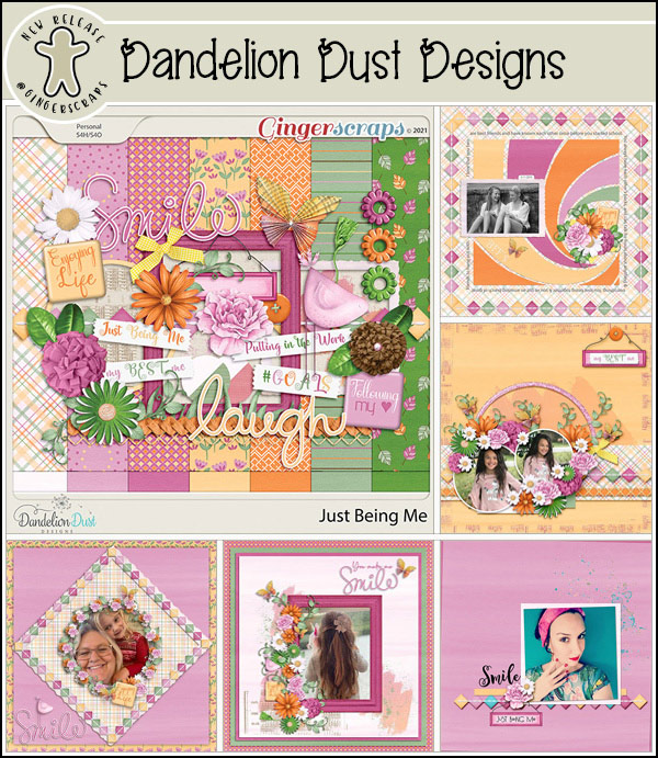
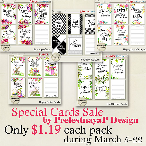
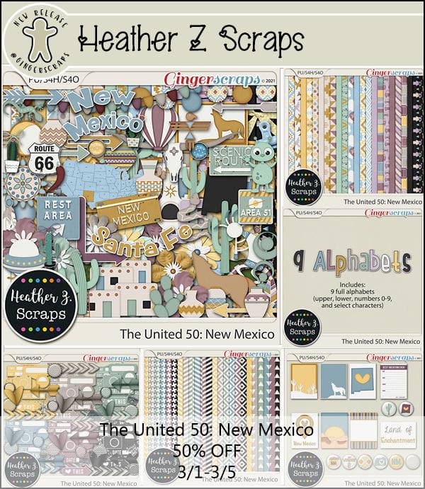
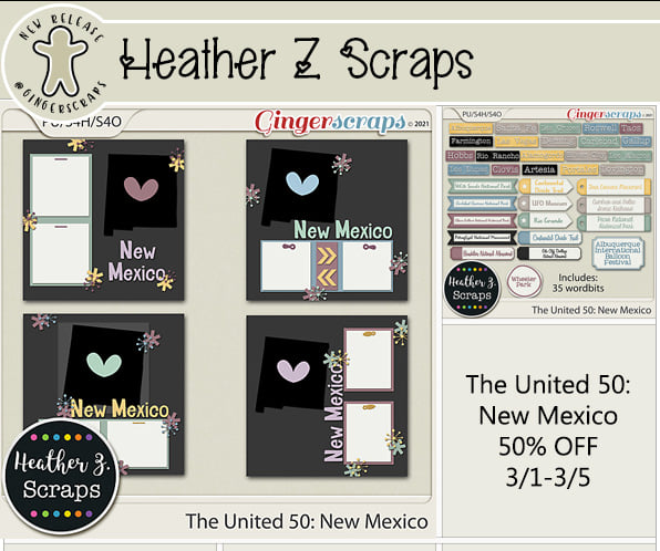
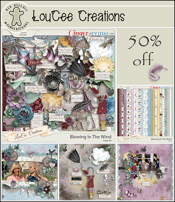
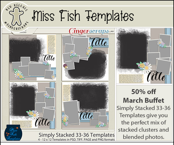
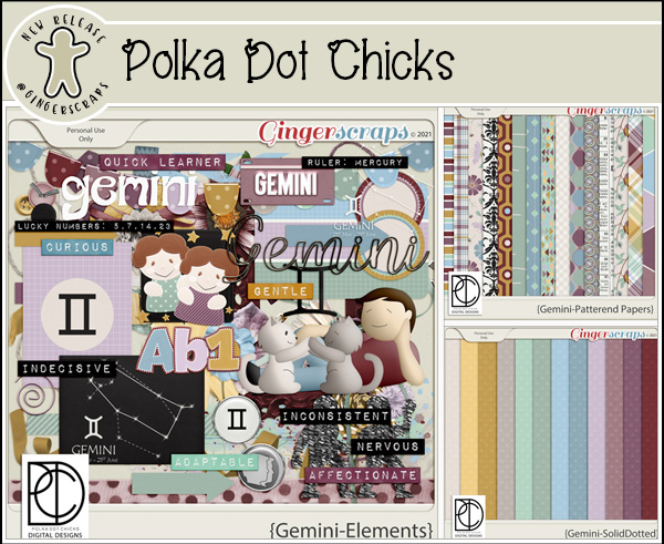
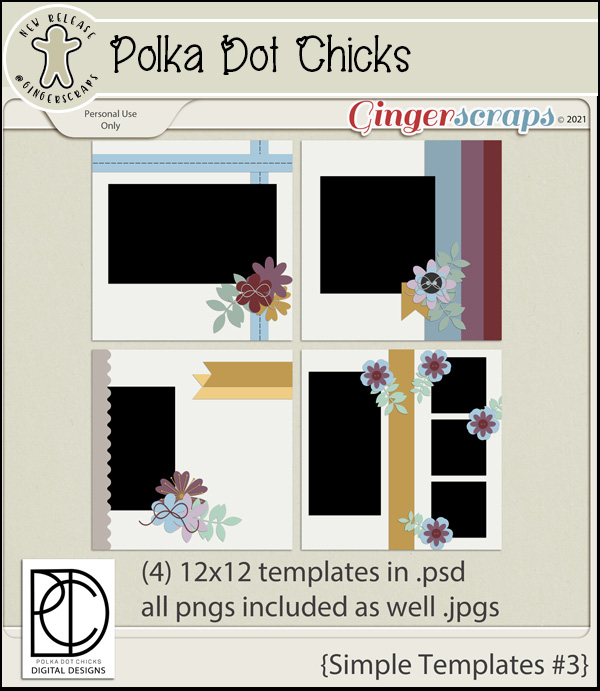
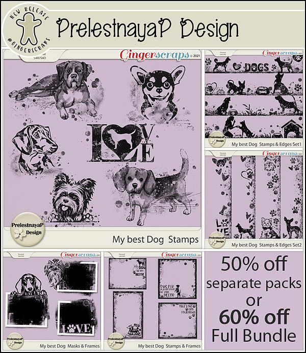
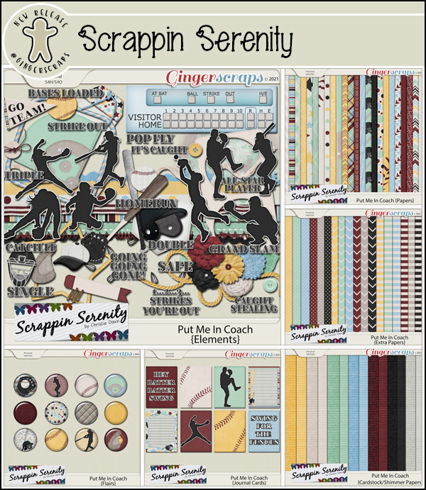
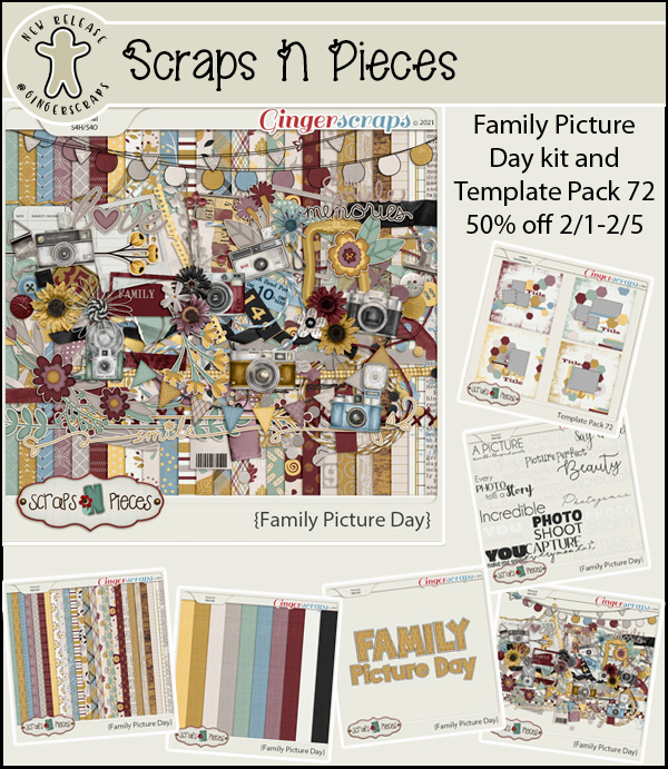
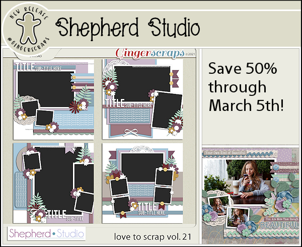
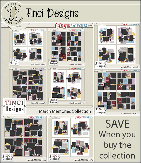
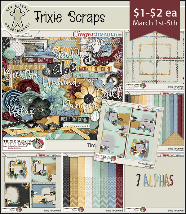
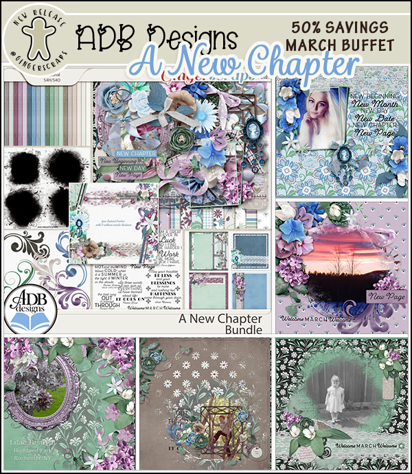
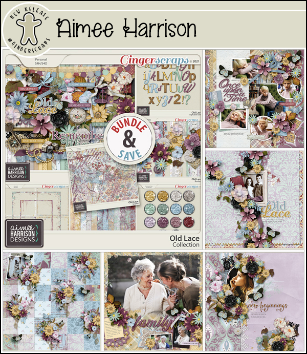
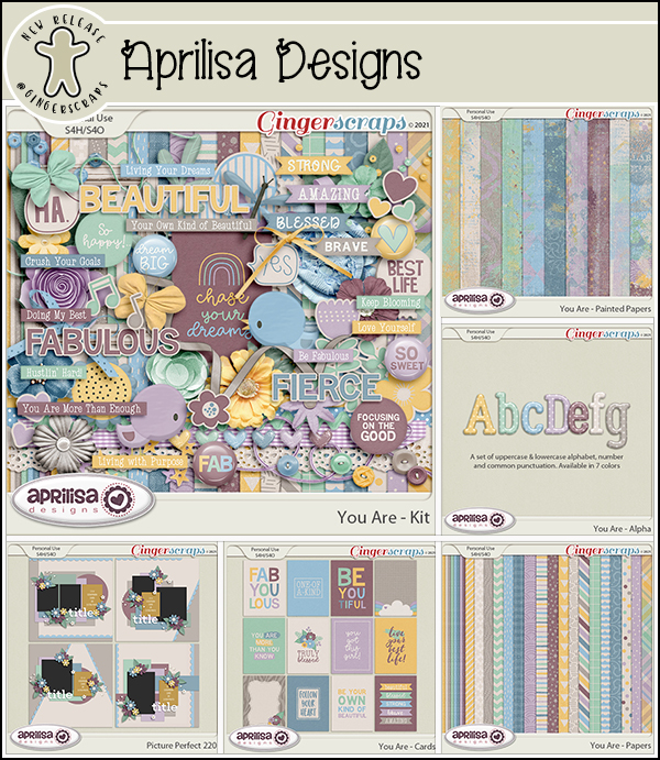
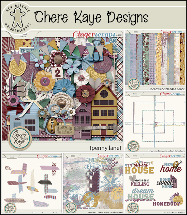
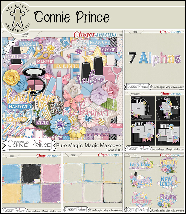
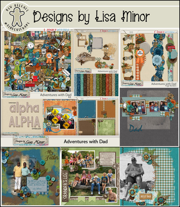
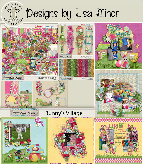
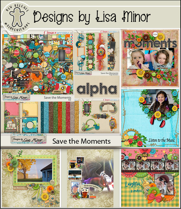
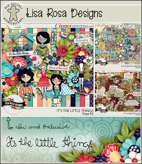
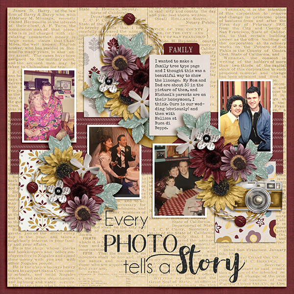
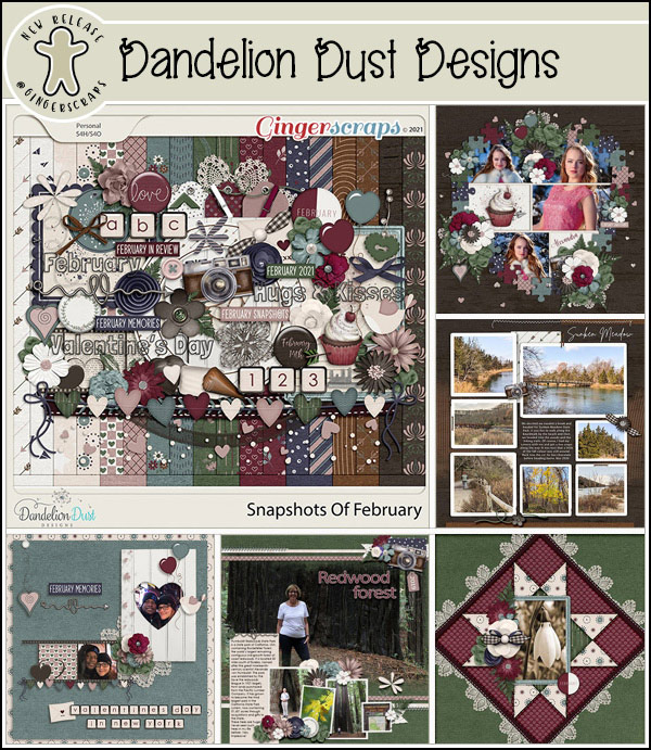
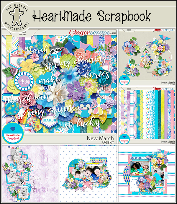
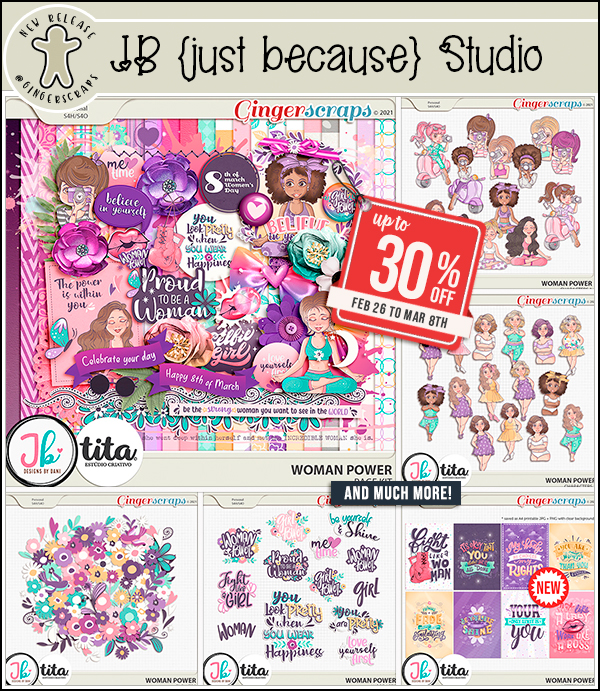
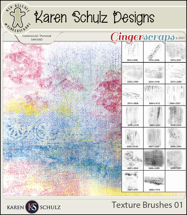
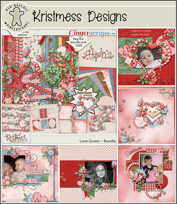
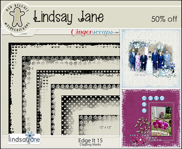
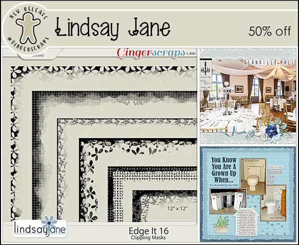
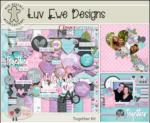
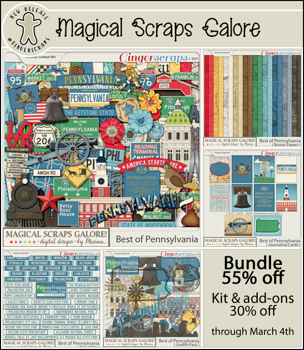
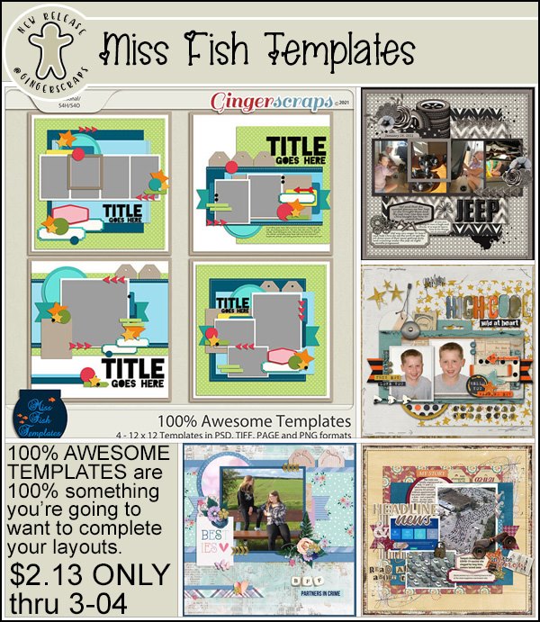
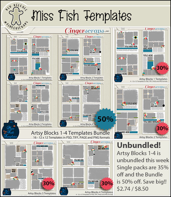
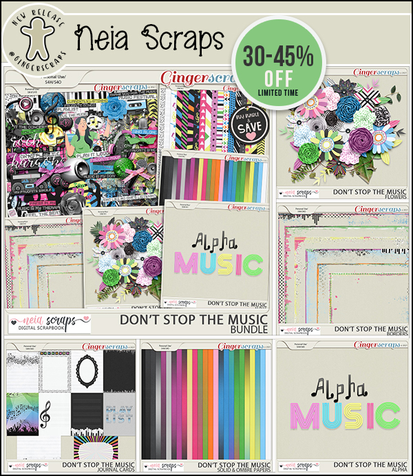
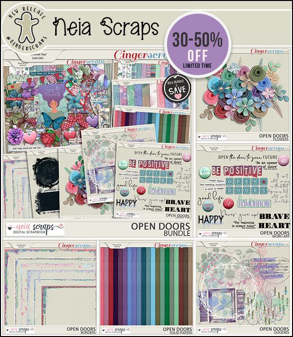
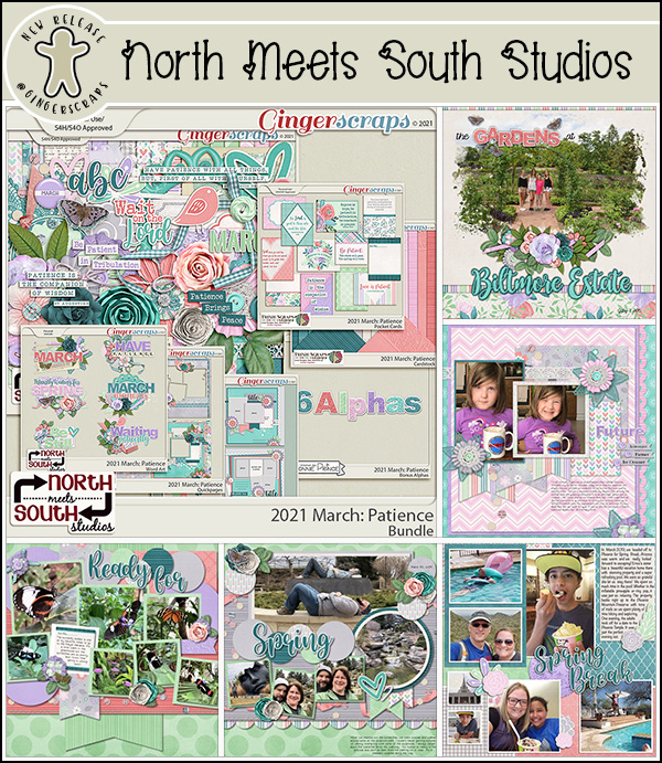
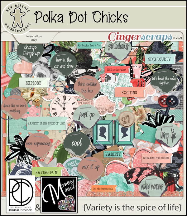
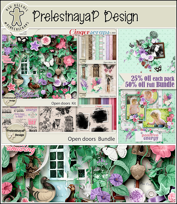
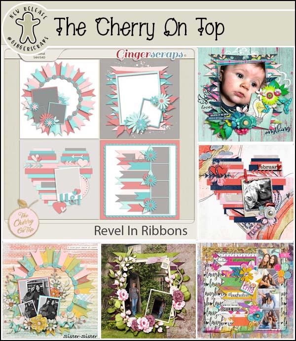
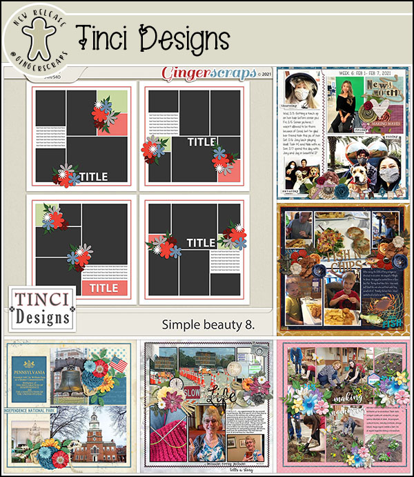
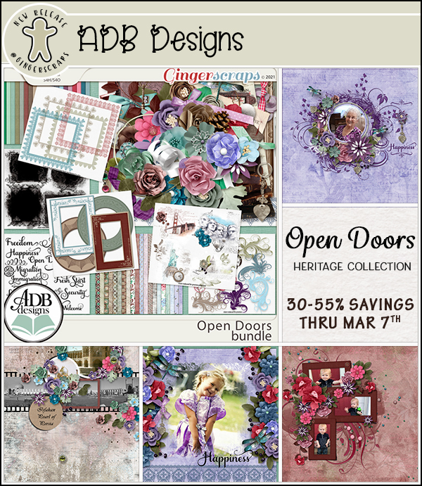
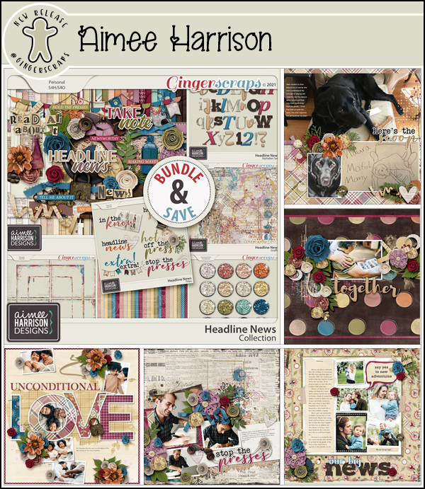
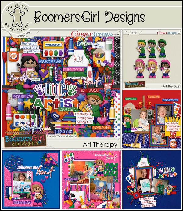
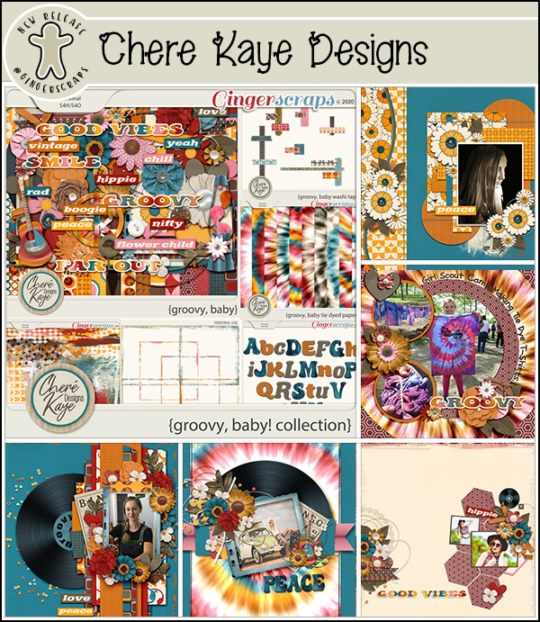
Now let’s see what the designers have for us this week.


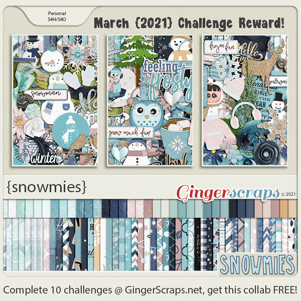
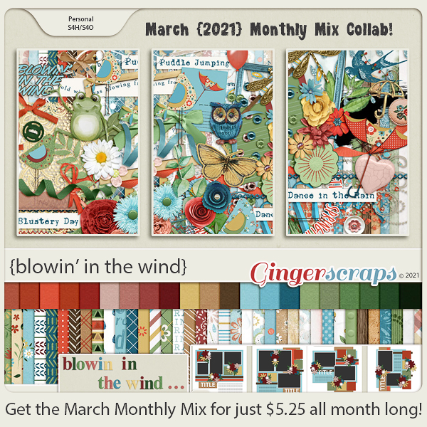
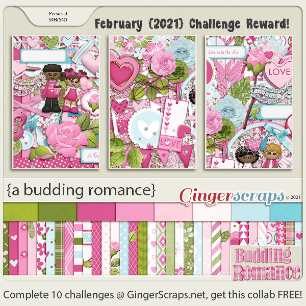
Don’t forget about those challenges. Any 10 completed challenges gets you this beautiful collab as a reward.


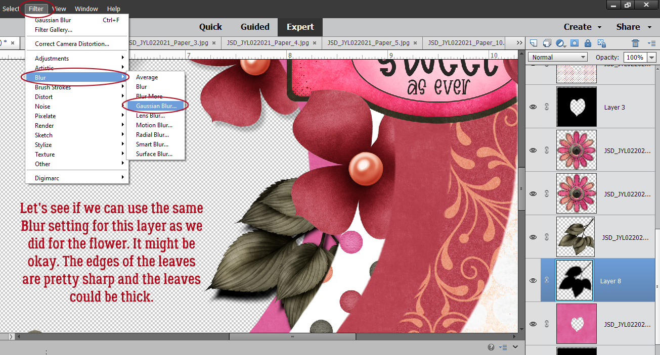
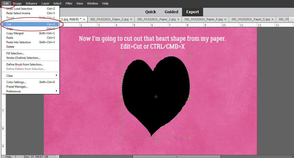
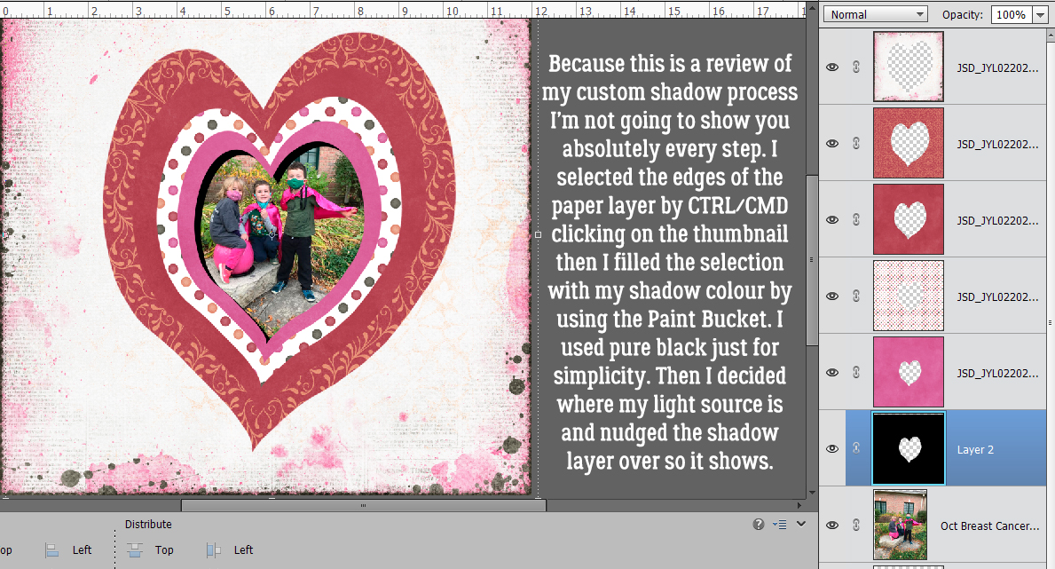
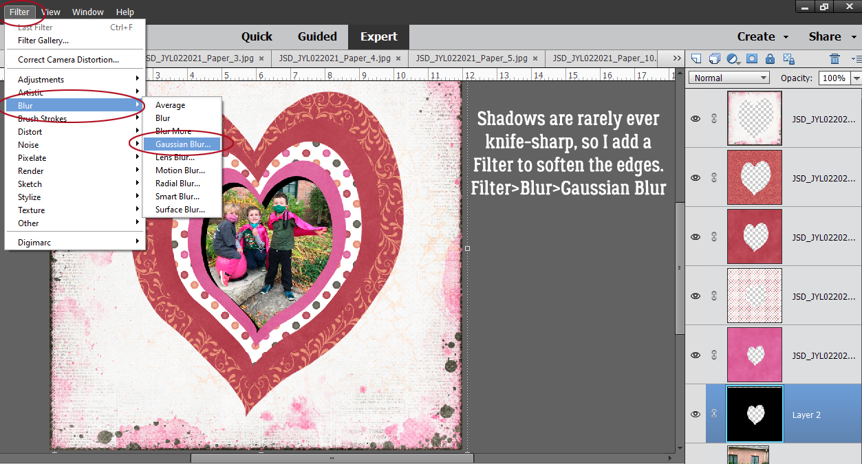
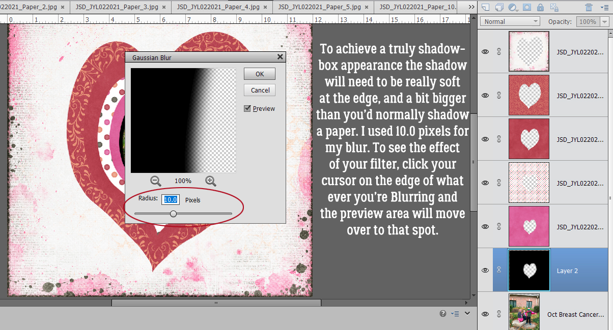
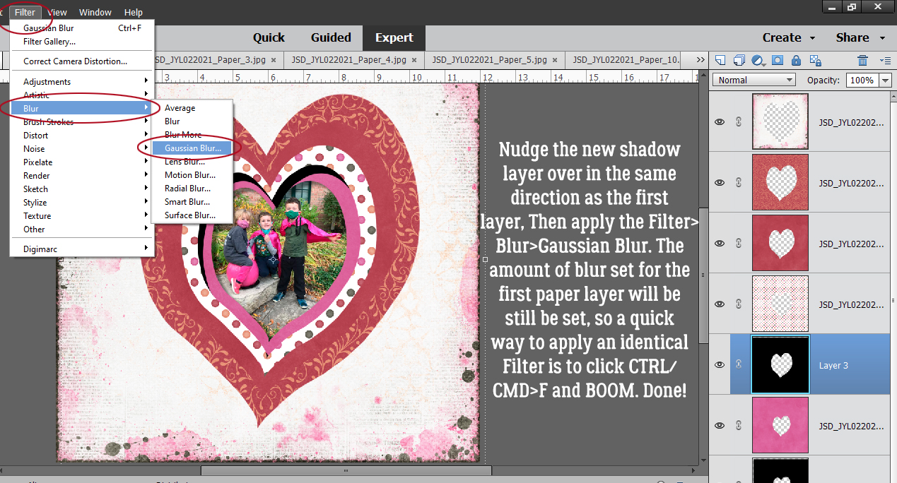
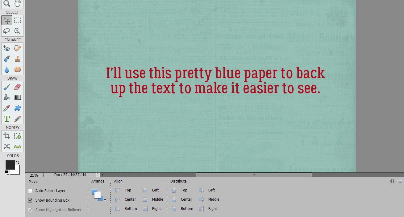
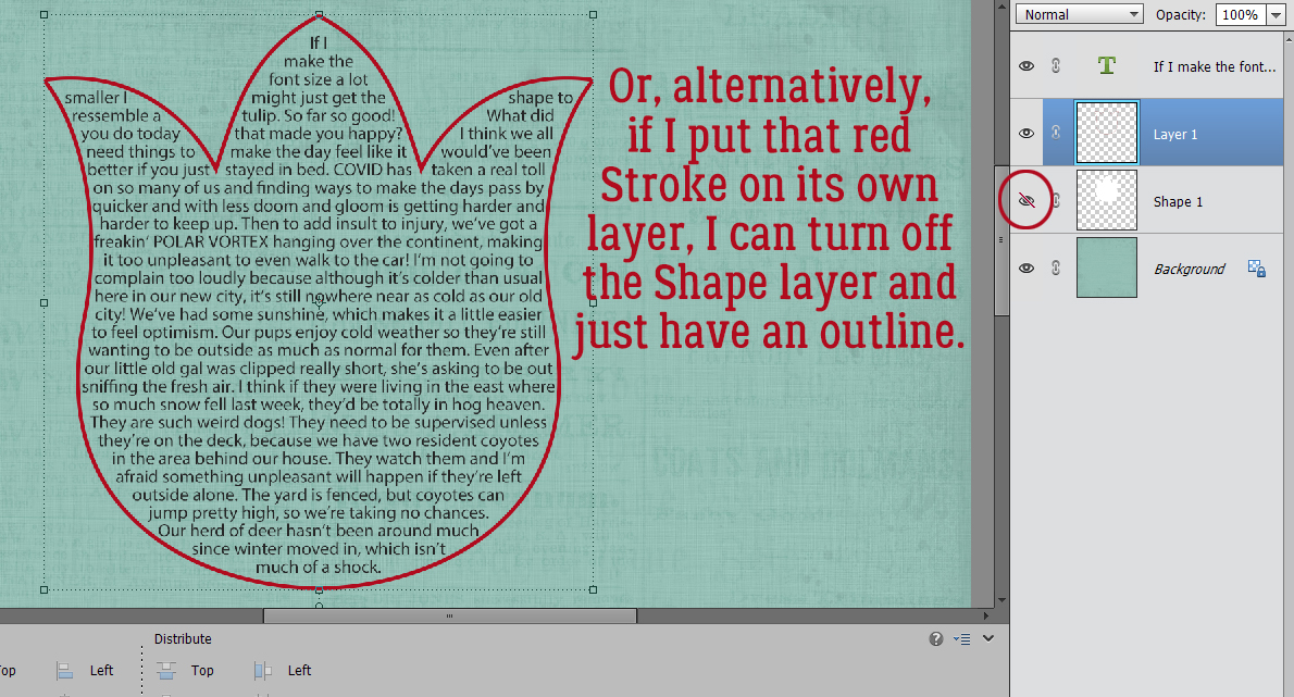
 Apply a filter by clicking Filter>Blur>Gaussian Blur.
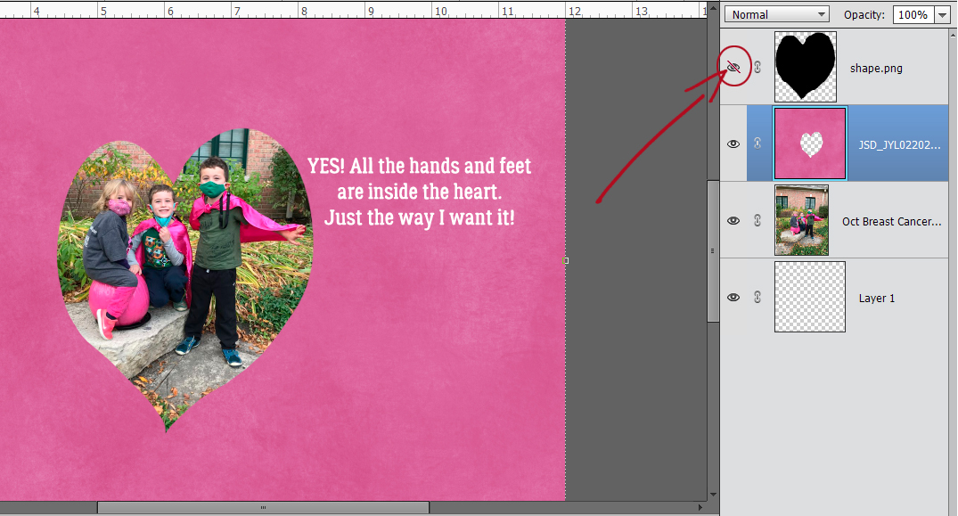
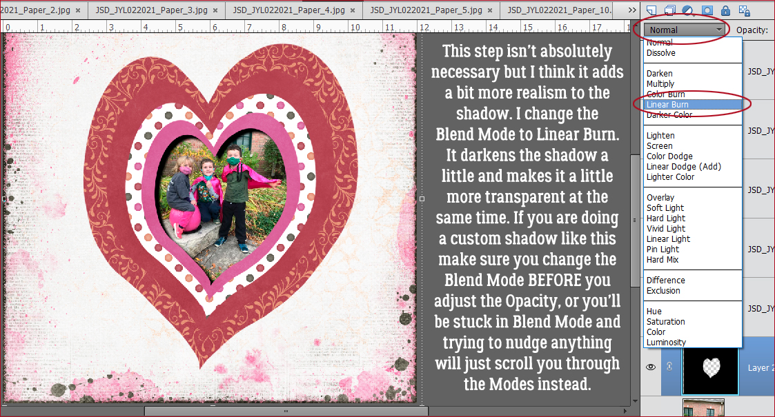
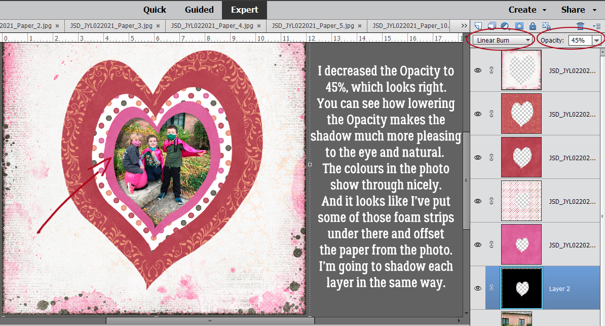
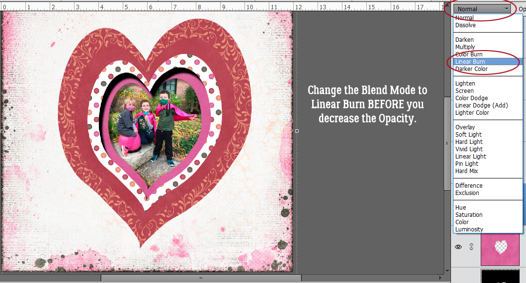
 Change the Blend Mode to Linear Burn.