Ten Fonts for DAD!
![]()
It’s almost Father’s Day already, and that means the year is nearly half over. I know staying home and feeling hemmed in has made it seem like time has really been dragging, but it really hasn’t. I know many of you have been scrapping your little hearts out to keep busy, and that Father’s Day this year (like Mother’s Day and so many other special occasions) will be a little different than we’d like. Personally, I haven’t had time for much, but that’s gradually sorting itself out. For this week’s tutorial, I have a question for you… “Do you have some great fonts for your masculine layouts?” I did a little looking around for some manly (and FREE!) fonts that will add the finishing touches to your layouts about Dads. These are the Top Ten on my list.
First I looked at dafont.com, which is my go-to for free fonts.
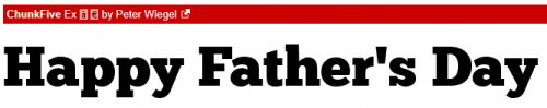
Chunk Five is a basic poster-type font, but a sturdy one.
Reisenberg comes in a variety of styles. It’s an all-caps font with limited punctuation. It’s clean and bold, so it will make awesome titles.

Galactic Vanguardian has a slightly futuristic look to it.

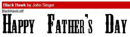
Black Hawk is a marquee-style font that would be perfect for layouts showcasing vintage photos.
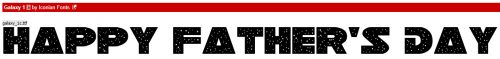
Here’s another spacy font, Galaxy 1. I think it’s ideal for dads (or sons, or brothers) who love the Star Wars franchise, Space Balls, Star Trek, Battlestar Galactica… You know who they are!
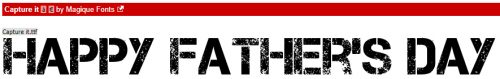
This grungy font Capture It still has a lot of presence, even though it looks pretty rough.
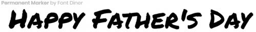
Then I moved on to fontspace.com, another source for fabulous free fonts. Permanent Marker is a handwritten font you could use for both titles and journalling.
I like this one, Trajanus Roman, for its formal and spare look.
The next site I checked out was 1001fonts.com, where I found a couple of keepers.
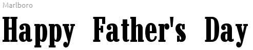
Marlboro is reminiscent of the old cigarette ads that used to fill up magazines. But it’s also a strong, rugged font.
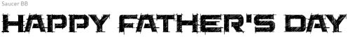
I saved the best for last… I LOVE Saucer!! I can think of so many ways I can use this one.
What are YOUR favourite fonts for layouts about the men in your lives?
![]()