Another Paper- to Digi-Technique – Stenciling
![]()
After last week’s tutorial came out, I got a really nice private message from calgirl (aka Steph). It read, in part: “I love the tutorials you have done on the digital version of a paper-scrapping technique.
I have been trying to think of other techniques it would be fun to see – how do you do this. I happened upon this you tube video which has many ideas but I was particularly interested in the stenciling concept.” Well, I checked out the YouTube video she linked in her message – it was a speedy card-making video (more about that later) and I knew just what would work to create the look she was after. Below you’ll find three ways to use digital scrapbooking elements as stencils! The basics are the same for all three, but the looks are all quite different. It’s a lot easier than it looks, and definitely less messy!
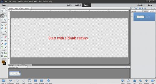
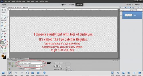
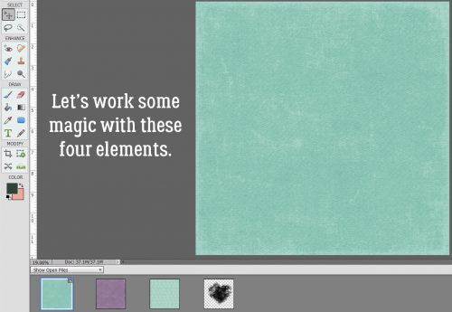
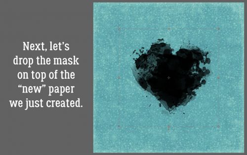
The most obvious element I could think of – and find quickly – for this technique is a doily. I chose one from Lindsay Jane‘s kit Dogs and Puppies. It’s pretty, and has some nice open areas that could work nicely for stenciling. I opened a new 12×12 canvas on my workspace and dropped the doily onto it.

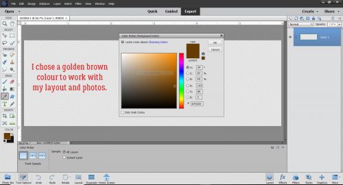
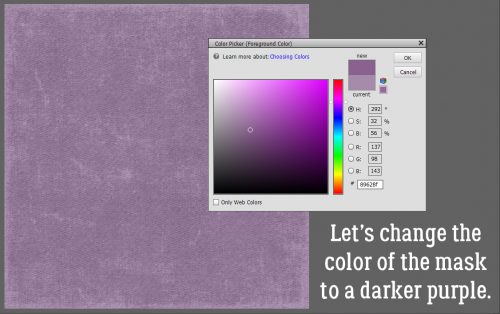
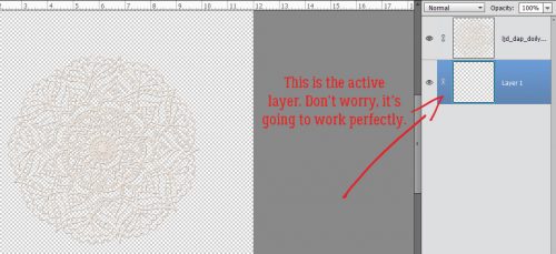
Next, I decided on some colours and got them set. Then I opened up my Brush tool. The Basic Brushes set that comes with the software will work for this method so I chose a large, soft, round brush. I’m working on the layer UNDERNEATH the doily, but don’t worry, it’s going to work exactly like I want it to. If you recall, working on a separate layer with your brushes gives you a lot of options such as simple resizing, repositioning and adjusting Opacity. And you can copy the brush layer(s) as many times as you want.

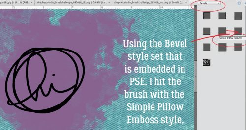
Here you can see that I have the layer at the bottom of the panel active.
I centered the brush over the doily and gave it a single click. if the screenshot was bigger and clearer, you’d see the doily sitting on top of the brush layer.

With the doily layer turned off, this is what I see.
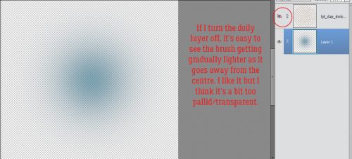
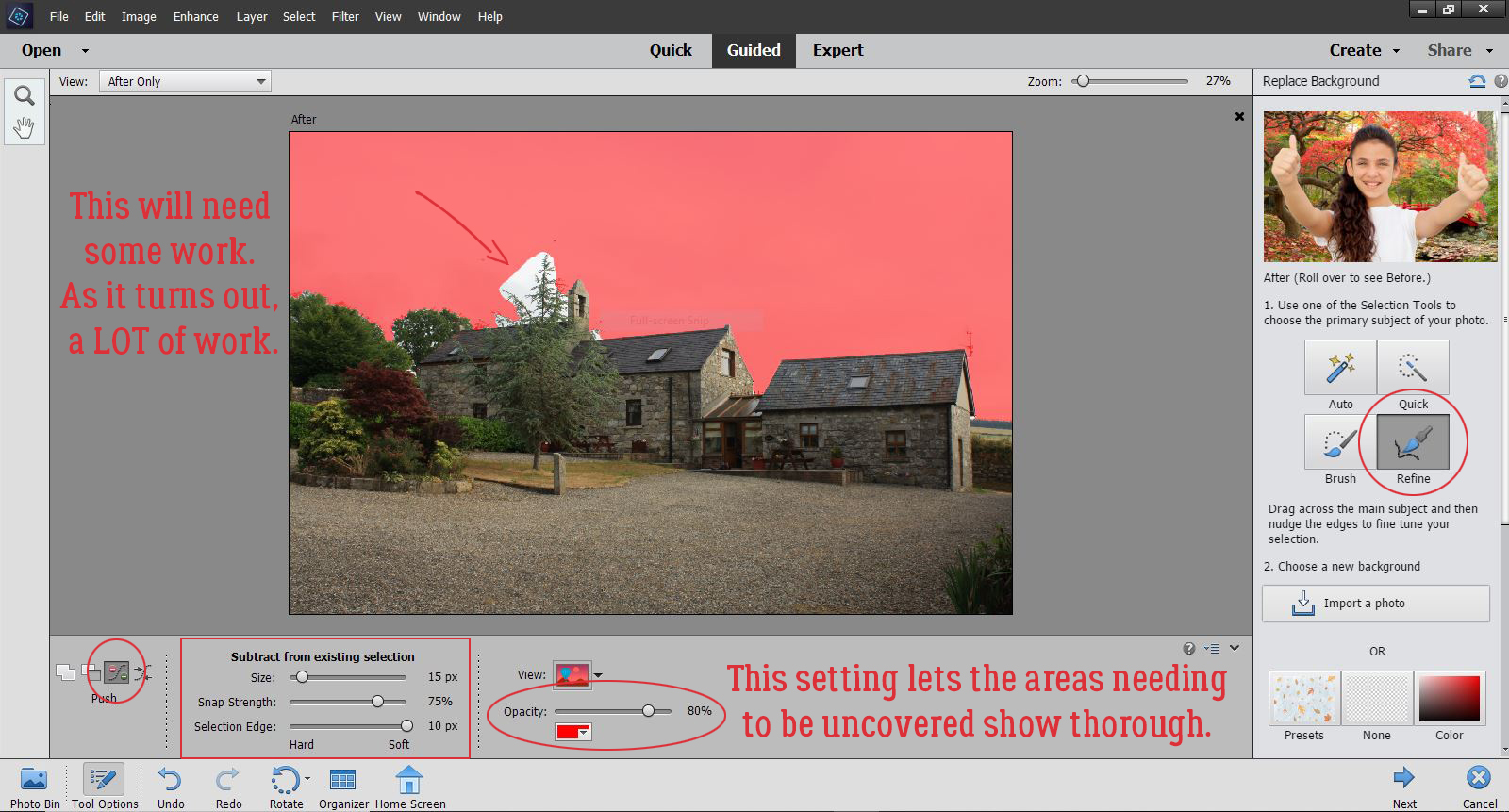
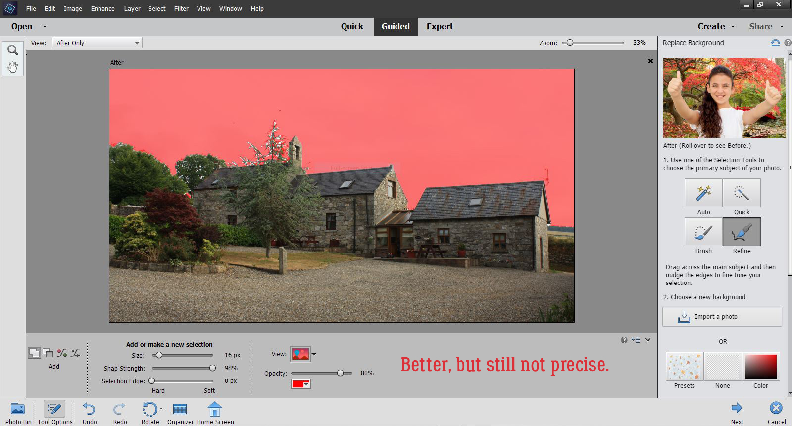
I decided the brush layer just wasn’t… enough. So I Copied it once (CTRL/CMD>J) then I made the copy brush bigger, to 120% of the original. By doing that, I deepened the Opacity of the original layer and pushed the softer edge further out.

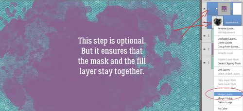
Before I moved on, I Merged the two brush layers together. (CTRL/CMD>E)

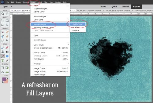
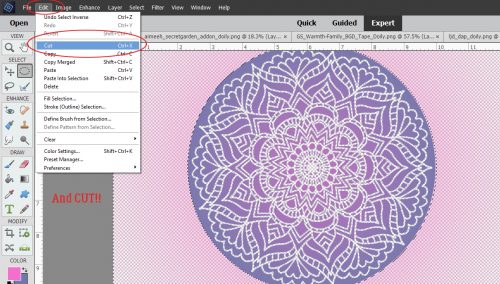
Keeping the brush layer active, I CTRL/CMD>clicked inside the layer thumbnail for the doily – the image inside the box on the doily layer. That Selects the edges of the doily, and produces the marching ants.

The next step is to Edit>Cut the doily area away from the brush layer. (CTRL/CMD>X)

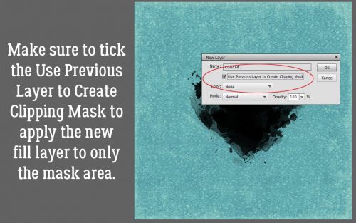
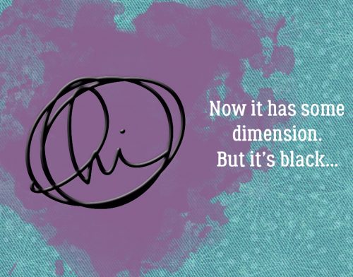
It’s a bit hard to see in the screenshot but the area where the doily laid over the brush has been removed and the transparent background shows through. The doily layer is turned off.

Here’s a much closer look at it. As you can see, there’s no doily texture showing, just the outline of where it was.

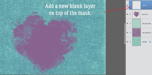
I looked at the results for awhile and decided I wanted the edges to be just a smidge sharper. So I added another layer on top of the brush layer. (Doily is still turned off.)

This time when I Selected the outline of the doily, I chose to add an outline Stroke. I wish there was a keyboard shortcut for that, I use it a lot. But there isn’t. Edit>Stroke (Outline Selection) has to do.
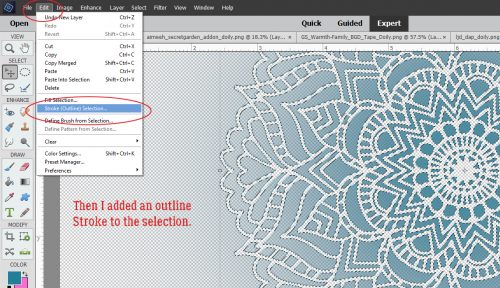
I used the same colour as for the brush layer. The outline doesn’t have to be too bold, so 2 pixels on the outside of the selection will work. Why put the stroke on a separate layer? It’s all about control!

I’m still thinking about how to remove the overspray area around the outside of the doily outline. I think I have it figured out, but will need to play with it a bit more. Once I’ve got it down pat, I’ll edit this post to include the details of how I did it.

Okay. Let’s go back to the beginning and look at another way of doing it. Because you know there’s always more than one way of doing most things.

For this example I used a sharp-edged round brush from the Basic Brushes set that I could size to fit the doily exactly. It’s at full Opacity too.

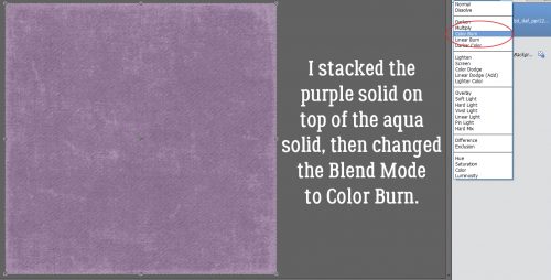
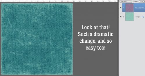
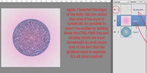
But here’s where the fun starts! I changed my foreground colour to that fuchsia/magenta colour you might have noticed in the previous screenshots. Then I chose the Gradient tool, which is right below the Eraser tool. This tool has a few options that make it very useful. Because I’m working with a circle, I chose the Radial setting. I clicked on the centre of the doily image and dragged my cursor up to the top left corner of the canvas and let go there. That tells the tool which way to grade the colour. I could have chosen any point on the canvas for either action and the gradient would go “from here to there”. If you look closely, you can see the pink is darkest at the centre and fades away as it moves from the centre out. Notice too how the turquoise has changed to periwinkle.

I used the same steps to remove the area of the gradient layer where the doily covers it. I don’t know how many of you can see it, but the doily layer is turned off, and it doesn’t matter! The software will still select the edges even when YOU can’t see it. And, of course, the gradient layer is separate from the others.
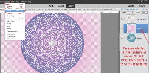
Now, with this method, it’s super-easy to remove the overspray area. I used the Elliptical Marquee tool to pull out a perfect circle. The tool’s settings let me go with a Fixed Ratio of 1:1, which creates a circle shape. The hard part is getting the size right. It took me 5 tries to get it right.

The Selected area needs to be Inverted so that you’re cutting the part of the gradient layer OUTSIDE the circle away, not what’s inside. You can either Select>Inverse or CTRL/CMD>SHIFT>I to make that happen.
Then, just like before we’ll Cut it off. Edit>Cut or CTRL/CMD>X.
There! The only pink area is inside the circle.

I liked how it looked, but thought I could make it even better so I Copied the gradient layer and dropped the Opacity down to 70%. Pretty?

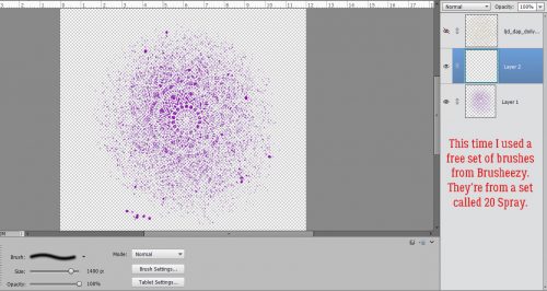
One more! I might have mentioned that I have LOTS of brushes. Many of them were freebies or challenge-related, but the ones I get free from Brusheezy are fabulous. One of these sets is the 20 Spray set. I had to load the brush set to be able to use it, since I haven’t had the opportunity to load them all on my new laptop, but that’s easy enough to do. I wish I could still screenshot the selection bars but haven’t figured that out either! I changed colour to this purple and hit my canvas with it. It’s a different look for sure. I Cut the doily out of the brush layer too.
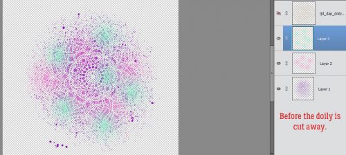
I changed my brush, made it smaller and changed my foreground colour back to fuchsia. Then I randomly added some pink to the mix. On its own layer. ALWAYS!

After Cutting away the doily this is where I was.

Then I thought, how would it look with some green?

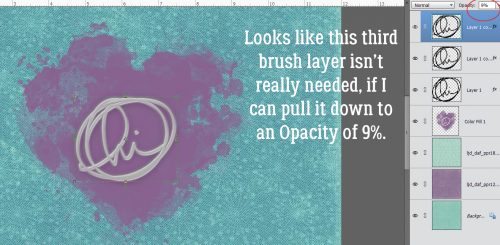
Some random hits with a third brush from the same set gave me this… before I did anything else to it.
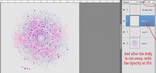
I thought the green was too much so I toned it down to 35%.
And then for fun, I plopped a black spider web paper from Just So Scrappy‘s Spookalcious kit behind it. (I erased the big splats from the purple layer too.) I think it looks gloriously boho!

What do you think? Something you might try? Obviously, you can use anything that might work as a stencil with this technique, it doesn’t have to be a doily. I had fun with it, and I know you will too.
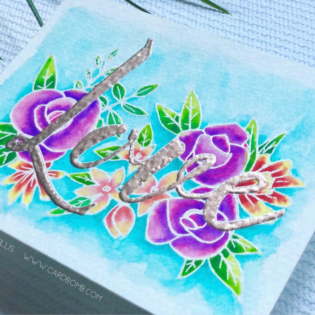
Now, about the video… the host showed off a paper-scrapping tool that caught my eye. It’s called a Misti (Most Incredible Stamp Tool Invented)… anybody familiar? It allows for perfect placement of stamps on just about any size and shape of paper, and for restamping the same image multiple times for more hefty outlines both with acrylic and unmounted rubber. Well, I decided I wanted one, since I do make cards and have a big collection of acrylic stamps. So I looked for it on Amazon… and nearly died when I saw the price! $138 seems like a lot to me for something so simple in concept. So I kept looking. I found some YouTube videos that showed a couple of similar products, but they had to be withdrawn from the market over patent infringement claims. Sounds like I was going to have to suck it up and pay the $$… until I found a seller who had a couple of the taboo knockoffs for $37 each. It arrived today and will work beautifully! I’ll have to wait to use it though. It has to go into storage with all the rest of my paper crafting stuff. To be continued!
![]()