Tutorial Tuesday (Windows)
Michelle: Finding Font

At long last, the tutorial Michelle (belis2mi) has been waiting for! (It IS still May, right?) She didn’t have any burning learning needs for Photoshop Elements. What she really wanted was some tips on managing all her fonts. Can you relate? In the process of setting this tutorial up I discovered I have nearly 1700 of them!! No wonder it takes me forever to find the one I want to use. So I set out to test drive font management software. I had NexusFont on my old laptop but only made it a short way through my list of fonts (which has exploded since then) before I got burnt out with the sorting process. So I knew I wanted something a bit more user-friendly. And it had to be FREE. That led me to check out MainType by High Logic. They have a free version which will handle up to 2500 fonts, and a paid version for professional/commercial users. The version I’m going to show you is the free one. Be observant when you open the software, because it will ask you if you want to upgrade, and it moves the “leave me alone” button around. So pay attention and only select the free option.There is a pop-up that appears every so often while you’re working on tagging, asking if you want to go pro. I just X out of it. There is no Mac version, though, so if you’re using Apple, you can save yourself some time by skipping this one. 
This is where you’ll find the link to the software on your computer. (Shown in Windows 10) Open the folder view.

You can choose to pin it to your Start toolbar along the bottom if you think you’re going to use it regularly. Right-click on the name in the view as shown and select “Pin to Start“.

This is the Home screen. It’s completely customizable. You just click on the little pushpin icon at the upper right corner of any of the panels and it’s removed to the little strip to the left of the screen. Click on the tab to make it reappear. This is where you start. The software will automatically find the fonts that have been installed into the Windows font directory. You may have fonts in another folder, as I did. I had to manually find the folder, which was found on this path: C:\Program Files (x86)\Common Files\Adobe\Fonts and then add it as a new folder using the Tools menu. If you hover your cursor over the various icons on the screen, the software will tell you what they do. There is also an extensive searchable Help section, which I only had to use a couple of times because the software is really quite intuitive.

The panel in the upper left corner has a list of font folders in it. The centre panel is a list of the fonts. You can change the order of them by clicking on the headers. I went in alphabetical order… it’s easier and it’s the default setting. This is also the panel where your Tag Search results will show up. The far right corner panel is a Character map of all the various characters in the font. You can look here to see if there are numerals or punctuation marks included in the font. The centre-left panel is the Tag Search box. It will have a list of all the tags you’ve selected for the software to use for searching. Just underneath that is the Font Tags panel. This is where you choose the tags you’re going to give each of your fonts for later searches. In the lower centre is a Pangram. That’s a fancy word for a preview panel. You can put whatever you want in that box. More on that later. And last is the Zoom panel. You can select any letter, number or symbol from the active font by clicking on the character in the Character map.

MainType will find all the fonts you have on your computer, whether you’ve installed them onto the hard drive, or simply put them in a folder. These fonts are available to any and all software that uses fonts. There is an advantage to NOT installing all your fonts. When you activate the Text tool in your software, you’ve probably noticed it takes a while before you can actually use it. That’s your computer finding and generating the list of your installed fonts. If you load the font you want to use from the folder it’s stored in when you’re ready to use it, the time lag is only a couple of seconds. There’s an easy way to know which fonts are installed and which are just in folders. When you look at the preview panel in MainFont, right ahead of the font name there’s a little bubble. The colour of the bubble tells you if the font is installed on the hard drive (green) or loaded (blue) and accessible. The caveat to this is that when you turn off your computer, the loaded fonts are reset to not loaded. But as I say, it takes maybe 2 seconds to load, which still is less time than it takes Elements or whatever software you’re using to build the font library with installed fonts.

So let’s talk Tagging. This is how you’re going to find the exact font you’re looking for later. There is a preset list of tags in the software, including Comic, Serif, Bold, Italic, Sans and Typewriter. You can add as many different tags as you can think of to make your searches easier. As you’ll see, I’ve added quite a few. Tagging is the time-consuming set-up phase. Here’s your obligatory WSNH tip: Don’t tag all of those system fonts you can’t remove from your machine. You know the ones I mean… the ones you’re NEVER going to use on a layout, greeting card or holiday newsletter. Like Courier, Myriad Pro and Times New Roman and the rest of them. Generally speaking, if there are 24 different versions of the same font, it’s one of those and you can just skip them all. It’ll save you a lot of time, some repetitive stress on your wrists and some small measure of sanity. This is a case of “don’t do what I did”! I was already through the first 1000 fonts before I decided I would untag the system fonts. Hours later………..

You can use the usual Windows tools to expand or shrink a panel. I made the top panel very small so there would be less scrolling between all of my custom tags.

You can use as many tags as you want for each font. The more tags you use, the easier it will be to find them later. Be descriptive. I added a Tag called Marker so I could find those fonts that look like they’d been done using a felt pen. I added Brush for the same reason. As you work through the list of fonts, you’ll see the name of the font in the top centre panel, and an example of how it appears in the lower centre as shown. Bubbliest is tagged as Bold, Handwriting, Marker and Slab. If I want a heavy, handwritten font for some purpose, I can just select those tags and MainType will find this one and any others that fit the category.

To add a new tag, click on the icon shown.

I have a number of fonts that are all upper-case, so I added a tag called All CAPS. In the image above, you can see I’ve added a lot more!

When you click on the Add Tag icon, this menu opens up. Just type in whatever you want your new tag called.

If you don’t like a tag, or don’t find it something you’d use, you can rename it. Select the Tag you want to rename, click on the icon shown below (or F2 if you’re into Function keys) and wait for the drop-down menu to open.

I don’t really have any Distorted fonts. At least in the sense I would use the word. So I chose to rename that one.

Distorted didn’t really work for me so I changed it to Meandering. I use that tag for those fonts that don’t sit on a baseline but wander all over, as you can see in the image below. Kind of like torsades-de-points… a little medical humour there.

You can change the text in the Sample box to whatever you want. If you’re trying to see how a certain phrase will look in a variety of fonts, pop it in here and then run a Tag Search.

It’s really handy to be able to see your own text in the fonts you’ve searched for, and to see a close-up of individual characters too.

Here’s an example of a Tag Search. I selected For Fun (a tag I used for whimsical fonts, the ones I’d use for layouts with kids for example, and Handwritten/Printed (a renamed tag that meant more to me than Handwriting did) and this is the list the search produced.

In the box at the top of the Tag Search list panel, you can change the search terms to any of the ones in the drop-down menu: Font Name, Characters in font, Digits, Alphabets (upper), Alphabets (lower) and Alphabets up and low. You can adjust the preview size here too. If you select Characters in a font, it will show you a number, which can help you narrow down your choices to fonts with foreign characters, for example. Or you could select Digits if you knew you were going to be putting a date into your journaling.

You can also change the search terms to whatever you want.

Here’s an example of a Tag Search I did for Typewriter fonts. It’s so easy!! It literally took seconds.

What makes this software more user friendly than NexusFont for me was the easy tagging system. I didn’t have to drag-and-drop my fonts into different groups, which made a big difference to my satisfaction with the software. If I would have skipped over the system fonts from the start, I think tagging all my useful fonts would have taken me about 3 hours of continuous work. It’s easy to break up into shorter stints and your work won’t be lost. Another feature is automatic syncing. Every time you open the software, it will search for new fonts on your computer and automatically add the new ones to your database. How awesome is that?!! You can control how often the software refreshes itself in the Tool Options tab. I think you’ll find this software to be simple and effective for most average-digiscrapper purposes. If you give it a try, let me know how you like it.

Remember, if you’ve used a technique from these tutorials, post your finished layout in the GingerScraps Facebook Tutorial Tuesday Challenge Gallery for an opportunity to have YOUR chance to challenge me. If you’re not a Facebooker, you can post a link to the layout you’ve created with the tutorial you used in the comments section here on the Blog. I’ll get a notification and will then enter you into the draw. The first week of each month I’ll have a random draw of all entries and the winner will be announced at the end of the first tutorial of that month.

Tutorial Tuesday (Photoshop Elements)

Behind the MASK

Today’s tutorial came about from a support request Ginger received; a faithful GingerScrapper asked how MASKS are used. So I have some suggestions. For this lesson I’ve used a mask from Seatrout Scraps lovely Tattered and Torn collection (retired) and papers from her Mom to Boys collection.

Masks are really versatile tools for the digital scrapper. They essentially create a cutout of whatever is clipped to them. With a little creativity, the sky’s the limit! They can be resized, flipped, turned, stretched, filled, glittered, glossed, textured, beveled – really, anything you can think of. Let’s start with the simplest use, clipping a paper to a mask.

I opened a neutral patterned paper as my background, then dragged my mask onto it. I use Elements 12, which turns everything into Smart Objects when you drag and drop, meaning it’s the same size as the canvas it’s dropped onto. Sometimes this is a real curse… who wants a button with a 12 inch diameter?? (The work-around is to open the item on the workspace then drag it DOWN onto the page.) But in this situation I left the mask full-sized. Then I dragged a daisy-patterned paper on top of the mask. Right click on the layer, then select Create Clipping Mask, (WSNH: CTRL/CMD>G) to clip the paper to the mask as shown.

Once the paper is clipped to the mask you can play with Blend Modes. Working on the MASK layer, I changed the Blend Mode to Overlay.

And this is what it looks like. For this purpose, it looks kinda blahhhhh. But it might work beautifully with different papers.

Next I tried the Linear Burn mode. (Actually, I tried them all but I’m not sharing the really ugly results.)

As discussed in the tutorial about Blend Modes, any mode that includes BURN in the name DARKENS.

Hard Light doesn’t do exactly what one would think it does.

See how faded it is? So maybe it DOES do what it sounds like it should.

Next I played with a solid paper clipped to the same patterned paper.

To my eyes it looks a little umm… boring? So I played with some Blend Modes again. As before, I worked on the MASK layer.

Multiply darkened but also added some more transparency.

I tried some of the lighting modes and liked Soft Light best.

Soft is a great description for this look. But… it really reduces definition.

I played with the Texture Filter. (Filter>Texture>Texturizer)

This is the menu that opens when you select the Texturizer. There are several adjustments you can make in this menu, starting with the type of texture you want. The selections are Sandstone, Burlap, Canvas and Brick. I selected Canvas. Then I used the sliders to adjust the Scaling, Relief and Light direction. The Preview panel lets you see what you’re doing.

This is what it looks like after I’m finished.

Then I reversed my previous choices, clipping a patterned paper to the solid one.

I tried Soft Light on the Mask Layer.

It looks rather pretty.

Multiply?

Dramatic!

You can also clip PHOTOS to your masks. For best results, enlarge your photo so the entire mask is covered. You don’t want the mask itself to be visible.

CTRL/CMD>G and voilà!

If you want to blend the edges into your background, you can use the Eraser tool with a large, soft brush set to a lowish Opacity so it softens but doesn’t erase completely.

All I did was make a circle around the outside with my eraser brush. If you look at the thumbnail of my mask in the Layers panel, you can see how the edges have been lightened.

Another super way of playing with masks is to Fill it with colour. Using your Eyedropper, you can pull a colour from your photo or your background paper. Then select Layer>New Fill Layer>Solid Color.

The drop-down menu looks like this. Check the Use Previous Layer to Create Clipping Mask box.

And you end up with this.

You can adjust the Opacity of the coloured layer by sliding the Opacity slider  on the MASK layer to the left. If you adjust the opacity of your coloured layer the black from the mask will alter the colour you’ve used, darkening it.

But there are more options with Fill Layers! Let’s see what the Gradient… setting does.

Again, make sure you’ve checked that Use Previous Layer box. Otherwise your Fill Layer will cover up everything.

Ooh, that’s really pretty!

What does that third choice in the New Fill Layer menu do?

It opens up this menu…

… which then opens THIS menu.

Wow… that’s an interesting look! I could play with this all day!

So there you have some ideas about what you can do with masks. They’re so much fun! Do you think you can guess which of these little tricks I’ve shown you is the one I used for my May Inspiration Challenge layout? Can you pick out the other tutorial techniques I’ve used?

When I contacted Bekki (bekfek) to tell her she was Mr Random’s choice to challenge me, she was pleased but felt that Ellen (gmae) should have had more entries. So she has graciously passed on her opportunity to Ellen, who is thinking upon it. I’m still working on Michelle’s (belis2mi)  challenge…

Remember, if you’ve used a technique from these tutorials, post your finished layout in the GingerScraps Facebook Tutorial Tuesday Challenge Gallery for an opportunity to have YOUR chance to challenge me. If you’re not a Facebooker, you can post a link to the layout you’ve created with the tutorial you used in the comments section here on the Blog. I’ll get a notification and will then enter you into the draw. The first week of each month I’ll have a random draw of all entries and the winner will be announced at the end of the first tutorial of that month.


Tutorial Tuesday (Photoshop Elements)

Can This Photo Be Saved?

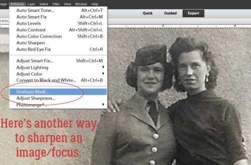
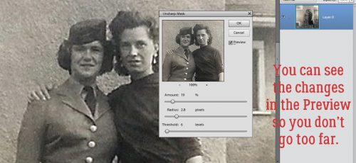
Hey there GingerScrappers! I thought this week we’d look at something a little different. With Mother’s Day almost upon us and lots of old photos being pressed into service, I know there are some of you out there who wish your scanned pix were just a little less… blurry. So I’m going to show you a super-duper-simple trick for tightening up those images a bit.

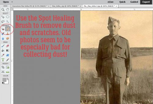
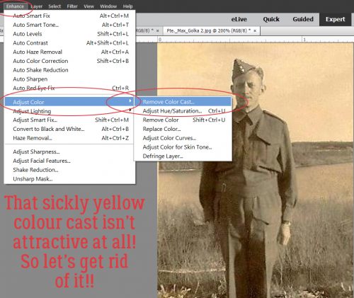
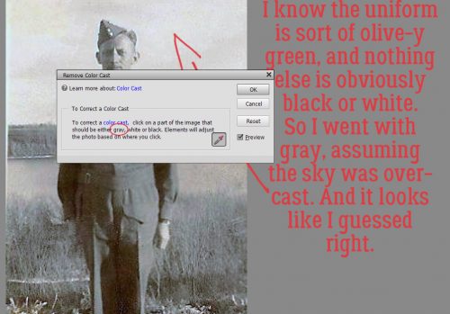
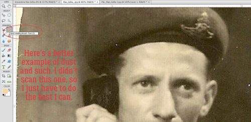
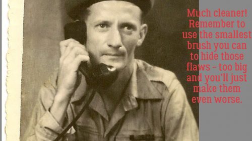
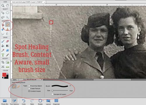
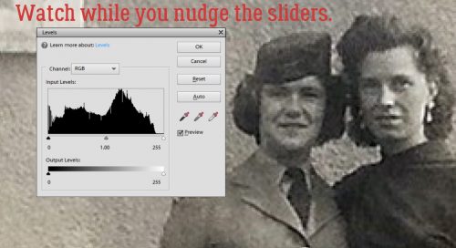
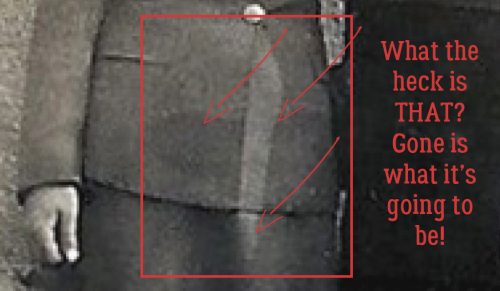
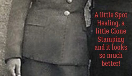
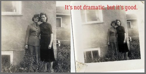
I started with this photo taken in May, 1955; I found it in a box of my mom’s photos. (No, that isn’t me in there.) First I dealt with the dust spots and scratches using the Spot Healing brush then I was ready to sharpen it.

It’s not horrible, but it’s a little… um… soft. So I Duplicated the image (WSNH= CTRL/CMD>J).

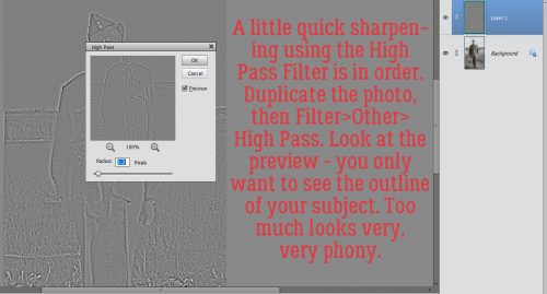
Working on the topmost layer I just created, I clicked on the Filter tab, scrolled down to Other and selected High Pass…

The Tool menu opens up a dialog box as shown. I selected a Radius of 1.0 pixels. There is now a gray-scale image of my photo, with some details visible.

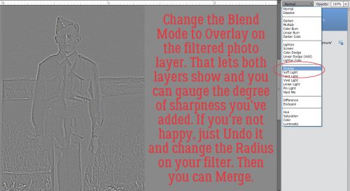
To make this filter adjust the appearance of my photo, I’m going to change the Blend Mode for the topmost layer to Overlay. If you don’t feel there’s been enough sharpening, you can Undo (CTRL/CMD>Z) and increase the Radius until you’re happy. But be careful. A word of caution: Don’t keep adding layers with High Pass filters on top of each other because you’ll end up with something quite bizarre-looking.

Can you see the difference between this image and the untouched one? Facial features are a little clearer.

By setting the Radius to 3.0 pixels, there’s more detail visible on the filter layer.

When you get to the point where the Filter layer looks a lot like the original, it might be time to stop. Too MUCH is not better. Less in this case can actually be more.

I was pleased to see that the resulting image was sharp, the contrast was good and my photo now looked a lot better. So I Merged the two layers (CTRL/CMD>E) and saved my photo as an edit.

I can hear you mumbling about colour photos… so I’m ready for that too! This photo was in the same box, and was taken in 1978.

At a Radius of 1.0, there’s faint detail visible, and only gray-scale.

It looks a bit better, but not much!

At a Radius of 2.0, there’s a faint hint of colour showing through, and a bit more detail.

The area that seems to show the most sharpening effect is the window. Notice that the colours are darkening too.

The higher I take the Radius, the more colour shows through.

What happens if I’m tired of inching up and just make a jump to say… 7.0 pixels?

The colours have darkened a lot and some detail is actually lost. To save this one at this degree of sharpening, I’d have to make quite a few tweaks of Lighting, Brightness and Contrast and I run the risk of making the photo look really phony. So I suggest you don’t save this version over the original, but as an edited copy so if you’re sickened by how far you took the image (as I was with some of my Ireland trip photos… blech!) you still have the original and can start over with a lighter hand.

I plan to make a layout with the first image for the Inspired by a Word/Words iNSD challenge from JoCee Designs. When it’s finished I’ll add in a link so you can see it if you want to.

In April there were 4 people who linked me up to layouts where they’d used one or more of these tutorials. Ellen had several, but to be fair, she only is on the list once. Mr Random has selected Bekki Braun Fekete (aka bekfek) as this month’s winner. Bekki, put your thinking cap on!

Remember, if you’ve used a technique from these tutorials, post your finished layout in the GingerScraps Facebook Tutorial Tuesday Challenge Gallery for an opportunity to have YOUR chance to challenge me. If you’re not a Facebooker, you can post a link to the layout you’ve created with the tutorial you used in the comments section here on the Blog. I’ll get a notification and will then enter you into the draw. The first week of each month I’ll have a random draw of all entries and the winner will be announced at the end of the first tutorial of that month.

Next week’s tutorial will be for Michelle (aka Belis2mi). She needs some help with organization, so stay tuned. You might find a tip or two you can use!


Tutorial Tuesday (Photoshop Elements)

Keeping Things in Perspective

Ellen (aka gmae) issued me the challenge of helping her with perspective. We think that’s what she wants to learn… we had some difficulty pinning it down since she wasn’t able to find the example she wanted to emulate. She described it as a framed photo that wasn’t perfectly perpendicular to the viewer, or not laying flat on the paper. She said that when she tried to do it herself it looked odd, because the photo didn’t match the perspective of the frame. So this is what I’ve come up with. Ellen, if it’s not what you wanted to learn, we’ll take another run at it.

I started out with a frame (Seatrout Scraps Summer’s End – retired) that is resting partially on a grapevine wreath (Seatrout Scraps Autumn Odyssey). To make the steps more visible, they’re laying atop a paper from Ooh La La Scraps Creepy kit, which I used extensively in the remainder of my layout.

To make this technique work you’ll need PSE’s grid overlay to be visible. If you don’t use this tool, you’re missing out! You can do so many great things with it. To turn it on, click the View tab, then select Grid from the drop down menu. WSNH= CTRL/CMD>’ Line up your frame so that the top and the bottom are either on a line or an equal distance from two parallel lines.

Next step: Image>Transform>Distort where you’ll be moving the corners toward each other just the teensiest bit. I started with the top one and moved the handle (that square at the corner of the bounding box) vertically until it was halfway between two horizontal lines on the grid.

You can see in the detailed screenshot below what I mean. You can also see that I kept the right edge parallel to the edge of the paper.

Then I did the same thing at the bottom. DON’T Commit current operation until you’ve adjusted both corners!

So now the frame is slightly narrower at the right edge than it is on the left, just enough to be visible. And it looks like it’s touching the paper, but raised off it by the wreath.

The photo I chose doesn’t provide a dramatic view of what needs to happen to the photo in this technique in the way a photo of a landscape might, but I still went ahead and adjusted it anyway.

You guessed it… I did exactly the same thing with the photo that I did with the frame.

The amount I shrunk it is the same as for the frame.

Now it’s essential to create perfect shadows for this frame and photo so it looks natural and real. So I created a new layer just underneath the frame. Layer>New>Layer and then moved it down.  WSNH= CTRL/CMD>sheet of paper icon puts it underneath automatically. Then I clicked on the layer thumbnail for the frame to select the outline of it, while my NEW layer was active.

Using the Fill tool (aka the paint bucket) and my shadow colour (2c1901) I filled the selection on that layer under the frame.

This shadow is going to be for the inside edge of the frame. So I resized it a little bit, as you can see by the location of the marching ants. I blurred the shadow layer using Filter>Blur>Gaussian Blur set at 7.1 pixels. You can choose what looks good to you.

Then I nudged the shadow into place with the direction of the light source coming from the upper left corner (120°). I turned the visibility of the photo off, since the background of it is dark, and I needed to see where I was putting the shadow.

To make it look more natural, I decreased the Opacity to 44%.

I renamed the layer by double-clicking on the name in the Layers panel and called it Inner Shadow.

Then I repeated the steps for creating a shadow for the frame so that I could have a shadow under the framed photo. It’s on its own layer.

Look at all the practice you’re getting with Transforming images!

I pulled the lower left corner of the frame’s shadow down and away to add to the visual impression that the frame is resting on top of something thick, while keeping the lower right corner fairly close to the frame.

Then I moved that shadow layer underneath the photo and used the Smudge tool to enhance the realism of the shadow. I just pushed some of the edge a little closer to the frame.

After adjusting the Opacity to 50%, I was really pleased with how it all looked.

Does it look to you like the framed photo is lifted off the page where it rests on the wreath? I think it does.

Remember, if you’ve used a technique from these tutorials, post your finished layout in the GingerScraps Facebook Tutorial Tuesday Challenge Gallery for an opportunity to have YOUR chance to challenge me. If you’re not a Facebooker, you can post a link to the layout you’ve created with the tutorial you used in the comments section here on the Blog. I’ll get a notification and will then enter you into the draw. The first week of each month I’ll have a random draw of all entries and the winner will be announced at the end of the first tutorial of that month.

Next week I’ll have the winner of the April Tutorial Challenge for you, and hopefully Michelle will have her challenge for me figured out. I’m having so much fun!


Tutorial Tuesday (Photoshop Elements)

Get in SHAPE, Girl!

So, I was having a chat online with Lisa (slfam) about the April GingerScraps challenges. She wanted to take part in the Scraplift Challenge but didn’t know how to make rounded rectangles. This beautiful layout sort of demands them… if you’re like me and want to stick as close to the original as possible.

Looking at the layouts posted in the thread told me that Lisa wasn’t alone in wondering how to get those curvy corners. So I decided to work a tutorial out for y’all.

Let’s start out with a 12×12 canvas. Select the Custom Shape tool, which may look a bit like an amoeba on your desktop. The top right icon in the Tool Options section takes you to the menu for rounded rectangles. Because the example layout uses a square shape, I set the Geometry Options to Square.

The amount of curve on your corners will be determined by the Radius you set for them. You can type in any number you want and do a test run to see what it looks like.

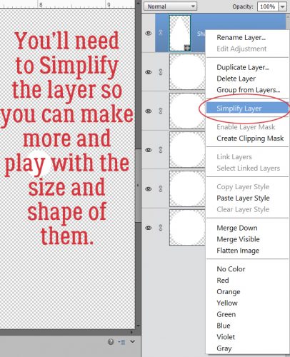
I started at 150 px, and just kept click-dragging out squares until I got to a radius of 400 and was satisfied with the amount of rounding. See the little Simplify button down there? You can WSNH by using it, or you can do it the other way. But you DO want to simplify your shape once you like it, because that makes your background transparent.

This is the long way… See what the thumbnail looks like? You want the background to be transparent for a later step.

Now that I’ve got the shape with the curvy corners I was looking for, I can resize it – bigger or smaller – and still keep the corners at the same radius.

You can also change the proportions from square to rectangle, but when you do you also change the radius of the corner from a perfectly round one to a more elliptical one.

Here’s why I wanted you to Simplify your shape. After going to all that trouble (well… playing with the radius can be tedious!) you might want to save your shape as a clipping mask for future use. You can use the same mask over and over and over and over! (If you want to use it multiple times in one layout, just CTRL/CMD>J it as many times as you want.)

In the Save As menu, select where you want to put it so you can find it later. (I have a folder labeled Jan’s Elements where I’ve saved quite a few things I’ve created over the years.) Name it something simple you can remember and select PNG as the format. That’s how you preserve your transparent background.

Now let’s take this little lesson a step further. We’re going to make a template for a banner. With the Custom Shape tool selected, click on the icon in the middle of the second row of the Tool Options section. That opens up the Polygon shape tool. You can make an equilateral (all sides the same length) shape with as many sides as you want. Let’s make a triangle.

For my banner, I don’t really want an equilateral triangle. I’m looking for more of an isosceles triangle. (Am I causing you flashbacks to junior high math class? Sorry!)

After I Simplified my shape, I changed the dimensions. Once I had the shape right, I could change the size to something more useful.

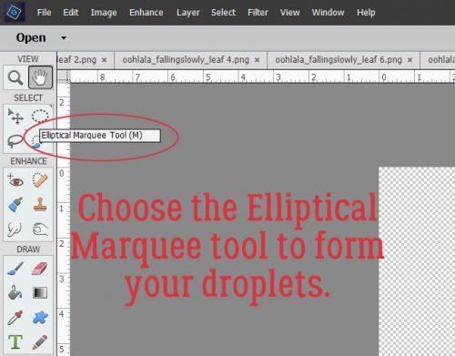
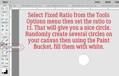
To make the string/rope that your banners will hang from, the next step is to draw out a nice elliptical shape using the Elliptical Marquee tool. A gentle curve will work beautifully.

I made 5 copies of my little flag before I moved on to this step. For now they’re all still in a stack. Once the ellipse is drawn out and looks good, apply a white Stroke to the outside of the marching ants. Edit>Stoke (Outline) Selection…

I chose 20px for this stroke. I wanted the rope to be strong! (At this point your rope will just look like a line. Giving it the appearance of rope or twine is an advanced technique we’ll have to explore another time.)

Once the stroke has been applied, Crop the whole shebang down to a manageable size.

Then you can start moving your flags along your line. Spread them out. Tip them so they’re attached to your line at both corners of the short side. Don’t worry too much about eyeballing for a perfect spacing.

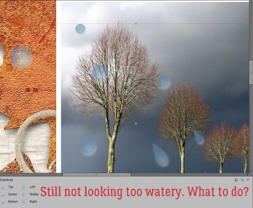
Once you’ve got them all lined up, select each of the little flag layers. In the Tool Options section of the Move tool, select Distribute>Middle and voilà! They’re all perfectly spaced. Too easy!

Move the string layer to the bottom and you’re done! Now you can clip papers to each of the flags, mixing and matching colours, patterns, stripes… whatever your little heart desires! And you’ll have a custom banner that’s a perfect match to the kit you’re using.

The final step is to Save As… Only this time you’re going to save it as a PSD file, which will let you change up your papers every time.

I just know you can think of a gazillion ways to use this lesson. If you like to add lots of tabs to your layouts, you can make your own clipping masks in the shapes you like best. There are so many things you can do with this you might never work without clipping masks again!

Remember, if you’ve used a technique from these tutorials, post your finished layout in the GingerScraps Facebook Tutorial Tuesday Challenge Gallery for an opportunity to have YOUR chance to challenge me. If you’re not a Facebooker, you can post a link to the layout you’ve created with the tutorial you used in the comments section here on the Blog. I’ll get a notification and will then enter you into the draw. The first week of each month I’ll have a random draw of all entries and the winner will be announced at the end of the first tutorial of that month.

Until next week, friends! Ellen‘s challenge is going to be a big one… as soon as I figure out how to show what I’m doing while I do it. Michelle is still deciding on her topic. Stay tuned!

Tutorial Tuesday (Photoshop Elements)

Title Tweaks

Titles are an integral part of fabulous scrapbook layouts, whether they’re done the traditional way with papers, printed photos and glue, or digitally. Having a title on your layout that connects with the topic, means something to either the creator or the viewer and is pleasing to the eye, can elevate a layout from merely “nice” to OUTSTANDING. I received a private message last week from GingerScrapper Lisa (slfam in the forum and gallery) asking me if I knew how anGELLeyes created the title for this layout, and if I did, could I make it a tutorial topic. So here we are!

This tutorial is going to build on some of the techniques from previous tutorials, so for some of you, working through it is going to be really quick and easy. But because there are always new viewers to the Blog, I’m still going to go step-by-step.

I started with a swirly twirly font called Risthi Script.

Before you can make alterations and adjustments to fonts other than those related directly to the text itself, it’s usually required that you Simplify the layer. Right click on the layer and select Simplify from the drop-down menu. Now you can play with it to your heart’s content.

When I looked at the phrase I liked the font but felt like it needed a bit more weight. So I selected the text – CTRL/CMD>click on the layer thumbnail to produce the marching ants – then Modify>Expand.

The fly-out menu looks like this. You can enter whatever number you want into that box where I have the number 4. I wanted to beef up my text a little so I went small.

That move shifted the marching ants out 4 pixels from the edge of the selected object, the text.

Then I used the Fill tool, aka the Paint Bucket (Work Smart Not Hard – just hit the “K” key on the keyboard) to fill in that blank space.

One problem with this little trick is that it leaves some gaps where the marching ants were. To get rid of the gaps, just hit your text with the Paint Bucket again.

After the gaps were filled, I Duplicated the layer (WSNH: CTRL/CMD>J) so that the original layer would remain untouched, as my base layer. You’ll see why this is important in a minute. The multi-step method for duplicating is to right-click on the layer then select Duplicate Layer… which then opens another menu that asks you where you want the copy to go.

On the new copied layer, I wanted to create a white Stroke around the outside. Edit>Stroke opens this menu. As you can see, I chose a relatively narrow stroke but you can choose whatever number makes sense to you for your title. The other thing I want to point out is that I put the stroke centered over the edge of the text. If I were to zoom in tightly on my text, I’d see that the edge of is it actually quite jagged. If I put the stroke on the outside of the text’s edge, those jaggies would be magnified. Putting it inside would emphasize them. There is some degree of smoothing that comes with centering the stroke, so that’s where it went.

It’s hard to see in the image below but there’s a nice white border around the text and it’s applied to the top layer in my Layers panel.

Here we go… see the white stroke now? And the jaggedy edge? It’s not really visible at the size the finished title will be so don’t fret over it. My next step is to CTRL/CMD>click on the layer thumbnail of the base layer. That bottom layer has no white border, so when you click on the thumbnail, the entire text will be selected. You’ll see that in the image following this one.

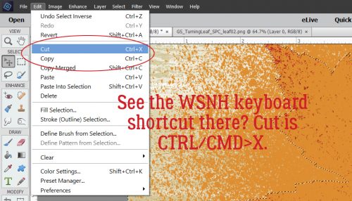
Because I centered the stroke over the edge, the marching ants are about halfway between the red and the edge of the white, as shown. That’s okay, because what I’m trying to do is create a 3D border and it doesn’t have to be gigantic to look good. Once I had the red text area selected ON THE TOP LAYER I hit CTRL/CMD>X to remove the red text section on that layer, leaving only the white. (The multi-step way is to select Edit>Cut.)

There’s that white border. (Visibility of the red layer is turned off so you can see what I’m doing.)

To get the 3D look that anGELLeyes created, I applied a Bevel from the Effects panel. (You’re getting a real good look at where my money goes… Bevels are default effects that come with the software though.)

The Bevel menu looks like this. When you have a few minutes, play with them and see what they do. It’s fun! I chose the Simple Emboss style for this purpose and double-clicked on it, once I was sure I was on that TOP layer that only had the white outline on it.

The default size on this Bevel style is 21 pixels, which is much too much for this technique. By double-clicking on the fx icon on the layer, I can adjust the size of the Bevel.

When I decreased the size down to 4 pixels, I ended up with a nice, well-defined, 3D border with a tiny shadow for added definition. Other than the multi-coloured effect on our example, that’s really all there is to it. You need go no further, your title is already awesome.  And you can accomplish all of this in about 5 minutes. No lie!

Let’s play with this technique a bit. I created some examples of adding other styles to the same phrase so you can see how easy it is to make your title something really special. For these examples I used a collection of styles from Just So Scrappy‘s Up on the Housetop collection. But first, I again duplicated the bottom-most layer, the one that is only red text.

Red coarse glitter…

…looks like this!

Red glitter gel looks like this. (I LOVE this one!)

This one is the red fine glitter.

Let’s see what the translucent red acrylic gel looks like.

It was really shiny and overpowering, so I pulled the Opacity of that layer down to obtain this effect.

How about changing the colours of some of the words… I used the rectangular Marquee tool (WSNH = “M“) to select the word “Flowers” and Cut it away. (CTRL/CMD>X) Then I Pasted it back onto my work space (CTRL/CMD>V), resulting in it being on its own layer, repositioning it so it lined up with the bottom layer. I did the same with the word “Showers”.

I like to turn the visibility of the other layers off while I play around so I’m not distracted and can see exactly what’s happening. I wanted to apply the opaque red acrylic gel style to most of the phrase so that layer is the active and visible one.

The style gives the text a shiny look, which you’ll see in the image following this one. This is what the base layer looks like without any adjustments.

I like how this looks. So I’m going to leave it alone.

I turned the visibility for the “Flowers” layer on and selected the opaque pink acryic gel style.

Isn’t that cool? It looks like enamel inside a form, which is what I was going for.

“Showers” will go next.

The opaque blue acrylic gel style might be a good colour for something watery, don’t you think?

This is what the final version looks like. I could have played with this for hours, but needed to get all the screenshots edited for the tut, so I stopped there. Total time to actually make all the adjustments to this? 25 minutes start to finish. It’s just that easy!

There were only two entries for the Tutorial Challenge in March, and rather than go through the bother of a draw, I’m going to give both gals their moment in the spotlight. Michelle and Ellen, please send me a message with the topic you’d like me to work up for you and I’ll get on with them right away!

Remember, if you’ve used a technique from these tutorials, post your finished layout in the GingerScraps Facebook Tutorial Tuesday Challenge Gallery for an opportunity to have YOUR chance to challenge me. If you’re not a Facebooker, you can post a link to the layout you’ve created with the tutorial you used in the comments section here on the Blog. I’ll get a notification and will then enter you into the draw. The first week of each month I’ll have a random draw of all entries and the winner will be announced at the end of the first tutorial of that month.

See you all again next week!

Tutorial Tuesday (Photoshop Elements)

WSNH Tips and Tricks

For my 30th (yes, this is #30! I can’t believe it either!!) Tuesday tutorial I thought I’d do a bit of a recap and put my Work Smart Not Hard tips and tricks in one place. We all have busy lives and could use a little help to streamline our workflow. So we can scrap more layouts, right? Can I get an AMEN??

  • Use a template if you’re short on time. They take out the drudgery without eliminating creativity. If you’re like me and have a gazillion templates in your stash, it can be more time-consuming to find the one you want to use than it would be to wing it and build your layout from scratch. I’ve developed a way of expediting my search by relabeling the previews with some key words my file explorer search menu can track down. It was a gargantuan job to go through all of the ones I already had but it was so worth it! What do I do, you ask? I had to decide what system I wanted to use first. To do that I had to think about how I select them in the first place. I usually choose photos first, so my labeling system needed to reflect that. And although I rarely make 2-page spreads, I thought it might be easier to find what I’m looking for by putting that in the label too. My main categories then are “single#” and double#”. Then I thought about some other factors that relate to templates and started adding labels like “large” to templates with large photo spots, “circle” and “square” for those predominating shapes, “blend” for templates with blended photos, and “mask” for those with masks. Your labels should reflect how YOU work, so don’t feel like you need to duplicate what I do, just because it works well for me. Do what works for YOU. If you start with the new ones you download and do it as you’re unpacking your zip files, then gradually work your way through your existing collection, it’ll save you a lot of time in the long run.

This is what a search for a “single3” template in my GingerScraps stash looks like:

With the extra-large view, I can scroll through the whole list in a matter of a couple of minutes and choose the one that fits my desired photo(s) and kit(s) selections. Right-clicking on the preview image and selecting Open File Location takes me to the folder where the template lives. And away we go! (P.S… keyboard shortcuts to follow in a single list.)

  • When working with templates, once you’ve added an item onto your canvas and moved it into position over/under the place-holder template symbol, look for all similar items. Duplicate the one you’ve just added and move it up or down the Layers panel until it’s just above or just below the symbol. Then nudge it into position on the layout over/under the place-holder symbol. **If you’re working with a pre-shadowed template, copy the symbol’s Layer Style and apply it to your element BEFORE duplicating, so you don’t have to do each layer individually.** Do this with each element of your template and all that will be left is to create a title and do your journaling. If you’re not using a pre-shadowed template, you can select all similar layers and shadow them with your drop shadow styles (either default ones that came with your software, or those you’ve purchased) all at the same time. Trust me, this will save you a LOT of time!
  • Speaking of shadows… remember that whatever you’ve typed should never look like it’s floating. Journaling, sub-titles and date labels – anything you use a FONT for – should sit directly ON the paper below it. No shadows. NO shadows. The exception to this rule is if you’ve turned your font into a sticker; then you can apply a very slight shadow to it to show that it’s a sticker.
  • And speaking of text… If you’re going to use more than one font, remember to Simplify your text layers as you go along to prevent the software from changing the font on ALL your text layers. This is more than annoying!
  • I like to create my titles on a separate canvas. That lets me see what I’m doing without any distractions. I have a general idea how I want it to look in terms of shape and size, so I’ll select a canvas size big enough for me to move things around and see it all clearly. I like to use alphas with or without a font, and it’s nice to see what I’ve got going on without trying to take everything else into consideration. Once I think I have it right, I Merge the individual alphas for each word together then Link all the layers together so that when I move the title onto my layout, everything goes, but I still have some flexibility to adjust placement in order to fit it better into the layout.
  • Don’t be afraid to turn off the Visibility of other layers if you’re trying to stitch a ribbon down, apply a staple or brad, or for any reason. Stitches and staples, just like text, should be on the layer immediately above whatever they’re securing. (If you want to turn on or off Visibility for a lot of layers, hold down the left-click mouse button as you move the cursor over those creepy little eyeballs.) Once you’re happy, you can turn all the other layers back on.
  • Make good use of Layer Masks to add more realism to your layouts. The advantage of the Layer Mask is that it’s easy to correct over-zealous erasing by simple toggling the white foreground colour to the background, the black background colour to the foreground and painting back whatever you oopsed on. With this nifty trick you can dangle a charm from a string or a ribbon, make a paper clip look like it’s really holding two sheets of paper together, twine a ribbon or a vine around some flowers and twigs, tuck a flower into a pocket… really, anything your imagination can conjure.
  • If your Panel Options aren’t set to give you a full-sized thumbnail in the Layers panel, you may want to rename your layers as you go along so you know what’s where. Don’t know how to change the layer name? Double-click on the label PSE has given the layer in the Layers panel and type in whatever you want. Want to change your thumbnail size? Click on the little icon that looks like a stack of papers at the upper right corner of the Layers panel right next to the trash can icon. Then select Panel Options>Thumbnail Size>Jumbo. Also make sure Thumbnail Contents>Layer Bounds is selected, otherwise what you’ll see in the Layers panel is a tiny little image in the area where it’s located on your layout inside the thumbnail box. I tried that and hated it!
  • Learn some basic keyboard shortcuts. There are a lot of them, but you’ll probably only use about a dozen with any regularity. Once you’ve incorporated them into your workflow, you’ll wonder how you ever got anything done without them. I find that my fingers just do it automatically. Below is a list of the ones I use most often, roughly in order of use. Windows users will use the CTRL key, Mac users CMD.

If you want to save this to your computer just right-click on the image and Save Image As… and then name it something you’ll be able to find later.

Since March has only been over a couple of days, I’ll wait until next week to check the galleries for entries into the Tutorial ChallengeRemember, if you’ve used a technique from these tutorials, post your finished layout in the GingerScraps Facebook Tutorial Tuesday Challenge Gallery for an opportunity to have YOUR chance to challenge me. If you’re not a Facebooker, you can post a link to the layout you’ve created with the tutorial you used in the comments section here on the Blog. I’ll get a notification and will then enter you into the draw. The first week of each month I’ll have a random draw of all entries and the winner will be announced at the end of the first tutorial of that month.
See you all again next week!


Tutorial Tuesday (Photoshop Elements)

Style Savvy!

Over the weekend Marcia posted a question on the Just So Scrappy Fan Group Facebook page. She’s just learning digital scrapping and she wanted to know how and why styles are used. First, let’s talk about WHAT they are. Basically, they’re little mini-scripts that tell Photoshop/Photoshop Elements to change the appearance of an object. The object could be a font, a paper item, a shape or almost anything. It’s a lot easier to understand this concept if you can see it at work, so today’s tutorial was born. I’ll be using some layer styles created by Just So Scrappy‘s alter-ego, Ooh La La Scraps that coordinate with her Take Time to Be Kind bundle. Katie Castillo is the talent behind both design lines and she creates a bundle of styles for each of her collections. So let’s have a look at what they are and how to use them.

First, I had to load the style files into my software. After unzipping the files, I went to the Effects panel in Elements and clicked on the little stack of horizontal lines shown below.

This menu opens up. Select Load Styles and find the folder with the desired styles in it. They have to be loaded one at a time, unfortunately.

When I unzipped these styles files, I decided to rename the files for the purposes of this tutorial. In the Effects panel this is what I see. You don’t have to do that, I just wanted to make everything quite clear.

The screenshots below show what each different type of style does to an object. I used a large, open font, a chipboard swirl, a cardstock tag and some grungy paint from the Take Time to Be Kind elements pack to demonstrate. Each style comes in all of the colours in the palette for the collection. See what effects they have on different objects.

Acrylic Gel (Transparent Blue)

 Acrylic Gel (Opaque Brown)

Cardboard (Corrugated Cream)

Cardboard (Smooth Green)

Felt (Orange)

Cardstock (Textured Pink)

Cardstock (Glitter Edge Yellow)

Chipboard (Nubby Blue)

Chipboard (Beveled Brown)

Chrome (Fat Cream)

Chrome (Thin Green)

Dots (Orange)

Dots (Glitter Edge Pink)

Dots (Acrylic Gel Yellow)

Embossed (Dots Blue)

Embossed (Brocade Brown)

Glitter (Chunky Cream)

Glitter (Chunky Gloss Green)

Glitter (Fine Orange)

Glitter (Fine Gloss Pink)

Plaid (Plain Yellow)

Plaid (Kraft Edge Blue)

Plaid (Gloss Brown)

Stripes (Plain Cream)

Stripes (Glitter Edge Green)

Stripes (Gloss Orange)

Wood (Smooth Pink)

Wood (Bevel Yellow)

That has given you a look at the colours and textures these styles provide. As you can see, grungy paint is fabulous with a glitter style applied but downright ugly with most of the others. The swirl looks great with any of them, the tag takes on a completely different look. The font wasn’t perhaps the best choice for this purpose. I could see myself creating a matching alpha for this collection using a chunky, bold font. But Katie has already included some stunning alphas so I’ll save my efforts for some other purpose.

That was a very simplistic look at what styles can do. But let’s go a step further and COMBINE some styles to really jazz up an object. I’m using the swirl again because it’s pretty great already, but I might want it to be even more eye-catching on my layout. I resized the canvas so I’d have some room to maneuver. [Image>Resize>Canvas Size or WSNH: CTRL/CMD>ALT>C]

You might notice that this swirl has some texture to it. Don’t be concerned, because styles cover that up.

I created a new layer underneath the swirl by clicking on the sheet of paper icon above the layer panel while holding the CTRL/CMD key down. Then, with the CTRL/CMD key still held down I clicked on the swirl thumbnail to select its edges. See the marching ants?

I want to enlarge or expand that selection.

I chose to expand by 10 pixels.

See the space around the swirl? I’m going to fill that, first with a solid colour and then with glitter.

I selected the lower, blank layer for this step.

I used the Fill tool (aka the Paint Bucket) and the colour in the foreground. It doesn’t matter what colour this is.

Before I forgot to do it, I Duplicated the swirl layer (NOT the red, solid colour fill layer) [WSNH: CTRL/CMD>J] and it’s these layers that I’m going to play with next. But first, I turned off all visibility for all but the lowest of swirl layers.

I then went to the Effects panel and selected the OLL Be Kind Glitter style menu. Then I double-clicked on the pink fine glitter style.

And presto! I have a nice glitter edge, the size of which I chose.

Moving up to the first swirl layer, I then selected the OLL Be Kind Embossed brocade style, also in pink.

Moving up to the middle swirl layer, I selected the transparent acrylic gel style.

Whoa!! That looks awesome!! But… the brocade effect has disappeared.

So I decreased the Opacity of the acrylic gel layer. Now I can see the brocade effect but still have some nice gloss on it. (If you think you need to so you’re not confused, you can change the name of the layer to the style you’ve applied.)

On the very top layer, I selected the smooth pink wood style. It adds a little bit of a bevel and a smidge of a shadow. But it also completely covers up everything underneath it.

Decreasing the Opacity lets some wood grain and brocade effects to show through, while keeping the gloss too! If I was moving it onto a layout, I’d select all the layers and either link them together by clicking on the little chain icon, or merge them together [WSNH: CTRL/CMD>E].

I hope this helps you see the potential with styles. They’re an incredibly powerful tool and can really elevate your scrapping skills. It’s a lot of fun to play with them just to see what they do. Don’t be afraid to try different combinations because if you don’t like it, CTRL/CMD>Z will undo it. Really, the sky’s the limit here!

Remember, if you’ve used a technique from these tutorials, post your finished layout in the GingerScraps Facebook Tutorial Tuesday Challenge Gallery for an opportunity to have YOUR chance to challenge me. If you’re not a Facebooker, you can post a link to the layout you’ve created with the tutorial you used in the comments section here on the Blog. I’ll get a notification and will then enter you into the draw. The first week of each month I’ll have a random draw of all entries and the winner will be announced at the end of the first tutorial of that month.

See you all again next week!

Tutorial Tuesday (Photoshop Elements)

Tearing Up the Sheets (of Cardstock)

Have you ever wondered how other scrappers get their torn paper to look so realistic? Let me show you…

If you were to tear a piece of high-quality cardstock, which generally has colour applied to one or both sides with a white core, you’d get a bit of an irregular edge, with varying amounts of white backing paper showing along it. So to demonstrate this, I’ve used an embossed cardstock from Ooh La La Scraps‘ simply gorgeous bundle You and Me. Fortunately for me, there is also a solid white, textured paper in the kit too, so I’m going to use it for the core. (For the first few steps, I turned the visibility of the white paper layer off.) And to make it easier to see what I was doing, I put a piece of gray patterned paper behind it all.

I wanted to have tears along both vertical edges of the paper and I wanted some of the background to be visible. I also wanted to Work Smart Not Hard. So I selected the layer with my pink cardstock on it and using the Rectangular Marquee tool, I selected a portion of paper then Edit>Cut [WSNH: CTRL/CMD>X]I trimmed away some paper from each side. You’ll see why this is a WSNH tip as we go along.

I then selected the Eraser tool and a relatively small brush size. Working along the right side of my canvas, I erased away some of the pink cardstock in an irregular, jagged manner. Don’t try to be too careful because you want it to look… well, TORN. If it might make it easier for you to visualize, take a real piece of paper, any kind, and tear it. For real. Then look at the edge. It’s not gonna be perfect!

Because I wanted both sides to be torn, I repeated the process on the left side of the canvas too. You may have noticed that I broke my own rule of only erasing on a Layer Mask. If you’re wondering why, it’s because it really doesn’t matter if I erase too much of these papers. It doesn’t have to be perfect. It’s better if it ISN’T perfect.

Once I was happy with the edges of my tears, I turned the visibility of my white paper layer back on and trimmed away some of it along both edges in the same way I did with the pink. It made me so happy to see that the texture of the white paper was the same as the pink – that core layer should have some texture to it too.

The next step was to erase the edges of the white paper just like I did with the pink cardstock. Zoom in close to your work so you can see exactly what you’re doing.

This time I erased close in to the pink paper in some places and veered away a bit in others.

When you zoom back out, there may be some bits of white paper still there. These have to be erased too.

After I had my white edges the way I wanted them, I selected the pink cardstock layer again and went back with the Eraser tool and created some little slivers of torn paper as shown below. This would happen with real cardstock, so I always include a few little shreds.

Here’s a full screen view of the two torn edges.

The last step to ensuring realism is to add a very infinitesimal shadow to the cardstock layer. I like to have shadows visible on both edges, so to accomplish that I duplicated [WSNH: CTRL/CMD>J]the pink cardstock layer before I applied a drop shadow. I used a simple shadow, with the following settings: Size 0, Distance 2 and Opacity 75. (These aren’t hard-and-fast, use whatever settings look the most realistic to you. Just remember them for later.)

When I had my shadow just so, I Simplified the layer. Doing that locks the shadow to the cardstock so it doesn’t change later.

Then I did the same thing with the second pink cardstock layer, with one difference – the angle of the shadow.

After both layers had that little extra definition provided by the shadows, I merged the two pink cardstock layers with the white paper layer. [WSNH: Select all layers then CTRL/CMD>E]

And here’s the finished layout. Can you see what other techniques I’ve shown you have also been used?

Remember, if you’ve used a technique from these tutorials, post your finished layout in the GingerScraps Facebook Tutorial Tuesday Challenge Gallery for an opportunity to have YOUR chance to challenge me. If you’re not a Facebooker, you can post a link to the layout you’ve created with the tutorial you used in the comments section here on the Blog. I’ll get a notification and will then enter you into the draw. The first week of each month I’ll have a random draw of all entries and the winner will be announced at the end of the first tutorial of that month.

TTFN!

Tutorial Tuesday (Photoshop Elements)

Carol: Objects Inside Other Objects and Going Incognito

At the end of last week’s tutorial I announced that Carol (gnana96) had been selected to challenge my PSE skills. When I contacted her she told me she had two tricks she’d like to learn and couldn’t decided between them. They were both relatively simple so I decided to show her how to accomplish both. Ready, Carol?

In her message to me, she said she was building a recipe book and wanted to use cooking-related elements but was having trouble making them look right. She wanted to know how to put something (ground meat) into something else (a frying pan) so that it looked good. I don’t have those sorts of elements in my stash, so I’m going to use toys instead, but the principle is the same.

I pulled a wagon from a Wimpychompers kit called Chalk It Up (acquired via The Daily Digi). Then I grabbed a puppy and a frog from Boomers Girl Designs‘s Boys Will Be Boys. I proceeded to put the puppy and the frog into the wagon, so to ensure I had enough room to manoeuvre, I changed the Canvas Size. The long way is Image>Resize>Canvas Size [WorkSmartNotHard: CTRL/CMD>Alt>C]. Then I moved the wagon down to the bottom of the canvas.

To see where things needed to sit for the best effect, I put the puppy element and the frog element on layers on top of the wagon, resizing as necessary, and adjusted them so they didn’t extend below the bottom of the wagon. Then to make sure they were properly aligned I used the Align tool. To do that, select as many layers as you want to line up then go to the Tools work space. Determine which edge you want to line up, then click on the appropriate icon – NOT the descriptor, because that does nothing!

Then, with both puppy and frog layers still selected, I moved them under the wagon on the Layers panel. Now it looked like they were inside the wagon, and that might have been enough (ground meat in a pan) but these little things have articulating limbs, so I could take them another step toward really looking like they were inside the wagon.

I wanted to have one of the frog’s legs and one of the puppy’s legs hanging down over the side of the wagon, so I created a Layer Mask. (Lots of previous tutorials have used Layer Masks, so if you’ve read those ones, feel free to skip ahead.) The reason for using a Layer Mask is to give more control over what happens to an image. Layer>Layer Mask>Reveal All [WSNH: Click on the blue-square-gray-circle icon at the top of the Layers panel]

Now I was ready to erase the wagon where it overlaid the frog’s leg. Make sure you’re on the Layer Mask, not the actual element. I selected the Eraser tool with white as my foreground colour.  (Black Conceals, White Reveals) You can toggle between white and black using the X key.

Don’t worry if you erase more of the object than necessary, because you can switch from erasing to painting back by toggling foreground colours. I did the same process to reveal one of the puppy’s legs too.

I zoomed in really close for the painting-back step so I could see exactly where the limb’s edges were. Looking good!

Once I was satisfied the image looked perfect, I right-clicked on the layer in the Layers panel and selected Simplify. That incorporated the masked areas into the layer and eliminated the risk of messing it up. But…

The detailed images of the frog and the puppy had shadows where they overlaid the critters’ bodies. Shouldn’t there also be shadows on the side of the wagon? Simply using a drop shadow Layer Style isn’t going to help (even though I DID use one at this step so that the frog threw a shadow on the puppy where they overlapped) because the layer’s shadow will be behind the wagon. What to do?

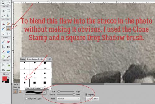
Drop Shadow brushes to the rescue!! These brushes come preloaded with your PSE software, so just look in your Brushes menu for them. Remember, for ease of adjustments later, put your brushes on their OWN LAYER. For this step, don’t worry about the Opacity of the brush, just pay attention to the colour you’ve chosen and the size of the shadow you’re extending. It’ll take some trial and error to get it right so be patient! Following the direction of the light source the designer used, I painted in my shadows.

When I was done, I wanted to soften the edges of the shadows. Filter>Blur>Gaussian Blur will do that nicely.

I pulled the slider to the right to increase the radius of the blurring, and watched the actual image as I went along. When the shadows I’d painted blended into the shadows on my little frog, I selected OK. Then I decreased the Opacity of this shadow layer to seamlessly blend the edges in. You can adjust Opacity first and then Blur if you like. It might give you more control, so try it both ways to see what works best. CTRL/CMD>Z  (Undo) is your best friend!

I repeated the process for the puppy. When I was finished, I knew I wanted to Merge the layers together to move them to my layout as one object.

After selecting all the layers, I merged them as shown. (You’re saying, “Yeah, sure… you used the keyboard shortcut.” And you’re correct!) Then I carried on with building my March 2017 Inspiration Challenge layout.

When choosing something that makes me happy – the theme of the Inspiration Challenge – the first thoughts that come to mind are thoughts of my grandchildren. The second of Carol’s requests was about concealing the identities of her older grands, who value their privacy. So this was a natural! Little A isn’t concealed at all below, is he? I clicked on the Quick Selection Tool, which many people just call the Magic Wand. Using it, I outlined his little face, which put a line of marching ants around it. That’s my “selection”.

Then I went to Filter>Blur>Gaussian Blur just as I did for my limb shadows above.

A little tug to the right and his features are blurred, but his expression is still discernable. It’s really that easy! To conceal parts of her journaling, Carol could select the words in question on her text layer (simplified, of course!) using the Rectangular Marquee tool then blurring the very same way. Now Carol (and all the rest of you grandmothers out there) can scrap photos of her older grands as often as she wants.

Remember, if you’ve used a technique from these tutorials, post your finished layout in the GingerScraps Facebook Tutorial Tuesday Challenge Gallery for an opportunity to have YOUR chance to challenge me. If you’re not a Facebooker, you can post a link to the layout you’ve created with the tutorial you used in the comments section here on the Blog. I’ll get a notification and will then enter you into the draw. The first week of each month I’ll have a random draw of all entries and the winner will be announced at the end of the first tutorial of that month.

See you all next week!