More Fun with FONTS
![]()
I’ve confessed it before – I’m a fontaholic. I LOVE fonts and the options they provide. But have you ever downloaded a font because the example the email or website shows makes it look like it’s been hand-painted – cool, right? – only to find out it’s just… a font? And it looks sort of like the screenshot below. That makes me so cranky! So I’m going to show you how those cheaters do it.

Pick a colour. It doesn’t matter what you choose because it’s going to disappear later, but you want to be able to see it clearly.

Then pick a font, one with some weight to it. I like this one called Cedar. It’s one of the ones I was enticed to buy because of its lovely watercolour paint look in the samples. Umm. Yeah.

This step is optional, but I’m going to use this as a title so I filled in those gaps and made the letters all solid shapes. Tip: When using the paint bucket Fill tool, if you only click inside the space once, there will be a faint outline of the gap left when you’re done. Solution: click TWICE.

And in case you haven’t been paying attention, Simplify your font layer.

Now you’re going to choose a watercolour brush. Or one with some kind of texture. You want to make the font look fabulous, but you also want it to be grounded to the paper below it. Letting a little of that background colour show through does that nicely. Because this text will mimic a painted-on title, it won’t be shadowed later, so ground it now. Choose your paint colour at this step as well.

Create a new layer for your brush. Always. ALWAYS! If you hover your brush over your text, you can see where the edges should be, but this isn’t always so with this type of brush. It does, however, give you some idea of whether your brush will cover your text and whether it needs any adjustments. I tipped my brush a little to get a more uniform coverage by using the Brush tool Settings menu as shown below.

Then just click your brush over your text. If you want more oomph, click more than once, but be careful not to lose the tonal variations you’re trying to create.

Stay on your brush layer and Select your text by clicking on your text layer’s thumbnail. Behold, marching ants!

To Invert your Selection, you can Select>Inverse as shown, or you can CTRL/CMD>Shift>I, which shifts the active area to everything OUTSIDE the text.

This next step Deletes the paint outside the edges of the text. There are 3 ways this can be done: Edit>Delete or CTRL/CMD>X or simply hit the Delete key.

So now the paint only covers the area over the text! CTRL/CMD>D makes the marching ants disappear.

Once I eliminated the marching ants, I wasn’t totally happy with the look so I just added a Stroke to the edges… still on the brush layer.
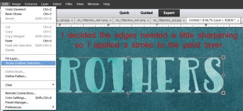
I used the same colour for my stroke. But I could have pulled one of the other shades of teal from the background paper. I think that would have ruined the effect though. Centering the stroke on the edge eliminates those raggedy jaggedy pixels some fonts have when they’re enlarged.

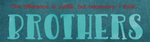
The change made by the stroke isn’t obvious but I think it just defines the text a little better.
You could leave the original text layer and colour show through your brush layer, or you can turn the visibility off to see how you like the look. I found that some of the tonal variation was lost when I did that. But if you’re happy with the visibility turned off you can go ahead and delete the text layer.

Okay, so let’s try something a little different, but using the same basic steps. We’re going to reverse the look.

Back up all the way to where we Selected the text. We’ll use the same brush and colour.

But this time, don’t Invert your selection, just Delete it. Edit>Delete, or Ctrl/CMD>X or just hit Delete.

Now the Text layer is fully visible and the brush is smooshed all around it.

Turning the visibility of the Text layer off looks like this. Decision time. Happy? Not happy? What should be changed, if anything?

Let’s make some small changes.

Would a Stroke make it look better?

Same settings, same everything else.

It’s better, but not really what I want.

So I just Undid – CTRL/CMD>Z – my way back to the Select text step and changed my brush to a dirty spray.

I know I reminded you to put your brush(es) on its own layer – here’s why. You can adjust it to your heart’s content without affecting anything else. You can make the brush bigger or smaller, change the angle of it, decrease the opacity of it, change the Blend Mode, duplicate just the brush… a schwack of things can be done to it that can’t be done if it’s on the same layer as something else.

This time I clicked my brush several times, moving it around to cover the text more but still letting some of the background colour show through.

Et voilà! Turn off the text layer and it looks like a reverse stencil.

If you’ve seen the layout I used this technique for, you’ll know I went with a different colour and the very first method. Despite the appearance of a great deal of time consumed, this actually only takes a matter of minutes to do. Give it a whirl!
![]()