Creating ‘Mazing Monograms
![]()
Lately I’ve been really interested in designing labels for decorative items I’m planning for my home. It’s a challenge, but it’s also a lot of fun and lets me use my creative eye, PSE skills and a little ingenuity. When my grand-daughter was born late last month, I thought I should design a monogram to use as the title of a layout introducing her to the world. I think we all know what a monogram is. But did you know there are some conventions around them?
Monograms have been used for about 2 millenia. Yep, they’ve been around since about 350BC when they began to appear on coins issued by Greek cities, identifying the coins as having come from there. They’ve also been used as signatures by artists and craftsmen, especially when trade guilds began enforcing their rules about membership and took measures against those engaging in those activities without authorization. They later were used as signatures of monarchs and noblemen to identify their holdings, their armies and their money.
Individual monograms came into use as a natural continuation of their use by Important People. They can be part of the letterhead on personal stationery, to identify one’s luggage, to fancify their handkerchiefs, shirts and ties and oh, yeah… wedding invitations! If the monogram is that of a woman, her surname initial is the central, larger one, with her first initial on the left and her middle initial on the right. For men, that convention is often ignored, and their initial are put in order of appearance in their name. Engaged couples may choose to have their two first initials entwined and newlyweds might have one member’s first initial on the left, their joint surname initial in the middle and the other member’s first initial on the left.
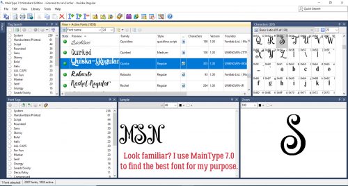
The example below has my grand-daughter’s initials following the first individual convention. I used MainType 7.0 (as described in the tutorial on organizing your fonts) to find the perfect font for the job. The font I ended up using is one I picked up at the FontBundles July $1 event. It’s called Quiska Regular and it’s gorgeous!
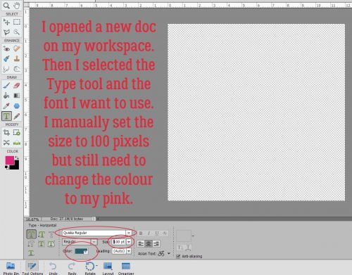
Once I’d settled on my font, I opened a new 12×12 document in PSE. I like to work large and then resize because detail is so much more visible. Then I found the font in my Type tool menu. (Keyboard shortcut is just the letter T.) I increased the size of the font to 100 pixels. And last, I changed the colour to that luscious fuchsia.
I put each of my 3 letters on their own layers. I know I’m going to want to make adjustments to one or more letters, but not necessarily all of them at once.
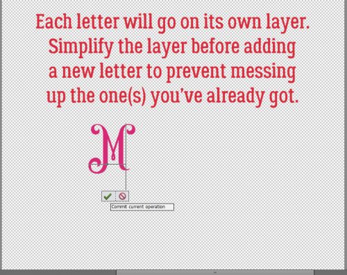
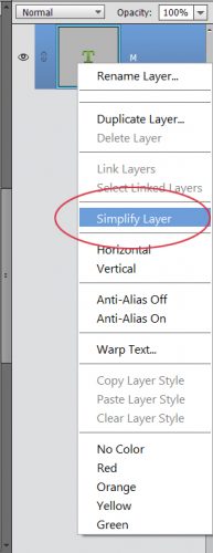
I’m not lecturing you, really… but remember to Simplify those letters as you go along. Elements has a bad habit of messing with your existing text should you decide to change fonts or colours if you don’t take that step. Once the layer is simplified you can’t change the font, but you CAN resize, recolour and play with it.
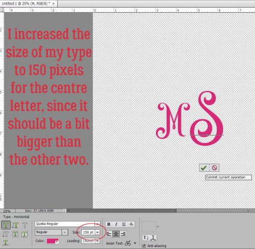
For that middle initial I changed the size of the font (just by typing in the number I want into the box I’ve circled below) to 150 pixels.
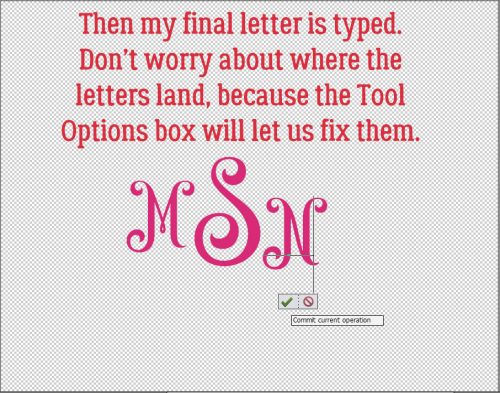
Then I went back to 100 pixels for my last letter. You’ll notice they’re randomly placed, and that doesn’t matter, because Elements has tools to fix that.
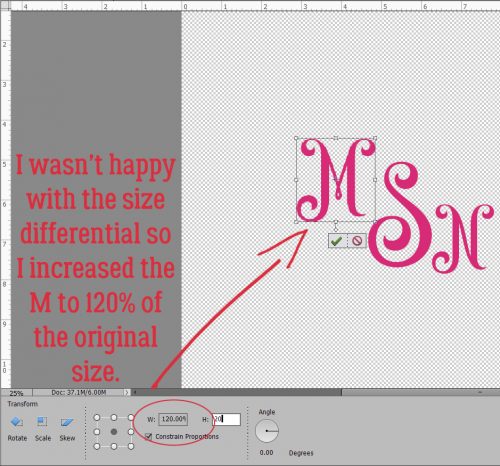
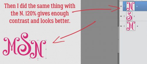
While I was playing with the letters, I didn’t like the size differential so I decided to increase the size of the smaller letters by 20%, to 120 pixels. Then it looked right!
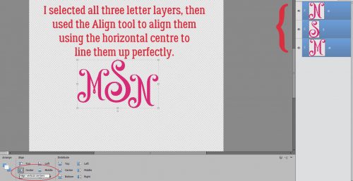
By selecting all three layers, I could then use the Align tool to line up the horizontal centres of the letters.
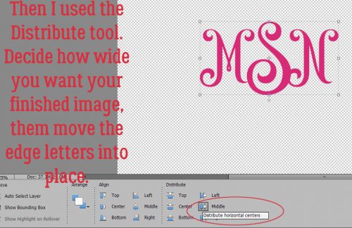
I wanted a little bit of an overlap on the letters to tie the monogram together. So I used the Distribute tool too to shift the letters based on their vertical centres.
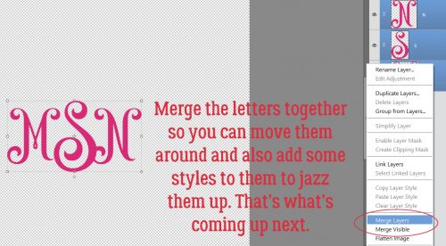
All that’s left is to Merge the layers together to make a single object. They’re already all selected; right-click on them and select Merge, or just hit CTRL/CMD>E and they’ll unite.
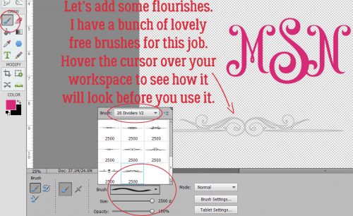
Those of you who read my tripe weekly will know that I wasn’t serious when I said I was done. I decided to add some flourishes to my monogram. I love brushes and have quite a collection of them that I’ve often downloaded free from Brusheezy.com. The one I opted to use here is part of a collection called 20 Dividers V2. Did you know that if you hover the cursor over your workspace you’ll get a preview of the brush just like I’ve shown you below? You’ll know what it looks like and can then adjust your size and angle before you even use your brush.
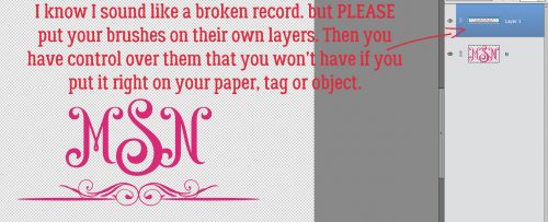
I know I sound like a broken record. Good habits are important to streamline your workflow and prevent oopses. If you put your brushes on their own layers, you have total control over them. If you put them right on your paper, you can’t do anything with them – can’t change their colour (easily) or opacity, increase or decrease the size, apply a style, copy them or any other tweak you might decide is needed. So just put them on their own layers!
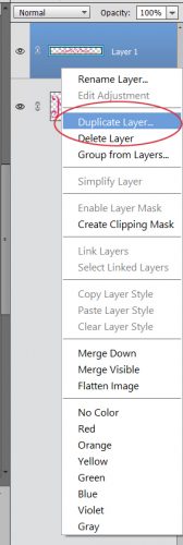
For balance I want a second flourish; duplicating the layer is the easiest way to ensure they’re identical. Either right-click on the layer and select Duplicate, then click OK in the pop-up menu or simply CTRL/CMD>J to copy it.
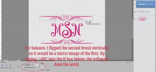
Then I flipped the second brush vertically so the two brush layers are mirror images. The easiest way to do that is to grab one of the middle handles on the bounding box then drag the handle in the direction you want the flip to go. (Either horizontally or vertically.) Don’t obsess over dragging it to exactly the same size, because you can simply type -100 into the corresponding box in the tool options below. Then the software does all the work. WSNH!!
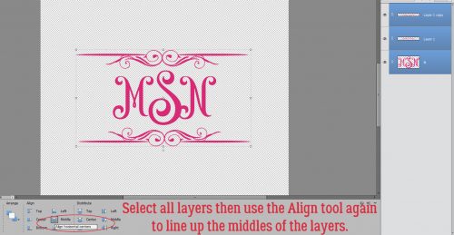
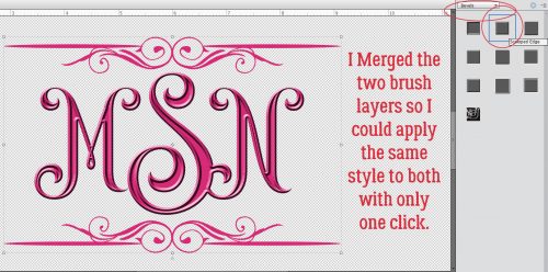
Again, let the software do the work to Align all the layers again. I opted to then select the two brush layers and shrink them somewhat so they were closer to the same scale as the monogram. Then I Merged the brush layers into one.
I might be done… but then again, I might not be done! Let’s see what we can do to really make this monogram pop. I’m going to use a Bevel Style.
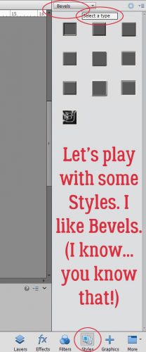
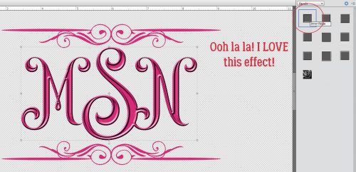
I have the letters layer selected and used the Inner Ridge Bevel. It looks like enamel and I love it!
Then I selected my brush layer and hit it with the Scalloped Edge Bevel just to give it a bit more weight and dimension.
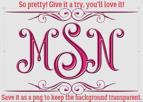
Isn’t that amazing?! And so simple!! I saved it as a png file so I can use it as the title for my layout when the time comes. Keep your eye out for it in the Gallery!
I’m departing tomorrow (July 11/18) for a two-week genealogical expedition to Ireland. So there won’t be a tutorial next Tuesday or the Tuesday after. If I’m not totally whipped when I get home again, there MAY be one ready for the 31st. Think about what I can teach you next. Sláinte!!
![]()