Stackin’ ’em Up!
![]()
I’m seriously in need of a week where I’m actually not scrambling for a tutorial post! I was wide awake at 1 am wracking my brain for a topic. But what do you know… one magically appeared. I remembered there were still some really useful Guided Edits I haven’t shown you yet, so that’s what we’re doing. Let’s look at the Photo Stack, just for fun.

When I tell you that this technique is literally only about a 10 minute job, I know you’re thinking, “She always says that.” But it really is SO much faster even than using a template with photo stack, because with this edit, the software does ALL the copying and stroking. All of it! The hardest part is deciding which of the three options to choose, and I think that comes down to what you want the focus to be.

All I did to get this image was to click just once on the 4 frame spot I’ve shown below.
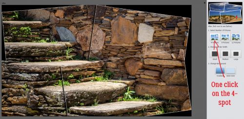
The very first image has the narrowest border already in place. A single click on one of the border options is the next step.

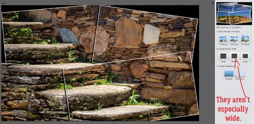
The medium border is still pretty skinny.
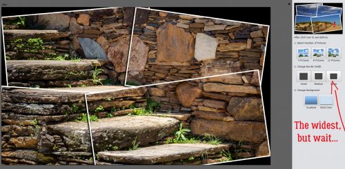
Even the widest one isn’t especially in-your-face. But that’s completely under your control! Before I show you that part, let’s look at the other two stack options.
The eight frame option looks like this with the baseline border.

Beefing up the borders to medium still lets a lot of the original image through.

Then the wider one, still not much of a distraction.

And then there’s the twelve frame option.

Medium

Wide

With this photo I think 4 frames is the right choice. So now I’m going to move to the Expert Editor.

Whoa! Look at all those layers! And each one is another opportunity to fine-tune the final image. (Notice the multiple copies of the photo layer? It’s a GREAT thing!)

Here I’ve selected one of the border layers. The border is actually simply a stroke on its own layer. The default settings are 10 pixels and 100% Opacity.

Pulling the slider to the right makes the border wider. I could also change the colour of the border in this menu if I wanted to.

I’m going to come back to that in a minute. But first, I’m going to unlock the background (original photo) layer so I can edit it. And so I can put a transparent layer underneath it. I right-clicked on the layer in the Layers panel then chose Layer from Background. That makes it like all the other layers, completely editable.


I then added my transparent layer underneath it by CTRL/CMD>clicking on the new layer icon (the blank sheet of paper) at the top left of the Layers panel.
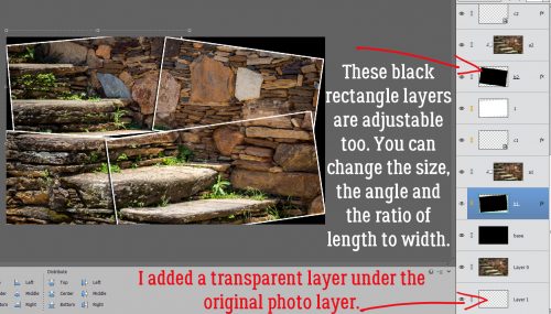
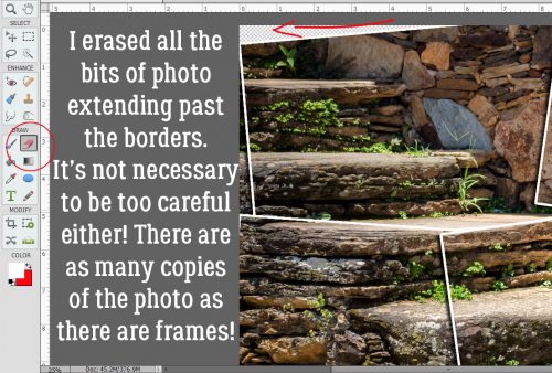
I turned the visibility of the very first black rectangle off and now the original image is visible to the edges and can be erased away, leaving a transparent area instead.

Don’t panic about having to be precise with the erasing. It’s not a problem! All those extra copies of the original photo that are clipped to the stacked layers aren’t going anywhere. You can just use a big eraser and go for it!
After I did that, I decided I wanted to shift the stacked photos so they were entirely inside the canvas. So I CTRL/CMD>Z as many times as I needed to to get back to the black rectangle. Then I resized them a tiny bit, shifted them a tiny bit and rotated them a tiny bit until I arrived at what you see below.

Then I decided to make the borders just a smidge wider. I double-clicked on the fx icon on the first border layer to get into the Styles menu.

I didn’t go overboard, just doubled the width of the border on each one. And then I went back and erased the areas of the original photo layer to make my stack usable.

An advanced version of this Edit would substitute other photos for some of the frames, but it would be almost as much work as using a template would be… the photos would need to be resized and rotated individually then clipped to the spots.
If I was ready to put my layout together, I could just leave it as is for now and come back to it later. But I’m going to save it for later.

In order to be able to use it for a layout, the transparent background is essential. So I’m saving it as a PNG file.

To keep the images sharp I’m using the Slowest setting and Non-Interlaced. I gave it a name and saved it to the folder I’ve created for my (future) layout.

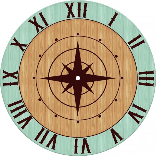
Before I forget, LilyAnn Fisherman left a comment on last week’s tutorial asking me if I couldn’t have made my clock face by texting-on-a-path. So I went back and did it again, using Text on a Shape. It was maybe a tiny bit less work, but I still had to fiddle with the spacing to line the hours up with where they should be on the clock.

And while I was at it, I did a mock-up of what I hope the clock will look like when it’s finished.
Check back in a few weeks to see if I succeed!
![]()
That clocks look pretty good to me! I tried myself last week and couldn’t get it to look right.
What I ended up doing in order to get the numerals in the right spots was to divide my canvas in quarters, using the Pencil Tool on a new layer. (To review, I selected the Pencil Tool, set the size to about 15 pixels and the Opacity to 100%. I chose a contrasting colour so I could see it. I clicked on the top centre point of the canvas, held down the SHIFT key and clicked at the bottom centre point. Then I went horizonally and did the same thing to create crosshairs.) Then I used the space bar and the backspace to line up the 12, 3, 6 and 9. Next, I rotated the crosshairs layer 30° (you can type that into the box at the lower left when you’ve activated the Move tool) and shifted the numerals again so they lined up appropriately. Then I repeated that once more so that all the numerals were centred on the cross hairs lines. As I said, it was a bit of work!
Thank you for the photo stack tutorial! It’s very cool and will be very useful in scrapping pages. By the way, I love your clock design! You have worked so hard to get it just right, and it’s beautiful!