Don’t Let Your Text “FLOAT”!
![]()
PDF Version : https://bit.ly/3ju3KfO
Have you ever wanted to run some text across an element, like a piece of washi tape, a paper ribbon, or even just over a crease in your digital paper, but then look at it and think, “Well that looks like garbage…”? Odds are you feel that way because the text isn’t grounded to the element and looks like it’s floating. Kathi (granny5pics) was in that situation and asked if I could help. This is it!
My example uses a piece of crumpled washi from Cheré Kaye‘s portion of the Beautiful Struggle collab she created with Aimee Harrison and Cindy Ritter, and a very creased label from Cindy Ritter‘s Autumn Treasures. Killing two birds with one stone, as it were.

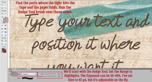
After I typed out my text and positioned it where I wanted it, I Simplified the layer so that Elements will allow my changes. My method for Simplifying is to right-click on the layer then choose Simplify Layer. It can also be achieved by clicking Layer>Simplify Layer.

Next, I chose the Dodge Tool – the one that looks like the paddle the optometrist uses to close one of your eyes. This tool lightens the area it’s used upon; I like to start with less, then work my way up to more. My settings were Range: Highlights, Exposure: 30% (I adjusted that after I took the screenshot) and 45 pixels for my brush size. Note that I’m working on the text layer, not the tape layer, so the changes I make will only affect the text. I ran the Dodge brush over the parts of the text that are over top of areas where the light creates highlights, the creases on both the tape and the label. For straight lines like the creases in the label, click your Tool at one end of the area you’re working on, hold down the SHIFT key and click just past the other end. Don’t worry about going past the edges of the text; the Tool will only affect the layer you’re on. If you have text that crosses the same crease on multiple lines, you can do all of them in one pass.
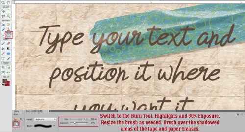
Next I switched to the Burn Tool, the “OK” sign, and used similar settings. This tool darkens areas where it’s used. Again, I like to build the effect, because it’s easier to see when to stop. This time, I ran the brush over areas where the text crosses shadowed areas of the tape and the label. I adjusted the Size of the brush to suit the width of the shadowed areas by using the [ key to make it smaller, the ] key to make it larger. Zooming in and out let me see if I needed to go over any areas again.
Here’s a close-up. The arrows point out the areas where I’ve made my adjustments. I can see some dimension beginning to be visible.

I kept Dodging and Burning until I was satisfied. Then I planned how I was going to show the edge of the tape where the ink from my pen wouldn’t have reached the paper below.

The tear at the left edge of the tape is jagged so to help me out, I CTRL/CMD>clicked on the tape layer’s thumbnail to Select the edge, but kept the text layer as my active layer. Then I used a very small Eraser brush to erase a narrow bit of my text. I also shaved a thin strip along the bottom edge of the tape.

If I’d decided it still needed something, I could have used the Smudge Tool – the flying fickle finger of Fate – to gently push the top edge of the text toward the high crease on the tape, knowing that the Smudge Tool blurs the image a bit. But it looked right to me so this is what I’m happy with.

Here’s a Zoomed out look. Can you see the way the text seems to follow the contours of the tape and the creases in the label?

Here they are, side-by-side. I think you’ll all see it now!

PDF Version : https://bit.ly/3ju3KfO
![]()
now this is an excellent tutorial .. never thought of this before! thank you!
I never would have thought of putting my text over a piece of washi tape. I’ve never used the burn or dodge tool before … thanks for the tutorial! It does make the text look more realistic!
Daily download for December 7th?????? Great tut by the way!
Oh, those tools can do so much for your photos and your layouts! I’ve used them in several other tutorials, I just can’t come up with which ones off the top of my head.
Thanks, Lisa! I’m picky about my work and want as much realism as I can provide to my layouts. Text especially needs to be anchored to the page, otherwise it just looks unnatural. Hence the letterpress effect I like to use and altering type so it follows the contours underneath it.
Thank you so much Jan. And it looks like a pretty simple way of fixing “my” problem. I get so confused as to which of those tools do what and sometimes when I use them, I can’t see much difference in my work. I will definitely be trying this, maybe going back to my Happy Thanksgiving and practicing there.
It really is simple, but so worth it! Maybe I should do a “What’s in Your Toolbox” tut. Brilliant!
Hi Jan. I like your tutorials, but I have an unrelated question. When I upgraded to Windows 11, from 10, I encountered a problem with my scrapbook folders. Up until then, someone in the community discovered that if you label the contents preview with “folder” you will see what is in the folder without having to actually open it up. Do you know if there is a fix for this or is it just an anomaly I am experiencing. It is so helpful when I want to find a kit that matches my photos without having to open every file folder! I am old and just don’t remember what colors and elements are in every kit I buy or happen on for free! Please if you can help, I would be forever grateful.
Thanks, Jacque!
I’ve resisted making the jump to Windows 11 but may have to bite the bullet and just do it. Let me do some digging and see if I can find a fix for you.
Jan
that happened even before windows 10 … i used to have the same view and now the folder is blank .. i tried to find a fix years ago and never found one that would stick. that would be a great help! but i use the thumbnails included with the kits in folders by theme (part of my organizational system) and designer so i just need to look in that folder.
WoW !!!!! That really did make a big difference 🙂 I love how simple that looked to do, can’t wait to try it out. Thanks for this incredible tutorial.