Coloured and Patterned Shadows
![]()
PDF Version : https://bit.ly/3HXqGOs
When I saw this technique on another site, I was intriqued. The scrapper was using Photoshop, but I knew I could make it work just as well in Elements so I had to prove it to myself. This is the result!
This tutorial will be a review of how I create custom shadows, but with a twist. It will work best with a white/light coloured alpha or meaty font against a white or light-coloured solid background. The alpha I used is from the GingerBread Ladies‘ Dream Big collab and will be part of a layout created with JB Studio’s Farmhouse Winter. My layout was also created with this month’s Challenge template from Scrabookcrazy Creations by Robyn.
When I create a title with alphas, I usually put it together on its own canvas so I can easily tweak whatever needs tweaking without the distraction of all the rest of the layout. I usually go with a straight line +/- some individual height or angle changes for interest. But because this technique is a shadow trick, this time my working title is on an angle. The shadows on the title must lie in the same direction as the rest of the layout and the title will be on an angle on the finished layout. So…

Typically, once I’ve got the title the way I want it I shadow any overlapping areas and Merge the characters. But you’ll see that I’ve kept each character on its own layer and will keep them separate. This is important for later.* (If you’re using a font, you may want to put each letter on its own layer. Skip ahead to the * to see if that’s what you need to do.) The first step to a custom shadow is to Select the outline of the object. CTRL/CMD>click on the Layer Thumbnail – that little image of what you’ve put on a layer that shows at the left side of the layer in the Layers Panel.

Next, I add a new blank layer UNDER the working layer. The quickest way to do that is to hold down the CTRL/CMD key and click on the Create New Layer icon – the one that looks like a sheet of paper with one corner turned up.

Next, I set the foreground colour in the Color Picker to the colour I want for my shadows. If I’m using a template, I’ll match that to whatever the template designer has used. In this case, it’s just black. Using the Paint Bucket tool, I fill the outline of the letter on the blank layer. This is the Shadow layer.
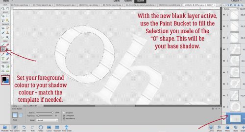
Don’t be concerned that you can see a thin rim of black around your letter. It’s not going to make any difference to the final product.

Here is where this technique departs a bit from my usual custom shadow routine. I made a Copy layer of the SHADOW: right-click on the layer and choose Duplicate Layer… then click OK on the pop-up menu. The keyboard shortcut is CTRL/CMD>J.

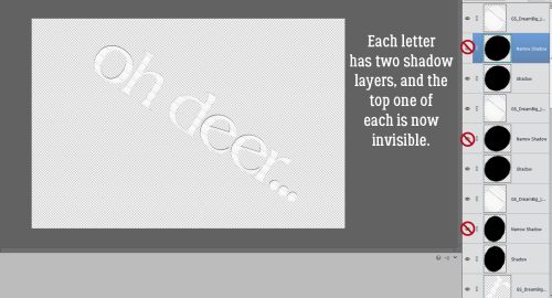
I renamed the two shadow layers; the first, bottom one is Shadow, the top one just below the actual letter is Narrow Shadow. If you want to rename your layers, go to the Layers Panel and double-click on the name of the layer that you can see. Type in what you want it to be called and Enter. Then I turned the visibility of the NARROW SHADOW layer off.

I did this process for each of the letters in my title, creating two shadow layers and turning visibility for the one just underneath the letter itself off.
Now to give the Shadows an offset, which is a regular step in my custom shadow process: Activate each of the visible, bottom SHADOW layers by holding down the CTRL/CMD key and clicking on each layer all the way up the pile. This lets me move all the Shadows in one movement so they match.

For the most realistic look all the shadows on a layout lie in the same direction and give dimension to the objects above them. The shadow Styles on the template I used are at 60° (I flipped the template horizontally, and the shadows flipped too.) To know the exact angle of light on a template double-click on the fx symbol on one of the template’s layers and it’ll show up in the pop-up.

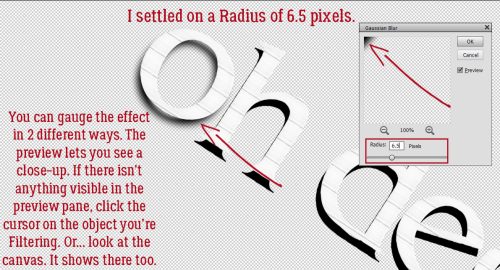
Now to soften the Shadows. So far I haven’t found a way to do this step in a batch, so I processed each layer individually. First step is to add a Filter>Blur>Gaussian Blur…

Elements provides a Preview of the Filter effect. If you don’t see anything in the Preview pane, click your cursor on the edge of your Shadow. It’ll appear in the pane. Or you can just watch what’s happening on the canvas. Using the slider, adjust the amount of Blur the Filter adds. I want them to be quite soft, so I used a Radius of 6.5 pixels. Elements also “saves” the settings of the most recent Filter used, which makes it easy to add that Filter to multiple layers. Simply click Filter>Last Filter. The keyboard shortcut for that is CTRL/CMD>F. One step!
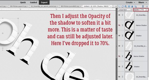
Next, I changed the Blend Mode to Linear Burn. This mode makes the shadow transparent so the layers below are visible – just like a real shadow!

Then to tone the harshness down a bit more, I decreased the Opacity of the Shadow layer to 70%. This step is also subject to personal preference. If you try this and 70% doesn’t look good to you, find what does! It can also be further adjusted later.
This is what the title looks like with each of the Shadow layers Blurred and lightened. I could stop here and be quite happy. But this tutorial is about coloured and patterned shadows, so onward ho!

Yes. You’re not seeing things. I’m going to Clip a patterned paper to the Shadow layer under my “O”.

Doesn’t that look neat?

I Clipped a different* patterned paper to each letter, using the same paper for the two “E”s and went with the green houndstooth for the ellipsis at the end. If you want to use the same patterned paper for all your letters, you could Merge all the alpha layers/not separate the characters if using a font then do all of the preceding steps on your title as a unit.

Okay, so once I had all the Shadows coloured, I decided they looked a little anemic. So I increased the Opacity of each Shadow layer to 80%. That looks better to me.

Now to add just a tiny bit more definition to that alpha. I’ve made all the Narrow Shadow layers visible again and activated them by CTRL/CMD>clicking on each layer. A little nudging in the same 60° direction as the coloured shadows – just a little! – gives each letter an actual shadow.

Again, they’re pretty sharp and harsh so Filter>Blur>Gaussian Blur first.

But because these ones are a lot closer to the objects they’re shadowing, the Blur should be less pronounced. I went with a Radius of 3.0 pixels.
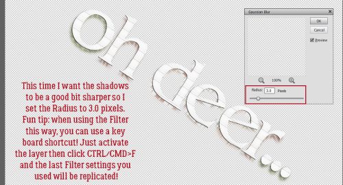
I didn’t need to decrease the Opacity of these shadows. They look just right to me!

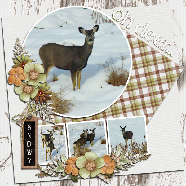
Here’s my finished layout. The technique isn’t really obvious, so you might want to work on a larger scale, with a bit more space around your title if you choose to try this. I’m really pleased with my layout as is.
Five days until the first night of Hanukkah, twelve days until Christmas, thirteen until Kwanzaa and nineteen until next year… is everybody as behind on EVERYTHING as I am? Thinking about it exhausts me. But I have an amusing little anecdote I want to share. On Saturday one of my former coworkers (the very last one I saw before I moved away, to be exact) posted to Facebook that her maternal grandmother had passed away. She linked to her Baba’s obituary. Where’s the fun part, you ask? Well, it turns out we’re RELATED! Distantly and by marriage, but still!! Her maternal great-grandfather’s first wife was my great-grand-aunt’s sister-in-law. There are a couple of other spots where our roots intertwine too, that I’ll be untangling over the next while. We ended up talking on the phone for an hour and a half; she said finding out we’re “cousins” was the best thing to happen to her all month.
Before I forget… There was a comment on the cardmaking tut from a few weeks back from Lisa. She said she uses Royal Brites Matte Photo paper to print hers. I couldn’t find any locally, but was able to buy some Staples premium matte photo paper and printed my cards with it. OMG!!!! The difference00 is HUGE!! Thanks and a shout-out to Lisa!!
Next week we’ll be checking out the Challenge Spotlight and the final tutorial of the year is a Quick Trick you’re going to LOVE! See you soon!!
PDF Version : https://bit.ly/3HXqGOs
![]()
Love these new tutorials and “new to me” techniques. Want to know – since we are coming up to the end of the year and people always make top 10 lists. What are the top 10 beginner tutorials and their links that have been posted on the GS Blog and secondly, what are the top 10 more advanced tutorials and their links that you have posted?
Nice Tut Jan
Just an additional FYI about adding the gaussian blur. Once you have added the blur , there are 2 ways to add the blur to additional layers, The last filter you used shows up as the first command when you click on filter. It will stay there until you change to a different filter or close out photoshop elements. (I have PSE 2021). The other way is that for the last filter used, the shortcut for the filter is control f. It’s not a big change, you still have to do each layer separately but it does save a couple clicks.
What a great question, Penny! I’ll put together lists and add them to the Quick Trick post at the end of the month/year.
Did I forget to include the keyboard shortcut for the Filters? I’ll remedy that. Thanks, Ellen.
Great tut. Thank you. I just did a layout where I used a custom shadow. I’ll redo it using the linear burn–I may be happier with it!
For greeting cards, I’ve been using Staples Brochure and Flyer paper. It’s a white gloss which does make the colors pop, as opposed to some greeting card paper. But I don’t particularly like the glossiness inside. I’ll have to give the Staples premium matte photo paper a try. I also couldn’t find Royal Brites.
I’m really impressed by the matte photo paper. I was having trouble with my printer WiFi connection and accidentally printed my cards on plain copy paper. [I HATE wasting ink!] When I finally got them printed on the photo paper I put them side-by-side. The difference was so obvious! The weight is perfect for cards too.