Archives for January 2024

Tutorial Tuesday (Photoshop Elements)

Quick Trick: All-in-One Alphas

PDF Version : https://bit.ly/4bl74QA

January has flown by! It’s already the last tutorial of the month. Whew!

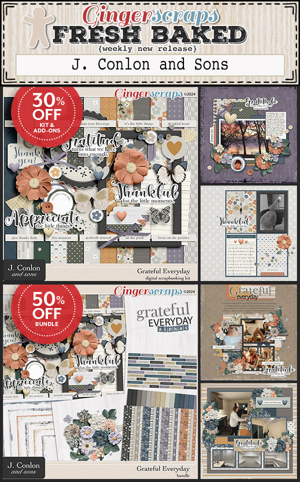
Susan asked for a tutorial on using those all-in-one sheets some designers provide with their alphas, and it just so happens that topic fits nicely into the Quick Trick deck. Now, I don’t use them, as a rule; I typically delete them and keep the individual letter files. But then, I’ve got a ton of hard drive space for that, and I know not everybody does. However, when I ran a search through my GingerScraps kits, I found more than one folder that had the all-in-ones inside – the only form of the alpha(s) provided. So I was set to get this tut out to you.

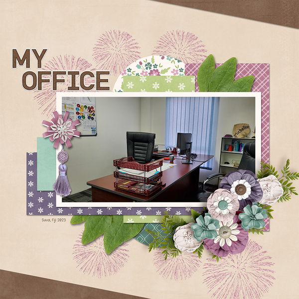
For my sample, I’m using this pink striped alpha from the GingerBread Ladies Summer Treats collab.

Once the all-in-one is in your Photo Bin, I recommend opening a New Project/canvas [CTRL/CMD>N] to create your text in a clean, no-distraction space. I have several presets in my Elements bag of tricks, including this one, a Title Strip 6 inches wide and 1 1/2 inches tall.

So on to the actual task at hand. Open up the all-in-one and using the Rectangle Marquee Tool, draw a box of marching ants around the first letter you want to use.

Now click Edit>Copy or use the keyboard shortcut CTRL/CMD>C.

Flip over to your blank canvas. It will show in your Photo Bin, as well as in the strip across the top of the Elements workspace. Click Edit>Paste or use the keyboard shortcut CTRL/CMD>V. (They couldn’t use P because that’s already in use for Print. 😉 )

And there’s your first letter! It’s just that easy. Follow the same steps to add the rest of your letters. If you’re reusing one or more, you can always use CTRL/CMD>J to make a Copy right there, rather than going back and forth between your all-in-one and your text.

Each letter you Copy and Paste in this manner will be the same size. Once you’ve got all your letters on the canvas, they’ll need to be organized and distributed, because Elements dumps EVERYTHING in the centre of the canvas, and not always in order. When you’re happy with it, you can Link or Merge [CTRL/CMD>E] all the layers so you can move the whole text box onto your layout. Then you can treat it as you do any of the embellishments you add to your layouts. Easy peasy!

I’ll be back over the weekend with the February Designer Spotlight, so stay tuned!

January 26, 2024: Fresh Baked

Hello friends. Welcome to another Friday and Fresh Baked newsletter. I hope your week has gone well.

Remember, spend $10 in the store and you’ll get this collab for free.

Let’s see what is new in the store.

NEW partnership sale with The Digital Scrapper!

 Tell the story of your everyday life using hundreds of photos, a priceless collection of tiny stories, and a handful of beautifully designed scrapbook pages.

Stories, My Everyday Life includes: 50% off — NOW $36

  • 4 styles of 12×12 grayscale templates
  • Step-by-step PDF manual
  • Action for splitting double pages and sharing
  • Private Class Forum & Community Gallery
  • FOREVER ACCESS

How are your  January Challenges? Complete any 10 challenges and get this collab as a reward.

Tutorial Tuesday (Individual Style)

Making Multi-photo Layouts Work

PDF Version : https://bit.ly/42fFbp4

Last week I threw out a “tutorial-writer-needs-topics” plea at the end of the Challenge Spotlight. In the comments, lisar threw a couple of topics back. (For one of them I need some clarification.) “I don’t remember if you’ve done one on a gazillion photos on a page…” As someone who tends to want to scrap single-photo layouts, I’ve discovered I actually have quite a lot of multi-photo (but not quite a gazillion) layouts that turned out quite well. So that got me thinking. What makes a good multi-photo layout? So today, I’m going to pick apart a dozen of my own layouts. Brace yourselves!

I started off thinking about what I consider to be “multi”. Four photos are easily scrapped within the constraints of a 12×12 or 8.5×11 canvas, five only a little less so. That led me to only looking at layouts I’ve created with six or more photos. What became immediately apparent was that the photos I used for each had something in common. A theme, if you will. Some of them were taken on the same day, some of them were taken on different days but were linked in some way, some showed a progression.

Let’s start with this six-photo layout from my 2013 trip to Boston. The theme of my photos is the Boston Marathon bombing. Because we were there only 5 weeks after it happened, it was very much front-of-mind; the blast area was still filled with memorials. Rather than focusing on tragedy I looked at resilience. I chose a template designed by Dagmar Krupalova (who no longer has a shop at GS) because I could fit in all the memorial images I had. The photos are roughly the same size so no one image is the focal point. With the photos arranged in a loose circle gave me room to journal about the event and its aftermath.

You may have seen this layout here on the Blog. The photos are a mélange of images from my two trips to Ireland. They were selected to coordinate with the blessing I chose as my theme. The largest photo reflects both the iconic Celtic cross found everywhere on the island and my Irish Catholic ancestry, the others the beauty of the country. I used a Miss Fish template from her Travelers Notebook V.9 pack.

This layout is built on a Neia Scraps template from Enjoy the Moment V.10 (retired) to commemorate Maeve’s first week with us.  I liked it for this layout because I could have a large photo of my husband holding her the moment she became ours. The smaller photos offer glimpses into her personality. The way they overlap the large photo lets me conceal some background that isn’t interesting. Neia has quite a selection of multi-photo templates that I encourage you to check out.

My last six-photo layout for today is another travelogue with a mariner theme; the photos were taken by my sister who took a 3 week-long driving tour through Canada’s Maritime provinces. I used LDrag Designs‘ May 2019 challenge template because it has large photo spots in both landscape and portrait orientations. That let me crop the photos to keep the important elements of each. I like the asymmetry of the photo spots too. Lina likes journal cards but I tend not to use them, so I swapped them out for journal spots; there was lots to say about this fishing village. At the end I’ll talk about photo and template selection a bit more.

I have a couple of seven photo layouts to dissect next. My “celebration” of Orangemen’s Day in Northern Ireland was memorable for several reasons. The things I saw that stayed with me are a metaphor for struggle. The churches in the village of Derrylin are one kilometer apart at opposite ends of the main road and are starkly different in design. St Ninnidh’s (Catholic) is smaller and plainer than Holy Trinity (Church of Ireland/Protestant). The village is much closer to the Republic of Ireland than it is to most of Northern Ireland, which may be why there’s a visible Catholic presence in the village. Enniskillen Castle was the garrison for English soldiers and looks more Scottish than Irish; it represents the Plantation of Ulster in my mind. Okay, enough history. That’s not what we’re here for. I chose this template for the pocket-scrap organization. Each photo is quite separate and the eye moves around the page easily and it has a big spot for storytelling – which could easily be replaced with another photo.

I like the different photo spot shapes so much better than I like some of my hairstyles in these photos. I used a template from  JBStudio‘s Put It All Together V.1 that I rotated a quarter turn to the left which gave me lots of room for the quote I wanted to use as a subtitle.

Now let’s do some eight-photo layouts. The first two are a sort of diary looking at the same topic from slightly different perspectives. The first was built on a Dear Friends template now retired. The basic grid style works well to provide continuity and the varied sizes of photo spots let me show the details of each.

Its counterpart is more venting than art. I was so glad to see the last of the porta-john! The template I used is one from Tinci Designs Autumn Stories V.1. I replaced the journal card with a photo. The symmetry of the template echoes the symmetry of the new houses being built and shows the haphazard placement of the porta-john so clearly.

Another eight-photo layout captures the horror of Ronan Gillespie’s Famine Memorial in Dublin. I couldn’t leave out any of these images. It would have felt incomplete and dismissive. It’s based on another of Tinci Designs Autumn Stories V.1 templates, and again, I rotated it a quarter-turn to the left. I felt it was suited well to the photos I’d chosen; the four small photo spots let me zoom in on the faces of the statues. I moved and rotated one of the rectangular photo spots, moved the circle of paper up and rotated the paper flag to better accommodate my photos so they told a story.

Let’s move away from sad and depressing. I wanted to document the transformation of our new yard from dirt to landscaped. I like the diagonal arrangement of this Pixelily template; it took some fiddling to get the photos positioned so the overlap concealed things that should be concealed, but didn’t hide what should be visible. But it was worth it in the end. Each of the eight photos here lent itself to my story.

And last, I have a layout with NINE photos. It was created for a Journaling Challenge using another Dagmar Krupalova template. The ring-around-the-page orientation suited the photos and having the journaling in the centre added to the effect. I was able to show the significant parts of each photo clearly, despite the number and size of the photo spots.

So what’s the process for creating a multi-photo layout you can be happy with?

  1. Choose your photos first!
  2. Examine each for the parts of them you want to be featured. Don’t get hung up on orientation. Cropping can deal with that.
  3. Think about the story you’re trying to tell.
  4. Look for a template that will tell your story with the photos you want to include. If you’ve organized your templates the way I do, renaming the preview with the number of photos for easy searching, this step can be a lot simpler than it sounds.
  5. Don’t fixate on using your template exactly as designed. If you find one you like but it’s short a photo spot, look at how you can add one in. Similarly, if you like one but it has too many photo spots, how can you remove the extras? Can you make each spot slightly bigger? Can you combine two spots into one? Substitute journaling for a photo? This applies to photo spot orientation too. If you have 4 photos that are in landscape and 3 that are portrait, but the template has 3 portrait and 4 landscape, rotate the template! If other aspects need to be tweaked, tweak them! You’re cooking, not baking; you don’t have to follow the recipe exactly to have something you love in the end.
  6. Once you’ve settled on the basics, you can choose the kit(s) you want to use. You may have already picked a kit, so now you’ll need to figure out how to make all three components work together. This is the fun part.

So there you have it. Multi-photo layouts that tell your story and look great doing it!

If any of you are wondering about the shelves… I finally had them up securely on Friday by suppertime, and I only had to make one trip to Home Depot for better anchors. Sheesh.

Okay, so next Tuesday is the last of January (insert collective groan here) so it’s Quick Trick Tuesday. I’ll be filling a request…

$2 Tuesday & 65% OFF Retirement Sale @ GingerScraps!

Get ready for a midweek treat that’s too good to resist! It’s time for our special $2 Tuesday & Wednesday SALE! Discover a treasure trove of digital delights for just $2 each—because creating memories shouldn’t break the bank.

ALSO, make sure you visit the Spring Cleaning Sale! It ends on Thursday, January 25th and then these products will be removed from our shop, make sure you get them while you can.

January 19, 2024: Fresh Baked and RETIRING PRODUCTS

Happy Friday everyone. This week really went fast. Along with our regular Fresh Baked releases, we have our Out with the Old Retiring Products Sale. We also have a class from Digital Scrapper that is discounted for our GingerScraps family. Scroll down to the bottom of the newsletter for that info.

Take a look after the Fresh Baked items to see samples of items on sale.

Remember, spend $10 in the store and you’ll get this collab for free.

Let’s see some of the new items in the store this week.

NEW partnership sale with The Digital Scrapper!

 Tell the story of your everyday life using hundreds of photos, a priceless collection of tiny stories, and a handful of beautifully designed scrapbook pages.

Stories, My Everyday Life includes: 50% off — NOW $36

  • 4 styles of 12×12 grayscale templates
  • Step-by-step PDF manual
  • Action for splitting double pages and sharing
  • Private Class Forum & Community Gallery
  • FOREVER ACCESS

How are your  January Challenges? Complete any 10 challenges and get this collab as a reward.

Tutorial Tuesday (Individual Style)

Challenge Spotlight: Brush

It still feels funny to say, “2024”. But time waits for no (wo)man! There are LOTS of Challenge layouts in the Gallery for a month only 16 days gone. I think that speaks to the weather everywhere – we’re about to get another big dump of snow, hard on the heels of a deep cold snap and I know I get more scrapping done when I’m housebound, to keep myself from going shack-wacky. It was hard to choose a Challenge to feature. Recalling my original plan for this Spotlight, analyzing layouts that are all required to follow the same set of criteria, I chose the Brush Challenge. It’s hosted by Ivonne, the designer known as Craft-astrophic and the supplied brush is a required element.

There were a dozen layouts uploaded to the Challenge Gallery and will be revealed in the order they arrived. As usual, each layout is linked to its spot in the Gallery so you can get a closer look, and maybe leave a comment. Just click on the GingerScrapper‘s user name. Now let’s get to it… I have shelves to hang.

First Scrapper out of the gate was lisar. She took the multi-layer approach to select the parts of the brush she wanted to use and then hit the fireworks layers with gold glitter. Her title and subtitle were recoloured black, with a gold stroke outline. Stunning!

For her layout, belis2mi chose to highlight her very tidy office and celebrate the achievement with fireworks. The brush colour matches the lavender of her plaid paper and blend nicely into the background. No mention of the New Year.

Alasandra chose to go with the blues and grays we usually associate with winter to reflect the subject of her photos, and she’s layered the fireworks for a dramatic look. She also went with multiple brush layers so she could move the word art around.

I love that MarilynZ used a green gingham paper for her background to echo the green plaid pyjamas in her photos. Clever touch. The chrysanthemum blooms of the fireworks replicate the needles on the pine branches. Another clever touch!

Here, linweb has layered the fireworks and coloured them with the same colours in the 2024 Times Square crystal ball and she’s added some confetti as another nod to the ball-drop. (Here’s some trivia for you. The balls used for New Year’s celebrations at Times Square are crafted by the Waterford Crystal Works glassblowers. Each one is different.)

Celebration is the theme of kabrak1207‘s layout. She kept the overall look clean and uncluttered, pulling colours from her embellishments for her fireworks. She didn’t include the word art, making her celebration suitable for all occasions.

I like the paper-doll effect pepsibubbles has created here. The fireworks blend into the background but add to the elegance of the images.

I’m like pixygirl, praying that better days are ahead. She used the fireworks part of the brush as an accent, while the pearls look like the path her dove took to reach the journal card. The heart scatter speaks of hope.

It seems larkd was drawn to the word are more than the fireworks. They replicate the spray of the champagne as the cork pops.

NHSoxGirl went super-simple for her welcome to 2024. Her photo is the focus.

A celebration of a different sort was on fontaine‘s mind. She used the fireworks to show someone how fabulous they are.

And finally, dhariana has resized and blended the brush into her background to frame her photo and title. They’re a subtle touch.

I’m on the hunt for a topic for next week if anybody has any ideas. I’ve got a Quick Trick in mind for the 30th – five-Tuesday months are hard… but not as hard as hanging shelves on drywall. 🙁

January 12, 2024: Fresh Baked

Welcome to another Friday. We have some wonderful goodies for you in the store this week.  We also have a class from Digital Scrapper that is discounted for our GingerScraps family. Scroll down to the bottom of the newsletter for that info.

Remember, spend $10 in the store and you’ll get this collab for free. I just love those snowmen and pengiuns.

Let’s see what is new in the store.

NEW partnership sale with The Digital Scrapper!

 Tell the story of your everyday life using hundreds of photos, a priceless collection of tiny stories, and a handful of beautifully designed scrapbook pages.

Stories, My Everyday Life includes: 50% off — NOW $36

  • 4 styles of 12×12 grayscale templates
  • Step-by-step PDF manual
  • Action for splitting double pages and sharing
  • Private Class Forum & Community Gallery
  • FOREVER ACCESS

Have you gotten started on your January Challenges? Complete any 10 challenges and get this collab as a reward.

Tutorial Tuesday (Photoshop Elements)

Texture Overlays – Whut?

PDF Version : https://bit.ly/48LXfch

Just before Christmas I had a request from Hilary: “I didn’t know where to stick this so here goes. Can you do a tutorial on the .jpg textured-overlays please? Or an explanation of how to use them? When I try using them all I’m seeing is dark splodges, you can’t see the underneath photo/picture. TIA” Of course I can! But let me start by saying that texture overlays are better suited to applications on paper, and not photos, unless you’re doing a very arty layout. The following tutorial will work with photos, with the same caveats as for papers. The textured overlay I’m using in my samples is from Karen Schulz‘s  CU Textured Overlays V.01. (CU stands for Commercial Use, meaning the item can be used by designers and others without crediting the original designer. This is in contrast to Personal Use (PU), where crediting the original designer is part of the terms of use of both the designer and GingerScraps.)

These Overlays are intended to by adjusted using Blend Mode and Opacity tweaks to achieve the look you like best. As you’ll see, there are infinite combinations which provide very different looks. I can’t show you every possible permutation; you’ll have to experiment a little. Nothing is final until you say it is! In the example below I’ve simply dropped the Overlay onto a solid colour Fill Layer, which in its unadjusted state just looked like “dark splodges”. I changed the Blend Mode on the Overlay to Multiply. Opacity here is 100%. I like it, and might use it as is.

By decreasing the Opacity to 50% the texture is still visible, but much more subtle. For most of the subsequent versions, I’ll leave the Opacity at 50% for comparison.

Color Burn gives a bit brighter look with a slight increase in the Overlay’s visibility.

Linear Burn darkens everything somewhat, even without an Opacity change.

See how Lighten changes everything? The teal is softer, the Overlay is grayer.

Screen lightens and softens everything. I like this version a lot too.

Overlay brings a ton of detail into the Overlay that was less obvious in the previous versions. Note too how the centre of the paper looks lighter and brighter.

Soft Light is very subtle and reads as almost a solid. I would keep this one in my repertoire.

Hard Light brings the detail back, lightens and brightens everything, as you would expect.

Vivid Light is really dramatic! The teal is so much brighter and the detail sharper.

Linear Light maintains the tonal change of Vivid Light, but lightens and softens it all.

Luminosity has preserved the sharper details, while changing the colour only slightly.

Now, let’s look at what happens with a patterned paper. This one is from Ooh La La ScrapsFreezing collection. It’s got a similar shade of teal in the plaid for consistency. Right here, it just looks like it’s been dragged through the mud. It could work for an arty layout just the way it is.

With a 50% drop in Opacity, now it looks more distressed and less depressed.

Switching to Multiply dampens the texture but doesn’t hide it completely.

With Color Burn, the texture all but disappears. The patterned paper does look brighter, though.

To my eye, Linear Burn gives a sort of grungy grease-stained look. Could work!

Lighten gives the appearance of worn paper in the more transparent areas of the Overlay.

Screen completely obliterates the texture and blows out the pattern too much. But… maybe it could be salvageable with an Opacity increase. Remember, I’m just showing you samples. You’re in control of your work.

Overlay isn’t dramatically different from Screen at 50%. Maybe at 25% it might look good. Here’s a tip: use the SLIDER. Watch what changes as you move it. Stop when it looks right.

Soft Light just basically makes the whole image soft and light. Boring…..

Hard Light gives some slight variation in depth, but not really a visible texture.

Vivid Light. Just no.

Pin Light shows more variation in depth than Hard Light. Think of a tiny flashlight shining on it.

Luminosity brings back the grunge.

If we go a step farther and add that solid colour teal Fill Layer between the Overlay – Opacity at 50% – and the patterned paper, a whole other world of possibilities opens up. Color Burn on the FILL LAYER at 100% changes the entire look!

Drop the Fill Layer Opacity to 50% and the texture pops back into view. With the three layers, you can tweak both the Overlay and the Fill Layer Blend Modes for an incredible variety of looks.

As I said many times before, don’t be afraid to play around with your options. It hurts nothing and isn’t permanent unless you want it to be. CTRL/CMD>Z (Undo) is your friend! If you don’t like it, make it go away. When you find something you really like and think you might use it again sometime, don’t forget to Save it. For papers the format is JPG, for elements the format is PNG. Put it somewhere that you’ll be able to find it again. 😉

The new dishwasher was installed on Friday and it’s FABULOUS! Whisper-quiet, gets everything spotless and even gets the plastic stuff dry. Now I just have to pay the credit card bill… Next week is Challenge Spotlight Tuesday. Which Challenge will I choose this time?

1/9-1/10 : $2.00 Tuesday & Wednesday @ GingerScraps!

It’s time for our weekly $2.00 deals! Stop by the $2.00 Tuesday & Wednesday section of the shop to see what we have to offer this week, January 9 & 10, 2024. Here is a peek of some of the items included this week: 

 We also have a class from Digital Scrapper that is discounted for our GingerScraps family. Scroll down to the bottom of the newsletter for that info.

Remember, spend $10 in the store and you’ll get this collab for free. I just love those snowmen and pengiuns. 

Let’s see some of the new items in the store this week. 

NEW partnership sale with The Digital Scrapper!

I just finished my week 1 page, I love the templates and all the prompts, I’m excited to continue on My Everyday Life for the 2024 year!

 Tell the story of your everyday life using hundreds of photos, a priceless collection of tiny stories, and a handful of beautifully designed scrapbook pages.

Stories, My Everyday Life includes: 50% off — NOW $36


  • 4 styles of 12×12 grayscale templates 
  • Step-by-step PDF manual
  • Action for splitting double pages and sharing 
  • Private Class Forum & Community Gallery 
  • FOREVER ACCESS


Have you gotten started on your January Challenges? Complete any 10 challenges and get this collab as a reward.

Designer Spotlight (January 2024)

Heather Z Scraps and Scrapbookcrazy

Better late than never, right? I had good intentions to have this post out to you before now. Heather has been very patient!

Our first Designer Spotlight of 2024 is a pairing of Heather Z Scraps and Scrapbookcrazy Creations. (Robyn has so far declined being put under the microscope.) Read on for a glimpse into Heather‘s and my visit.

J: Heather, thank you for popping by to chat with me. The ladies at GingerScraps will love getting to know you better. Now that Christmas and New Year’s are in the rear view mirror, it’s time to get to work! How long have you been designing?

H: I’ve been digi-scrapping for 10 years (almost 11), and designing for 8.5 years.

J: Ah! You started digiscrapping right around the time I made GS my digi-home, 11 years ago in March. What was the trigger for you to start designing your own creations?

H: I started digi-scrapping as a form of therapy after my sister passed away suddenly in 2012, and then I moved on to designing about a year or so later because I just love to be creative and wanted another outlet for my grief. It helped to keep me busy and to make it through some very sad/dark years!

J: I think you’re in good company here. I’m so sorry to hear you lost a sister so young. You’re a strong person for channeling your grief into creativity. Distraction can be very effective, allowing us to heal. Do you have a special place where you do your designing?

H: I design right from my couch! I have a laptop, so I sit on the couch and design while watching TV and hanging out with my family.

J: Again, you’re in good company! I sit in my comfy IKEA wingback chair with my feet on the coffee table. Do you have a favourite colour? Colours you really can’t use?

H: Favorite color(s) is teal/turquoise, and my least favorite would be brown or gray, probably.

J: Aha! I created a custom colour for you on WordPress! I like teal a lot, so much that it’s the main colour in my bathroom. What did you want to be when you grew up? [It’s a theme at our house right now.]

H: I wanted to be a veterinarian for a long time as a kid … until I realized you also had to put them to sleep. That’s when I changed my
mind! Then I went to wanting to be a teacher and now I’m finally living that dream … I’m working as an Instructional Assistant in a Multiple Disability Classroom (mainly autism, though). I love my job!

J: Mmm. Yeah, the euthanizing part would be really hard. I LOVE that you work with kids like my son, who is a pediatric stroke survivor. He’s 40 now; he was in kindergarten when it happened and when he went back to school after his stroke, the principal had worked miracles setting up a comprehensive program for him. She took advantage of a new division guideline for physical classroom size and carved out a wheelchair-accessible washroom and therapy space from the renovations. She also saw to it that every entrance was ramped and an elevator was installed so ALL students could get to the library on the second floor. The six years he attended her school saw innovation after flash of genius after brilliant idea and the school became a model for the rest of the division. [Bless you, Cathi Hill!] Are you the sporty type, or more of a spectator?

H: I love watching football, basketball and baseball. I don’t play any sports, but I love to watch my boys play these sports!

J: I’m a true Canadian cliché, I was a varsity curler in high school… you know, with the brushes and the big granite boulders. I prefer baseball to the other “balls”; one daughter played rugby and ultimate, the other ladies’ fastball. Makes for busy days! Describe for me your perfect vacation.

H: Anywhere with my family, really! But I love a trip to the Caribbean, staying at a really nice resort, all-inclusive, with fun excursions! I’m planning something like this for my family and I next year or a cruise. Not sure which yet.

J: Daughter #2 was married (the first time) in Jamaica. It was a once-in-a-lifetime experience for us. I’m not interested in cruising – my big boating adventure was a glass-bottom boat tour of Negril. What would you do if you won the lottery?

H: First, I would buy a house. Nothing fancy, but big enough for the four of us and my parents. Then I’d make sure both kids had college paid for in advance, and last I’d take us all on a fun family vacation! [See above!]

J: We’ve been in our dream house for almost 4 years now. Our 2024 tax assessment was a shock… $1,048,000. GASP!! We paid about half that when we bought it! So I suppose you could say we did win the lottery. If time travel was a thing, would you want to? Would you go backward or forward?

H: I’d probably go back in time. Although I’d love to go in to the future as well. I’d love to go back to the 50s/60s and early 1900s to see what life was like and perhaps change the future for the better.

J: I was a kid during the 60s. Life was so much simpler then. If I could go back to the early 1900s I’d want to spend some time with my Swedish great-grandmother. I have a million questions for her. I feel like I should come with a label: Will drive you crazy with her chatter! What would yours say?

H: WARNING!!! SAYS WHAT EVERYONE ELSE IS THINKING!!!

J: Hey, somebody’s gotta do it! On that fine note, I want to thank you again for the visit. I hope your Spotlight month is very good to you.

Now, before I let Heather completely off the hook, I want to take a moment to remind y’all that she and Robyn are providing the January Daily Download, found here on the Blog. Every day a link to a new chunk of the (FREE) kit is posted and the link is valid for 5 full days. If you miss enough of the links you can still grab the kit from the Shop a few weeks after the new month starts.

As well, both ladies have coupons to their Shops!

Robyn‘s is here:

Heather’s:

Make sure you check them out! But that’s not even all… they’re both hosting the Designer Spotlight Challenge this month. That’s on TOP of Robyn‘s monthly Template Challenge and Heather‘s Signature Challenge. They’re so busy!! I hope you’ll make them even busier… you know what I mean. 🙂