Inspiration for the April Scraplift Challenge
![]()
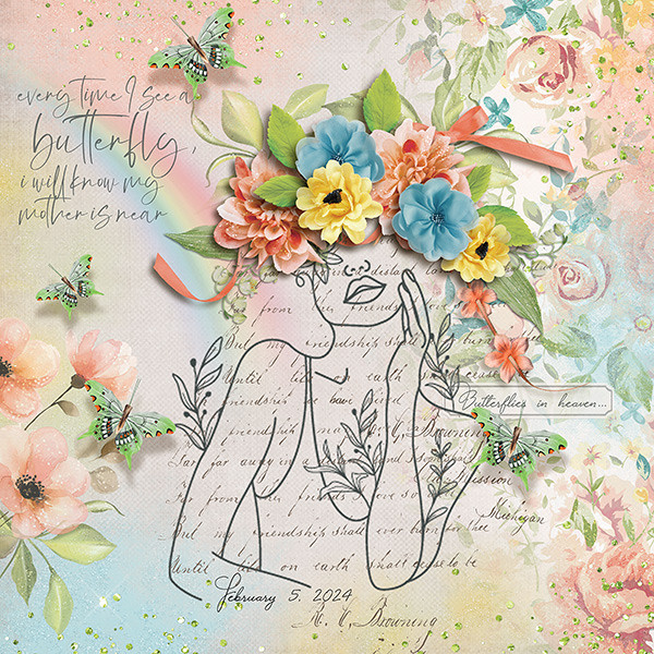
I’m very literal (I know, I say that ALL the time) when it comes to the Scraplift Challenge. If I like a layout enough to emulate it, I’m gonna EMULATE it. So I was looking at the April 2024 Scraplift Challenge last night and what resonated with me was the abstract drawing Alexis used for her no-photo sample layout.

Then I started thinking about what I could use to emulate it. Do I have any doodle drawings in my stash? Will they work? What else could I use? And just about the time I fell asleep, it occurred to me that maybe using a dingbat could be an option. So I pored over the dingbat section at dafont.com and I found a few you might like. All the sets I’m showing you are 100% free for personal use; the bold name of the dingbat (font) is a direct link to the download. Let’s take a look.
First and most closely related to the image above is this collection called Woman Faces. Don’t be fooled… there are a LOT of options with this set that wouldn’t fit into the screenshot. 236 different glyphs, to be exact! Many of them are line-drawings, so very suitable.

If you like a less formal effect Cartoonabha might work for you. This one comes with 66 different options. some of them are very expressive!

This set contains the 12 constellations that make up the Zodiac. If you’re into that kind of thing, Constellations Ostia could provide your non-photo focal point. Or you could use the glyphs as background stamps.

The Goddess gives off a bit more of an esoteric vibe. There are 30 options in this one; the letter X is a fairy!

Art Nouveau Flowers offer a lot of possibilities. They can be filled with the Paint Bucket, Styled to look like wrought iron or lead, have papers clipped to them, or just be left as is.

For a more whimsical take, Country Cuties is your friend. Mostly line-drawn, there are some sweet kittens, cutie bears, a frog, and that hilarious pig.

For the Disney fans, there’s Disney family 1, with all the usual suspects represented.

If you’re more of an old-school Star Wars gal, check out Lucas characters. No Grogu… so if you’re looking for him, skip this one.

These Vintage Mixed vol1 dingbats remind me of print ads from the 60s. There’s even an image of Fred Astaire and Ginger Rogers for elegance. The pointing finger could work for quite a few topics, don’t you think?

I just love the gossipy image! Vintage Mixed vol2 has even more retro images; I think my fave is the cartoon bride and groom on the run.

If you’re in the Path of Totality for this month’s solar eclipse, this set called Galaxia might have something you could put into a photo-less layout. Or you could use the drawings for a border.

These just made me laugh. Smile 2 Me has a huge assortment of expressions; I love the one flashing a peace sign.

From the ridiculous to the sublime… Caligrafia Divina strikes a more elegant chord. The dragon is fabulous.

And last, since we do Takeout Tuesday at my house, there’s a food set called LMS Junk Food Junky. (Of course!) I could see myself creating a layout and calling it In Praise of Pizza.

I had one more for you but for some reason WordPress isn’t allowing me to attach an image of it. I’ve tried several different tricks and failed……… It has a selection of fairy tale images in it and is called Once Upon a Time2.
If you’re not sure you see anything you like, check out the other dingbats at dafont.com. There’s something for everyone there. These are just my picks for what would work as line drawings. (I won’t tell you how many I downloaded today. 😉 )
Before I let you go, I should explain how to use these dingbats as line drawings, shouldn’t I? Install your dingbat set; they take a little longer to install than say a script font, because of the added details. Then open Elements. Dingbats are essentially fonts, so the Text Tool will let you see what’s in the set. I usually run through the alphabet, looking at which image is attached to each letter. For this purpose, I’d use a huge size, like 200 pts. Then I’d Simplify the text (image) so it can be manipulated. Now it’s resize-able to whatever will work best. And then I’d work my layout into the canvas.

For sets that have additional glyphs you can’t access via the alpha keys, check out this tutorial Unlocking the Secret Extras in Your Font Files.
This might be fun!
![]()