Challenge Spotlight: Word Art
![]()
I feel like we’ve done a Word Art Challenge Spotlight not that long ago, but when I looked at the layouts in the Gallery, I just had to choose it for this month’s Spotlight. You’ll see why once I get all them all into this post.

Challenges are a great way to grow your scrapping skills. They encourage creativity and highlight individual style. They can also be a good way to break out of a slump by motivating us to think about what we have in our stash and how we could make it fit into a specific Challenge. Several of the Challenges at GingerScraps include freebies: #2023, Brush, Created with Rewards, Daily Download, Font, Jumpstart Your Layouts, Mini Kit, Memory Mix Up, Photomask, Template (there are 3!), Use It All and Word Art all provide you with some building blocks for zero dollars. (I’ve linked all of the freebie-included Challenges for you.) These are the Challenges that really offer the best insights into individual style because everybody is working with the same key items.
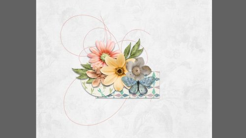
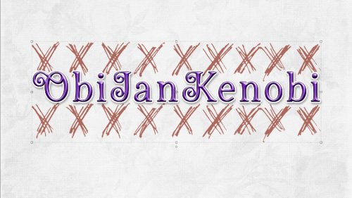
The layouts I’ll show you have been taken from the Gallery in the order they were posted. As always, I’ve linked each layout to its spot in the Gallery for those inclined to take a closer look or to leave some comments. Just click on the scrapper’s user name. Cheré has provided 2 separate versions of the word art, the teal one as shown above and a grey-scale that can be recoloured as desired. Let’s see how they’ve put Cheré‘s word art creation to use.
First off the hop is justpennys. Her layout is a photoless, minimalist one where her Top 3 are things she likes about herself. The teal word art is her choice.

KAPOH has recoloured the word art a vivid yellow to mirror the topic of her layout. It’s clear she’s a soccer fan!

Here, we can see that wvufan04 used the grey-scale version and left it as is. It works beautifully with the theme of her layout, favourite photos of grandparents. I love that line drawing of the antique sedan.

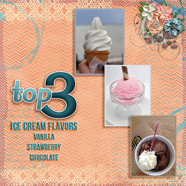
For her layout, fontaine surveyed her family to list their Top 3 places they’d visited together. Glacier National Park got the most votes. She used the teal version of the word art and kept the layout simple to keep the focus on the choices.

Roller coasters would never appear on any list of mine, unless it was things I don’t like, but elfmaiden687 has her own Top 3. She also used the original teal word art, using it as the basis for her palette.

The grey-scale version works nicely with nimble4u‘s layout too. It seems to reflect the dusty olive green of her background paper.

Got2Scrap recoloured the word art to coordinate with the colour palette she chose for her white-space layout. Look at those clusters! Incredible.

This layout by lulumoon is deceptively simple. (Cluster alert!) She pulled the lighter teal colour from the original for her subtitles, which compliments the coral background to perfection.
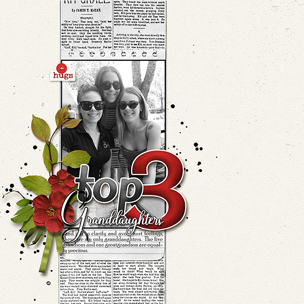
I think Jill‘s layout is my favourite of the bunch. She chose the deep red of the flowers in her cluster to bring the focus to her title, which then leads the eye to her black-and-white photo. Her colours absolutely POP off the page.
Pixel Palette chose to keep the original teal for her philosophical layout. (She’s not wrong!) The focus of the layout is firmly on her photos.
![]()
Once again, I have to commend Katherine Woodin for (literally) documenting the good, the bad and the ugly of everyday life. I like how she’s divided the layout into perfect thirds and used the same paper in 3 different colours to reinforce the 3 aspect of the Challenge.

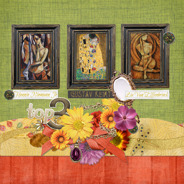
Grace‘s layout is a work of art in itself. Her colour choices relate to Klimt’s work in the best way. She recoloured the word art a golden brown that also reflects Klimt’s sort of grungy look.
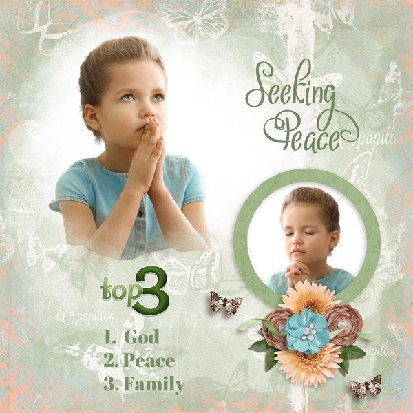
The faith-based simplicity of dkane‘s layout is its strength. She opted for a beautiful deep green for the word art and it works.
For her layout, glee also kept the original teal and pulled it into her overall palette. I like the stencil look to the fern-and-leaf border and that her title tells the whole story.

Grey-scale for the win here! These are hichchei‘s Top 3 foods. Can’t argue with any of them!

I’ve thought about this Challenge a lot and still don’t know how I would meet it. I have 3 siblings. I have 3 children. I have 3 grandchildren. I have 3 best friends. I have 3 favourite wineries. It’s making my brain hurt! Maybe I’ll save it for later.
Next week’s tut will be another Quick Trick. With the announcement of GingerScraps‘ partnership with the Digital Scrapper and their suite of video tutorials, it appears I’ll soon be rendered redundant. Time will tell.
![]()