Scrap-Lift Challenge {March 2025} Host: Alexis Design Studio
March has arrived, bringing the promise of spring! With blooming flowers, warmer days, windy weather, and St. Patrick’s Day celebrations, it’s the perfect time to refresh, create, and enjoy the season’s energy and renewal.
Welcome to this month’s Scrap-Lift Challenge! I’m excited to see the incredible layouts you’ll create and discover new ideas to spark creativity. Don’t forget to spread the love by leaving some feedback in the gallery – after all, who doesn’t love a little encouragement? I can’t wait to see what you come up with!
So let’s get started.
This month, I have chosen: Cat’s Take a Message by deej!
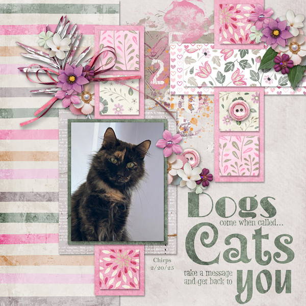
I’ve selected this layout for the scraplift challenge because of its fantastic use of paper blocking. and the perfect balance of delicate clusters and word art. It all comes together beautifully for a well-crafted and inspiring design!
Rules for this month’s challenge:
- Look at the flow of this layout and replicate it with your touches and style!
- Please add blocking of papers, photo, clusters and title or word art!
- Any kit/collection… must use 80% Ginger Scraps products 😉
- *Your layout cannot be used in more than one challenge.
- Post your linked page in this thread, once the forum is back up.
- Post in the Scrap-Lift Challenge gallery and the
- gallery of the designer’s kit you used in your layout.
I can’t wait to see the pages you create this month!
REMEMBER
- All challenge layouts must consist of at least 80% GS products from current GS designers.
- Find the FULL list of March 2025 Challenges and RULES HERE


") .
.