Greetings, Scrapbook Enthusiasts!
As our exhilarating DSD celebration draws to a close, I hope you’ve been relishing the delightful blend of shopping frenzy and engaging forum activities!
A quick reminder: our sensational 50% off sale will conclude at 11:59 ET on Thursday, October 12. Hurry, because once the clock strikes midnight, prices will gracefully revert to their non-sale figures. DSD SALE ENDS COUNTDOWN:
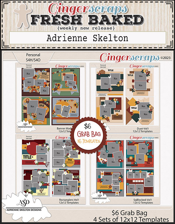
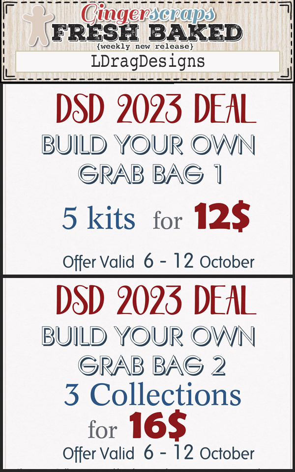
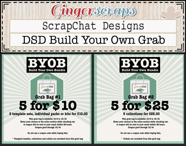
And here’s an exciting nugget of news: dive into our special DSD Grab Bag section at the store! You won’t believe the fantastic deals waiting there just for you!

🌟 **Check it out here:** [DSD Grab Bags]
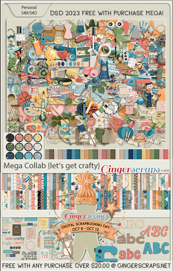
But wait, there’s more! For purchases over $20.00, you’re in for a treat – our “Let’s Get Crafty” MEGA Collab is absolutely free! Make sure to snag this amazing offer before the DSD sale bids adieu.

Lastly, don’t overlook the treasure trove of discounts and specials tucked away in our forum’s hidden corner: DSD 2023 {Specials & Sales} Our thoughtful designers have poured their generosity into creating additional delights for you there.
Get inspired by our special DSD 2023 {Fun & Games} Our designers have a variety of super fun activities to kickstart your scrapping!
So, make the most of these final moments, indulge in your passion for scrapbooking, and seize these unbeatable offers before they slip away. Happy scrapping! <3 Ginger