Challenge Spotlight: Inspiration
![]()
How is it already the third Tuesday of August? Of course, this month has FIVE Tuesdays, so we’re actually smack-dab in the middle of the month. The Okanagan valley in BC, where I live, is having a heat wave and we’re blanketed with wildfire smoke again. I feel very bad for the movers who are emptying a truck across the street in this heat and cruddy air. Our Level 4 drought is quickly moving to Level 5. Seems like it’s bad news everywhere. To all the GingerScrappers in Hawaii, you have all our love.
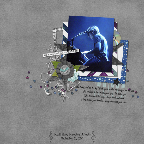
I chose the Inspiration Challenge for this month’s Challenge Spotlight because the Challenge Joy (Memory Mosaic) has tossed our way is something I love to do: take a photo from an “odd” perspective and scrap it. The alternate Challenge is to scrap a photoless layout from someone else’s perspective. When I looked at the Challenge Gallery, I was a little surprised to see only one person chose the photoless option. But what a great choice it was! Let’s have a look at the entries. As usual, they’re in the order they were uploaded to the Gallery and they’re linked to the Gallery so you can take a closer look, leave some praise or whatever. Just click on the scrapper’s user name and you’ll be right there. (I have participated in this Challenge, but decided not to include my own layout, because the focus of these Individual Style posts is on YOU!)
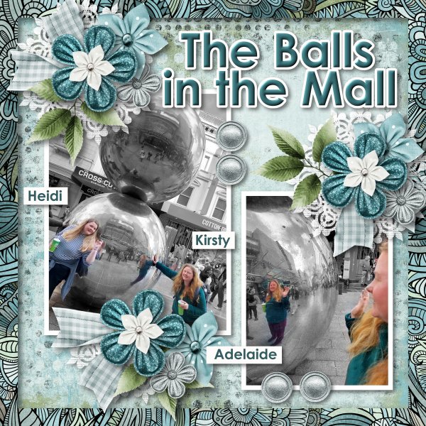
Here, greenfiend27 has two photos and perspective is a feature in both of them. These stainless steel balls see, to be everywhere these days and offer endless potential for interesting photos. They can be a lot like funhouse mirrors, right?
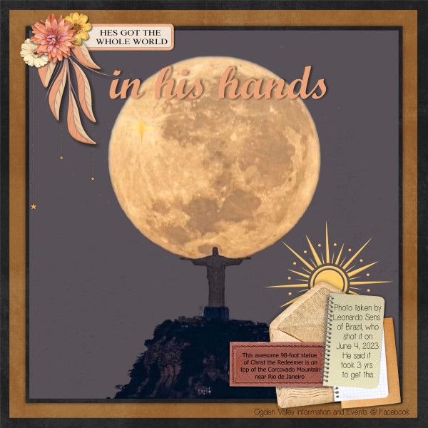
GrannyNKy has a really carefully-framed photo for her layout. There are millions of photos of Christ the Redeemer near Rio de Janeiro, but not many like this one!
Look at TBear‘s layout… the lone outlier! Here’s what she said about it: “DGD, who thinks outside the box as second nature, asked me what I thought an alien birthday cake would look like. I tried to create something from her perspective…outside the cake mix box.” I LOVE it! Kids are so clever.

I had to look very closely at this layout by MeleahG to decide where the “perspective” was… and then it hit me: the depth and breadth of variety! Shakespeare, Narnia, The Count of Monte Christo, The Witch of Blackbird Pond… I read that one when I was about 10 and had completely forgotten it.

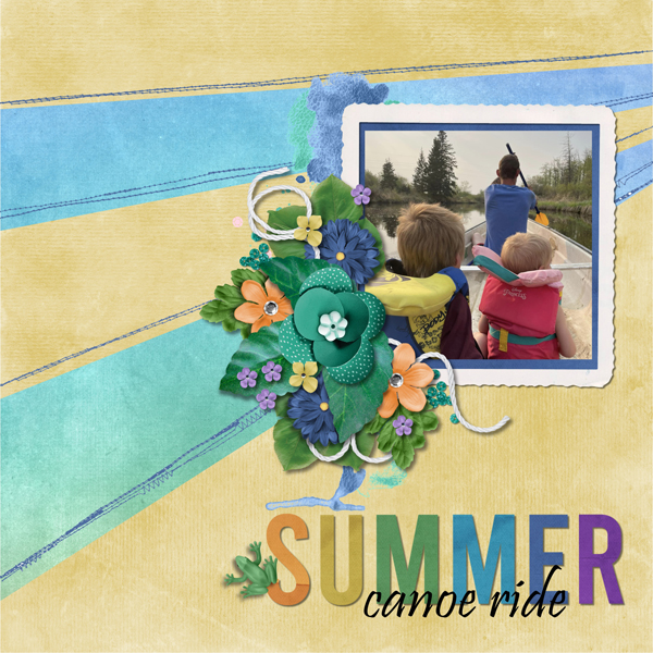
For her layout, bumblebeee chose a photo taken from HER perspective of her family canoeing in an idyllic spot. Sometimes looking at the back of someone’s head can be magical. (This PICU nurse’s heart is happy to see life jackets on those precious babies.)
One of the cardinal rules of obtaining great photographs of kids and animals is to get down on their level. And Karen Diamond learned that one well! She also has an aerial view of the farm and a downhill shot of cows in a pasture, so she’s used many perspectives. Good job!

JAMSquared80 has skillfully used up-shots for her layout. That perspective gives a sense of just how tall those buildings are.

Here’s another good example of getting down on their level from photocrazy. Not only do we get better images this way, but they’re more natural and uninhibited.

I’ve NEVER seen a real peacock with its tail fanned out, never mind from the BACK! Props to gmae for this unusual perspective!

This makes it look like the subject of the photo is either walking on water or walking up a glass wall. It’s a bit disappointing to know it’s a glass balcony wall and gadawg83‘s subject is seated, don’t you think?

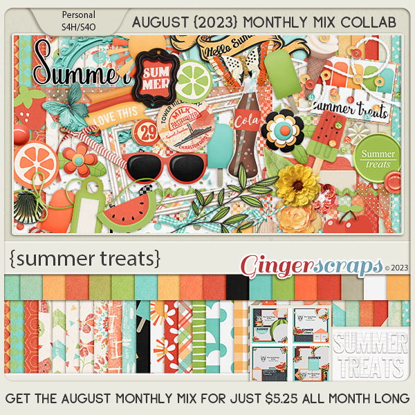
If you’re new to digi-scrapping, GingerScraps’ Challenges are a perfect way to find inspiration, learn new things and build up your stash. Several of our designer-hosts include freebies with their Challenges and there’s a Challenge Reward kit for completing 10 Challenges. (Missi keeps track of everybody’s totals. When you reach 10 completed you’ll automatically receive the download link for that month’s Reward via Private Message. However, the counter stops there until a new month starts, so if you hit your 10 layouts on, say, today – August 15th, but you keep going and complete 5 more layouts, those ones don’t carry over to September when the counter starts again. Clear as mud?) Here’s a look at the August Reward kit.

See you all next Tuesday!
![]()