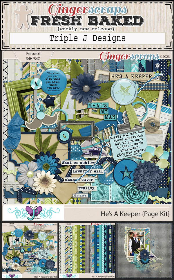
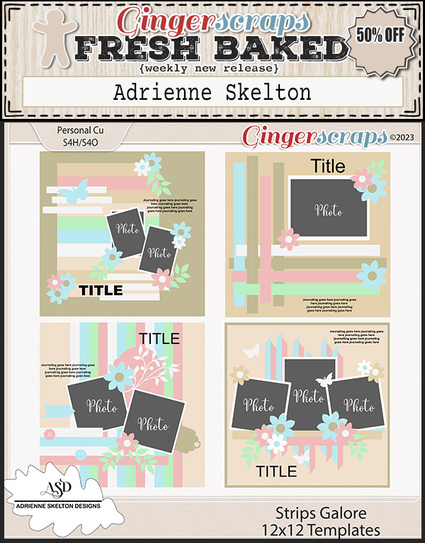
It is the 1st of the month and you know what that means, a huge, exciting newsletter! We have a New Buffet, New Monthly Mix, New Free With Purchase Collab, New Challenge Reward, New Daily Download on the GingerScraps Blog, & New Designers!
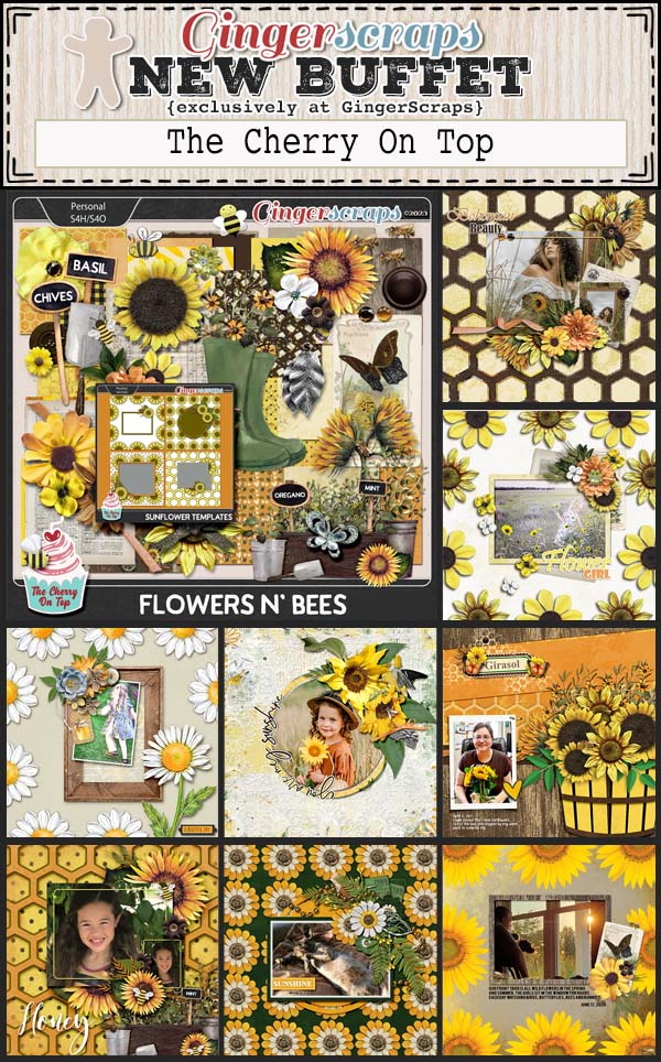
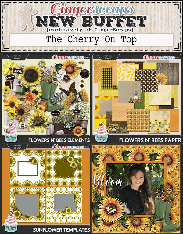
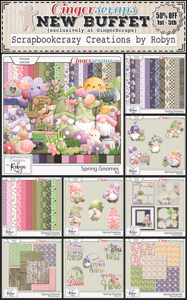
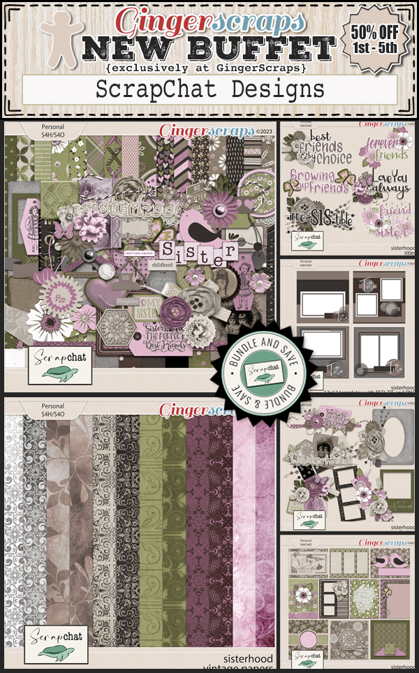
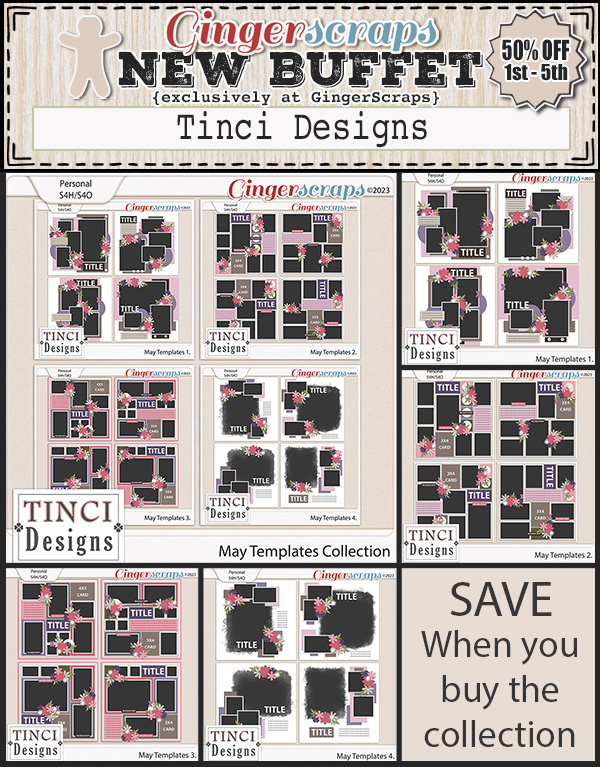
Let’s start out with the March Buffet. Don’t forget to check out the Buffet Bundles. One easy click to add bundles of Buffet goodies to your cart.

Aren’t the buffet colors gorgeous? And with the buffet kits, you can mix and match to get the perfect kit for you.


Remember any $10 spent in the store gets you this great collab. Are you feeling {outdoorsy}?
This Free With Purchase was created by: Just So Scrappy, Kristmess, Miss Fish Templates, and Neia Scraps.
This collab includes: 1 Alpha {Uppercase, Lowercase, Numbers & Punctuation}, 47 Papers, and 102 Elements.

When life gives you lemons, just make {lemonade & laughter}.
This Monthly Mix was created by: Aprilisa Designs, Dear Friends Designs, JB Studio, Jumpstart Designs, and Sweet Pea Designs.
This collab includes: 1 Alpha {Uppercase, Lowercase, Numbers & Punctuation}, 50 Papers, 78 Elements, and 4 12×12 Template {png, psd, tif file formats}.

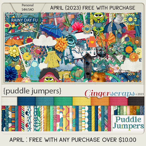
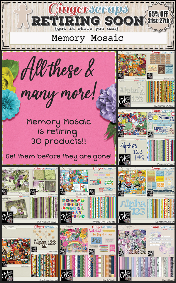
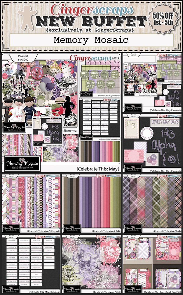
Now to the May Daily Download Sneak Peek. This month’s Daily Download is from Memory Mosaid! Make sure you are checking the blog every day to get all the pieces of this kit!

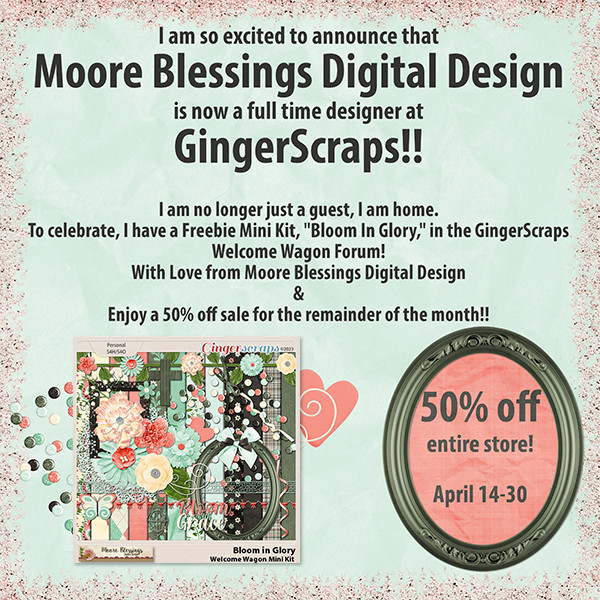
We have great designer news for May.
First, we have a new permanent designer joining the GingerScraps family.

BIO:
Cornelia lives with her husband, her four children and a puppy husky in Austria. When her oldest daughter was born in 2009 she started scrapbooking and never quit documenting the lives of her family. A few years later she started her design career to make her own collections. Her designs will be available exclusively at GingerScraps!


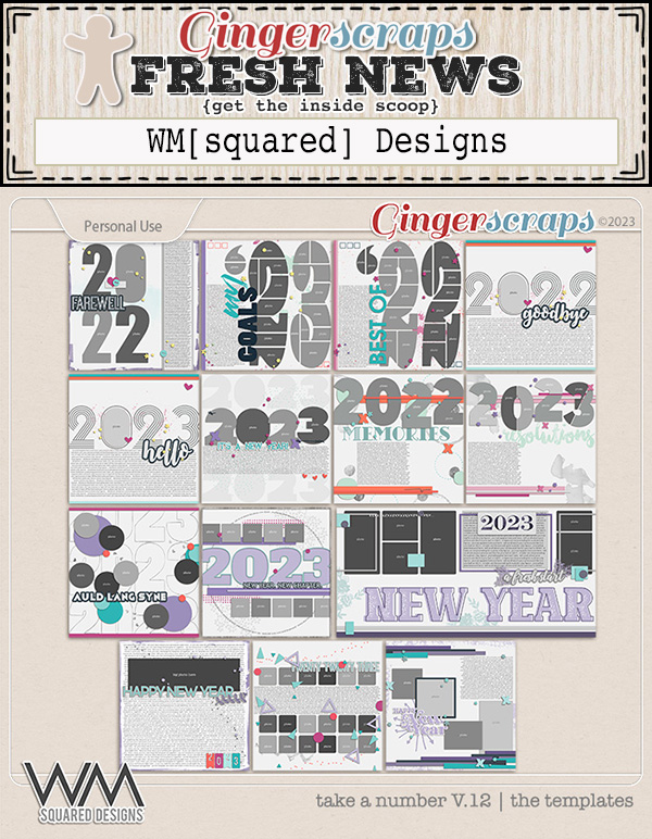
We also have a guest designer this month!

BIO:
My name is Wendy and I’m the creative force behind WM[squared] Designs. I started digital scrapbook design whilst living in California. Everything was so expensive out there and I found that creating elements and papers made me happy, and provided me with exactly what I wanted to use on my layouts! That was 15 years ago!
I’ve always loved to travel, and creating travel themed kits makes me happy! I’ve been married for going on 3 years to my soulmate, and we live with our 4 cats in Ireland, though I’m originally from Texas!


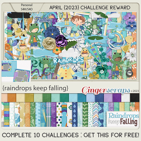
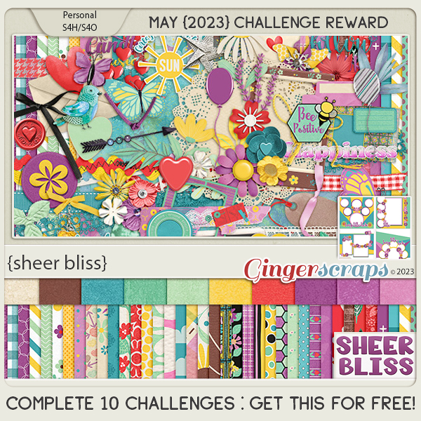
Are you ready for the May challenges? Remember any 10 completed challenges gets you this great kit.
This Challenge Reward was created by: Adrienne Skelton, Lisa Rosa Designs, Scrapbookcrazy Creations by Robyn, and ScrapChat Designs.
This collab includes: 1 Alpha {Uppercase ONLY}, 48 Papers, 78 Elements, and 4 12×12 Templates {png, psd, tif file formats}.
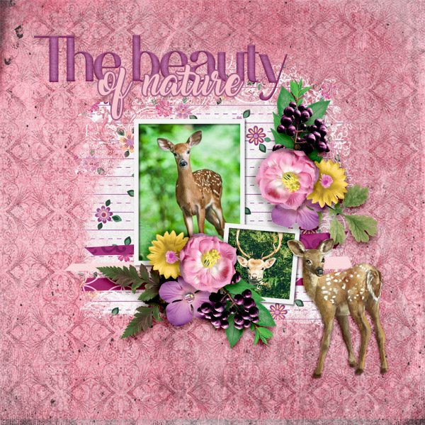
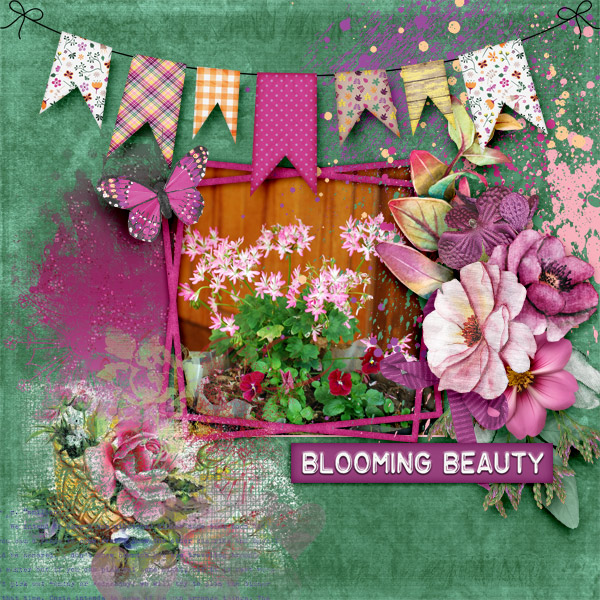
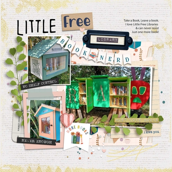
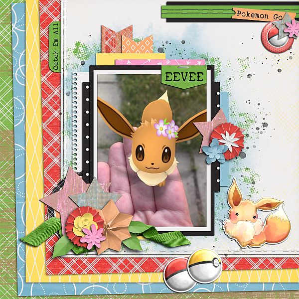
And now a few samples from our talented store CT with a sneak peek of the iNSD Mega Collab!