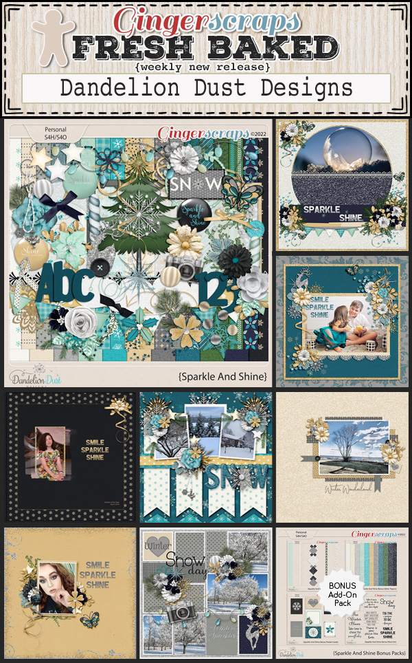
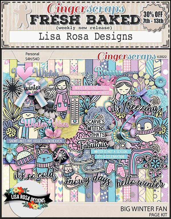
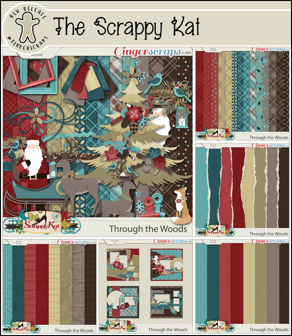
Romantic and Corny… Valentine’s Day Fonts
![]()
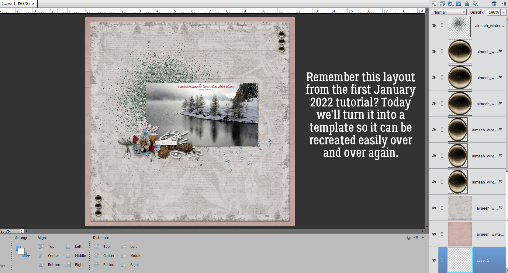
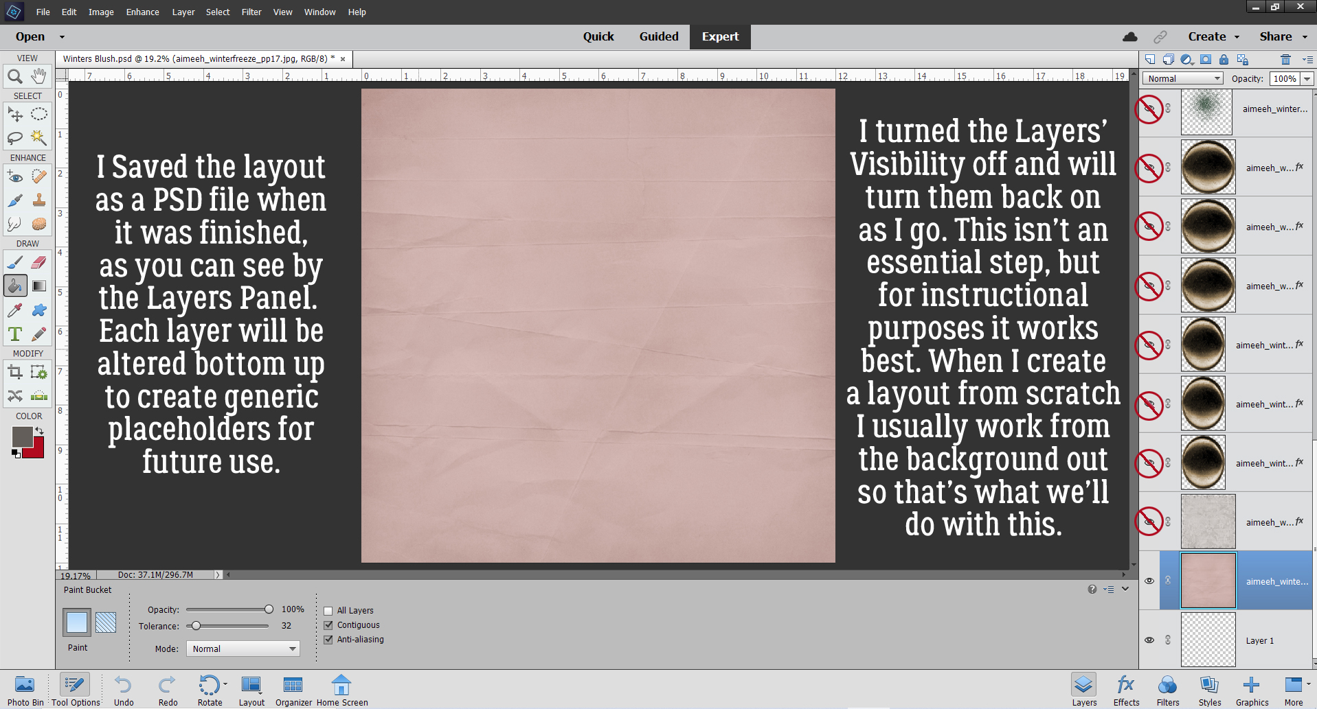
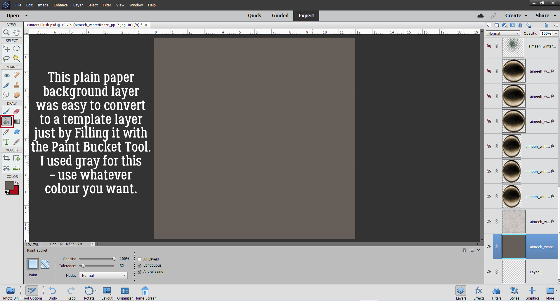
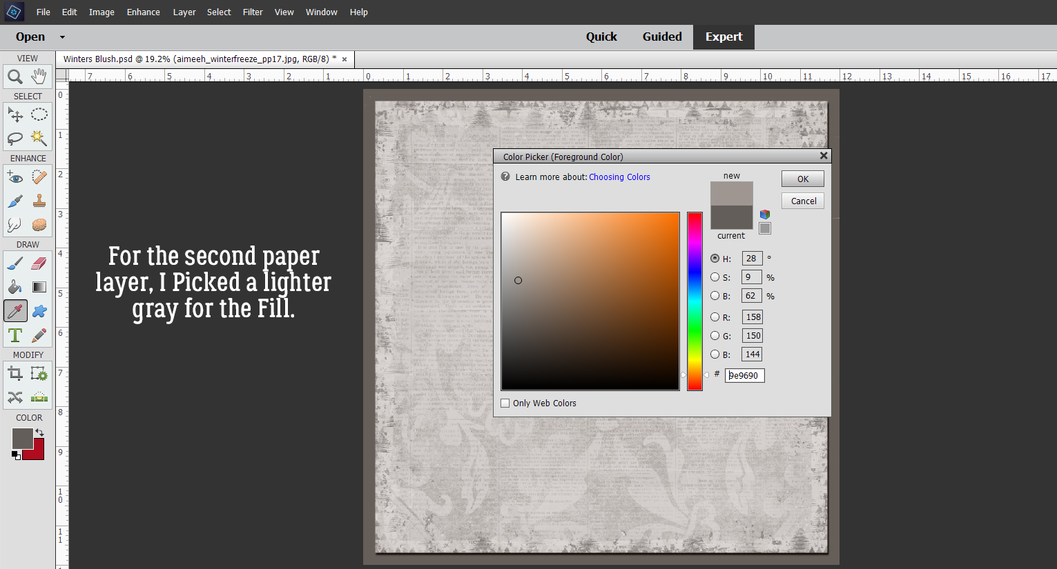
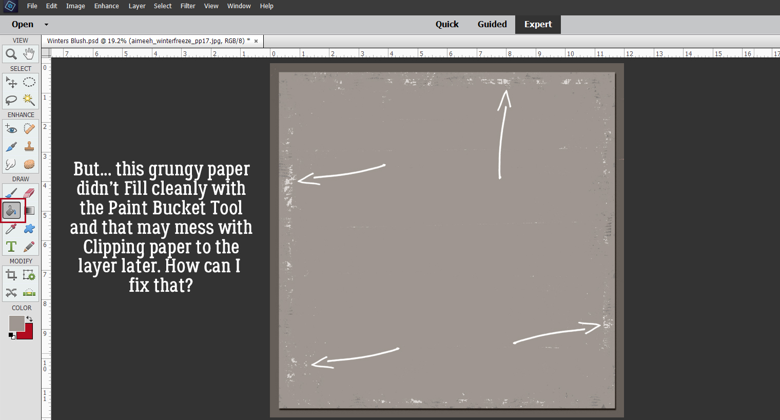
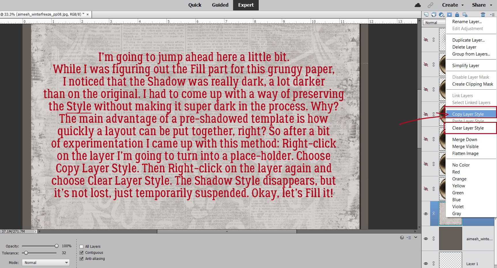
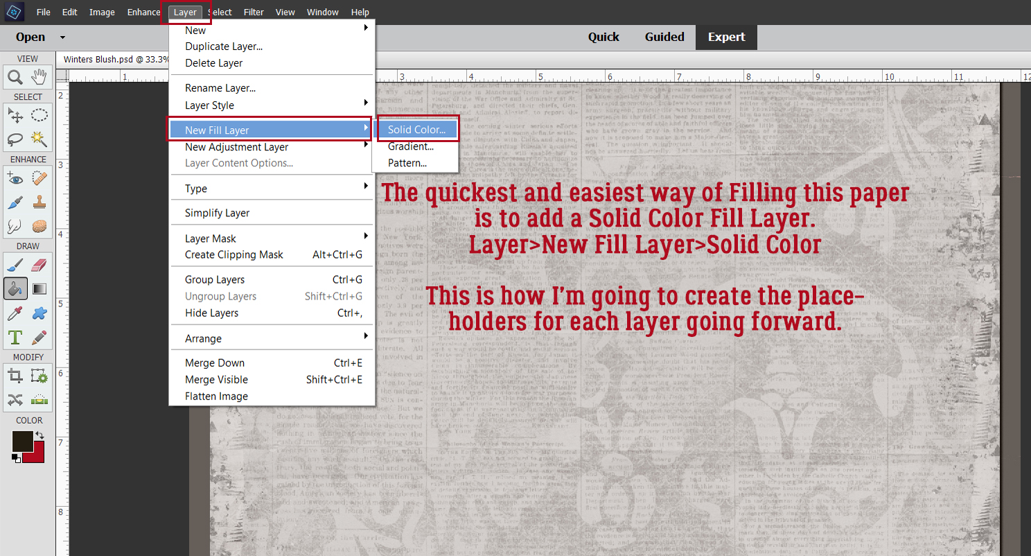
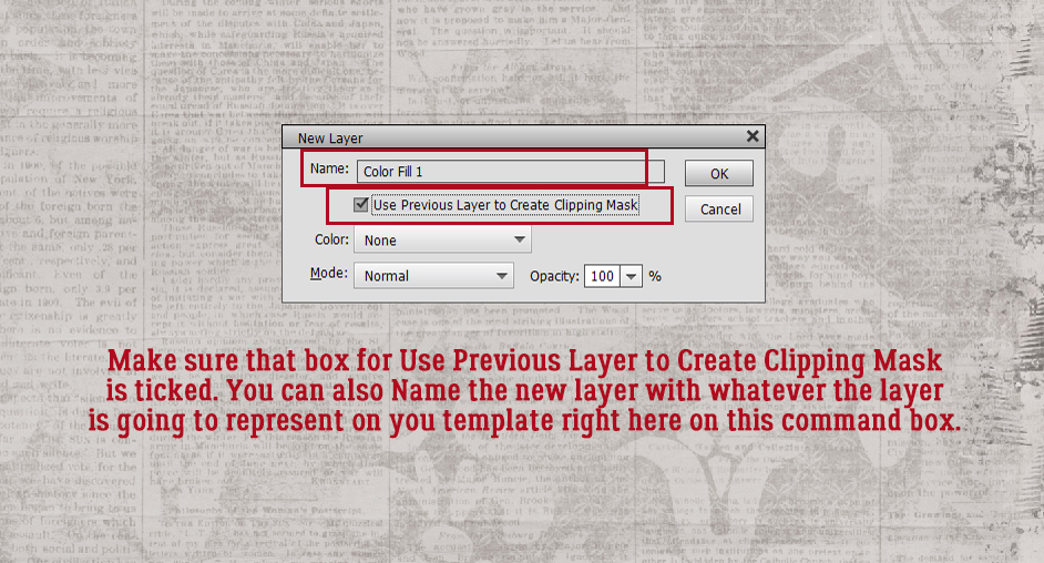
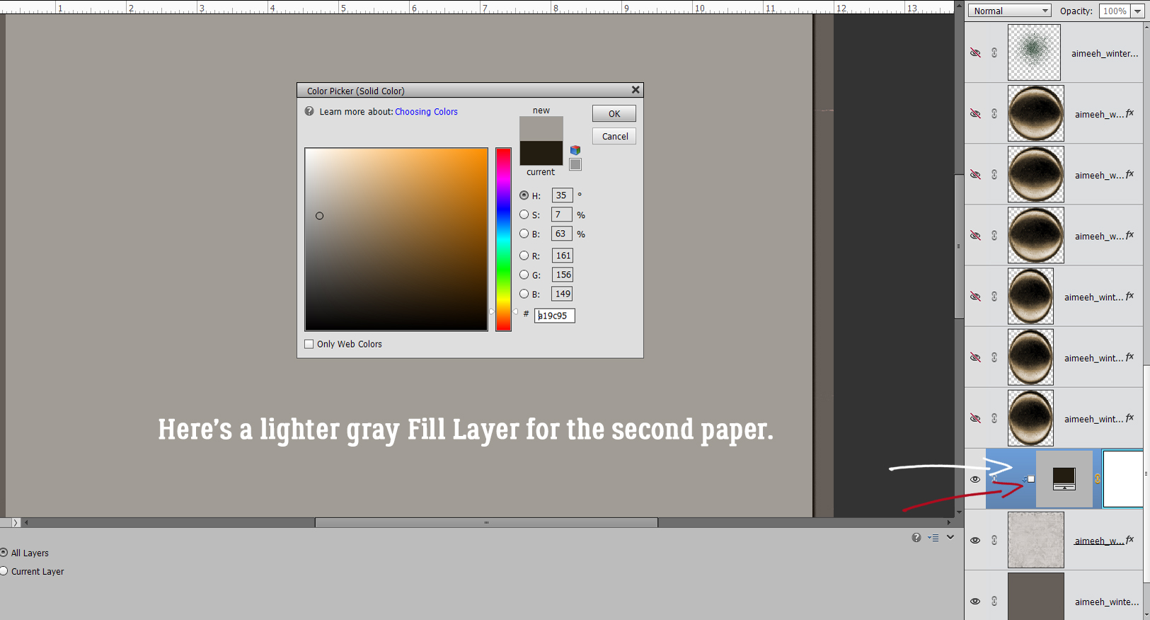
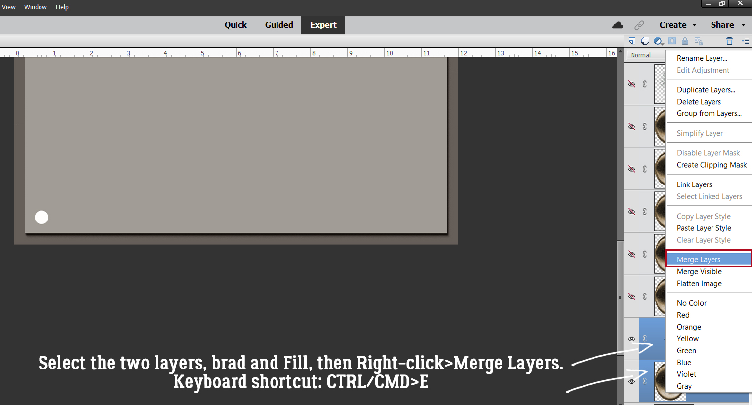
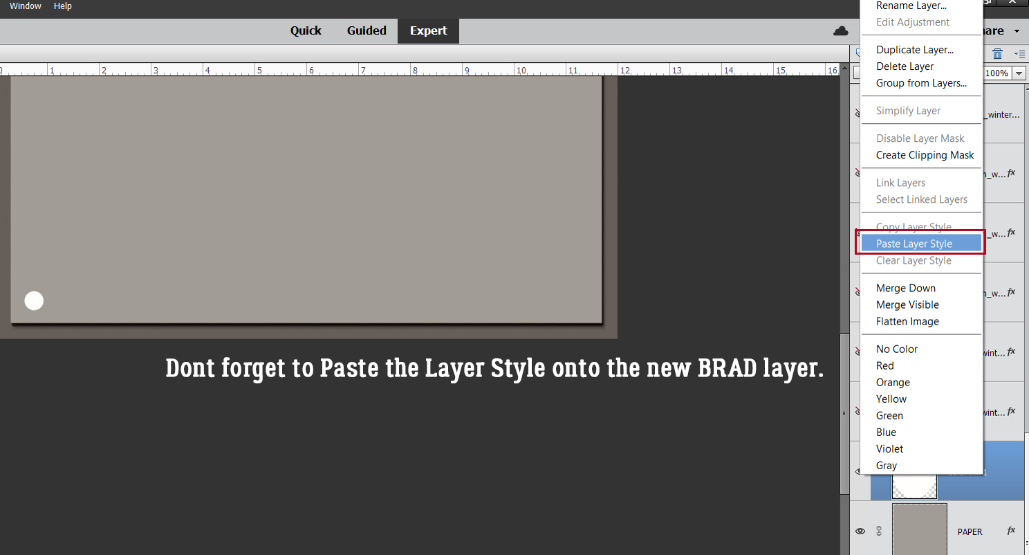
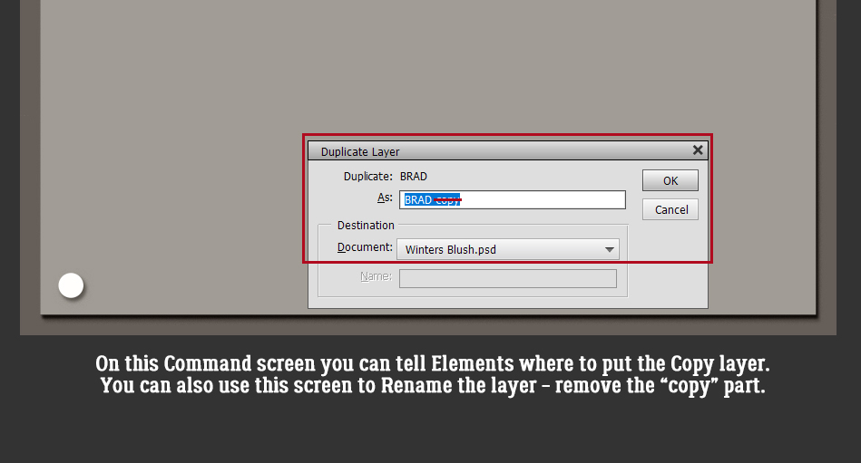
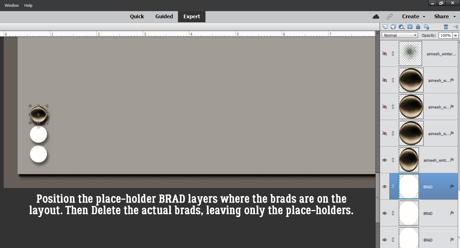
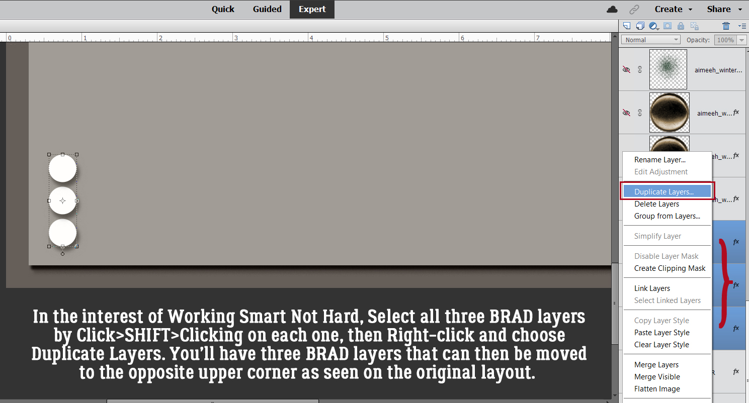
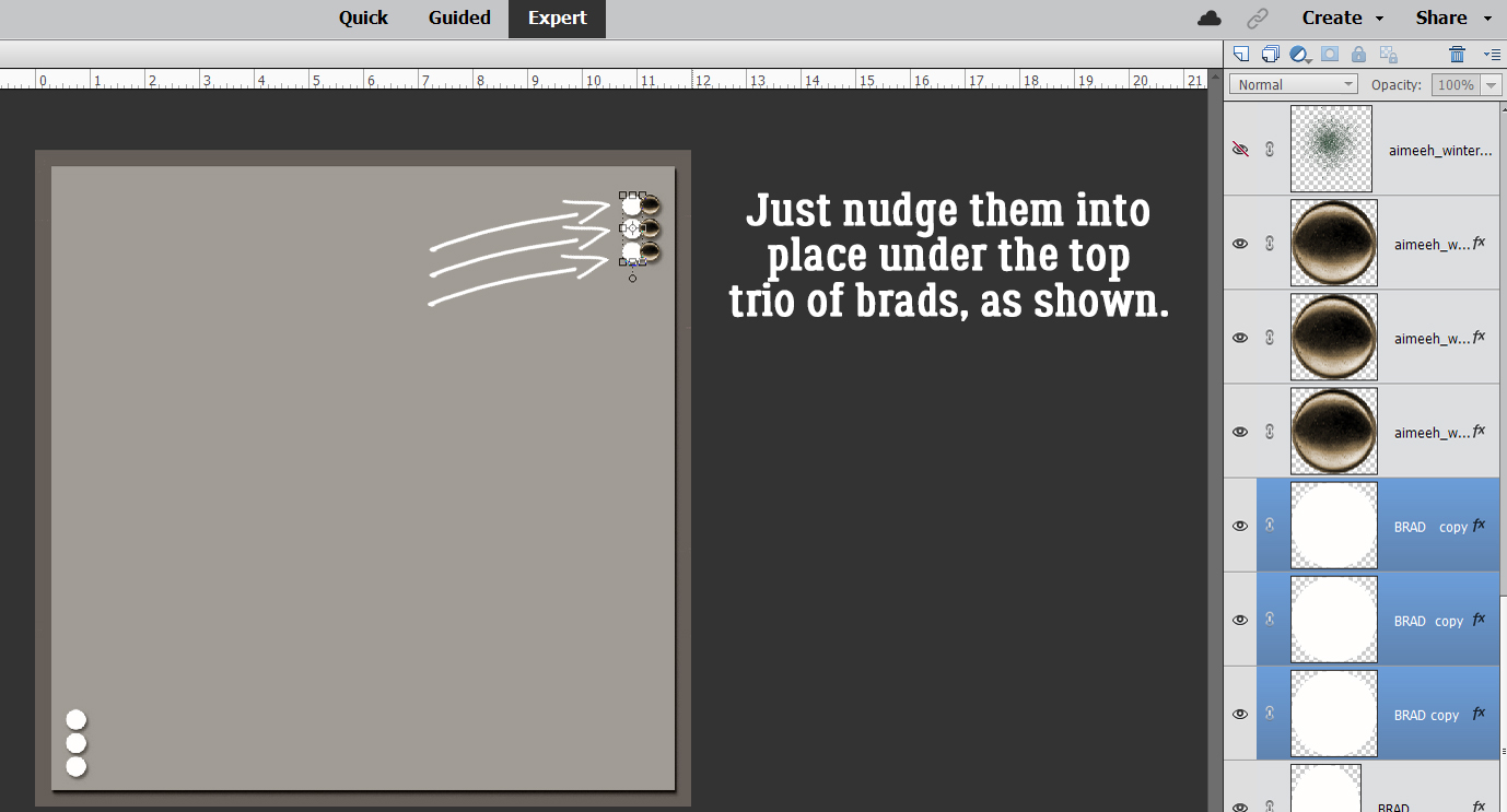
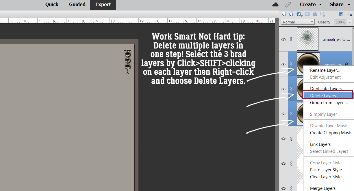
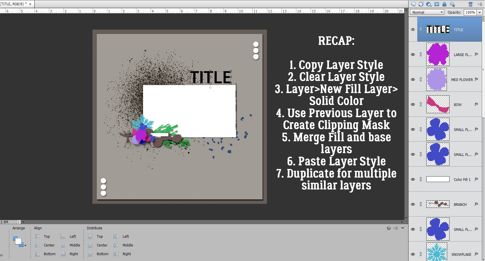
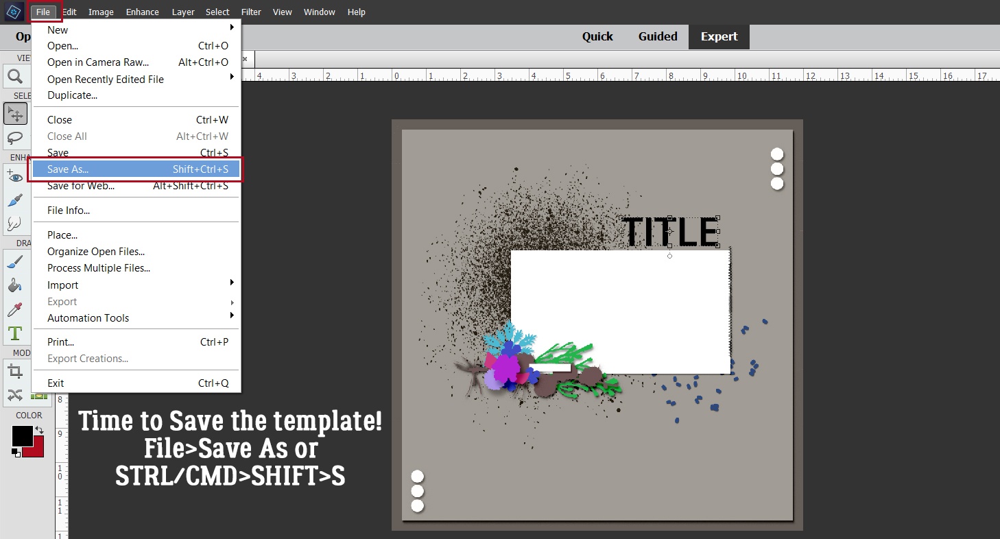
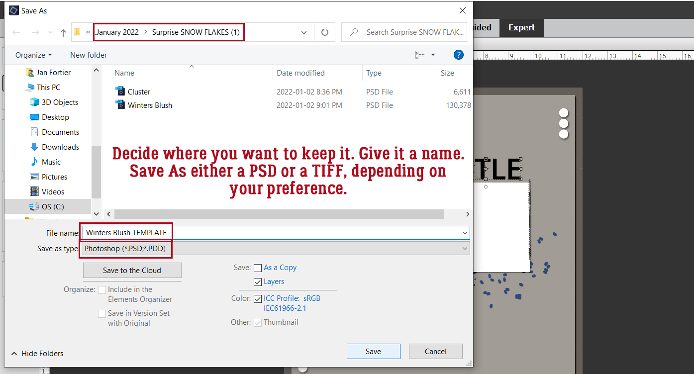
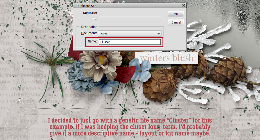
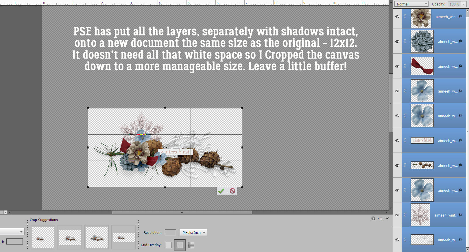
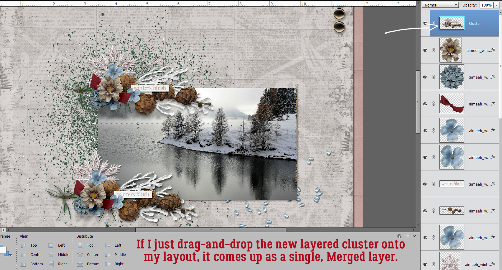
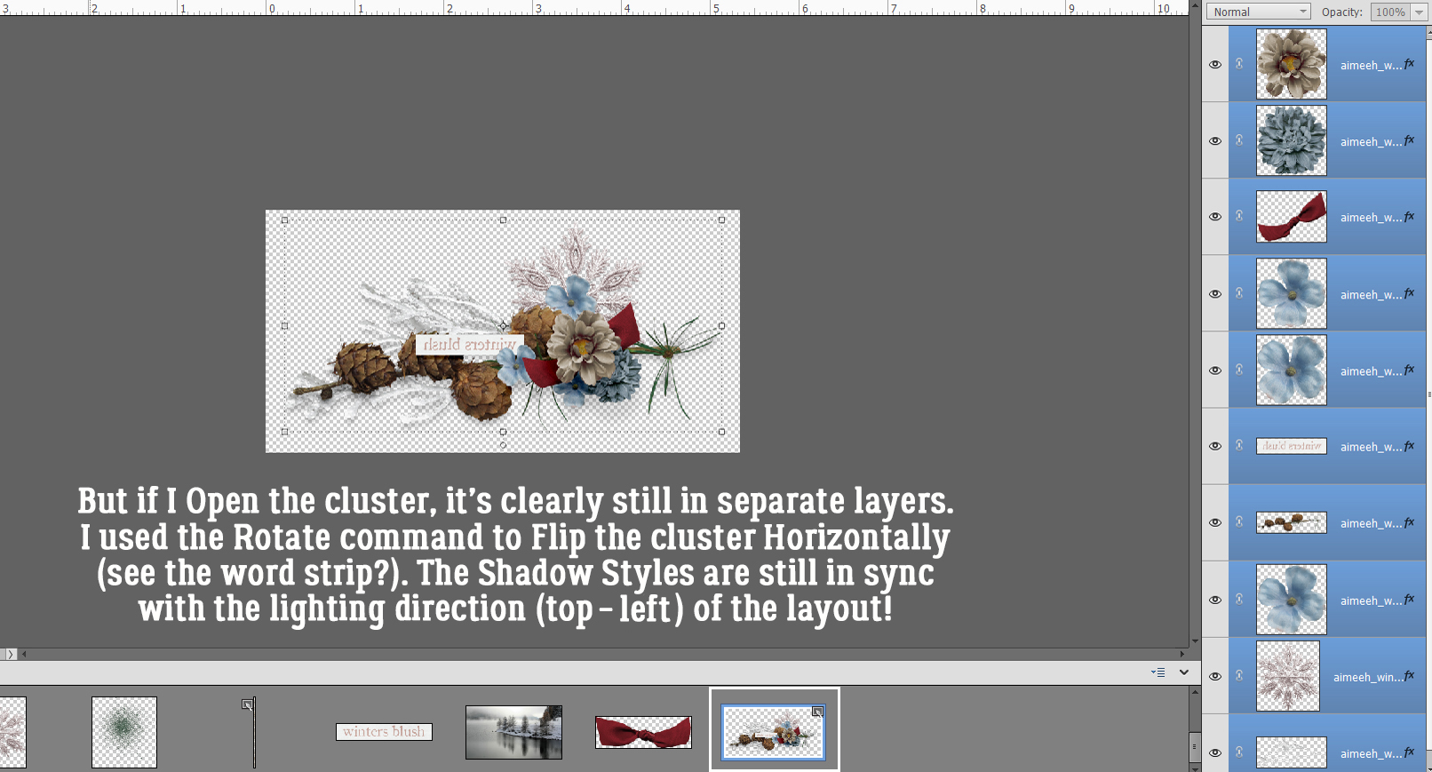
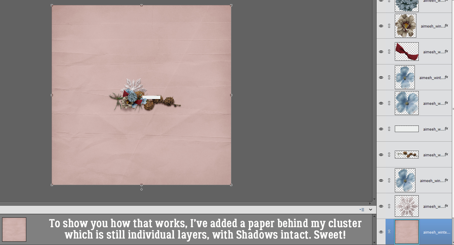
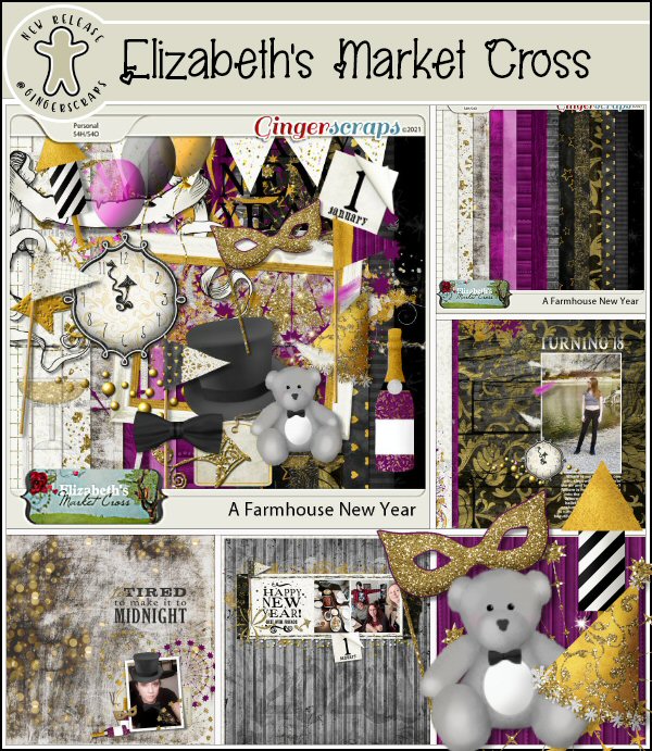
How is it even possible that January is almost over already? It’s not even like I got anything accomplished this month. Except getting back on the one med that controls my “functional dyspepsia” and also treats my insomnia… that was a good thing. Anyway, I thought we’d get a jump on Valentine’s Day and check out some new(er) fancy fonts that would be useful for layouts, wedding invitations and cards so I popped in at DaFont.com and had a look. They’re always adding new fonts (and dingbats!) so there’s often some new and unexplored (FREE) goodies there. Each of these is linked through the name of the font – bolded and in red. Just click on it and you’re there. I’ve got a dozen fonts and three sets of dingbats, so let’s have a look!
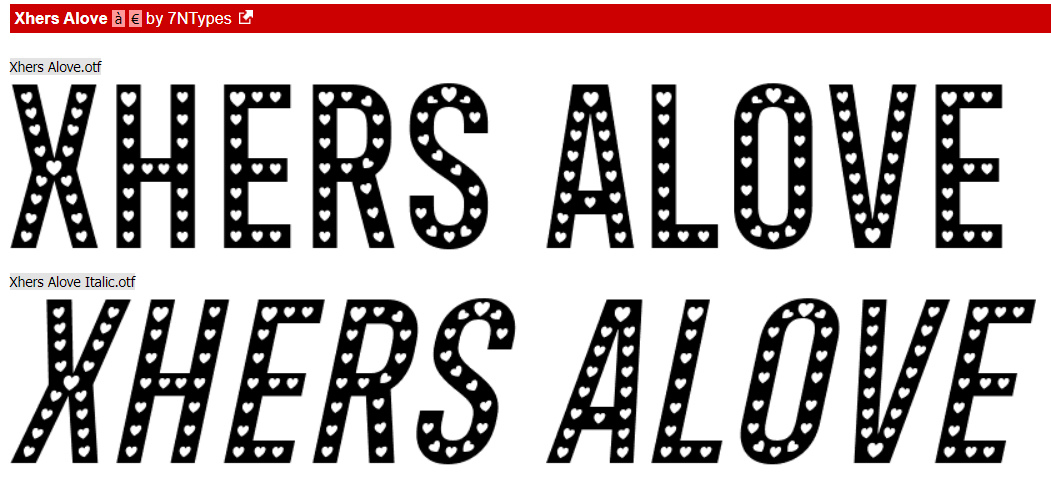
First up is Xhers Alove. As shown, both regular and italic versions are included. It would be good for titles and to draw attention to your message. Look at all those cute little heart cutouts!
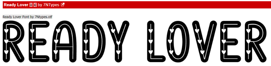
Ready Lover can be manipulated in SO many ways. I’d throw a Bevel at it to bulk it up and maybe put it on top of pink or fuchsia paper. It’s a title font, without question.
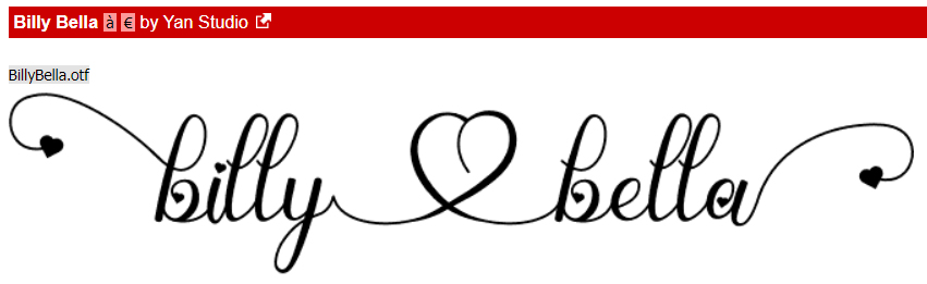
I’m such a sucker for swirly script fonts. Billy Bella ticks so many boxes for me. I can see it as a subtitle or without the extra glyphs, as text. What are your thoughts?
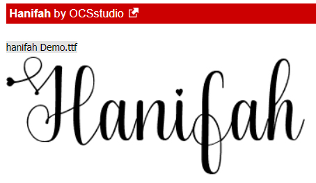
I adore this upright script font, Hanifah. It’s sophisticated, pretty and only a little fussy. It would work nicely for journalling, I think.
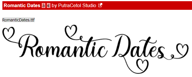
This one, Romantic Dates, is a bit sturdier but swirly. It’s versatile like Billy Bella, with many options for use.
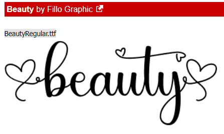
Beauty is another very useful font. Pretty, swirly but highly legible, you can use it for anything your heart desires.
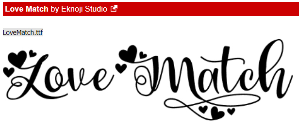
Isn’t Love Match quirky? With or without the glyphs, it’s got potential.
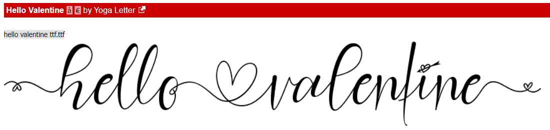
I think I swooned a little when I saw Hello Valentine. That cupid-heart dot over the “i” is so fun! The uneven baseline and the scripty look are so current.
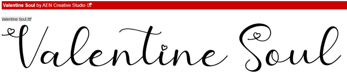
Valentine Soul has a broader wheelbase than some other script fonts, and it’s a great all-purpose font too!
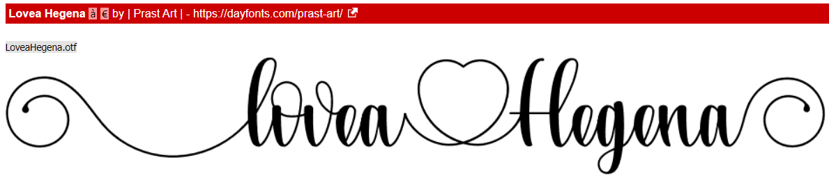
This font is such a contradiction… compact AND zaftig at the same time! I can see it on a wedding invite pretty clearly. Lovea Hegena could even be used as a divider.
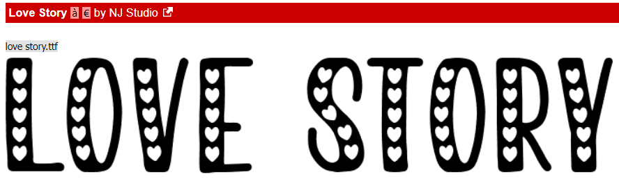
Love Story has those cute little cutout hearts, and would be a perfect title font. I might apply an acrylic Layer Style to it, and then stick it on a contrasting paper to give it real presence.
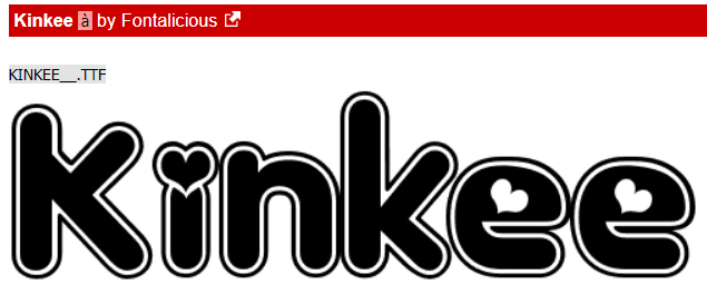
This is an older font, but I’ve never seen it anywhere else. Don’t let it throw you, it’s Kinkee in name only. It’s got so much potential too. Layer Styles would turn it into a phenomenal alpha!
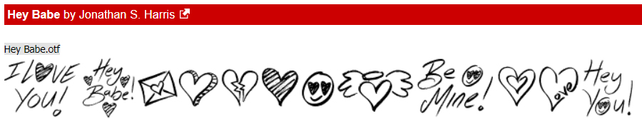
Now for some dingbats. These are little pictograms tied to the alpha keys. Hey Babe looks a lot like graffiti and could be stunning on a chalkboard paper.
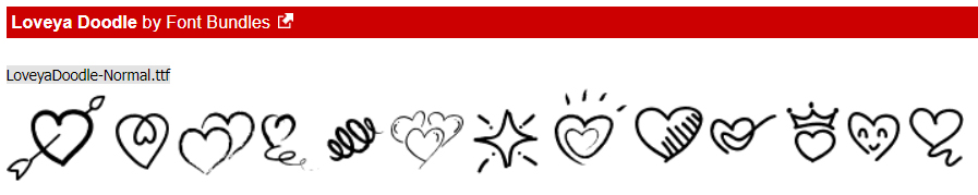
Loveya Doodle is chock-a-block with doodly hearts. They could be used like brushes to jazz up your background papers.
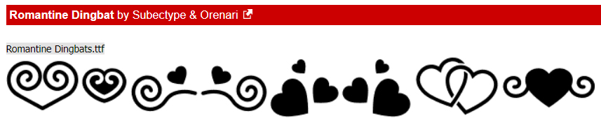
Last, but not least, Romantine Dingbat is a more solid doodly set, and I think they’d make amazing scatters. Maybe with a glitter-gloss Layer Style?
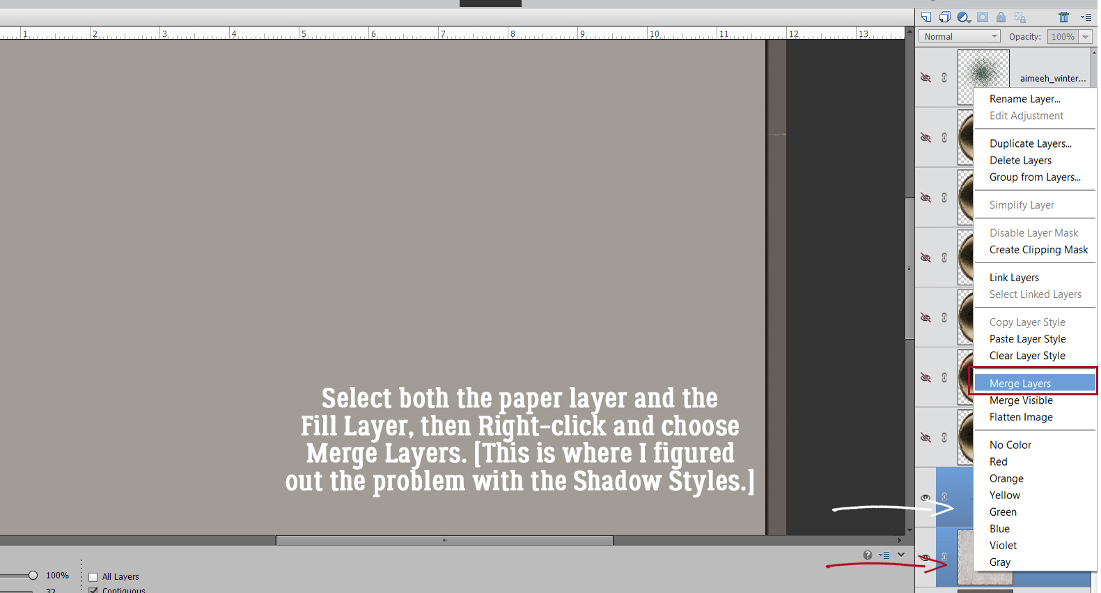
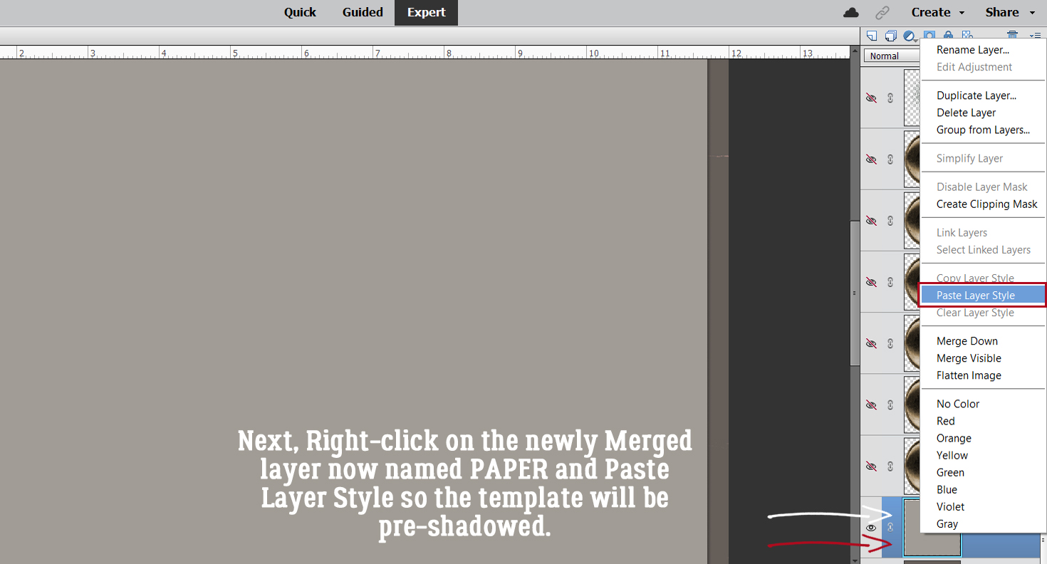
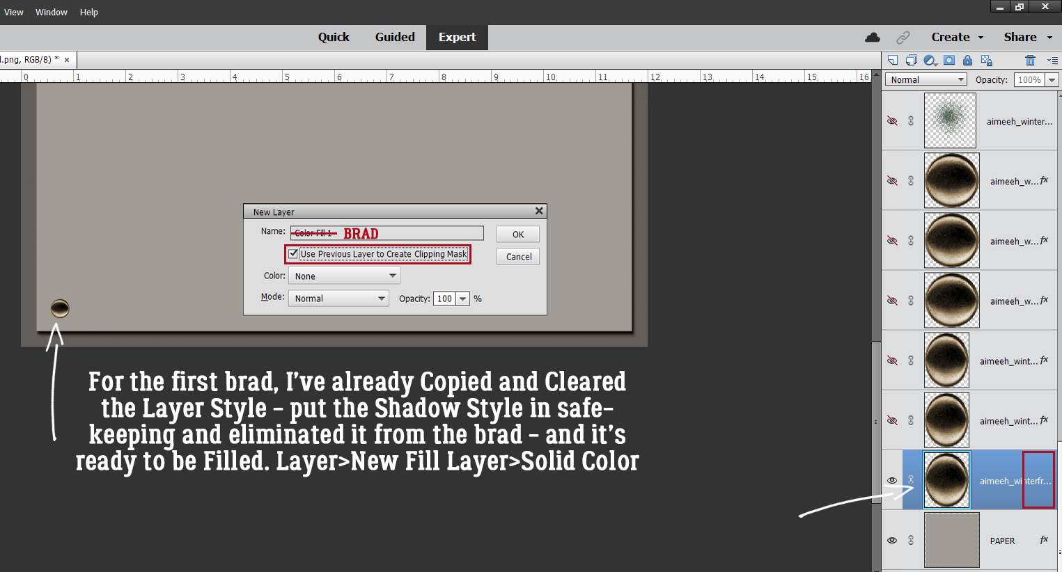
For next week’s tutorial, I’m planning another paper-to-digi technique very appropriate for Valentine’s Day. It’s coming together in my head, I just have to translate it into something approaching coherence. Til then,
PDF Version : https://bit.ly/3AMYGYw
![]()