Welcome to the first Friday in July. Here in the US, we are getting ready for a big holiday weekend. It’s always a fun time with family and friends, although the groups will be smaller this year.
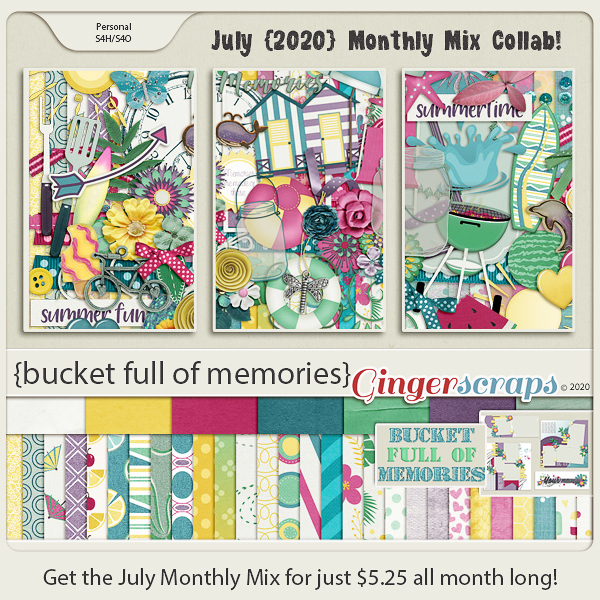
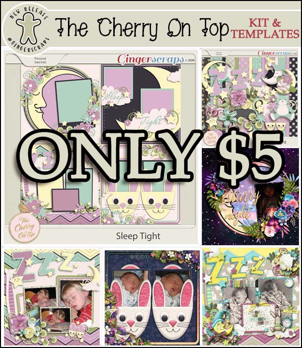
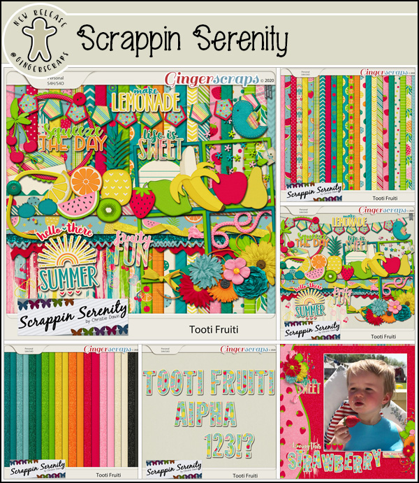
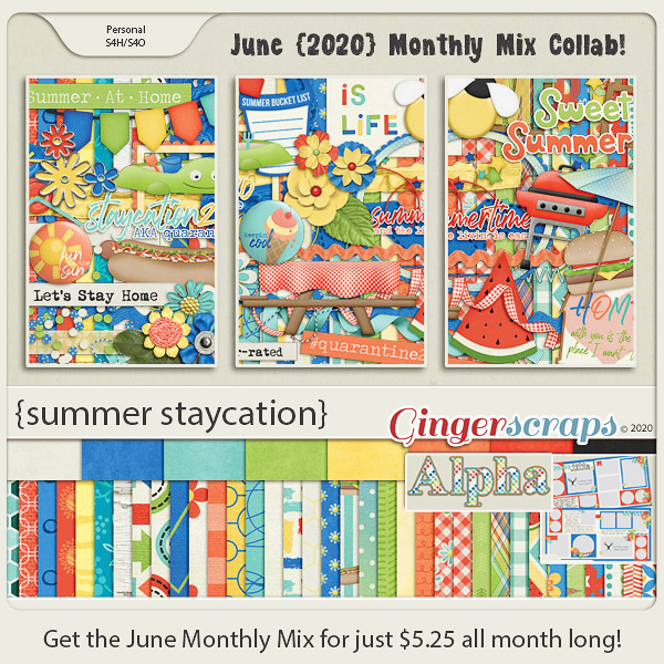
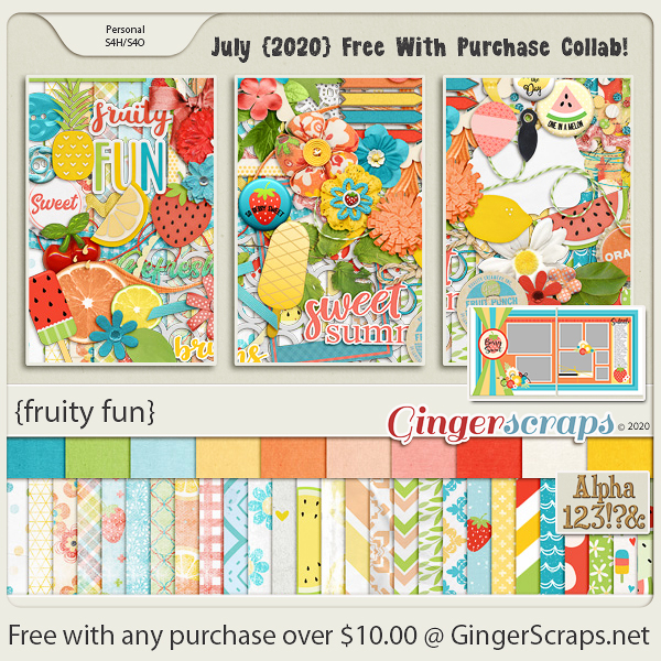
If you spend $10 or more in the store you get this awesome kit for free. Doesn’t it just scream summer?
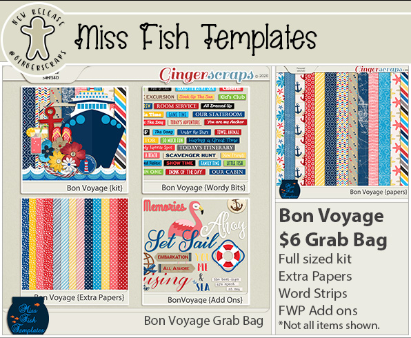
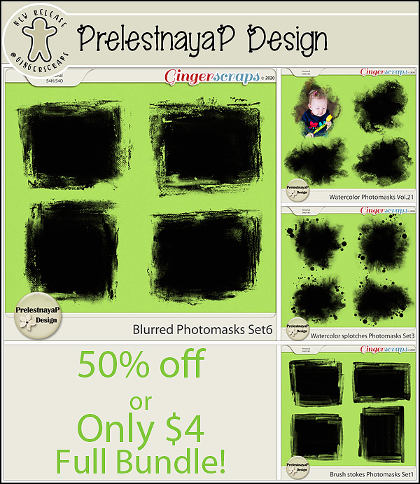
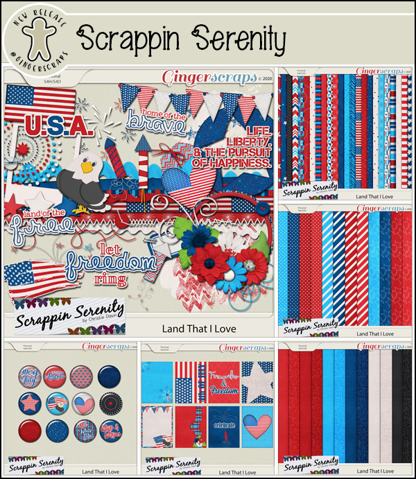
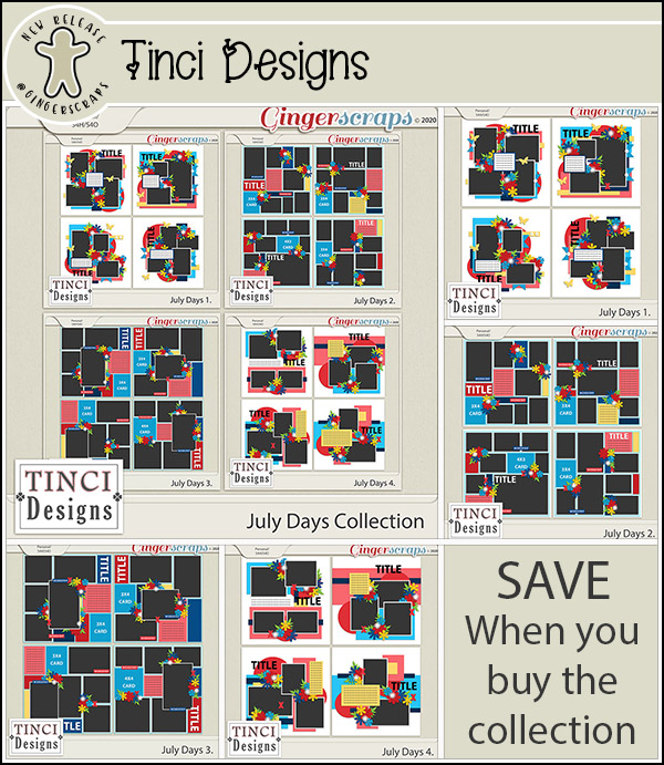
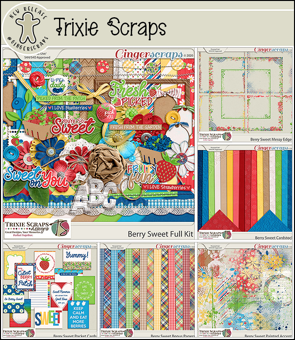
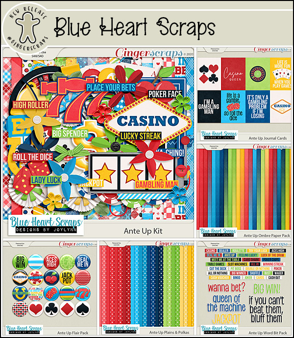
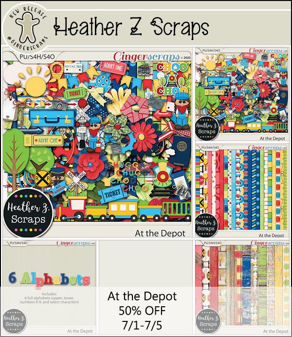
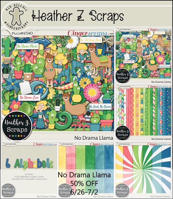
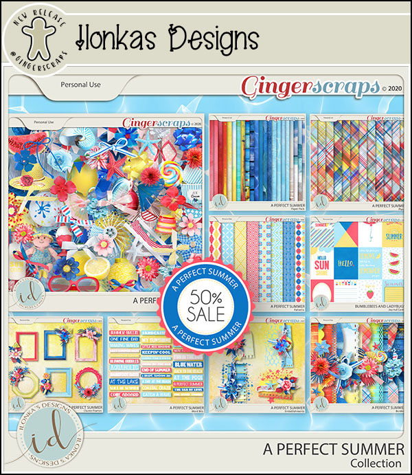
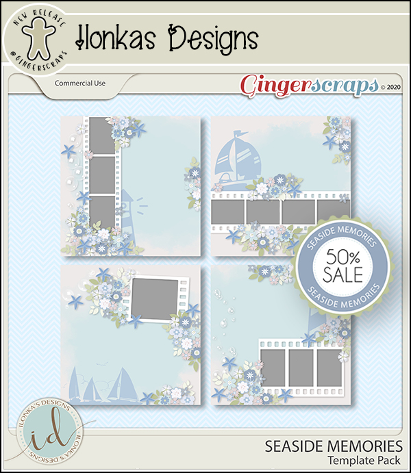
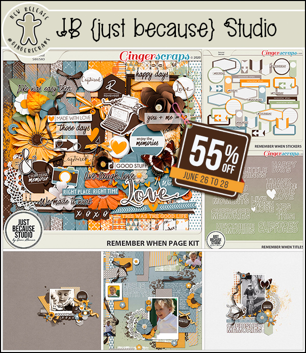
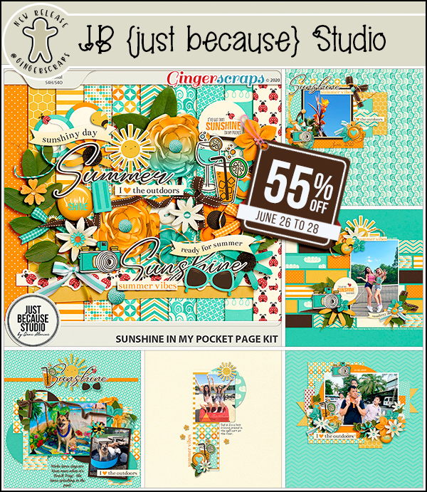
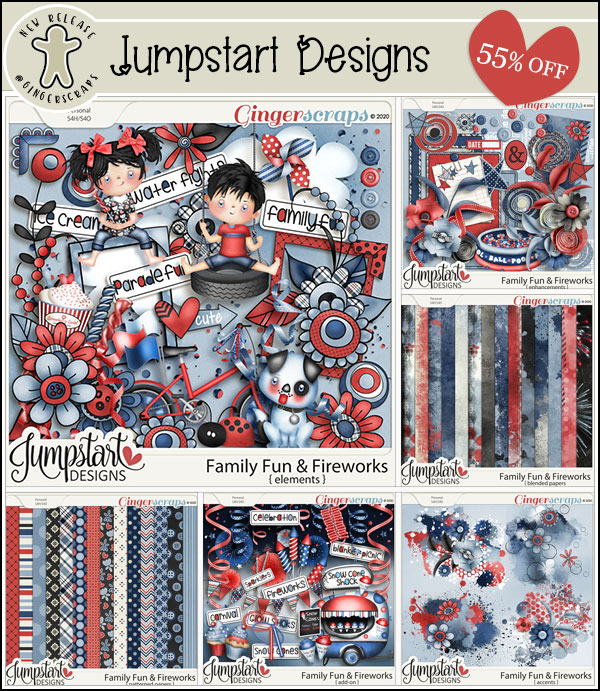
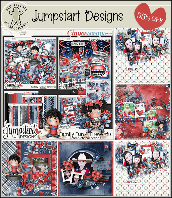
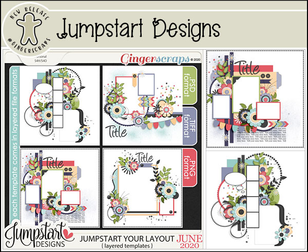
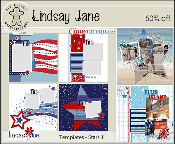
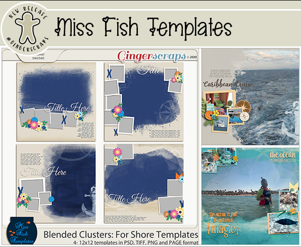
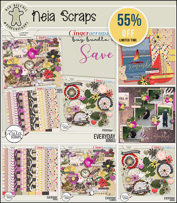
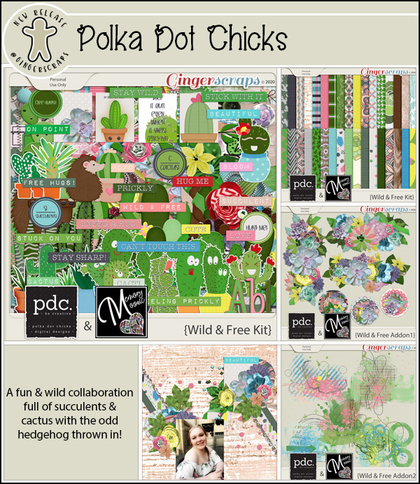
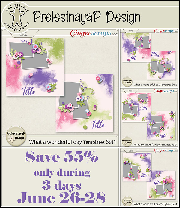
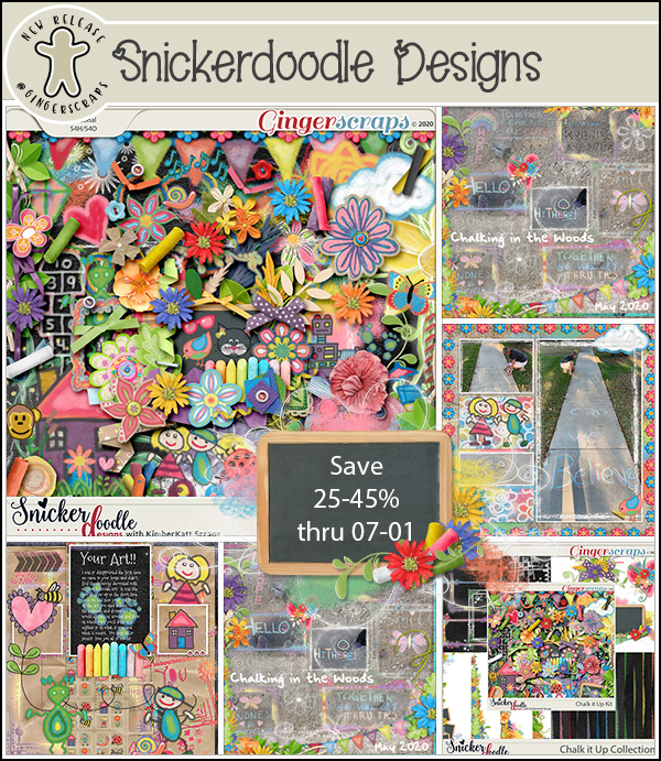
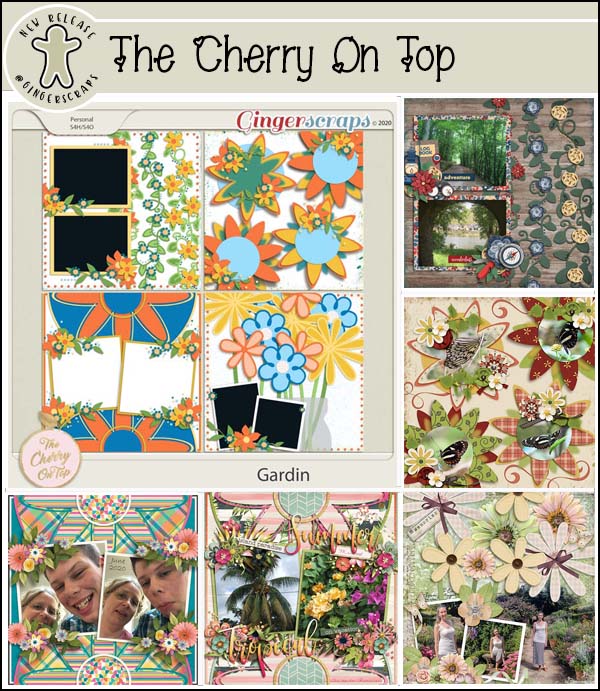
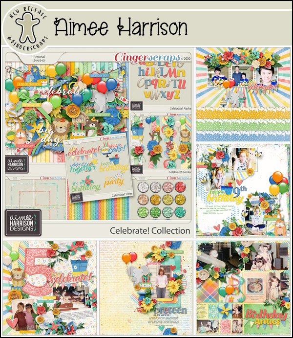
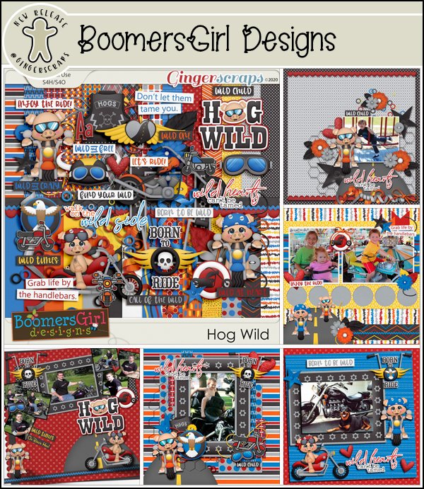
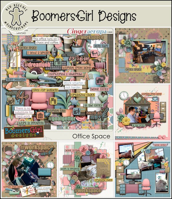
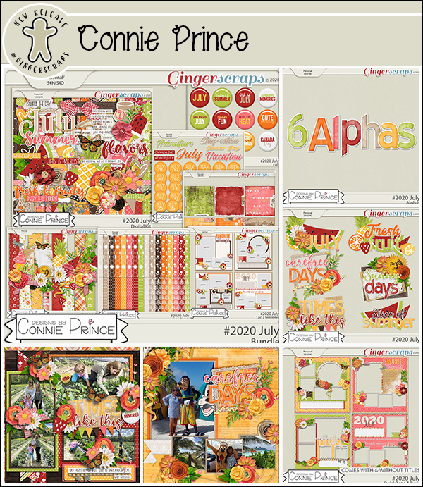
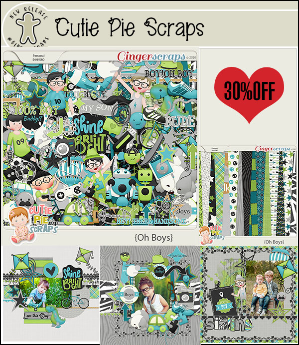
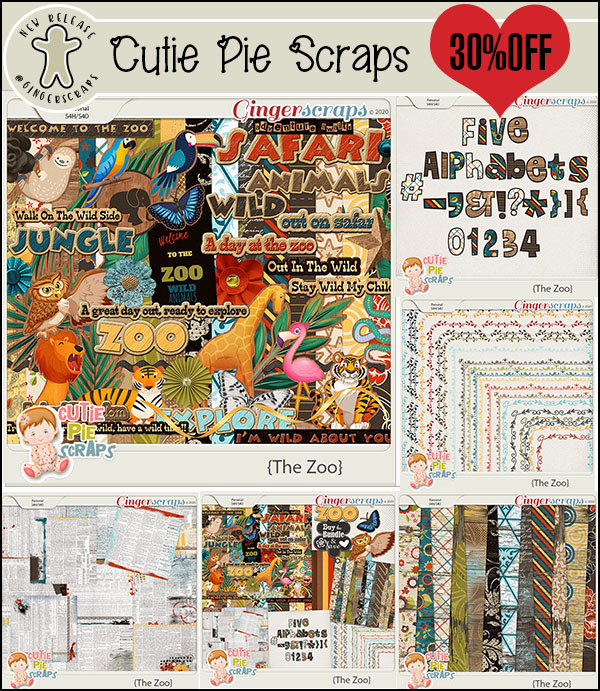
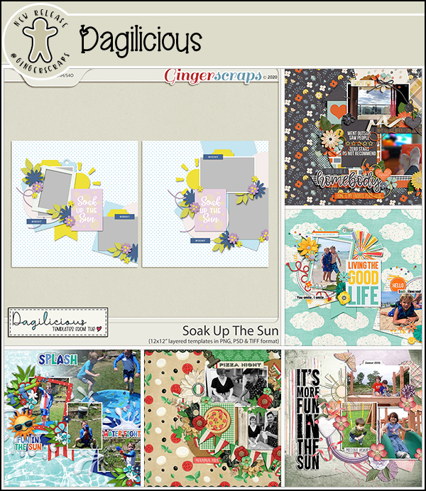
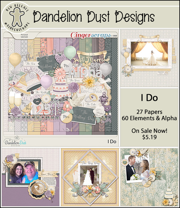
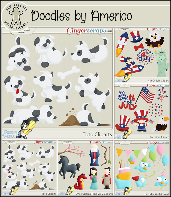
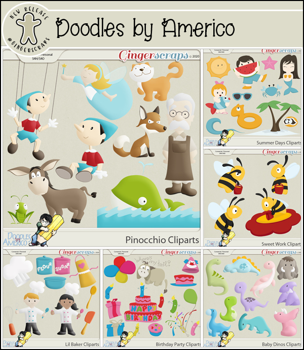
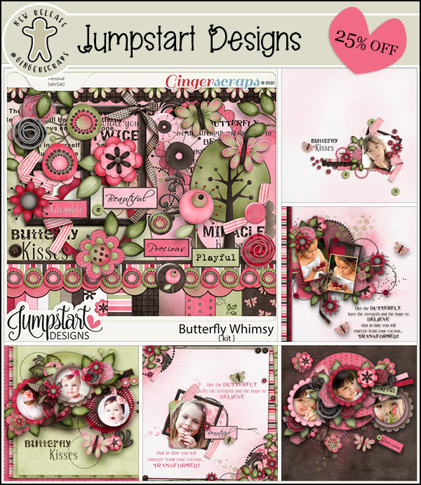
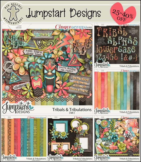
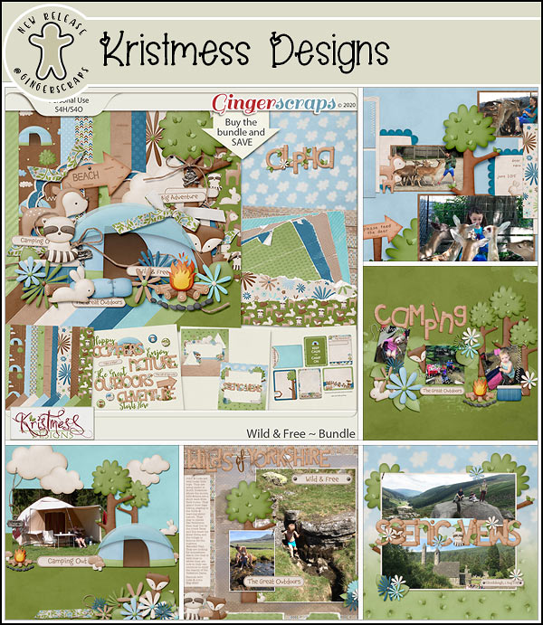
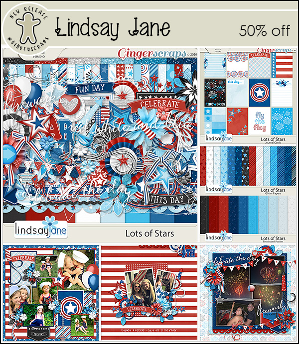
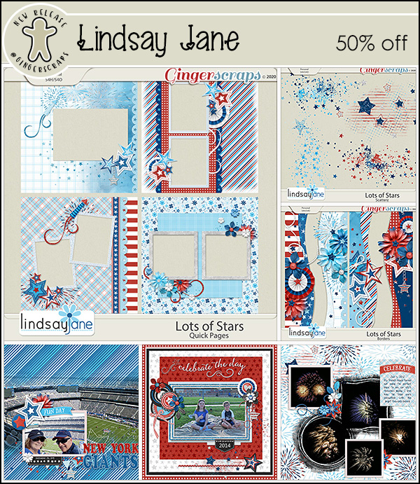
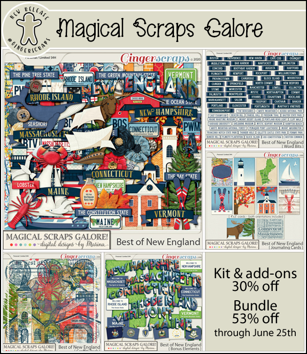
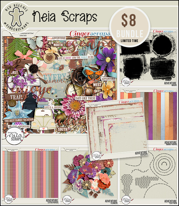
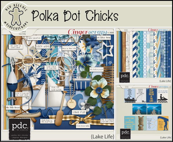
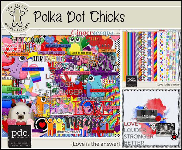
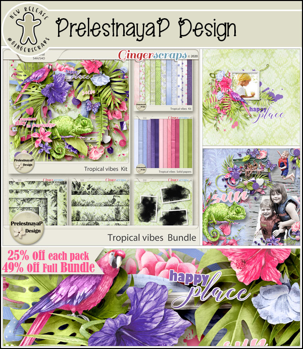
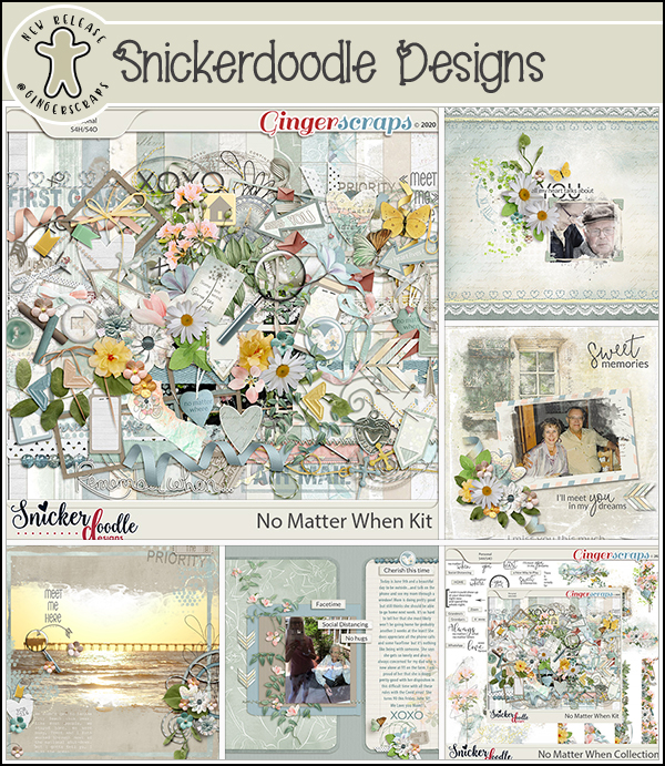
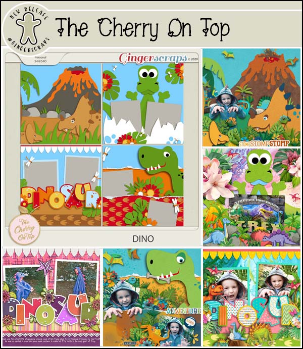
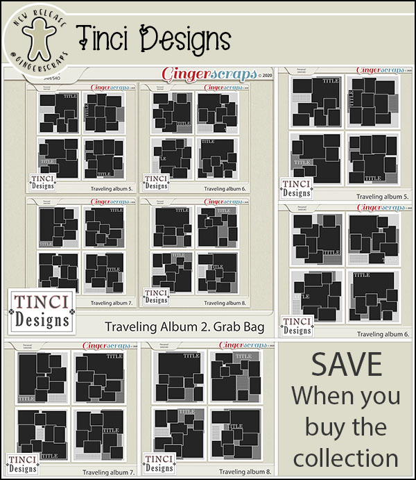
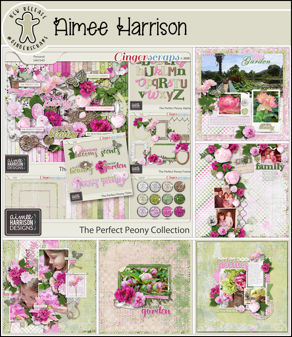
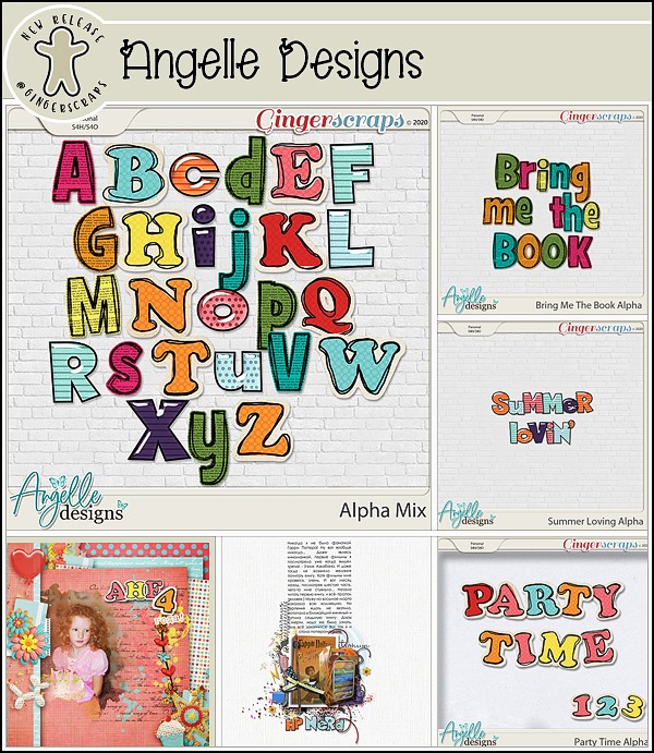
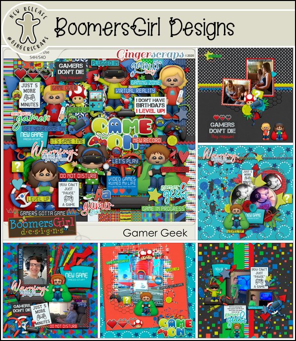
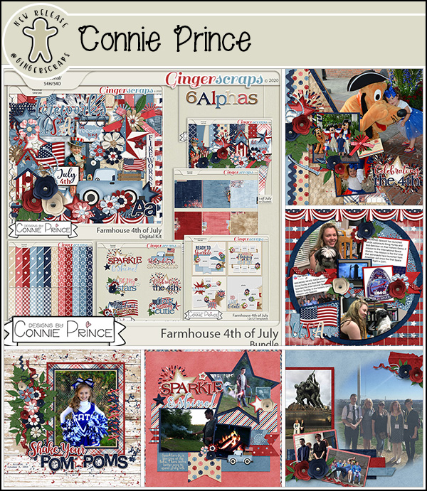
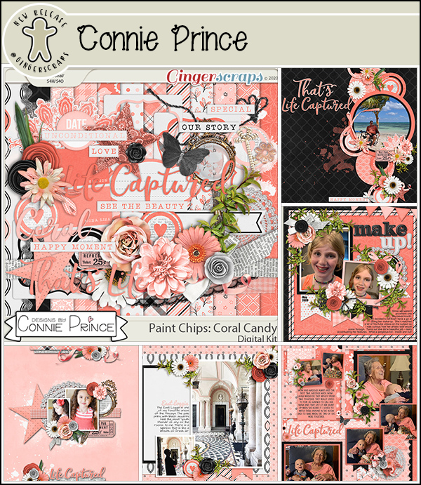
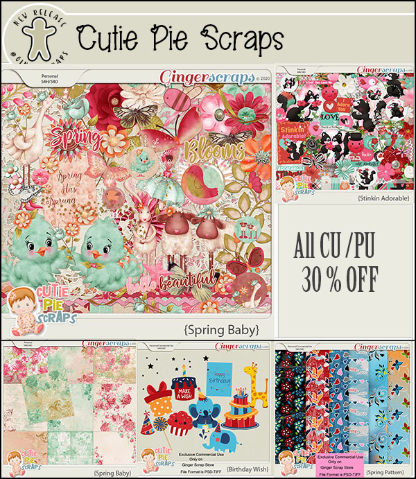
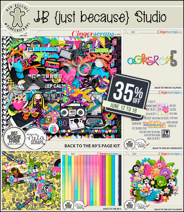
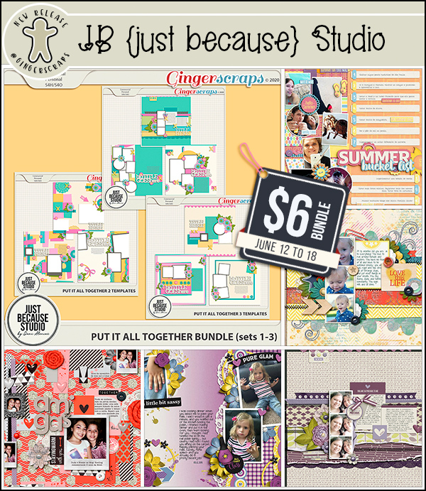
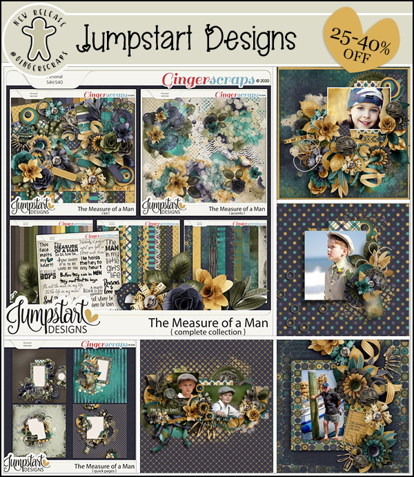
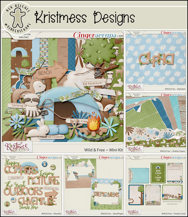
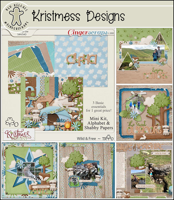
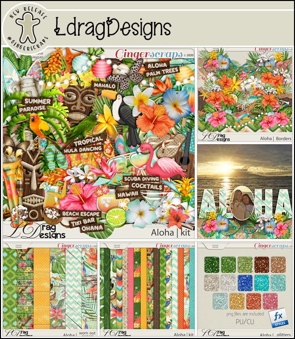
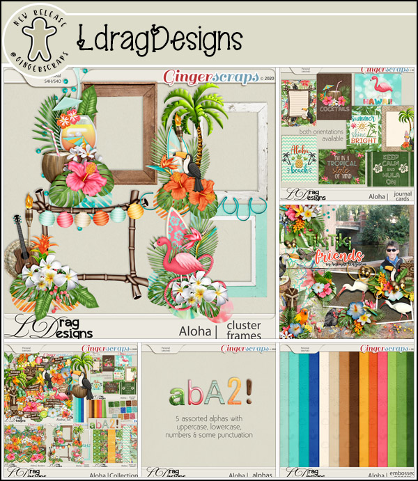
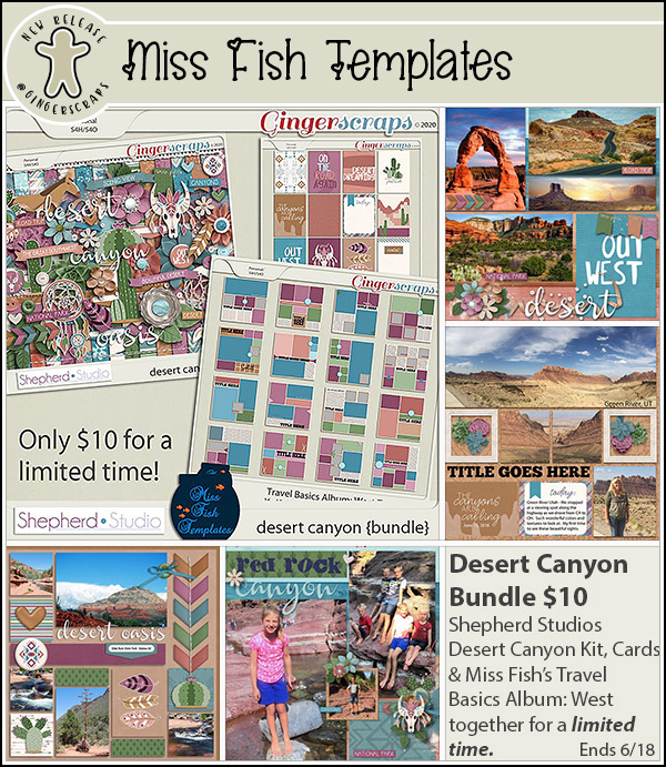
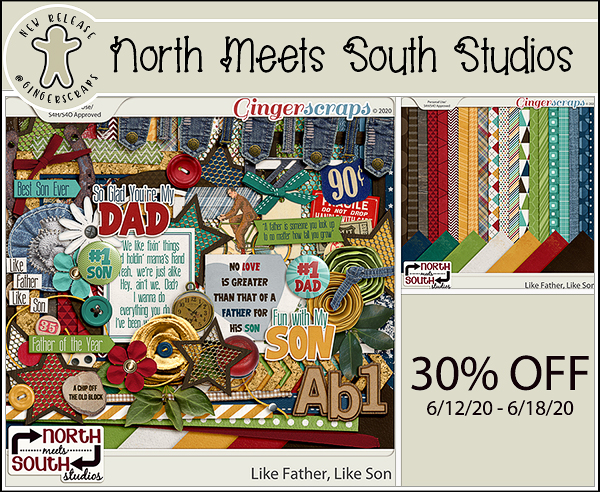
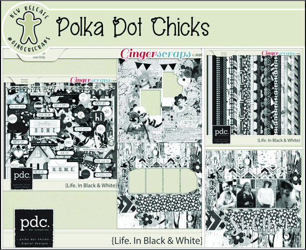
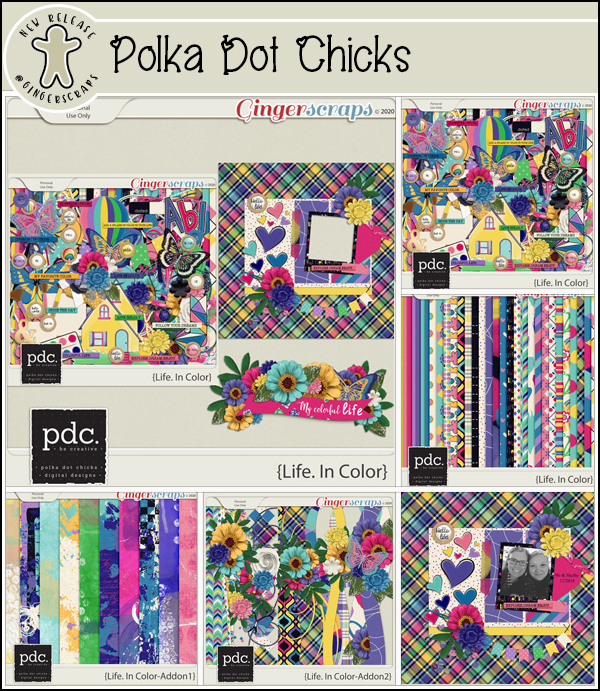
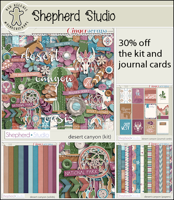
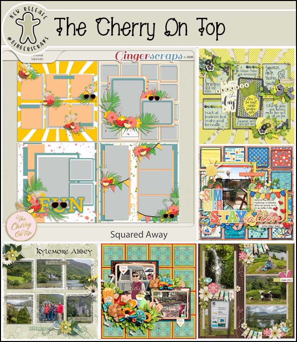
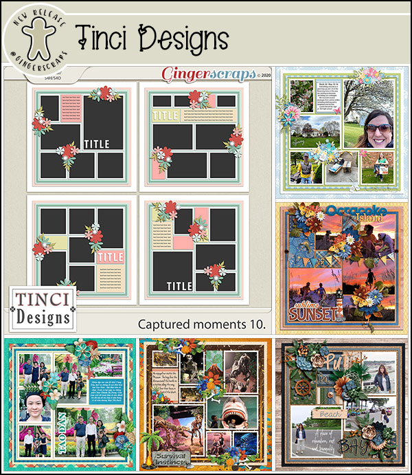
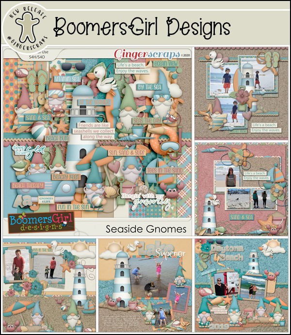
Let’s take a look at some of the new kits in the store today.


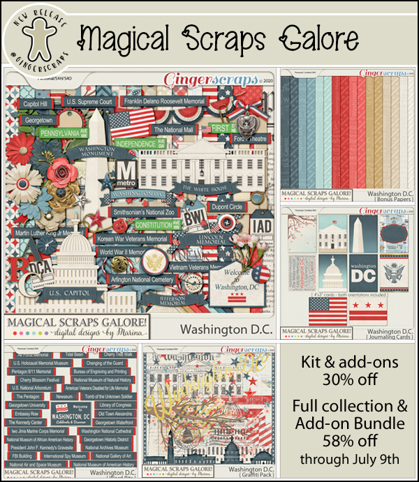


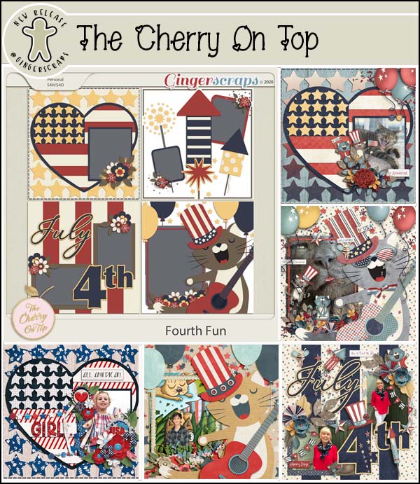

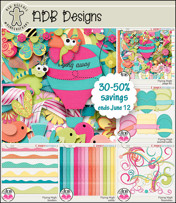


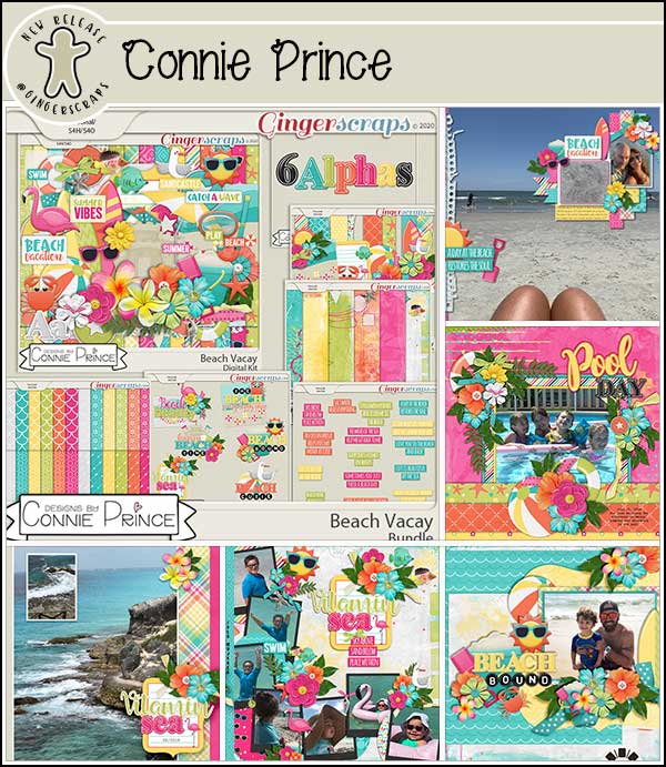


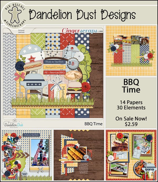


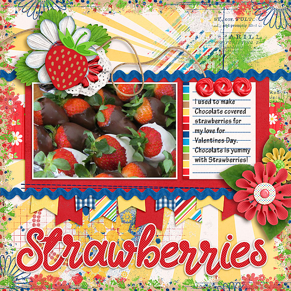
Aren’t those just lovely?
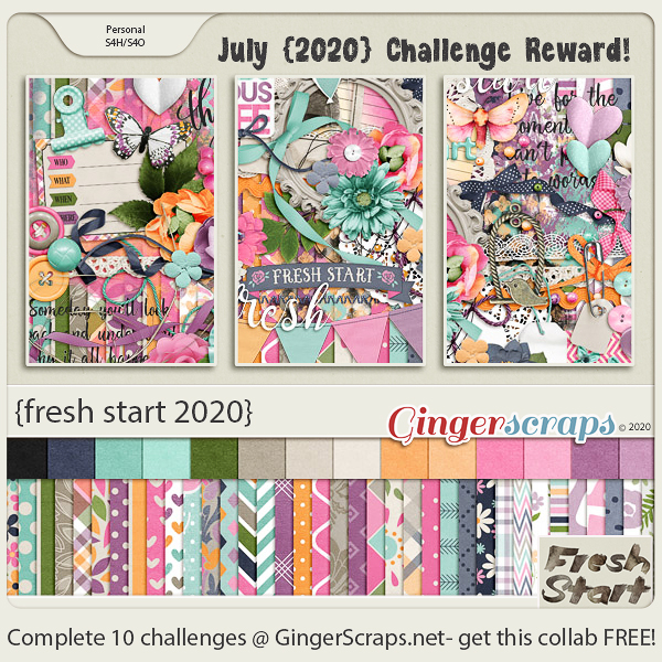
Remember, if you complete 10 challenges you get this wonderful collab from the GingerBread Ladies. I think we need a {fresh start 2020}, don’t you?