Taking Distress to the Next Level
![]()
PDF Version : https://bit.ly/4d1IYdD
Happy July! Happy Canada Day! Happy Independence Day! Happy Muharram! Happy Bastille Day! On to the second half of the year……….
Last week’s Quick Trick elicited this response from Steph: “I gave this tut a try and like the effect I got. While I was reading the text, i was thinking that we would be “roughing up” the edges of the text or shape. What i ended up with was a distressed look on my whole word. Is it possible to do a roughed up edge just on the outside edge? This might be tough on a font, but would a simple shape be more possible? Thanks!” Well, yeah. It’s possible! Some parts of this technique are similar to an old, old tutorial on inked edges, but I’ve added some twists.
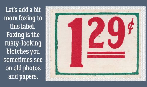
What better object to create a beat-up look on than a piece of ephemera? I chose this price label from the GingerBread Ladies‘ collab Like Them Apples. If you look closely along the right side of the label, it shows some foxing – that rusty, splotchy, discolouration seen on old photos and documents. We’re going to add some foxing to the lower right corner of the label.
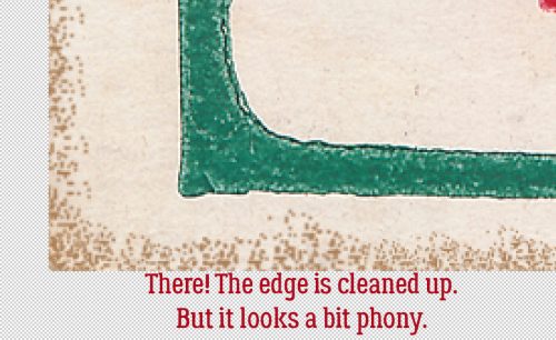
Because we’re working with the Brush Tool, repeat after me: “Brushes go on their own layer!” Before we go any further, pop a new blank layer on top of the Label Layer by clicking on the sheet of paper icon to the top left of the Layers Panel. My foreground colour was picked using the Eye Dropper Tool, from a darker are of the foxing already on the label. Now to choose a Brush. In the Natural Brushes set there are a bunch of Stipple Brushes. (One of the most recent updates to my firmware removed my ability to show you a lot of things, like the Brush Options Panel in screenshots. Grr.) I chose the 21 pixel size, then Resized it to 30 pixels. (To quickly Resize Brushes on the fly, use the [ – bigger and ] – smaller keys.) Then I clicked the Brush – Opacity at 100% – randomly along the edge of the label, overlapping the edge in several spots. That’s not a problem, it’ll be fixed in a minute. But don’t DRAG the Brush, that just makes a mess.

When I’ve got enough colour there, next step is to Select the outside edge of the label. With the Brush Layer active, CTRL/CMD>click on the Label Layer Thumbnail. The marching ants will appear around the edge.

If we went ahead and Cut away the Stippling right now, it would disappear from INSIDE the edge, so the Selection has to be Inverted. You can click Select>Inverse or use the keyboard shortcut CTRL/CMD/SHIFT>I.

If it seems like I’m belabouring the point about being positive what Layer is active, it’s because I am. Edit>Cut or CTRL/CMD>X the stippling that falls outside the label’s edges to clean it up.

The only issue I have with how it looks is that it’s a bit too dark and looks artificial. Easy fix!
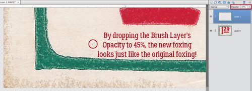
I’ve circled a foxed spot that was part of the label before I started messing it up. I used it to guide me as I dropped the Opacity of the Brush Layer to 45%. Now it looks natural!
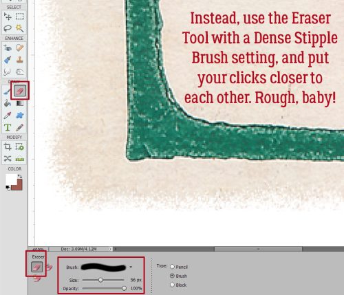
To simply rough up the edge, rather than Brushing ON, Erase away! Choose the Eraser Tool, pick one of the Dense Stipple Brushes, make it fairly big and rather than spreading the clicks out, group them closer together. (I’ve put a white background layer behind my sample so you can see the rough edge better.) If you want to give the effect of white-core cardstock, “fox” this new edge using white. So many ways to make this work!!
Now let’s distress this baggage label from Cindy Ritter‘s One in a Melon. The label has been crumpled, but if it had ever been on a bag, it would look more beat up than this.
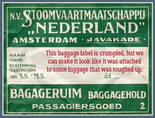
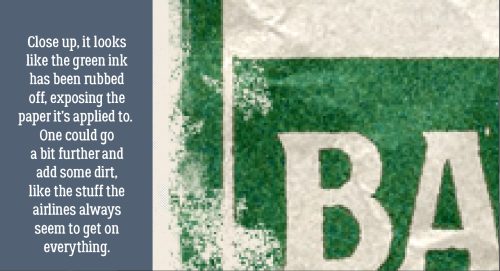
This kind of label is ink-printed on heavy paper, so distressing it should show the base paper through the ink. To that end I picked my colour from the lightest cream area of the paper. I’ll use a Dry Media Brush, Pastel on Charcoal Paper to add some “wisdom” to the label.

On your shiny new layer that you’ve popped on top of the label, start clicking the Brush over areas that logically would be rubbed against the wall or other baggage. The tops of those creases need to be rubbed a bit too. You can adjust the size, roundness and angle of your Brush by clicking on Brush Settings… and making your changes.

Now, if you’re really Type A and want to replicate what your luggage tag looked like after your last airline experience, you could add some dirt….
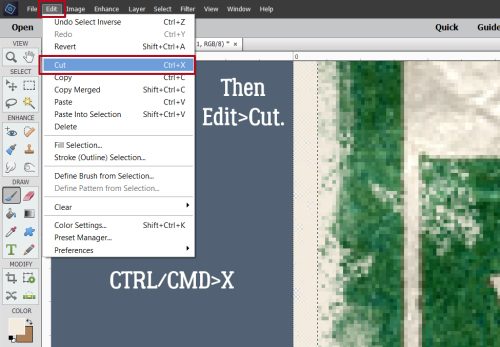
Once you’ve got your label roughed up enough, Select the edge of the label as we’ve done before, but with the Brush Layer active.

Invert your Selection.

And clean up your background.
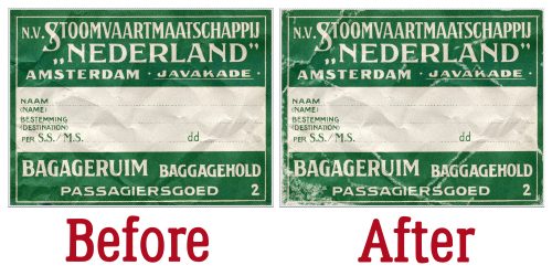
Yep, it’s scuffed alright!

Side-by-side comparison…
Does that give you some ideas, Steph?
![]()


