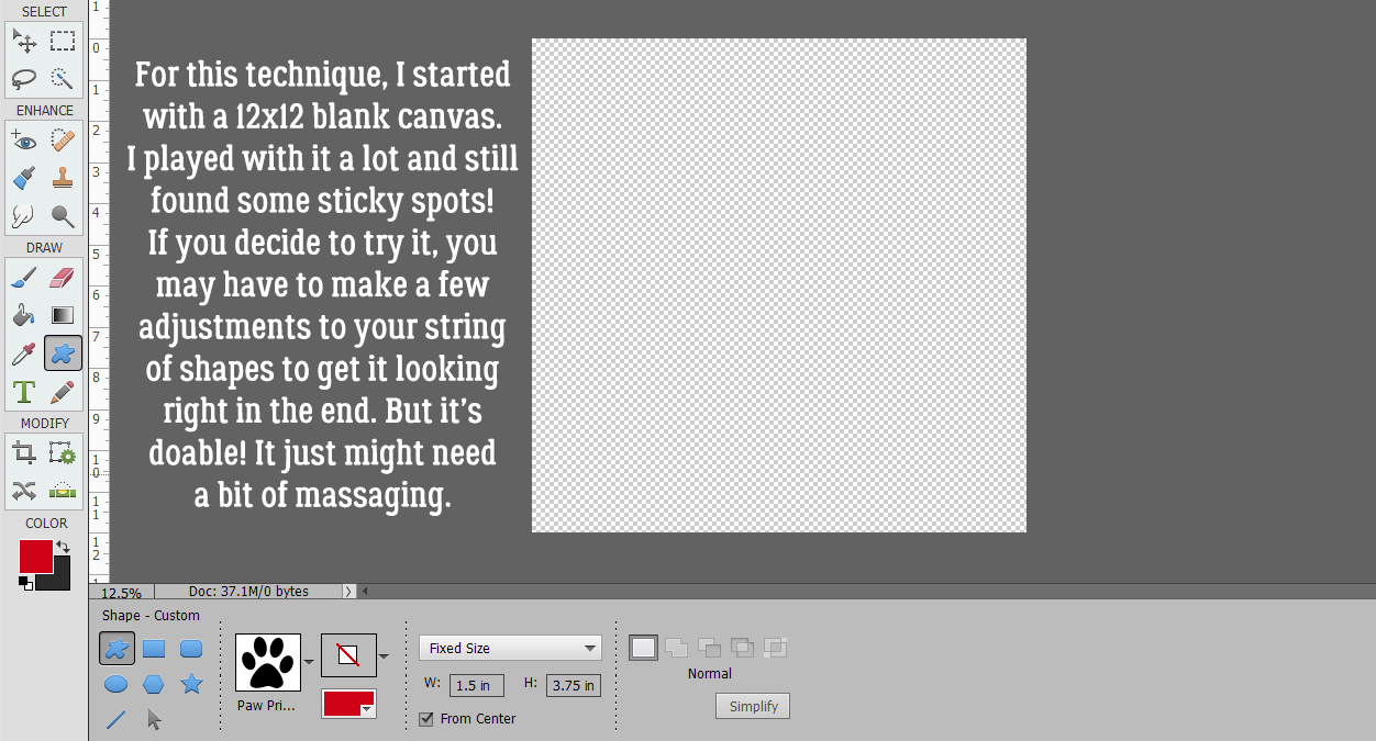
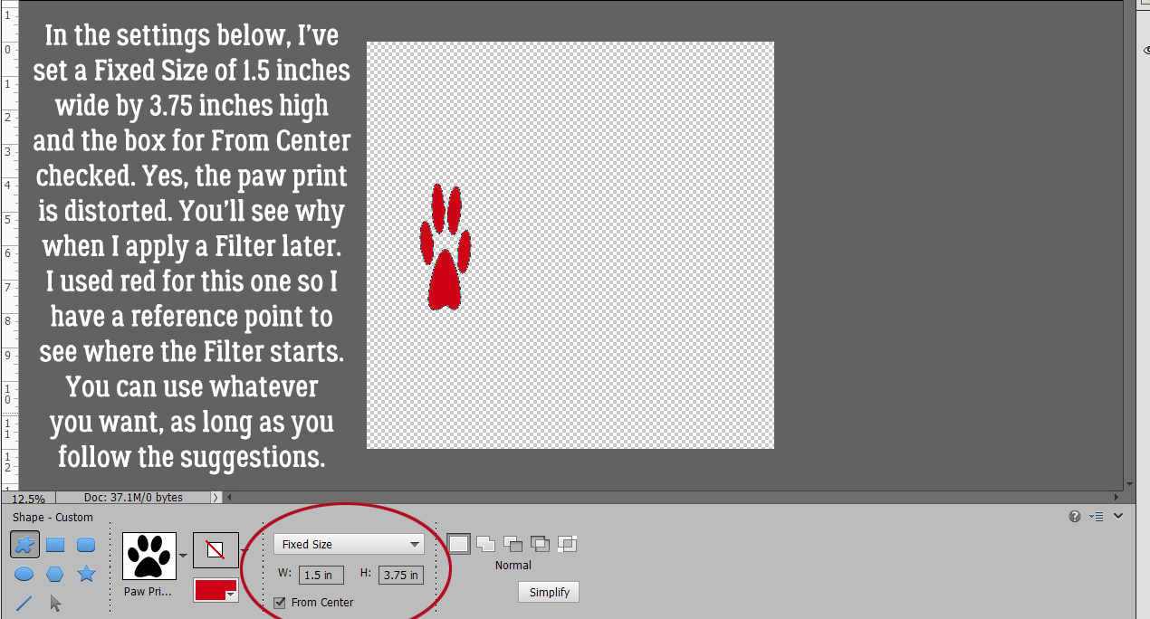
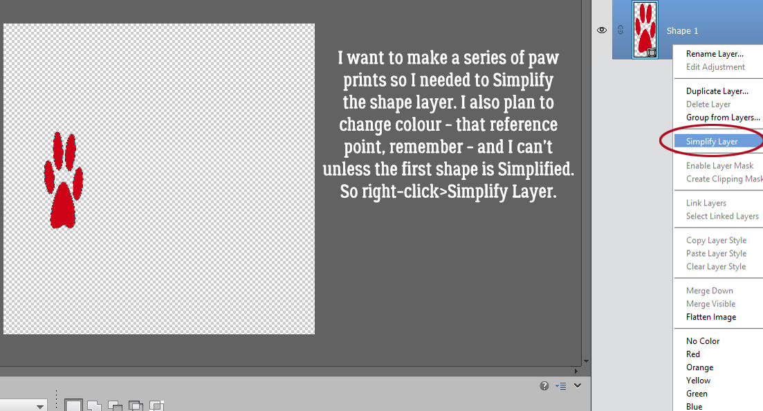
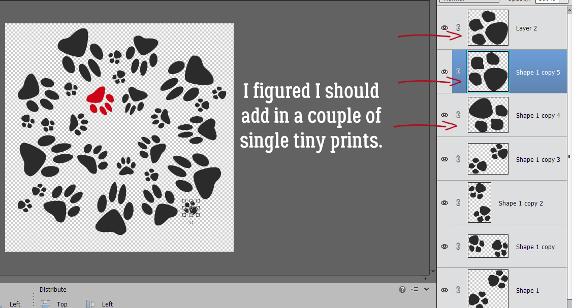
Gradient Border Masks – So Many Options!
![]()
The other day, I got a message from Ginger that a customer was looking for information on how to use Lindsay Jane‘s border masks, and wanted to know if I had a tut for that. Well, I didn’t. The customer specified she had Border It 28, so I popped over to the shop and bought them. And then I played with them.
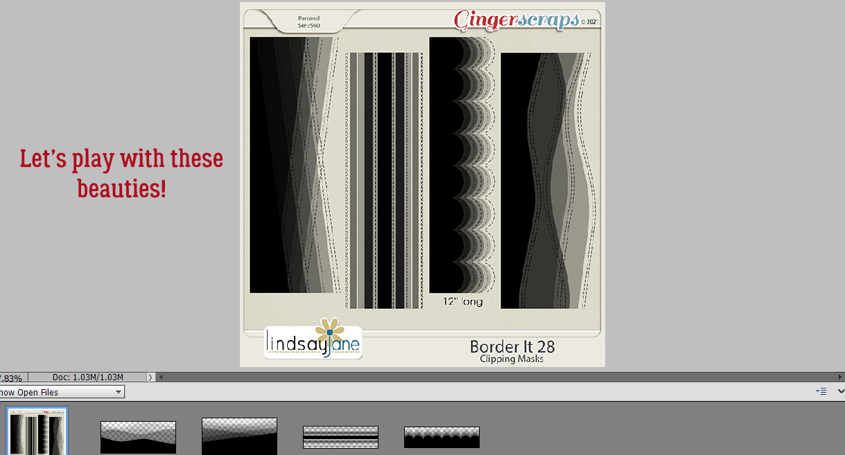
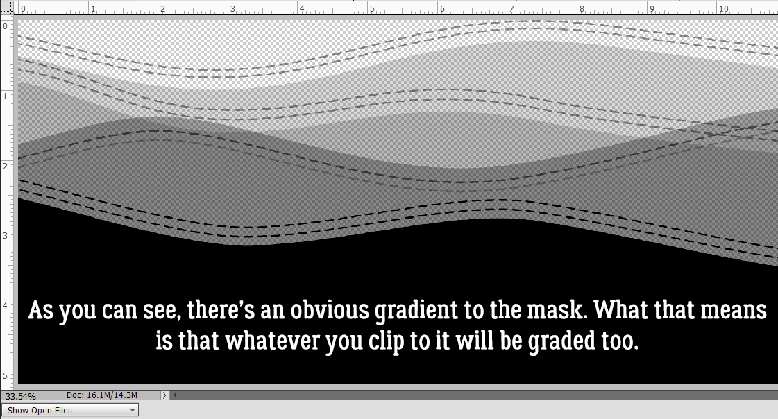
A close-up look at one of the border masks reveals a gradient effect. What this means is that whatever is Clipped to it will also have a gradient. Where the mask is solid black, the paper or photo clipped to it will be 100% visible. As the mask becomes more transparent, more of the paper behind it will show through. This can be a really interesting look, but it’s going to require some experimentation to find a look that appeals to the beholder.
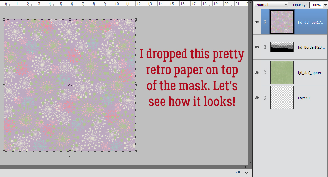
I’m using papers from a retired kit from Lindsay Jane‘s store, called Denim and Flowers. I’ve pulled a couple of solids and a couple of patterns to play with. Let’s give it a shot!
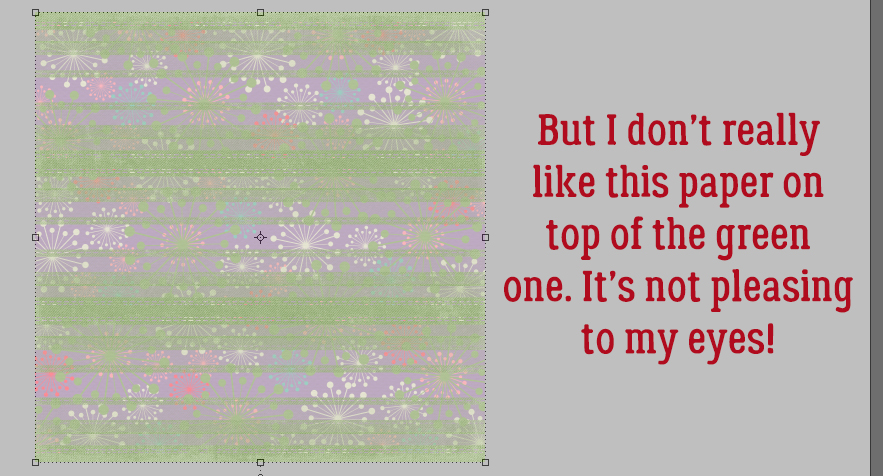
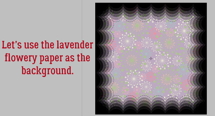
I love the retro look of these patterned papers. This lavender one is so pretty.
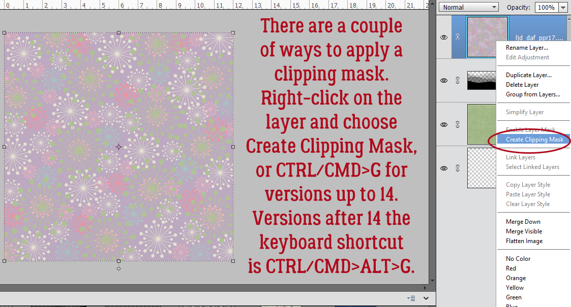
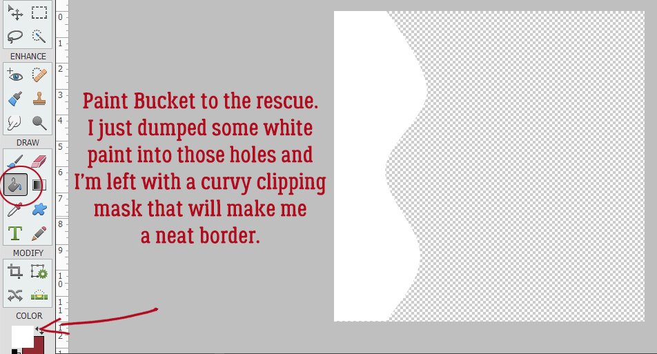
There are actually 3 ways to achieve the same result of Clipping papers to masks. Clicking on Layer>Create Clipping Mask is one. Right-clicking on the paper layer then choosing Create Clipping Mask is the second. The keyboard shortcut method was changed in Version 14. Prior to V14, CTRL/CMD>G works. Version 14 and later the keyboard shortcut is CTRL/CMD>ALT>G.
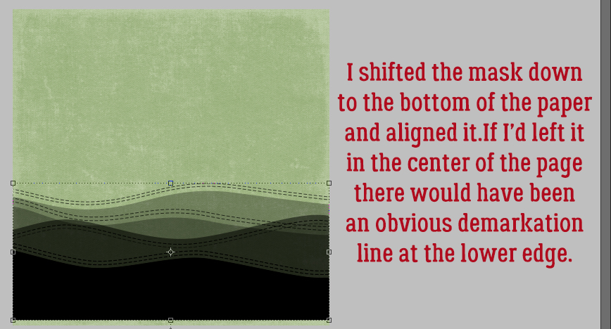
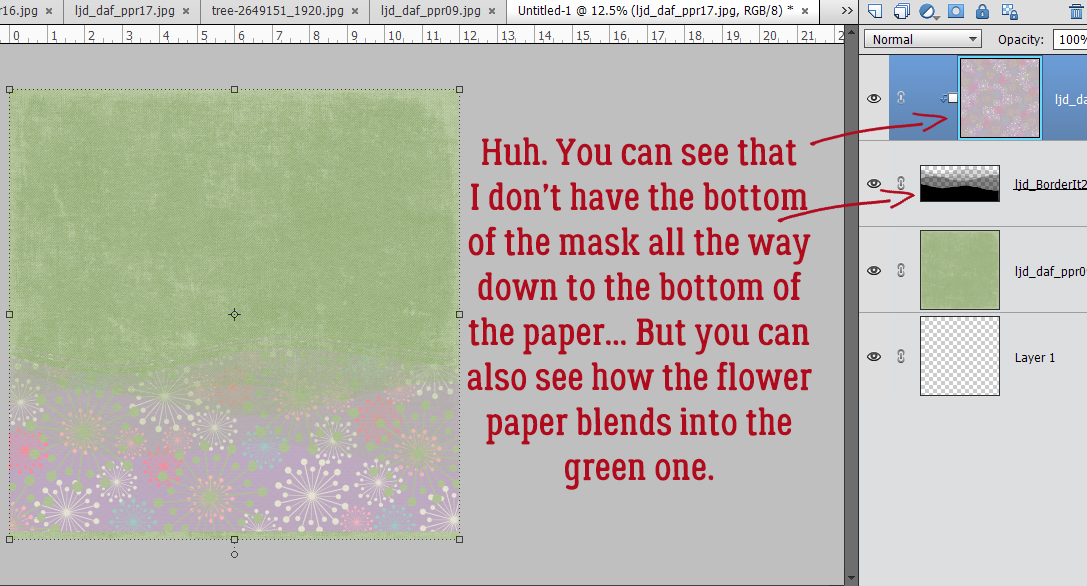
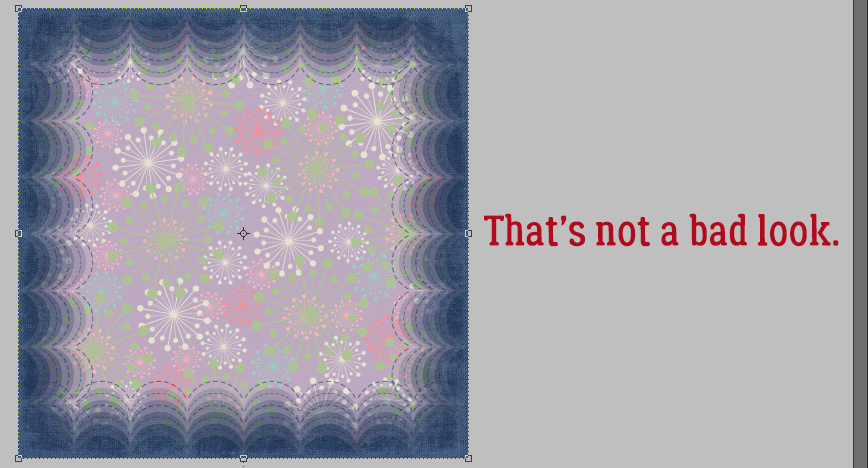
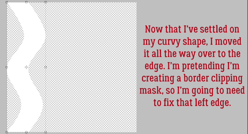
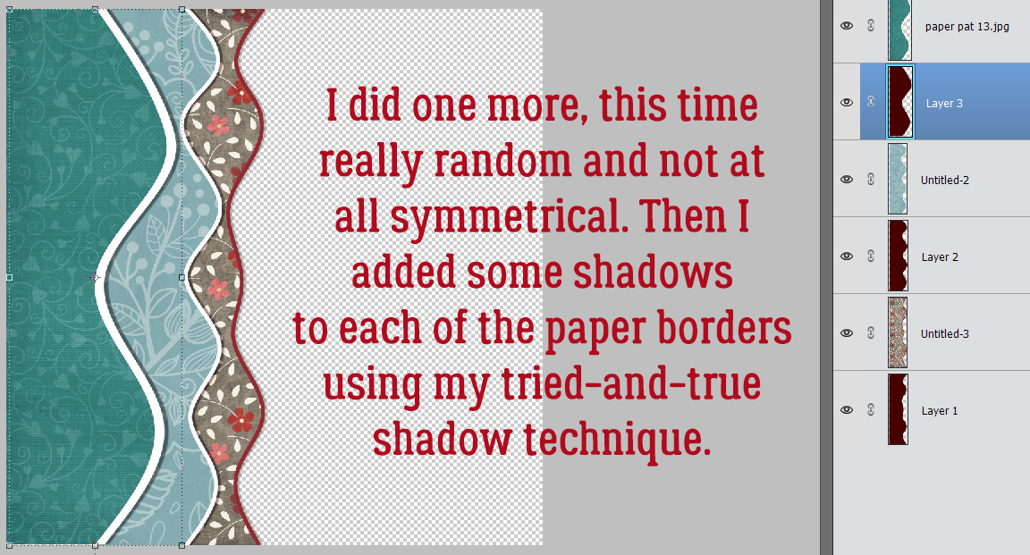
Well, guess what?!! I don’t have the bottom of the mask right at the bottom of the background paper. Easy to fix.
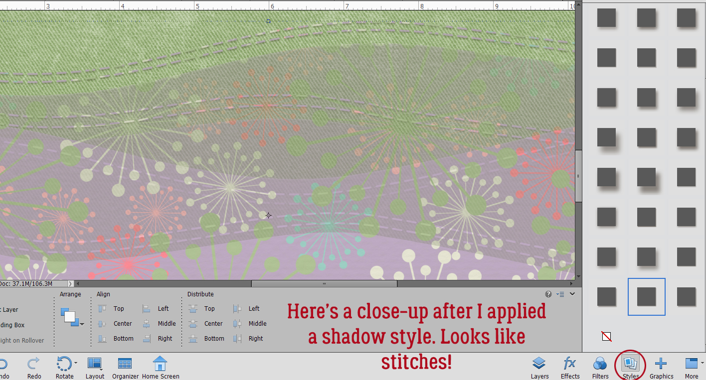
Because this mask has what looks like rows of stitches, I decided to see what it looks like with a shadow style applied to it.
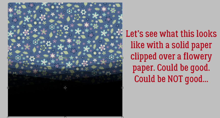
More experimentation. It’s the only way to know what will work and what won’t for this kind of mask.
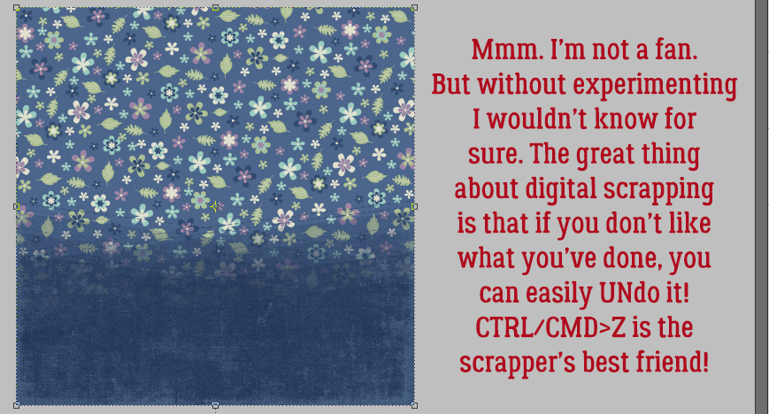
Yeah… not loving this look! This is why I believe Undo (CTRL/CMD>Z) is a digi-scrapper’s best friend.
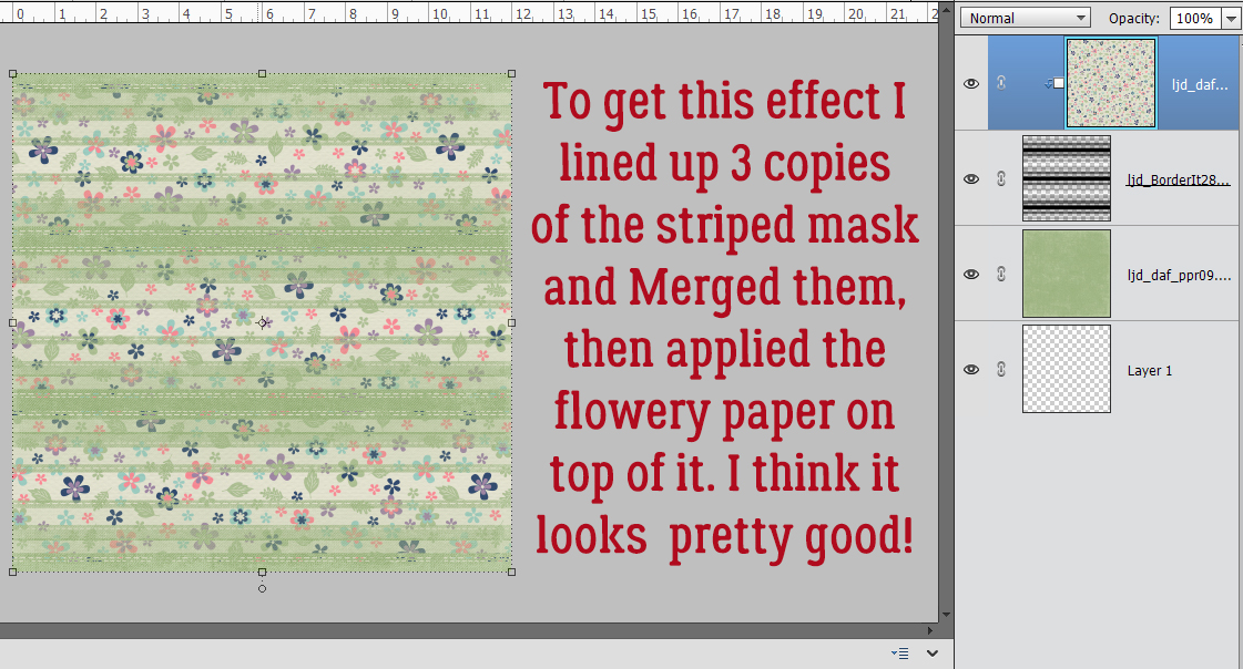
This look reminds me of a t-shirt I had when I was 19! I made 2 Copies of the striped mask and spread them out evenly then Merged the mask layers. (Right-click and choose Merge Layers or CTRL/CMD>E) Then I Clipped the flowery paper to the solid. That combo could be a nice background for a spring layout.
Ewwww. Nope!! Don’t like this look at all!
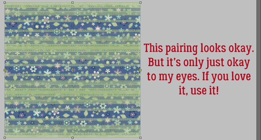
This one is okay. It’s not my favourite, but it looks okay.
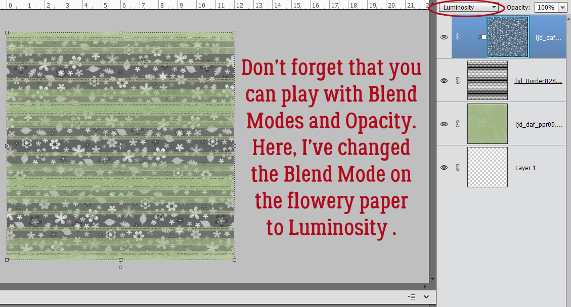
Don’t forget that you have lots of other tools at your disposal. Blend Modes and Opacity changes are two of those, Here I’ve taken the blue-floral-on-green-solid and changed the Blend Mode of the floral PAPER layer to Luminosity.
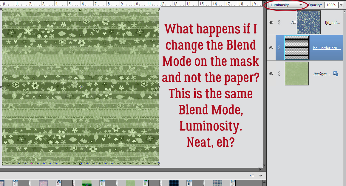
If I change the Blend Mode on the MASK layer to Luminosity, this is what it looks like.
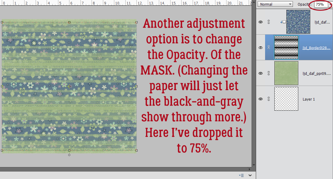
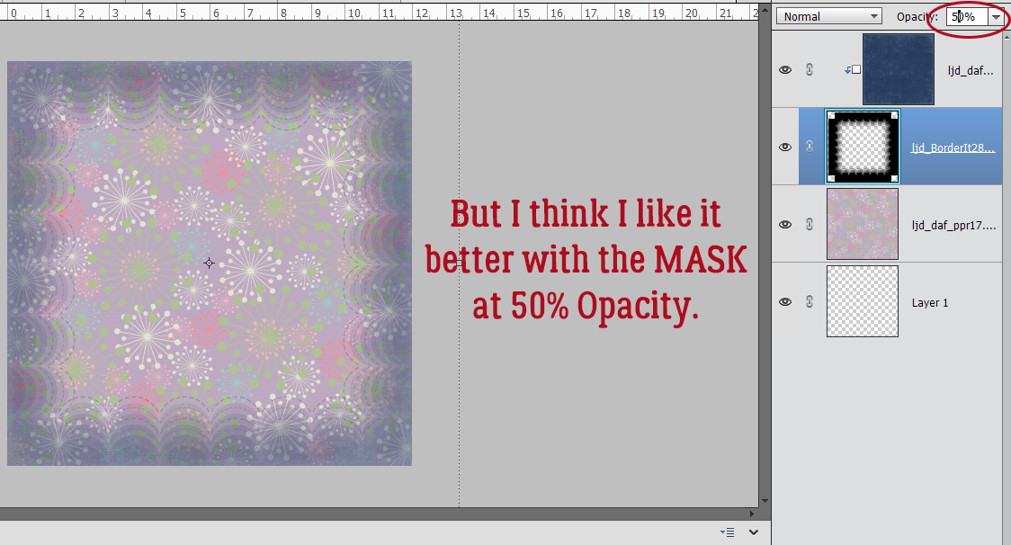
Here I’ve just decreased the Opacity of the MASK layer to 75%. (Decreasing the Opacity of the PAPER would only allow more of the black/gray of mask to show through.)
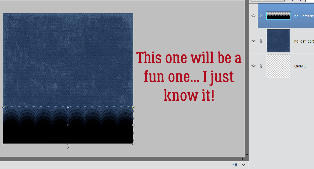
The solid navy blue paper is actually a denim, so this look is going to be a fun one, I just know it!
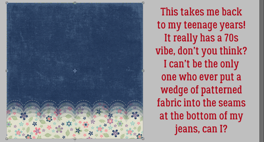
YES! Again, I’m thrown back to the 70s!! My very first pair of bell bottoms was navy with tiny flowers. This look though reminds me of the time I opened up the outside seam at the bottom of my straight jeans and sewed in a wedge of floral fabric, turning them into bell bottoms.
This might be fun… I’m going to Merge these mask layers into a single one.
Now that I’ve played with these masks and papers a bit, I’m getting a sense of what will work and what won’t.
That’s pretty close to what I expected. I like it.
But the navy blue is a tad harsh, so I dropped the Opacity of the MASK layer to 50%. I like this look a bit better.
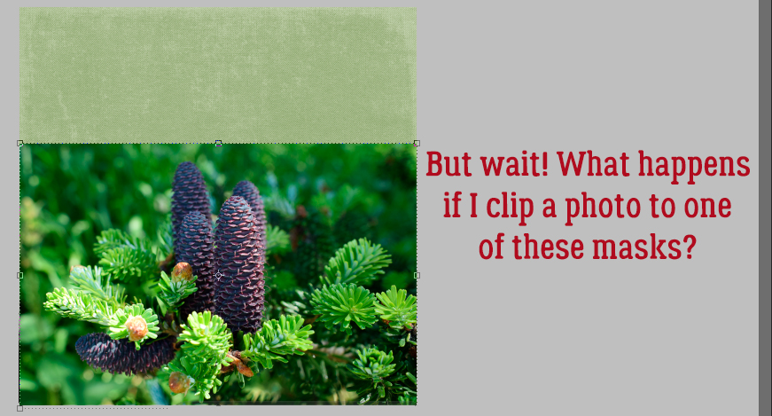
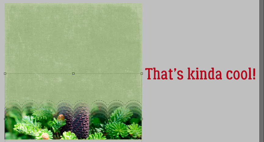
But papers aren’t the only option for Clipping to these masks. What does a photo look like? I chose this stock photo because of the pinecones.
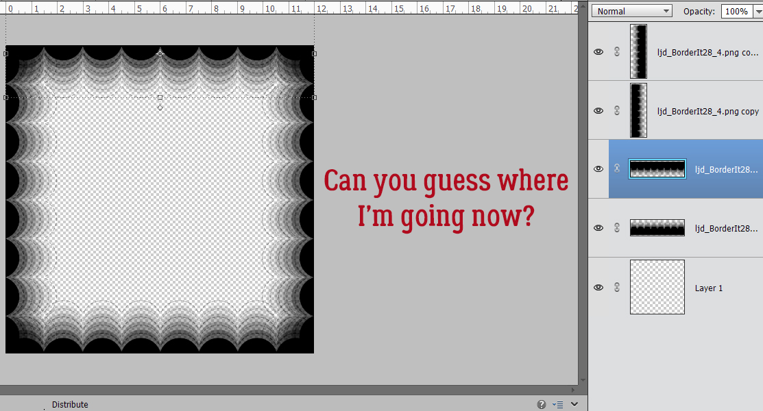
Repeating shapes!
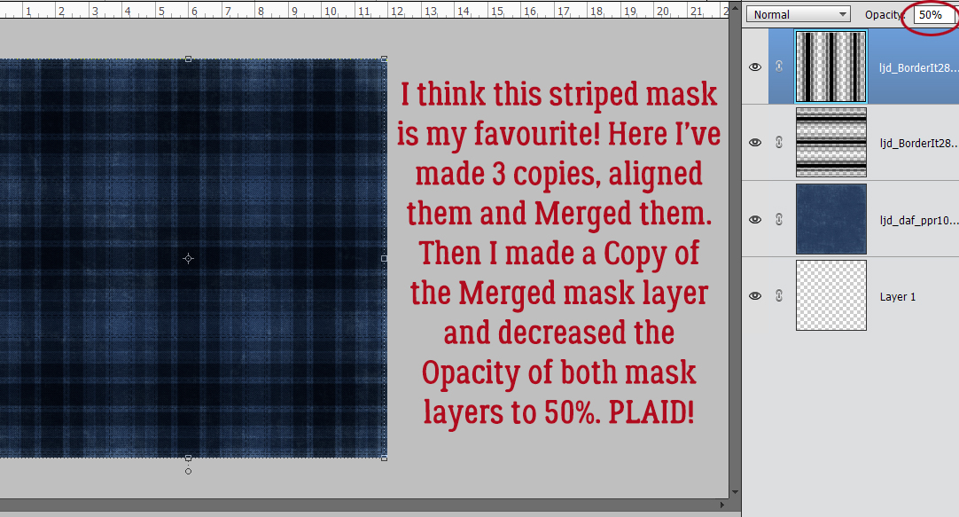
I really do think this stripped mask is my favourite. Again, I lined up 3 Copies of it and Merged them together. Then I Copied the mask layer and Rotated it 90°. Plaid! This is just the masks with their Opacity decreased to 50% at this point and might be what you like.
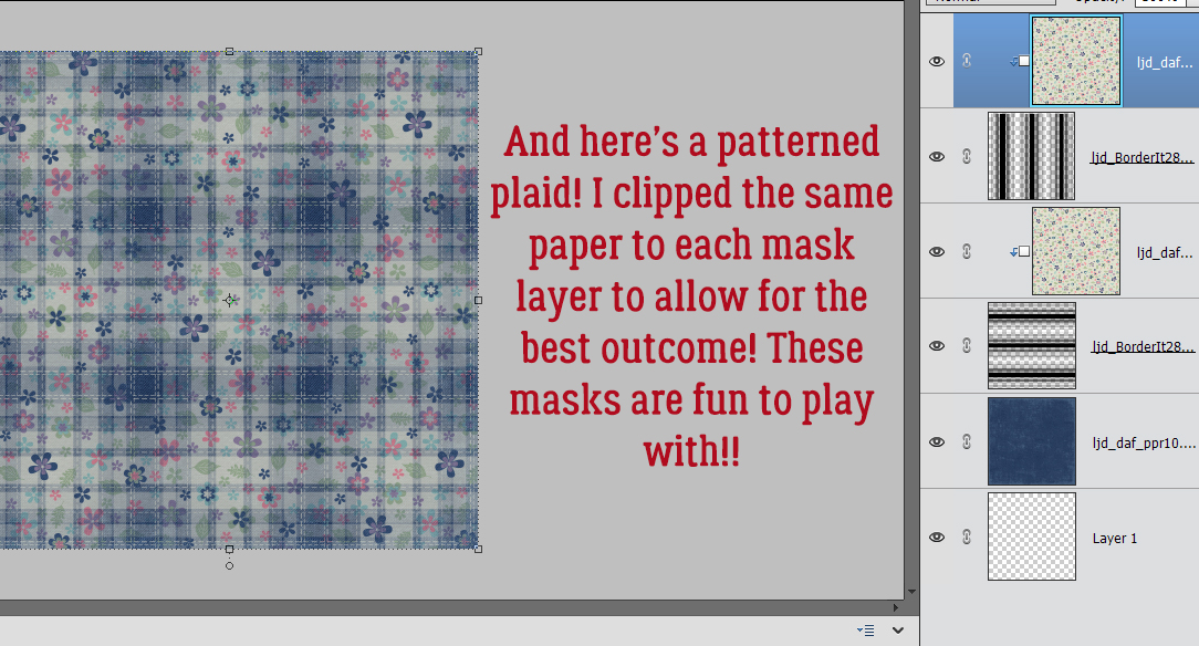
Here I’ve clipped the floral paper to each of the mask layers. I love this look!
Can you think of other ways to make use of these masks? Please feel free to share in the Comments!!
I hope this tutorial makes sense. I’ve been under the weather and I’m not at the top of my game. Thanks for bearing with me!
Here is the PDF version of this tutorial : https://bit.ly/3cSdBGm
![]()


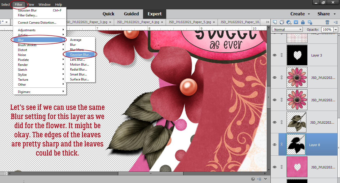
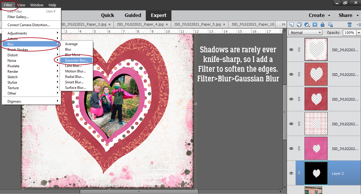
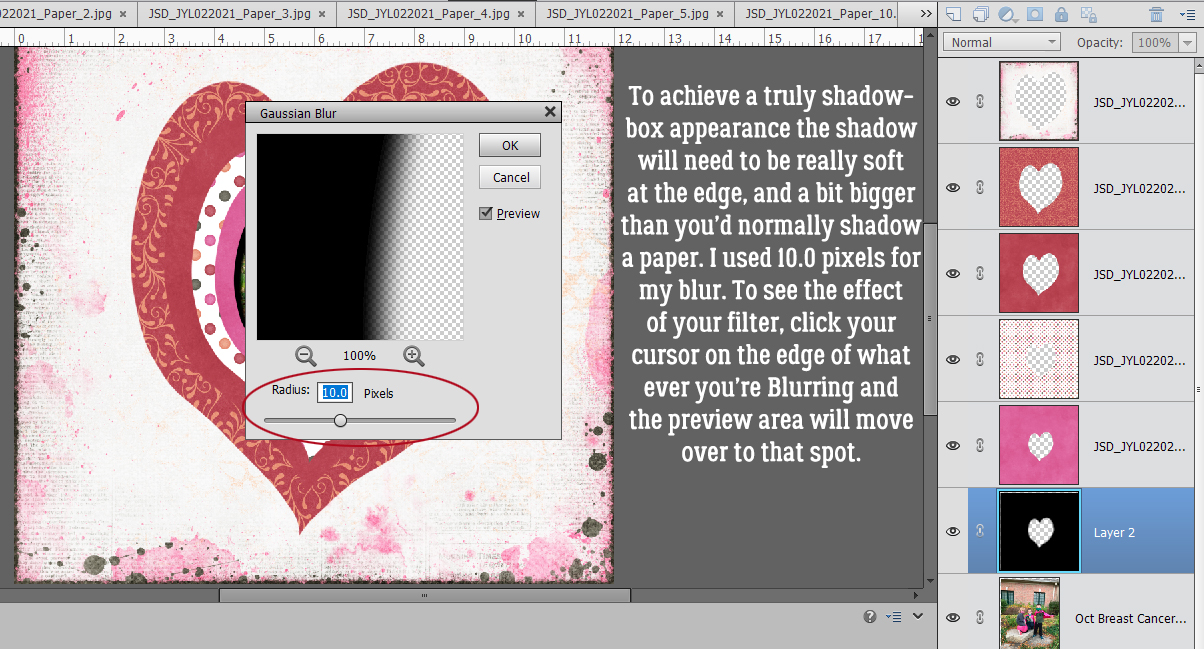
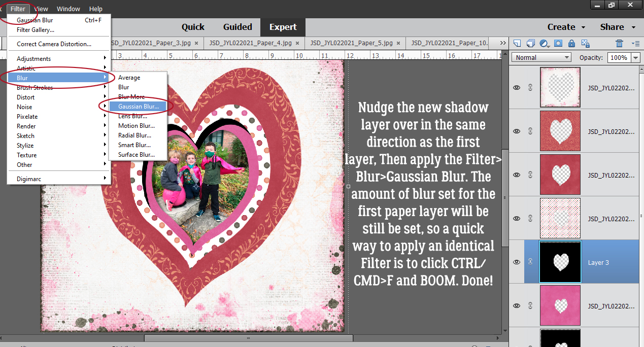
 Apply a filter by clicking Filter>Blur>Gaussian Blur.
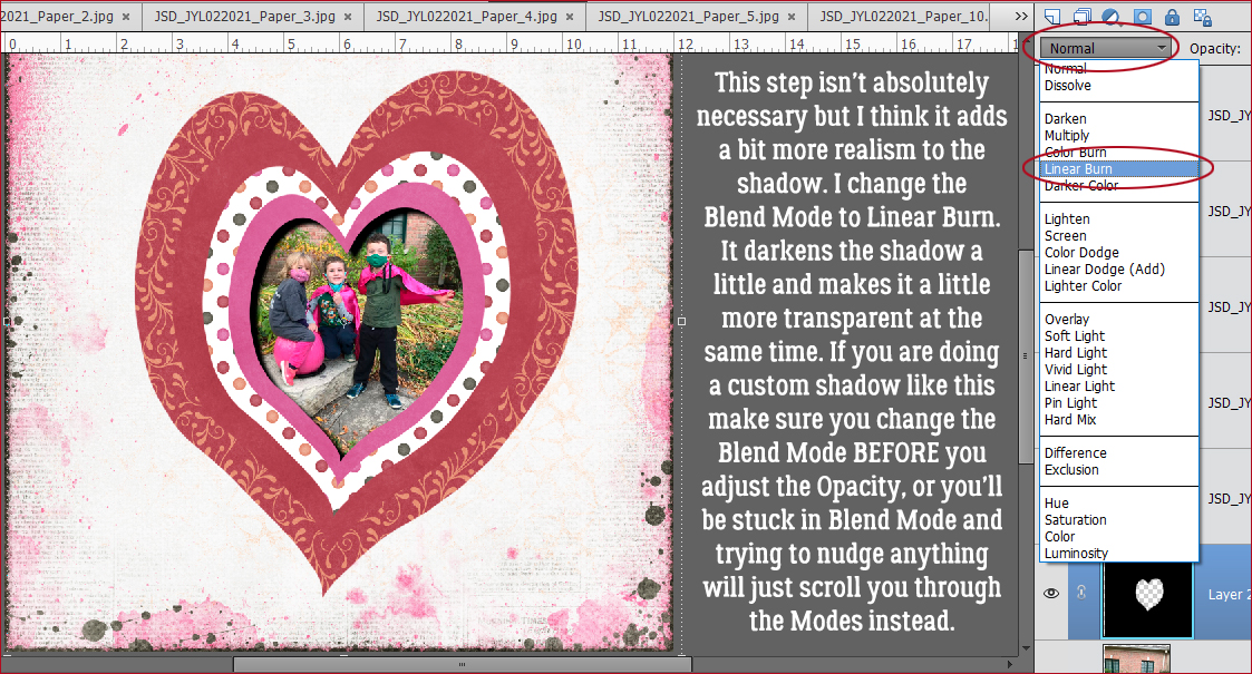
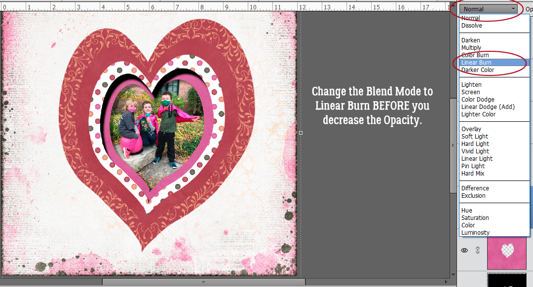
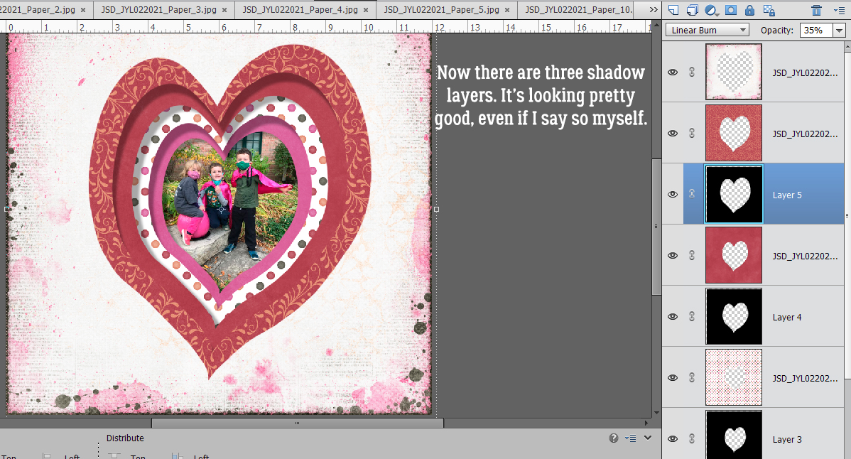
 Change the Blend Mode to Linear Burn.