Tutorial Tuesday (Potpourri)
Heritage and History: Recorded

Late last week, I connected with one of my distant cousins on my mom’s mother’s side through Ancestry DNA. I never expect anything to come from my contacting them, and am always so thrilled when they respond. This particular long-distance connection led to an explosion of “new” family members for me and the beginnings of several friendships. But perhaps the best thing that has come from this is that I now have several photos of the old family Bible, that dates back to 1884.

I know there are more than a few of you loyal readers who are also interested in your family history and in recording what you learn for future generations. My family Bible photos are going to make an amazing layout. And GingerScraps has pretty much everything I’m going to need to make it special. And I’m going to let you in on my design process.

First, did you know you can search the store using keywords? On the far left of the store’s home page, there’s a search box right underneath the log-in panel. I typed in “heritage” and the search returned THIRTY-TWO pages (more than 500!) of possibilities. I know the right kit for me to use for my special layout will be in there somewhere. Here are some of the options I’m considering.

Many of these kits are part of a larger bundle, which of course is your very best value.

My heritage layouts go in one of two directions; I either focus on a single photo or I go with a collection of them. Because the photos by themselves are just “nice” but don’t tell the story, lots of room for journalling is a must. Our GS designers have so many options for templates that it’s like an embarrassment of riches. Here are some options for multi-photo layouts.

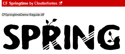
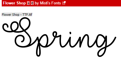
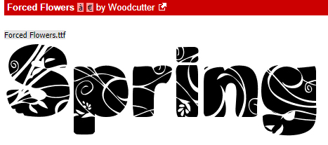
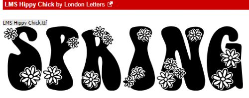
For titles and journalling, there are nearly as many options for (free) fonts as there are days in a year. I like to use decorative fonts for titles, typerwriter fonts for journalling – it needs to be completely legible for the story to be preserved. Here are some that I like.

Now, my challenge to you is to see if you can guess which kit, template set and fonts I will use for my layout. Check in the gallery at the end of the week to see if you’re right!

Tutorial Tuesday (Photoshop Elements)

Magic Eraser!! (Not Mr Clean but close)

I know I can’t be the only one who collects brochures from the attractions I visit when I travel. And I’m pretty sure I’m not the only one who likes to make my own journal cards to go with my photos when I scrap those travel photos. I really wanted to use the Wells House logo somewhere on my layout below and decided this would be a good time to try something new (to me). The template I chose, from the GingerBread Ladies mega-collab Oh Snap! had a journal card spot, and it inspired me. And ADB Designs‘ January Daily Download kit Cozy New Year was the perfect kit to go with my photos.

The logo is pretty well delineated in the image below, and I just want the logo itself. I could put it on a new document and extract it using one of the methods I’ve shown you in the past, but I wanted to try something new. So let’s get to it!

I’d never tried the other options in the Eraser Tool menu and this seemed like a good time to give it a look. That one with the yellow starburst is called the Magic Eraser Tool and it is indeed magical!

There are some settings that are vital to use with this technique. The Opacity has to be 100%, and all three boxes along the right side of the menu should be checked: Sample All Layers, Contiguous and Anti-Aliasing.

The screenshot says it all… I really did just click on the background and it vanished. (See the new transparent background?)

So then I wanted to play! I have a bunch of Bitmoji images saved to my computer and this one, which is pretty much how I’ve looked the whole month of February, was my next victim.

CLICK!

It was so easy, I wondered what would happen if I tried it on a photo. This one looks like a good choice to experiment with.

Oh. Didn’t expect that!

The tool magically erased some of his t-shirt along with the sky. That’s a limitation – the shadow isn’t enough of a contrast to the sky and Elements couldn’t tell

So I combed through my stock photos for one with more obvious contrast.

Now I’m starting to understand how the tool works. I’m going to need to click on every. single. different. colour. variation. Too much work!

So how about this one? Will it work better?

Not so much.

Maybe this one will work.

Or maybe not. Now I had to see what else I could do that would be smart, not hard, to preserve the stuff I wanted and remove the stuff I didn’t.

I went to the Magic Wand tool to see if it would be quick and easy enough to extract the woman and only the woman.

The marching ants surrounded her hair well enough. So I clicked on Select>Inverse (I lie. You know I went with CTRL/CMD>Shift>I.) to invert the selection… to “select” the background and not her hair.

Now you can see the marching ants around the outside of the photo. Back to the Magic Eraser I went.

Much better! The wisps might be a problem.

I clicked on other areas of the background that were still there.

Not bad! The only fiddly part of this is the wispy hair now.

I wanted to try it one more time, with this crest from one of the radar stations I lived on when I was a kid. It’s a fair representation of the place, I’ll say that! And it has a more detailed edge with that wreath of maple leaves.

One click got rid of most of the background, but left the white in the spaces between the leaves. You can see them along the right side of the screenshot. I’d already clicked a few more times in the spaces to the left side. It only took about a minute to go all the way raound and get rid of the rest of the white background.

Sweet!! I’m not sure what I’ll use this for, and I’m going to see what I can do about wispy hair for a future lesson, but I can feel you chomping at the bit to try this one yourself.

Have fun!!

Tutorial Tuesday (PSE-Word Mashup)

A Whole New Meaning to Copy-and-Paste!

Welcome to the tutorial that almost wasn’t! The last week has been a little difficult around our house and the weekend was particularly so. I didn’t have time to put together something to share with you before I had to go back to work yesterday. 12 hour shifts don’t leave a lot of energy, mentally or physically, and I always do two in a row so I was expecting to have to disappoint you all by posting a “sorry…” and a promise to do better. But the over-staffing fairy visited me this morning and I magically got the day off. Not having a topic in mind, I had to do some pondering. And then I learned something myself that I knew would be perfect for this week. So we’ll settle for late, rather than not at all. Here goes!

Have you ever put your heart and soul into a layout, then spent forever coming up with the perfect journaling – only to hate the way the journaling looks, or worse… see a glaring typo? Have you ever wished PSE came with a spell-check? Or that you could copy-and-paste something from a website? Well, have I got the trick for you! Word and PSE work together! And even better… all your fonts are there in Word too!

Your Word version may be different from mine; the interface might look different but this is pretty basic, and all the things I’m going to show you will work with any version. I opened a new blank document in Word, chose a font and set my formatting so that my text would fit inside a border on a beautiful journaling blank I pulled from Ooh La La ScrapsShabby Chic collection.

I love using quotations for a variety of reasons. Like not having to think too hard! I typed out this one in a matter of a few seconds. I changed the size of the font for Mr Bergen’s name.

I just spotted a typo on my screenshot below. RATS! Word’s spell-check wouldn’t have caught it either, but it DOES catch those transposed letters, “e”s that should be “a”s and that kind of thing. It also capitalizes the first word of each sentence for you if you forget.

Then I opened up Elements on my desktop, dropped my journal blank onto a new document and set up the Text tool with the same font settings that I chose in Word. If I skipped this step now, Elements would default to the last settings I used.

Back to Word… I selected the text then right-clicked to open up a dialogue box. It looks like this. I want to Copy the text. (WSNH tip: the same keyboard shortcuts I’ve shown you in previous tuts also work exactly the same in Word, so CTRL/CMD>C will work to copy the text.)

I flipped back to Elements and Pasted my text into the journaling space. That can be done by right-clicking then choosing Paste from the dialogue box, or CTRL/CMD>V. Did you notice that Elements ignored the different text sizes?

Now I have the ability to change it up to suit my layout. I changed the text colour first by pulling the gray from the border.

Then I changed the font size on Mr Bergen’s name again. Now that I know the font size changes made in Word don’t move over to Elements, I can skip that step in the future.

Even better, it’s totally possible to Copy whole sections of text from a web site or other document on your computer and Paste it into Word. As you can see in the screenshot below, I’ve selected a new quote from my favourite quotations site.

Then I Pasted it into Word with a couple of clicks! Yeah. I wasted time resizing Ellen’s name. (Did you catch the typo in this screenshot too?)

Here you can see that I’ve got Elements open and it’s just waiting for me to Copy-Paste Ellen’s words of wisdom over.

Oh, right… I didn’t go to Elements and set up the font. So this is the font, size and colour I used for the last layout I created.

So I just Undid that step and started over. But this time I decided to use a Text Box. This handy tool helps to constrain the text so it doesn’t bleed out into areas where I don’t want it. To create a Text Box, with the Type tool click-and-drag from one corner diagonally to the opposite corner of the area you want to cover with text. This journal blank made it easy by having reference points in the border.

And then I pasted Ellen’s quote into my text box. Notice that it’s now centre-justified, rather than left-justified as it was in Word. I had “Center” selected in the Text tool settings and Elements over-rode Word.

This time I didn’t have too many changes I needed to make, other than shrinking Ellen.

But to show you how easy it is to change it to suit your purposes, I switched the angle from upright to right-italic and changed the text colour. I want to try this trick with texting on a path, but wanted to get you the basics now. Stay tuned!

Tutorial Tuesday (Photoshop Elements)

Fancifying Those Fonts

As promised, today’s tutorial is a demonstration of how to add some variety to your fonts. IceCold had the most options so I went with it for the layout I did up for the Mix It Up Challenge. I used a template from Jumpstart Designs that I’ve had forever and CathyK‘s Aviator kit.

If you’re a faithful reader, you’ll recall that I like to create my titles on their own work space so I can play around without distraction and without messing up anything on my layout accidentally.

Before I can do anything to the text I first have to Simplify the layer. Right-click on the layer on the Layers panel then select Simplify Layer.

Because I never know where I might go with my experimentation, I like to make several copies of my original layer so I won’t have to recreate it later. Then I play with the copies. CTRL/CMD>J will make one copy for each time you perform the keyboard shortcut. Or you can right-click on the layer in the Layers panel and select Duplicate Layer. (Can you see why I use the WSNH – Work Smart Not Hard – shortcut?)

The first thing that occurred to me was to make the snow caps look like snow caps. I was originally going to just Erase the letter parts but thought better of it.

I added a Layer Mask by clicking on the icon that looks like a square of paper with a circle in the centre, right there in the middle of the icons at the top of the Layers panel. Why? Because if I go too far with my Eraser, I can easily change the tool to a paint brush and paint back the part I should have left alone. It’s as simple as toggling between black and white in the Color Selector. To know which color is the one you want, remember the phrase “White conceals, Black reveals“. Keyboard shortcut? Just hit the X key!

Then I started Erasing away the letters from the snow caps.

This part of my technique is VERY time-consuming. And it causes eye-strain too… but that never stops me from trying new things or writing tutorials about my experiments!

Is it just me or do these look more like eyebrows than snow caps?

Once I had all the letter parts removed, I Simplified the layer. Same like with the font step. Otherwise, unless you’re paying particular attention (and I’m usually not… watching TV while I work is how I roll!) you won’t know what part of the layer you’re working on until you’ve committed some massive blunder and can’t reverse it. (Guilty as charged!)

Now I want to add some chill to my snow caps. In retrospect, I really didn’t need this step, but I have the screenshots so I’m going to show you because it does tie in with a later step.

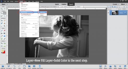
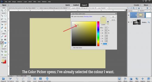
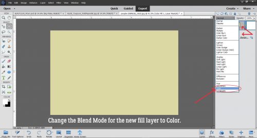
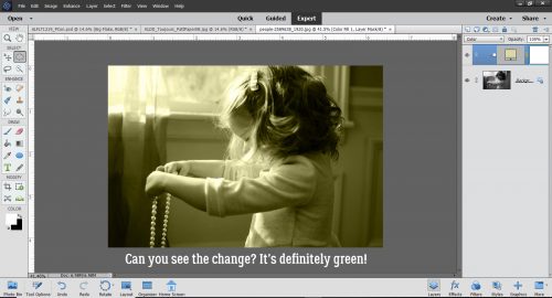
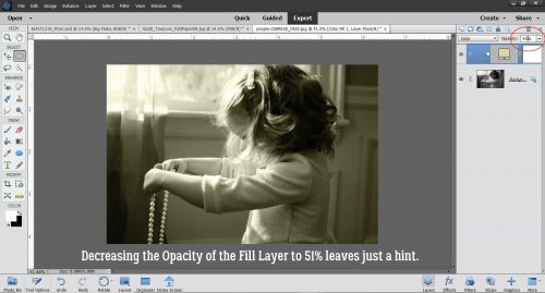
To quickly and easily change to colour of fonts and text, just create a Layer>New Fill Layer>Solid Color. It will apply your new colour to everything selected.

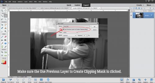
When the New Layer menu box opens, make sure the Use Previous Layer to Create Clipping Mask box is checked. If you don’t take that action, the whole canvas will be filled with that new colour.

I know the blue is impossible to see, and as I said, I really didn’t need to do this step. But can you see in the screenshot that I Copied the snow cap layer BEFORE I added the Fill layer to the original snow cap layer? That’s another WSNH tip. Only do things once!

Again, you want to Merge these two layers in the same way and for the same reason you Simplify text and other Layer Masks. It’s to preserve what you’ve already done.

This next screenshot is impossible for anyone to actually read, so I’ve included the pertinent information on it. I’m going to use a glitter Styles set from Just So Scrappy‘s Lucky Me bundle. The fastest way to get to your Styles folder is to just click on the Styles button at the bottom of the Layers panel.

Katie of JSS always includes both chunky and fine glitter in her Styles bundles. I chose the fine white glitter #2 option because my title isn’t going to be huge, and snowflakes aren’t either.

This is the effect it gave my snow caps. Now you can see why I said the colour change wasn’t necessary… you can’t see any of the blue anyway!

On we go to the copy of the snow caps.

The colours in JSS‘s Lucky Me bundle work for this next phase, so I’m using the Chrome set for this. The Style adds a very smooth shiny look to whatever you hit with it.

Again, Katie offers options! There are thick and thin Chrome coatings here. I knew I’d want the thin one so that’s what I used.

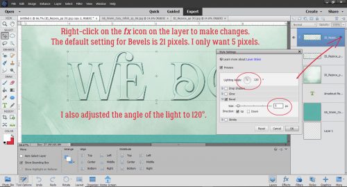
It didn’t look quite like I wanted it to, so I right-clicked on the fx icon on the layer in the Layers panel and opened up the Style menu. I adjusted the various sliders to give me more of a chilly, icy look.

Then I lowered the Opacity of the Chrome layer and the snow cap has dimension, some colour and some sparkle.

I could stop here. HA!

I went down to the very first layer where I’d typed out my title, hid all the other layers, and added a Layer Mask to that first layer.

Then I started Erasing the thin lines from the letter section of the title.

Once I got them all Erased, I Simplified the layer.

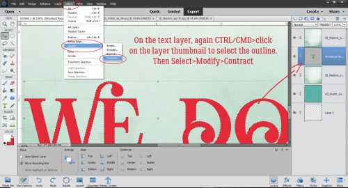
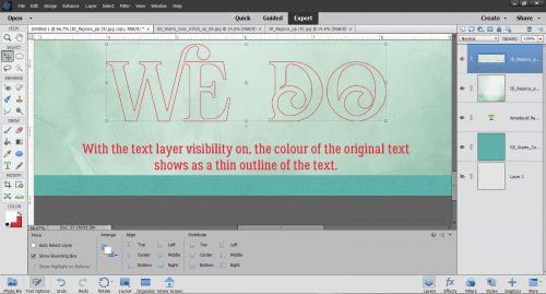
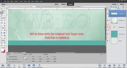
I also wanted to lose the snow caps, but because I’d already isolated the snow caps, it was a piece of cake to get rid of them. I clicked on one of the snow-cap only layer thumbnails to Select the outlines of the snowcaps – while still on my lowest layer – then Edit>Cut (CTRL/CMD>X) them away.

I knew I wanted to use the Paint Bucket to fill the wide spaces with colour and I knew (from prior experience) that if the areas I was filling were not COMPLETELY enclosed, the whole shebang would be filled, I decided to put a Edit>Stroke around the snow caps’ edges. Just a skinny one, 1 pixel wide. Then I erased the parts that weren’t required.

This is where I wound up.

Then I used the Paint Bucket tool to fill in all the spaces inside the letters using the same light blue as before. I decided the dark brown lines were just too harsh, so I wanted to change them to a darker blue/green. So I went to Enhance>Adjust Color>Replace Color.

Another thing I’ve learned form doing it wrong a thousand times is to make sure the colour I WANT is the BACKGROUND colour. Then I clicked on the colour swatch at the top of the menu – the colour I want to replace – and used the eyedropper that popped up to click on the dark brown.

Then I clicked on the lower colour swatch to make it active. If I had a colour on my canvas that I wanted to use, I could then click on it with the eyedropper, but I don’t so I clicked on the background colour swatch where I have my darker blue-green. And bingo! the dark brown is now dark blue-green.

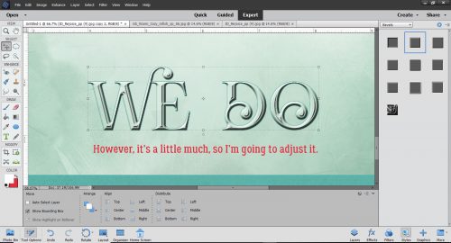
I could stop here. But you know me… I didn’t. I felt like the letters needed some sheen to make them look icy. I opted to use the Wow Plastic Styles that were already in PSE when I bought it. There are 10 options in that set. If you hover your cursor over the little blocks it’ll tell you what each one is.

As you can see, it changed the colours quite a bit while adding that shine I was after. I played around with the fx menu a bit.

Then I checked to see if the title looked the way I wanted it to. And it didn’t.

I went back to the title canvas and Copied the white glitter layer, moving the copy layer to the very top, above the shiny blue Chrome layer. Then I Erased some of the top white glitter layer to make it look like freshly-fallen snow on top of some older, crusty stuff. (Those of you who live in the snowbelt know what I mean.) Then I opted to play with the letters layers again. I tried one of the Glass Buttons Styles, which also are integrated PSE styles.

Only snag? All that work I did with the stripes went bye-bye. Boo! But wait… There’s a tweak for that.

And back they come! Almost happy…

I still had some snow-cap-less layers there in the middle so I went to one of them and erased everything but the skinny lines.

Quick change to the colour – Layer>New Fill Layer>Solid Color in white.

It’s pretty subtle, but it’s there and I like it! So let’s see how it looks on the layout.

YES!! I think it’s a lot closer to the colours in the photo and I’m very happy with the outcome!

See you all next week!

Tutorial Tuesday (Fontography)

Fancy and Fun Fonts for Wintery Layouts

As much of the Northern Hemisphere is being walloped by heavy snow, high winds and frigid temperatures (which basically would be Wednesday here in northern Alberta 😉 ) I thought I’d compile a collection of free fonts y’all can use for your winter layouts. Sound good? Each of the fonts I show you will be linked to the source so you can find ’em quickly!

My favourite go-to website for free fonts is dafont.com. They have such a huge assortment of fabulous fonts and dingbats!

Like Snowtop Caps, which also includes numbers and punctuation.

Winter Fall is a rounded font that would be great for a wintery title, but it only includes a small number of special characters and no numerals.

Iceberg is chunky but still rounded. It also only has a few punctuations and no numerals.

Winter Flakes has it all! It includes some dingbats too, so it’s pretty much perfect.

Igloo Laser is a modern-looking all-caps font with numerals and a few punctuation characters.

Snowflake Letters would look smashing with a bevel and a clear, glossy style on it. It’s all-caps, with numerals and punctuation.

You could use Snowhouse for journaling; it’s a script font with numerals and some punctuation, and includes a large variety of special characters.

Snowinter is another super-title font, with all the goodies one would need.

I like Kingthings Christmas a lot. It’s a complete package with awesome potential.

I think I’m going to build a tutorial about how to use Ice Cold to its best advantage. It’s got some serious title charm!

CF Tuques is just a fun font for winter. (I’m super-happy the designer spells “tuque” correctly!) No numerals or punctuation though.


Now how about looking at some dingbats. Don’t know what a dingbat is? Basically, it’s a symbol, shape or drawing accessed through your alpha keyboard.

Winter has a collection of line drawings of winter things, like snowmen and snowed-in houses. It’s pretty cute!

DH Snowflakes could be used for borders, dividers or backgrounds. Lots of possibilities!

Faux Snow is another snowflake dingbat set with unique shapes.

And so is WW Flakes.

KR Snowpeople has an assortment of snowmen and snow-women.

I invite you to check out the vast collection of fonts and dingbats at Dafont. I know you’ll find lots of inspiration there!

Tutorial Tuesday (Photoshop Elements)

Memory-Keeping with Not-So-Great Photos

I don’t know about you, but I’m seriously lousy at getting good selfies. Maybe I’m too critical, or maybe I just don’t look good in photos. But when the only photos I have of an event I really want to scrap about are those nasty selfies, what’s a woman to do? Such was the day I went to the beach on the Wild Atlantic Way… the ONLY day out of the whole two weeks I was in Ireland this time when it rained. It was also the only chance I would have to walk on the beach at Kilkee, where my 3x great-grandparents were born. So I went ahead to walk on the beach (although I didn’t walk the cliffs – I AM a bit of a chicken) and took the nasty selfies, then scrapped them into a minimalist layout for the January Color Challenge.

When I say it was raining, I’m not talking about the soft, misty rain Ireland is usually known for; it was more like a prairie downpour. My hair was plastered to my head and my jacket was soaked through. (And I was freezing… in July!)

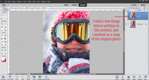
If I was going to do something with these photos that I could live with, I was going to have to think a bit. I made a copy of my photo so I’d be playing with it and not the original.

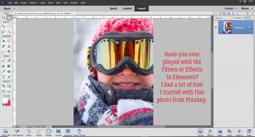
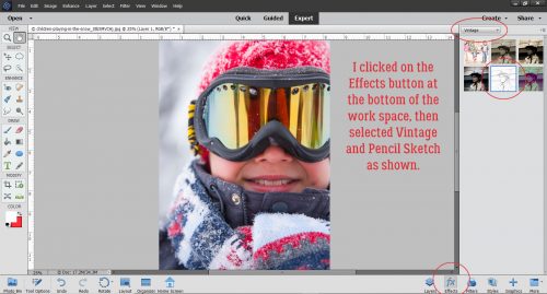
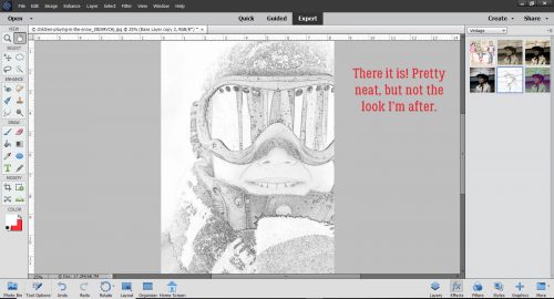
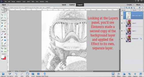
Then I did something I’d never done before… I checked out the possibilities in the Effects menu. I played with each of the options to see what they do, and some of them will be given more attention in upcoming tuts. Imagine my surprise when I found an even quicker-with-fewer-steps sketch effect than we’ve looked at in other tuts.

Just one click and I had a sketch!

The effect produced another new layer.

The details are pretty blown-out, so I thought about how to find them again. (Although I wasn’t really upset that the crowsfeet are gone!)

I used the Levels adjustment (Enhance>Adjust Lighting>Levels or CTRL/CMD>L) to darken the outlines. With Levels, pushing the Input Levels dark value slider to the right as shown and the Output Levels light value slider just slightly to the left allowed some colour to leak back in, but also brought the details and textures back. The raindrops on my glasses are more obvious now.

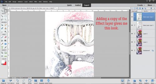
I wanted a tiny bit more sketchiness so I duplicated the sketch layer (right-click on the layer then select Duplicate Layer or CTRL/CMD>J) then played with the Levels again. Can you see the difference in the histograms between the two images?

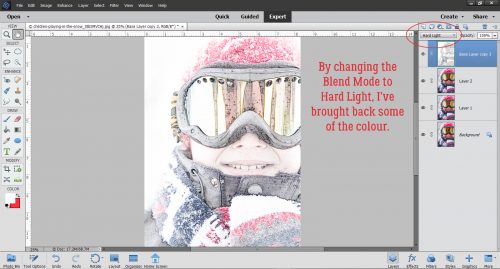
Just for fun, I played with some Blend Modes too. Some of them give really interesting results… There are no limits on creativity here!

I chose Pin Light. The only difference it makes is to brighten the image up a bit. And maybe sharpen the sketch effect a smidge.

Lowering the Opacity of that layer lets a bit more colour show through without losing the total sketch effect.

But naturally, I have to play a bit more.

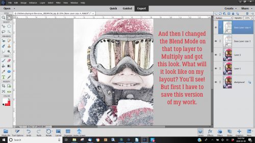
I tried all the Modes then settled on Overlay.

That’s more like it! Some of the gray is gone,, the details are sharper and there’s a hint of colour.

After I Merged all the layers, this is what I ended up with.

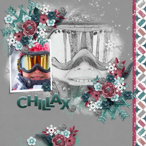
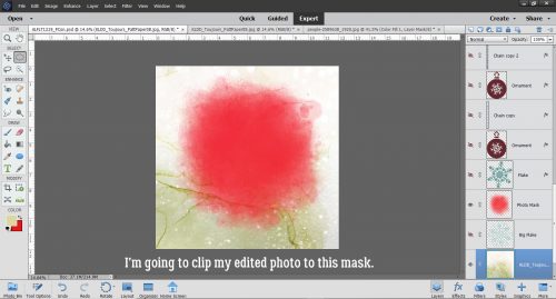
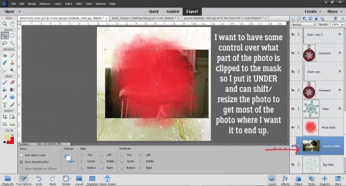
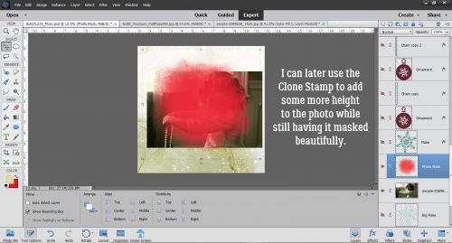
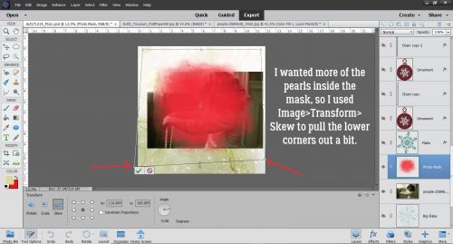
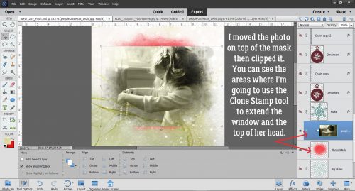
And my final layout looks like this… The blended photo in the background is simply clipped to a mask then the mask’s Opacity was lowered a bit to blend the background a bit more.

Tutorial Tuesday (Photoshop Elements)

Any Way You Slice It

After last week’s tutorial went out and I posted my Possibilities layout there were several comments about the photo treatment I used. Well, I actually stole it from a paper layout I saw in an old issue of Creating Keepsakes. Sort of. The digital version is a lot less labour-intensive and creates no mess or destruction. No glue either. So I thought that might make a suitable topic for today’s tutorial!

I started out by adding a new blank layer above my photo layer. That can be done simply by clicking on the little piece-of-paper icon at the top of the Layers Panel. Then I activated the Rectangular Marquee tool. (CTRL/CMD>M)

Next I pulled out a narrow rectangular selection along the left edge of my photo, including the parts of the photo I wanted to keep and excluding the part I didn’t – who wants to look at a roof?

Then I added a narrow white stroke around the selected area.

Then I dragged out another rectangular selection from my photo. See that little dialog box with numbers in it? That’s a great tool! It tells you the dimensions of whatever shape you’ve dragged out, therefore allowing you to keep the width or length of your selection identical. (Or you can just CTRL/CMD>J it and make an identical copy that you can then adjust to whatever dimensions you want…)

These are the settings I used for all my strokes: 5 pixels in width, centered over the selection, white and 100% visible.

I made a bunch of copies of my second rectangle and moved them over, which let me really WSNH (Work Smart, Not Hard) by skipping a lot of steps. I left the width the same but stretched or shrunk heights as I went. Once I had the whole photo “sliced” up, I Merged the frames.

Then I moved back to the photo layer and, still using the Rectangular Marquee, I started selecting the areas of the photo I didn’t want to keep. Then I Cut those areas away. (CTRL/CMD>X)

All that was left was to apply a hint of a drop shadow on the frame layer to give the whole thing a little dimension. The shadow settings I used were Angle: 90°, Size: 16 pixels, Distance: 0 pixels and Opacity: 18% with the colour being black. I didn’t add a shadow to the photo itself.

It’s really that easy!

Tutorial Tuesday (Inspiration)

What’s Your Super Power (Word)?

Happy New Year! Are you ready for 2019? I know lots of you, like me, were happy to see 2018 to the door. When I was thinking about topics for this week’s tutorial, I had a few ideas, but my thoughts kept returning to just one. If you’re into social media, I know your Facebook and Instagram feeds have been flooded with chatter about New Year’s resolutions. And if you’re like me, resolutions are just wishes! Experts say it takes three months of repetition for a change to become a habit; how many of us actually stick to those diet plans, those vows to exercise more, that vague promise to ‘be more organized’, for that long? <insert laugh track here> Resolutions are things we have to DO. And I don’t like being told what to do. <wink>

What works better for me is to choose a ‘power word’ for the upcoming year, a word for me to strive to BE. If you’ve seen the annual challenge by the maven of scrapbooking, Ali Edwards, called One Little Word, you’ll know what I’m talking about. Choosing that one little word is harder than it sounds. Like making resolutions, it requires a certain amount of introspection and soul-searching. The first time I chose a power word was at the beginning of 2010. I was going through a very difficult chapter in my life then and had no idea how it would come out in the end. But I’d been through tough times before and I knew I’d come through this one too. So the word I chose was PERSEVERE. Yes, it’s an action, something I had to do, but it was also a state of mind and a state of being. Guess what… I PERSEVERED and came out the other side in much better shape than I expected. This time last year I was in a great mood with a new grandchild on the way and a trip to Ireland to find my roots in the offing. My power word was ANTICIPATE… and ANTICIPATE I surely did! By the end of the year, it had morphed into ENDURE after my husband’s accident in September. Thankfully things are 90% back to normal, and I’m entering into 2019 on a more optimistic footing. I know this year will bring challenges… after all, it’s LIFE, and that’s a challenge all by itself. But with my rose-coloured glasses firmly in place, I’m choosing POSSIBILITY as my power word this year. I usually tend to look at the glass as being half empty, but I’m making a conscious affirmation to look at the POSSIBILITY that things will go well.

Now, how do YOU go about choosing a power word for the year? If you’ve already made some resolutions, you can use them as a framework. Do you see a theme? Is there an impending event in the future that you’re already aware of, either with excitement or dread? Are things going well for you, or are you really struggling right now? There are a number of online resources designed to help choose a power word. One that I particularly like is found at Heidi‘s blog Happiness is Homemade. She has a list of options, and one of them is sure to resonate with you. Another resource is on Jess‘s blog, Cultivate What Matters.

When you go to scrap your power word, the only constraint is your imagination. You could  choose a grungy, moody art journal style if that’s how you’re feeling, you could find a photo or a few that represent the theme, you could put it into a word cloud. You could create an acrostic with it and embellish the meaning using synonyms. So many options!!

I scrapped my guiding word today, with ADB Designs‘ gorgeous Coming to America bundle. My photo was taken in October when my husband, my son and I made a previously-planned-therefore-not-going-to-be-postponed-even-for-a-knee-injury trip to British Columbia. It’s the view from Tower Ranch Hillside Park in Kelowna, a spectacular vista I’ve fallen in love with. To me it’s the visual representation of POSSIBILITY – the sky really IS the limit!

Next week we’ll get back to the nuts-and-bolts of digital scrapbooking. Thank you for indulging my navel-gazing!

PS… for Rochelle (roxyrenders): Your comment on my Happy Holidays layout reads: “Wow- what kind of magic did you work on the wordart stamp? It almost seems as if it is glowing!” Simple little tricks! I first duplicated the mask/stamp layer. I applied a fine glitter style to the bottom-most of the two, then decreased the opacity of the layer to about 50% – that’s what creates the glow. Then on the upper layer, I clipped an ivory-and-gold foil brocade patterned paper (from JoCee DesignsDecember bundle) to the mask, then changed the Blend Mode to Hard Light. It’s just that easy!

Tutorial Tuesday (Tutorials!)

Now Where Did I See That Tutorial About…?

If you read the comments GingerScrappers leave here on the Blog you might have seen a brilliant suggestion from Ellen for a “quick tut” to index all the other tuts I’ve written over the last 2+ years. Lemme tell you, “quick” it ain’t! But it IS brilliant, so that’s what I’m bringing you today. Without further ado, here is a chronological linked index to all the tutorials I’ve prepared for you to date, all in one place.

1. Turn a Font into a Sticker

2. Use a Basic Template

3. Titles Revisited: Alphas Plus Fonts

4. One Photo, More than One Photo Spot

5. Making Templates Work for You

6. Simple Photo Blending

7. Extractions… Choose Your Method

8. Brush Basics: Colour

9. Playing with Text

10. Shadow Basics

11. Text Talk: LETTERPRESS!

12. Titles with STYLE(s)

13. Word Art Wizardry

14. For all you former paper scrappers: INKED EDGES!

15. Getting More Mileage from Your Templates… Easily!

16. Reverse Stencilling with Brushes

17. Kustomize Your Kits

18. Sizzling Signatures!

19. Journaling INside the Box

20. Yes! You CAN Warp Shadows in PSE!

21. Heritage Photos Get a Makeover

22. Only the Shadow Knows… Take TWO

23. When is a Square NOT a Square?

24. Creating Clusters… Not Clutter

25. Build-a-Brush Workshop

26. Blend Modes? Say What??

27. Down on the Border (not the Little River Band version)

28. Carol: Objects Inside Other Objects and Going Incognito

29. Tearing Up the Sheets (of Cardstock)

30. Style Savvy!

31. WSNH Tips and Tricks

32. Title Tweaks

33. Get in SHAPE, Girl!

34. Keeping Things in Perspective

35. Can This Photo Be Saved?

36. Behind the MASK

37. Michelle: Finding Font

38. Putting the “OH!” in Your Photos

39. Ellen: Talking about Tools

40. Chalking it Up to Inspiration

41. Becoming an ALPHA Female

42. Over-the-Top TITLES

43. Templates with a Twist

44. How’d You DO That?!! Fontography Demystified

45. A Little Bit Sketchy

46. More Fun with FONTS

47. Dodge and Burn… NOT an Action Movie

48. Reflections

49. The EYEs Have It

50. There’s a Flag on the Play – Out Of Bounds!

51. Abstract Meets Graphic Art

52. Mixing it UP!

53. Revisionist History

54. The TutOR Becomes the TutEE

55. A Few Quick Template and Shadow Tips

56. It’s a PUZZLE!

57. I Feel the Need… the Need for SPEED (Scrapping)!

58. More FUN with FOTOS

59. Turning a POSITIVE into a NEGATIVE

60. Raindrops Keep Falling on My Head

61. Scrapping with Heritage Photos

62. You’ve Gotta Know When to FOLD ‘Em

63. More Fun with Fonts – Die-Cut!

64. A(nother) Way with WORDS

65. Playing on Emotion

66. In the RAW!

67. Christmas FONTography

68. Ahead of the CURVE

69. Like Snowflakes… No Two ALIKE

70. The ART of ILLUSION

71. More Fun with Photos!

72. Fun with FONTS & FOTOS 

73. First Past the Post(mark)

74. SKETCHIER!

75. Here’s a Little Clip!

76. The EYES Have It!

77. Facebook Timeline Covers

78. Tiny BUBBLES!

79. Uniquely YOURS

80. DIAMONDS are a Girl’s Best Friend

81. Totally TACKY!

82. UNZIP Me Dahling!

83. Direct Your Own SCRIPT

84. Transforming the Ordinary to the Extraordinary!

85. Making the Most of (inter)National Scrapbooking Day!

86. When SIZE Really DOES Matter…

87. A Road Map for Newbies

88. Throwing the BOOK at Glee

89. Jailbird No More!

90. Alphas Revisited

91. Everything New is Old Again

92. Still MORE Fun with FONTS!! 

93. Where the Boys Are

94. Like a Broken Record

95. Creating Amazing Monograms

96. Vacation Memories Sanitized!

97. Another Way to Have the Photo You REALLY Wanted, Not the One You Got

98. Fontography with Alphas

99. Expanding Your Repertoire

100. Sketchy Simplified

101. It’s Fall, Y’All!

102. Making a Stylish Sandwich

103. Clusters… Have Them Your Way, the Easy Way!

104. Driven to Distraction

105. Are YOU Ready for Digital Scrapbooking Day?

106. Don’t Lose Your Cool… or Your Stash!

107. 8 ball, Corner Pocket!

108. One Hand in my Pocket… and the other one’s holding a Journal Card!

109. Shaving Shadows

110. Cuttin’ It Out – Old-School

111. Let’s All Give Thanks… for AWESOME Photos!

112. Gentle(wo)men, Start Your Ovens!

113. The EYE-lets Have It!

114. Save Me! (methods for saving layouts for gallery posting)

115. What’s Your Super Power (Word)?

116. Any Way You Slice It (quick way to duplicate a multi-strip photo)

117. Memory-Keeping with Not-So-Great Photos

118. Fancy and Fun Fonts for Wintery Layouts

119. Fancifying Those Fonts

120. Another Font-to-Alpha Option

121. It’s All About the EXPOSURE!

122. A Whole New Meaning to Copy-and-Paste! (A PSE-Word Mash-up)

123. Magic Eraser!! (Not Mr Clean but close)

124. Heritage and History: Recorded

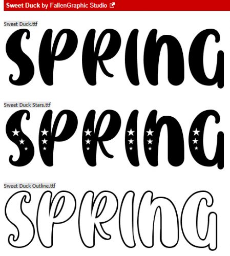
125. Fontastic Spring!

126. What the Heck is a Vignette?

127. True Colours – Not Just a Song

128. Numbers-Go-Round

129. Stackin’ ’em Up!

130. Standing Out in a Crowd (How to scrap a template so it looks different from everybody else’s)

131. Repeating Patterns – Basic

132. Repeating Patterns – Part Deux

133. UnMASKing the MASK

134. Repeating Patterns, Part Three

135. Restoring those Vintage Snapshots

136. How Do You Know When to Upgrade?

137. Deconstructing the Custom Shadow

138. Complex Shadows – Jan’s Method

139. Summertime Funtime Fonts

140. FINALLY! Kerning is Here!

141. Watercolor Effects -SO Beautiful!

142. Even Sketchier Still!

143. Pick your Pivot Point

144. Can We Talk? (journaling)

145. Anatomy of a Paper Stack

146. Anatomy of a Well-Composed Layout

147. Making the Most of Milestones (first day of school photos)

148. Digital Duplication: Embossing

149. Another Paper-Scrapping Digi-Hack (flocked “fussy cut” elements)

150. Breaking the Digi-Scrapping Code (glossary of terms)

151. Slaying the Green-Eyed Monster

152. What’s Your Digi-Scrapping Style?

153. Background Check

154. Unlocking the Secret Extras in Your Font Files

155. For All the Mac Users – Unlocking Secrets in Your Fonts

156. Another Paper- to Digi-Technique – Stenciling

157. Paper-to-Digi: 3D Embossing

158. Hybrid Pillow Box

159. To Theme or NOT to Theme

160. DIY Christmas Card Workshop

161. Beyond the Ordinary – Holiday Photos

162. Double Indemnity? Nope, Double Exposure!

163. Getting in on the Action(s)

164. Decluttering Isn’t Just for Homes

165. Following Up for Donna

166. It’s a Total Eclipse (another paper-to-digi technique)

167. A-Tinting We Will Go

168. Effect? Affect? What’s the Difference?

169. Let’s Play Stump the Chump

170. Springy-y Fonts- Part 2

171. Jazzing Up a Font

172. Jan’s Meme Creation Challenge

173. It All Comes Out in the Wash-i (Realistic Digital Washi Tape)

174. Working in the Background  (Creating Custom Backgrounds)

175. Be A-Frayed, Very A-Frayed (Realistic Fabric Tears)

176. Building Strong Borders with Brushes

177. Ten Fonts for Dad

178. Faking It! Tuck a Corner into a Digital Slit

179. Plan your Holiday Photos NOW!

180. Unlocking the Photoshop Elements Easter Eggs (Photoshop Elements Plus)

181. The Key to Painless Extractions (PSE +)

182. How Can I… Pierce My Paper?

183. It’s All a Matter of Taste (Black and White)

184. Taking the Shine Off (Photo Retouching)

185. Peek-a-Boo, I See You (Solving Under-exposed Faces)

186. Recorded History (Heritage Fonts)

187. When the Tutor Becomes the Tutored (Selective Recolouring for Word Art)

188. Another Guided Edit – Multi-Photo Text

189. Scrapping in the Time of COVID

190. Taming the Wild Template (Organizing and Finding Them)

191. The Photoshop Elements No-Diet Weight Loss Plan

192. Faking It – Those Incredible Full Moon Photos…

193. Method Scrapping – What’s My Motivation?

194. Customizing Template Banners

195. Preferences and Settings

196. Reflections, Perspective and Shadows

197. Jazzing Up a Neutral Background

198. Stuffing that Envelope

199. Christmas is Coming – Get Your Fancy Fonts Here!

200. Creating a 3D Metallic Look on 2D Shapes

201. New Year, New Challenges!

202. One BIG Word – Using a Title as a Divider

203. Another Take on Titles

204. Write Your Troubles in Sand

205. Hearts and Flowers (fonts)

206. Text Boxes Don’t Have to be Boxes!

207. Creating a Shadow-Box Layout

208. Creating a Shadow -Box Layout Part 2

209. Fooling Around With Gradients: Graduated Filters in Elements+

210. Circular Stencils: Another Paper-to-Digi Technique

211. Making Use of the Circular “Stencil”

212. I Love a Curvy Border

213. A 3D Title with Punch!

214. Gradient Border Masks – So Many Options!

215. 3D Photos – Yes, You CAN!

216. Selectively Recolouring Your Brushes

217. Uploading Your Layouts to the GingerScraps Gallery – Step by Step

218. Updating the Custom Cluster

219. Digital Stamps in Living Colour

220. Digitize your Handwriting

221. Selectively Colouring your Photos

222. Exploring Uncharted Territory (Elements Features)

223. Torn Paper: A Review

224. Jan’s Like a Broken Record… (or Why “Everything on Its Own Layer”)

225. More Fun with Blend Modes

226. Let’s Talk About New Computers

227. Which Template Format is Best for You?

228. How Do I Run an Elements+ Script on a Template?

229. Faking the Wood Burning Look

230. Colour Palettes, Swatches and How to Use Them

231. How Did They Do That? (Outlining a Title with Paper Cuts)

232. Anchors Aweigh! (Reverse Masking)

233. Jumpstart Your Layouts!

234. It’s Almost Digital Scrapbooking Day!

235. Fun Fonts for Layouts about Kids

236. Custom Word Art Using Only Fonts

237. Giving Credit Where Credit Is Due (or: Editing your Gallery images)

238. Use It All! Challenge Spotlight

239. Pleated Paper? Maybe,,,

240. November Challenge Spotlight: Template Challenge

241. Can I Make Something Crystal Clear? (As Glass)

242. Clearly Complete – Adding Some Background

243. DIY Worn Wood

244. Challenge Spotlight: Miss Fish Memory Mix Up Challenge

245. How Do I Build a Reusable Cluster?

246. Build-Your-Own-TEMPLATE!

247. Photo Mask Challenge with PrelestnayaP

248. Romantic and Corny… Valentine’s Day Fonts

250. Another Paper-to-Digi Technique: Partial Cutouts

251. Taking Those Shapes to the Next Level

252. Realistic Book Looks

253. Making Magic with Brushes

254. Creating Art with a Photo

255. A Simple Photo Border with Label

256. Importing a Tear

257. Making Your Own Messy Edges

259. April Quote Challenge with CathyK

260. QuickTrick: Improving the Work Flow with Templates

261. Template Mash-Ups Revisited

262. Create a Word Art Photo Frame

263. Challenge Spotlight: Perfectly Paired 

264. Quick Trick: Correcting Colour Cast

265. Creating a Title Echo for Your Layout

266. Elements Work-Around: Photo in a Jar

267. Celebrating Dads and Grads (fonts)

268. Quick Trick: Anchor Points Revisited

269. Title-Topia

270. Quick Trick: Transparent Titles

271. Creased Paper Cut-Out Word Art

272. Going Creative with the Stitch Technique

273. Quick Trick: Transform a Selection

274. Turning a Font into a Sticker: Reprise

275. Yes! You Can Create Smooth Curved Lines with Elements!

276. Realistic Folded Paper Shapes

277. UnZIP Me, Dahling – Updated

278. Curvy Lines/Borders Method #2

279. Challenge Spotlight: Minikit

280. Quick Trick: Brighter Photos the Easy Way

281. Redirecting Text on Your Embellishments

282. Challenge Spotlight: Created With Rewards

283. Quick Trick: Auto Colour Correction

284: Don’t Let Your Text FLOAT!

285. Coloured and Patterned Shadows

286. Challenge Spotlight: Scraplift

287. Quick Trick Tuesday: Close All

288. I Do Hereby Firmly Resolve…

289. It’s the Snowy Season! (Fancify a Font)

290. Quick Trick: Controlling Camera Shake

291. Loading Those Styles

292. Pattern Files, Custom Shapes and Styles Mash-Up (Replay)

293. Quick Trick: Content-Aware Fill

294. Weaving – the Digital Way

295. Individual Style: Color Challenge

296. Quick Trick: Select SUBJECT

297. How Do I Know When to Stop? (Editing)

298. Guided Edit: Perfect Landscape

299. Quick Trick: No More Blemishes

300. Selectively Recolouring Brushes – Revisited

301. DIY Solid and Neutral Papers

302. Challenge Spotlight: Jumpstart Your Layouts II

303. Quick Trick: Dropping Things Where You Want Them

304. 3D Titles – Paper Letters

305. Are They Scribbles? Doodles?

306. Challenge Spotlight: Back It Up II

307. Quick Trick: Scroll Through Blend Modes

308. Guided Edit: Saturated Film Effect

309. Photo Edit: Plumb and Level

310. Challenge Spotlight: Word Art

311. Quick Trick: Layer Thumbnail Appearance

312. Going Right Back to Basics: Preferences

313. Inspiration: Song Lyrics

314. Challenge Spotlight: Inspiration

315. X-Fonter: A Powerful Font Manager

316. Using Alphas for Titles – A Technique Tweak

317. Challenge Spotlight: Minikit

318. Quick Trick: Special Effects Brushes

319. Autumn and Creepy Season Fonts

320. Four Ways to Use Dingbat Fonts

321. Quick Trick: Hiding Multiple Layers

322. Challenge Spotlight: Pinterest

323. Yes! You Can Add a QR Code to Your Layout!

324. Two Minute Warning! Holidays Ahead!!

325. Challenge Spotlight: Scraplift

326. Quick Trick: Type Tool Measurements

327. Realistic Snowy Titles

328. Challenge Spotlight: Pinterest

329. Quick Trick: Deselect

330. New Year, New Challenges

331. Textured Overlays – Whut?

332. Challenge Spotlight: Brush

333. Making Multi-Photo Layouts Work

334. Quick Trick: All-in-One Alphas

335. Scraplifting Mother Bear

336. Ink Smudge Technique for Photos

337. Text on a Custom Path – Keeping the Path

338. Tucked Photo Frames Made Easy

339. Challenge Spotlight: Word Art

340. Quick Trick: Cleaning Out the Cookie Jar

341. Inspiration for the April Scraplift Challenge

342. A Little Crisp Around the Edges (burnt paper look)

343. Challenge Spotlight: Daily Download

344. Quick Trick: Level Your Horizons

345. Stuffing a Vellum Envelope

346. Recolouring Word Art with Gradient Maps

347. Challenge Spotlight: iNSD Mini Kit Challenge

348. Quick Trick: Gradient Titles

349. Celebrating Dads and Grads Again (Fonts)

350. Quick Photo Edits with Blend Modes

351. Challenge Spotlight: Template

352. Quick Trick: Distressing Elements

353. Taking Distress to the Next Level

354. Creating and Shadowing Transparent Elements

355. Challenge Spotlight: Recipe

356. The Style File: Where Is It?

357. Quick Trick: What the Font?

358. Step-by-Step: Gallery Limits, Challenges and Cookie Jar Entries

359. Multitasking: Gallery Uploads

360. Challenge Spotlight: Real Moments

361. Paper-to-Digi: Tone-on-Tone Heat Embossing

362. Challenge Spotlight: DSD Brush Challenge

363. What Do I Do With All My Layouts? (printing)

364. Quick Trick: About Those Shortcuts

365. History in the Making (US Election)

366. Rerun: Raindrops with Photoshop (Elements)

367. Challenge Spotlight: Quote Challenge

368. Quick Trick: Templates Without Drop Shadows

369. Wintery, Christmasy Fonts

370. Here’s a Hybrid Gift Card Tag

371. Challenge Spotlight: Daily Download

372. Quick Trick: Styling Strokes

373. Greatest Hits: Elements Preferences and Settings

374. Layering Patterned Papers and Loving It

375. Challenge Spotlight: Photography

376. Quick Trick: Smart Brush Tool

377. New Valentine’s Day Fonts!

378. Greatest Hits! A Forum Roadmap for Newbies

379. Challenge Spotlight: Wild About Styles

380. Quick Trick: Dupe a Graphic Novel Look

381. Greatest Hits: Faking It – Those Incredible Full Moon Photos…

382. Users’ Guide to the New Forum and Gallery

383. Challenge Spotlight: Everyday Memories

384. Guided Edit: Pattern Brush

385. Greatest Hits: What’s Your Digital Style?

386. Challenge Spotlight: Inspiration

387. Remember that Pattern Brush?

388. Greatest Hits: Weaving – the Digital Way

389. Challenge Spotlight: Wild About Styles

390. Three Things I LOVE about Windows 11

391. Greatest Hits: Let’s Talk About New Computers

392. Challenge Spotlight June 2025

393. Quick Trick: Install that Font!

394. Happy Canada Day Eh!

395. Greatest Hits: Abstract Meets Artsy


Tutorial Tuesday (Digital Scrapbooking)

8 ball, Corner Pocket!

Last week when I was struggling to find a topic to write about, I asked the GingerScraps Ad Team members for some ideas. Teresa suggested I do something about pocket scrapping. I have to tell you, I was floored. Pocket scrapping isn’t my thing and it’s really not my comfort zone either. I know it was a big part of the digi world several years ago, and I flirted with Project 52 (there’s NO WAY I could commit to Project 365 and I admit it!) but I wasn’t all that successful. So I had some learning to do before I could present myself as an expert. Ha! The EXPERT is Becky Higgins, the developer of Project Life. She has an app for that in addition to a whole paper line for pocket scrapping.

What IS pocket scrapping? Basically, it’s a clean-and-simple style of layout based mainly on a grid. It’s ideal for documenting the memorable (and the ordinary) events of our lives. Each section of the grid or block can hold a photo, a pocket/journal card, art work or a cluster of embellishments.

Why is it called pocket scrapping? It has its roots in paper scrapping, and it makes use of vinyl pockets of mainly two standard sizes, 2″x3″ and 4″x6″. Digital pocket scrapping follows the same format, and it lends itself very well to hybrid scrapping. You can create your page, print it and then attach buttons, ribbons, lace and pockets holding ephemera to the page.

Most of the designers on the GingerBread Ladies team here create kits and templates that work beautifully for pocket scrapping. In fact there are pages and pages of kits tagged for this style of memory keeping. And it’s easy to find them, too! I thought about giving you a list of designers whose products are amazing for pocket pages, but it would be a lot faster just to show you how to see them for yourself.

I’d love to show you some examples I found in the Gallery. This one is from trina513. I like that she’s used her Instagram photos.

minicooper452 created this one. The photos tell a story, and the journaling preserves the excitement of the day.

This one by emscraps is obviously a Project 52 layout. Em has managed to maintain her P52 for years now!

Belis2mi has documented a special day for her children with this layout.

I really like the feel this layout from amyjcaz has, with the photos of how she spent her day at the beach.

Because I live in cowboy country, this one by psychozoe caught my eye right away.

And then there’s this one from firstoscartgrouch that’s so whimsical and fun.

After looking at all these examples of pocket scrapping and seeing the individual stamps of each scrapper on her layout, I decided to give it a shot! It’s pretty amateurish, but maybe if I do a few more…

Next week there will not be a tutorial. We’re going to visit my parents and then our daughter in her new home in the mountains for a few days and I just won’t be able to squeeze in a blog post. I’ll be doing all the driving so I’ll be seeking a horizontal surface!