Quick Trick: Caps Lock ISN’T ON, PSE!!
![]()
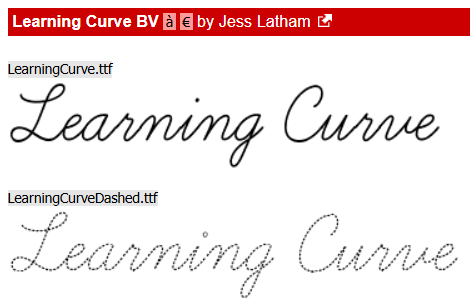
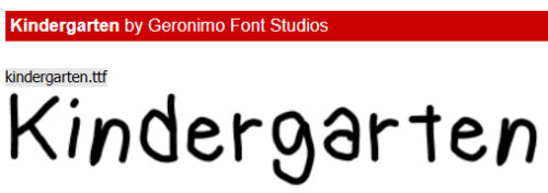
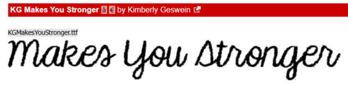
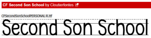
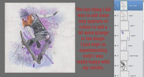
Have you ever been working away on a layout, right at the point where you’re ready to journal, and EVERYTHING is in upper case, no matter what you do? You check the caps lock, it’s not on. You save your layout, close out of PSE completely, go get a cold drink, come back and get started again, only to find it’s STILL messed up. So you reset all your Type Preferences, and that fails too. You’ve tried different fonts, you’ve cursed under your breath, gotten another cold drink, taken a walk around the block and are so frustrated you could scream. You’ve done a Google search, but the answer you need is either paywalled or requires a subscription. That was me the other day. You might want to bookmark this post so you can find it again…
There’s no discernable reason why this happens randomly when everything had been completely normal before. But it can give you an ulcer. The fix is stunningly easy.
- Activate your Text Tool.
- Choose your font.
- Set your cursor where you’re planning to put text.
- Before you put anything in your text box, click CTRL/CMD>SHIFT>Y.
- Voilà!! It’s fixed!
I know!! It’s ridiculous, but it works!
See you next week when I’m back with the Designer Spotlight. We’ve all met this Designer before, so we’re going to have some fun.
![]()